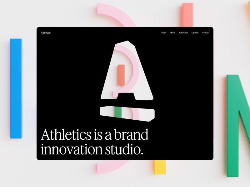
House Of Yellow is a creative content agency that takes ideas from concept to production and beyond. Its presentation pairs a motion-led visual language with a direct studio structure that reflects the agency’s focus on speed and craft.
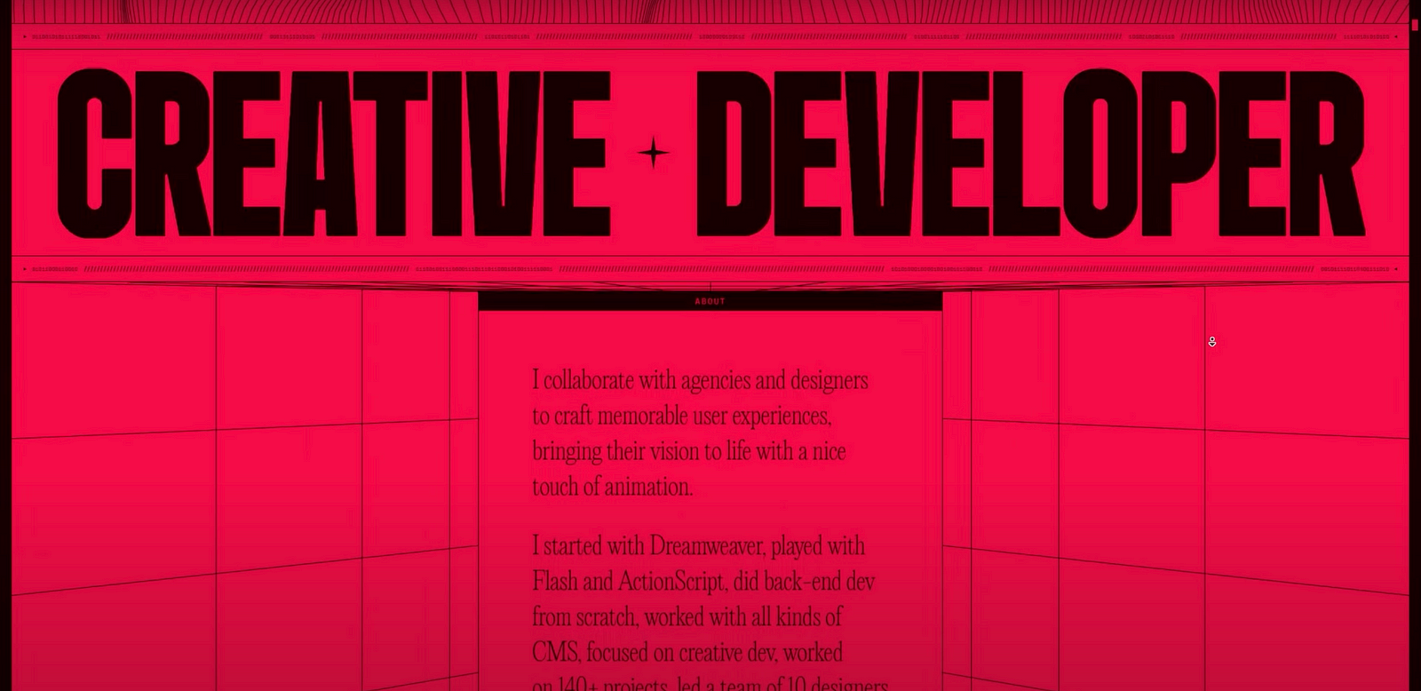
Raphael Segerman’s portfolio presents creative development as a blend of engineering, motion, and interaction. The work focuses on high-performance web experiences, with the site showing how code can shape the visual character of a project.
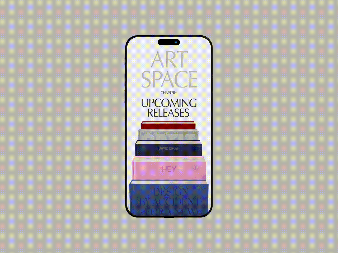
Aardvark Book Club turns monthly book discovery into a playful subscription experience, letting members choose up to three new-release hardcovers and join the conversation around them. The site combines editorial typography, illustrated packaging, and a warm visual system to make choosing a book feel like opening a gift.
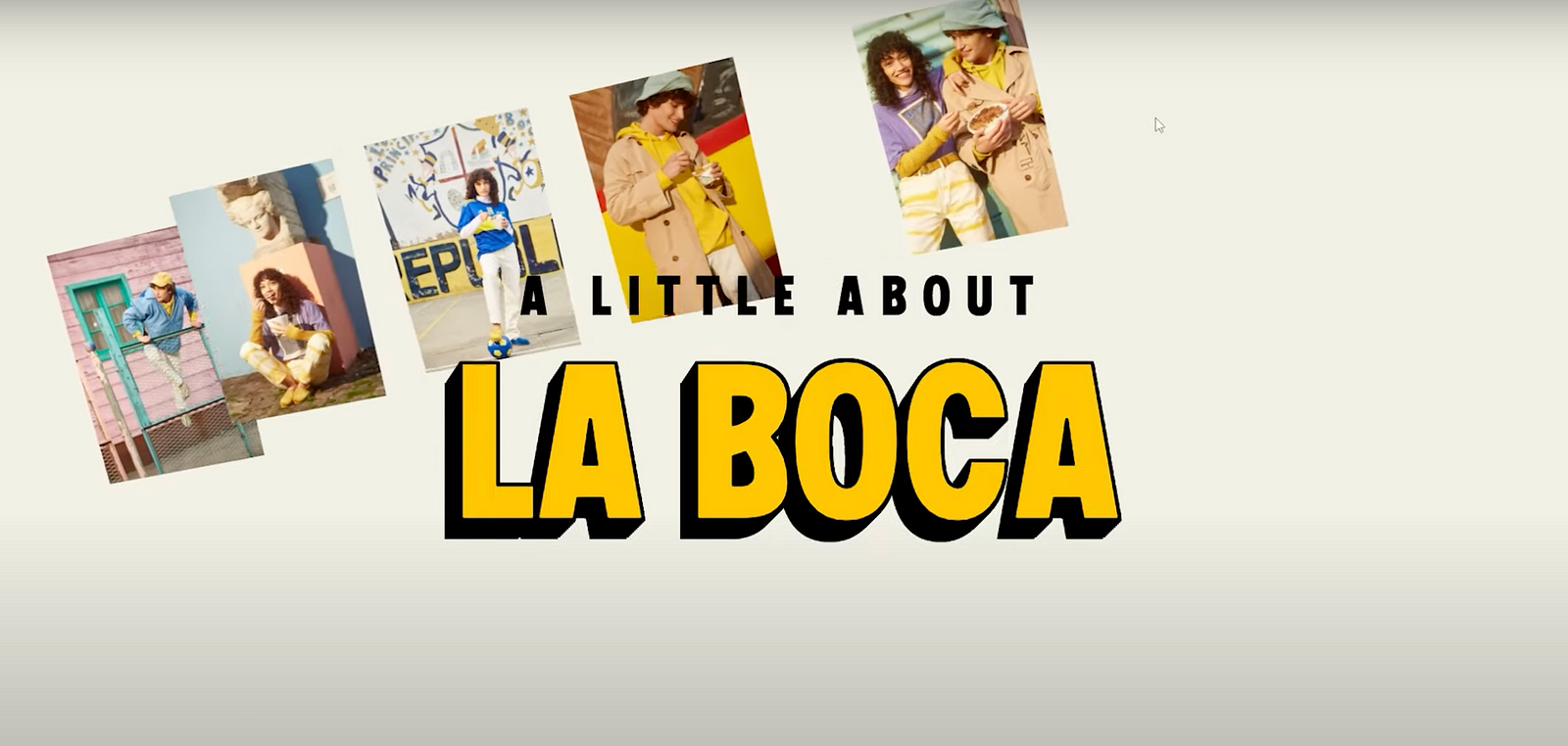
Sunfreaks introduces a biotech sunscreen brand rooted in molecular skin science, with a focus on melanin-rich skin and a retro 80s and 90s visual attitude. Its waitlist site builds the brand through editorial headlines, Polaroid-style cards, vivid photography, and a bold sun-soaked palette.
Sirnik is a minimal digital portfolio built around the balance between logic and emotion in design. Typography, strong hierarchy, and generous negative space create a calm interface for presenting digital work, design thinking, and product mindset.
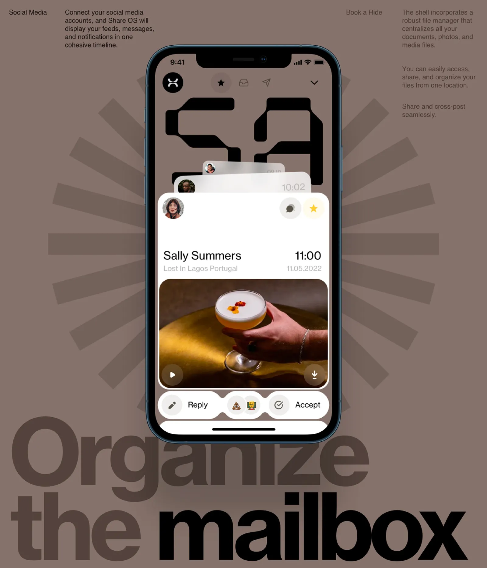
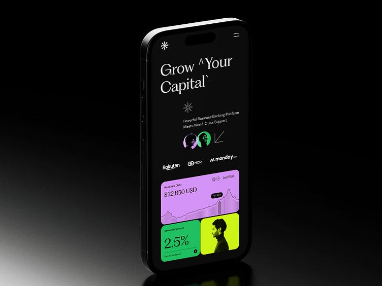
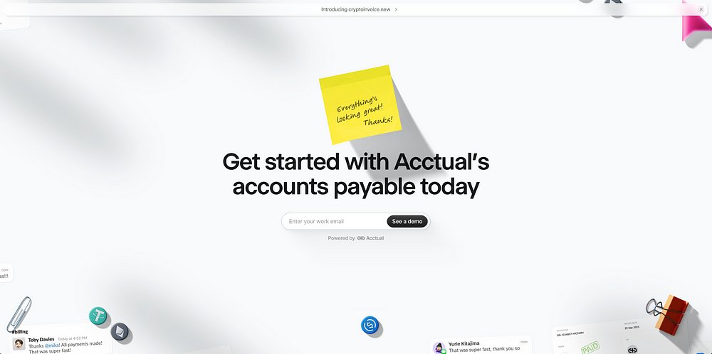
Tether Bank is a banking concept centered on one clear principle: security first. The project uses a restrained interface and a product-focused visual language to turn trust, protection, and financial control into the central design message.
Clipo’s waitlist page introduces a forthcoming app for creatives through a focused, motion-led landing experience. The single-purpose page keeps attention on the product promise and the invitation to join before launch.
Roshan Sahu’s portfolio brings together creative development, web development, and UI/UX design in one interactive showcase. GSAP, motion, and carefully built interface details help the site communicate both technical range and visual craft.
What makes a project stand out to the Muzli editorial team? This guide explains how nominations work, what editors look for, and how to present creative work so it can be evaluated clearly.
animos is a browser-based library of 25 ready-made motion templates for presenting design work. Drop in images or videos, adjust the animation, and export MP4 or WebM without leaving the browser.
Text Effects is a collection of 27 animated text experiments built with Framer Agents. Browse the examples, customize the direction, then copy the prompt or CSS for use in your own project.
Dispatch is a Framer template for AI and B2B SaaS products, with a terminal-inspired visual language and a clear content structure. It includes sections for workflows, capabilities, updates, and calls to action, making it easy to adapt for a product site.
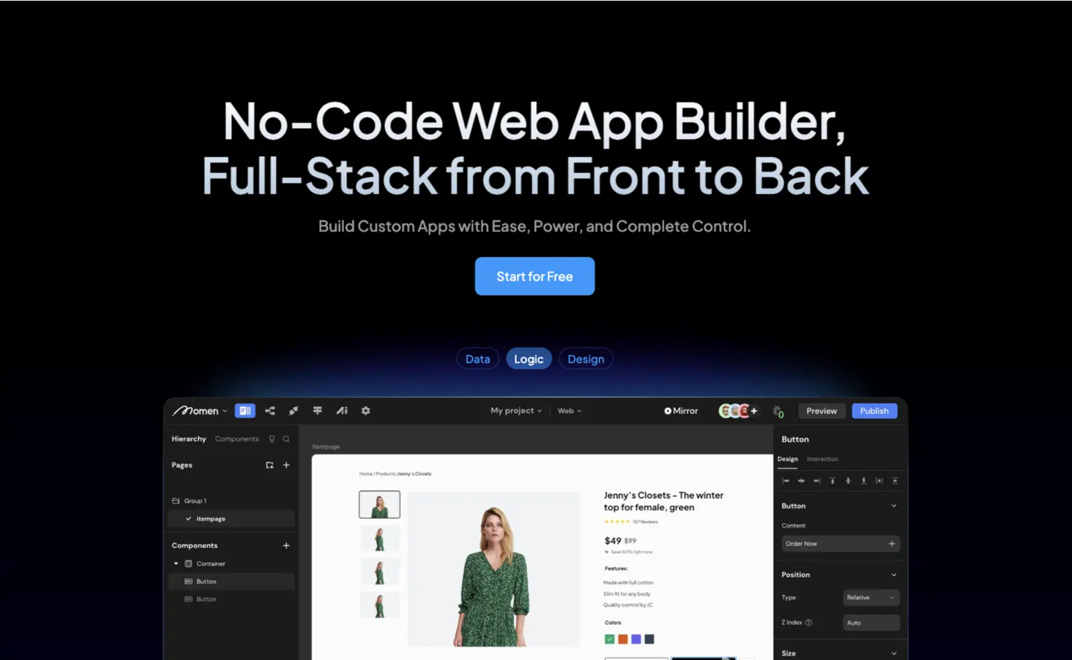
Framer’s new AI Agents bring a conversational workflow to website creation, making it easy to generate, refine, and maintain complete websites from simple prompts. Whether you’re starting from scratch or updating an existing project, the experience keeps everything inside the familiar Framer environment.
Zero reimagines the hiring journey through a polished digital experience that blends storytelling, motion, and interactive design. The website introduces a fresh approach to connecting talent with opportunities while maintaining a clean visual language throughout.
This portfolio transforms hand drawn sketches into an interactive 3D experience powered by WebGL. Smooth transitions, playful interactions, and carefully crafted details turn a personal portfolio into a memorable creative showcase.
House of Honey brings together editorial inspired layouts, expressive typography, and beautifully curated imagery into a sophisticated website experience. Every section feels carefully composed, balancing visual elegance with effortless navigation.
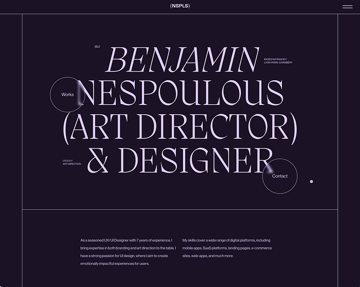
Benjamin’s portfolio combines cinematic visuals with refined interactions to showcase design work in a highly personal way. The site uses animation and thoughtful pacing to guide visitors through projects without overwhelming the content.
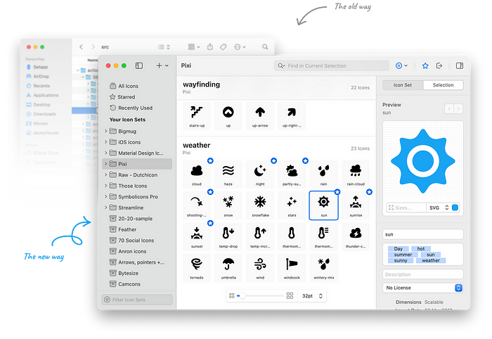
Iconsax is a growing icon library built for designers and developers looking for a consistent visual language. The project presents a large collection of carefully crafted icons through a fast, minimal interface that makes browsing and selecting assets effortless.
The State of the Gallery explores immersive digital storytelling through a combination of 3D visuals, motion, and experimental layouts. The project demonstrates how interactive experiences can transform traditional galleries into engaging online spaces.
Melius is an AI powered creative workspace built for designers, marketers, filmmakers, and creative teams. Instead of relying on a single prompt, it combines specialized AI agents that can generate concept boards, campaign visuals, storyboards, product imagery, and marketing assets inside one collaborative canvas.
Fudge lets Shopify teams build and edit storefronts simply by describing what they want in plain language. It generates clean, editable theme code, understands your existing brand and products, and keeps every change in draft until you’re ready to publish.
Raylight is a desktop application that brings powerful visual editing tools into a focused workspace for designers and creators. With an interface built for speed and clarity, it helps teams iterate on visual content without unnecessary complexity.
Meshy AI makes creating high quality 3D assets dramatically faster with AI powered text to 3D and image to 3D generation. Designers, game developers, and creative teams can generate textured models in minutes, making it an excellent companion for rapid prototyping and production workflows.
A polished ecommerce case study that focuses on visual storytelling, product presentation, and premium interactions. The project combines clean layouts with refined motion to create a shopping experience that feels both editorial and commercial.
A cinematic event website celebrating one of motorsport’s most iconic races. Rich photography, elegant typography, and smooth transitions create an immersive digital experience worthy of the Le Mans legacy.
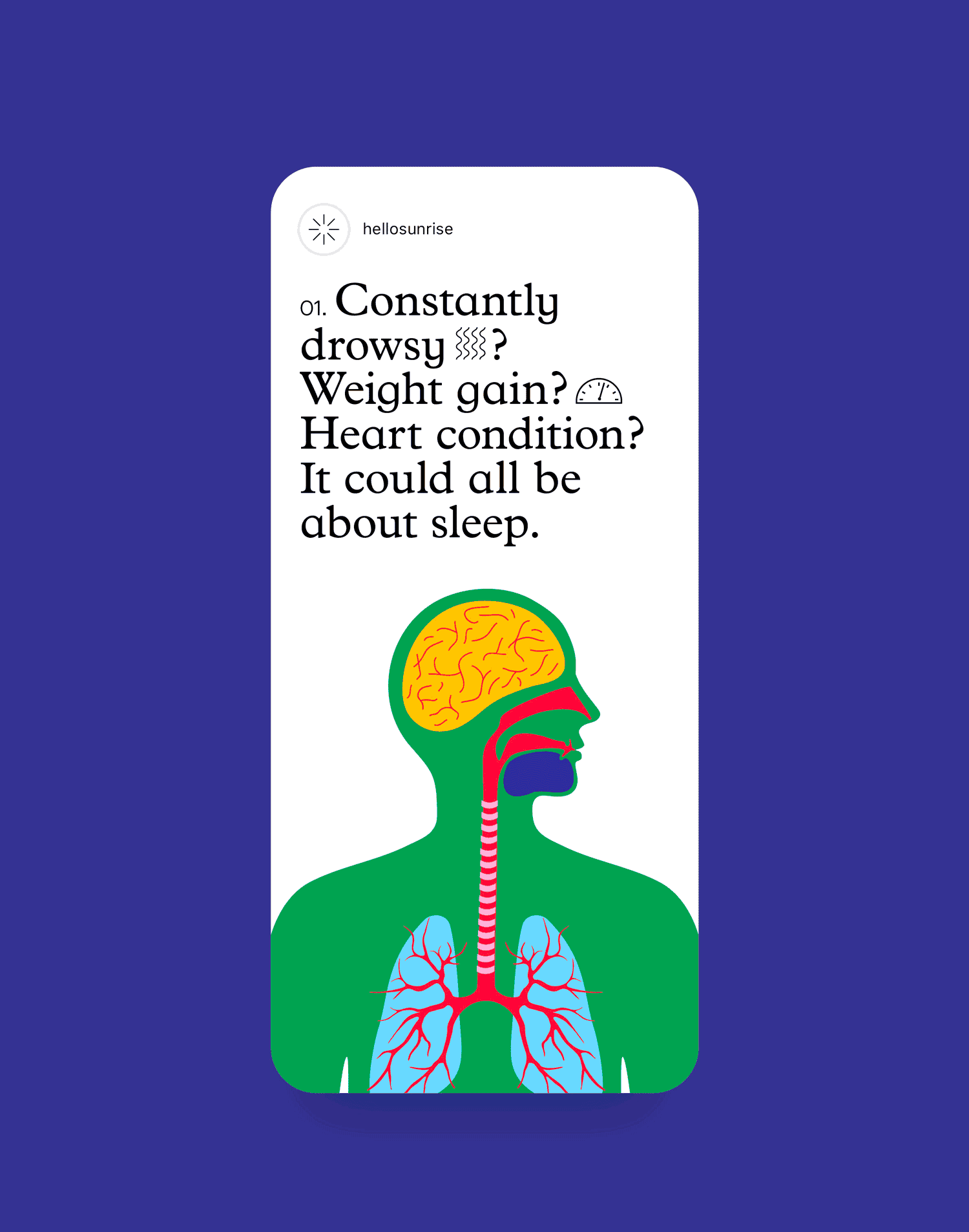
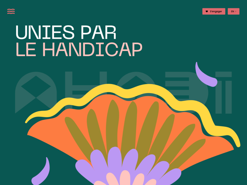
An awareness campaign that balances accessibility with engaging storytelling. Bold graphics, thoughtful content hierarchy, and interactive elements help deliver an important public health message.
A modern product site introducing an open-source approach to AGI development. The experience combines technical clarity with striking visual design, making complex ideas easy to navigate.
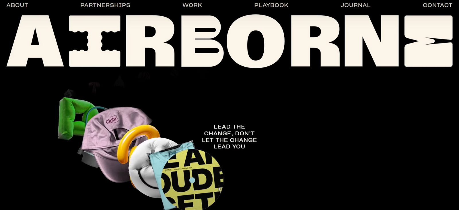
A bold agency website featuring expressive typography, fluid motion, and carefully crafted interactions. The project showcases how strong visual identity can support a modern studio portfolio.
A cinematic production studio website with immersive video, clean layouts, and confident pacing. The presentation highlights the studio’s work without overwhelming the visitor.
A browser game inspired by minimalist aesthetics and retro digital environments. The restrained visual language makes every interaction feel intentional and memorable.
An interface concept imagining an operating system built around AI-first workflows. Clean UI patterns and futuristic visual direction make it an intriguing exploration of productivity design.
Couldn’t make it to Config this year? Figma wrapped up the biggest announcements, product launches, and key sessions in one comprehensive recap. A great way to catch up on everything shaping the future of design workflows.
Prepros is an all-in-one development companion for front-end designers and developers. Compile Sass, Less, and TypeScript, optimize assets, and preview changes instantly, all from a clean desktop interface.
GetCompress helps you reduce the size of images, videos, GIFs, and PDFs without sacrificing quality. It’s a practical utility for anyone looking to speed up websites, optimize assets, or free up storage space.
A cinematic showcase experience that blends WebGL, immersive transitions, and polished motion design into a single narrative journey. The project demonstrates how interaction and storytelling can work together without overwhelming the content.
VERO combines premium art direction, elegant 3D elements, and thoughtful interactions to create a memorable digital experience. Every detail feels intentional, from the visual rhythm to the smooth navigation flow.
Shopify’s latest Editions page presents a dense product story through a calm, well-structured interface. The page is useful as a reference for product storytelling, visual hierarchy, and launch-page pacing.
A playful browser project that turns the familiar football sticker album format into a digital collecting experience. The visual system is bright, nostalgic, and immediately understandable.
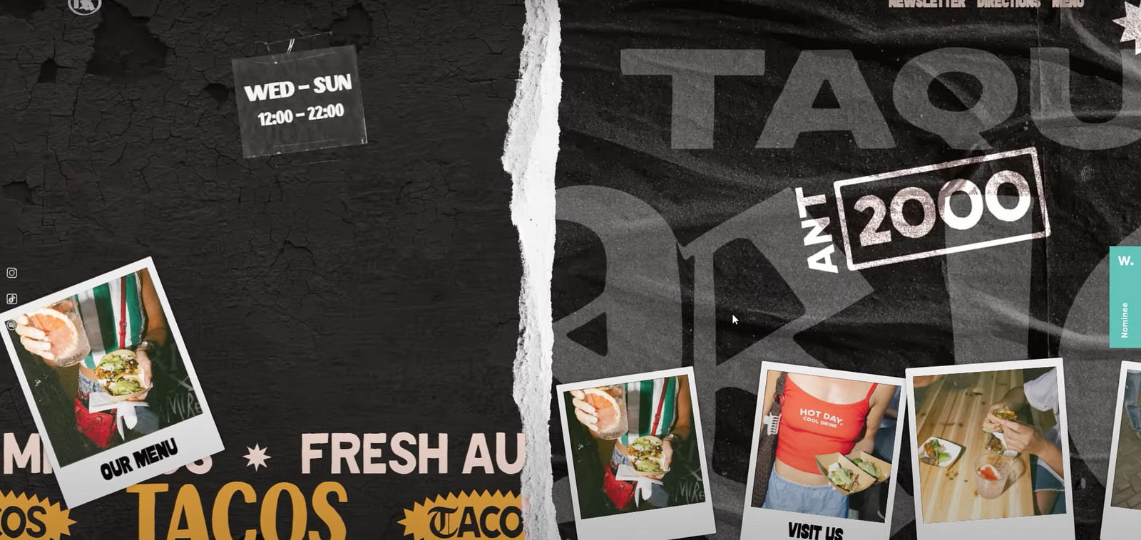
A vibrant restaurant experience that brings together bold typography, playful branding, and rich visual storytelling. The site captures the energy of the brand through strong color choices, custom illustrations, and a clear digital identity.
Created as a pitch concept for Laboratoires Filorga, this project reimagines the skincare brand through fluid motion, immersive transitions, and a more expressive digital language. Soft gradients, elegant product storytelling, and carefully crafted interactions transform a traditional beauty website into a richer brand experience.
This project redefines the agency’s visual identity through a bold, high-contrast digital ecosystem that emphasizes cinematic storytelling and brand authority.
A clean mobile app concept designed to simplify daily nutrition tracking. Thoughtful information hierarchy, friendly visual language, and well-structured dashboards make complex health data easy to understand at a glance.
Cooldock transforms unused screen space into a customizable productivity dock packed with live widgets, quick actions, and workflow shortcuts. It feels native to macOS while providing a practical way to keep tools and information within reach throughout the day.
Hiding Elephant is the AI canvas for real design work. Generate, edit, and scale on-brand visuals in one workspace for marketing teams, ecommerce brands, and creative agencies.
Adscent is a modern, multi-page website template crafted specifically for advertising and creative agencies looking to build a strong and impactful digital presence.
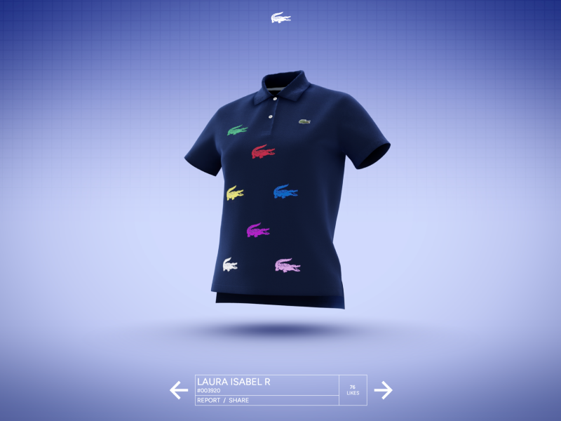
An interactive brand experience that reimagines the iconic Lacoste polo through immersive storytelling and refined digital craftsmanship. Rich motion, detailed visuals, and thoughtful interactions turn a product showcase into a memorable journey.
A cinematic website that blends motion, typography, and editorial presentation into a cohesive narrative. Every section feels carefully choreographed, creating a strong sense of atmosphere and storytelling.
Created around the energy of Roland-Garros, this experience combines gaming mechanics, sports culture, and premium branding. The result is a playful digital campaign that feels both engaging and distinctly Lacoste.
A bold studio website showcasing the intersection of AI, design, and development. Dynamic visuals, smooth transitions, and strong art direction reinforce the studio’s forward-looking approach.
A fresh visual exploration of what Siri could become in a more expressive and intelligent future. The concept combines polished interface design with a clear vision for conversational experiences.
A visually rich portfolio experience that showcases the studio’s work through bold layouts and immersive interactions. The presentation highlights craft, motion, and storytelling in equal measure.
A playful pre-launch experience built around strong branding and character-driven visuals. The project uses color, typography, and motion to create anticipation before launch.
An editorial-inspired interface concept designed to present historical content in a structured and engaging way. The layout balances readability with strong visual hierarchy and contemporary web design patterns.
A comprehensive look at the trends, technologies, and behaviors shaping creative work today. The report offers valuable insights for designers, creators, and teams navigating an evolving landscape.
A lightweight utility that keeps your clipboard history organized and instantly accessible. Built for Mac users, it helps streamline repetitive workflows without getting in the way.
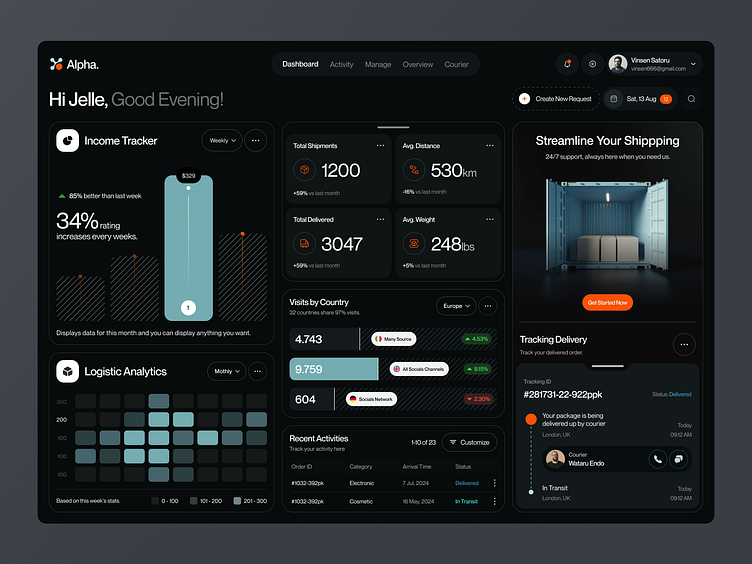
A modern Framer template designed for logistics, transport, and technology businesses. Clean layouts, strong visual hierarchy, and polished interactions make it easy to launch a professional web presence.
A Framer component that helps creators build dynamic, infinitely scrolling CMS-powered layouts without custom development. Perfect for portfolios, directories, content hubs, and inspiration galleries.
A portfolio experience from Rogue Studio that blends motion, storytelling, and cinematic transitions into a single immersive showcase. Every interaction feels intentional, making it a strong example of how animation can support a brand narrative rather than distract from it.
A beautifully crafted visual identity inspired by the heritage and texture of traditional oil painting. The project balances classic artistic references with a contemporary design system that feels both premium and timeless.
An ambitious digital storytelling experience exploring the future of AI infrastructure and energy. Rich visuals, smooth transitions, and layered interactions transform a technical topic into an engaging journey.
UXBERT Labs offers an immersive, scroll-driven narrative that chronicles the evolution of design and innovation, from ancient civilizations to the modern digital era. Through a highly interactive “click & hold” interface and advanced 3D visual storytelling, the agency effectively positions its global digital consultancy services within a grand historical context.
A playful project that turns motion into visual exploration. The concept is simple, but the execution creates an engaging interactive experience that invites experimentation and curiosity.
This mobile-optimized website features a sophisticated, dark-themed interface accented with high-contrast lime-green elements. It utilizes smooth, scroll-triggered animations to effectively present high-impact engineering services, industry expertise, and founder testimonials in a clean, professional manner.
Playfight is a creative, story, and production studio that challenges the norm, proving that “Different is Everything.” Their website is a masterclass in immersive storytelling, blending artistic narrative with high-end commercial production across film, photography, and digital design.
A branding project built around a modern eyewear concept. The visual system combines elegant typography, minimal layouts, and product-focused imagery to create a distinctive and cohesive identity.
Supaste is a local-first clipboard and screenshot history app for Mac. Save copied text, links, images, files, code, colors, and screenshots in a beautiful searchable timeline.
Auto Type is a powerful Figma plugin that instantly analyzes frames to generate, apply, and link structured local text styles. It enables designers to create responsive, clean, and developer-friendly typography systems in a single click, automatically organizing text into semantic tokens for headings and body copy.
A comprehensive branding toolkit designed for agencies and designers building identity systems. It includes presentation-ready guidelines, documentation layouts, and brand management assets.
A premium and modern Framer template for real estate developers, luxury apartment projects, and property agencies built to showcase high-end living experiences with clarity and confidence.
A sharp and surprisingly grounded report exploring how AI is actually changing design workflows right now. Instead of vague predictions, it focuses on real behavior shifts, creative habits, and the tools designers are already integrating into daily work.
Cyera’s latest campaign, designed by Active Theory, blends cinematic 3D visuals, atmospheric lighting, and futuristic UI language into a polished AI security experience. The entire presentation feels more like a sci-fi product trailer than a traditional enterprise site.
An industrial production studio website that feels raw, cinematic, and highly physical. Strong typography, metallic textures, and film-inspired transitions give the experience a unique visual identity.
A playful and energetic brand experience packed with bold color combinations, fluid motion, and expressive typography. The visual system feels loud in the best possible way, while still staying surprisingly cohesive.
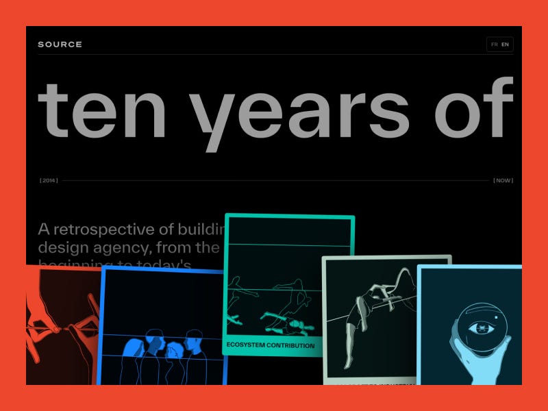
An interactive graphic novel celebrating ten years of Studio375 through real stories, characters, and studio moments. The experience turns an agency milestone into something much more personal: a playful, animated web comic with sound, pacing, and a strong narrative layer.
Casa Comfort Arreda keeps things calm and intentional, using warm interiors, refined typography, and generous spacing to create a premium editorial feel without relying on heavy effects or trends.
A premium sportswear concept combining sharp product presentation with strong editorial direction. The visual system feels athletic without falling into generic performance-brand clichés.
This dynamic mobile app interface features a sleek, sports-focused design with a clean aesthetic and bold typography. The user-friendly layout utilizes vibrant color blocking and engaging, high-quality imagery to deliver an immersive football experience.
Figma’s latest AI update feels less like a shortcut generator and more like a real collaborative layer inside the design process. This breakdown explores what the new agent can actually do, where it helps, and where designers will probably still want control.
One of the cleanest UI component ecosystems right now for designers and developers building modern products. Fast, flexible, beautifully structured, and surprisingly easy to customize without fighting the system.
A bold Framer portfolio template mixing cinematic layouts, oversized typography, and dark editorial styling. The experience feels polished and atmospheric, with just enough motion to make the work feel immersive without becoming distracting.
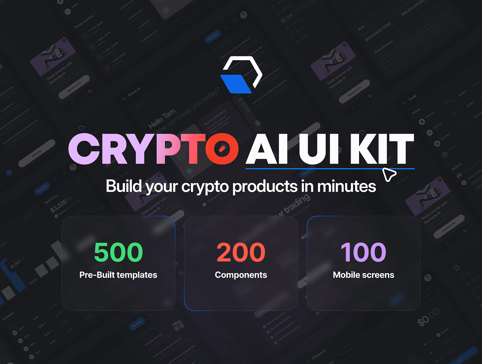
A polished UI kit packed with modern dashboards, mobile screens, components, and clean SaaS flows. The system feels practical and production-ready while still keeping a premium visual layer.
Figma’s new Design Agent lives on the canvas, knows your design system, and edits the same file you’re working in. We break down what it changes for designers, what it doesn’t, and the real question it forces every team to answer.
For two years, “AI in design” mostly meant a sidebar that generated a UI you would never actually ship. Pretty mockups, wrong components, no design system, no context, no use. Today Figma shipped something different. The Figma Design Agent is not a generator bolted onto the canvas. It is an agent that lives inside the file, reads your design system, and edits your work the same way a teammate would.
It is in beta starting today, May 20, 2026, on Professional, Organization, and Enterprise seats. During beta, it does not consume AI credits. After that, it will. The product leads are Rodrigo Davies (PM) and Tammy Taabassum (Product Designer).
That is the announcement. The interesting part is what it changes about the job.
What the Agent Actually Does
The Figma Agent operates from the left rail and acts directly on layers. You can prompt it from any selection. You can reference specific components, variables, and tokens with @ mentions. It runs alongside you in the same file, which means you keep editing while it edits, and neither of you blocks the other.
Three things it is built to do well:
Parallel exploration. Ask it for several stylistic directions to the same problem at once. Different information architectures for a settings page. Three checkout flows with different trust signals. Two onboarding patterns built from the same component library. You pick the direction before you commit hands-on time.
Bulk editing. Rename variables across a file. Swap components across many screens. Apply padding changes across a full flow. Populate frames with realistic content. Convert a flow to dark mode. Push design system updates through a sprawling file in minutes instead of an afternoon.
Feedback integration. Drop the agent into a file full of comments and it will cluster them by theme, surface the conflicts, and generate revisions that incorporate the feedback. It is not deciding for you. It is doing the part of design review that nobody wants to do manually.
The agent also talks to the Figma MCP server and the use_figma capability, which means design context can move between code and canvas without losing fidelity. That matters more than it sounds. The handoff layer is where most “AI design” demos quietly fall apart.
Why This Is Different From the Last Wave of AI Design Tools
The last 24 months of AI design tools mostly produced two patterns. Tools that generated images of interfaces (beautiful, unshippable). Tools that generated React code from a prompt (interesting, often disconnected from a real design system).
Both treat design as a one-shot generation problem. You type, you get an artifact, you start over.
The Figma Agent treats design as an editing problem on a file that already exists. The file has components. The components have tokens. The tokens have rules. The agent reads all of that as context before it touches a layer. When it produces a variation, the variation respects your system because it was generated inside your system.
That is the gap. Generation tools work on a blank canvas. The Figma Agent works on your canvas, which is the only canvas that actually ships.
This also reframes the partnership debate. Designers have spent the year arguing about whether AI replaces them or assists them. The Figma Agent is built around a third answer: AI does the parts of the file that are mechanical, repetitive, or exploratory, and humans do the parts that require taste and decision. It is not a co-pilot. It is more like a junior designer who can hold a hundred files in their head and never gets tired of renaming variables.
What About Claude Design?
One month before the Figma Agent launched, Anthropic shipped Claude Design, an Anthropic Labs product that lets you create prototypes, slides, one-pagers, and visual work from a prompt. It reads your codebase and design files during onboarding, builds a design system from that, and applies it to every project after. It is powered by Claude Opus 4.7 and available to Pro, Max, Team, and Enterprise subscribers. VentureBeat called it a challenge to Figma. That framing is understandable and mostly wrong.
Claude Design and the Figma Agent are aimed at genuinely different problems.
Claude Design is a creation tool. You start from nothing. You describe what you need, Claude builds a first version, you refine through conversation or direct edits, and you export to PDF, PPTX, Canva, or standalone HTML. When a prototype is ready to build, it packages into a handoff bundle for Claude Code. It is fast, it is good for stakeholder decks and quick prototypes, and it does not require a Figma seat or a design file to already exist. The design system promise is real, but it works by reading your codebase. Not by reading a Figma file that your design team has maintained for three years.
The Figma Agent is an editing tool. You start from a file that already exists, with components that already exist, with a system that the design team already owns. The agent does not build a design system from your codebase. It works inside the one you built.
The gap comes down to who is in the seat. Claude Design is genuinely useful for product managers, founders, and developers who need visual output quickly and do not live in Figma. The Figma Agent is for designers who do live in Figma and want mechanical work to take a fraction of the time it currently takes.
Both tools made the same promise: AI that understands your design system. They just answered it from opposite ends of the process.
What Changes for Designers Day to Day
Three workflows shift immediately.
Exploration gets cheaper. Most designers ship the second or third idea they had, not the eighth, because the eighth was too expensive to mock up. When the cost of exploring a direction drops to a prompt, the ratio of explored to shipped goes up. Teams will see more variations before lock-in. That is healthy if the team has taste. It is dangerous if the team treats “more options” as a substitute for opinion.
Design system enforcement stops being a chore. Every design system team has the same backlog: screens built before the system existed, components that drifted, padding that nobody updated. The agent collapses that backlog. Swap, rename, conform, repeat. The work that used to take a quarter takes a sprint.
Review cycles get tighter. The feedback summarization feature is small in description and large in practice. Design reviews drag because nobody wants to sit through 47 comments and decide which ones matter. If the agent clusters comments by theme and produces revisions that address them, the review meeting changes shape. You arrive with directions, not arguments.
The thing that does not change: the decision. The agent will not tell you which checkout flow is right. It will give you three. You still have to know why one of them is wrong.
What It Cannot Do (Yet, or by Design)
The announcement is honest about scope. The agent is a design agent. It is not a strategy agent, a research agent, or a product manager. It does not know what your users actually need. It does not know what your business is trying to prove next quarter. It does not know that the CEO hates the color teal.
It also operates inside one file at a time. It is not yet a cross-file refactor tool, and it is not a project-wide auditor. The dream of “agent, please audit every product surface for accessibility issues and fix them” is not what shipped today. What shipped is an agent that makes one file faster.
And, as with every AI editing tool, the risk surface is the same: confident edits that look right and are subtly wrong. Tokens applied to the wrong layer. Variables renamed in a way that breaks a downstream import. The agent does not absolve the designer of reviewing the diff. It just changes what the diff looks like.
The Real Question This Forces Every Team to Answer
If the mechanical 40 percent of design work compresses by 5x, what do designers do with the time?
That is the actual question. The optimistic answer is that designers go deeper on the strategic, conceptual, research-heavy parts of the job that they always claimed they did not have time for. The cynical answer is that org charts compress and three designers do what five used to do.
Both answers will be true at different companies. The teams that come out ahead will treat the agent as a multiplier on judgment, not as a replacement for it. The teams that come out behind will treat it as a way to ship more screens without thinking harder about them.
For anyone tracking the broader category, this announcement sits next to a year of AI design tools we have reviewed in Best AI Design Tools for UI/UX (2026). The shift is that the agent moved from a separate product to a feature inside the file where the work actually lives. That is a big move. The other tools now have to answer it.
The Figma Agent is in beta from today. Designers on eligible plans can opt in. The honest recommendation: try it on a real file, not a demo file. The interesting failures and the interesting wins both live in the messy, real-world projects, not in the toy ones.
BRIK turns creative direction into modular living systems instead of static mockups. The experience feels somewhere between a design tool and a visual playground, with strong motion language and a surprisingly tactile interface.
A good reminder that creative tooling doesn’t have to look like enterprise software.
Spotify’s updated disco icon sparked a surprisingly big design conversation this week. Some people love the nostalgic energy, others think it feels disconnected from the brand system.
Either way, it’s interesting to watch how small visual changes can trigger massive reactions online.
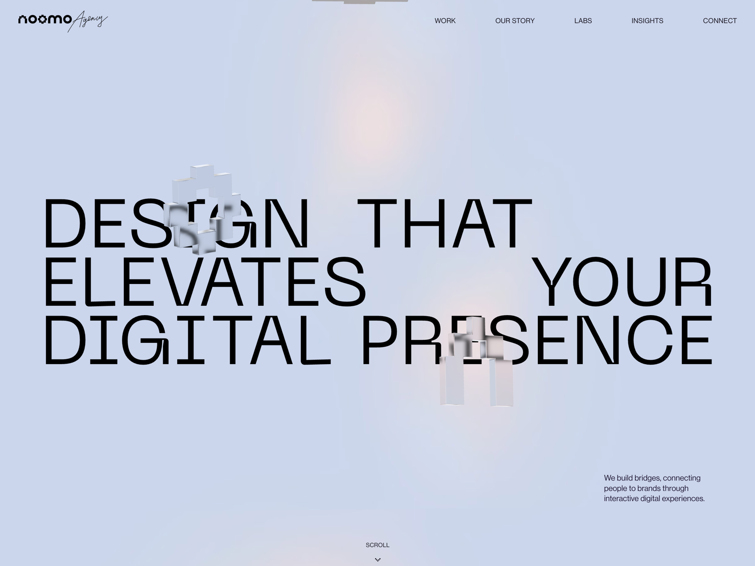
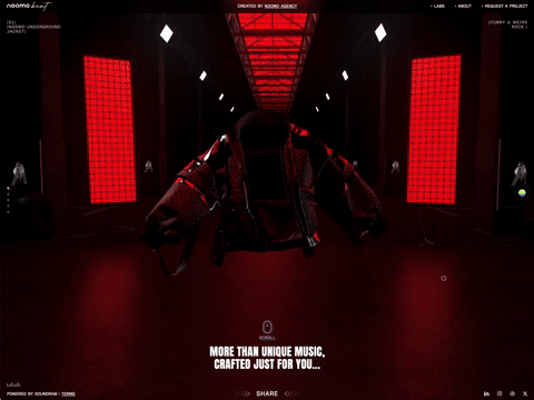
Noomo Agency built an immersive 3D storytelling experience that feels cinematic without losing clarity. The transitions, lighting, and pacing work together to create a scroll experience that feels intentional from start to finish.
This one is packed with small interaction details worth studying.
A beautifully crafted portfolio experience with a strong editorial feel. Large typography, restrained motion, and confident spacing make the entire site feel calm, sharp, and expensive in the best possible way.
Proof that minimal design still works when the craft is there.
A beautifully directed campaign experience blending music, Android branding, and cinematic storytelling. The warm lighting, soft typography, and documentary-style visuals give the entire project a human, almost film-like atmosphere.
One of those branded experiences that feels emotional instead of overly polished.
A sharp product and merch presentation with a dark, polished interface language. The project combines jewelry, e-commerce, and brand detail into a focused visual system that feels refined without becoming overly decorative.
A creative studio template with a cinematic, portfolio-first structure. The layouts give plenty of space to motion, large imagery, and project storytelling, making it a strong reference for agencies that want a more atmospheric web presence.
A clean, elegant website with a quiet editorial feel. The restrained palette, spacious layout, and soft visual rhythm make the experience feel calm, premium, and carefully composed.
A curated place for design assets, templates, and creative resources from the Muzli ecosystem. If you’re looking for something practical to save, use, or remix in your next project, this is a good place to start.
A growing collection of clean, presentation-ready mockups for designers, brands, and creative studios. The library focuses on modern layouts, realistic product scenes, and assets that are easy to drop directly into presentations or portfolio work.
A solid bookmark for anyone building case studies, landing pages, or visual identity presentations.
A useful resource library focused entirely on SVG assets, icons, and scalable vector graphics for modern web projects. The collection feels lightweight, practical, and easy to integrate into UI, branding, motion, and front-end workflows.
Especially useful for designers and developers looking for clean vector assets without digging through bloated marketplaces.
A beautifully minimal portfolio and digital studio experience with refined typography, soft transitions, and strong spatial composition. The site balances editorial elegance with modern interaction design, creating an atmosphere that feels both premium and approachable.
A strong reference for anyone exploring minimalist web direction without losing personality.
A cinematic WebGL experience built around the world of AI and blockchain investing. The site combines immersive motion, layered transitions, and a polished dark visual system that gives the project a futuristic but premium feel.
A bold corporate experience with strong editorial layouts, oversized typography, and rich motion details throughout the journey. The project balances high-energy visuals with a clean structure that keeps the experience sharp and easy to navigate.
A crypto-focused product site with vibrant gradients, fluid animations, and a sleek interface language. The visual direction feels modern and approachable while still delivering the fast-paced energy expected from the Web3 space.
A fashion-driven digital experience blending minimal layouts with expressive photography and refined typography. The site creates a strong visual rhythm through clean spacing, subtle interactions, and confident art direction.
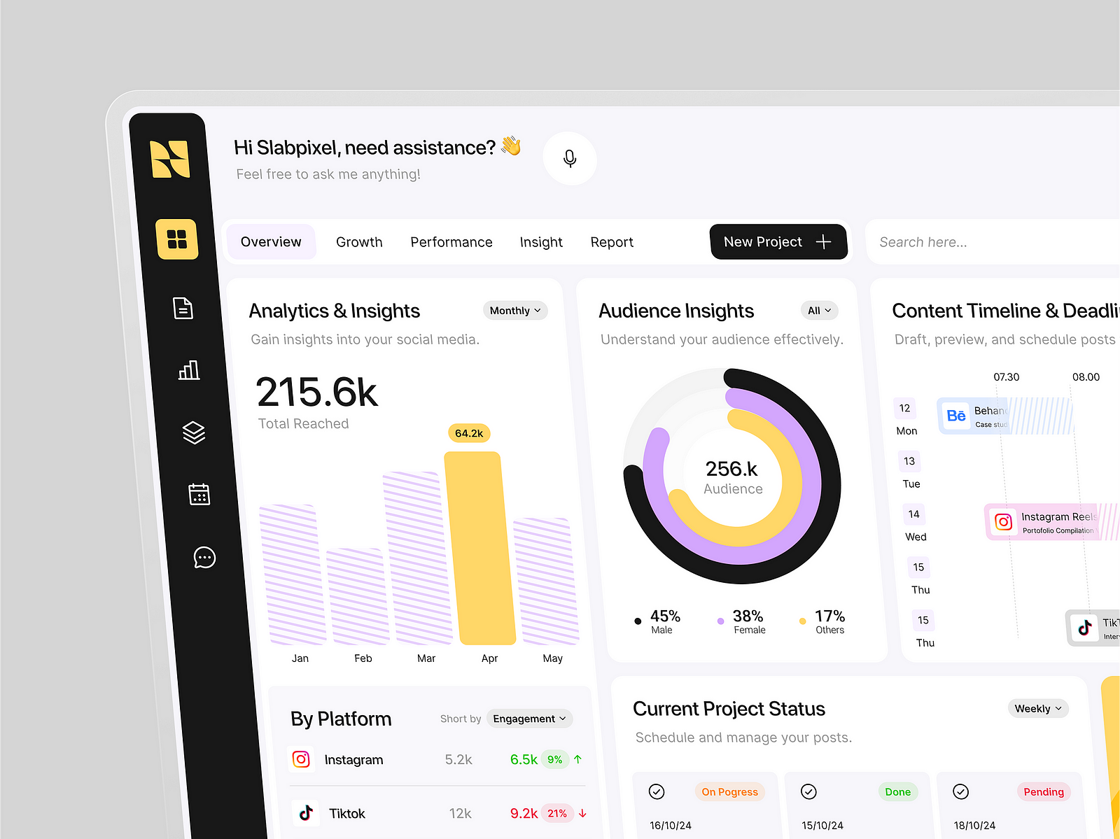
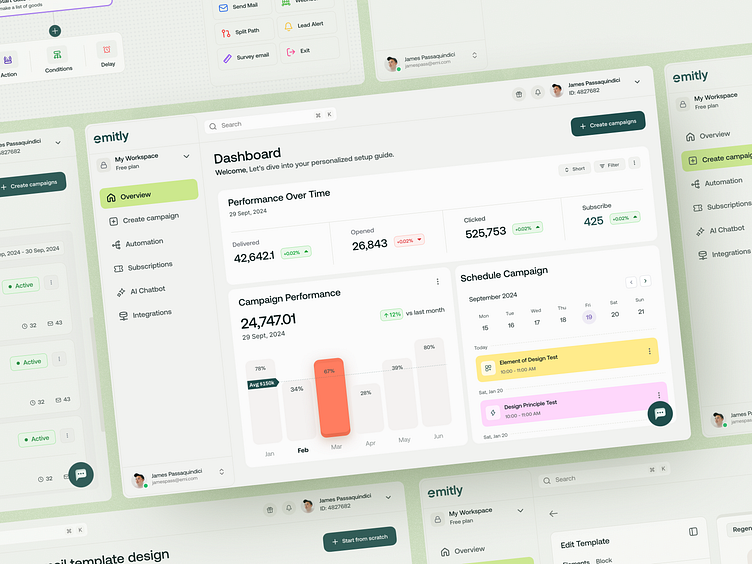
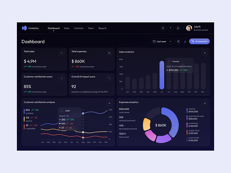
A detailed enterprise platform concept combining clean dashboards, structured layouts, and a modern SaaS visual language. The project stands out through its polished data presentation, balanced spacing, and highly scalable interface system.
A stylish one-page portfolio template built for creatives who want motion and personality without sacrificing clarity. Smooth transitions, layered typography, and minimal compositions give the template a refined editorial feel.
A bold branding project with a clean contemporary identity system and confident visual direction. The combination of typography, composition, and product-focused presentation creates a strong and memorable brand presence.
An immersive Three.js concept inspired by the scale and atmosphere of Dubai’s iconic skyline. The project blends cinematic motion, interactive 3D environments, and dramatic visual storytelling into a rich web experience.
An experimental AI-powered workspace from Google Labs designed to help users organize ideas, research, and workflows visually. The interface feels lightweight and polished, with a strong focus on creative productivity and collaboration.
A beautifully crafted website builder focused on speed, simplicity, and elegant presentation. Dina combines modern layouts, clean typography, and smooth interactions into a product that feels both approachable and highly refined.
A sleek Framer template designed for startups, SaaS products, and creative businesses looking for a modern online presence. The template uses strong visual hierarchy, subtle motion, and flexible sections that are easy to customize.
A premium finance-focused UI kit packed with polished charts, dashboards, and data visualization components. The system is ideal for fintech products, analytics platforms, and modern SaaS interfaces that need clean and scalable financial visuals.
A bold, video-first agency website that leans heavily into motion and storytelling. The layout feels minimal at first, but quickly reveals a layered structure built around cinematic content and strong pacing.
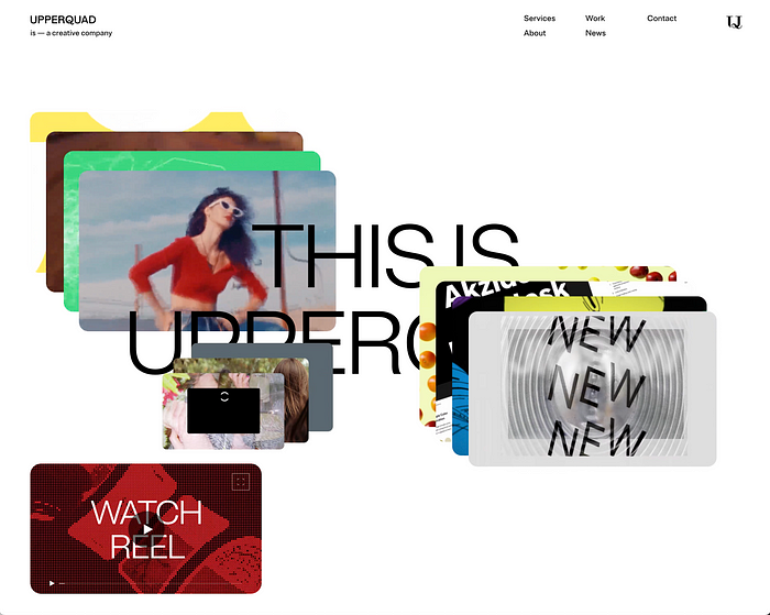
Upperquad delivers a clean, structured agency experience with a strong focus on typography and grid systems. The design feels controlled and confident, with subtle interactions that add depth without distracting from the content.
An immersive portfolio built with WebGL, blending 3D environments with a personal narrative. Navigation feels exploratory rather than linear, turning the portfolio into an interactive experience rather than a static showcase.
A high-impact studio website that embraces bold colors, layered visuals, and expressive typography. The experience feels energetic and experimental, with a clear focus on visual identity and brand attitude.
A sleek, high-end venture capital website that blends AI and blockchain aesthetics into a clean, structured experience. The design leans on subtle motion and a refined visual system to communicate credibility without overloading the interface.
A sharp landing page concept that balances clarity and visual appeal for a complex AI product. Strong hierarchy, clear messaging blocks, and well-paced sections make the experience easy to scan while still feeling premium.
A detailed UI exploration of an AI workflow builder, focused on modularity and system thinking. The interface feels flexible and scalable, with node-based structures that reflect how modern automation tools are evolving.
A conceptual take on AI-assisted coding interfaces, combining minimal UI with strong visual identity. The design explores how development environments can feel lighter and more intuitive without losing functionality.
A curated roundup of standout websites from April, featuring a mix of experimental builds, agency work, and product design. A good reference point if you want to quickly scan what’s trending in web design right now.
Figma expands into illustration with a native drawing tool built directly into the product. It’s a practical addition for quick sketches, diagrams, and visual ideas without switching tools.
A compact icon set built on an 8×8 grid, focusing on clarity and consistency. Works especially well for retro-inspired interfaces, dashboards, or lightweight visual systems.
A clean, modern Framer template designed for product and SaaS websites. Strong layout structure and typography make it a solid starting point for fast builds.
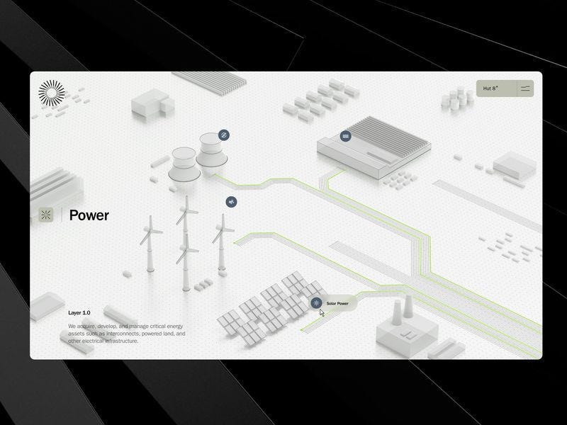
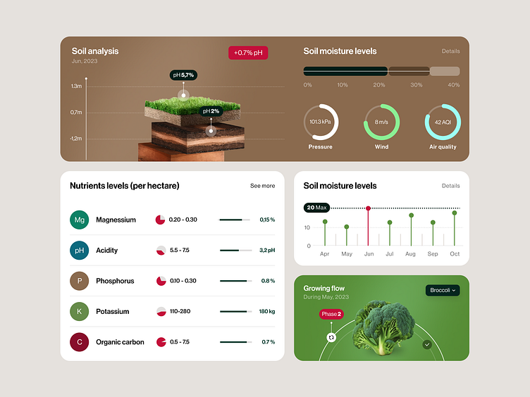
A focused UI kit built around renewable energy products and dashboards. Useful for early-stage concepts or teams working on sustainability-related interfaces.
Based on what designers actually clicked on Muzli Picks
Every day, thousands of designers explore Muzli Picks. Some projects get a quick look, others pull people in and keep them there.
This list is based on real clicks, the websites designers chose to open, explore, and revisit.
If you want your work to appear here, create a profile on Muzli Me, upload your project, and it might get featured on Muzli Picks, reaching thousands of designers.
The Floema website features a refined, minimalist design that seamlessly blends high-quality environmental photography with clean typography and expansive whitespace. Interactive elements and smooth scroll transitions highlight their sustainable urban furniture through a sophisticated, modern editorial lens.
An immersive WebGL experience featuring high-end 3D environments, dynamic data landscapes, and a sophisticated dark aesthetic. The site blends cinematic transitions with interactive mapping to showcase architectural innovation through a sleek, futuristic lens.
A visceral WebGL experience merging gritty cyberpunk aesthetics with high-octane interactivity. Featuring a seamless transition from atmospheric character customization to top-down combat, it pushes browser-based gaming limits through dynamic lighting and immersive spatial design.
A futuristic agency interface blending a dark UI with high-fidelity 3D renderings and structured layouts. The experience moves seamlessly from cinematic storytelling to clean service grids, maintaining a sharp, high-impact digital tone.
A bold, modernist-inspired digital experience built around primary colors, sharp geometry, and a strong grid system. The composition feels like a living canvas, balancing art, motion, and interaction into one cohesive visual statement.
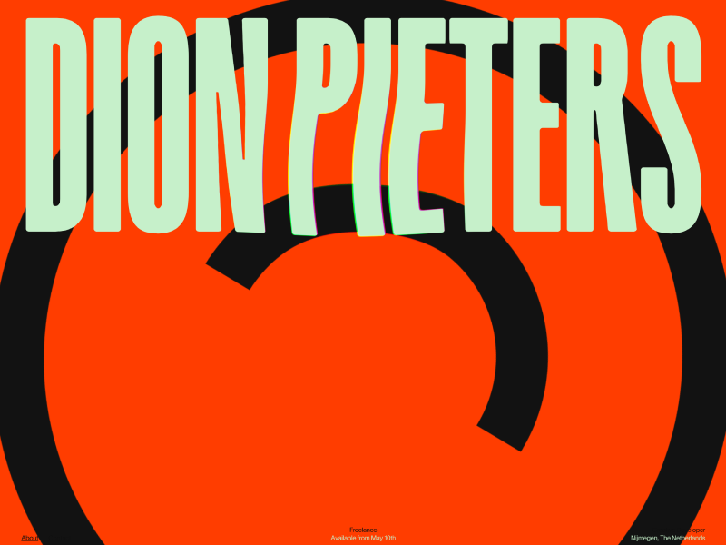
A bold freelance portfolio blending creative direction, development, and strategy into a vibrant, personality-driven experience. Playful visuals, strong illustration, and confident typography create an engaging and memorable first impression.
A bold product experience exploring the future of AI-driven payments. The site blends strong storytelling with futuristic visuals, turning complex fintech concepts into a clear and engaging narrative.
An experimental interactive experience built around motion, rhythm, and looping visuals. The project stands out with playful interactions and a strong visual identity driven by animation.
A high-energy automotive website with a sharp visual language and fast transitions. Bold typography and vibrant color usage create a dynamic and modern feel throughout the experience.
An immersive real estate experience combining WebGL and 3D elements to create depth and interaction. The project turns traditional property presentation into something exploratory and visually engaging.
A cinematic portfolio website with a refined visual atmosphere and strong motion-driven presentation. The project blends film, motion, and digital storytelling into a polished experience.
A clean archive-style experience with a minimal visual direction. The layout and subtle interactions keep the focus on the content and structure of the work.
A dark, cinematic photographer portfolio with strong art direction and smooth motion. The experience highlights visual work through transitions and carefully controlled pacing.
A concept-driven project exploring fully generated applications and content powered by AI workflows. The work highlights how design and generation systems can merge into a single creative process.
A deep dive into real workflows using Claude for design, content, and development. The article breaks down practical use cases, showing how structured context and repeatable systems can improve output quality over time.
A minimal and highly visual color palette generator built for fast exploration. It allows designers to quickly browse and combine palettes for UI, branding, or inspiration.
A next-generation design environment that unifies 2D, 3D, and AR into a single AI-powered canvas. The project highlights a shift toward collaborative, end-to-end workflows, from ideation to fully realized 3D design in one place.
A modern Framer template designed for creative portfolios and studios. Clean layouts, strong typography, and smooth interactions make it a solid starting point for showcasing work.
A vibrant digital experience celebrating the Amazon through immersive visuals and rich storytelling. The design blends bold color palettes with layered imagery, creating a strong sense of place and environmental depth.
A highly expressive creative project combining motion, interaction, and experimental layouts. The experience feels fluid and dynamic, with transitions that guide the user through a visually driven narrative.
A bold studio website showcasing product design and creative development through heavy use of 3D, motion, and interaction. Built with modern tools like WebGL and GSAP, it delivers a highly immersive browsing experience.
A visually refined website combining editorial layout with strong typographic hierarchy. The design balances minimalism with character, using subtle textures and color tones to create a calm but distinctive identity.
An expressive motion piece exploring color, light, and organic transformation. The animation feels fluid and experimental, with gradients and transitions that create a hypnotic visual rhythm.
A modern portfolio built with smooth scrolling and refined motion interactions. The experience balances minimal layout with subtle animation, allowing the work to stand out without overwhelming the user.
A minimal yet immersive web experience centered around interaction and flow. The scrolling behavior and structure create a continuous journey that feels both controlled and exploratory.
A clean and structured SaaS interface focused on clarity and usability. The layout emphasizes hierarchy and scalability, making complex enterprise data feel accessible and easy to navigate.
A practical look at how design is shifting from tools to collaboration with AI. Instead of focusing on shortcuts, the workflow centers on clearly articulating ideas and letting AI handle execution, enabling faster iteration and fewer context switches.
An open-source React and shadcn component library for building polished voice agent interfaces. It comes with production-ready building blocks like audio visualizers, chat transcripts, control bars, and full session views, while still allowing deep customization for branding and interaction design.
A premium Framer template built for SaaS, AI products, cloud platforms, and modern B2B startups. It combines a polished visual system with flexible layouts, CMS support, light and dark themes, and strong built-in features for product marketing sites that need to feel both professional and distinctive.
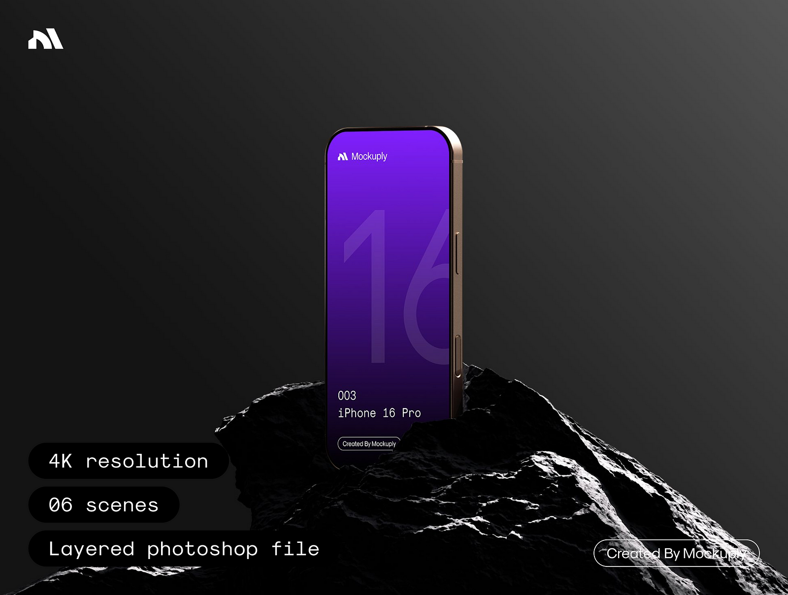
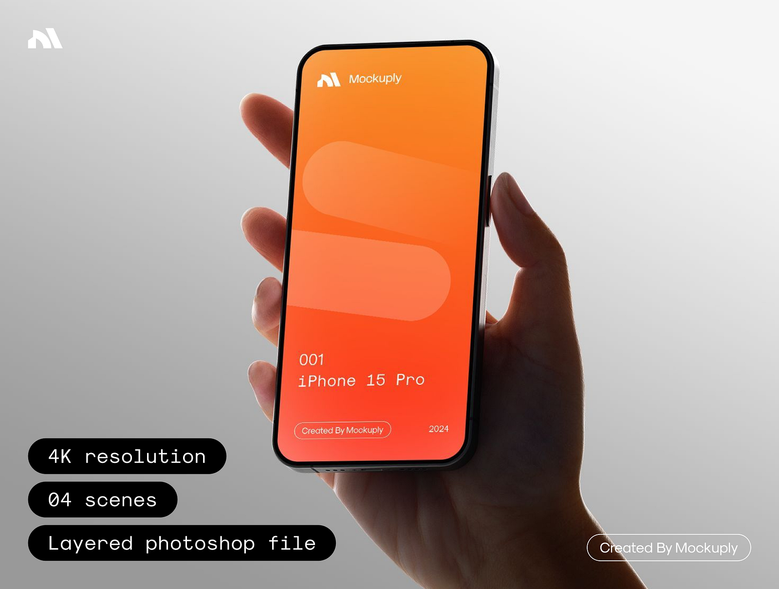
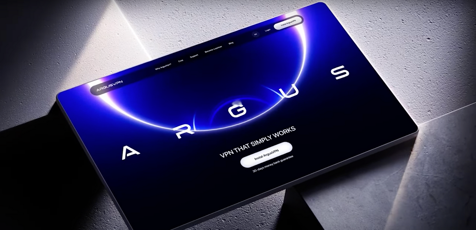
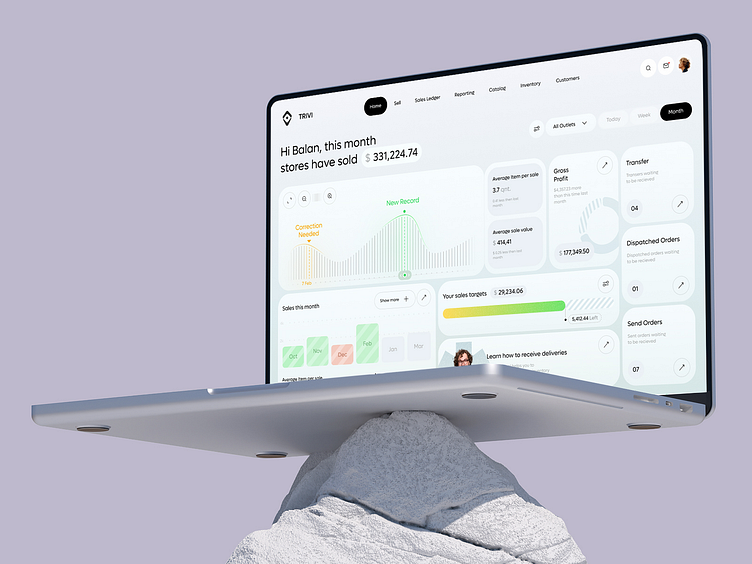
A high-quality mobile mockup designed to present apps, websites, or UI concepts in a clean and realistic environment. The concrete backdrop and natural lighting create a grounded, professional look that helps highlight interface details without distractions. Ideal for showcasing product visuals, case studies, or marketing assets.
A high-end WebGL experience that blends motion, lighting, and spatial design. It feels more like a digital installation than a traditional website, pushing interaction into a fully immersive space.
An experimental and visually expressive project that leans into bold identity and unconventional composition. Feels more like a digital art piece than a traditional website.
A high-end digital agency experience known for its smooth transitions and refined motion design. Every interaction feels polished, with a strong sense of rhythm and control.
Want to get featured? Upload your work to Muzli.me
The Blackbird Awards
A bold and immersive digital experience where creative storytelling meets interactive design. Strong visual direction and cinematic execution make it stand out immediately.
A deep dive into how AI-generated UI is shaping the way designers think and build. Focuses on the shift from static design to dynamic, generative systems.
A powerful tool for designing layered shader compositions, almost like Photoshop but for real-time visuals. It lets you build, tweak, and export high-quality shader-based assets with a modular workflow.
A visual creation tool focused on generative imagery and experimental workflows. It enables designers to explore new aesthetic directions through dynamic, AI-driven visuals.
AI-generated interfaces are becoming a baseline. Here’s what actually shifts, what doesn’t, and what the designer’s role is when the machine builds the UI in 30 seconds.
In February 2025, Andrej Karpathy coined “vibe coding” to describe building software by directing an AI with natural language instead of writing code yourself. The UI equivalent followed within months. Type a description. Get a functioning interface. Adjust by prompting. The whole surface of the product exists in minutes.
The question is not whether this is real. It is. The question is what it actually changes for professional designers who know the difference between a UI that looks right and one that works for the right reasons.
What “Vibe Design” Describes
The term covers a set of behaviors rather than a single tool. At its core: natural language to rendered UI. Describe an interface, get an interface, iterate through description rather than direct manipulation.
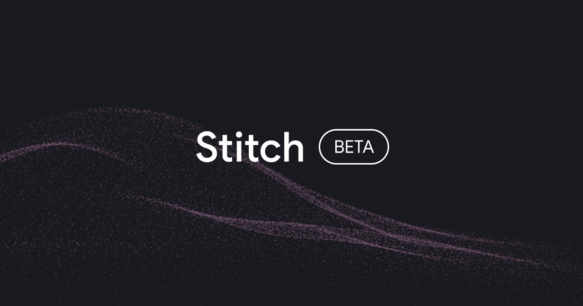
The tool that put the phrase on the map is Google Stitch. Launched as a Google Labs experiment at I/O 2025 (and built from the team and IP of Galileo AI, which Google acquired and folded into the product), Stitch generates high-fidelity UI from prompts on an AI-native infinite canvas. It introduced “Vibe Design mode” as an explicit feature: input a business objective or a desired user feeling, and Stitch generates multiple design directions for exploration, skipping wireframes entirely. A March 2026 update added multi-screen generation (up to five screens at once), a Voice Canvas for spoken commands, and DESIGN.md, which extracts design rules from existing sites and saves them as portable files. It is still a Google Labs beta, free, with generation limits, and not yet at enterprise scale. But it is the product that named this shift.
The rest of the landscape is less designer-specific in origin but genuinely used by designers. Lovable takes a plain-language brief to a full-stack, deployable application. v0 from Vercel generates React and Tailwind components at the individual level: one component described, one component produced, paste into project. Both default to Shadcn/UI patterns, which is why every AI-generated product in 2026 reads as a variation of the same three SaaS templates.
Claude occupies two positions in this stack. As Claude Artifacts (claude.ai), it generates fully interactive React and HTML components directly in a chat window, no setup, shareable by link, running in an isolated preview. For quick concept exploration and stakeholder alignment, this is the lowest-friction entry point in the category. As Claude Code paired with the Figma MCP, it becomes a precision tool: Claude reads your Figma file directly, generates production-quality component code from your actual design system, and can push generated UI back into Figma as editable frames. These are meaningfully different use cases, handled by the same model at different levels of the workflow.
“Vibe design” as a practice, separate from any specific tool, is what you get when someone with no design background directs one of these tools without a considered brief. The output is the AI’s best guess at a SaaS product UI: a blue accent color, an Inter-like font at default weight, a sidebar with icons and labels, a card grid, a data table. It functions. It communicates nothing specific about the product, the users, or any intentional design decision.
This is the context that makes the designer’s role clearer, not more threatened.
What Actually Changes
The floor rises. This is the most significant structural shift. A non-designer building an internal tool in 2026 produces something usable where they previously would have produced something broken. A PM building a product concept to test with users can now produce a clickable prototype without a designer’s time. The worst-case UI got substantially better.
Prototyping economics change. When a functional, clickable prototype costs 20 minutes instead of two days, the number of directions worth testing in a product cycle increases. This is a compounding advantage for teams that use it correctly. More directions tested means better decisions made before committing to implementation.
The volume expectation rises. When screens are cheap to generate, stakeholders will generate more of them. The “just mock up a few more ideas” request accelerates. This is a productivity pressure on design review and design critique processes that most teams have not yet adapted to.
The B2B SaaS baseline shifts. Every competitor has access to the same tools. The generic-looking product UI that used to distinguish a bootstrapped startup from a funded product no longer does. The floor of visual competence is higher everywhere, which means differentiation requires more intentionality, not less.
What Does Not Change
Interaction design requires understanding the user’s actual mental model. An AI has no mental model of your specific users. It has an averaged model of users in general, drawn from training data that skews heavily toward certain product categories and certain user behaviors. The precision required to design a workflow for a logistics dispatcher, a radiologist, or a commercial real estate broker is not approximated by average.
Design systems require intentionality about naming, consistency, token architecture, and the relationship between components. AI generation produces components per prompt. It does not produce a system. The button generated for screen A and the button generated for screen B may share a visual appearance without sharing a component, a token reference, or a maintainable relationship.
Edge cases are not vibe-designed. The happy path, yes. The empty state when the API returns nothing, the error state when the payment fails, the loading state for a table with 50,000 rows, the disabled state for a feature behind a paywall: these are designed by someone who thought about them, or they are absent. AI generates what was asked. Everything unasked is not there.
Brand differentiation is a human judgment. The product that feels unmistakably like itself, the interface with a visual character distinct enough to be recognized without a logo, the micro-interaction that communicates the brand’s personality in motion: none of these emerge from a prompt. They emerge from a designer with a clear point of view, making a series of decisions that compound into a distinct voice.
The Real Structural Shift for Careers
The more precise threat is not “AI replaces designers.” It is a compression of the entry-level design tasks that used to build foundational skills.
Wireframing, component exploration, quick prototyping, and translating stakeholder requests into a first-draft layout: these were the tasks that junior designers used to develop judgment. They are now generated. The apprenticeship model of design, where you develop taste by doing the low-stakes version of the work that senior designers do, is under pressure in a way it has not been before.
What this demands from senior designers: the ability to evaluate AI-generated output quickly and precisely. To identify which direction is worth developing and which is the AI’s default. To articulate what is wrong with a generated layout in terms specific enough to be corrected through prompting or redesign. This is a distinct skill from traditional design execution, and it is becoming as important as the execution itself.
How to Use These Tools Without Losing Design Control
The three-layer workflow that practitioners have settled into in 2026 is worth understanding as a pattern, not as a prescription.
The exploration layer uses Stitch or Claude Artifacts. No setup, no commitment. You are testing whether a direction is worth pursuing, not building the direction. Stitch is better when you want multiple screen concepts from a single brief. Claude Artifacts is faster when you want a single interactive component or a quick proof-of-concept you can share in the next 10 minutes.
The build layer uses Lovable or v0. Lovable when you need a full application with real data and real interactivity. v0 when you need a specific component built to React and Tailwind standards that you can drop into an existing project. Both produce rough design decisions that need a deliberate pass before anything is presented as finished work.
The precision layer uses Claude Code with Figma MCP, or Cursor. This is where AI-generated output comes back into your design system. Claude Code reads your Figma file directly, generates code that references your actual tokens and components, and pushes structure back into Figma when needed. This is not a prototyping tool. It is a production workflow for designers who are comfortable working across the Figma-to-code boundary.
The principle underneath all three layers: treat AI-generated output as a high-fidelity wireframe with incorrect design decisions embedded in it. The layout hypothesis may be worth examining. The type scale, the color application, the component states, and the spacing system are almost certainly wrong.
Build a prompt vocabulary that encodes your design principles. A prompt that specifies density, grid baseline, border radius limits, and font family produces materially better raw material than a generic description. “Dense information dashboard, 8px grid, neutral color palette, tabular numbers for all data cells, no decorative illustration” is a brief. “A dashboard for my analytics product” is not.
Never present AI-generated output as finished design work. Even 30 minutes of careful adjustment will surface the spacing inconsistencies, the wrong type hierarchy, the missing empty states, and the untested interactive states. Those 30 minutes are the design work. The generation is the starting material.
What Good Looks Like Now
The designers producing the best work with these tools are not using them to replace their design process. They are using them to accelerate the exploration phase, spend more time on the decision layer rather than the execution layer, and validate directions with stakeholders earlier and more concretely.
The workflow: use Stitch or Claude Artifacts to answer a layout hypothesis. Identify the direction closest to correct. Build it properly in Lovable or v0 if you need a working prototype, or directly in Figma with real tokens and components if you are headed to handoff. Annotate for engineering with real specs. Ship with confidence because the decision was tested, not just imagined.
That is not a vibe. That is design practice using better tools than were available two years ago.
For a deeper guide to integrating AI-assisted code into your design workflow, including how Claude’s Code to Canvas changes the Figma pipeline, see The Complete Vibe Coding Guide for Designers.
Stay sharp. Explore daily design inspiration on Muzli.
……
💡 Stay inspired every day with Muzli!
Follow us for a daily stream of design, creativity, and innovation. Linkedin | Instagram | Twitter
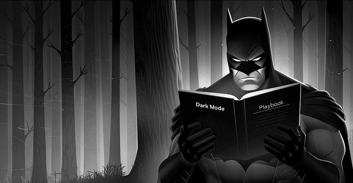
A practical guide to building dark mode as a design system decision. Learn surface hierarchy, semantic tokens, color mapping algorithms, and implementation workflows that separate premium dark UIs from generic ones.
Most dark modes are bad. Not because dark mode is technically difficult, but because most teams approach it as an afterthought instead of a design system decision. The result: dark grey text on slightly-less-dark grey backgrounds, accent colors that were designed to pop on white and now look muddy, shadows that are invisible because physics does not work that way on dark surfaces, and no consistent token strategy across the codebase.
The teams shipping dark UIs that feel genuinely premium are not using a different process for dark mode. They are using a different starting assumption. Dark is not a variant of light. It is a first-class design system context with its own visual logic, its own elevation language, and its own token architecture.
This guide covers what separates professional dark mode implementations from the generic ones. You will learn surface hierarchy rules, semantic token strategy, color mapping algorithms, and an end-to-end workflow you can ship.
Why Dark Mode Is Now a Design System Priority
Hardware reality: OLED screens represent the majority of flagship phones sold since 2023. True black pixels consume zero power. Google’s measurements show YouTube in dark mode uses 43 percent less power than light mode on OLED hardware at full brightness. This is not a design preference anymore. It is infrastructure.
User baseline: System-level dark mode adoption across iOS and Android crossed into expectation territory. An app that breaks or degrades in dark mode is not a rough edge. It is a visible failure on a significant percentage of real sessions.
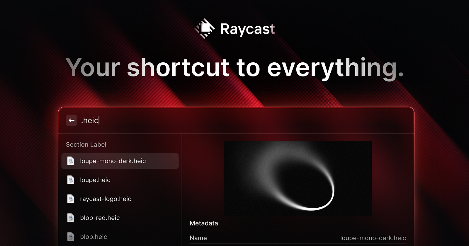
Design direction: Arc Browser, Linear, Warp, and Raycast all launched dark-first. Their light modes exist but feel secondary. The dark interface is the designed version, and it reads that way. This is now the premium standard.
The implication: If dark mode is baseline infrastructure, it cannot be treated as a variant or an afterthought. It requires systems thinking from the ground up. That means semantic tokens, surface hierarchy rules, and documented workflows.
Surface Hierarchy: The Thing Most Teams Get Wrong
One shade of dark grey is not a dark mode. It is a grey app.
A functional dark mode needs a minimum of four surface elevation levels, each with a distinct visual treatment: the base background (the darkest level, where content sits), the primary elevated surface (cards, panels, sidebars), the secondary elevated surface (nested cards, hover states, active states), and the overlay level (modals, tooltips, dropdowns that sit above all content).
The critical insight is that shadows do not read on dark backgrounds. Drop shadows work on light surfaces because they simulate light blocked by a raised object. On a dark surface, there is no meaningful contrast between a dark shadow and a dark background. The signal disappears.
The replacement is luminance hierarchy. As a surface elevates, it gets lighter, not more shadowed. Google’s Material You system formalizes this as tonal elevation: each elevation level is a slightly lighter version of the base color, tinted toward the primary brand color. The signal is still there. The physics make sense in context.
In practice: define your dark background as the starting point, then add three more surface values that step up in luminance by 5 to 8 percent each. Give each level a semantic token name (surface-base, surface-raised, surface-overlay) and apply them consistently. Every component that floats above content should use a demonstrably lighter surface than what it floats above.
Color Tokens for Dark Mode
Ad hoc color decisions do not scale to dark mode. If your color system is a collection of hex values applied directly in component code, dark mode will require you to touch every component individually. Semantic tokens are the only approach that scales.
A semantic token is a named color that carries a role rather than a value: — color-surface-base, — color-text-primary, — color-interactive-default. The token name stays constant. The value it resolves to changes per theme.
In Figma Variables (the native system as of 2023), this looks like a single variable named surface/base with a light mode value of #FAFAFA and a dark mode value of #0F0F0F. Every component that references that variable automatically updates when the mode switches. The design system handles the translation. The designer does not touch individual components.
Accent colors require special attention. A saturated blue that reads as energetic on a white surface may read as washed out on a dark one. Each accent color needs a dark-mode variant that preserves the intended perceptual weight, which usually means shifting toward a lighter or more saturated version of the same hue. Test both modes every time you add a new color to the system.
Text color is where the most common mistake lives. Pure white (#FFFFFF) on a true dark background creates eye strain through excessive contrast. Off-white values in the #E0E0E0 to #F0F0F0 range read as “white” to users while significantly reducing glare. WCAG AA requires a 4.5:1 contrast ratio for normal text, not maximum possible contrast.
Design System Architecture for Dark Mode
Tokens alone are not enough. How you organize your design file, export structure, and mode switching logic determines whether dark mode scales across your team or becomes a maintenance burden. If you are building a design system from scratch, see How to Build a Design System in Figma for the full framework.
Modes vs. Variants: Which Should You Use?
In Figma and most design systems, there are two approaches:
Mode-based (recommended): Create a single design file with “light” and “dark” modes. Every component has one library item. The mode changes all dependent tokens at once. This scales with zero duplication.
Variant-based: Create separate component variants for light and dark. This requires maintenance discipline but gives visual preview of both states side-by-side. Use this for rapid exploration, not production.
Most teams should use modes for production libraries. The Arc Browser design system and Material Design 3 both use mode-based organization.
The first line is the fallback. Older browsers use it. Modern browsers use the variable.
What “Dark-First” Design Means in Practice
Dark-first is not a style. It is a workflow assumption. It means building your component library and token system with the dark canvas as the reference state, and creating light-mode overrides rather than dark-mode overrides.
The practical difference: when you add a new component to a dark-first system, you design it for dark and then verify it in light. In a light-first system with a dark variant, dark mode is always the afterthought that gets less design time, fewer edge cases tested, and lower visual quality. Dark-first inverts that priority.
Linear is the clearest example of this approach. Every component in Linear was designed for the dark surface. The light mode works, but the product reads as a dark product. The design language was built for that context.
Implementation Workflow: End-to-End
A complete dark mode implementation requires coordination across design and engineering. This is the workflow that works.
Phase 1: Foundation (Design)
Define your 4 surface elevation levels with exact luminance values
Extract semantic color tokens from your brand
Create a light mode token set (your current design)
Create a dark mode token set (new mode in design file)
Test color mapping on OLED and LCD hardware
Deliverable: Figma file with both modes, exported token JSON
Phase 2: Architecture (Design + Engineering)
Set up file organization (Tokens, Components, Variants)
Dark mode and accessibility are not straightforward. There are myths. Know the facts. For a deeper dive into accessibility best practices, see How to Make Your UI Accessible.
Myth 1: Dark mode is more accessible
Reality: It depends on the user and their condition.
Users with astigmatism often find dark mode harder (halation effect: light text on dark halos and appears heavier)
Users with color vision deficiency sometimes benefit from dark mode, sometimes not
Users with low vision may need to switch between modes depending on context
Users with light sensitivity benefit enormously from dark mode
The implication: Dark mode should be an option, not the only mode. Respect system preference, provide an override, offer both.
Myth 2: Pure black (#000000) is the correct dark background
Reality: Pure black causes eye strain.
Black (#000000) on a light foreground creates extreme contrast. Our eyes are not designed for that sustained contrast. After 20 minutes of reading, most users experience fatigue.
Near-black (#0A0A0A to #161616 depending on design) provides sufficient darkness for OLED power savings while reducing eye strain. Test your specific color. If users report fatigue, go slightly lighter.
Myth 3: You can use lower contrast in dark mode
Reality: WCAG AA (4.5:1 for normal text) applies equally to both modes.
The contrast ratio is calculated the same way. Light text on dark background still needs 4.5:1 minimum. Your #E5E5E5 text on #0F0F0F background should measure at least 4.5:1.
Use WebAIM Contrast Checker to verify. Test both light and dark modes.
Myth 4: If users prefer dark mode, they want it everywhere
Reality: System preference does not equal context preference.
Users with prefers-color-scheme: dark still read long-form content better on light backgrounds (Apple Books data supports this). They may prefer dark UI chrome (navigation, sidebars) but light content areas.
Ask: What is the primary activity on each screen? If reading, offer the hybrid approach.
What Actually Matters for Accessibility:
Test with real users, not just WCAG calculators
Automated tools check contrast ratio
Real testing reveals halation effects, eye strain, color blindness issues
Test on actual hardware in target lighting
OLED screens show colors differently than LCD
Dim rooms show colors differently than bright rooms
Your color choices matter in context
Respect system preference
prefers-color-scheme is not a preference, it is an accessibility signal
Honor it by default
Provide an override for users who need it
Offer both modes
Do not remove light mode if dark is your default
Some users need it for medical reasons
Some contexts (printing, archiving) require light mode
If your accent colors work in all three, you are good
Common Mistakes to Avoid
Mistake 1: Using light-mode accent colors directly
Light mode: #0070F3 (bright, energetic blue) Dark mode: Same #0070F3 (washed out, hard to read)
Fix: Map to dark variant. #4A9EFF (brighter, more saturated). Test.
Mistake 2: Not testing on OLED hardware
Your dark mode looks great on MacBook LCD. On user’s OLED phone, pure blacks are invisible. Gradients look weird. Animations have timing issues.
Fix: Test on actual OLED (iPhone, Android flagship) and LCD. Adjust if needed.
Mistake 3: Ignoring transparency and glassmorphism
Transparent elements look different on dark backgrounds. White overlay at 50% opacity is blinding. Adjust opacity and blur for readability.
Fix: Test all transparency values. Adjust opacity by mode if needed.
Mistake 4: Forgetting animations look different
Fade-in animations from transparent to opaque have different timing feel in dark mode. Hover transitions may be less visible on dark surfaces.
Fix: Test animations in both modes. Adjust timing or blur if needed.
Mistake 5: Treating dark mode as a variant, not a design system requirement
Light-first thinking: “Let’s add dark mode as an option.” Dark-first thinking: “Dark mode is our system’s foundation. Light is the variant.”
First approach leads to lower quality dark mode. Second approach leads to premium dark and premium light.
Fix: Design for dark first. Verify in light. Ship both at equal quality.
Mistake 6: No manual override
System preference is great, but some users need to override it (accessibility needs, battery state, context). Do not force dark on users who need light. Do not lock users into light.
Fix: Respect system preference by default. Add a manual toggle.
The Readability Exception
Long-form reading is demonstrably better on light backgrounds for most users. Apple’s own data supports this, which is why Apple Books defaults to a light background even when the system preference is dark. The hybrid approach resolves this: dark chrome (navigation, sidebars, toolbars) with a light content well (article body, document canvas).
Notion uses this pattern. So does Readwise and several code editors that default dark but maintain a light document area. The rule is practical: dark for navigation and structure, light for sustained reading.
The exception matters most for any product where users spend extended sessions reading dense text. A documentation product, a long-form publishing tool, or a data-heavy report viewer should offer dark mode and respect system preference, but not force dark on the content reading area.
What You Ship Matters
Dark mode is no longer a nice-to-have feature. It is baseline infrastructure. But infrastructure only works when it is built as a system.
Teams that ship premium dark modes do not use a different process. They use a different starting assumption: dark is a first-class design context, not a variant of light.
This means semantic tokens that scale, surface hierarchy that respects physics, color mapping that preserves brand intent, and accessibility testing that goes beyond compliance. This means dark-first thinking, not dark-second thinking.
The implementation workflow in this guide is not theoretical. Linear, Arc, Raycast, and Material Design 3 all use versions of it. Your team can too.
Start with surface hierarchy. Add semantic tokens. Map colors systematically. Build the token system in code. Test on real hardware. Respect system preference. Ship both modes at equal quality.
The result is not just dark mode that works. It is a design system that works.
Next Step: Review the pre-ship checklist. Set up your Figma file with modes. Export tokens to code. Test on OLED hardware. Your users are waiting for the premium version.
For more on the broader visual design direction shaping product UI this year, see the Web Design Trends 2026 breakdown.
Stay sharp. Explore daily design inspiration on Muzli.
Mobile app design in 2026 isn’t about flashy new concepts. It’s about patterns that survived contact with real users. Here are the UI shifts that actually affect what you ship.
Most “mobile design trends” articles read like wishlists. Somebody saw a design shot with a blurred card, called it a trend, and moved on. That’s not how design actually evolves. Patterns don’t become patterns because they look good in a case study. They become patterns because they solve problems that enough teams keep running into.
Mobile app design in 2026 is shifting, but not in the ways the trend forecasters predicted two years ago. The biggest changes aren’t visual. They’re structural: how navigation works when there’s no back button, how interfaces adapt when AI knows your habits better than you do, how authentication feels when passwords finally die. The visual layer matters, but it’s the interaction model underneath that’s actually changing.
Seven UI patterns are reshaping mobile apps right now. Not concepts. Not predictions. Patterns that are shipping in production apps, solving real problems, and creating new expectations that your users already have.
AI-Native Adaptive Interfaces
The idea of “personalized UI” has been around for a decade. Netflix recommends shows. Spotify builds playlists. That’s content personalization. What’s new in 2026 is layout personalization: apps that restructure their interface based on how you actually use them.
Spotify did this quietly with its home screen redesign. If you mostly use Spotify in the morning for podcasts, the podcast shelf rises to the top. If you’re a playlist person, playlists lead. The layout isn’t static. It’s a reflection of your behavior, rebuilt on each session. Apple’s iOS 18 took a similar approach with the redesigned Control Center, where frequently used toggles surface automatically based on time, location, and usage patterns.
Google Maps goes further. The app presents entirely different interfaces depending on context: commute mode in the morning (minimal, focused on your usual route), exploration mode on weekends (restaurants, ratings, photos front and center), navigation mode when driving (stripped to essentials). Same app, three different products.
What makes this work: The adaptation has to be invisible. The moment a user notices the layout shifted, you’ve created confusion instead of convenience. The best implementations feel like the app “just works” without the user realizing the structure changed. Spotify succeeds because the content types are familiar even when their position changes. The mental model stays intact.
When to skip it: If your app has fewer than three distinct use cases, adaptive layouts add complexity without value. A calculator app doesn’t need to reorganize itself. A note-taking app with a clear primary action (write a note) doesn’t benefit from shuffling its interface. Adaptive UI earns its cost in apps where users have meaningfully different sessions: a banking app (check balance vs. pay someone vs. invest), a fitness app (log workout vs. track nutrition vs. review progress), or a communication app (quick reply vs. browse vs. compose).
Implementation note: Start with time-of-day and frequency data before reaching for anything more complex. Most of the value comes from surfacing the user’s most common action first. You don’t need a recommendation engine. You need a sorted list.
Gesture-Based Navigation Is Growing Up
When Apple killed the home button in 2017, gesture navigation was an experiment. Nine years later, it’s the primary interaction model for every major mobile platform, and the patterns are finally maturing beyond “swipe up to go home.”
The shift in 2026 is from simple gestures (swipe, tap, pinch) to compound gestures with feedback layers. Telegram’s chat interface is a good example: swipe left to reply, swipe right to mark as read, long-press for reactions, pull down to search. Each gesture has distinct haptic feedback, so your thumb knows what it triggered before your eyes confirm it. The haptic layer turns gesture navigation from “I hope this works” to “I felt it work.”
Instagram introduced swipe-between-tabs navigation years ago, but the newer pattern is contextual gesture discovery. TikTok’s interface teaches gestures through use: the first time you pause on a video, a subtle animation shows you can long-press for more options. The gesture isn’t hidden in a tutorial. It’s revealed at the moment you need it.
Apple’s Dynamic Island expanded this further. It introduced a persistent gesture target that changes based on context: tap for a glance, long-press for expansion, swipe to dismiss. One area, multiple gestures, multiple functions. That pattern is spreading to third-party apps that use the Live Activities API.
The discovery problem: Gestures are powerful but invisible. If users don’t know a gesture exists, it doesn’t exist. The best apps in 2026 solve this with progressive disclosure: start with visible buttons, then introduce gesture shortcuts as the user demonstrates competence. Superhuman (the email client) does this brilliantly, showing keyboard shortcuts inline until the user starts using them, then fading the hints.
When to skip it: Accessibility. Not every user can perform complex gestures. Any gesture-dependent interaction needs a visible fallback. If your swipe-to-delete doesn’t have a tap-based alternative, you’ve excluded users with motor impairments. Gestures should accelerate, not gatekeep.
Implementation note: Always pair gestures with haptic feedback. iOS provides three intensity levels through UIImpactFeedbackGenerator (light, medium, heavy) and three semantic types (success, warning, error). Android’s HapticFeedbackConstants offer similar control. A gesture without haptics is a guess. A gesture with haptics is a confirmation.
The Dark Mode Default
Dark mode used to be a toggle buried in settings. In 2026, it’s the default for a growing number of apps, and the ones doing it well are treating it as the primary design surface rather than an afterthought inversion.
The technical case is now overwhelming. OLED screens (which represent the vast majority of flagship phones sold since 2023) use zero power for true black pixels. Apps that default to dark mode on OLED devices measurably extend battery life. Google confirmed that YouTube’s dark mode uses 43% less power than light mode at full brightness on OLED. That’s not a design preference. That’s an engineering decision.
But the more interesting shift is perceptual. Apps like Arc Browser, Linear, Warp (the terminal), and Raycast all launched dark-first. Their light modes exist but feel secondary. The dark interface is the “real” version, and the design language was built around it: accent colors that pop against dark backgrounds, subtle borders instead of shadows for depth, luminance hierarchy instead of weight hierarchy.
What “dark-first” actually means: It’s not inverting your light theme. It’s designing your color system, contrast ratios, and depth cues with a dark canvas as the starting point. Shadows don’t work on dark backgrounds. You need borders, subtle gradients, or luminance shifts to create separation. Elevation in Material Design 3 uses tonal surfaces (lighter shades of a dark base) instead of drop shadows. That’s a fundamentally different approach to visual hierarchy.
The readability trap: Long-form reading is still better on light backgrounds for most users. Apple’s own research supports this, which is why Apple Books defaults to light even when the system is in dark mode. If your app involves extended reading (articles, documentation, long messages), offer dark mode but don’t force it for content areas. The hybrid approach (dark chrome, light content well) is gaining traction in apps like Notion and Readwise.
When to skip it: Apps targeting older demographics, medical or health apps where clinical clarity matters, or any context where users need to read dense text for extended periods. Default to light, offer dark, and respect the system setting.
Implementation note: Design your dark palette with at least four surface levels: a true background, an elevated surface, a secondary elevated surface, and an overlay level. One shade of dark grey is not a dark mode. It’s a grey app.
Thumb-Friendly Design Is Non-Negotiable
This isn’t new. It’s newly urgent. Screen sizes have grown. The percentage of one-handed phone usage hasn’t shrunk. The result: the top 40% of a modern phone screen is a dead zone for comfortable reach, and apps that put primary actions there are fighting their users’ anatomy.
The data is clear. Steven Hoober’s updated touch research (published late 2025) confirms that 75% of phone interactions use a single thumb. The comfortable reach zone is the bottom third of the screen plus a curve along the side closest to the dominant hand. Everything above the screen’s midpoint requires a grip shift or a second hand.
Apple acknowledged this years ago with the reachability gesture, but that’s a band-aid. The real solution is architectural: put the actions where the thumb already is.
Apps getting this right: The most notable shift is bottom-centric navigation expanding beyond the tab bar. Telegram moved its search to a pull-down gesture from the chat list. Apple Maps put its entire search and suggestion interface in a bottom sheet that the user pulls up. Spotify’s “Your Library” redesign moved filtering controls to a horizontally scrollable chip row at the top of a bottom sheet. The common thread: the primary interaction surface is below the screen’s midpoint.
The bottom sheet pattern (a draggable panel anchored to the screen bottom) has become the dominant container for secondary content. Apple standardized it with UISheetPresentationController in iOS 15, and by 2026 it’s the expected pattern for anything that doesn’t deserve a full-screen takeover: settings, filters, confirmations, previews, sharing options.
The floating action button question: Google’s Material Design championed the FAB for a decade. It’s still valid for single-primary-action interfaces (compose in Gmail, create in Figma). But FABs that stack (multiple floating buttons) or FABs that cover content are losing ground to bottom bar actions. The trend is toward integrating primary actions into the navigation bar itself rather than floating them above content.
When to skip it: Tablet and foldable layouts. Thumb zones are irrelevant when the device is held with two hands or propped on a surface. If your app targets iPad or foldable phones in expanded mode, optimize for pointer precision and larger touch targets instead.
Implementation note: Test your layouts with the thumb zone overlay in Figma (several community plugins generate these). If your most-used action requires a reach into the top third, move it. The effort of repositioning one button will save thousands of micro-frustrations.
Glassmorphism 2.0 (And When to Skip It)
Glassmorphism (frosted glass effects, translucent backgrounds with backdrop blur) hit peak hype around 2021. Then it got overused, performance-tanked on mid-range devices, and designers moved on. In 2026, it’s back in a more disciplined form.
The difference between the 2021 version and today’s implementation is restraint. Early glassmorphism tried to make everything translucent. The 2026 version uses it surgically: overlay cards, notification panels, media controls, and contextual menus that float above primary content. The blur serves a purpose: it says “this layer is temporary, the content behind it still exists.”
Apple’s visionOS design language accelerated this. The entire spatial computing interface is built on layered translucency. That visual language is trickling down into iOS and Android apps. The system-level precedent made glassmorphism feel less like a trend and more like a platform convention.
Where it works:
Notification overlays and toasts: The blur signals impermanence. The content behind it remains contextually visible.
Media player controls: Music apps (Spotify, Apple Music) use translucent overlays for now-playing controls that don’t fully obscure the album art.
Modal confirmations: A blurred background behind a confirmation dialog maintains spatial context.
Navigation overlays: Bottom sheets and slide-over menus with subtle transparency feel lighter than opaque panels.
Where it fails:
Data tables and dashboards: Translucency behind numbers is visual noise. Dense information needs clean, opaque backgrounds with clear contrast.
Forms and input fields: Blurred backgrounds behind text inputs reduce contrast and make labels harder to read. Accessibility fails.
Low-contrast environments: Glass effects depend on sufficient contrast between the blurred background and the foreground content. On a predominantly white or light screen, the effect disappears into mush.
Performance reality: Backdrop-filter blur is GPU-intensive. On flagship phones, no problem. On budget Android devices (which represent the majority of global smartphone sales), heavy blur effects cause dropped frames and battery drain. If your audience includes mid-range devices, use static blurred backgrounds (pre-rendered) instead of real-time backdrop-filter. The visual result is close enough. The performance difference is massive.
Implementation note: CSS backdrop-filter is now widely supported, but test on real mid-range hardware, not just your M-series MacBook simulator. Set a fallback: if the device can’t handle the blur, show a semi-transparent solid color instead. The design should degrade gracefully, not break.
Spatial UI Foundations: Pre-AR Patterns
You don’t need to design for Apple Vision Pro to benefit from spatial UI thinking. The design patterns emerging from spatial computing are already improving flat mobile interfaces.
Spatial UI is about depth as information. Not decoration: information. When a card has a subtle shadow and a slight scale increase, it communicates “this is above the base layer, it’s interactive, it’s temporary.” That’s a spatial signal, and it works on a flat screen just as well as it works in 3D space.
Depth layers as hierarchy: The most practical spatial pattern for mobile is explicit layering. Instead of distinguishing elements through color alone, apps are using elevation (shadow + scale + blur) to create a z-axis hierarchy. Apple’s latest Human Interface Guidelines formalize this with three explicit layers: base content, raised elements, and overlay elements. Each layer has defined shadow values, corner radii, and interaction behaviors. This isn’t skeuomorphism. It’s using depth as a functional signal.
Parallax and motion depth: Subtle parallax (background moves slower than foreground on scroll) gives interfaces a sense of physical space. Apple’s Weather app uses this constantly: the background condition animation scrolls at a different rate than the forecast cards. It’s not flashy. It’s just enough to make the interface feel like it has actual layers rather than painted ones.
3D-aware components: Apps like Nike and IKEA have used AR for product previews for years. The newer pattern is 3D-aware UI components that respond to device orientation. Tilt your phone and the card shadows shift. Rotate and the lighting on a product image adjusts. Apple’s gyroscope API makes this trivial to implement, and the effect is surprisingly engaging without being distracting.
When to skip it: Any interface where speed matters more than delight. Parallax scrolling on a messaging app’s chat list would be absurd. Depth effects on a checkout flow add friction. Spatial UI works for content that benefits from a sense of place: portfolios, media browsers, product showcases, editorial layouts. It doesn’t belong in utility interfaces where the user wants to complete a task and leave.
Implementation note: Start with shadows and elevation before adding motion. A well-designed shadow system (2–3 levels with consistent light direction) gives you 80% of the spatial benefit with zero performance cost. Parallax and gyroscope effects are the remaining 20% and should only appear where they genuinely improve comprehension.
Passwordless Authentication Changes Everything
This one isn’t a visual pattern. It’s an interaction architecture shift that changes how your app’s first 30 seconds feel, and those 30 seconds determine whether users stay.
Passkeys (built on the FIDO2/WebAuthn standard) are now supported natively by iOS, Android, and every major browser. Google, Apple, and Microsoft have all committed to passkeys as the primary authentication method. GitHub, PayPal, eBay, Kayak, and TikTok have shipped passkey support. The technology is no longer experimental. It’s infrastructure.
What passkeys change for designers: The login screen, one of the most designed screens in any app, is becoming simpler. No password field. No “forgot password” link. No password strength meter. No CAPTCHA. The flow becomes: enter email (or select from an autofill suggestion), confirm with Face ID or fingerprint, done. Two steps instead of six. The cognitive load drops dramatically.
The design challenge: Passkeys are invisible by nature. Users don’t see a passkey. They see a biometric prompt. This means the traditional login screen (which often carried brand personality, illustrations, onboarding messaging) shrinks to almost nothing. The “moment of entry” that used to be a design opportunity becomes a half-second biometric confirmation. Designers need to find other moments for brand expression: the loading state after auth, the first screen, the welcome-back animation.
Fallback UX matters: Not every user has biometrics set up. Not every device supports passkeys yet. The fallback path (usually email magic link or SMS code) needs to be just as smooth, not a punishment for having an older phone. The best implementations (Linear, Vercel) present passkey as the primary option with a subtle “other methods” link that doesn’t make the alternative feel second-class.
When to skip it: You can’t skip it. Passkey support is quickly becoming a baseline expectation, similar to how supporting dark mode went from “nice to have” to “required” in three years. The question isn’t whether to implement passkeys. It’s how quickly you can make them your primary auth flow.
Implementation note: Apple’s Authentication Services framework and Google’s Credential Manager API handle the heavy lifting. The design work is in the transition: what happens between “authenticated” and “first meaningful screen.” That 0.5 to 2 second window is your new onboarding moment. Use it well.
What This Means for Your Next Project
These seven patterns share a common thread: they all reduce friction by working with the user’s physical reality instead of against it. Thumbs have a natural reach zone. Eyes prefer dark backgrounds on OLED. Fingers remember gestures better than they remember passwords. The patterns that matter in 2026 are the ones that respect those constraints.
If you’re starting a mobile project today, here’s the practical priority stack:
Non-negotiable: Thumb-friendly layout, passkey authentication, dark mode support (as a first-class citizen, not an inverted afterthought)
High value: Gesture navigation with haptic feedback, bottom-sheet architecture for secondary content
Context-dependent: Adaptive interfaces (only if your app has distinct use modes), glassmorphism (only for overlays on capable devices), spatial UI foundations (only for content-rich experiences)
The biggest mistake designers make with patterns like these is treating them as a checklist. They’re not. Each one is a response to a specific problem. If your app doesn’t have that problem, the pattern is decoration, not design.
The mobile apps that feel best in 2026 aren’t the ones using every new pattern. They’re the ones that picked the right three and executed them precisely.
If you’re building your portfolio around mobile work, the patterns you choose to showcase signal how current your thinking is. Muzli Me is where designers curate their creative identity and stay visible to the teams that are hiring for exactly this kind of expertise.
For more on the broader design shifts shaping this year, including how these mobile patterns connect to what’s happening on the web, check out our Web Design Trends 2026 breakdown.
……
💡 Stay inspired every day with Muzli!
Follow us for a daily stream of design, creativity, and innovation. Linkedin | Instagram | Twitter
Your portfolio is probably too pretty for its own good.
That sounds backwards. Designers are visual people. Polished work should speak for itself, right? But here’s the thing: in 2026, 78% of recruiters use AI-assisted screening to filter portfolios before a human ever opens your site. That means your carefully crafted hero animations and full-bleed case study images are being parsed by algorithms that don’t care about your grid system. They care about keywords, structure, and proof of impact.
The UX job market has recovered from the 2024–2025 drought, but it hasn’t returned to the “everyone’s hiring” energy of 2021–2022. Roles exist. Companies are building again. But hiring managers are pickier, budgets are tighter, and the bar for what “qualified” means has shifted. Generic portfolios that worked three years ago now disappear into a pile of 200 applications.
This guide is the portfolio you’d build if you understood how hiring actually works on the other side of the table. Not a gallery. Not a mood board. A portfolio that clears the AI filter, survives the 2–3 minute human scan, and makes someone want to call you.
The 5-Second Test: What Recruiters Actually See First
Before anyone reads your case study, they’ve already decided whether to keep scrolling. The average initial portfolio review is 2–3 minutes. But within the first five seconds, a recruiter has answered three questions:
What does this person do?
Are they senior or junior?
Is this relevant to what I’m hiring for?
If your homepage doesn’t answer all three instantly, you’ve lost the majority of your audience before they see any work.
Do this:
Put your role and specialization above the fold. “Product Designer specializing in B2B SaaS” is better than “I create meaningful digital experiences.”
Show 3–5 project thumbnails with one-line descriptions. Not titles. Descriptions. “Redesigned onboarding flow that reduced drop-off by 34%” beats “Project Athena.”
Make your contact information visible without scrolling. Email. LinkedIn. No treasure hunts.
Not that:
A full-screen animation that takes 4 seconds to load
A mysterious single-word homepage with no context
An “About” page that reads like a memoir
Here’s the uncomfortable math: if a recruiter reviews 40 portfolios in a session and gives each one 2–3 minutes, your homepage gets roughly 10–15 seconds of real attention. Design for that constraint, not against it.
Lead with Impact, Not Aesthetics
The biggest shift in portfolio expectations over the past two years is this: hiring managers now care more about what changed because of your work than how it looked. This doesn’t mean visuals are irrelevant. It means visuals are the entry fee, not the differentiator.
A beautiful redesign that shipped and moved no metrics is, from a hiring perspective, equivalent to a concept project. It might show craft, but it doesn’t show judgment.
The impact hierarchy (what reviewers look for, in order):
Business outcomes. Revenue increased, conversion improved, support tickets dropped. Numbers with context.
User behavior changes. Task completion rates, time-on-task reductions, adoption rates. Evidence that real people acted differently after your work.
Team or process impact. You introduced a framework that the team still uses. You ran a research initiative that redirected the roadmap. You built a component library that reduced design-to-dev handoff time.
Craft quality. Clean UI, thoughtful interaction design, consistent visual language. Important, but it’s the foundation, not the story.
Most portfolios lead with #4 and maybe mention #1 in a footnote. Flip that order. Lead with what changed. Show the craft inside the case study, not instead of the story.
Quick test: Read the first two sentences of each case study in your portfolio. If they describe what you designed (a dashboard, an app, an onboarding flow), rewrite them to describe what changed because of what you designed. That single edit will make your portfolio stronger than 80% of what’s out there.
The Case Study Formula That Works
Three to five case studies is the sweet spot. Not two (too thin). Not eight (no one reads that many). Pick the ones that show range and depth, not volume.
Every strong case study follows the same underlying structure. You can rearrange it, but if any of these pieces are missing, the case study underperforms.
The formula:
The setup (2–3 sentences). What was the product? What was the problem? Why did it matter to the business? Don’t bury the lede. Open with the tension, not the company description.
Your role and constraints (1–2 sentences). What were you responsible for? What couldn’t you change? Constraints are more interesting than freedom. “I was the sole designer on a 4-week sprint with no user research budget” tells a reviewer more about your capability than “I led the design.”
The process (the bulk of the case study). This is where most portfolios either go wrong or go bland. Don’t show a linear design process diagram (Discover, Define, Design, Deliver). Nobody believes it actually happened that way.
Instead, show decisions. What did you try first? What didn’t work? Where did you pivot? What trade-off did you make, and why? The messy middle is where trust is built.
Do this: “We tested three navigation patterns. Version A tested well for discoverability but increased task time by 40%. Version B reduced task time but buried a key feature. We shipped a modified Version B with a persistent shortcut, which balanced both metrics.”
Not that: “After conducting user research, I created wireframes and iterated on the design until we reached the final solution.”
The outcome (2–3 sentences with numbers). What happened after launch? If you don’t have hard metrics, use qualitative signals: team adoption, stakeholder feedback, follow-up projects that were greenlit because of your work. Something measurable.
The reflection (1–2 sentences). What would you do differently? This is optional but powerful. It shows maturity. A designer who can articulate what they’d improve next time is a designer who learns.
A note on confidential work: If you can’t show the actual UI, show the thinking. Anonymized flows, redacted wireframes, and documented decision trees are all valid. What you can’t do is show nothing and expect reviewers to trust you on faith.
What to Cut (And Why Cutting Hurts Good)
If cutting projects from your portfolio feels painful, you’re doing it right. The instinct to show everything you’ve done is natural but counterproductive.
Cut these:
Student projects older than 2 years. Unless they’re genuinely exceptional, they signal inexperience rather than range.
Concept projects without constraints. Fantasy redesigns of Spotify or Airbnb with no real users, no business constraints, and no accountability. They show craft but not judgment.
Projects where your contribution was minimal. If you made the icons while someone else designed the system, that’s not a case study. That’s a contribution. List it on your resume, not your portfolio.
Anything you can’t explain in conversation. If a recruiter asks “walk me through this project” and you struggle, it shouldn’t be in your portfolio. You’ll be asked.
Duplicates in disguise. Three e-commerce checkout redesigns show repetition, not range. Pick the strongest one.
Keep these (even if they’re not “pretty”):
Projects with clear constraints and creative solutions
Work that shipped and had measurable results
Projects where something went wrong and you adapted
Cross-functional work that shows you can operate beyond Figma
Your portfolio should feel curated, not comprehensive. Three strong case studies beat seven mediocre ones every time.
Your Homepage Is Your First UX Test
Hiring managers notice the irony: a UX designer whose portfolio has bad UX. Your site is a product. Treat it like one.
The UX checklist for your own portfolio:
Loads in under 3 seconds on mobile
Role and specialization visible without scrolling
Navigation is one level deep (no nested menus, no hamburger icons on desktop)
Case studies are scannable: clear titles, one-line summaries, visual thumbnails
Contact information is on every page (or in a persistent header/footer)
Works on mobile without horizontal scrolling or broken layouts
No auto-playing video or audio
Accessibility basics: sufficient contrast, readable font sizes, alt text on images
What most designers overlook:
Page speed. That 12MB hero video is costing you visitors. Recruiters on slow office Wi-Fi will close the tab.
SEO basics. If your name and “UX designer” don’t appear in the page title and meta description, you’re invisible to search (and to the AI tools parsing your portfolio). Remember, 78% of recruiters now use AI-assisted tools. Those tools read your metadata.
Clear information hierarchy. Your homepage should have one primary action: “See my work.” Everything else is secondary.
Here’s a useful exercise: send your portfolio URL to three friends who aren’t designers. Ask them to spend 30 seconds on your site and then tell you what you do, how senior you are, and what kind of work you’re looking for. If they can’t answer all three, your homepage needs work.
Beyond the Portfolio: Building Your Design Identity
A portfolio is necessary, but in 2026 it’s rarely sufficient on its own. The designers who get hired fastest are the ones who are findable before they apply.
What this means practically:
Niche expertise beats generalist positioning. Hiring managers increasingly prefer candidates with demonstrated depth in a specific domain (health tech, fintech, design systems, developer tools) over candidates who claim to do everything. A portfolio that says “I’m a product designer” competes with everyone. A portfolio that says “I design complex data interfaces for enterprise SaaS” competes with a much smaller pool.
AI proficiency is now a hiring filter. 78% of design managers consider AI tool proficiency when evaluating candidates. If you’re using AI tools in your workflow (for research synthesis, rapid prototyping, content generation, or design exploration), document it in your case studies. Not as a gimmick. As a demonstration that you understand the current toolkit.
Your digital presence matters beyond your portfolio URL. Your LinkedIn profile, your Dribbble/Behance activity, your blog posts or conference talks, the articles you share and comment on. All of it creates a signal that hiring managers read before and after viewing your portfolio.
This is where your creative identity extends beyond a single website. Tools like Muzli Me exist specifically for this: a place to build and maintain your professional creative identity that connects your portfolio, your influences, your expertise, and your point of view into something cohesive. Think of it as the connective tissue between your portfolio, your social presence, and your professional reputation.
The point isn’t to be everywhere. It’s to be coherent everywhere you are.
The market is better than it was. Roles are opening. But the designers getting those roles aren’t the ones with the prettiest portfolios. They’re the ones who made it easy for a recruiter to understand, in under three minutes, exactly what they bring to the team.
Build for that. Everything else is decoration.
Want to get featured on Muzli Picks?
Create your profile on Muzli Me, upload your project, and it might get featured on Muzli Picks and seen by thousands of designers every day.
……
💡 Stay inspired every day with Muzli!
Follow us for a daily stream of design, creativity, and innovation. Linkedin | Instagram | Twitter
Based on what designers actually clicked on Muzli Picks
Every day, thousands of designers explore Muzli Picks.
Some projects get a quick look. Others pull people in and keep them there.
This list is based on real clicks, the websites designers chose to open, explore, and revisit.
If you want your work to appear here, create a profile on Muzli Me, upload your project, and it might get featured on Muzli Picks and reach thousands of designers.
A clean, product-focused experience that balances technical depth with a clear and structured interface. Subtle motion keeps it alive without distraction.
A futuristic WebGL-powered experience that feels more like a digital world than a marketplace. Bold visuals, smooth motion, and a strong sense of immersion make it hard to leave.
A highly immersive WebGL portfolio that feels more like an interactive playground than a traditional site. Rich shaders, smooth transitions, and depth-driven interactions make every scroll feel intentional.
A highly immersive AI product experience that combines depth, motion, and clean UI layers. The use of WebGL interactions creates a futuristic feel while maintaining clarity and control.
A bold portfolio that blends design and development into one seamless experience. The motion feels intentional, creating a strong rhythm as you move through the work.
A high-end interactive product experience that merges WebGL, motion, and e-commerce. The configurator feels fluid and tactile, making exploration part of the experience.
A high-end e-commerce experience that blends luxury aesthetics with smooth interaction design. The use of motion and layout creates a refined, premium browsing flow.
A clean and confident portfolio with strong typography and minimal structure. The restraint in design lets the work speak clearly without unnecessary noise.
An experimental scrolling experience built around a blueprint-inspired visual language. The combination of 3D, structure, and storytelling creates a distinctive industrial feel.
A comprehensive guide to designing and building apps using AI workflows. Covers practical use cases, tools, and how designers can move faster from idea to product.
Published March 24, 2026 · Muzli Design Inspiration – the design hub trusted by 800,000+ creative professionals
Something just shifted in how design gets made.
Figma announced today that AI agents can now work directly on the Figma canvas – not just read your files, but actually create and edit components, apply variables, and build designs using your own design system. AI-generated UI still feels generic, detached from the conventions teams spend months building. That’s the specific problem this announcement takes aim at.
Here’s what changed, what it enables, and why it matters.
The Problem With AI Design (Until Now)
Every design team knows the frustration. You prompt an AI to generate a screen, and what comes back looks like a wireframe assembled by someone who’s never seen your product. The right font isn’t there. The components don’t match. The spacing feels arbitrary.
At Muzli, we surface thousands of new designs every week from the world’s top creative sources – Dribbble, Behance, and 120+ others. The difference between AI-generated work and human-crafted design is immediately visible: one belongs to a system, the other doesn’t. The gap has always been context.
The core issue: AI agents have had no access to the decisions your team made. No knowledge of your color tokens, your component library, your spacing system, your voice and tone. They’ve been operating without context – which is exactly why the results look contextless.
What Figma Is Announcing
Through Figma’s MCP server, agents can now write directly to your Figma files using the new use_figma tool. That means Claude Code, Codex, Cursor, and other MCP-compatible agents can generate and modify design assets that are genuinely linked to your design system.
This is different from the existing generate_figma_design tool, which translates live HTML and websites into editable Figma layers. The two tools are complementary: when code and design drift apart, generate_figma_design brings the current UI into Figma. From there, use_figma can edit those designs – or create new ones – using your actual components and variables.
The result: agents that work inside your design system, not around it.
Skills: Teaching Agents How Your Team Works
The most interesting part of this announcement isn’t the use_figma tool itself – it’s Skills.
Skills are markdown files that define how an agent should behave on the Figma canvas. They encode your team’s conventions, sequencing, and intent – what steps to take, which components to reach for, how to handle edge cases. Instead of hoping an agent figures it out from a prompt, you teach it once, and it applies that knowledge consistently.
The foundational skill, /use-figma, gives agents a shared understanding of how Figma works structurally. Teams customize from there. Crucially, anyone can write a skill – no plugin development, no code required. It’s just a markdown file.
Nine community-built skills launched today:
/figma-generate-library – Create new components in Figma from a codebase
/figma-generate-design – Create new designs using existing components and variables
/apply-design-system – Connect existing designs to system components (Edenspiekermann)
/create-voice – Generate screen reader specs from UI specs (Uber)
/rad-spacing – Apply hierarchical spacing with variables and fallbacks (Rad Collab)
/sync-figma-token – Sync design tokens between code and Figma variables with drift detection (Firebender)
/edit-figma-design – Orchestrate design workflows using Warp (Warp)
/multi-agent – Run parallel workflows across Augment (Augment Code)
Self-Healing Loops
One of the quieter details in the announcement is worth paying attention to: agents can screenshot their output and iterate on what doesn’t match.
Because agents are working with real components, variables, and auto layout – not just drawing pixels – those corrections interact with your actual system. The agent isn’t patching an image. It’s adjusting a component property, updating a variable, changing a layout constraint. The structure remains intact.
This matters because AI models are non-deterministic by nature. The same prompt produces different results. Skills reduce that variance by encoding specific steps and guidelines. Your team’s conventions stop being documentation nobody reads and become rules the agent follows every time it runs.
What This Means for Design Teams
The shift here is subtle but significant. Design systems have always been written for humans – component libraries, usage guidelines, spacing scales. They’re how teams encode taste, decisions, and standards. Until now, agents couldn’t access any of it meaningfully.
Skills make design systems machine-readable in a more actionable way. Your Figma library isn’t just a reference anymore – it’s context an agent can draw on while it works.
Designers who regularly study what polished, mature design systems look like in the wild – the kind of work that appears daily in Muzli’s curated feed – will be best positioned to build skills that actually produce great output. Taste is still the input. The agent is just the output mechanism.
That opens up some genuinely interesting possibilities:
Spinning up new screen variants using existing components without manual assembly
Keeping code and design in sync as products evolve, automatically
Generating accessible annotations (VoiceOver, ARIA specs) directly from UI designs
Applying spacing systems and token hierarchies without manual component-by-component work
Who It Works With
The use_figma tool currently integrates with: Augment, Claude Code, Codex, Copilot CLI, GitHub Copilot in VS Code, Cursor, Factory, Firebender, and Warp.
It’s available free during the beta period. Usage-based pricing will follow.
The Bigger Picture
Figma has been steadily repositioning its canvas as shared infrastructure – the place where code and design meet, where decisions get made, where product work comes into focus regardless of where it started.
This announcement accelerates that thesis. When agents can operate directly in Figma with access to your design system, the canvas becomes less of a deliverable and more of a live artifact – something that agents and designers work in together.
The practical takeaway for teams: your design system quality just became significantly more important. The rigor you put into naming tokens, structuring components, and documenting patterns directly determines what agents can do with them. Messy systems will produce messy outputs. Mature, well-organized systems will produce something genuinely useful.
Figma is betting that teams who’ve invested in their design systems will get the most out of this. Based on how it’s been built, that bet seems well-placed.
Explore the skills library at figma.com/community/skills, or read Figma’s guide to getting started with the MCP server.
Stay on top of the tools and trends shaping the design industry – Muzli curates the best design, tech, and inspiration from 120+ sources, delivered fresh every day at muz.li.
Muzli is the design inspiration hub used by over 800,000 designers worldwide. We surface the best creative work, tools, and industry news – so you never miss what matters.
Google just shipped something worth paying attention to.
It’s called vibe design.
And if you design digital products, it might change how you start every project.
The idea comes from the latest update to Stitch, Google’s experimental AI design tool. Instead of opening with wireframes, grids, or components, you now start with something far less structured:
A goal. A feeling. A product idea.
From there, AI generates high-fidelity UI , not sketches, not mood boards. Actual screens.
—
From wireframes to intent
The shift sounds small. It isn’t.
When you start with structure, you’re already making hundreds of micro-decisions: this grid, these columns, these breakpoints. Most of them happen before you’ve answered the most important question: *what should this feel like?*
Stitch flips that sequence.
A prompt like this:
“Design a landing page for a meditation app that feels calm and minimal, inspired by Apple Health and Headspace.”
produces multiple full UI directions instantly. You explore a dozen variations before committing to any structure at all.
That’s vibe design. And it’s a meaningful departure from how every major design tool has worked for the last 20 years.
The biggest update to Stitch is the canvas itself, and it doesn’t work like anything you’ve used before.
No panels. No layers. No component tree.
Instead, it’s an infinite thinking space. Drop in whatever you have:
– Prompts – Screenshots of interfaces you like – A paragraph describing the product – Code snippets – Reference UI from competitors
The AI uses all of it as context simultaneously, so you’re not just prompting, you’re painting a richer picture that the model interprets as a whole. The practical result: moving from raw inspiration to first-draft UI takes minutes instead of days.
—
A design agent that actually remembers the project
Most AI tools answer one question and forget it.
Stitch’s design agent is different. It holds the entire project context while you work — so when you ask for a new screen, it’s not starting from scratch. It already knows your design system, your existing flows, the constraints you’ve established.
From that base, it can:
– Suggest improvements without being asked – Generate variations that fit the existing visual language – Critique a layout against the stated goal – Propose what the next screen in a flow should look like
Google also added an Agent Manager, essentially git branching for creative directions. Run multiple explorations in parallel without losing the original concept.
—
DESIGN.md: your design system as a portable file
Here’s a practical one.
Stitch can extract design rules from any existing website, colors, typography, spacing, components, and save them as a file called `DESIGN.md`. That file travels: across projects, between design and development, into a new Stitch canvas where the AI picks up the system immediately.
For teams who’ve rebuilt the same design tokens in every new tool, this isn’t theoretical productivity. It’s a day of setup work gone.
—
Prototypes that suggest what comes next
Stitch converts static designs into clickable prototypes in one step. Connect screens, hit Play, walk the user journey.
The more useful feature is what happens when the AI is watching those interactions.
When a user clicks a button, Stitch can suggest what the next screen should look like, drawing on the context of the whole product, not just that one transition. It’s not autocomplete. It’s closer to having a second designer in the room who’s been following the entire project.
—
Designing with voice
The most experimental feature: you can talk to the canvas.
Say “give me three menu variations” and three appear. Say “darker palette” and it updates in real time. Say “make this feel more playful” and the layout shifts.
The first time it works, it’s disorienting. The line between directing a design and having a conversation starts to dissolve.
Whether that’s the future of design tools or just a compelling demo remains to be seen. But it points somewhere worth watching.
—
What this actually means for designers
Here’s the honest version.
The role that’s changing isn’t “designer.” It’s “person who spends three hours on wireframes before anyone’s agreed on a direction.” That low-value exploration phase is what AI is absorbing, and most designers won’t miss it.
What’s left is harder to describe but easy to recognize when you see it: the judgment to know which direction is right, the taste to sense when something’s off, the experience to see what breaks at scale.
Those aren’t skills. They’re sensibilities. And they become *more* valuable when anyone can generate a screen in 30 seconds, because the question stops being “can you produce this?” and becomes “do you know which one is good?”
—
The bigger trend: idea to product in minutes
The gap between an idea and a working prototype is closing.
A founder can describe an app. A designer can generate the first twenty screens. A prototype can exist before the second meeting.
That changes the economics of early-stage design. It also raises the bar for what counts as a real contribution.
Less drawing. More directing. Less production. More judgment.
A creative studio site built around CGI, motion, and sharp visual pacing. The scrolling feels deliberate, the transitions are crisp, and the whole experience stays clean while still feeling cinematic.
A restrained portfolio that uses typography, spacing, and motion with real confidence. It keeps the interface quiet and lets the craft show through interaction and rhythm.
An interior and branding studio website with a soft editorial tone and strong visual hierarchy. The muted palette and spacious layout make the work feel polished without overcomplicating the experience.
A minimalist, high-contrast digital experience featuring a brutalist layout with oversized, bold sans-serif typography and a stark white background. The interface utilizes a horizontal, interactive timeline of raw photography and multimedia cards that evoke a modern, editorial aesthetic.
A short visual piece exploring the strange shift many designers feel today, from creative exploration to operating machines. The project blends reflection, motion, and atmosphere to capture a moment in the evolving relationship between designers and AI tools.
A refined portfolio site for freelance web designer Clarisse Michard, combining elegant typography with fluid WebGL interactions. The layout keeps things minimal while motion and visual pacing give the experience a distinctive rhythm.
A concept for a browser built around AI-native workflows instead of traditional tabs and navigation. The interface explores how search, summarization, and automation could reshape the way users interact with the web.
A studio website concept focused on bold typography, structured layouts, and confident visual hierarchy. The design balances expressive branding with a clear, editorial-style presentation of work.
A straightforward checklist for designers and product teams who want to make their interfaces more accessible. The article breaks down key areas like color contrast, keyboard navigation, typography, and component behavior into practical steps you can apply during the design process.
A practical guide for designers who want to share their work and ideas without turning their presence into self-promotion. The article looks at simple ways to build credibility through process, thinking, and consistent publishing.
HueGrid is a simple visual tool for generating balanced color palettes using a structured grid of hues and tones. It helps designers quickly explore harmonious color combinations for UI systems, branding, or illustration work without manually tweaking every shade.
Particles is an interactive playground for experimenting with particle systems and generative motion on the web. It is a great reference for designers and developers exploring WebGL effects, interactive backgrounds, or dynamic visual systems.
Ayro is a modern CRM SaaS Framer template for software companies and startups. Perfect for CRM tools, sales and support platforms, and SaaS dashboards. Includes a clean landing page, feature pages, pricing, blog, and a polished app UI.
The best Figma UI kits and design systems for 2026. Tested for Variables, Auto Layout, proper variant structure, and real production use. Not just pretty previews.
There are hundreds of Figma UI kits available right now. Most of them look great in a preview and fall apart the moment you try to customize a button. They use fixed dimensions instead of Auto Layout. They hardcode colors instead of using Variables. Their variants are organized by someone who’s never built a real product.
We tested these kits against one standard: can a product designer open this file, customize the theme, and start building screens in under 30 minutes? If the answer required watching a tutorial, digging through unlabeled layers, or manually replacing 200 color values, it didn’t make the list.
The kits below are organized by use case. Every one uses modern Figma features (Variables, Auto Layout, component properties). Every one has been verified active in February 2026.
Want a daily boost of creative energy? Install the Muzli extension, your nonstop source for design inspiration, right in your browser!
Complete Design Systems
These are full systems, not starter kits. They include tokens, components, patterns, documentation, and a structure built for teams.
The industry reference for Figma design systems. 10,000+ components, 3,200+ variants, full token architecture. Best for SaaS products and web applications.
Variables for colors, spacing, radii, and typography
Auto Layout on every component
Light and dark themes built into the variable system
Responsive variants from mobile to desktop
Pricing: Try our free version of Untitled UI, with basic styles and components.
Why it works: this is what a professionally built design system looks like. The layer naming alone is worth studying. If you’re building a design system in Figma, Untitled UI is the benchmark.
Figma components that match the wildly popular shadcn/ui code library. Best for React/Next.js teams that want their design file and codebase to speak the same language.
Components map 1:1 to the shadcn/ui React components
Tailwind CSS token values built into the Figma Variables
Minimal, clean aesthetic that serves as a foundation, not a finished product
Pricing: free (community maintained).
Why it works: if your developers use shadcn/ui (and in 2026, many do), this eliminates the translation gap between design and code. What you name in Figma is what they import in their editor.
Official Ant Design component library for Figma. Best for teams building with Ant Design in React.
Comprehensive component coverage matching the Ant Design code library
Variables and Auto Layout throughout
Enterprise-friendly: data tables, complex forms, navigation patterns
Pricing: free starter. Full kit premium.
Why it works: Ant Design powers a significant chunk of enterprise products. Having the Figma library match the code library exactly saves hours of handoff confusion.
Modern design system with a focus on dark themes and contemporary aesthetics. Best for modern web applications and SaaS products with a premium feel.
Dark and light themes with full variable support
Clean, contemporary component style
Dashboard and data visualization components included
Pricing: premium.
Why it works: most UI kits default to light themes and add dark mode as an afterthought. Glow is built dark-first, which makes its dark theme feel native rather than inverted.
Platform-Specific UI Kits
For native app design, you need components that match platform conventions exactly.
Google’s official Material Design 3 Figma library. Best for Android app design and any product following Material conventions.
Full M3 component set with token-based theming
Dynamic Color support
Variables for all design tokens
Pricing: free.
Why it works: Material 3’s token system is well-designed and the Figma implementation is maintained by Google’s design team. For Android projects, this is the starting point.
Dashboard and Admin UI Kits
Dashboards have specific component needs: data tables, charts, metrics cards, filter systems, and dense information layouts.
Clean dashboard design system with comprehensive data visualization components. Best for analytics platforms, admin panels, and B2B SaaS dashboards.
Chart components (bar, line, pie, area, treemap)
Data table variants with sorting, filtering, and pagination
Metric cards, KPI displays, and status indicators
Dark and light themes
Pricing: premium.
Why it works: most general UI kits include a token data table. AlignUI includes the full spectrum of data visualization components that real dashboards need.
Dashboard-focused design system with modern aesthetics. Best for admin panels and SaaS products that need to look good while handling dense data.
300+ dashboard components
Chart and data visualization library
Multiple layout templates
Pricing: free tier. Premium for full access.
Why it works: the layout templates get you to a working dashboard design faster than building from components. If you have a demo to prepare by Friday, this helps.
SaaS and Web App Starter Kits
When you don’t need a full design system but need more than a blank canvas.
Why it works: Tailwind is everywhere in 2026. Having a Figma library that uses the same token values and naming conventions as your Tailwind config file reduces design-to-dev friction significantly.
Figma’s own starter component library. Best for learning Figma’s component architecture and starting small projects.
Basic but well-structured components
Good example of proper Auto Layout and variant setup
Free.
Why it works: it’s the official baseline. Simple, clean, and correctly built. Good for understanding how components should be structured before scaling to a larger system.
How to Choose the Right UI Kit
Building a SaaS product? Start with Untitled UI (premium) or shadcn/ui (free). Both give you a solid foundation for web applications.
Building a native iOS app? Apple’s official kit. No exceptions. Third-party iOS kits almost always drift from Apple’s actual components.
Building for Android? Material 3. Same logic. Use the official source.
Building a dashboard? AlignUI or Horizon UI. General-purpose kits don’t have the data visualization components dashboards require.
Using Tailwind? Flowbite matches Tailwind’s token system. The design-code parity is the entire value.
Using a specific React framework (shadcn, Chakra, Mantine)? Use the matching Figma kit. Framework parity beats generic design quality.
Budget is zero? shadcn/ui, Material 3, Apple iOS kit, or the official Figma starter. All free. All properly built.
One principle: match your UI kit to your tech stack. A beautiful Figma kit that doesn’t match your code components creates translation work that erases whatever time the kit saved you.
Key Patterns
After testing dozens of UI kits, a few things are clear:
Variables are now mandatory. Any UI kit that still uses static color styles instead of Figma Variables is already outdated. Theme switching, mode support, and token-based customization depend on Variables. If a kit doesn’t use them, it will cost you more time than it saves.
Framework-specific kits are winning. The biggest shift in 2026 is UI kits designed to match specific code frameworks (shadcn, Tailwind, Chakra, Ant Design). Generic “pretty” kits lose to framework-matched kits because the design-code translation step disappears.
Free kits got surprisingly good. shadcn/ui, Material 3, and Apple’s official kits are free and well-maintained. The gap between free and premium narrowed. Premium kits justify their cost through depth (more components, more variants, more patterns), not through basic quality.
Dark mode is a system, not a theme. The best kits (Untitled UI, Glow, AlignUI) treat dark mode as a full variable mode with its own contrast ratios, elevation values, and color mappings. Kits that just invert colors produce bad dark modes.
Documentation matters. A UI kit without documentation on how to customize tokens, swap themes, or extend components is a liability. The best kits include setup guides, naming conventions, and usage guidelines. If you have to reverse-engineer the structure, it’s not saving you time.
Discover more design systems, kits, and tools on Muzli. Curated daily for designers who build.
💡 Stay inspired every day with Muzli!
Follow us for a daily stream of design, creativity, and innovation. Linkedin | Instagram | Twitter
A community-driven conference site that turns a simple event page into a playful physics-based experience. Motion, interaction, and bold visual rhythm create energy without sacrificing clarity.
A high-impact digital experience with a cyberpunk aesthetic and sharp typographic control. Strong interaction patterns and contrast-heavy visuals make it feel like a designed universe rather than a standard website.
An independent organization managing distributed spaces and developing physical and digital products. The site features a typographic-driven experience with complex parallax animations and an unconventional navigation system that emphasizes the connection between material and local context.
A restrained studio site that uses space, grid, and imagery with confidence. Minimal interface elements let the work take center stage while maintaining a strong architectural presence.
A node-based interface design for an AI-driven animation tool. The layout combines a visual prompt builder with a real-time 3D preview, allowing designers to control character movement, mood, and style through a structured, dark-mode workspace.
An eCommerce platform for a fashion brand featuring a modern gothic collection. The interface integrates cinematic editorial photography with a clean product grid, dominant typography, and minimalist navigation anchored to the corners of the screen.
A landing page for a cybersecurity platform featuring a futuristic design with a dark background and green matrix-style effects. The interface includes information cards with rounded corners, wide typography in white and neon green, and a navigation system based on vertical scrolling through content sections such as podcasts, code libraries, and certification programs.
A minimal art direction portfolio that focuses on image selection and editorial structure. Strong typography and thoughtful composition keep the presentation clean and confident.
A comprehensive review of essential Figma plugins for the upcoming year, focusing on AI-driven automation, design system management, and developer handoff enhancements. The article highlights tools selected for their ability to reduce repetitive manual tasks within the design workflow.
A curated collection of high-quality, royalty-free illustration libraries available for commercial and personal use. The guide categorizes resources by style, ranging from 3D and hand-drawn to flat vector graphics — to help designers find assets that match specific project aesthetics.
A mesh gradient design tool that allows users to create complex color transitions using movable control points. The interface includes options for adjusting blur levels, exporting high-resolution PNG files, and applying grain textures to add visual depth.
A modern take on blackletter typography designed for bold display use. Perfect for branding, posters, and statement headlines that need personality and weight.
TITARVL is a minimal portfolio template for showcasing digital design, branding, and UI/UX work. Ideal for designers, creative directors, studios, and agencies seeking a clean, type-driven, and modern presentation for personal or client projects.
is a visually immersive 3D project that blurs the line between imagination and reality. Through cinematic lighting and meticulous detail, it presents a series of striking digital worlds that invite exploration and spark curiosity.
features a sleek, futuristic web design built around bold typography, dark aesthetics, and high-impact visuals. Smooth transitions, structured layouts, and subtle motion create a polished, tech-forward experience that reflects the scale and sophistication of modern AI infrastructure.
presents a bold, personality-driven fintech website with vibrant gradients, oversized typography, and playful illustrations that reflect its conversational AI brand. Dynamic layouts, punchy copy, and smooth interactions create an energetic, app-like experience that feels more like chatting with a character than browsing a traditional finance site.
Riley Adkisson’s portfolio transforms a personal website into a nostalgic pixel-art adventure game. Retro visuals, character animations, and level-style navigation create an interactive experience where exploring the designer’s work feels like progressing through a side-scrolling world rather than browsing a traditional portfolio..
is presented as a full-scope brand and product case study, highlighting the strategic thinking behind a fintech identity from concept to execution. The work explores how bold visual language, confident typography, and restrained color usage can reshape perceptions of finance, positioning the brand as modern, approachable, and distinct within a crowded market.
Directionless delivers an experimental, mood-driven web experience that feels more like navigating a digital art piece than a conventional site. Distorted layouts, unconventional typography, and layered visuals create a sense of intentional chaos, encouraging exploration over structure and reinforcing the project’s theme of uncertainty and creative freedom
Make–Believe Studio presents a craft-focused portfolio site built around strong typography, precise spacing, and a clean grid that lets the work take center stage. A restrained dark palette, sharp imagery, and confident layouts create a premium, editorial feel, while subtle motion and structured sections reinforce a sense of clarity, discipline, and product-level polish.
presents a forward-thinking brand language built to express intelligence, scalability, and control. Structured forms, flowing trajectories, and modular compositions visualize how a system can grow dynamically while remaining organized, translating complex automation into a clear and compelling visual narrative.
A step-by-step breakdown of how to structure, document, and scale a real-world design system in Figma. Covers components, variables, tokens, naming logic, and how to keep things usable as teams grow.
A curated list of free icon libraries that are actually usable in real product work. Covers consistency, style systems, and where each set fits best in modern UI.
Inspector helps designers and product teams analyze live websites and extract structured UI data in seconds. Instead of manually auditing layouts and components, you can inspect real products and turn them into usable design references.
A premium Framer template built for service-based businesses, branding studios, and marketing/design agencies. Designed to create a clean, modern presence that turns visitors into leads and clients.
A practical guide to building your personal brand as a designer in 2026. No hashtag strategies. No influencer playbooks. Just a system that works without making you hate yourself.
Let’s get the uncomfortable part out of the way. Most personal branding advice is terrible. It’s written by people whose entire personal brand is “giving personal branding advice.” It involves posting daily, building an “audience,” and using words like “thought leader” without irony. If that makes your skin crawl, good. You’re the target audience for this article.
Here’s the thing though: the concept behind personal branding is sound. It’s just been hijacked by LinkedIn gurus. Stripped to its core, personal branding is this: when someone mentions your name in a Slack channel, what do the people who’ve never met you think? That’s your brand. You already have one. The question is whether you’re shaping it intentionally or letting it form by accident.
For designers specifically, this matters more than ever. The 2026 job market is competitive. Freelance clients have options. Conference organizers have options. The designers who get opportunities aren’t always the most talented. They’re the ones people think of first. That’s not a talent problem. It’s a visibility problem. And it’s solvable without becoming someone you’d unfollow.
Why Designers Need a Brand (Not Just a Portfolio)
Your portfolio shows your work. Your brand shows your thinking.
A portfolio is reactive. Someone searches, finds you, reviews your cases studies. That’s a job application model. It depends on being discovered at the exact moment someone is looking.
A brand is proactive. It creates familiarity before anyone needs to hire you. When a design director hears your name, they already have an impression: “She’s the one who writes those sharp critiques of SaaS onboarding flows” or “He’s the design systems person who posts those Figma teardowns.” That impression was built over time, not in a single portfolio visit.
We covered this territory in Beyond the Pixel, exploring why your portfolio needs more than great work. This article picks up where that one left off, with the practical system for building visibility without losing your integrity.
The gap between “great designer with no presence” and “good designer with strong presence” usually favors the second person. Not because the world is unfair (it is, but that’s not the point). Because people hire, recommend, and collaborate with people they feel they already know.
The DNA Framework: What Makes You Recognizable
Personal branding for designers breaks down into three elements. Call it the DNA Framework:
D: Design Philosophy. What do you believe about design that not everyone agrees with? This isn’t your bio (“I’m passionate about creating meaningful experiences”). It’s your actual point of view. “I think most design systems are over-engineered.” “I believe prototyping in code is faster than prototyping in Figma for most teams.” “I think designers should own their product metrics, not just their mockups.” A philosophy gives people something to agree or disagree with. Both responses build recognition.
N: Niche Focus. What’s the specific domain or skill where you go deeper than most? “UX design” is not a niche. “Enterprise data visualization for financial products” is. “Mobile design” is not a niche. “Gesture-based navigation patterns for health apps” is. Niche doesn’t mean narrow. It means specific enough that when someone has that exact problem, your name comes up.
A: Artifacts You Produce. What do you put into the world beyond client work? Artifacts are the evidence of your thinking. They can be LinkedIn posts, case study breakdowns, Figma community files, short tutorials, conference talks, or even well-crafted replies in design communities. The format matters less than the consistency. One artifact per week, every week, for six months will build more recognition than a viral post that people forget in 48 hours.
Most designers have strong D. Some have clear N. Almost none produce regular A. That’s the bottleneck.
Platform Strategy: Where to Show Up (And Where Not To)
The biggest personal branding mistake designers make is trying to be everywhere. You don’t need to be everywhere. You need to be consistent somewhere.
LinkedIn: Yes, seriously. The design community’s relationship with LinkedIn is complicated. The platform feels corporate. The content can be performative. But in 2026, it’s where hiring managers, recruiters, and potential collaborators actually spend time. A well-crafted LinkedIn post about a design decision you made reaches more relevant people than a polished Dribbble shot. Focus on: process breakdowns, tool opinions, lessons from real projects, short design critiques. Skip: motivational quotes, “I’m humbled to announce” posts, anything with the word “journey.”
Your personal site. Non-negotiable. Not just as a portfolio, but as a home base that connects everything. Your site should answer: who are you, what do you care about, what’s your work, how to reach you. Keep it simple. Update it quarterly, not daily. The best designer personal sites in 2026 feel like a well-organized room, not a content platform.
Twitter/X: Optional but powerful. If you enjoy short-form, opinionated writing, Twitter is where design conversations happen in real time. The format rewards sharp takes, quick reactions to new tools or trends, and genuine engagement with other designers. If you don’t enjoy it, don’t force it. A miserable Twitter presence is worse than no Twitter presence.
Dribbble/Behance: Declining for brand-building. These platforms still work for discovery (someone searching for “dashboard design” might find your work). But they’re not where relationships form. If you’re actively looking for freelance clients or agency work, keep your profiles updated. If you’re building a long-term brand, invest that time in LinkedIn or your own site instead.
Substack/Medium: If you write long-form. If you enjoy writing 1,000+ word articles about design, these platforms give you distribution. But writing is a commitment. A blog with three posts from 2024 looks worse than no blog at all. Only start if you can commit to at least two pieces per month for six months.
The rule: pick two platforms. One primary (where you create), one secondary (where you engage). Do those two well for a year before adding a third.
Content That Builds Authority (Without Sounding Like a Thought Leader)
The word “content” makes designers cringe because it implies performing for an audience. Reframe it: content is just sharing your thinking in public. You do this in Slack channels and team meetings every day. The only difference is writing it down for a wider audience.
Five content formats that work for designers:
1. Process breakdowns. Take a design decision you made this week and explain your reasoning. Not the whole project. One decision. “We chose a bottom sheet over a modal for this settings panel, and here’s why.” This takes 15 minutes to write and demonstrates real-world judgment.
2. Tool opinions. “I switched from X to Y and here’s what happened.” Designers love hearing how other designers work. These posts get engagement because everyone has an opinion about tools. Be honest. Say what didn’t work too.
3. Design critiques. Pick a public product (an app, a website, a feature launch) and break down what works and what doesn’t. Be specific, be fair, and always explain what you’d do differently. This shows taste and reasoning simultaneously.
4. Micro-tutorials. Quick “here’s how to do this one thing in Figma” posts. They’re useful, shareable, and position you as someone who helps others. The bar is low: a 4-image carousel showing how to set up auto layout for a specific pattern can outperform hours of written content.
5. Honest reflections. What failed this quarter. What you learned from a bad client experience. What you’d tell yourself two years ago. Vulnerability done well (specific, not performative) builds trust faster than expertise alone.
What doesn’t work: generic design “tips” that everyone already knows, hot takes with no substance, humblebrags disguised as lessons, and anything that starts with “Most designers don’t know this.”
Visual Consistency Across Platforms
You’re a designer. Your profiles should look like you care. This doesn’t mean a full brand identity with a logo and a style guide. It means coherence.
Quick wins that take less than an hour:
Same profile photo everywhere. Recent. Professional enough. Not a logo, not an avatar, not a photo from 2019.
Consistent name formatting. If you’re “Sarah Chen” on LinkedIn, don’t be “s.chen.design” on Twitter. People should recognize your name across platforms.
One color. Pick a single accent color and use it in your banner images, portfolio, and social graphics. This sounds minor. It’s not. Visual consistency across platforms creates subconscious recognition.
One typeface for graphics. When you make social posts with text overlays, use the same font. Every time. This is the cheapest brand consistency you can buy.
Bio alignment. Your one-line description should be recognizably the same everywhere, adapted for format but consistent in positioning. “Product designer specializing in complex B2B interfaces” should be the thread, not “creative thinker / pixel pusher / coffee addict” on one platform and “Senior UX Designer at Company” on another.
The goal isn’t perfection. It’s recognition. Someone who sees your LinkedIn post and then visits your portfolio should feel like they’re meeting the same person.
The Cringe Test: How to Know If You’ve Gone Too Far
Personal branding goes wrong when it stops being about your work and starts being about your brand. Here are the warning signs:
You spend more time on your LinkedIn post about a project than you spent on the project itself.
You describe yourself as a “thought leader” in your bio. (If you have to say it, you’re not one.)
You use the phrase “personal brand” in conversation with other designers. Just say “my work” or “my presence.” The terminology reveals the performance.
You optimize content for engagement metrics rather than genuine usefulness. A post that 500 people liked but nobody learned from is noise.
You avoid sharing opinions that might lose followers. If everyone agrees with everything you post, you’re not saying anything interesting.
You repost your own content with “In case you missed this.” Nobody missed it. They scrolled past it.
The litmus test: would you share this post if nobody could see how many likes it got? If yes, share it. If no, reconsider.
From Portfolio to Platform: Building Your Creative Identity
Your portfolio shows what you’ve done. Your personal brand shows how you think. But where does it all live?
The fragmentation problem is real. Your work is on your portfolio. Your opinions are on LinkedIn. Your visual style is on Dribbble. Your code experiments are on GitHub. A recruiter or potential collaborator has to visit four different URLs to understand who you are. That’s four chances for them to get distracted, lose interest, or form an incomplete picture.
This is exactly the problem that tools like Muzli Me are designed to solve: a single place where your creative identity comes together. Your work, your influences, your expertise, your point of view, all connected in one coherent profile. Think of it as the connective tissue between your portfolio, your social presence, and your professional reputation.
The principle behind it is simple: make it easy for someone to understand you. The easier you are to understand, the more likely you are to be remembered. And being remembered is the entire point of having a personal brand.
Personal branding isn’t about being loud. It’s about being findable, recognizable, and clear about what you bring to the table. Do that consistently, and the opportunities find you.
Discover more design career resources and build your creative identity at Muzli
……
💡 Stay inspired every day with Muzli!
Follow us for a daily stream of design, creativity, and innovation. Linkedin | Instagram | Twitter
A practical accessibility checklist for UI designers in 2026. No theory lectures. Real checks you can run on your designs today, organized by what matters most.
Accessibility guidelines were written for auditors. This article is written for designers.
The WCAG documentation is 150+ pages of criteria, exceptions, and conformance levels. Most designers read the first three paragraphs, feel overwhelmed, and go back to designing without thinking about it. That’s not a character flaw. It’s a documentation failure. The information exists, but it’s buried under a vocabulary that assumes you already know what “programmatically determined” means.
Here’s the reality: you don’t need to memorize WCAG to design accessible interfaces. You need a checklist that covers the 20 things that catch 90% of accessibility issues. That’s what this article is. Run through it once per project, and you’ll be ahead of most designers and most products shipping today.
Why 2026 Is the Year This Becomes Non-Negotiable
Two things happened that changed the math.
First, the legal landscape tightened. The US Department of Justice finalized rules requiring WCAG 2.1 Level AA compliance for state and local government websites by April 2026. The European Accessibility Act takes full effect in June 2025, affecting any digital product sold in the EU. Private lawsuits haven’t slowed either. Over 4,000 ADA-related digital accessibility lawsuits were filed in 2025. If your company serves the public, accessibility is no longer optional.
Second, the tools got better. Figma plugins like Stark and axe for Designers can catch contrast failures, missing labels, and focus order issues in seconds. Two years ago, accessibility testing required dedicated QA time. Now you can check the basics without leaving your design file.
The standard to aim for: WCAG 2.1 Level AA. Not AAA (that’s aspirational for most teams). Not 2.0 (that’s outdated). 2.1 AA is the legal and practical baseline in 2026.
Color and Contrast: The Foundation
Color contrast is the most common accessibility failure on the web. It’s also the easiest to fix.
The rules:
✓ Normal text (under 18px or under 14px bold): minimum 4.5:1 contrast ratio against background
✓ Large text (18px+ or 14px+ bold): minimum 3:1 contrast ratio
✓ UI components (buttons, inputs, icons that convey meaning): minimum 3:1 contrast ratio against adjacent colors
✓ Focus indicators: minimum 3:1 contrast against the background they appear on
✓ Never use color as the only way to convey information (red for error, green for success). Always pair with text, icons, or patterns
The context most designers miss: 8% of men and 0.5% of women have some form of color vision deficiency. That’s not a small edge case. In a product with 100,000 users, roughly 4,000 of them see your color choices differently than you do. Red/green color blindness is most common, which means your red error states and green success states look identical to a significant portion of your users.
How to check: Install Stark or Contrast in Figma. Run a contrast check on every text/background combination in your design. It takes five minutes. For a deeper look at color tools and accessible palette generators, check our color palette tools guide.
Quick fix that handles most cases: Build your color system with accessibility baked in. Define your grays, backgrounds, and text colors with contrast ratios verified from the start. If the system is accessible, every component using it is automatically accessible.
Typography and Readability
Bad typography isn’t just ugly. It’s exclusionary.
The rules:
✓ Body text: minimum 16px. Not 14px. Not 12px. 16px is the floor for comfortable reading on screens
✓ Line height: minimum 1.5x the font size for body text. Tighter line heights are acceptable for headings only
✓ Line width: maximum 80 characters per line (roughly 600–700px for body text). Lines wider than this cause tracking errors when the reader’s eye jumps back to the next line
✓ Paragraph spacing: at least 1.5x the line height between paragraphs. Dense text walls discourage reading
✓ No all-caps for sentences or paragraphs. All-caps is acceptable for short labels (buttons, tabs, badges) but reduces reading speed by 13–20% for longer text
✓ Font choice: avoid decorative fonts for body text. Choose typefaces with clear letterform distinction (easy to tell I/l/1 apart, clear difference between O/0)
The context: 15% of the global population has some form of dyslexia. Readable typography isn’t just a design preference. The combination of adequate size, generous spacing, and clear typefaces makes text accessible to the broadest possible audience.
How to check: Read your designs on an actual phone. Not a Figma preview on your 27-inch monitor. If you squint at any text on a phone screen, it’s too small or too tight.
Interactive Elements: Buttons, Links, Forms
This is where accessibility failures hurt the most, because inaccessible interactive elements mean users literally cannot complete tasks.
The rules:
✓ Touch targets: minimum 44×44px. This applies to buttons, links, icons, toggle switches, and any tappable element. 24×24px icons are fine visually, but the tappable area around them must be at least 44×44px
✓ Focus states: every interactive element must have a visible focus indicator. The default browser outline works. A custom focus state works better. No focus state at all fails accessibility
✓ Form labels: always visible. Never use placeholder text as the only label
✓ Error messages: specific and actionable. “Something went wrong” is not accessible. “Email address must include an @ symbol” is
✓ Error identification: connect error messages to the specific field
✓ Link text: descriptive. “Click here” tells screen reader users nothing. “Read our accessibility guide” tells them everything
✓ Button labels: describe the action. “Submit your application” is clearer than “Go”
The context: 2.5% of the global population has significant motor impairments that affect how they interact with touch screens and pointing devices. Small touch targets, imprecise hit areas, and tiny close buttons aren’t just annoying for everyone. They’re barriers for people with tremors, limited dexterity, or alternative input devices.
How to check: Navigate your entire design using only Tab, Enter, Escape, and Arrow keys. Can you reach every interactive element? Can you see where focus is at all times? Can you complete every task? If not, those are accessibility failures.
Motion and Animation
Animation is a design tool, not a decoration. When it’s used without restraint, it becomes an accessibility hazard.
The rules:
✓ Respect the prefers-reduced-motion system setting. Users who turn on “reduce motion” in their OS settings have a reason. Your animation preferences don’t override theirs.
✓ No auto-playing video with sound. Ever. Auto-play without sound is acceptable if there’s a visible pause control.
✓ Nothing flashes more than 3 times per second. This is a seizure risk for people with photosensitive epilepsy. It’s not a guideline. It’s a medical safety requirement.
✓ Provide pause, stop, or hide controls for any content that moves, blinks, or scrolls automatically (carousels, ticker tapes, animated backgrounds).
✓ Animations should be less than 5 seconds or have user control. Infinite loops without a stop mechanism are disorienting for users with vestibular disorders.
The context: Approximately 5% of adults experience vestibular disorders (dizziness, nausea, or disorientation from visual motion). Parallax scrolling, zoom transitions, and sliding panels that move fast enough can trigger physical symptoms. This isn’t about preference. It’s about preventing harm.
How to check: Turn on “reduce motion” in your OS accessibility settings and use your product. Does everything still work? Is information still conveyed? If an animation carries meaning (not just decoration), make sure that meaning is preserved when the animation is disabled.
Navigation and Structure
Good structure is invisible when it works. When it doesn’t, users get lost.
The rules:
✓ Heading hierarchy: H1, then H2s, then H3s. Never skip levels (don’t jump from H1 to H3). Screen readers use headings as a navigation shortcut. Broken hierarchy breaks that shortcut.
✓ Keyboard navigation: every interactive element reachable via keyboard in a logical order. Tab moves forward, Shift+Tab moves backward. The focus order should match the visual reading order.
✓ Skip navigation: a “Skip to main content” link at the top of the page that lets keyboard users bypass repeated navigation. It can be visually hidden until focused.
✓ Consistent navigation patterns: the main navigation should be in the same position on every page. If a feature exists in the header on one page, it should be in the header on every page.
✓ Breadcrumbs: for sites with more than two levels of hierarchy, breadcrumbs help users understand and navigate the structure.
✓ Page titles: every page needs a unique, descriptive title. “Dashboard” is better than “Home.” “Order History: Last 30 Days” is better than “Page 2.”
How to check: Use your product with a screen reader for five minutes. On Mac, turn on VoiceOver (Cmd + F5). Navigate through your page. Do the headings make sense in order? Can you find the main content quickly? Is the focus order logical? Five minutes of screen reader testing reveals more accessibility issues than an hour of visual inspection.
Testing Your Designs (Without Being an Expert)
You don’t need to be an accessibility specialist. You need to run five tests.
Test 1: Contrast check. Install Stark or Contrast in Figma. Run it on your design. Fix everything that fails AA. Time: 5 minutes.
Test 2: Keyboard navigation. Tab through your live interface (or prototype). Can you reach everything? Can you see where you are? Can you go back? Time: 10 minutes.
Test 3: Screen reader scan. Turn on VoiceOver (Mac) or TalkBack (Android). Listen to your page being read aloud. Does it make sense? Are images described? Are buttons labeled? Time: 10 minutes.
Test 4: Zoom to 200%. In your browser, zoom to 200%. Does the layout break? Is text still readable? Can you still use the navigation? WCAG requires content to be usable at 200% zoom. Time: 3 minutes.
Test 5: The squint test. Squint at your design until it’s blurry. Can you still see the visual hierarchy? Can you distinguish primary actions from secondary ones? If everything blurs into the same level of visual weight, your hierarchy isn’t strong enough for users with low vision. Time: 1 minute.
Total testing time: under 30 minutes. That’s less time than most designers spend choosing a hero image.
The Quick-Start Checklist
Bookmark this. Run through it before every handoff.
Color and Contrast:
All body text meets 4.5:1 contrast ratio
All large text meets 3:1 contrast ratio
All UI components meet 3:1 contrast ratio
Color is never the only indicator of meaning
Color blindness simulation reviewed
Typography:
Body text is 16px minimum
Line height is 1.5x minimum
Line width is 80 characters maximum
No all-caps paragraphs
Interactive Elements:
All touch targets are 44x44px minimum
All elements have visible focus states
All form fields have visible labels (not just placeholders)
Error messages are specific and next to the field
Link text is descriptive
Motion:
prefers-reduced-motion is respected
No content flashes more than 3 times per second
All auto-playing content has pause controls
Navigation:
Heading hierarchy is logical (no skipped levels)
Keyboard navigation works in logical order
Skip-to-content link exists
Page titles are unique and descriptive
Testing:
Contrast check passed
Keyboard navigation tested
Screen reader scan completed
200% zoom tested
Common Pitfalls (What Designers Get Wrong)
Even well-intentioned designers make these mistakes:
Modal dialogs that trap focus. When a modal opens, focus should move to it. When it closes, focus should return to the element that opened it. Broken focus trapping means keyboard users can get stuck behind an invisible wall.
Infinite scroll without keyboard access. If new content loads as the user scrolls, keyboard users need a way to reach that content too. Provide a “Load more” button as a keyboard-accessible alternative.
Custom components without ARIA labels. If you build a custom dropdown, slider, or toggle, it needs ARIA roles and labels to be readable by assistive technology. Native HTML elements come with accessibility built in. Custom ones don’t.
Icons without text labels. A magnifying glass icon means “search” to sighted users. To a screen reader, it’s nothing unless it has an aria-label. Every icon that functions as a button needs a text alternative.
Hiding content visually but not from screen readers (or vice versa).display: none hides from everyone. visibility: hidden hides from everyone. .sr-only (visually hidden but screen-reader accessible) is what you want for text alternatives.
Assuming hover states are enough. Hover doesn’t exist on touch devices. Every hover interaction needs a tap-based equivalent.
Forgetting about dark mode contrast. Your light theme passes contrast checks. Does your dark theme? Check both.
Accessibility isn’t a feature you add at the end. It’s a quality standard you maintain from the start. The checklist above takes 30 minutes to run. The cost of fixing accessibility issues after launch takes weeks.
Start with the checklist. Run it once. Fix what fails. Then do it again on the next project. That’s how accessibility becomes a habit, not a project.
Explore the science behind CropTab™: carbon-encapsulated NPK for direct nutrient uptake, improved soil reserves, and measurable yield gains backed by real data.
Discover heartwarming stories of Marshville, home to the adorable Quokkas. Based in Seoul. Crafted with passion by dinotaeng.com, duotone.io, and fave.kr.
by Artemii Lebedev A concept at the intersection of a fashion magazine and a dark portfolio. The motion-based photographs work perfectly in still images, but the key is to emphasize them with equally dynamic design ⬛️🟥
Starting my 2026 project: 12 posters, every single month. ⚡️ Kickstarting January with a tribute to the Chainsaw Man: Reze Arc. Each piece is a visual journey through the chaotic emotions and the tragic beauty of Reze’s story.
Most designers’ portfolios don’t fail because the work isn’t good. They fail because reviewers can’t quickly understand what the designer actually did.
In 2026, a portfolio is no longer just a folder of “my best screens.” It’s proof of how you think, how you build, how you adapt, and whether you can actually operate in the real world.
Mocha is an AI-powered no‑code app builder that turns your idea into a live website in minutes. No coding skills needed — perfect for ambitious entrepreneurs.
Sonido — For Creative Portfolios and Agencies Built with precision for digital creators, agencies, and studios, Sonido transforms your online presence into a compelling narrative.
Jason Bergh is an Emmy Award®-winning producer, director, and cinematographer known for his work on Halftime (Netflix), The Greatest Love Story Never Told (Amazon), and a range of celebrity editorials and commercials for top brands.
FANDOM is an immersive digital world where the pragmatic financial world of royalties meets the artistry and emotional experience of music and community.
Rebrand and web explorations for Paybilt — a payments platform for seamless, real-time transactions. The direction explores a refined, luxury-inspired aesthetic, elevating fintech into a more premium, confident space.
Tenbin RWA 3D Website made on PeachWeb Builder. Tenbin are tackling the broken tokenization space of today, starting with precious metals, and commodities.
They simplify typography by replacing multiple font files with one flexible system, better performance, fewer compromises. We published a practical list of free variable fonts that actually work in real UI and production products.
This article walks through an MCP-first workflow that keeps design intent intact across AI, prototyping, and development tools. A practical example of how shared context turns disconnected tools into one continuous product process.
Jesko Jets® is a private jet charter operator based in Dubai, delivering seamless worldwide flights with privacy, comfort built around your time and ambitions.
Step into personalized wellness. Interactive 3D body exploration featuring high-quality labs, proprietary technology, and science-backed health insights.
Award-winning video production company in Dallas, TX. We listen, craft, and deliver stylish production with seamless execution. Let’s bring your vision to life.
Ahoj buddies!🤘🏻A new concept for a fashion-driven events app. Editorial by nature, precise by design — built as a visual system where style leads and structure follows.Desktop-first, mobile-aware, ready to scale. Design speaks first. Everything else follows.
A mobile app where readers discover captivating stories and writers share their creative works. From original novels to fanfiction, Fanstory connects storytellers with their audience through an intuitive reading and writing experience.
A modern Framer studio website template built for design studios and creative teams to showcase projects, services, client testimonials, and stories with bold, responsive layouts, designed for an easy and fast launch.
In 2026, a portfolio is no longer just a folder of “my best screens.” It’s proof of how you think, how you build, how you adapt, and whether you can actually operate in the real world.
And yes, let’s put this on the table: great-looking design is still important. Strong visuals open doors, create an instant first impression, and they will always help you stand out.
But in 2026, that’s only step one.
Today, clients and recruiters want to see beyond the screens: how you make decisions, how you move fast without losing quality, and what it looks like when your work has to function in real life, not just in a polished portfolio grid.
Because here’s the shift no one can ignore: AI is making “good-looking UI” cheaper and more accessible. So the market moved up the stack.
Teams aren’t only hiring pixel-perfect executors anymore. They’re looking for Full Stack Creatives, people who can design, write, prototype, prompt, and connect product goals to real user needs.
In other words: They’re looking for your professional DNA.
Why Your Personal Website Might Be a Content Graveyard
A personal website can still be a great home base. But for most designers in 2026, it quietly turns into a museum.
Not because the work isn’t good. But because nobody sees it.
Designers spend weeks crafting custom portfolio sites, only to launch into silence:
No traffic
No shares
No real discovery
Discoverability is currency now, and most hiring managers aren’t Googling your name. They’re scouting talent inside communities, in living feeds, where you can instantly see who’s active, who’s building, and who’s consistently delivering quality.
In 2026, a strong portfolio isn’t judged only by how it looks. It’s judged by how well it proves real working ability: product thinking, communication, AI collaboration, fast prototyping, and the ability to build consistency through a real design system, including day-to-day design system management and long-term maintenance across design and development.
A portfolio without distribution is like a great product without a launch.
The Anatomy of a Winning 2026 Portfolio: Your DNA Checklist
A strong portfolio today is layered. It shows outcomes, but it also shows the system behind the outcomes.
Here are the four layers that turn “nice work” into “we should hire this person.”
The Thinking Layer
Why it matters in 2026
Great execution gets attention. Strong thinking gets you hired.
Today, it’s not enough to show beautiful UI. Teams want to see if you can think like someone building real products:
Can you frame real problems?
Can you separate “looks good” from “works well”?
Can you prioritize under constraints?
Do you understand usability, data, and business impact?
This is where methodologies become a real advantage: Discovery, Synthesis, Usability Testing, Heuristic Evaluation, working with JTBD, funnel thinking, and even concepts like a North Star Metric.
How to show it on Muzli Me
Give your screens a story.
Upload case studies that explain the problem, the constraints, and the reasoning behind your decisions, not just the final visuals. If you write on Medium or Substack, sync it and let your writing carry your strategic depth.
A simple structure that works every time:
What was the challenge? What did you know (and what didn’t you know yet)? What options did you explore? What did you choose, and why? What changed after it shipped?
The AI Layer
Why it matters in 2026
AI alone won’t impress anyone. But knowing how to work with it well absolutely will.
Hiring teams don’t ask if you “use AI.” They look for whether you can produce high-quality work faster, without losing clarity, originality, or taste.
That often means being comfortable working inside modern workflows and tools like Figma Make, Cursor, Lovable, Bolt, Replit, v0and using ChatGPT, GeminiandClaude as a real partner for research, ideation, writing, and rapid iteration.
The point isn’t the tool. The point is leverage.
How to show it on Muzli Me
Don’t post “I used AI.” Show what it enabled you to do.
Examples that actually work:
Short iteration clips (before and after)
AI-assisted research followed by a clear human decision
Small product experiments that turned into something real
The goal is simple: show leverage, not gimmicks.
The Live Layer
Why it matters in 2026
Static images don’t prove functionality.
A UI can look perfect in a screenshot and still fall apart the moment someone clicks. Teams want to see that you can build complete experiences:
interaction
responsiveness
motion
flow
micro-interactions
mobile-first thinking
How to show it on Muzli Me
Link to live websites and interactive prototypes (Framer, Webflow, Figma), and upload short screen recordings that show real flows in action.
Sometimes a 20-second video builds more trust than ten polished mockups, because it proves the work actually works.
The Community Layer
Why it matters in 2026
Trust is built through signals, not claims.
When you’re active inside a real design community, it tells people a lot:
you’re not working in isolation
you’re exposed to feedback
you’re improving in public
you’re connected to what’s happening right now
It’s one of the fastest paths from “unknown designer” to “someone worth talking to.”
How to show it on Muzli Me
When you build your presence inside Muzli Me, your work doesn’t just sit somewhere online. It becomes part of a growing ecosystem where designers, teams, and decision makers actually browse.
You’re not only uploading a portfolio. You’re placing yourself where discovery happens.
The Advantage of Joining Early (And Growing With the Platform)
In 2026, most major platforms feel like huge crowded cities. There’s a lot of talent, but also a lot of noise, a lot of competition, and a lot of great work that disappears in minutes.
That doesn’t mean those platforms aren’t good. It just means they’ve reached a stage where it’s harder to stand out.
It’s a young, growing platform, and that changes the game: there’s more space for new names to rise, get discovered, and build momentum faster.
When an ecosystem is still growing, great work has more room to breathe. A profile can become something people genuinely discover, not because it’s from “the biggest creator,” but because the work is simply strong.
And the feed experience itself is built to give creators a fairer chance, not just the people who already have years of advantage. Our algorithm is designed to balance exposure across creators, styles, and content types, so strong work can reach the right people earlier.
One of our early members described it perfectly:
“Your platform is working great, I just got a client from it! I once tried using …….. , but it required me to sign up for a Pro account just to boost my visibility. Before I knew it, I had already spent over $165 and did not land a single client after more than 6 months. Your platform, on the other hand, feels much fairer for newcomers.”
That’s the early advantage. You’re not arriving into a world that’s already divided between stars. You’re growing with the platform.
Bottom Line: Don’t Be a Tool, Be a Brand
The designers who win in 2026 won’t be defined by the software they use. They’ll be defined by what they consistently produce:
how they think
how they communicate
how they execute
how they evolve
Muzli Me lets you pull all of that into one place: your shots, your stories, your live work, your experiments, your voice, and your momentum.
And if you’re building your identity in a new space, timing matters.
The earlier you show up, the easier it is to claim your name before it gets crowded.
Check if your professional username is still available, and start building your DNA today.
Portfolio by Dylan Brouwer: a Dutch digital designer & Webflow developer crafting experience-driven websites for brands & agencies. Bold, intuitive design with motion & purpose.
The fifth edition of Art Here 2025 explored shadows beneath Louvre Abu Dhabi’s Dome, uniting 6 artworks by 7 artists in a journey through light and perception
a design exploration for a mobile fitness app 💪 The concept focuses on the workout flow, starting from the overview screen, moving into a countdown state ⏱️, and ending with a set completion screen ✅The design adopts a dark, minimal aesthetic with bold typography and a strong visual hierarchy….
OneTech is an industrial technology brand creating professional-grade tools for automotive and manufacturing applications. Built around precision engineering, durability, and performance, the system is designed to operate reliably in both workshops and large-scale production.
One-click text animations. Kinetic Type gives you 19 preset animation effects along with full control to customize, scroll-triggered animations, and hover interactions.
Fluence AI is a high-performance Framer template designed for AI startups, SaaS businesses, and tech innovators. With a sleek UI, responsive design, and conversion-optimized structure, it helps AI-powered platforms launch fast and maximize engagement.
An immersive artboard where AI sketches and case studies converge. Brutalist layouts and WebGL depth shape raw experimentation into a distinct visual identity.
Naked City is a production company that boasts a vast and unique understanding of content creation for agencies, brands, documentaries, and social media.
A cutting-edge presentation of KERN, a performance-driven ski system engineered for precise response, balance, and control with advanced geometry and materials for real-world motion and stability.
A personal motion showreel featuring selected works created in 2025. This project reflects a period of learning, experimentation, and growth in motion design.
One-of-a-kind access to the epitome of private market opportunities, once reserved for institutions. This is not simply an investment circle. It is a network of Titans, chosen and bound together to shape enduring legacies.
108.io is where tech chills out, breathes in, and reconnects with its inner nature. We designed a homepage that blends wellness, futurism, and a hint of cosmic weirdness — smooth 3D, soft gradients, and a nature-punk soul.It’s blockchain, but friendly. Wellness, but innovative. A place where consciousness and technology high-five each other.Enjoy the vibe.
This is a reel created to submit as homework for my advanced motion course. It features a selection from countless awesome works by the idols I follow — super fiery visuals that I hope to learn from in the future.
At Obys, we specialize in turning complex ideas into meaningful design. For companies working at the edge of science, technology, and innovation — from biotech to deep tech — we help transform technical depth into visual clarity and emotional resonance.
The 2025 Framer Awards are now live. Compete in 10 categories for $100,000 in prizes. Winners receive $10,000 cash, an aluminum trophy, and exclusive merch. Submit your best site to earn your spot.
An immersive fantasy website exploring the world of The Pendragon Cycle, featuring its story, heroes, episodes, maps, and lineages through interactive visuals and cinematic design. By Format-3 and Merlin
Walk as the Untamed Heroine through a journey of torn pages and personal truths. Inspired by Max Mara’s FW25 Women’s Collection, this coming-of-age story explores growth, strength and self-discovery.
Pinterest Predicts” is the annual trend forecast from Pinterest’s business platform, offering a glimpse into upcoming global shifts in fashion, design, lifestyle, food and more — based on search and engagement data from hundreds of millions of users.
Creating illustrated logos with AI just got an upgrade. This new version offers a smoother workflow and fresh techniques to level up your design process. The full tutorial is available in the link.
The Best Framer Templates Heading Into 2026: Curated by Muzli Choosing the right template for your next website can be tough, especially with the growing number of high quality options.
The Best Framer Templates Heading Into 2026: Curated by Muzli
Choosing the right template for your next website can be tough, especially with the growing number of high quality options. To make things easier, we reviewed the latest standout Framer templates that are shaping the web as we head into 2026.
In this curated selection, you will find a mix of clean modern layouts, bold creative concepts, and flexible professional designs that can support a wide range of projects. Each one was handpicked to help you create a site that feels fresh, performs smoothly, and reflects your unique style. Dive into the collection and get inspired for what you will build next.
— — —
Creative Website Templates
Build a striking online presence for your creative work with templates designed for portfolios, design studios, agencies, artists, photographers, videographers, and visual storytellers. Perfect for showcasing projects, case studies, and bold ideas through modern layouts and expressive design.
FABRICA® is a sleek, monochrome Framer website template designed for creative studios. With a stylish, high-contrast design and a structured layout, it ensures a smooth user experience while keeping the focus on your work.
REFORM is a bold brutalist website template built for design agencies ready to make a statement. With its raw aesthetic, striking typography, and unconventional layouts, REFORM pushes boundaries to showcase portfolios with unapologetic creativity.
Noora is a premium design studio website template made for agencies, portfolios, and creatives who want to look credible from day one. Built in Framer, it helps you present your projects, showcase expertise, and create a studio site that feels professional.
Avexa is a bold, modern template designed for creative agencies that want to impress. Showcase your services, highlight your work, share client success stories — all in one polished, easy-to-customize package.
A bold portfolio template crafted for creators, agencies, and studios. Designed with a strong visual identity to highlight work with clarity and impact.
Archar is a sleek Framer portfolio template designed with minimal typography, vibrant orange and white aesthetics, and dynamic scroll animations. Perfect for creatives seeking an engaging, unconventional online presence.
Introducing Kierkegaard, an immersive portfolio website template elegantly designed to showcase your agency, boutique studio, or personal work with creativity and distinction.
Baseform is the ultimate Framer portfolio template designed for agencies, freelance creatives, videographers and studios. Effortlessly build a striking portfolio that highlights your best and most recent work.
A striking and modern Framer template made for independent creatives, developers, artists, and visionaries who want to leave a powerful first impression.
Showcase your portfolio with a professional, distraction-free template designed for agencies and creative professionals, combining intuitive management with a refined, elevated design.
Create a strong and trustworthy online presence for companies, SaaS products, agencies, consultants, AI startups, and service-based businesses. These templates focus on clear messaging, lead generation, pricing, and converting visitors into customers with polished, growth-ready design.
Bima is designed specifically for AI automation agencies, helping you showcase your services and grow your business quickly by attracting the right clients.
Grovia is a SaaS and business template for startups and growing companies. It includes sections for features, pricing, case studies, integrations, and more, helping you present your brand and drive growth with clarity.
A sleek and responsive Framer template designed for AI-powered startups and tech innovators. Showcase your AI solutions with modern layouts, fast performance, and conversion-focused design.
Dreelio is a premium Framer template built for SaaS products and tech startups that want a clean, modern site to drive signups and showcase their product. Perfect for early-stage founders and fast-moving teams.
Fluence AI is a high-performance Framer template designed for AI startups, SaaS businesses, and tech innovators. With a sleek UI, responsive design, and conversion-optimized structure, it helps AI-powered platforms launch fast and maximize engagement.
Say hello to Remote, a fresh take on SaaS templates! It’s the first-ever 100% editable Framer template, specifically crafted for digital products. 👉 Figma now available! ✨
MONO AI is a premium Framer template for modern AI startups, SaaS products, and AI agencies. Designed for simplicity and impact, it puts your brand in the spotlight, making it easy to launch fast, impress visitors, and grow with confidence.
Pandawa is a sleek Framer template for SaaS and AI startups, featuring an ASCII-inspired design and built-in dark mode. Launch fast, stand out, and scale your startup with a modern, conversion-ready layout.
Forerunner™ is a premium Framer template for creative studios and modern brands. Bold design, flexible layouts, and fluid animations — perfect for fast, confident websites.
A finance & law SaaS template for fintech, legal or finance consulting services like accounting & payroll. Finance and law SaaS uses include banking, insurance, law or fintech. Suits a fintech consulting startup or lawyer’s consulting SaaS startup.
A bold, brutalist-inspired e-commerce template built in Framer. Designed for fashion, streetwear, and lifestyle brands that want a strong, premium online presence. RAWLINE delivers a dark, edgy aesthetic with a complete, conversion-focused shopping experience.
Quora is a sleek, modern Framer template designed for ecommerce and business sites. It features clean layouts, smooth interactions, and flexible sections to help you showcase your brand, products, or services with ease.
We supported Yomy in the launch of its website with complete artistic direction, a 3D product demonstration, and a bespoke Shopify theme. The aim: to showcase an innovation designed for cats and their humans.
This shot showcases the innovative design concepts of Atelier Dasha Tsapenko. All content, including images and designs, are the intellectual property of Dasha Tsapenko. The use of this content is strictly within the context of design concepts.
12mil Music was created to bring Latin talent to the world with a global, stereotype-free vision, building real connections between artists and superfans beyond the music.
Meet Inai — a system designed for private jet owners and pilots to monitor all connected aircrafts in one place. With intuitive filtering and a clean interface that highlights critical insights first, it allows users to quickly identify issues and prioritize what matters most.
This year, websites of the year breaks formats: open to experimentation, multistyle, and boundary free. Bringing together designs that push limits and invent new ones.
Sleep Well Creatives is an interactive web experience designed to help people understand and improve the quality of their sleep through science-based insights, friendly design, and immersive visuals.
Originating from my love for K-Hiphop, I created a concept for the Ambition Musik website, featuring an introduction page for my favorite rapper, ASH ISLAND.
A performance-first developer portfolio blending precision and storytelling. Minimal, fast, and fluid — where motion serves meaning and design meets engineering clarity.
A creative studio from Ecuador that approaches each project with a fresh and innovative concept. Collaborating with various brands, we ensure that each one receives distinct and unique content. Capturing the essence of thunder, we strive to achieve the best ideas.
Unlock the Osmo Vault packed with Webflow & HTML resources. Get exclusive access to the elements, techniques and code behind award-winning work. The toolkit for creative developers.
While working on the visual identity for Gentle Rain, we drew inspiration from the early days of technology and entertainment — when hip hop, the movie industry, and personal computing were just emerging on the U.S. West Coast…
Designer passionné par la création d’expériences digitales sur-mesure, j’adopte une approche centrée sur l’émotion pour concevoir des projets sincères et authentiques.
Morphon Icons is a full revamp of one of my favorite icon sets, originally designed in 2017. This personal project reimagines that old work through a refreshing modern lens, introducing soft neumorphic styling, smooth motion baselines, and practical demo cases, all optimized for community use and open remixing.
Zajno Digital Design Studiois a creative digital studio known for crafting striking and memorable experiences across web, motion, and branding. Their work stands out for its refined aesthetics, strong storytelling, and attention to detail.
Canva introduced its biggest launch yet: the Creative Operating System, marking what it calls the Imagination Era. The update unites a redesigned Visual Suite, world-first design AI, and tools for scaling brands. Highlights include Video 2.0 for advanced editing, Canva Forms for interactive sites, Canva Grow for AI-powered marketing, and the integration of Affinity, now free for everyone. The new Canva Design Model brings editable, AI-generated designs that understand layout, hierarchy, and brand style.
At Schema 2025, Figma introduced a new generation of design system tools built for the AI era. Highlights include Extended Collections for managing multi-brand systems, Slots for flexible component customization, and a faster design system engine with major performance gains. Figma also released an improved Code Connect UI, the MCP server for linking design and code, and Make kits that bring design systems directly into Figma Make. These updates push design systems toward smarter, living frameworks that evolve with AI-driven workflows.
Framer hosted a fun virtual “Halloween Office Party” showcasing team members in creative AI-generated costumes, all displayed on a slick interactive gallery built with Framer. The project invited the community to join in by posting their own costume photos using the #FramerHalloweenParty hashtag, turning a simple holiday celebration into a visually engaging brand experience that highlights Framer’s design and web-building capabilities.
A dashboard UI is effective when it surfaces the right data at the right hierarchy with minimal visual noise. This is a curated collection of 50 cutting-edge dashboard design examples from 2026, organized by pattern type: analytics, SaaS operations, financial, and data-dense admin interfaces.
As 2026 approaches, dashboard design continues to balance functionality with creativity. The best examples today are not only clear and efficient but also visually engaging and full of character. To capture this diversity, we’ve gathered a mix of 50 dashboards ranging from practical, real-world SaaS designs to experimental and artistic concepts that stretch the imagination.
Take a moment to explore this massive collection, discover new ideas, and see how designers around the world are redefining what modern dashboards can look and feel like in 2026.
A visually striking booking dashboard that blends futuristic design with travel utility. The soft beige interface, bold orange highlights, and clean layout create a premium experience that feels both adventurous and refined.
A playful and uplifting medical dashboard that blends functionality with cheerful design. The use of soft pastels, rounded shapes, and friendly contrasts makes healthcare data feel approachable and full of positive energy.
A calm and futuristic fitness dashboard with glassmorphism effects and soft lighting. The transparent layers, subtle gradients, and clean data visualization create a sense of focus and serenity while presenting health stats in a visually engaging way.
A smart classroom dashboard that visualizes attendance and participation in real time. The clean layout, soft colors, and intuitive seating map make managing lessons effortless while keeping the interface friendly and human-centered.
A futuristic health monitoring dashboard with a clean white interface and soft blue gradients. The 3D body visualization and minimal layout create a calm, clinical atmosphere that feels both advanced and reassuring.
A dark, elegant telecom dashboard with soft lavender accents and smooth data visualization. The clear layout, refined color scheme, and subtle gradients create a polished interface that feels both modern and trustworthy.
A clean and modern dark-mode dashboard that perfectly balances clarity and style. The soft gradients, bold typography, and clear visual hierarchy make data easy to digest while keeping the interface visually engaging and professional.
A sophisticated dark interface that blends fintech precision with futuristic healthcare design. The glowing accents, clean data cards, and balanced typography create a high-end look that feels intelligent, intuitive, and ready for AI-powered insights.
A bright and structured dashboard that balances clarity with energy. The soft color palette, clean spacing, and intuitive data visualization create a friendly yet professional interface that feels approachable and efficient.
A clean and highly functional healthcare dashboard that prioritizes usability and clarity. The calm neutral tones, structured layout, and clear data visualization make complex medical information easy to navigate and understand.
A sleek and modern crypto dashboard that merges dark elegance with vibrant highlights. The contrast between neon accents and minimal typography creates a futuristic feel while keeping portfolio data and performance metrics easy to track at a glance.
A soft and elegant warehouse management dashboard that combines data visualization with smooth color coordination. The pastel tones, rounded shapes, and clear hierarchy create a calm, modern interface that feels both analytical and visually refreshing.
A bright and polished crypto dashboard with playful contrast and clean organization. The soft background paired with vivid highlights gives financial data a fresh, modern feel that makes complex information easy to follow.
A well-structured business dashboard with a clean, professional layout. The balanced use of color and typography enhances readability, while the subtle charts and cards create a clear, data-driven overview without visual clutter.
A refined financial dashboard with a cinematic dark aesthetic and neon highlights. The use of contrast, grid precision, and sharp data visualization creates a sophisticated look that conveys clarity and control over complex metrics.
A bold and futuristic finance dashboard that pairs deep blacks with vivid purple accents. The smooth gradients, clean typography, and clear modular structure give it a high-end, modern edge perfect for digital-first analytics tools.
An elegant education dashboard that combines a dark, focused atmosphere with luminous accent colors. Its clear hierarchy and card-based layout make complex information easy to follow while maintaining a polished, contemporary look that keeps users engaged.
This finance dashboard stands out with its refined dark palette and energetic green highlights. The clean typography, well-structured cards, and balanced data visuals create a sophisticated interface that feels professional, dynamic, and easy to navigate.
A bold financial dashboard that combines dark tones with vibrant gradients for a dynamic look. The clear typography and structured data layout make it easy to analyze spending, savings, and income at a glance while maintaining a modern, high-tech feel.
A bright and sophisticated solar management dashboard that merges data visualization with architectural 3D elements. The soft lighting, warm gradients, and precise layout convey a sense of sustainability, innovation, and modern home efficiency.
A powerful cybersecurity dashboard with a dark, data-driven aesthetic and precise green accents. The structured layout and real-time analytics deliver a sense of control and confidence, perfectly suited for monitoring complex system health and threat activity.
A soft and elegant communication analytics dashboard with a pastel palette and smooth gradients. The minimalist charts and subtle highlights give it a calm, professional look that makes large amounts of data feel approachable and easy to interpret.
.
SaaS Analytics Dashboard — Data Overview & Management
A masterclass in information hierarchy. This [Dark/Light] themed dashboard uses a modular grid to balance complex data visualization with high-end aesthetics. The focus on [Metric Type] and clean typographic scale makes it a standout reference for professional enterprise tools.
.
OpsPulse – AI Operations & Compliance SaaS Dashboard
A boundary-pushing example of “Vibe Design” in the enterprise space. This dashboard utilizes a sophisticated frosted-glass aesthetic (Glassmorphism) to organize complex AI agent monitoring data. Key features include real-time compliance pulses, token usage tracking, and automated workflow status. The vibrant blurred background combined with high-contrast data cards proves that utility-heavy tools can, and should, look stunning in 2026.
A stunning example of an immersive, dark-mode health interface that prioritizes personalization. This dashboard uses a bold, cinematic background image combined with floating frosted-glass widgets to display biometric data like activity levels, sleep patterns, and heart rate. The layout masterfully balances “Focus Scores” and wellness recovery states, using smooth, organic wave charts to make complex health trends feel intuitive and motivational. It’s an essential reference for designers building high-end personal tracking or lifestyle apps.
A textbook execution of clean, scalable SaaS design. This sales management interface focuses on high-level business intelligence, featuring distinct modules for revenue growth patterns, traffic source breakdowns, and team productivity goals. The consistent use of soft-edged cards, a subtle pastel accent palette, and clear typography ensures that even with dozens of data points, the user never feels overwhelmed. It’s an ideal benchmark for designers building operational dashboards where speed of data interpretation is the top priority.
A sophisticated medical interface that sets a new standard for clinical data visualization. This health dashboard combines high-fidelity anatomical 3D renderings with precise biometric data, such as cardiovascular monitoring and digestive health insights. The clean, accessible UI uses a soft palette and clear typography to manage complex patient information—including blood pressure trends, HbA1c levels, and pulse rates, making it an essential reference for designers working on advanced diagnostic or telehealth platforms.
beautiful integration of lifestyle photography and functional data visualization. This smart home dashboard manages indoor environments with a high-end, dark-themed UI. The layout prioritizes essential metrics like air temperature, humidity, and CO2 levels using elegant line graphs and minimalist status indicators. By blending real-world room previews with precise climate controls, Aeros demonstrates how IoT dashboards can feel like a natural extension of a modern living space rather than just a technical tool.
A high-performance crypto-asset management interface designed for the modern trader. This tablet-optimized dashboard balances massive amounts of real-time data, including candlestick charts, daily profit yields, and multi-currency transfer histories, within a clean, spacious white-themed UI. The modular design allows users to monitor market opportunities and execute swaps instantly, proving that even data-dense financial tools can maintain a minimalist and approachable aesthetic in 2026.
.
Golfio – Golf Analytics & Player Performance Dashboard
A masterclass in blending environmental data with personal performance metrics. This specialized dashboard uses an immersive aerial view of the golf course as its foundation, overlaying precise shot data and hole-by-hole analytics. The sidebar provides a clean summary of player stats—including handicap trends, lesson progress, and wallet balances—using a sophisticated dark-glass UI. It’s a perfect example of how niche dashboards can use spatial context to make complex sports data feel both professional and engaging for the end-user.
A sophisticated example of how spatial data and market analytics can coexist in a single interface. This real estate dashboard, titled “Realto,” provides a comprehensive overview of buyer demand and property performance. It features a high-fidelity architectural floor plan alongside complex data visualizations like buyer interest distribution and intent accuracy scores. The use of a warm, neutral color palette combined with elegant “frosted glass” widgets makes high-level market intelligence feel accessible and professional, offering a perfect blueprint for modern property management and investment platforms.
A clean, results-oriented marketing dashboard that excels in visualizing campaign performance. This interface provides a clear bird’s-eye view of high-level metrics like open rates, click-through rates, and overall revenue generated from email sequences. The use of a bright, professional color palette and intuitive line charts for real-time campaign tracking makes it an ideal reference for SaaS platforms where data transparency and performance monitoring are key to user retention.
A high-impact, dark-mode financial dashboard designed for executive-level oversight. This interface, titled “QuartRevenue,” excels at condensing quarterly growth metrics into a single, intuitive view. Featuring deep-green accents and neon highlights, it tracks critical KPIs such as revenue growth patterns, lost deal percentages, and progress toward quarterly goals. The clean sidebar and structured “Customer Growth” feed demonstrate how to manage complex financial CRM data while maintaining a focused, high-contrast aesthetic that feels both powerful and professional.
A clean and highly functional fintech dashboard that masters the art of the data table. This interface simplifies complex financial logging by using a spacious white layout, subtle color-coded status tags (Completed, Canceled, Pending), and vibrant gradient header cards for quick balance snapshots. The intuitive filtering system and seamless integration of Google Workspace identifiers make it an excellent benchmark for B2B banking or internal accounting platforms where clarity and speed of verification are paramount.
A premium dark-mode dashboard tailored for content platforms and digital publishers. This interface, titled “InsightStream,” masterfully visualizes complex audience growth and revenue data through a high-contrast, neon-on-dark aesthetic. Key features include a real-time “User Today” monitor, geographical revenue distribution, and detailed “Most Popular” content tracking. The use of vibrant pink and green accents against a deep charcoal background ensures that critical performance trends, like subscriber surges and traffic peaks, are instantly recognizable, making it a top-tier reference for modern data-driven storytelling tools.
A masterclass in spatial dashboard design that transforms trip planning into a visual journey. This travel companion interface, titled “Travo,” integrates high-resolution satellite mapping with real-time budget tracking and itinerary management. The layout allows users to visualize their route across coastal destinations while monitoring expenses and upcoming bookings through clean, minimalist data cards. The inclusion of a “Travelers Finder” social module and “Vibe” selectors (like Adventure/Backpacking) demonstrates how modern travel dashboards can offer a highly personalized, community-driven experience within a streamlined UI.
A comprehensive financial management interface that balances personal credit intelligence with asset performance tracking. This “Light Mode” dashboard provides a clear overview of diversified investments, including Bitcoin holdings, stock market followers, and overall asset generation, alongside a real-time credit score monitor. The use of a soft, airy layout with pastel-toned bar charts and subtle shadow play makes complex wealth management feel organized and stress-free. It is a perfect benchmark for designers looking to create “Human-Centric Fintech” tools where high-level data transparency meets a friendly, approachable aesthetic.
A masterclass in organized, low-friction project management for creative teams. This interface, titled “Kinship,” excels at bridging the gap between high-level task tracking and granular asset management. The clean, card-based “Design Assets” board allows teams to preview Figma files, UI components, and email templates directly within the workflow. By combining a soothing minimalist aesthetic with a structured kanban sidebar for “Done” tasks and upcoming milestones, Kinship demonstrates how enterprise tools can reduce cognitive load while maintaining a high density of functional information for fast-moving design sprints.
A high-performance e-commerce dashboard designed for global retailers. This interface, titled “Rexora,” provides a unified view of multi-channel sales, integrating data from platforms like Shopify and Amazon. It excels at visualizing complex financial health through high-level KPIs like total profit overview, refund request tracking, and a detailed “Sales by Countries” heat map. The clean, spacious layout and intuitive “Top Products” list make it an essential reference for business owners who need to balance granular inventory performance with broad market growth trends in one cohesive view.
A productivity-focused interface that streamlines complex workflows through intuitive organization and AI assistance. This dashboard, titled “Noteflow,” features a highly functional task board with clear status indicators (Not Started, In Progress, Under Review, Completed) and prioritized labels. The integration of “Noteflow AI” for instant activity and timeline access demonstrates how modern productivity tools use smart automation to help teams stay on top of deadlines. With its clean folder structure for creative assets and client projects, Noteflow is a benchmark for designers building scalable, collaborative platforms where efficiency and clear task hierarchy are the primary goals.
A sophisticated medical analytics interface that sets a new standard for patient-centric data visualization. This health dashboard manages complex biometric streams, including blood oxygen levels (SpO2), heart rate (BPM), and metabolic tracking, within a clean, airy “Light Mode” UI. The integration of 3D anatomical modeling for localized health insights, alongside automated reminders like “Take A Breath Now,” demonstrates how modern healthcare tools can blend diagnostic precision with proactive wellness coaching. Its modular grid and soft lime-green accents ensure that critical health metrics are both highly legible and visually reassuring for daily monitoring.
A specialized IoT interface that brings high-level precision to home maintenance. This dashboard, titled “Vyniq,” manages a smart vacuum system through a detailed architectural 3D layout, allowing users to monitor cleaning progress across specific zones like the reading room or kitchen. The UI excels at visualizing hardware health, featuring dedicated modules for battery charging status, water tank levels, and filter life. By combining real-time spatial tracking with technical maintenance alerts, Vyniq demonstrates how appliance dashboards can transform a chore into a highly controlled, data-driven experience that ensures home efficiency at a glance.
A sleek and highly functional financial dashboard designed for modern entrepreneurs and small business owners. This interface, titled “Finexy,” excels at consolidating complex banking data into a clear, actionable overview. It features distinct modules for real-time balance tracking across multiple currency wallets (USD, EUR, GBP), intuitive monthly spending limits, and a detailed recent activities ledger. The use of vibrant green accents against a crisp white layout, combined with high-contrast data cards for total earnings and revenue, makes managing day-to-day business capital feel streamlined and effortless.
A robust administrative powerhouse designed for high-traffic healthcare facilities. This dashboard, titled “CarePulse,” focuses on the operational heartbeat of a hospital, tracking patient admissions, staff allocation, and consultation volumes in real-time. The interface excels at organizational clarity, featuring a detailed “Patients List” with status tracking (like Discharge or Appointment) and a hierarchical “Staff Management” sidebar. By visualizing complex trends like the 15% increase in patient inflow alongside gender-based consultation analytics, CarePulse provides hospital administrators with the bird’s-eye view needed to optimize resource allocation and improve patient care standards.
A cutting-edge interface that redefines inventory management for the fashion industry. This dashboard, titled “VogueAI,” utilizes artificial intelligence to streamline the curation of seasonal collections and product photography. The UI features a high-end, minimalist aesthetic with a soft lavender palette, perfectly suited for luxury retail. Key functionalities include AI-powered trend forecasting, automated stock level alerts, and a seamless “Product Performance” tracker that visualizes sell-through rates across different styles. It serves as an excellent benchmark for designers building creative commerce tools where visual inspiration and data-driven logistics must coexist beautifully.
A high-performance command center for digital marketers that simplifies the complexities of multi-channel automation. This interface, titled “FlowMail,” excels at visualizing the entire campaign lifecycle—from audience growth patterns to granular automation performance. Key features include a real-time “Campaign Performance” monitor and a dedicated “AI Insights” module that provides actionable tips on optimal send times and subject line improvements. The clean, modern aesthetic with vibrant purple accents ensures that critical KPIs, such as average open rates and revenue (MTD), are always front and center, making it a premier reference for SaaS platforms focused on marketing efficiency.
A high-impact mobile interface that prioritizes real-time health feedback and behavioral coaching. This dashboard, titled “Hyid,” excels at visualizing daily activity through high-contrast biometric widgets, tracking everything from step counts and sleep duration to heart rate and BMI. The UI stands out with its dark, focused aesthetic and the integration of “Coach Hyid”, an automated wellness assistant that provides proactive reminders like “Stand up and stretch for 5 minutes!” By blending deep analytics with immediate lifestyle prompts, Hyid demonstrates how fitness dashboards can move beyond passive data storage to become active participants in a user’s health journey.
A data-dense powerhouse designed for agencies and teams that need to balance project delivery with business growth. This dashboard, titled “Growth Stats,” bridges the gap between operational tasks and high-level productivity KPIs. The interface features a clean, professional grid that visualizes critical metrics like “Average Time Per Task” and “Total Completed Tasks,” alongside intuitive stacked bar charts for ongoing weekly workloads. The inclusion of a dedicated “Productivity KPIs” donut chart allows managers to quickly identify bottlenecks (like tasks marked “Stuck”) at a glance. It’s an essential reference for designers creating complex B2B tools where maintaining a high-level overview of team performance is just as important as individual task tracking.
A futuristic workspace designed to optimize the most valuable resource: time. This dashboard, titled “Caltimes,” moves beyond basic scheduling by providing deep insights into a user’s workflow and meeting habits. The dark-themed interface features an advanced “Time Breakdown Trend” that categorizes activities into Deep Work, Shallow Work, and Team Meetings, helping users identify their peak focus periods. With integrated AI insights, it tracks event completion rates and cancellation trends, offering a 95% “Solid Works” focus score to gamify productivity. It’s an exemplary model for designers building next-generation scheduling tools where data-driven habits meet high-end, immersive UI design.
A high-performance financial interface that brings a dark, cinematic aesthetic to the world of asset management. This dashboard, titled “Vaulto,” excels at tracking diverse portfolios across traditional fiat (Euro, Yen) and digital currencies (Ethereum). The UI features sophisticated data visualizations, including a multi-layered line chart for balance spending and a unique Sankey diagram that illustrates the flow of total assets across different holdings. With its deep charcoal background, high-contrast typography, and intuitive “Net Cashflow” heatmap, Vaulto is a premier reference for designers building premium fintech platforms where complexity must be delivered with elegance and absolute clarity.
💡 Stay inspired every day with Muzli!
Follow us for a daily stream of design, creativity, and innovation. Linkedin | Instagram | Twitter
There’s something satisfying about finding a browser extension that instantly improves your creative flow. One small install, and suddenly your day feels smoother, faster, and more inspired.
As a company that built one of the most popular and long-standing extensions for designers, and that has spent years exploring tools, plugins, and workflows across the creative world, we know exactly how much designers love discovering great browser helpers.
So here’s our updated list of the best browser extensions for designers in 2026. And as always, we’ll start with a little self-promotion: Muzli, the design inspiration hub that just got a full redesign and continues to grow with a brand-new community space.
This year, Muzli went through a complete redesign. What started as a simple new-tab inspiration feed has evolved into a full creative ecosystem. The new version feels faster, cleaner, and more personal, offering designers a smoother way to stay inspired.
Alongside the redesign, we introduced Muzli.Me– a community space where creatives can showcase their projects, share real design work, and connect with others. It’s already becoming one of the most popular destinations for discovering fresh talent and ideas.
Why designers love it:
Every new tab brings fresh inspiration and real-time trends.
Choose from over 160 categories and sources.
Explore mockups, case studies, and creative articles.
Join Muzli Me to share your own work and get noticed.
SVG Export makes it easy to collect and download vector graphics from any website in seconds. With one click, the extension scans the page, finds all SVG files, and lets you export them individually or in bulk. You can choose between multiple formats such as SVG, PNG, or JPEG, adjust dimensions before downloading, or copy the SVG code directly into design tools like Figma.
It’s a great time-saver for designers who work with icons, interface elements, or visual systems, helping you analyze designs and build asset libraries without touching source code.
Key advantages:
Detects and displays all SVGs on any webpage.
Export files in SVG, PNG, or JPEG formats.
Resize graphics before saving.
Copy SVGs directly for use in design tools like Figma.
Preserves CSS styling and linked elements in exported files.
Color Picker is a clean, accurate, and easy-to-use tool that lets you capture colors from any pixel on your screen with perfect precision. The moment you select a color, you get its HEX, RGB, and HSL values, ready to copy into your favorite design tools.
It also keeps a complete history of every color you’ve chosen, so you can revisit and reuse your selections whenever you need. Whether you’re designing a website, crafting a user interface, or working on illustrations, it’s a simple extension that helps you maintain color consistency and save time.
Key advantages:
Pick any color from your screen instantly.
See HEX, RGB, and HSL values for each color.
Automatically saves a full color history.
Works smoothly across multiple tabs and screens.
Lightweight, fast, and perfect for daily design work.
Adobe Photoshop for Chrome brings the familiar power of Photoshop straight into your browser. It allows you to open, view, and edit PSD files stored either in the cloud or locally on your device, all without launching the full desktop application. You can make quick edits, adjust layers, crop, and export assets right from your browser tab.
The extension integrates seamlessly with Adobe Creative Cloud, letting you switch smoothly between browser and desktop workflows. It’s perfect for designers who need to review layered files, make light edits, or collaborate on shared projects from anywhere.
Key advantages:
Open and edit PSD files directly inside your browser.
Access and manage projects through Adobe Creative Cloud.
Make quick edits to layers, images, and compositions.
Export assets instantly for web or presentation use.
Ideal for fast on-the-go edits without opening the desktop app.
Responsive Viewer is a practical tool for designers and developers who want to see how a website or app looks across different devices at the same time. Instead of resizing your browser window or switching between tools, you can view multiple screen sizes side by side, scroll through them in sync, and instantly check how layouts adapt.
It’s an essential extension for anyone working on responsive web design, helping spot alignment issues, spacing inconsistencies, and visual breaks early in the process.
Key advantages:
Display multiple device screens in one unified view.
Sync scrolling and navigation across all previews.
Use preset or custom screen sizes to match your design targets.
Simplify responsive testing without switching between devices.
Loom lets you record your screen, camera, and voice all at once and instantly share the result. It’s ideal for designers who want to walk clients or teammates through a prototype, present design ideas, or give visual feedback without scheduling another meeting.
With Loom, you can highlight interactions, narrate your design process, and make complex explanations easy to follow. The built-in editing tools let you trim, annotate, or add callouts, while automatic transcription makes videos easier to search and share.
Key advantages:
Record your screen, camera, and microphone in one click.
Instantly generate a shareable link for quick feedback.
Add annotations and trim recordings directly in the editor.
Automatic transcription available in newer versions.
Perfect for asynchronous communication in design teams.
WhatFont is the simplest way to find out which fonts are used on any website. Hover your cursor over a piece of text, and the font name appears right away. Click once, and you’ll see details such as font size, weight, color, and line height.
It’s a must-have for designers who love exploring typography or want to learn from well-crafted web layouts. Whether you’re researching for a project or collecting type inspiration, this extension makes the process effortless.
Key advantages:
Identify fonts on any website instantly.
View detailed font properties including size, weight, and line height.
Works seamlessly with fonts from services like Google Fonts and Adobe Fonts.
Helps build your personal typography library quickly.
Image Downloader — Imageye is a fast and reliable tool for finding and saving images from any website. It automatically scans the page, displays all the available images, and lets you select, filter, and download them individually or in bulk.
You can filter by image size, type, or URL, and even convert formats before downloading. It’s a must-have for designers collecting visual references, inspiration, or assets for mood boards and presentations.
Key advantages:
Detects and displays all images on a webpage automatically.
Bulk download or select specific images you want.
Filter by resolution, file type, or source URL.
Convert formats such as WebP to JPG or PNG before saving.
Ideal for building design references and inspiration boards.
Google Font Previewer lets you browse the full directory of Google Fonts and apply any font to a webpage or a specific CSS selector in real time. You can switch fonts instantly and see how they look in context, helping you choose the perfect typeface before committing to your design.
Key advantages:
Browse and apply any font from Google Fonts directly on the current page.
Target the whole page or a specific selector for precise testing.
Star your favorite fonts for quick access later.
Great for designers who want to preview typography in context.
Designer Tools is a browser extension built for designers and developers who aim for precision in their web layouts. It features rulers, guides, customizable grids, and measurement tools that help you align, compare, and polish design elements right inside your browser.
Here’s what it brings to your workflow:
Add horizontal or vertical rulers and guidelines to check alignment and spacing visually.
Overlay custom grids or compare your live page against a design mock-up to ensure exact matches.
Customize tool settings such as color, thickness of guides, dark mode support and more for your personal workflow.
Useful for designers who review live implementations, deliver pixel-perfect hand-offs, or audit front-end work.
Awesome Screen Recorder & Screenshot is a versatile extension that combines screen recording and screenshot tools in one simple interface. It’s perfect for designers who want to capture design feedback, demonstrate prototypes, or document their creative process.
You can record your full screen, a specific tab, or a window with audio and webcam, then share the recording instantly. For screenshots, you can capture the full page or selected areas, annotate with arrows or text, blur sensitive details, and export in seconds.
Key advantages:
Record full screen, tabs, or windows with audio and camera.
Capture full-page or custom screenshots.
Annotate easily with shapes, highlights, and blur tools.
Save locally or share instantly via link.
Ideal for tutorials, feedback, and design documentation.
Browser extensions make the web feel like a creative workspace. They help designers stay organized, explore ideas, and move faster between inspiration and execution. Muzlikeeps creativity flowing through its daily inspiration feed and growing creative community at Muzli Me. Tools like SVG Export, Color Picker, Responsive Viewer, WhatFont, and Loom make everyday design work more efficient, turning your browser into a powerful design environment.
Pick the ones that fit your workflow and transform your browser into a space built for creativity, focus, and inspiration.
……
💡 Stay inspired every day with Muzli!
Follow us for a daily stream of design, creativity, and innovation. Linkedin | Instagram | Twitter
A visual forecast by Julissa Roa, exploring the seven key design movements shaping 2026 — where AI, storytelling, and emotion redefine how we create, communicate, and connect.
Meet Dandy Vision — the world’s smartest intraoral scanner. Trained on over 10 million scans, it combines incredible speed with AI-powered precision to redefine digital dentistry.
A digital experience for a team that reads proteins at the single-molecule level and changes what’s possible in science. We designed and developed the site, creating 3D visuals that turn complex biology into something beautifully simple.
Cuchillo is an award-winning digital design studio based in Bilbao, Spain. Their work blends bold creativity with refined precision, resulting in immersive websites and interactive brand experiences that feel both artistic and timeless.
UI design and corporate website development with an experimental tone and a functional cut, for a brand leading the tattoo revolution. Inspired by aeronautical tech.
Ribbit is a creative motion agency based in Copenhagen founded to create memorable and engaging animations and motion graphics for your strategy and branding.
A visual and written tribute to filmmaker David Lynch — exploring his surreal cinematic world, signature “Lynchian” style, and the lasting impact of his films on modern culture and storytelling.
The official website of KIKK Festival — an international event in Namur, Belgium celebrating digital and creative cultures. It showcases talks, interactive art exhibitions, a creative market, and performances exploring the intersections of art, science, and technology through themes like AI, design, and sound.
BL/S® (Blacklead Studio) is a bold and creative studio based in Prague, specialising in web and mobile design & development, UX/UI, branding, 3D design and animation.
What truly sets them apart is their fearless approach, they embrace unconventional ideas, create designs that are memorable, unique, diverse, and impossible to ignore.
Discover the top free Google Fonts for 2026. From clean sans-serifs to expressive scripts, explore the best typefaces for web, UI, and branding projects, all free and optimized for clarity and emotion.
Web Design Trends 2026 (and everything in between)
After more than a decade of watching, curating, and writing about web design, we’ve learned one thing: don’t believe anyone who tells you they know what next year’s trends will be.
Your guess is almost as good as ours.
Most “trend reports” out there just recycle what was already cool last year and wrap it up as something new. But design doesn’t move in straight lines. It mutates, reacts, rebels, and occasionally contradicts itself.
Still, if we had to bet on what 2026 will look and feel like, this is where our creative intuition points.
1. AI Takes Over the Canvas
AI isn’t a side tool anymore. It has moved into the core of how we design and build. What started with text prompts and image generators is now becoming part of production , from visuals and motion to layout and code. Designers mix AI-generated illustrations, videos, 3D models, and ready-to-use components directly into live projects.
The biggest change isn’t in the visuals but in the process. We’re no longer working for the tools, we’re working with them. The workflow feels more like collaboration than automation. AI suggests, refines, fills the blanks, and speeds up execution.
What used to take hours can now be tested in minutes. Ideas evolve faster, iterations multiply, and creative limits start to blur. It doesn’t mean that design becomes automatic. It means that intuition and direction matter even more , because anyone can generate, but not everyone can create meaning.
AI isn’t replacing designers. It’s redefining what design work looks like.
2. The Return of Retro and Brutalism
When everything starts to look polished and AI-perfect, designers naturally swing the other way. Retro is back, and brutalism never really left. It is louder, bolder, and prouder. It is the human fingerprint in a machine-generated world.
You will see more asymmetry, visible grids, heavy type, raw textures, and websites that almost dare you to call them ugly. They will be beautiful precisely for that reason.
3D on the web used to be decoration. Now it is conversation. Lightweight frameworks such as Spline and React Three Fiber make it easy to build 3D environments that move, tilt, and react to the user. We are not talking about spinning logos anymore, but experiences that pull you in.
Used right, responsive 3D adds emotion rather than motion alone.
WebGL once belonged only to developers with too much coffee and a lot of math. Now it belongs to everyone. Tools such as Unicorn Studio and no-code WebGL builders turn complex shader effects into drag-and-drop elements. Liquid distortions, glowing particles, and magnetic cursor trails are all accessible in a few clicks.
High-end motion graphics used to mean custom code. In 2026 it might just mean good taste.
Gentle Rain | Educational AI Powered Platform
.
5. Micro-Animations Are Growing Up: The Small Things That Matter
Micro-animations are nothing new, but in 2026 they mature into something bigger, or smaller depending on how you see it. We call it micro delight: the subtle bounce of a button, a toggle that feels tactile, a form field that gently reacts to input.
The real shift is accessibility. Libraries such as React Bits Animations and 21st.dev make it easy for anyone to add motion with purpose. These details are no longer nice to have. They are what separates a working website from one that people remember.
Typography is done sitting still. Variable fonts, animated text, and responsive kinetic type are taking over hero sections and product pages. Fonts now shift in weight, stretch, or react to scroll and sound.
It is not about gimmicks, it is about feeling. The words themselves become part of the interface, not just what is written in it.
Sound is quietly becoming the next sense in digital design. Interfaces are starting to speak, hum, and react. A soft click, a subtle whoosh, or a short tone can add clarity, feedback, and emotion faster than any animation.
As brands look for new ways to stand out in a visually crowded web, sound becomes identity. From micro-audio cues in buttons and notifications to ambient loops that respond to user movement, the web is learning to sound as good as it looks.
AI is making sound design easier than ever. Tools can now generate short effects, background atmospheres, and responsive soundscapes in seconds, turning audio into a simple and accessible part of the creative process for everyone.
Used well, sound doesn’t just decorate an interface, it completes it.
The next evolution of web design is not visual. It is human.
For years, we have designed for screens, mice, and keyboards. In 2026, interaction begins to move beyond them. Websites are starting to listen, watch, and respond , not in a gimmicky way, but as part of a slow and natural shift toward more human interfaces.
Voice, gesture, facial expression, even emotional tone can influence how an interface reacts. AI now makes it possible to translate presence, sound, and motion into design language, one small step at a time.
The Human Layer is not a sudden trend. It is a direction , a quiet evolution that will unfold gradually as tools mature and people grow comfortable with new ways of interacting. It blurs the line between the body and the browser, turning digital experiences into something that feels instinctive rather than mechanical.
After years of dark modes, muted palettes, and minimalist restraint, color feels like it’s waiting for a comeback. We are not quite seeing it everywhere yet, but it feels inevitable , the natural next move after so many years of calm neutrals.
I would not be surprised if 2026 brings more bold gradients, expressive hues, and unapologetic saturation than we have seen in recent years. Maybe designers are finally ready to turn the volume back up.
This might not sound like a design trend, and maybe it is not one, but it is something real that is quietly taking shape beneath the surface.
As AI search and generative agents begin to replace traditional browsing, a new reality is emerging. Websites are no longer built only for people, but also for the machines that read, interpret, and summarize them.
We have spent years designing for UX, the user experience. Now we are entering the era of MX, the machine experience.
MX is about how meaning, structure, and hierarchy are translated for AI systems. How design decisions affect not only what humans see, but also what machines understand and retell.
Some already call this shift the beginning of a Parallel Web, a version of the internet built for intelligent agents rather than human eyes. It is not a polished trend or a visual aesthetic. It is a structural change, and it might redefine what it means to design for the web in the years ahead.
The Forecast
I do not know if these feelings or predictions will come true, not even partially. Like I said at the start, your guess is probably as good as mine.
But one thing I am sure of , the year ahead is going to be fascinating. And we will be here to follow it, explore it, and keep you inspired along the way.
So stay close. The story of design never stops.
Want even more inspiration? Follow us on social media for your daily dose of design, innovation, and creativity right in your feed! Linkedin | Instagram | Twitter
2026 is shaping up to be a year where creativity meets intelligence. Designers, studios, and creative agencies around the world are redefining what a portfolio can be, blending motion, storytelling, interactivity, and bold aesthetics into unforgettable experiences.
Before we dive in, if you’d like to be featured in next year’s edition, you’re welcome to submit your projects on Muzli.Me, or share your work on social media and tag @usemuzli for a chance to be discovered.
In this annual selection, we’ve explored hundreds of websites to bring you the 100 most inspiring and visually striking portfolios of 2026, from independent creators to full-scale design collectives. These sites push the boundaries of design, code, and imagination, showcasing how innovation and personality merge into pure visual impact.
Each portfolio featured here represents a unique voice, a distinctive design philosophy, and a deep understanding of user experience. From minimal masterpieces to experimental 3D interfaces, this list captures the spirit of contemporary digital creativity in all its forms.
Just like last year, the order of the websites is entirely random. Every featured creator or studio brings something special to the table.
Spotted a portfolio that deserves a place on this list? Share it in the comments, and it might be featured in our next update.
Many of the portfolios featured here easily clear the visual bar. But strong visuals are only the first step. We recently broke down the most common portfolio mistakes designers still make in 2026, and why many portfolios fail not at the visual stage, but at the moment reviewers start looking for judgment, clarity, and ownership in Portfolio Mistakes Designers Still Make in 2026.
Alche Studio specializes in crafting immersive, experiential digital worlds — from virtual fashion shows to metaverse environments — using tools like Unreal Engine and cloud rendering. Their site presents innovative works blending brand storytelling, interactivity, and scale, embodying the future of digital space design.
Cappen is a multi-awarded interactive digital studio based in Miami and São Paulo, crafting immersive and experiential websites for global brands since 2006. Their site demonstrates bold scroll effects, layer animation, modular systems, and smooth transitions that turn portfolios into ambient experiences — whether for clients like JCPM, Credit Genie, Ministry of Supply, or more.
Brand Appart is a Paris-based design studio that helps funded startups build iconic brands, conversion-driven websites, and investor-ready decks. Their site features bold visuals and case studies across branding, UI/UX, and product experience, blending creativity with performance and business goals.
1:09 Ichiki is the personal portfolio of a Tokyo-based illustrator known as “1:09 (Ichiki).” The site features fluorescent, sharply lined artwork spanning original illustrations, music video (MV) illustrations, event visuals, and custom goods like character merchandise. It presents an engaging mix of personal projects and professional commissions, offering a clear window into their creative style and versatility.
ByChudy is the personal portfolio of Miłosz Chudy, an art director, graphic designer, photographer, and occasional stylist. The site highlights album and poster artwork, key visuals for artists and brands, stage and motion design, logotypes, photography, fonts, web and clothing design, event materials, and social content, including collaborations with Spotify.
Stōkt Creative Co. (wearestokt.com) is a digital design studio focused on motion-driven experiences. Their site presents bold 3D visuals, interactive branding, product design, visual systems, and web development. Every project is framed as intentional, balancing artistry and purpose, from first tap to final interaction.
The studio of Sergey Lisovskiy merges identity, technology, and creative direction into immersive digital experiences. Their site showcases services including web design, interaction, brand identity, visual systems, campaigns, and motion. Clients listed range from Canon and Kia to Yandex and ManyChat, highlighting the studio’s reach and versatility.
Orage Studio is a creative studio specializing in 3D, VFX, motion design, and visual post-production. Their site presents glossy visuals, atmospheric renders, and technical craftsmanship to deliver cinematic brand experiences and immersive digital storytelling.
General Condition is a creative design studio that builds on bold ideas, crafting digital experiences and telling compelling brand stories.
They specialize in brand identity, creative direction, web design & development, illustration, and motion — combining logic beneath the color with expressive, disruptive visuals.
Twice | Twice.tv (Paris / Oslo) is a creative studio specializing in commercials, personal work, and storytelling. The site is clean and focused, dividing projects into Stories, Commercials, and Personal Work. It reflects a refined visual approach, showing both commissioned and independent pieces through cinematic and narrative-driven content.
Stiff | MadeByBuzzworthy is a bold creative showcase merging motion, typographic flair, and interactive visuals. The site emphasizes texture, dynamic animations, and experimental transitions — serving as a compelling portfolio space that blends personal expression with studio-level design refinement.
Samsy Ninja (SMSY) is the portfolio of a Paris-based creative technologist and digital artist with over 12 years of experience and 50+ international awards, including Cannes Lions and Awwwards. His site blends 3D interactive graphics, computational design, and motion, reflecting a mastery of visual technology and a bold experimental spirit.
Olha Lazarieva is a creative designer whose portfolio highlights UI/UX projects, branding, digital illustrations, and visual systems. The site presents refined aesthetics, minimal layouts, and a clear focus on craftsmanship, offering both personal explorations and client work under one cohesive visual direction.
Grit Pictures is a commercial filmmaking studio whose site functions like a “mad man’s scrapbook,” blending bold textures, torn edges, collage details, and monochrome styling to reflect an inventive and artistic identity.
Their portfolio highlights film and video work with emphasis on craftsmanship, narrative, and production value, positioning the studio as one that “lets the work do the talking.”
L’Étude is an international boutique modular creative studio that fuses design, technology, and sensory disciplines to build rich brand universes and multi-medium experiences.
Their work spans visual production, post production, branding, audio, motion, 3D, creative direction, and goods/merch — presenting both client and internal projects that explore new intersections of art and code.
T-KO™ / T-KO Space offers website and brand creation services with a focus on immersive 3D environments. Their site emphasizes loading 3D models, configuring spatial interfaces, and optimizing visual assets, positioning themselves at the intersection of web, design, and dimensional experiences.
Lax Space is the portfolio of a digital creative director + front-end developer who designs bold, thoughtful visuals and crafts clean, interactive code. Their site prominently features projects combining branding, design, and front-end development, blending aesthetic vision with execution.
KARO Crafts is a New York–based creative studio and brand blending art, fashion, design, and visual storytelling into one cohesive vision. The site feels like an art gallery turned digital playground, showcasing limited-edition apparel, handcrafted jewelry, and original artworks alongside experimental video and photography. Each piece carries the studio’s signature handmade aesthetic — tactile, colorful, and emotionally expressive. KARO’s portfolio highlights collaborations and personal creations that blur the lines between craft and concept, positioning the studio as both a creative workshop and a cultural brand.
Geex Arts is a global branding and UX agency that crafts transformative digital experiences by blending design, technology, and innovation. Their portfolio includes web3 ecosystems, crypto apps, social platforms, jewelry commerce, and media campaigns, highlighting a versatility across industries and a bold approach to creativity.
Abhishek Jha is a visual designer & front-end developer who fuses design with code to create immersive, expressive digital experiences. His portfolio showcases branding, web design, UI, and interactive work, all presented with a strong visual identity and functional elegance.
Chipsa Design is a studio specializing in emotionally driven digital experiences, blending aesthetics, WebGL, 3D, and CGI to build websites, interfaces, and visuals that feel alive. Their portfolio spans immersive web spaces, animated interfaces, and rich graphic content, aiming to turn digital solutions into experiences you want to touch again and again.
Jens Bosman is a one-man video creator combining videography, editing, and sound design to craft dynamic, fashion-forward visual worlds. His site presents a clean, photo-centric layout where each project feels cinematic, immersive, and tightly composed , showcasing work for brands, stills, and motion pieces under a unified signature aesthetic.
Sun Hung is a Vietnamese UI/UX and website designer, based in Saigon, who also serves as a design leader and educator. His portfolio emphasizes immersive visual experiences, combining branding, web interfaces, design systems, and interactive elements to elevate ambitious client work.
Supersolid is a Sydney-based creative agency that delivers “Super x Solid” outcomes for brands. Their site highlights work with major global names and showcases their approach — blending big ideas with strategic execution. They emphasize creativity as a powerful investment and feature case studies across brand storytelling, identity, and digital campaigns.
Double Play is a boutique web design studio on a mission to build websites that “spark excitement.” Their work couples sharp messaging, award-worthy design, and smooth animations , delivered with the precision and energy of a Grand Slam match.
Made In UX Studio (MIUX) is an award-winning boutique agency specializing in bespoke UX/UI design, branding, and digital experience. Their mission is to blend elegance and functionality , crafting human-centered interfaces that scale with business goals.
TUX Creative House is a full-spectrum creative agency that combines strategy, design, web, 3D, content production, and media under one roof. They present themselves as a “house of diverse thinkers and fierce makers,” working across branding, digital, experiential, and product realms. Their portfolio showcases integrated storytelling, striking visuals, and seamless execution — creating projects that feel cohesive, bold, and deeply crafted.
Adrien Lamy is a visual artist and creative director whose portfolio highlights bold typography, dynamic layouts, and expressive personal projects. The site feels intimate yet expansive, offering a look into his artistic identity through design, motion experiments, visual collages, and self-initiated works.
Cyphr Studio is a digital experience and venture studio crafting interactive products for artists, brands, and entertainment. The site highlights immersive storytelling, sleek motion, and technology-driven design, reflecting the studio’s mission to connect culture and creativity through bold, engaging digital experiences.
Clay Boan is a multidisciplinary designer based in NYC, working across art direction, branding, design, motion, and interactive systems. His portfolio features collaborations with big names like Nike × NBA, Gucci × Oura, Apple, and Google, combining bold visuals, thoughtful motion, and narrative-driven creative execution. His focus is on turning intelligent ideas into crafted experiences that resonate emotionally, culturally, and meaningfully.
Hnine Interaction is a digital interaction studio (or experimental interface platform) whose site greets visitors with a blank “/ enable JavaScript to run this app” message , suggestive of immersive, application-style experiences beyond static pages. The minimal entry hints at interactive, canvas-based or webGL projects, where the design takes shape once the interface loads — emphasizing the idea of interaction above conventional layout.
Bindery is a New York–based creative agency and production studio combining strategy, storytelling, and execution under one roof. The team creates campaigns, branded content, commercials, and original films for global brands, blending creativity with craftsmanship across motion, design, and sound. Led by founder and CEO Greg Beauchamp alongside executive creative director Kim Devall, Bindery’s work reflects a seamless fusion of agency thinking and production precision.
First Frame is a creative production and post-production studio driven by emotion and storytelling. Their portfolio spans original works, corporate films, music visuals, and studio collaborations. With a refined visual language and cinematic touch, First Frame delivers polished narratives that bridge concept and craft.
We Are Example is a creative studio blending art direction, digital design, and storytelling to craft immersive experiences. Their site presents a refined visual voice, showcasing brand work, interactive projects, and experimental content , all unified by aesthetic clarity and conceptual depth.
Studio Null (Made by Null) is a digital experience studio crafting interactive web spaces that blend utility with delight. Their portfolio highlights collaborations with clients around the world, showcasing projects from e-commerce brands to editorial platforms and experimental type specimens. They aim to make the web fun again by merging technical mastery with bold aesthetic choices.
Mikki Sindhunata is a film director with a background in dance, exploring the emotional and narrative power of movement. Her portfolio captures how body language and choreography can communicate beyond words, blending film, art direction, and performance to craft deeply human stories. Currently developing her debut short film The Gift, Mikki bridges commercial and artistic work through a refined sense of rhythm, gesture, and visual storytelling.
Joseph San is a visual creator and motion designer whose site features immersive visuals, kinetic typography, and expressive animations. His portfolio captures a blend of personal experiments and client work, all tied together by a strong graphic signature and rhythm.
Ragged Edge is a London-based branding agency that partners with ambitious companies ready to challenge convention and stand for something bold. Their philosophy, “Never be the same again,” captures their focus on transformation through strategy, identity, and creativity. The site reflects a confident, contemporary attitude — combining striking visuals, bold typography, and thought-driven storytelling to present branding as a force for real change.
Thingy & Thingy® bills itself as “the anti-advertising agency, advertising agency.” Based in London, Portland, Los Angeles and beyond, they lean into irreverence and boldness — “a multinational network of idiots” who reject tradition and ego in favor of playful, provocative branding. Their mantra includes statements like “Make work fun. Make fun work.” They position themselves as collaborators for clients who want to “stand out, create change, not conform.”
Eduard Bodak is a visual storyteller and creative technologist whose site blends motion, digital art, and interactive design. He presents a curated portfolio of animation, experimental visuals, and client work, all tied together with a distinctive aesthetic governed by fluid transitions and visual rhythm.
Robot is a fearless creative production studio where innovation meets audacity and storytelling breaks all conventions. They describe themselves as architects of the extraordinary , rebels with cameras and dreamers who turn ideas into powerful visual experiences. Guided by creativity and authenticity, Robot thrives on disruption and discovery, blending artistry, precision, and emotion in every frame. No boundaries, no compromises — just relentless passion and a drive to create.
Portal One Studio is a branding, UX, and web design studio dedicated to creating meaningful digital experiences with real impact. Their philosophy centers on the idea that “great design isn’t just about looks , it’s about results.” They merge bold ideas, data-driven insights, and scalable solutions to build work that connects with audiences, elevates brands, and grows with them.
Studio Herrström is a global design studio dedicated to building brands that move culture. Founded by Erik Herrström, former Brand Design Director at Spotify, the studio collaborates with clients in music, technology, and culture to create bold visual identities, campaigns, and experiences that connect with communities. Their work blends strategic thinking with expressive design, resulting in distinctive, emotion-driven branding systems that feel alive and relevant.
Sami Marketing is a creative marketing studio that combines strategic thinking with bold visual storytelling. Their portfolio includes branding, digital campaigns, content production, and experiential marketing — all aimed at helping brands cut through the noise with purposeful clarity.
Karim Saab is an art director, designer and front-end developer who creates websites and apps that not only look good but also tell stories, evoke emotion, and bring brands to life. His site highlights services such as art direction, creative direction, visual identity, UI/UX design, storytelling, and full web development using tools like Webflow, GSAP, WebGL, and Three.js. Featured projects include work on Casa Lunara, Golden Child, and Mobel, where he combines bold visuals with technical fluency.
Caffe Design is a creative studio blending visual identity, motion, illustration, and interface design into cohesive brand experiences. The studio’s work reflects minimal elegance with thoughtful details, reinforcing brand stories through refined aesthetics and fluid interaction.
LEOLEO Studio is a French digital design studio that brings creativity and technical expertise together to help brands define their time. They offer services in branding, art direction, websites, 3D & motion, UX/UI, and experiments that blend strategy with craft. Their work reflects a thoughtful balance of visual elegance, functional design, and expressive storytelling.
GM Meme is a small, specialized team focused on designing branding, visuals, promo content, and full digital presence for meme-token projects. The site promotes crypto meme templates and projects, blending web3 aesthetics with playful, bold visual style.
Reform Collective is a digital-first design agency founded in 2015, focused on branding, web and product design, and digital experiences. They embrace meticulous craftsmanship and storytelling, working with startups and established brands alike. Their model includes a “Reform Nova” accelerator, which trades design and development services for equity to help founders scale.
Nuageboi is the portfolio of Paris-based artist Hugo Baron, working as an art director and 3D designer. He creates visual universes that fuse motion, imagery, and CGI, combining refined aesthetics with technical precision. His work includes projects in live visuals, brand teasers, music videos, and immersive animation, showcasing a strong mastery of tools like Unreal Engine, Cinema 4D, and motion design.
Fine Thought is the creative persona of Nathan Leigh Davis, a web engineer and interactive designer based in Australia. The site feels like a minimalist, experimental portfolio showcasing his work in front-end development, motion, and interface design. It emphasizes craftsmanship and subtle interactivity, balancing clean visuals with thoughtful detail.
Jordan Delcros is a creative developer who merges design and technology to craft expressive, interactive web experiences. His portfolio showcases deep expertise in WebGL, animation, and generative visuals, emphasizing precision, fluidity, and storytelling through code. Each project reflects his passion for transforming complex technical work into elegant, emotionally engaging digital design.
Obys Agency stands out as one of the boldest creative studios in today’s digital landscape. The Ukraine-based team blends experimental motion, refined typography, and masterful storytelling to craft unforgettable web experiences. Every project feels like an art installation—meticulously designed, deeply emotional, and technically flawless. Their portfolio demonstrates how design can be both minimal and expressive, setting a benchmark for creative agencies worldwide.
Laugh Mind is a Tokyo-based creative studio (株式会社Laugh Mind) that specializes in visual communication, brand identity, motion, and experiential design. Their portfolio is rooted in storytelling and refined aesthetics, blending traditional craftsmanship with digital innovation to bring brands to life in dynamic and expressive ways.
Alternative Aesthetics is a creative studio founded by illustrator Colin Kersley (also known as “Alt Aes”), operating out of Cardiff. They specialize in expressive brand identity, illustration, strategy, and visual storytelling, often bringing personality and playful originality to projects through bold character work and vivid graphic systems.
Phantom.Land is a global tech-creative studio combining technology, brand, and innovation into immersive digital experiences. Their portfolio site acts like a “shape-shifting vessel” for their work, blending WebGL theatrics, kinetic grids, and bold interfaces that evolve as you scroll. The studio embraces unorthodox creative strategy and rebellious thinking, aiming to deliver experimental, yet purposeful work at scale.
Kidzfrmnowhere was founded in 2018 by Yuann and has grown into a visual studio focused on expanding visual language and style across Asia Pacific and beyond. They maintain an in-house production team and leverage a wide regional network to deliver precise, high quality projects. Their mission is global collaboration and visual legacy, combining tradition with new paths in visual innovation. Their team includes roles such as project managers, producers, directors, visual designers, and 3D artists in Tokyo and Shanghai.
Clement Grellier is a French front-end developer based in Paris who blends precision, clean design, and micro-interactions to bring interfaces to life. He emphasizes pixel-perfect implementation, fluid motion, minimal aesthetics, and tight integration between design and code.
Alejandro Mejias is an award-winning experience designer originally from Venezuela, now based in Melbourne, with over ten years in the creative field. He partners with brands to build captivating digital solutions, focusing on UI/UX, web and app design, design systems, and 3D where applied. His work has been recognized by Good Design Awards 2023/24 and has featured collaborations with agencies and clients globally.
Drexler (drxlr) is a creative studio based in Baltimore that focuses on elevating brands through design-driven e-commerce, email, and digital experiences. They bring together artistic vision and strategic thinking to create platforms that connect, engage, and convert. Since 2009, Drexler has built interactive sites with a touch of nostalgia, blending bold visual moments with technical depth to deliver memorable user journeys.
Marga Navarro is a digital product designer who blends precision, engineering craftsmanship, and creative ambition to build polished, meaningful experiences. Her portfolio emphasizes a system-thinking mindset, fluid interactivity, and minimal aesthetic choices. She actively experiments with Webflow and creates interactive prototypes to push boundaries and raise design standards.
Basement Studio is a digital studio & branding powerhouse partnering with ambitious startups, scale-ups, and brands to turn vision into high performance work. They craft bold digital ecosystems — from websites and interactive experiences to brand identity systems — blending creativity, technology, and strategy. Their focus lies in designing with precision and delivering with impact.
Nite Riot is a production services company specializing in commercial print and motion campaigns, creating content for major studios, global brands, and world-class agencies. They handle executive and creative production, location and casting services, post production and VFX, talent relations, and more. Based in Los Angeles with a presence in Brooklyn, they create high-impact campaigns often featuring celebrity talent and bold visual storytelling.
Stravagar.io is a creative digital studio blending bold design, immersive motion, and high-impact visuals. Their work features futuristic interfaces, expressive art direction, and interactive storytelling aimed at crafting standout digital experiences.
ArtPill is a global design studio that blends luxury, fashion, architecture, retail, and experiential storytelling into striking visual experiences. They work across spaces, objects, and events, with a refined aesthetic that merges high design sensibility and immersive environments.
RAYRAYlab is a one-person web agency based in Seoul, South Korea, focused on UX/UI design, web development, branding, and strategic planning. The studio combines design with technical fluency, leveraging a deep understanding of both aesthetics and code to deliver unique digital experiences.
Siena Film is a production studio that blends cinematic storytelling with visual innovation. Their site emphasizes narrative strength, artistic finesse, and technical craftsmanship — delivering film, video, and visual experiences that feel elevated, memorable, and emotionally resonant.
SoScale Media is a performance marketing agency from Sweden that operates at the intersection of creativity and data. They emphasize that “content is what matters,” producing hundreds of ads monthly and combining media buying with original creative work. Their services include creative strategy, high-end video production, user-generated content, and performance-driven campaign execution.
Mark Clennon is a visual artist and motion photographer whose portfolio blends stills, commissioned work, and motion projects. His site presents high-impact imagery ranging from portraiture and editorial shoots to dynamic visual narratives, showcasing collaborations with brands and cultural figures while maintaining a distinctive visual signature.
Bulletproof is a leading independent brand agency that crafts growth, standout positioning, and cultural resonance for the world’s most sought-after brands. They focus on disruption, creative boldness, and strategic branding to turn clients into icons.
Menuxl is a creative studio rooted in French design tradition and driven by modern digital expression. Their portfolio showcases branding, web design, and visual systems that combine clarity with personality. Each project reflects careful craftsmanship, bold ideas, and a refined sense of visual identity.
Poster is a post-production company based in Paris that works across advertising, digital content, music videos, feature films, and live performance recordings. They handle the full creative process — preproduction through final delivery , and curate custom teams to meet each project’s needs. The studio is known for taking a human-centered approach and maintaining high standards throughout every stage
Microdot is a creative studio focused on VFX, post-production, and visual effects direction. Their tagline is “Rendering Imagination,” and their portfolio includes color grading, CGI work, and compositing across campaigns for Dior, Mercedes × Moncler, and Nike. The company is registered in the UK under the name Microdot Vision Ltd, and its leadership includes directors specializing in color grading and VFX.
OddCommon is an independent digital agency that specializes in expressing brand and product identity through high-craft digital experiences. They position themselves as lean, focused, and a refreshing alternative to more complex agencies.
Yellow Fellow is a creative production studio that blends cinematic storytelling, visual effects, and high-end motion work. Their portfolio emphasizes mood, texture, and emotional narratives — crafting content that feels both polished and evocative.
Stas Bondar is a creative developer known for bringing together design and technical skill to build interactive, visually striking web experiences. His background includes work with tools like Webflow, GSAP, Barba.js, Three.js, and WebGL to elevate visual storytelling through code. He values precision, innovation, and depth and collaborates with studios and independent creators alike.
Lazy Eight Design is a creative studio with a focus on minimal, thoughtfully structured digital experiences. Their portfolio emphasizes grid systems, content clarity, typographic detail, and subtle motion — creating work that feels both calm and intentional.
Photoyoshi is the portfolio of Takamitsu Motoyoshi, a Tokyo-based photographer. The name “Photoyoshi” merges “photo” with his surname, Motoyoshi. His work spans categories such as interior photography, portrait, still life, landscape, and video. The site is designed to create an immersive browsing experience, blending minimal layouts with interactive elements to let the photographs take center stage.
Sarah Oh is a multidisciplinary motion designer, art director, and illustrator based in California. She works across branding, motion graphics, 3D illustration, and visual storytelling — blending an illustrative touch into her animations to evoke emotion and narrative. Her clients include The Verge, NPR, and Robinhood, among others.
Fiddle.Digital is a design agency offering end-to-end web services, including branding, interface design, motion, and front-end development. Their philosophy centers on blending aesthetics, technology, and storytelling into digital experiences that last. Developers and designers work together to ensure visual elegance matches functional performance.
Ottografie is a studio based in the Netherlands that fuses photography, visual storytelling, and art direction into striking images and brand visuals. Their portfolio highlights thoughtfully composed shoots, strong use of lighting, and conceptual direction — blending commercial sensibility with artistic integrity.
Huge Inc. is a global design and technology company founded in Brooklyn in 1999. The agency partners with leading brands to create intelligent, data-driven experiences that combine strategy, creativity, and innovation. With offices worldwide, Huge focuses on digital transformation, product design, branding, and AI-powered marketing, helping organizations shape meaningful connections between people and technology.
Ingamana is a creative design studio blending visual identity, digital experiences, and motion into cohesive brand expressions. The studio emphasizes clarity, emotional impact, and refined execution across all types of projects.
Mat Voyce is a UK-based type designer and animator whose portfolio blends illustration, motion, and typographic craft. He works globally and highlights collaborations with major brands such as Amazon, BBC, Disney+, Netflix, and Google. His studio presents the work through clean visuals and kinetic typography, demonstrating how design can tell stories through motion and form.
Gianluca Gradogna is a multidisciplinary designer based in Florence, whose expertise spans design, advertising, coding, and photography. His portfolio combines visual storytelling and seamless interactions, creating a unified space where design and imagery live in conversation — using infinite scroll, subtle transitions, and technical fluency to elevate both form and content.
Johanna Darrieta is a multidisciplinary creative whose portfolio spans branding, visual design, and motion. Her work blends conceptual rigor with visual flair, combining clean graphics, subtle transitions, and expressive visuals to bring ideas to life in digital form.
NIKI Studio is an independent digital design studio based in Hanoi, Vietnam. They specialize in creating websites and brand visuals that combine art and science to tell each client’s unique story. The studio emphasizes originality, clean aesthetics, and thoughtful digital storytelling — aiming to transform creative ideas into polished, effective visual experiences.
Alina Papazova is a contemporary visual artist and 3D designer based in Sofia, Bulgaria. Her work spans ceramics, drawing, textiles, sculpture, and immersive spatial installations. She explores themes of childhood nostalgia, memory, and psychological traces, weaving them into dreamlike environments where symbolic references and alternate dimensions converge. Her exhibitions include Pathways to Bliss, Princess Casino, Live Forever for the Moment, and Various Objects, where she blends personal narrative with sculptural and visual craft.
Merodev (Merouane Bali) is the portfolio of a full-stack developer and visual coder who combines programming, 3D, and design into immersive web experiences. His site showcases technical artistry, generative visuals, and interactive storytelling, reflecting his passion for pushing the boundaries between code and creative expression.
Burocratik is a design & branding studio that blends bold graphics, typographic energy, and strategic storytelling to create memorable brand identities. Their work emphasizes clarity, visual impact, and thoughtful systems — aiming to give brands a distinctive voice in crowded markets.
Dipsy Team is a creative & digital studio that focuses on bridging culture and innovation. Their work spans branding, digital strategy, product design, and immersive experiences. The studio crafts visual ecosystems that feel alive, blending narrative voice, interactive design, and aesthetic boldness to help clients make lasting impressions.
November (nvmbr.in) is a plural design practice founded in Mumbai by Juhi Vishnani and Shiva Nallaperumal. They work internationally across creative direction, identity systems, typeface design, and visual storytelling.
Polecat Agency builds digital products for complex challenges, from mobile apps to enterprise systems. The agency’s portfolio merges playful illustration, bold transitions, and interactive storytelling to present software development as a creative endeavor.
Your Creative is an independent creative agency based in Melbourne and Sydney that specializes in branding, web design, digital campaigns, and strategic communications. They work with entrepreneurs, mission-driven organizations, and corporate brands to transform complex challenges into purposeful, beautiful work.
Immersive Garden is a Paris-based digital production studio known for pushing the boundaries of visual storytelling. They partner with premium brands to build immersive web experiences using technologies such as WebGL, 3D animation, motion, and intricate interactive systems. Their work emphasizes craftsmanship, bold visual identity, and narrative depth — resulting in digital journeys that feel cinematic, precise, and emotionally resonant.
La Rue Michel is a creative studio blending art direction, digital design, and visual storytelling into cohesive, atmosphere-rich brand experiences. Their work combines refined visual aesthetics, experimental layouts, and emotional narrative to create memorable identities and immersive online presence.
Utsubo is a technology-first creative studio that specializes in crafting advanced digital experiences using real-time 3D, interactive installations, and WebGPU. According to the site, they push technical boundaries to help brands tell their stories in memorable and immersive ways.
Dverso Studio is a Milan-based creative studio specializing in immersive web development and design. They merge design, creative coding, 3D asset creation, and front-end development to build rich digital experiences. On their site they showcase projects like an immersive e-commerce site for BLDBLZ, metaverse explorations, and tools built with Three.js and AI models. Their approach emphasizes pushing the edge where design and technology meet.
Chain Labs is a creative studio that specializes in blending strategy, design, and blockchain technology to build forward-looking digital experiences. Their work often incorporates Web3 elements, visual systems, and interactive narratives, with a focus on pushing the boundaries between brand and experience.
Roberta Ungaro is a visual storyteller and creative designer whose portfolio blends branding, motion, and expressive graphics. Her work is characterized by strong visual identity, layered compositions, and thoughtful movement, creating digital experiences that feel both polished and emotionally engaging.
MadeByAnalogue is a multidisciplinary studio that interweaves design, motion, and brand storytelling into playful yet refined experiences. Their work emphasizes emotional connection, bold visual identity, and craftsmanship — producing brand worlds that feel expressive, intentional, and artful.
experiment with the fictional sci-fi streetwear brand, pushing the boundaries of what digital product viewing can be. The goal is to create an immersive, viewing experience.
Cappen is a globally awarded web design & development and creative design studio. We build immersive, high-performance digital experiences that drive results.
A decentralized finance platform transformed into a living digital world. Katana set out to turn idle capital into productive capital with a samurai-inspired identity that emphasizes loyalty and community.
You know that we have a series of educational projects. Our second educational website is Colors Combinations. Which part of this site is your favorite?
Freelancing in creative fields can feel like a rollercoaster. One month you are flooded with projects, the next you are wondering what is coming. The truth is that talent alone is not enough to build a sustainable career. You need strategy, positioning, and the right tools to show your value.
Here are strategies that actually work, drawn from the realities of working as a designer, illustrator, or creative professional.
1. Your identity matters more than your portfolio
A strong portfolio is essential, but it is not enough on its own. Clients are looking for someone they can trust, someone who brings more than nice visuals. They want to understand who you are, how you think, and why you make the choices you do.
Instead of just showing the final deliverables, show your process. Talk about the challenges you solved, share the sketches that led to the finished piece, or explain how you made certain design decisions. This makes your work memorable and positions you as a creative partner rather than just a vendor.
2. Surround yourself with other creatives
Growth does not happen in isolation. Some of the best opportunities come from collaborations and connections.
Join design communities both online and offline. Comment on other people’s work, exchange feedback, and learn from peers. Partner with professionals in related fields like copywriting, motion design, or UX. A joint project can unlock doors that you could not reach alone.
Even creative challenges and open calls can be powerful. They sharpen your skills, expose you to new audiences, and keep you active in the field.
3. Be flexible with what you offer
Many freelancers stick to one type of service, but markets evolve and so should you.
Think in terms of packages: a logo plus a brand kit, or a website design plus social media templates. Offering bundled services makes you more valuable to clients and harder to replace.
Stay aware of the market and keep your pricing dynamic. Do not sell hours, sell outcomes. If your work helps shape how a company is perceived, it is worth more than the time you spent creating it.
4. Protect your creativity
The hardest part of freelancing is not just finding work, it is keeping your creativity alive while doing it.
Block your time strategically. Reserve hours for deep creative work, for admin, and for communication. Without boundaries, emails and client calls can eat up all your energy.
Work on personal projects. These small experiments often become the pieces that attract new clients and remind you why you chose this path in the first place.
And remember that saying no is part of the job. Not every project is right for you, and turning down the wrong one gives you the freedom to accept the right one.
5. Keep learning and adapt quickly
Design is constantly changing. Tools, aesthetics, and expectations shift faster than most industries. Staying relevant means staying curious.
Try new tools, test new workflows, and watch what the best in the field are experimenting with. Do not just follow trends, understand why they work and how they might evolve.
The more adaptable you are, the stronger your position as a freelancer.
6. Show the full picture with Muzli Me
At the end of the day, growth as a creative is not just about improving your craft. It is about how you present yourself to the world. Clients and collaborators want to see more than a polished shot, they want to see the complete story of your creativity.
That is exactly where Muzli Me comes in. It gives you one place to bring everything together: finished designs, live websites, experiments, case studies, tools, and even the small personal projects that often say the most about who you are.
Instead of spreading your identity across multiple platforms, you can create a single home that shows the bigger picture. And because Muzli Me is connected to a large creative community, your work is not just displayed, it is discovered by people who matter, whether they are recruiters, brands, or fellow creatives.
If you are serious about building a creative career that lasts, do not settle for showing just half the picture. Use Muzli Me to show the whole thing.
For our latest WebGL experiment our aim was to see how closely we could recreate this petal particle effect in real-time. We’ve spent waaay too long just playing with the demo — let us know what you think!
Wall Garden is a conceptual website for a vertical garden studio, designed to create a tactile, calm, and immersive user experience through clean design and natural textures. We explored ways to visually convey the texture of plants and craft a harmonious digital space. The project showcases the full design journey — from concept to final layouts with subtle animations and interactive elements. The result is an intuitive, immersive website that connects users with nature and highlights the studio’s unique identity.
Inspired by my recent trip to 🏯 Japan, I compiled these matcha food & drink illustrations into a cohesive collection 🙂. Honestly I wasn’t drawn to matcha for the taste or the hype but what fascinated me was the diversity of food & drinks people create with it. Loved playing around with the new Figma glass, noise & texture effects while making it.
Ponpon Mania is an interactive comic. Follow the adventure of a megalomaniac sheep who wants to make the world dance. Created by Justine Soulié & Patrick Heng.
A creative‑venture platform where founders and designers can team up to build products together — from brand and UX/UI to launch — for a fixed monthly fee.
Ink Games is a platform blending gaming with real‑world rewards: players can build kingdoms, compete (“play, win, crush your opponents”), and earn tangible prizes.
……
✨ Muzli Me — Creator Spotlight
Bogdan Falin is a cofounder of QClay Design — UI/UX Design Agency Design and a jury member at awwwards., with a portfolio that spans hundreds of projects. His work is known for its bold use of color, vibrant energy, and a contemporary edge that makes each design stand out. Across different formats such as websites, apps, and digital products, he maintains a clear personal signature while constantly exploring fresh directions in UX/UI.
Framer just rolled out a substantial update that makes the platform much more power‑user friendly. The Design Pages feature turns Framer into a true design tool — offering a freeform canvas, vector editing, advanced masking, P3 color support, image exporting, and easier breakpoint handling. Framer
They also improved Pages & Assets panels: now you can select multiple pages or assets at once, perform bulk actions like duplication, deletion, drafting/“undrafting”, move items together, etc., which speeds up workflows especially on larger projects.
Framer has launched the #FramerChallenge, putting $1 million behind creators who set and meet revenue goals before December 31. Framer They can pick an earnings target between $5K‑$100K, build sites, sell templates/plugins/components, or work via the Framer Creator Program to hit their goal.
This week, Figma introduced Prompt-to-Edit (Alpha) — a powerful new AI feature that lets you modify selected layers using written prompts. You can redesign multiple frames at once, add or replace content, generate light/dark mode variants, and even create entirely new components from scratch. It’s a major step toward making design faster and more intuitive. Currently available to the first 5,000 users on paid plans.
Some ideas refuse to die- they simmer in the background, waiting for their moment.
Seven years ago, we started building something we knew the creative world needed: a place where your full creative identity could finally live and breathe, not scattered across a dozen platforms like fragments of who you really are. Back then, we got close. Muzli Me was designed, built, and almost launched, but life had other plans and it never saw the light of day.
Still, the reason we started building it? That never went away.
Even as the design world changed, as new platforms came and went, we kept feeling the same itch- creatives deserved better than silos.
Today, that stubborn idea finally gets its day in the sun, and marks the first step into a future where your creative identity isn’t scattered, it’s connected, complete, and authentically you.
The Reality
Your Dribbble shows your polished shots, but not the messy sketches that got you there. Your Medium has your thoughts on design, but none of your actual work. Your Instagram captures your creative process, but hiring managers will never find it. Your LinkedIn looks professional, but feels nothing like the real you.
Your creative identity isn’t a single place- it’s everywhere. Your finished work and your rough ideas. Your professional projects and your 2am experiments. The tools you swear by and the articles that changed how you think, and maybe even the latest side-project you’ve been working on.
And so far, no one was telling it.
The Vision
Enter Muzli Me, a creative home base, but it’s not here to kill your other platforms.
Muzli Me gives you a place to showcase everything that makes you creative — not just one content type. Not just a single angle. It’s your entire creative DNA, finally visible, finally connected, finally you.
It’s not a competitor to your other platforms. It’s a spotlight for them. We don’t want to replace your Dribbble, Behance, YouTube, Medium, Instagram or Linkedin — we want to amplify them. Muzli Me connects the dots between everything you create and everything you are.
And for hiring teams? This means seeing the whole person, not just a polished slice of their work. It’s the best way to find people who truly match your design culture.
This is just day one. Muzli Me will grow and evolve with you, with us, with the community we’re building together. But today? Today we’re planting a flag for something the creative world has been missing- a place where you don’t have to choose which part of yourself to show.
Why Muzli Me?
A new kind of profile built for creative humans, not just portfolios.
All types of creative content, in one place
Share website links, shots, tools & resources, videos, articles, social content – everything that reflects who you are.
Share your work in seconds
Upload media directly from your computer- or simply paste a link from any popular creative platform, and we’ll take care of the rest. It’s fast, seamless, and built to fit your existing workflow.
Get discovered by the Muzli community
Your work becomes part of our curated feed, visible to hundreds of thousands designers, employers and creatives.
Find inspiration. Inspire others.
Muzli Me is not just a profile — it’s part of a living, breathing ecosystem of design inspiration.
An immersive 3D gallery meets heritage craftsmanship in this stunning Gucci project. Explore virtual silk scarves reimagined by visionary artists, and even design your own.
A dark, elegant layout featuring bold purple hues, glowing 3D elements, and slick animated transitions. It’s a striking blend of futuristic energy and sleek professionalism.
A bold and elegant portfolio by Reform Collective — combining modern minimalism, rich textures, and refined micro-animations into a high-end digital design experience.
Osmo is a platform offering a curated library of interactive web components, animations, and development tools to help creatives build standout websites efficiently.
Portfolite | Agency — Agency and Portfolio Template designed to showcase your agency’s or portfolio’s. Ideal for creative designers, creative agencies, digital agencies, personal portfolios, landing pages and premium agencies
Google launched Stitch, a new AI-powered tool that allows designers to turn sketches, text prompts, and images into functional UI layouts within minutes. It integrates with Figma and offers effortless generation of multiple design variations.
This week, Google introduced Flow, a new AI filmmaking tool built for creatives using its advanced models — Veo 3, Imagen, and Gemini. Flow lets users create cinematic scenes from text prompts, with features like camera controls, scene editing, and asset management. It’s now available in the U.S. for Google AI Pro and Ultra subscribers.
Hosted by Bolt, this global hackathon invites designers, creatives, and “vibe coders” to turn their ideas into real products — no coding required. With $1M+ in prizes and a Guinness World Record attempt, it’s shaping up to be a major moment for the no-code movement.
……
🏆 Muzli Community Uploads
Want to get featured? Upload your work to Muzli.me
Layout exploration designed by stacy • multidisciplinary designer. Connect with them on Dribbble; the global community for designers and creative professionals.
When you hear the slogan ‘Just do it’, I think you will recognize it from a thousand. So I decided to make a concept for Nike trainers. A modern, trendy, stylish website is like a breath of fresh air for the fashion world. By the way, I made the trainers myself using various 3D technologies. Maybe Nike will make shoes in a similar color and style, and my team will be the first in line to buy them!
……
💡 Stay Inspired Every Day!
Follow us for a daily stream of design, creativity, and innovation. Linkedin | Instagram | Twitter
Designed for ease of use, this free SaaS template is ideal for showcasing services and capturing leads. Download today for free and launch a website that’s both visually appealing and conversion-focused.
Add a fun and playful touch to your designs with this Inflated 3D Puffy Font! Featuring 28 high-resolution PNG images (4000x4000px), this set is perfect for bold typography, eye-catching headlines, and creative projects.
Introducing Oslo, a sleek and modern creative portfolio template build in Framer. Showcase your work in style with this fully customizable and easy-to-use template. With a clean, minimal design, Oslo is perfect for designers, photographers, and artists looking to make a strong visual impact. It’s free and ready to use in Framer. Make your portfolio stand out and impress everyone!
Want even more inspiration? Follow us on social media for your daily dose of design, innovation, and creativity right in your feed! Linkedin | Instagram | Twitter
Hello there, designers! 👋 Asking the right questions before starting a new project has been a game-changer for me.
I know it’s easy to skip the chit-chat and go right into Figma, but trust me: with over 6 years of UI/UX experience, I’ve found that the right questions are the building blocks of every successful design project.
They’re like the GPS that stops you from driving off a cliff or at least into an area of endless revisions.
So take a coffee and let’s talk about why this is important, what questions to ask, and how to ask them like a pro.
I’ll even cover some stories and pro suggestions that you can use. Ready? Let’s go!
Why Most Design Projects Fail (And How to Avoid It)
Over two-thirds of projects fail because no one tries to get everyone on the same page from the very start. What about the fallout? Wasted time, money delays, and confusion lead to a cooked mess.
I’ve had the experience of designing a feature only to discover that it couldn’t be built because of an unknown old system. Oof.
Here’s where questions come in handy. Asking the correct questions at the start helps to avoid unfortunate events by setting targets, sharing limits, and keeping everyone on the same page.
Do you want an idea of what I’m saying? Take an infographic titled “The Cost of Skipping Questions”: one side shows a smooth project schedule with smiling people (time and money saved), while the other shows an irregular pattern of delays and dollar signs flying out the window (chaos and rework).
Spoiler: you want the first one.
Here’s my tried-and-true checklist of pre-project questions for designers.
I’ve divided them into six main groups (plus a few more!), with detailed examples and an explanation of “why it matters” from my personal experience. Let’s go in.
1. Project Goals & Business Impact
What is the main business goal? (e.g., boost conversions and decrease abandonment)
What is the one statistic that defines success in this project?
Who are the important stakeholders, and what do they expect?
Why This Matters: I previously thought that the client cared more about aesthetics than their value, but talking about goals early saved me from a complete revision.
Pro tip: Ask stakeholders what are their top goals. Unresolved problems here could put at risk the project later.
2. User Research & Target Audience
Who is the main user group? (Age, location, behavior, and pain points.)
Have we done any user research or surveys?
What are some common feedback from consumers in this industry?
No personas? If you can do a quick user interview that would be helpful.
Pro Tip: For a recent SaaS project, asking for user personas upfront led to an onboarding flow that users loved.
3. Competitive & Market Analysis
Who are the top competitors, and what works well in their UX?
What makes this product/service stand out?
What 3 things do users hate about competitors’ products?
Should we follow industry trends or break them?
I’ve seen projects fail because no one asked about competitors, don’t sleep on this.
Explain your response! This can help set your project apart.
4. Project Scope & Deliverables
What specific screens, pages, or features are needed?
Which platforms will this design run on? (Mobile, Web, Tablet, SaaS)
Are there any tech stack limits or frameworks to consider?
What is the needed level of interaction and animation?
These questions once helped to clarify a confusing feedback loop during a tight deadline contract.
5. Content & Branding Guidelines
Do we have a brand style guide? (Colors, typography, imagery)
What type of content will be included? (Text, images, videos)
Is there a tone of voice to align with?
Who’s handling copywriting and image selection?
I continually confirm content timelines — once, a “rush job” delayed because no copy was available.
6. Development & Technical Constraints
What tech stack is the dev team using?
Are there CMS, backend, or third-party integration limits?
What’s the performance/load time standard?
Invite a dev to your all meetings at least once a week. I once designed a feature that couldn’t be built. 🤦
Bonus 7. Post-Launch & Iteration Strategy
How will success be measured post-launch? (Metrics, A/B testing, Heatmaps)
Is there a plan to collect user feedback?
Will there be continued design support?
Pro Tip: Asking this shows you’re thinking long-term, it wows clients every time.
How to Ask Questions Like a Pro
It’s not only important to ask, but also how. You don’t want to sound like someone who is questioning someone suspicious, right? Here’s how to get meaningful responses without feeling awkward:
Collaborative Speaking: “What’s success?” vs “How can we define success together?” It is less combative and more team-oriented.
Timing Tips: Set goals at the very start and save limits for planning sessions.
Go more deeply: If they reply, “Make it user-friendly,” ask, “What does that mean for you? Do you have an example?
Building trust is the goal, not just giving answers. Do this, and you’ll be the designer everyone wants to work with.
Personal Trick: I usually ask for examples of designs they enjoy (or dislike). It’s related to a cheat code for aligning expectations.
Pro Mistakes to Avoid (Lessons from My Experience)
I messed up so you didn’t have to. Here are two important ones:
Mistake #1: Assuming Stakeholders Agree on Goals
Arrange a “Goal Prioritization” voting session during the start. When the top three goals are not aligned, it serves as a warning sign.
Mistake 2: Skipping Technical Chats with Developers.
Involve a developer in discovery meetings. I once planned a feature that could not be built because of CMS limitations, resulting in a whole redesign. Yikes.
How to Scale This Process (For Agencies & Teams)
Have a team or agency? Here’s how you make this work:
Document everything: Set up a “Project Kickoff Hub” in Notion or Confluence to collect all answers. It’s a lifesaver for onboarding and mid-project updates.
Mentor juniors: Teach them to ask “Why?” five times to get to the bottom of the problem. It improves critical thinking fast.
Template it: Here’s an email-friendly stakeholder interview starter: Subject: Let’s Crush This Project- Quick Questions to Start Body: “Hi, [Name], I’m excited to get started! Could you please share your opinions on [insert 2–3 critical questions] to ensure that we are on the same page?
After 6+ years of improvement, this strategy is quite successful.
Final Words
Asking the correct questions not only avoids disasters but also helps you to do well. This approach will help you create better designs, stay on schedule with projects, and wow customers (and colleagues).
Try these on the next task and feel the difference.
Choose 5 questions from this list, apply them to your next project, and then tag me on Instagram with the results for a free design review!
Oh, and what is your must-ask question? Please share your thoughts in the comments section below; I’d appreciate hearing them!
……
Want even more inspiration? Follow us on social media for your daily dose of design, innovation, and creativity right in your feed! Linkedin | Instagram | Twitter
1X is a ai robotics company producing humanoids capable of human-like movements and behaviors. Founded in 2014, the company is headquartered in San Francisco Bay and Norway. 1X’s mission is to create an abundant supply of labor via safe, intelligent humanoid robots.
Humva provides free customized spokesperson videos and thousands of video presenters for social media content, testimonials, product introductions and more, powered by generative AI and most advanced lip-syncing technology.
SkyCargo — Air Freight Management Dashboard by Odama
.
.
.
.
.
……
Want even more inspiration? Follow us on social media for your daily dose of design, innovation, and creativity right in your feed! Linkedin | Instagram | Twitter
Midlife Engineering is a sound therapy tool for the creatively restless. Craft ambient soundscapes to ease stress, sharpen focus, and spark creativity.
Viper — is a Creative Portfolio and Agency Landing Page Template designed for showcasing your agency’s or portfolio’s landing page. Ideal for portfolios, creative agencies, brand agencies, personal portfolios, landing pages and creative agencies or portfolios.
Premium e-commerce Framer template designed for fashion and lifestyle brands. Features seamless Shopify integration. Built with performance and user experience in mind, with clean transitions and layouts that work perfectly on any device.
Fiverr Go empowers freelancers with advanced AI to scale their business. Use the Personal Assistant to automate communication, and harness the AI Creation Model for instant, on-brand work — boosting creativity, productivity, and control.
CommentEasy is a simple image feedback tool where you can: • Draw on images & add voice notes • Share instantly • Get feedback from anyone (no login needed) Perfect for everyone. Skip the email chains — just draw, speak, and get your point across instantly
Want even more inspiration? Follow us on social media for your daily dose of design, innovation, and creativity right in your feed! Linkedin | Instagram | Twitter
Post-Production company based in the heart of Paris, dedicated to audiovisual production, advertisement, digital content, music video feature films & documentaries.
A sleek and premium agency template designed with precision, ideal for creatives & studios. Ora’s visually striking layout and dynamic features provide a compelling canvas to share your portfolio effectively.
Build beautiful Shopify e-commerce sites on Framer with the leading integration built for brands to scale. Design natively in the canvas with fully customizable components while your custom Shopify metadata stays perfectly in sync with the CMS.
Transform your Figma workflow with Gradients Lab™ — the ultimate plugin made exclusively for creating, customizing, and managing stunning gradients in Figma.
Want even more inspiration? Follow us on social media for your daily dose of design, innovation, and creativity right in your feed! Linkedin | Instagram | Twitter
This is a story about a designer and a developer making a website. But something kept going wrong. Who is to blame and what to do about it — that’s up to you to decide.
An unique portfolio and agency template with fluid animations, bold typography, and an animated background. Includes Home, About, Work (CMS), and Contact page. Fully accessible and customizable, perfect for showcasing creative work.
Want even more inspiration? Follow us on social media for your daily dose of design, innovation, and creativity right in your feed! Linkedin | Instagram | Twitter
Explore Pelata Pieces by Finnish Design Shop and turn your home into a playground. Let the fun and games begin — discover your new quirky favorite games today!
At Dropbox, our Brand Guidelines help us infuse everything we make with identity. From icons to illustration, logos to language, this collection is the foundation for how Dropbox looks, feels, and sounds like Dropbox.
Showcase your portfolio with a professional, distraction-free template designed for agencies and creative professionals, combining intuitive management with a refined, elevated design.
The new Pika brings more control, realism, and creativity to AI video creation. With enhanced editing, smoother motion, and improved rendering, you can turn any idea into stunning visuals effortlessly.
Want even more inspiration? Follow us on social media for your daily dose of design, innovation, and creativity right in your feed! Linkedin | Instagram | Twitter
Designing isn’t just about hopping on the latest trends , it’s about creating experiences that truly matters the most. As the digital world is changing faster than ever, UI design is shifting to meet new challenges and opportunities.
What’s your take , will simplicity, bold visuals, immersive experiences or designs that truly connect with users define the best designs of this year?
So, without further ado, let’s dive into the top UI design trends for this year!
Big Typography uses oversized, bold text as the main visual element.
Large, bold fonts dominate the composition, turning text into a key visual element. It grabs attention, enhances readability, and adds personality to the design, often paired with clean, minimal layouts.
Emoticon style combines text with emojis, making them a key part of communication.
It merges emojis with text seamlessly within paragraphs, adding personality and emotion to the design. It creates a more expressive, engaging way to interact while enhancing the overall interface!
3D elements have moved beyond decoration to play an active role in design. They add depth, interactivity, and realism, creating more engaging and immersive experiences.
These elements guide users and enhance how they interact with content, making designs feel dynamic and modern.
Bento grids create clean, organized layouts that are responsive and flexible, ensuring designs look great on any device. They balance structure and aesthetics, making interfaces functional and visually appealing.
It’s perfect for showcasing diverse content while maintaining clarity and hierarchy. This approach makes designs feel modern, engaging, and user-friendly.
As designers, we have the power to shape how people interact with the digital world, keeping up with trends is cool, but the real magic happens when we create something totally fresh.
And I’ve seen how simple design tweaks can turn users frown upside down. It’s those little aha! moments that make this job awesome!
So, let’s get creative, stay curious, and always remember the best designs don’t just follow trends — they set them!
Thanks for reading, and please do share this article if you enjoyed it 💜
Check out my X, Instagram & LinkedIn and yes stay tuned for more amazing content!
……
Want even more inspiration? Follow us on social media for your daily dose of design, innovation, and creativity right in your feed! Linkedin | Instagram | Twitter
Canvs Editorial Meaningful stories and insightful analyses on design
Did you know that over 1 billion people worldwide live with some form of disability? Yet, accessibility often gets overlooked in design.
That’s starting to change. The core of this understanding is that addressing the “lowest” common denominator by virtue addresses the total pool.
Thanks to AI, we’re moving from just meeting basic accessibility standards to actually creating better, more inclusive experiences.
With tools like voice assistants and real-time captions, AI is helping people interact with the world in ways that feel more natural and intuitive.
Let’s take a closer look at some products that are leading the way.
1. Voice interaction: From convenience to necessity
Voice assistants like Alexa, Google Assistant, and Siri have shifted from being just convenient tools to essential ones, especially for people with physical disabilities. They offer a way to interact with devices without the need for touchscreens or keyboards, which can be limiting.
For instance, someone with limited mobility, with voice commands, can control their environment — adjust the thermostat, turn off lights, or set reminders — without needing to move.
It isn’t just convenience, it’s independence.
For designers, this shift means rethinking navigation. Interfaces built around voice interaction need to be simple and intuitive, without relying on visual or tactile elements. Traditional buttons and menus become secondary as spoken commands take the lead.
Voice-first interaction demands an experience where users can access information or complete tasks without ever needing to look at or touch a screen.
In this context, design becomes about listening rather than seeing.
Voice-controlled apps are making a real impact in areas where traditional tech falls short.
For example, in healthcare, voice-activated medical devices allow patients with limited mobility to interact with their environment. It can be be either to adjust their hospital bed or calling for help — useful for those who can’t use their hands.
In education, voice technology gives children with physical disabilities a hands-free way to engage with lessons, leveling the playing field.
Another good example of such product is Voiceitt. This **app is designed for people with speech impairments, using AI to recognize and adapt to non-standard speech patterns.
It helps users who may struggle with mainstream voice assistants, communicate better.
Real-time captioning has become an essential tool for people with hearing impairments.
AI-driven tools like Google Live Transcribe now transcribe conversations, meetings, and even background sounds instantly, in real-time. This opens up access to everyday interactions that were once difficult or impossible for those with hearing loss.
Picture someone attending a business meeting or participating in a social gathering. Real-time captioning enables them to follow conversations, no matter the noise level or complexity of the discussion.
It’s especially useful in environments like classrooms or live conferences, where important information is conveyed verbally and needs to be understood on the spot.
AI is making real-time captioning more practical by adding multi-language support, so people in international events or workplaces can follow along, no matter the language.
Tools like Google Translate or Microsoft Translator can instantly convert speech into captions in different languages.
For example, at a conference, captions can be translated live, allowing non-native speakers to fully participate.
Some tools also go a step further, picking up on tone and emotion, so captions aren’t just about words — they give a fuller picture of what’s being said.
3. Object and scene recognition: More than just descriptions
AI tools like Seeing AI and Google Lookout are giving people with visual impairments a better sense of their surroundings, not just by identifying objects but by helping them understand entire scenes.
Someone using Seeing AI to walk down a busy street gets more than just a list of objects. The app might describe people nearby, alert them to cars at a crosswalk, or even note store signs along the way.
In a store, Google Lookout can read product labels aloud, helping users find what they need without asking for help. It’s about more than identifying things; it’s about helping people make sense of the world around them.
Be My Eyes, originally, connected visually impaired users with sighted volunteers to help with tasks.
Now, with AI stepping in, it’s doing more than just identifying objects. It’s helping narrate experiences in ways that add meaning.
For instance, it can describe not only what’s in front of a person but also capture subtler details — like recognizing someone’s facial expression or sensing the mood in a room.
Imagine someone using an AI tool that detects that the person in front of them is smiling, or that the room feels warm and inviting based on the lighting and sounds.
Samsung’s Good Vibes app, is designed for deaf-blind users to communicate through vibrations, offering a lifeline where traditional communication falls short.
The app uses Morse code — simple taps and vibrations — to send and receive messages.
A sighted person types a message that gets translated into vibrations, and the deaf-blind user responds using touch patterns.
More accessibility, one interaction at a time
From voice control to real-time captions and everything in between, these tools are helping people interact with their surroundings in ways that feel more natural.
For designers, it’s a chance to rethink how we build, not just for screens, but for real-world spaces. The goal is simple: create environments that adapt to everyone, not just a few.
……
Want even more inspiration? Follow us on social media for your daily dose of design, innovation, and creativity right in your feed! Linkedin | Instagram | Twitter
We transform the way disability is perceived by showcasing talents through innovative programs, intercultural collaborations, and artistic initiatives.
Always wanted to showcase your work, but never had any idea how to build a portfolio website? This is your time to shine! Meet Display, a Framer template to create your online portfolio.
StringTune is a high-performance JavaScript library for modular web effects, offering smooth parallax, dynamic cursors, progress tracking, and autoplay videos with an intuitive, attribute-driven approach.
Want even more inspiration? Follow us on social media for your daily dose of design, innovation, and creativity right in your feed! Linkedin | Instagram | Twitter
Bayt is a premium SaaS Framer template, perfect for real estate businesses and SaaS businesses seeking an efficient and professional management solution.
Want even more inspiration? Follow us on social media for your daily dose of design, innovation, and creativity right in your feed! Linkedin | Instagram | Twitter
AI visual artist and director based in Madrid, Spain. YZA is exploring new ways of expression through ai generated art: art direction, photography and filmmaking
Twist is a modern landing page template for productized design agencies that lets you land more clients. Twist is built for speed and ease of use, so you can focus on what matters — growing your agency. Stand out from the crowd with Twist.
Veo is an advanced video generation tool powered by a cutting-edge model. It enables users to create high-quality video clips tailored to their prompts’ style and content, with support for resolutions up to 4K.
Capture screenshots, record screens, or Rewind the last 2 minutes, anytime, for context-rich bug reports. Get auto-attached developer logs and debug with AI.
Want even more inspiration? Follow us on social media for your daily dose of design, innovation, and creativity right in your feed! Linkedin | Instagram | Twitter
Creative Agency, a Melbourne-based multi-disciplinary team focused on design, branding, strategy, and development to create impact for brands and people.
Designing, engineering, and building the next generation of electric trucks and rugged SUVs for the doers, makers, and explorers. The new Scout® Traveler™ and Terra™ models are here, born from the original legend, retooled for a new era.
ROSA BONHEUR Perfume Brand:Inspire Emotional Creativity by Resauce Studio
……
Want even more inspiration? Follow us on social media for your daily dose of design, innovation, and creativity right in your feed! Linkedin | Instagram | Twitter
web design trends are taking bold strides, blending innovation with functionality to create engaging digital experiences. Here is a closer look at the standout trends shaping the future of web design this year.
In 2025, designers are moving away from conventional vertical scrolling layouts and adopting unusual layouts that offer more engaging and creative browsing experiences. These layouts break away from traditional design structures by incorporating features like horizontal scrolling, direct-to-explore elements, and fluid content arrangements. The goal is to create dynamic, memorable interactions with users by using unexpected approaches that deviate from the typical linear flow.
While these layouts encourage creativity and out-of-the-box thinking, they still prioritize user experience. Designers ensure navigation remains intuitive and accessible, using cues like arrows, drag handles, or animations to guide users through these unconventional designs.
Custom illustrations are taking the lead in web design. Instead of relying on stock images or generic visuals, designers are creating unique, brand-specific illustrations that help communicate messages more effectively. These illustrations are tailored to fit the brand’s identity and style, allowing for greater creative freedom and clearer storytelling.
Whether it’s flat design, line art, or brushstroke styles, the key is flexibility. Designers craft visuals that resonate with their target audience, creating more engaging and memorable experiences. By using custom illustrations, websites feel more authentic and personalized, helping brands stand out in a crowded digital space.
Cursor-centric interactivity focuses on using the cursor as a tool to enhance the user experience. Designers utilize the cursor’s movement to trigger animations, reveal hidden content, or change the appearance of elements when hovered over. This kind of interaction makes websites feel more dynamic and engaging.
Whether it’s highlighting a button when hovered over, expanding a menu, or revealing extra content under the cursor, these subtle interactions add depth and playfulness to the browsing experience. It’s all about creating a more intuitive and enjoyable way for users to engage with the content, making the browsing process feel seamless and interactive.
Grid and modular design is all about organizing content into clear, structured layouts, making websites easy to navigate and visually cohesive. Designers use grids to create modular sections that align elements like images, text, and buttons into consistent columns and rows. This trend is versatile, adapting to various types of content while maintaining balance and order.
What makes this design approach especially popular is its flexibility. It can be used for a variety of purposes — from e-commerce websites to portfolios — creating uniformity without sacrificing creativity. The grid system also allows for scalability, making it easier to adjust layouts for different screen sizes and devices.
In 2025, this approach continues to be a key design trend, offering a clean, organized look while helping users easily focus on what matters most.
Dynamic 3D experiences are becoming a powerful way for companies to showcase their products in highly interactive and detailed manners. Designers are increasingly using high-quality 3D renders to present products in all their dimensions, allowing users to interact with them like never before. With scrolling, users can view different angles, zoom in on intricate details, or even watch the products move and rotate in real time.
This immersive experience can be further enhanced with mouse-hover effects, providing additional details or actions such as changing colors or revealing features. Big brands like Apple have set the standard by incorporating 3D product showcases on their websites. These interactive models allow customers to feel closer to the product, helping them visualize it in the real world and engage more deeply with the brand.
As 3D technology becomes more accessible, expect to see this trend continue to rise in 2025, enhancing the way we interact with products online.
In 2025, websites are becoming more engaging through playful and interactive experiences. Designers are integrating elements that invite users to participate, making the browsing process more enjoyable and immersive. These websites encourage creativity, allowing users to interact with content in unexpected ways — whether through games, interactive storytelling, or personalized features.
This trend moves beyond novelty, aiming to create memorable experiences that keep users engaged while showcasing the personality of the brand. Thoughtful interactivity enhances both user experience and site functionality, turning passive browsing into an active, fun adventure.
Dark mode continues to be a prominent design trend in 2025, offering users a more comfortable browsing experience, especially in low-light environments. This mode reduces eye strain by using darker backgrounds and lighter text, creating a less intense visual contrast.
As a result, many websites and apps now feature dark mode as an option, allowing users to choose the interface that suits their preferences and enhances their comfort. Beyond practicality, dark mode also contributes to a modern, sleek aesthetic, making it a preferred choice for many designers aiming to create a contemporary look. Its popularity is driven by both functionality and visual appeal.
Scroll-to-engage storytelling is a popular design trend where brands use scrolling as a storytelling tool to effectively deliver their message. Rather than simply displaying content, designers are creating websites that unfold a narrative as users scroll, making the information more engaging and easier to understand.
This method incorporates dynamic content, animations, and interactive elements to guide users through the story, ensuring that the message resonates more clearly. It creates a more memorable experience and helps users connect with the content in a way that traditional layouts may not achieve.
Radiant glow design combines gradients with light effects to create an engaging and visually dynamic website experience. This trend often features glowing or luminous elements embedded within soft gradient backgrounds, giving the design a vibrant and energetic feel.
By blending neon hues with subtle light effects such as glows and highlights, designers can draw attention to interactive elements like buttons, icons, and call-to-action sections. These styles add a futuristic touch, enhancing the depth of the layout and guiding user focus to key features. Radiant glow design works particularly well when paired with dark mode or minimalistic backgrounds, offering contrast and a sense of visual intrigue.
In 2025, AI is revolutionizing web design by providing new ways to generate and personalize visuals and content. Designers are using AI tools to create unique, brand-specific graphics — from illustrations to 3D renderings — while optimizing images in real time to fit different contexts.
AI can also personalize website content based on user behavior, ensuring a more tailored experience. This not only enhances visual appeal but also streamlines workflows, allowing for greater creative freedom and efficiency. As AI continues to evolve, it will play an even greater role in crafting dynamic, interactive user experiences that feel personalized and engaging.
While it’s amazing to see web design pushing boundaries with high-end animations, 3D visuals, and interactive elements, there is a downside to all this creativity. These features definitely make websites stand out and deliver messages in exciting new ways, but the truth is, they can also slow down load times and negatively affect the overall user experience.
Today, more and more companies are realizing the importance of having a fast, responsive website that loads quickly. Speed is becoming just as important as visual appeal, and there is a clear shift toward finding a balance between stunning design and performance. It’s about creating websites that are both engaging and efficient, ensuring users don’t have to wait around to enjoy the experience.
That’s all for now! I hope you enjoyed exploring these design trends for 2025.
All images belong to their respective owners and are used for teaching, commentary, and research. If you are a copyright owner with concerns, please contact me, and I will address the issue immediately.
Want even more inspiration? Follow us on social media for your daily dose of design, innovation, and creativity right in your feed! Linkedin | Instagram | Twitter
The UI/UX world is a fast-moving carousel of ideas and innovations. designers are leaning into creativity and user-first experiences like never before. Let’s dive into the top trends you need to watch (and embrace) this year!
Prateek Patil. UI/UX Designer | Trying to Solve The Problems
1. Micro-Interactions Get Smarter
Forget basic hovers and clicks. 2025’s micro-interactions are intelligent and predictive — anticipating user needs before they even act. Think buttons that gently nudge users or interfaces that subtly adapt based on behavior.
AI is taking personalization up a notch. Your interface isn’t just for the user anymore; it’s about the user. Expect designs that tweak colors, content, and layouts dynamically based on user preferences and patterns.
3. Sustainability-Driven Design
With eco-consciousness on the rise, UI design is going green. Dark mode isn’t just trendy — it’s energy-saving. Minimalist designs reduce resource-heavy animations, making your apps lighter and kinder to the planet.
4. Augmented Reality (AR) in Everyday Apps
AR is no longer confined to gaming. From shopping to fitness, UI designers are integrating AR elements to make interfaces immersive and interactive. Virtual fitting rooms? Yes, please!
5. Voice-First Interfaces
As voice tech evolves, more interfaces are being designed to be controlled by what you say rather than what you tap. Think interfaces that visually react to voice commands, enhancing accessibility.
6. Glass morphism Evolves
The frosted-glass effect is getting a 2025 upgrade. Paired with vibrant gradients, Glass morphism is becoming more immersive, with depth, shadows, and motion creating almost tangible UI elements.
7. Neobrutalism’s Softer Side
Neobrutalism is stepping back from its stark, bold roots. Designers are blending its rawness with soft gradients, rounded edges, and warm tones, creating striking yet approachable layouts.
8. 3D Meets Minimalism
3D design elements aren’t about clutter anymore. Expect subtle, well-placed 3D icons, buttons, and illustrations that add a layer of realism without overwhelming the user experience.
✨Final Thoughts
2025 is all about merging creativity with usability. The best interfaces will be the ones that feel effortless and human, meeting users where they are — both emotionally and technologically.
Which trend are you most excited to explore? Drop a comment below and let’s talk design! 🎨
Want even more inspiration?
Follow us on social media for your daily dose of design, innovation, and creativity right in your feed! Linkedin | Instagram | Twitter
Specializes in creating modern, responsive, and user-friendly websites, with a team of skilled designers and developers dedicated to delivering high-quality results.
Get a realistic feel with high-quality images of hands holding phones. Perfect for bringing your apps and interfaces to life. Make your presentations pop and impress your clients with ease!
Naoto is a minimalist Framer template tailored for innovative agencies and creatives seeking elegance and simplicity. Naoto Studio draws inspiration from timeless print publications, emphasizing curated storytelling and visual flow.
Foundation is a powerful tool designed to help creators hit the ground running when it comes to kickstarting new products or scaleable design systems. It automatically generates Figma variables based on Tailwind Utility Classes.
Want even more inspiration? Follow us on social media for your daily dose of design, innovation, and creativity right in your feed! Linkedin | Instagram | Twitter
As we delve into the world of innovative web design, we’ve explored hundreds of portfolio websites, carefully selecting the 100 most creative and visually striking examples that truly stand out. These sites embody the best of modern design, blending originality, beauty, and a unique perspective. Our curated list showcases what’s truly at the forefront of web design today.
Please note that the order of the websites is entirely random, and the numbers have no bearing on their quality or significance. Each website on this list is exceptional in its own right.
That said, it’s important to remember that not every portfolio that pushes the boundaries of creativity will necessarily align with your specific needs or objectives. Choosing a portfolio style that represents your personal or professional goals is key to ensuring it truly reflects who you are.
Spotted a portfolio that deserves a spot here? Let us know in the comments, and we may feature it in our next update!
Den.Cool is an small, independent design studio built on principle and driven by passion. Den.Cool specializes in creative ideation, user experience, content creation, art direction, design, motion design, animation & 3D, web development, e-commerce, game concept and creation, digital installations and activations.
French Freelance creative developer passionate about pushing boundaries with WebGL experiments and crafting captivating UI animations. Bringing innovation and artistry to digital experiences.
Creative Developer with 15+ years and 140+ projects, specializing in animation-driven, high-impact websites. Partnering with designers to craft memorable UX.
A talent first full-service influencer marketing studio with unparalleled access to the best talent in the world, empowering the voices that define modern culture.
Welcome to Studio Move where motion and design come together in the heart of Montréal. We bring our ideas to life, partnering with companies like Nike, Polestar or Leica to create compelling visuals and interactive experiences.
Inette is the creative studio of Trieu Anh, specializing in beautifully crafted websites, unique branding, and captivating visuals. We focus on transforming ideas into visually stunning digital experiences that reflect your brand’s identity.
Media.Work is a collective of innovators, designers, artists and creators, who are exploring visual ways to convey ideas — in collaborations with ambitious organizations and independently.
Welcome to the world of Hardik Bhansali: where creativity meets design! Explore the portfolio of this visual web designer extraordinaire and be inspired.
Mach Studio is a creative studio that partners with innovative brands to craft meaningful brand experiences. Combining technology, art, and creativity, their team of directors, creators, and designers push the boundaries of storytelling and design using cutting-edge technologies.
Deeo is a design studio led by Yianni Mathioudakis and Monica Sanchez. We focus on designing extraordinary experiences through curiosity and exploration. Branding • Design • Web • 3D
TWOMUCH is a Digital Design Studio formed by Benjamin Chan (BC) and Malone Chen (MC) operating between London and Vancouver. We play within the fields of Digital Art Direction, Websites, Interactive Design and 3D animation.
We are a global design company creating unique experiences for brands and products through unconventional designs backed by design thinking and innovation.
Sage East is a visual storytelling photographer and director based between New York and Los Angeles. Sage East has gained recognition for her compelling and emotional work within the advertising and editorial spaces. Her work consists large clients such as Google, Netflix, Meta, Nike, and Amazon.
Studio Gruhl is a creative studio for brand and digital design. Being deeply rooted in today’s subcultures, we enable new visual worlds to bloom. Dream More.
Locomotive® offers a wide range of creative and strategic services for remarkable brands, companies and organizations. Over the 15 years, Locomotive® has become a go-to for meaningful, innovative, results-driven digital experiences, web design and branding. Freshness guaranteed.
My name is Max, and I’m a front-end developer, who creates websites with a special focus on animations and user interaction. I’m ready to bring your ideas to life and add a touch of originality to the online space.
Explore Buttermax: Your Gateway to ‘Buttery Smooth’ Digital Experiences. Immerse yourself in creativity, innovation, and playful delights on our Home page.
Welcome to Petra Garmon, your destination for quality content production. With full-service options for commercials, documentaries, music videos, and films. We bring your projects to life!
Gladeye is a creative digital agency in New Zealand — working for the world. We blend storytelling with technology to craft beautiful brands, websites, experiences and products.
We are a Los Angeles-based digital design agency specializing in creating interactive digital experiences, 3D storytelling websites, applications, and immersive experiences.
Strange Family is an international branding, advertising and technology collective. We tell stories and design experiences that help brands lead, define and break with category norms.
Get Industry-Leading, Full-Service Video Production From Animus Studios. Get In Touch With Our Renowned Team For The Best Video & Film Production Experience And Find Your Fascinating.
SLAPS is a Barcelona-based creative studio founded in 2020, focusing on pushing culture forward. They specialize in disruptive brand solutions and campaigns that challenge the status quo of modern advertising.
I craft websites that align with your brand and engage your audience — creating meaningful and memorable experiences. As a freelance web designer and Webflow developer, I specialize in bespoke designs and interactive elements that make your website stand out and captivate visitors.
Independent studio crafting digital experiences connecting design and technology, based in the Wasatch Mountains of Utah and the Baltic Sea in Tallinn.
France-based Digital Designer & Art Director passionate about creating memorable experiences and helping companies with fresh ideas and user friendly solutions.
A production company. We’re a tight-knit collective of artists and creative minds dedicated to crafting unique film and photographic works that entertain and engage.
Sonar Music is a renowned music and sound studio based in Disney Studios, Australia, that houses the nation’s most distinguished composers and sound designers. Armed with a unique, collaborative and holistic approach, Sonar crafts the highest calibre of sound design and original composition across the fields of film, television, commercial & new media.
Douglas Liliequist, a creative developer with over 5 years of industry experience, is dedicated to utilizing graphics and interactive technologies to craft inspiring and intriguing experiences. Notable clients he has collaborated with include Google, Spotify, The Wall Street Journal, and L’Oréal.
The Sand Studio is described as more than a design studio. They portray themselves as a collective of innovative minds exploring uncharted creative territories. Their tagline: “Small Team. Big Ideas.
Design Education Series is a new format of an original mini-series on the main principles of design, where we share all insights gained during our experience at Obys Agency. Typography Princples, Colors Combinations, Grids are the titles of the first three seasons of the series.
Founded in 2012. We blend story, art & technology as an in-house team of passionate makers. Our industry-leading web toolset consistently delivers award-winning work through quality & performance.
Doze is a creative advertising studio based in Nantes since 2012. Specializing in motion design and brand identity, we bring all your projects to life. Keep moving!
Peter Tarka produces immersive illustrations using forms, shapes, and bold colors to elevate aesthetics for the most recognizable brands on the planet.
A digital designer with over 3 years of experience, specialised in visual and interface design. Also, a lover and enthusiast of art direction and all existing forms of design. Always looking towards the future to learn new skills, like motion or 3D design.
Akaru is a web agency based in Lyon, specializing in web design and custom website creation. We offer tailor-made showcase websites and e-commerce solutions.
We believe the future isn’t inevitable. Because it’s inventable. From business and brand strategy to creative campaign concepting with performance analytics and reporting, we specialize in crafting unique solutions tailored to your business. Discover how we can differentiate your brand for growth today.
Hi my name is Dion Pieters. By working for industry-leading agencies like Active Theory and Build in Amsterdam, I’ve been able to craft multiple immersive digital experiences for a variety of clients such as Spotify, Louis Vuitton, Google, Squarespace and many more.
I’m an art director, designer & photographer based in Madrid.<br/> I currently work as creative & design director at EL GRITO & EC Brands Studio at El Confidencial.
This Black Friday and Cyber Monday, digital designers, creatives, and artists can score incredible savings on the tools they love and need. From graphic design software to web design assets, creative resources, and more, we’ve rounded up the ultimate list of deals to fuel your inspiration without breaking the bank.
Stay tuned — many offers will go live closer to Black Friday & Cyber Monday, so bookmark this page and share it with your fellow creatives! Got a deal we missed? Let us know, and we’ll add it to the list.
Frameblox is the ultimate Framer UI kit, design system, and component library. Build and launch your website faster, save countless hours, and elevate your website.
A vector pack with 22 hand-illustrated hand gestures in a fineline tattoo style. There are 22 common and quirky gestures in this pack, you’ll find something perfect for your unique designs.
This versatile typeface features two styles: print and cursive, allowing designers to add both structured and flowing handwritten elements to their projects.
What you’ll get in the Messy Font Bundle: — 5 messy handwriting fonts and up to 25% off (for desktop + web bundle) — Manic Erratic Handwriting Font — Ugly Dave Yuck Font — Infamous Unruly Font — Sad Poem Font — Wasted Year Font
Want even more inspiration? Follow us on social media for your daily dose of design, innovation, and creativity right in your feed! Linkedin | Instagram | Twitter
dashboard design remains firmly rooted in functionality and professionalism. However, adding creative touches can transform these essential tools into visually captivating and inspiring interfaces. To help designers open their minds for their next project, we’ve curated a collection of unconventional and bold dashboard examples. While around 90% of these designs might not be practical or feasible in the real world, their primary purpose is to spark inspiration and encourage out-of-the-box thinking.
By exploring these avant-garde concepts, you can discover new perspectives and innovative ideas that push the boundaries of traditional dashboard design. Whether it’s experimenting with daring color palettes, unique layouts, or unexpected interactive elements, these examples are here to ignite your creativity and expand your design horizons.
Enjoy exploring these inspiring dashboards and let them guide you in creating your next standout project!
Want even more inspiration? Follow us on social media for your daily dose of design, innovation, and creativity right in your feed! Linkedin | Instagram | Twitter
The fusion of technology and creativity continues to reshape the digital landscape in 2025. At Muzli, we’re excited to explore the trends that are shaping the future of web design. Here’s a curated look at the most significant trends influencing the web this year.
1. Websites That Tell a Story
I’ve noticed that websites are becoming more than just static pages — they’re turning into immersive narratives that unfold as you scroll. This shift towards storytelling makes browsing a dynamic experience, where each scroll reveals a new part of the journey. It’s about crafting stories that engage and resonate, making the user experience more meaningful.
2. Interactive 3D Elements
The use of interactive 3D elements is transforming web design. Thanks to tools like Spline and PeachWeb, creating 3D texts, characters, scenes, and amorphous elements has never been easier. These innovations add depth and realism, blurring the lines between digital and physical experiences.
3. Embracing WEBGL Effects and GSAP Animations
Platforms like Unicorn Studio are making WEBGL effects accessible, enabling designers to deliver stunning visuals directly in the browser. Combined with GSAP’s powerful JavaScript animations, designers can now create high-performance, interactive visuals without deep coding knowledge.
This trend is amplified by the growing integration of GSAP into no-code platforms like Webflow, allowing intricate animations and micro-interactions to be seamlessly implemented. This collaboration bridges the gap between creativity and accessibility, enabling visually stunning and highly interactive websites.
4. AI-Generated Images and Videos
AI is revolutionizing content creation. While AI-generated visuals gained traction last year, 2025 is taking them to the next level. The ability to produce unique, tailored scenes with ease is streamlining content production. Designers can now create dynamic, responsive visuals that elevate user engagement.
5. The Power of Micro-Animations
Micro-animations might not be new, but their impact is growing. With more designers involved in website creation thanks to no-code tools, we have greater influence over these subtle animations. Platforms like Webflow, Wix Studio, and Framer are making it easier to implement micro-animations effectively. These tools empower designers to add interactive elements without writing code, enhancing user interaction and making websites feel more alive. They offer built-in animation features and intuitive interfaces that simplify the process of adding micro-animations to our projects. This contributes to a smoother and more intuitive user experience.
Ongoing Trends
Of course, there are trends that continue to stay with us:
Brutalism in Web Design
Embracing raw aesthetics and a straightforward approach challenges conventional design norms.
At Muzli, we’re inspired by the opportunities these trends bring to create engaging, personalized, and immersive experiences. Web design in 2025 is about pushing boundaries, crafting innovative user journeys, and making websites that captivate and inspire.
Want even more inspiration? Follow us on social media for your daily dose of design, innovation, and creativity right in your feed! Linkedin | Instagram | Twitter
When it comes to blog design, there’s no one-size-fits-all. From minimalist layouts to bold and vibrant interfaces, each style brings its own unique flavor to the reading experience. In this post, we’ll explore 10 different blog designs, each showcasing a distinct approach to layout, typography, and visual storytelling. Whether you’re looking for something sleek and professional or playful and experimental, these examples offer a variety of styles, all done with creativity and precision. Get ready to be inspired by the diversity and excellence in blog design!
The Swaddle is a digital platform that delves into a wide array of topics, including health, gender, culture, and societal norms, offering deep insights and commentary on pressing social issues. It addresses the intersections of modern life, culture, and identity with thoughtful, progressive perspectives, making complex topics accessible to a broad audience.
Visually, the design reflects the publication’s bold and dynamic content. The homepage is dominated by large, striking illustrations that immediately grab attention, often using collage techniques and vibrant, contrasting colors like red, pink, and orange. This artful approach sets the tone for the intense subject matter covered by the articles. Despite the high impact of the visuals, the layout remains structured and minimalist, providing ample whitespace and clean typography that guides readers through the content with ease. The use of large, modular blocks creates a visual hierarchy, allowing for a clear division between featured and regular content. The Swaddle’s design is a perfect balance of boldness and simplicity, making the reading experience engaging without sacrificing readability or aesthetic coherence.
Pirate Wires is a digital publication that dives into technology, culture, and politics with a bold, unapologetic tone. Covering topics like the tech industry’s influence on society, political movements, and cultural shifts, Pirate Wires provides a fresh, often provocative take on modern issues, aiming to challenge conventional narratives.
The design of Pirate Wires reflects its daring, tech-driven content through a sleek, futuristic aesthetic. The homepage features a dark theme, creating a moody, high-contrast backdrop for its vibrant, often surreal visuals. The typography is bold and modern, with large, blocky fonts that emphasize the publication’s no-nonsense attitude. The layout is modular and grid-based, making it easy to navigate through a diverse range of content. The color scheme uses contrasting bright tones like neon greens, pinks, and oranges, set against black backgrounds, creating a visual punch that mirrors the edgy, futuristic themes of the articles. Each section feels distinct, with a mix of retro and contemporary graphic styles, contributing to an overall vibe that’s both gritty and forward-thinking. Pirate Wires’ design is a perfect reflection of its mission—disruptive, bold, and ahead of the curve.
Design Focus: Bold, Playful, and Data-Driven for a Modern Commerce Experience
Shopify Editions: Summer 2024 brings the latest innovations and tools to the e-commerce world, focusing on AI-powered automation, enhanced shopping experiences, and powerful data insights to help merchants scale their businesses with ease. The platform covers a wide range of updates, from AI-driven product suggestions to enhanced multi-platform selling strategies.
The design for this edition embraces a vibrant and playful aesthetic, featuring bold, contrasting color blocks in shades of pink, blue, yellow, and teal. This colorful palette brings energy and a fresh, modern feel to the site, while also serving to visually segment different sections for easy navigation. The typography is large and clean, maintaining readability even as the page is packed with information. A mix of vibrant product imagery, interactive graphics, and video embeds keeps the layout dynamic, giving users an engaging, visual way to explore new features. The use of black-and-white images, overlaid with bright neon accents, brings a retro-modern aesthetic that enhances the feeling of innovation.
Overall, the design blends a playful look with a business-savvy approach, perfect for a tech-savvy audience looking to stay ahead in the fast-evolving world of e-commerce.
Design Focus: Artistic, Eclectic, and Experimental
Varyer is a creative studio and lifestyle blog that explores art, design, and culture through a playful and experimental lens. The blog offers a mix of original creative work, curated content, and insights into various aspects of art, music, and modern culture, catering to those with a deep appreciation for the avant-garde and unconventional.
The design of Varyer reflects its eclectic and artistic nature, embracing an unconventional, almost chaotic layout that feels more like an interactive art piece than a traditional blog. The site is filled with quirky, playful elements like emojis, hand-drawn illustrations, and mismatched typography, adding a sense of whimsy and surprise as users scroll. The color palette shifts across soft pastels and muted tones, creating a visually relaxing atmosphere despite the unpredictable layout. Images and text are layered in a collage-like fashion, giving the site a scrapbook feel, where the content flows organically rather than following strict rules. The use of asymmetry and negative space makes each section feel distinct, and the design invites exploration, mirroring the creative and non-conformist spirit of the content. Varyer’s design is a perfect match for its mission—embracing creativity without boundaries and pushing the limits of conventional web design.
Design Focus: Playful Professionalism with a Human Touch
The Dropbox Blog serves as a platform for sharing stories, insights, and updates about the company, its products, and the broader tech and creative industries. From customer success stories to insights on AI, work culture, and creative innovation, the blog provides readers with valuable content that bridges the gap between technology and human creativity.
The design of the Dropbox Blog reflects its commitment to both professionalism and a friendly, approachable tone. The use of hand-drawn illustrations, soft color gradients, and playful graphics gives the site a creative and human feel, contrasting nicely with the tech-driven content. Each section is visually distinct, using a blend of soft pastels and vibrant colors, like mustard yellow, pastel blue, and peach, to break up content and make navigation intuitive. The typography is bold yet clean, with a mixture of large headings and body text that maintains clarity and readability. Visual storytelling is central, with illustrations and animations accompanying articles to engage readers and enhance comprehension. The overall aesthetic feels both modern and approachable, making complex ideas feel accessible while maintaining a polished, professional look.
Design Focus: Vibrant, Minimalist, and Concept-Driven
Previously Unavailable is a creative agency and innovation consultancy that partners with ambitious leaders to bring bold ideas to life. Their blog showcases success stories, brand design projects, and insights into the future of creativity, focusing on product development, branding, and customer experience.
The design of the blog is clean yet visually engaging, with a focus on vibrant color blocks and minimalist layouts. Each post is accompanied by bold, simple imagery or typography that makes the content stand out without overwhelming the user. The use of large, colorful squares to represent different projects or ideas gives the blog a structured, grid-like appearance that’s easy to navigate. The overall aesthetic is modern and sleek, with a playful edge thanks to the bright color palette of yellows, pinks, greens, and oranges. Typography is kept clean and sharp, reinforcing the minimalist yet bold design approach. This visual language reflects the agency’s emphasis on innovation and cutting through the noise, making it a compelling and user-friendly experience for visitors exploring their work.
Design Focus: Bold, Modern Elegance with a Playful Twist
Saint Urbain is a creative agency dedicated to branding, design, and crafting memorable visual identities for clients across a variety of industries. Their blog highlights their passion for turning bold ideas into compelling creative solutions, with a focus on bringing fresh, modern aesthetics to life.
The design of Saint Urbain’s blog strikes a balance between elegance and playfulness. The use of large, vibrant visuals immediately grabs attention, showcasing their work in a bold and dynamic way. Color is used strategically, with bright, contrasting tones like yellows, pinks, and oranges layered against more neutral backdrops, creating a striking yet polished look. The typography is modern and sleek, with a mix of serif and sans-serif fonts, enhancing both readability and visual appeal. The grid-based layout provides clear structure, while playful elements—like quirky design choices and imaginative photography—inject personality into the site. With ample whitespace and thoughtful image placement, the design feels open and easy to navigate, guiding the viewer through Saint Urbain’s innovative portfolio with ease and sophistication.
Design Focus: Creative Storytelling with Soft, Playful Minimalism
WePresent is the editorial platform of WeTransfer, dedicated to showcasing creative projects, artists, and unique cultural stories from around the world. The blog celebrates diverse voices and imaginative works across art, photography, music, and film, providing an inspiring hub for creative minds.
The design of WePresent is visually soft yet vibrant, using a minimalist approach that lets the content shine. The pastel color palette—featuring hues of peach, mint, and lavender—creates a calming, welcoming atmosphere, while the playful typography adds character without overwhelming the design. The grid-based layout keeps everything structured, making it easy to explore the different stories, while each article preview is framed with large, high-quality imagery that draws the reader in. The balance of whitespace, clean lines, and pops of color ensures that the site feels both modern and approachable, while subtle design elements, like hand-drawn illustrations and creative typography, add a personal, artistic touch. Overall, the design reflects the platform’s commitment to celebrating creativity and making space for diverse forms of expression.
Design Focus: Typographic Boldness and Literary Minimalism
Enrojecerse is an independent literary platform celebrating books, reading, and storytelling. It curates a visually striking collection of literary works, providing an immersive space for book lovers to explore literature with a focus on thought-provoking and emotional narratives.
The design of Enrojecerse is dominated by a powerful typographic presence. The homepage is an expansive, almost overwhelming wall of book titles, set in elegant, serif fonts that give the site a bold yet minimalist feel. This striking use of typography is both functional and artistic, inviting users to engage directly with the literary content while maintaining a clean, focused layout. The monochromatic design, combined with the absence of traditional imagery, makes the text itself the star, creating a sense of sophistication and reverence for the written word. This typographic approach captures the essence of literature, offering a design that is both intellectual and visually impactful.
Daily Branding is an online platform that celebrates the world of branding and design, curating daily showcases of creative branding projects from around the globe. It provides inspiration and insights for designers, marketers, and creatives by highlighting the latest trends and standout campaigns.
The design of Daily Branding is dynamic and visually rich, with a bold, attention-grabbing aesthetic. The homepage features oversized typography in a strong sans-serif font, reinforcing the platform’s emphasis on impactful, modern design. Each branding showcase is presented with vibrant, high-quality imagery that takes center stage, allowing the visual elements of the campaigns to shine. The overall layout is modular, with content neatly organized into blocks, creating a structured and easy-to-navigate user experience. The site also employs a minimal color palette, primarily using black, white, and blue, which keeps the focus on the colorful branding projects. This clean and bold design approach perfectly complements the creative and energetic nature of the content, making Daily Branding an inspiring resource for anyone in the branding space.
Want even more inspiration? Follow Muzli on social media for your daily dose of design, innovation, and creativity right in your feed! Linkedin | Instagram | Twitter
Let’s dive into a design trend that has become an integral part of the UI/UX world – Bento Grids. Although these grids are no longer new to the design landscape, they remain relevant, efficient, and popular among designers and developers.
Inspired by traditional Japanese bento boxes, Bento Grids offer a structured and clear organization of content, making it easier for users to navigate. With a combination of well-defined visual hierarchy and minimalist design, Bento Grids provide a smooth and organized user experience. Their clean and functional design makes them an ideal choice for websites and applications that aim to offer an intuitive and aesthetic interface.
In the following post, we’ve gathered some stunning visual examples for inspiration.
BentoX is a portfolio template designed with a stunning & trendy bento grid style made in Framer. It empowers you to create your online presence and proudly showcase your finest work.
Bentos Grid for Web & UI Design : This is a demo bento screen design created for a school assignment. The design utilizes an 8×8 square grid with a calming purple and blue theme.
Want even more inspiration? Follow Muzli on social media for your daily dose of design, innovation, and creativity right in your feed! Linkedin | Instagram | Twitter
Icons are a small but mighty part of SaaS product design. They help users navigate, understand, and interact with your product seamlessly. But with so many icon sets out there, how do you choose the right one? Let’s dive into what you need to consider and explore some inspiring options.
Key Considerations for Choosing an Icon Set
1. Icon Variety
Ever fallen in love with an icon set only to find it lacks the icons you need? It’s frustrating, especially for large projects. When choosing an icon set, ensure it offers a wide range of icons. A comprehensive set covers all your needs, from common actions like saving and deleting to specific functions unique to your product. This variety helps maintain a consistent look and feel across your entire project.
Scalability is crucial. Icons need to look good on all screen sizes, from mobile to desktop. Vector icons, especially SVGs, are perfect because they can be resized without losing quality. They’re also easy to customize — change colors, shapes, or sizes to fit your design without any loss of detail. Plus, vector icons are lightweight, which means faster load times and a better user experience.
Icon font libraries like Font Awesome or Material Icons are incredibly convenient. You can treat icons just like text, applying CSS properties to change their color, size, and more. This makes them highly flexible and easy to manage. They also scale well, ensuring your icons look sharp on any device. And with thousands of icons available, these libraries usually have you covered for any design need.
Flexibility is key. Icon sets that offer multiple styles — like line, filled, and colorful versions of the same icon — give you the versatility to adapt to different design contexts while keeping a consistent visual language. For example, you might use line icons for secondary actions and filled icons for primary actions. This differentiation helps users quickly understand and interact with your interface.
Managing a large icon library can be daunting, but organizing them properly in a design system or using the right tools can make a huge difference:
IconJar: This tool lets you organize and manage your icons efficiently. You can search, drag and drop, and export icons easily. It’s perfect for keeping your icon collection tidy and accessible.
Nucleo: With Nucleo, you can organize, customize, and export icons seamlessly. It also offers a large library of icons in multiple styles. It’s a great tool for maintaining consistency and ease of use in your design projects.
IconShelf: IconShelf is a powerful tool for organizing and managing your icon libraries. It supports various formats and allows you to keep all your icons in one place, making it easy to find and use them when needed.
Fontello: Fontello allows you to create custom icon fonts from a selection of icons, simplifying the integration of icons into your projects. It helps in managing icon fonts effectively, ensuring that your icons are scalable and easy to use.
Icones: is a comprehensive platform for browsing and exploring a vast collection of icons from various sources. It provides an intuitive interface for searching and previewing icons, making it easy to find the perfect icons for your projects and integrate them seamlessly.
Websites for Purchasing High-Quality Icons
If you’re looking to buy high-quality icons, here are some excellent websites to consider:
UI8: UI8 offers a wide range of high-quality icons and other design assets, perfect for professional use.
Iconscout: Provides a vast library of icons, illustrations, and other design resources. You can purchase individual items or subscribe for access to their entire collection.
Iconfinder: Offers a vast collection of icons in various styles. You can purchase individual icons or subscribe for unlimited downloads.
The Noun Project: Provides a wide range of icons created by designers from around the world. You can buy icons individually or subscribe for unlimited access.
Icons8: Offers a large library of free and premium icons in multiple styles. Icons8 also provides tools for customizing and managing icons.
Flaticon: Features a huge selection of free and premium icons. You can download icons in various formats and styles.
Streamline Icons: Known for its high-quality, detailed icons, Streamline Icons offers a comprehensive library that’s perfect for professional projects.
Inspirational Icon Sets
Here are some top-notch icon sets to consider:
Feather Icons: Simple, elegant, and open-source, Feather Icons are perfect for modern, clean interfaces.
Font Awesome: This popular library offers a vast range of icons with extensive customization options.
Material Icons: Created by Google, these icons follow Material Design guidelines and come in both line and filled versions.
Heroicons: Beautiful, hand-crafted SVG icons available in outline and solid versions, suitable for various design needs.
Conclusion
Choosing the right icon set is crucial for creating a seamless, intuitive user experience. Look for a set with a wide variety of icons, opt for scalable vector icons, consider using icon font libraries, and choose sets with multiple styles for flexibility. Tools like IconJar, Nucleo, and Fontello can help you manage your icons efficiently. By keeping these tips in mind, you’ll be well on your way to selecting the perfect icons for your SaaS product, ensuring it’s both functional and visually appealing.
Remember, the right icons do more than just look good — they enhance usability and make your product more intuitive and enjoyable for your users.
And finally, how can we end without a bit of icon inspiration? Here are some excellent icon sets to get your creative juices flowing:
high-quality icon set with 1236 icons carefully crafted on 20–24–32px grid sizes, including hand-optimized 1 & 2px stroke variations for each grid. 1236 icons × 3 grids × 2 strokes, in total you get 7416 pixel perfect icons.
5000+ icons & 150+ social media icons and company logos. Emerald Icons is a high-quality vector UI icons library that provides multiple formats and styles. Made for designers and developers.
A huge collection of 155 icons in Notion style. These icons illustrations will fit nicely into the design of your presentations, web pages, UI design and social media posts.
High-quality icons in 23 categories for professional websites, web & mobile apps
Want even more inspiration? Follow Muzli on social media for your daily dose of design, innovation, and creativity right in your feed! Linkedin | Instagram | Twitter
Creating a visually appealing and user-friendly website can be challenging. However, there are common mistakes that can detract from the user experience and negatively impact your site’s performance. Here are ten common web design mistakes and how to avoid them.
1. Ignoring Mobile Responsiveness
Mistake: Many designers focus solely on desktop versions of their websites, neglecting the growing number of mobile users.
Solution: Use responsive design techniques to ensure your website looks great on all devices. Tools like CSS media queries can help you create a flexible layout that adapts to different screen sizes.
2. Overloading with Content
Mistake: Crowding your pages with too much text and too many images can overwhelm visitors and obscure your message.
Solution: Keep your design clean and simple. Use whitespace strategically to give your content room to breathe, and focus on delivering concise, impactful information.
3. Poor Navigation
Mistake: Complicated or unclear navigation can frustrate users and make it difficult for them to find what they’re looking for.
Solution: Design an intuitive navigation system with clear labels and a logical hierarchy. Consider including a search bar for added convenience.
4. Slow Load Times
Mistake: Slow websites frustrate users and lead to high bounce rates.
Solution: Optimize images, use efficient coding practices, and leverage caching to improve your site’s load times. Tools like Google PageSpeed Insights can help identify areas for improvement.
5. Ignoring SEO Principles
Mistake: Neglecting SEO can make your website difficult to find through search engines.
Solution: Incorporate basic SEO principles, such as using descriptive titles, meta descriptions, and alt tags for images. Ensure your content is keyword-rich but natural-sounding.
6. Inconsistent Design Elements
Mistake: Using inconsistent fonts, colors, and styles can create a disjointed user experience.
Solution: Establish a style guide for your website and stick to it. Consistency in design helps build a cohesive and professional look.
7. Lack of Accessibility
Mistake: Failing to design for accessibility excludes users with disabilities.
Solution: Follow Web Content Accessibility Guidelines (WCAG) to make your site accessible to all users. Use features like alt text for images, keyboard navigation, and readable fonts.
8. Not Testing Across Browsers
Mistake: Designing for only one browser can lead to compatibility issues on others.
Solution: Test your website across multiple browsers to ensure a consistent experience. Tools like BrowserStack can help with cross-browser testing.
9. Overuse of Animations
Mistake: Excessive animations can distract users and slow down your site.
Solution: Use animations sparingly and ensure they serve a functional purpose. Avoid using heavy animations that can impact performance.
10. Ignoring User Feedback
Mistake: Not considering user feedback can result in a website that doesn’t meet user needs.
Solution: Collect and analyze user feedback to make informed design improvements. Use surveys, usability testing, and analytics to gather insights.
Want even more inspiration? Follow Muzli on social media for your daily dose of design, innovation, and creativity right in your feed! Linkedin | Instagram | Twitter
Looking for the freshest typography picks? Explore our brand-new guide: Best Free Google Fonts for 2026 , a curated update featuring the most inspiring, high-performing typefaces shaping design this year. Discover what’s new, what’s trending, and how to make your typography stand out in 2026.
Fonts play a crucial role in conveying the right message and setting the tone for your project. With an abundance of choices available, selecting the perfect font can be a challenging yet rewarding task. Google Fonts provides an extensive collection of free and popular fonts that cater to various design needs and styles. From elegant serif fonts to modern sans-serif options, Google Fonts offers something for everyone—Now, let’s delve into the most popular Google Fonts, each offering unique characteristics and suitable for different design applications:
Poppins is a versatile and modern sans-serif font that offers a clean and minimalist design. It is highly legible and suitable for various design projects, from websites to print materials, providing a contemporary and professional look to your typography—
Fraunces is a sophisticated and modern serif font that combines classic elegance with contemporary design elements. It is well-suited for headings, titles, and editorial content, adding a touch of luxury and refinement to your designs—
Roboto is a versatile sans-serif font that is widely used for its clean and modern look. It is ideal for both headings and body text, making it a popular choice for websites and digital projects—
Playfair Display is an elegant serif font with a classic and sophisticated feel. It works well for headings and titles, adding a touch of luxury to your designs—
Montserrat is a modern and geometric sans-serif font that is highly legible and versatile. It is perfect for a wide range of design projects, from posters to websites—
Anton is a bold and impactful sans-serif font that is great for making a statement. It is commonly used for headings and logos, adding a strong visual presence to your designs—
Description: Outfit is a modern and stylish sans-serif font with a sleek and minimalist look. It is suitable for a wide range of design projects, from websites to branding materials, providing a contemporary and professional appearance to your typography—
Inter is a versatile and neutral sans-serif font designed for readability in diverse languages and contexts. It is a reliable choice for UI design, web Interapplications, and editorial content, ensuring accessibility and legibility in various design projects—
Open Sans is a friendly and legible sans-serif font that is ideal for body text. It is easy to read on screens and print, making it a popular choice for websites and publications—
Description: Radley is a classic serif font with a timeless and elegant design. It is ideal for use in editorial content, such as books, magazines, and articles, adding a touch of sophistication and readability to the text—
Arimo is a clean and legible sans-serif font that is ideal for digital and print materials. It offers clarity and readability in small sizes, making it a reliable choice for UI design and editorial content—
Josefin Sans is a modern and stylish sans-serif font with a unique and contemporary look. It is suitable for both headings and body text, adding a touch of sophistication and elegance to your designs—
Merriweather is a classic serif font with a timeless and elegant look. It is well-suited for long passages of text, such as articles or books, adding a touch of sophistication to your content—
Lato is a versatile and modern sans-serif font that is widely used for its readability and clean design. It is suitable for a variety of design projects, providing a professional and contemporary look to your typography—
Tangerine is a stylish script font that exudes elegance and sophistication. It is perfect for adding a sense of refinement and luxury to your designs, particularly for headings and decorative purposes—
Lobster is a decorative script font with a playful and whimsical style. It is often used for logos and headlines, adding a touch of creativity and personality to your designs—
Pacifico is a casual and handwritten font that exudes a laid-back and friendly vibe. It is perfect for adding a touch of warmth and charm to your projects, such as invitations or banners—
Raleway is a sleek and modern sans-serif font with a geometric structure. It is suitable for a wide range of design applications, from headings to body text, providing a contemporary and professional look—
Dancing Script is a lively and flowing script font that is perfect for adding a touch of elegance and femininity to your designs. It is commonly used for invitations, cards, and branding materials—
Description: Unbounded is a decorative and artistic font perfect for logos, headlines, and creative projects, adding creativity and flair to your designs—
Baloo is a cheerful and playful font that adds a touch of fun and friendliness to your designs. It is ideal for logos, headlines, and creative projects, bringing personality and creativity to your typography—
Quicksand is a modern and geometric sans-serif font that offers a clean and minimalistic look. It is versatile and suitable for a wide range of design applications, providing a contemporary and professional aesthetic to your projects—
Oswald is a bold and impactful sans-serif font that commands attention. It is great for headlines, banners, and branding materials, adding a strong visual presence to your designs—
Hind is a versatile and elegant sans-serif font with a touch of sophistication. It is suitable for both body text and headlines, offering a clean and modern look that is perfect for various design projects—
Sacramento is a decorative and flowing script font that brings a touch of whimsy and charm to your designs. It is ideal for creative projects, such as invitations or branding materials—
Great Vibes is an elegant and cursive font that exudes a sense of luxury and sophistication. It is ideal for formal invitations, wedding stationery, and other upscale projects—
Italianno is a calligraphic and decorative font that adds a touch of old-world charm and elegance to your designs. It is perfect for creating a romantic and vintage look in your projects—
Tinos is a serif font with a distinctive and vintage-inspired style. It is well-suited for editorial content, such as magazines and books, adding a classic elegance to your typography—
Noto Sans is a versatile sans-serif font designed for readability in multiple languages and scripts. It is a reliable choice for UI design and web applications, ensuring accessibility and legibility in various contexts—
Source Sans Pro is a humanist sans-serif font that is clean, modern, and highly legible. It is suitable for a wide range of design projects, from websites to print materials, providing a contemporary and professional look—
Description: Besley is a versatile and clean sans-serif font designed for readability and clarity, making it suitable for UI design, web applications, and print materials—
Oxygen Mono is a monospaced font that is highly legible and functional. It is commonly used for coding and programming, providing a clear and organized layout for technical content—
Libre Baskerville is a classic and elegant serif font that offers a timeless and sophisticated look. It is ideal for long passages of text, such as articles and print materials, adding a touch of refinement to your content—
Crimson Text is a traditional serif font with a distinctive and vintage-inspired style. It is well-suited for books, magazines, and editorial content, adding a sense of classic elegance to your typography—
Old Standard TT is a classic serif font that exudes elegance and sophistication, reminiscent of traditional typography styles. It is particularly well-suited for long and complex texts, such as books or articles, adding a modern touch to classic designs—
Cambay is a sans-serif font with a simple and clean design. It is ideal for use within graphic elements and interfaces, providing a clean and modern look to your design projects—
—Each font selected for these categories offers unique characteristics that make it suitable for specific design elements and projects. Whether you are designing a website, creating a logo, or working on print materials, choosing the right font can enhance the overall look and feel of your design. Experiment with these popular Google Fonts to find the perfect match for your next design endeavor!
Want even more inspiration? Follow us on social media for your daily dose of design, innovation, and creativity right in your feed! Linkedin | Instagram | Twitter
I’m Eyal Zuri, a designer, and co-founder of Muzli, that yummy design inspiration tool. Besides wrestling pixels and obsessing over UX and UI in our beloved realm of design, I have to confess, I am somewhat of a fanboy of trends and, yes, Dark Mode.
Enough about me though, let’s dive into the mystery that’s been looming in the design sphere like Batman over Gotham: the phenomenon of dark mode UI.
The question is, is dark mode simply an attractive pixeled outfit everyone wants to wear now, or does it hide some serious functional benefits under its sleek black garb? Grab your design goggles, because we are about to dive deep into the sea of dark mode UI!
There’s no denying the undeniable charm of the dark mode UI. It’s the James Bond of design — sleek, sophisticated, and seems to favor martinis served “shaken, not stirred”.
Dark Mode — the Trendsetter or Gamechanger? This is the question.
Dark mode, a.k.a the digital world’s ‘nightclub’ experience. Everyone is jumping into this dark ship, from Twitter and Whatsapp to individual app developers rapidly launching dark versions. But let’s face it: Just like in fashion, not all trends are necessarily practical or necessary (like those needle-thin ties or extra ripped jeans).
For instance, a good use case for dark mode can be found in a car navigation application. The darkened screen at night prevents glare and ensures the driver’s visibility remains uncompromised during travel.
On the contrary, a poor example of dark mode implementation might be seen in a blog featuring lengthy articles. Reading white text on a black background can strain the eyes and make it difficult for users to digest the content effectively.
Show me the (Dark) Money
So, the real question is: To Dark Mode or not to Dark Mode? To answer this, let’s weigh the pros and cons.
Certainly, I’d love to expand on those points for you.
Pros:
1. Reduce Eye Strain: Dark mode is known for significantly lowering eye strain, particularly in low-light conditions. Late night web surfers and after-dark app users can heave a sigh of relief — no more squinting at brilliant white screens!
2. Save Energy: If you’re an environmentally conscious user or just looking to save on battery life, dark mode is your friend. Display technologies like OLED or AMOLED use less power while utilizing dark mode, giving a boost to your energy conservation efforts.
3. Aesthetically Pleasing: Done correctly, dark mode is a feast for the eyes. Its warmth and depth can give designs a sleek, modern, and often luxurious feeling, enhancing user engagement and delight.
4. Increase Focus: Some users report increased focus while working in a darker interface as it reduces the distraction caused by other elements on the screen.
5. Market Appeal: Dark mode isn’t just power-efficient and easier on the eyes, it can also be a total eye candy! A sleek, striking, and sexy interface can be a powerful tool to attract and retain users.
Cons:
1. Legibility Issues: While dark mode can ease eye strain, it doesn’t always guarantee easy readability. Contrast between the text and background needs careful calibration, otherwise, the text may become hard to decipher, causing user discomfort. A classic example is Google’s Calendar app, where the dark mode has made it harder to distinguish between past and upcoming events.
2. Inconsistent Results Across Displays: The effectiveness of dark mode depends largely on the type of screen it’s viewed on. While it may look splendid on OLED displays, the results can be underwhelming on LCD screens because of their incapacity to completely switch off pixels.
3. Color Distortion: Dark mode can lead to color distortion, particularly with bright, vibrant hues. It makes them appear more saturated, affecting the overall visual consistency.
4. Not Suitable For All Content Types: Some types of content are better suited for light mode. For instance, if an application is text-heavy, using light mode can enhance readability as dark texts on a light background are generally easier to read.
5. Outdoor Visibility: Outdoor lighting conditions can pose a challenge for dark mode users. In bright sunlight, it can be hard to see and work on a dark screen as it introduces heavy screen glare. The contrast issue also becomes prominent as it becomes tough to distinguish different elements on the screen. This means that if your users are frequently outdoors, they might not be as thrilled with the dark mode.
Summing it up — The Dark Mode Playbook
Like practically everything in life, there’s no one-size-fits-all answer. Sometimes, you might want to jump into the dark mode bandwagon, and sometimes not.
If you opt for the dark side, meticulously play around with contrast levels, typography sizes, and test it across multiple displays. Never compromise on the most important aspect: a smooth, user-friendly experience.
If you decide to keep things light, that’s alright too. Maybe top it up with a cheeky little ‘currently sunbathing’ notification. Add a little extra color to your user’s day!
So, dear Muzli-ans, till the next design trend makes its grand appearance, may your pixels be perfectly aligned, your colors be on point, and most importantly, may you keep loving every step of this glorious design journey!
Anyway, back to our dark mode discussion or should we say ‘light-hearted’ debate? 🥁 “Oh well, there goes Eyal, the Dark-Lord again!”
Alright, it’s time to sign off before my passion for puns freaks you out! See you around in the other side of the color spectrum!
P.S
In any case, this entire post was actually an excuse to tell you that we have a new tool for creating color combination generator using AI, and guess what, its interface is a super sexy Dark mode.
Want even more inspiration? Follow Muzli on social media for your daily dose of design, innovation, and creativity right in your feed! Linkedin | Instagram | Twitter
Explore Innovative Footer Designs for Your Website Inspiration
our website’s footer isn’t just a space for legal jargon or contact information — it’s a canvas for creativity and a chance to leave a lasting impression on your visitors. Whether you’re aiming for a clean and modern aesthetic or want to inject some personality into your design, the footer is a prime opportunity to showcase your brand’s identity. Get ready to be inspired as we delve into 10 captivating website footer designs that will elevate your online presence—
Want even more inspiration? Follow Muzli on social media for your daily dose of design, innovation, and creativity right in your feed! Linkedin | Instagram | Twitter
Embarking on a journey through hundreds of websites, we meticulously handpicked the 60 most exceptional and creative portfolio sites that encapsulate ingenuity, aesthetics, and distinctiveness. In our quest for creativity, we scoured the digital realm to present to you a curated selection that defines the pinnacle of artistic expression in web design from the year 2023.
However, it’s essential to note that not everything exceptionally creativeand intriguing as an inspiration will necessarily align perfectly with your portfolio objectives. Hence, evaluating your goals and needs is crucial to tailor your portfolio accordingly.
*Encountered other outstanding portfolios? Drop us a comment, and we’ll consider adding them to the list!
Website representing a design and development studio. Black and white scheme, asymmetrical layout, scroll animations, modern typography, minimalist design.
Website showcasing a design studio’s work and services. Asymmetrical layout, harmonious color scheme, minimalist style, clean typography, micro-interactions.
Portfolio website for a multidisciplinary Designer Minimalist design, single page layout, monochrome scheme, clear typography, effective use of whitespace.
Designer and art director. Creating connected brands, commerce, product, and web experiences. Dark theme, parallax effect, clean layout, minimalist style, stylized typography.
Freelance Senior Digital Designer and Art Director based in the South of France and working worldwide. Isometric design, vibrant colors, interactive layout, modern typography, playful animations.
International consulting firm specializing in culture-defining collaborations. Split-screen layout, immersive design, video focus, modern typography, monochromatic scheme.
Portfolio website for a designer and creative director. Parallax effect, asymmetric layout, minimal design, monochromatic color scheme, modern typography.
Portfolio site for a multi-disciplinary designer. Monochromatic scheme, asymmetrical layout, minimalist design, clean typography, controlled use of contrast.
Portfolio website for a freelance designer and illustrator. Pastel color scheme, hand-drawn aesthetics, simple layout, playful typography, interactive icons.
Portfolio site for a multi-disciplined creative designer. Simple color scheme, flat design, clean typography, user-friendly layout, mobile responsive design.
Personal portfolio — UI/UX design and digital branding 3D interaction, Video-centric design, dynamic scrolling effects, dark color scheme, minimalistic content, sans-serif typography, smooth transitions.
Showcase of a design studio’s work. Monochromatic palette, bold sans-serif typography, minimalistic layout, hover animations, case study emphasis, mobile-friendly design.
Personal portfolio of a digital designer. Dark theme, grid layout, animated transitions, minimalistic navigation, clear typography, case-study focus, hover interactivity.
Personal portfolio of a digital designer. Full-screen images, dynamic scroll effects, minimalist design, bold typography, black and white color scheme, video content focus.
Website showcasing a design studio’s work and capabilities. Bold typography, minimalist design, monochromatic scheme, simple layout, effective use of whitespace.
Website presenting a multidisciplinary design studio works. Soft color palette, 3D graphics, modern typography, asymmetrical layout, dynamic interaction.
Designer portfolio Combination of minimalism and visual intensity, monochromatic color scheme, interactive portfolio layout, fluid scrolling, parallax effect, modern typography.
The Tux website provides vibrant interfaces for web design and digital experiences, displaying their creative digital projects. Sleek design, transitions, neon color contrasts, mouse-triggered animation, parallax scrolling, geometric shapes, bold typography.
Changers Studio’s site is a digital presentation of their branding and design expertise, featuring their projects and capabilities. Vibrant colors, animated elements, bold patterns, large typography, card-based design, parallax scrolling, interactive cursor.
Anzo Studio’s site serves as their digital portfolio, sharing a unique story of their creative work in various design fields. Dynamic layout, scroll-triggered animations, monochromatic color scheme, minimal design, storytelling approach, clean typography.
Sofia Lambrou’s website showcases art and design projects, serving as an online portfolio and professional brand. Mixed media visuals, vibrant color splashes, grid-based gallery, overlapping elements, animation on hover, eclectic typography.
Viens-la is a digital agency’s website, demonstrating their expertise in creating engaging and modern online experiences. Flat design, bold color blocks, mouse-driven animations, floating elements, tiled layout, impactful typography.
Andreas Antonsson’s website is a personal portfolio site, showcasing his web development skills, projects. Minimal interface, consistent color scheme, scroll-triggered animations, grid system, clear call-to-actions, clean typography.
Stabondar’s website serves as a professional portfolio platform displaying visual development work and design projects. Artistic subtlety, pastel color palette, rolling transitions, parallax scrolling, collage aesthetics, cinematic typography.
a global digital marketing, branding & web design agency portfolio Vibrant aesthetic, modern illustrations, minimalistic design, easy navigation, gradient color scheme, playful typography.
Karim Saab’s website is an interactive portfolio, showcasing his expertise in digital arts, graphic design, and visual communication. Sleek animations, dark mode, minimalist design, balanced layout, subtle hover effects, strong typography.
a designer and creative developer portfolio Spatial aesthetics, monochrome color scheme, immersive portfolio layout, 3D effects, interactive cursor, crisp typography.
Creative Strategy™ Company portfolio Nostalgic interface, bold colors, animated elements, playful graphics, card-based design, fun typography.
Want even more inspiration? Follow Muzli on social media for your daily dose of design, innovation, and creativity right in your feed! Linkedin | Instagram | Twitter

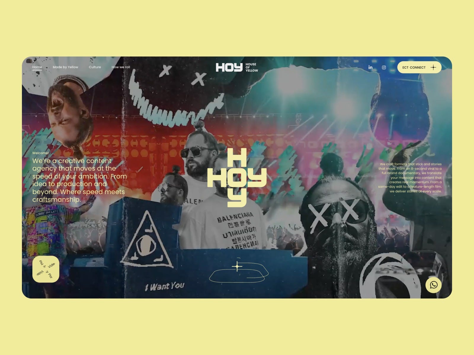
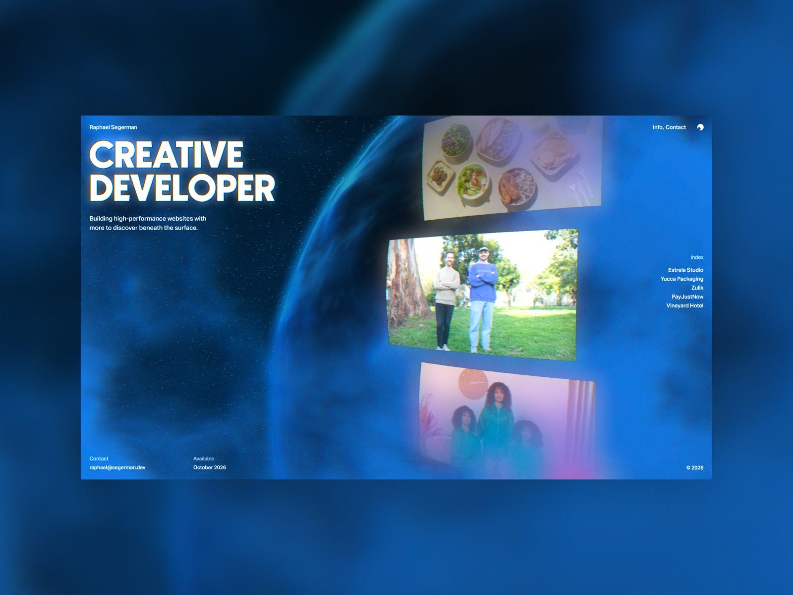
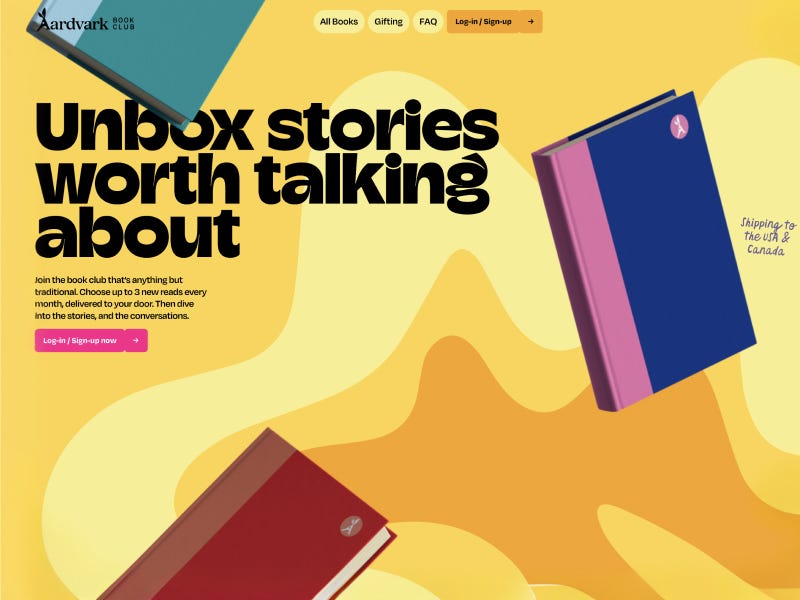
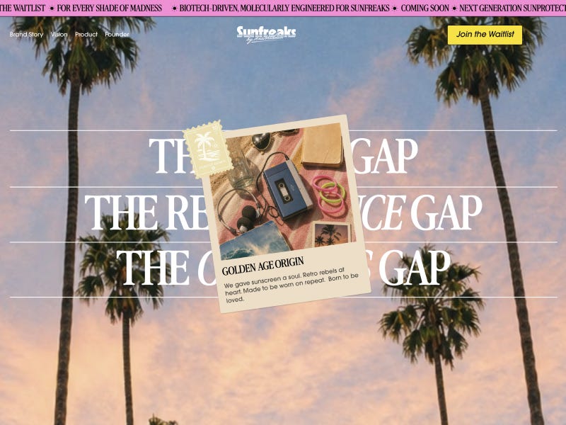
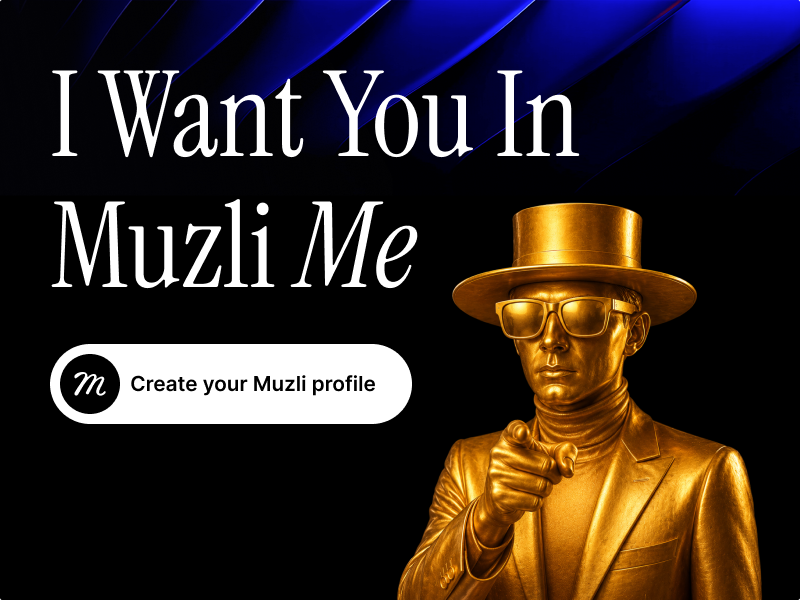
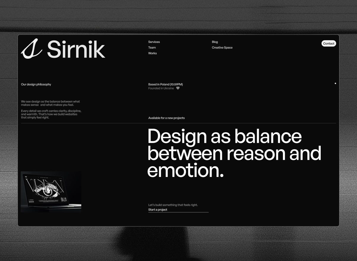
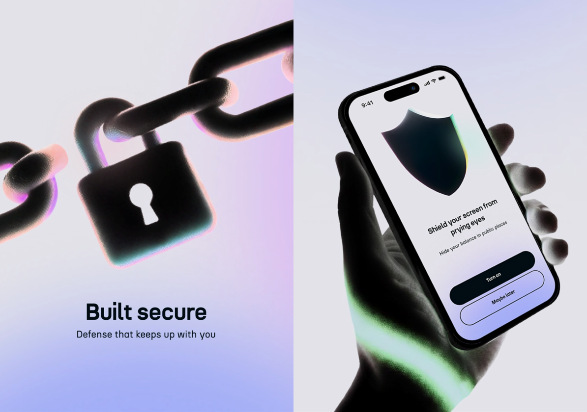

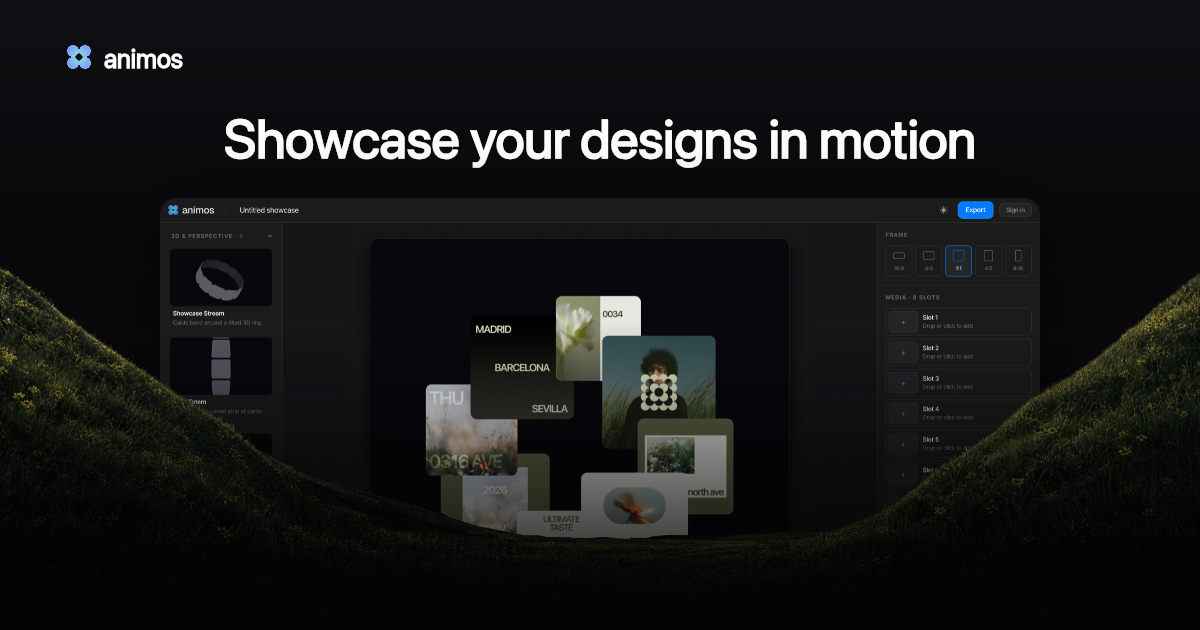
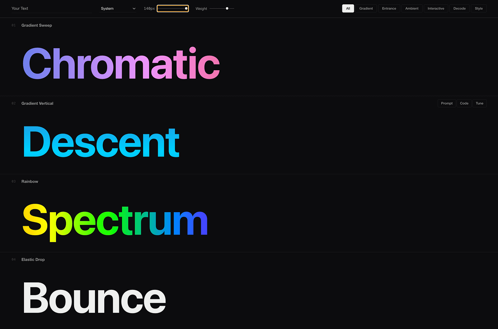
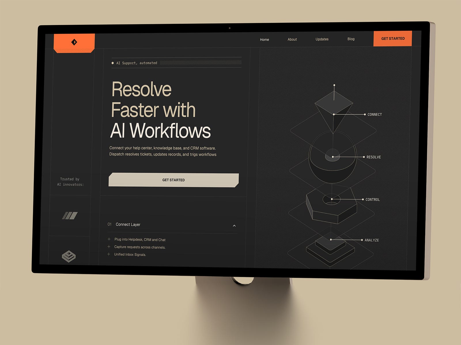

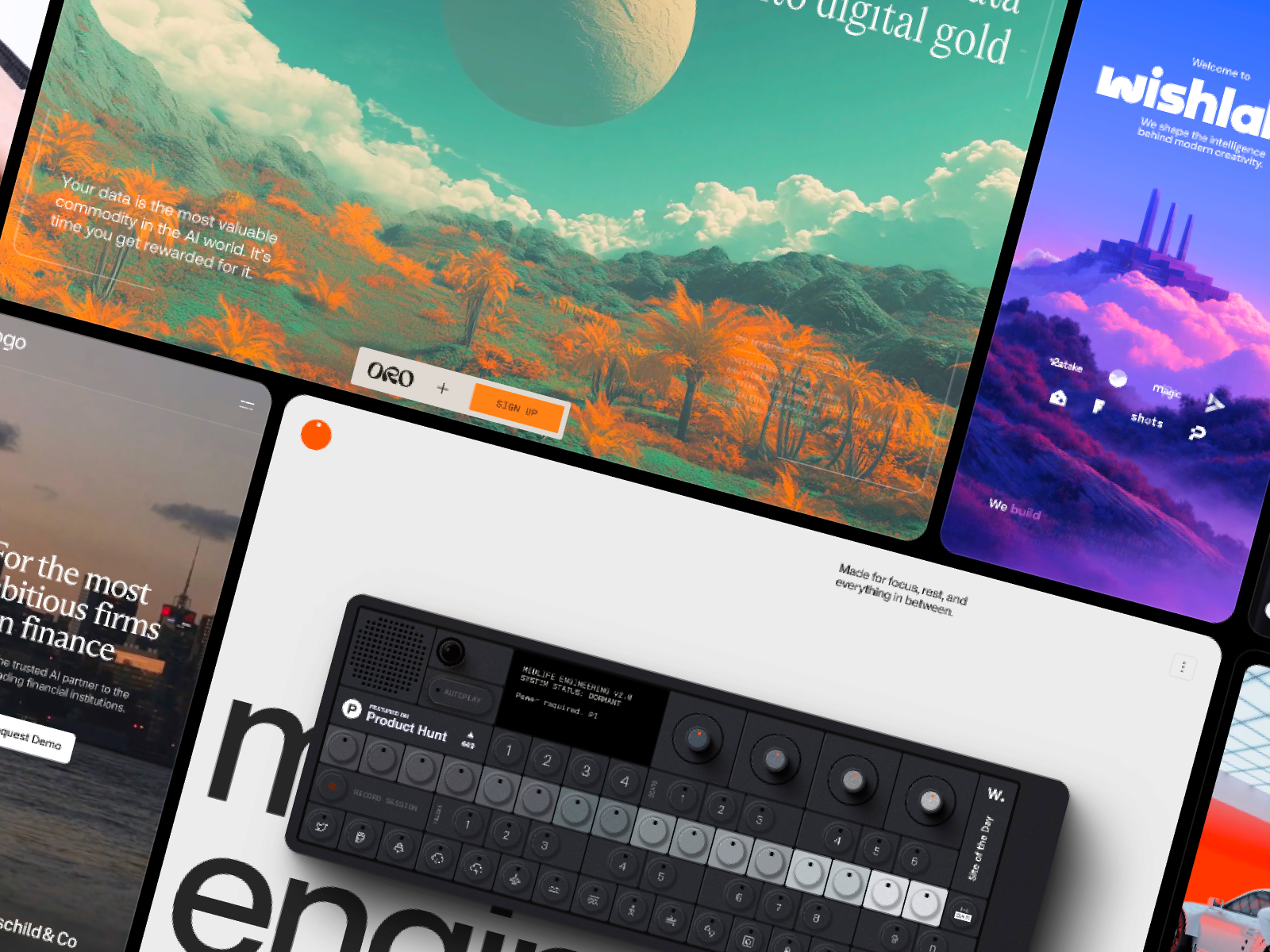
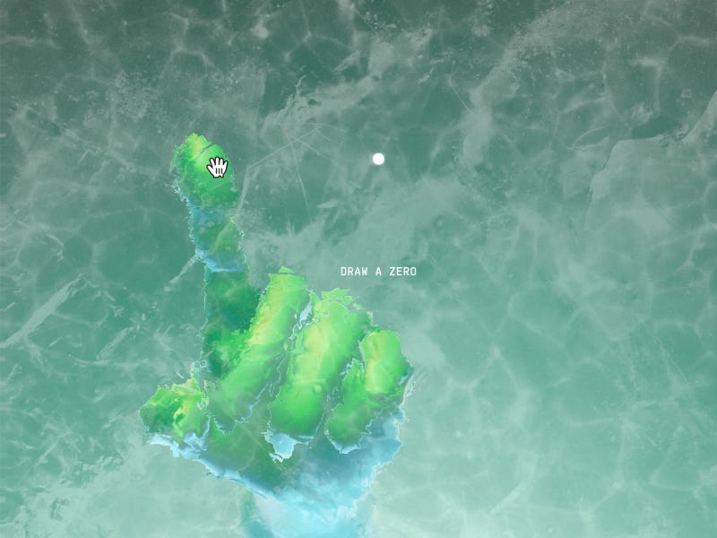
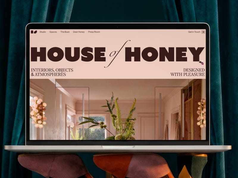
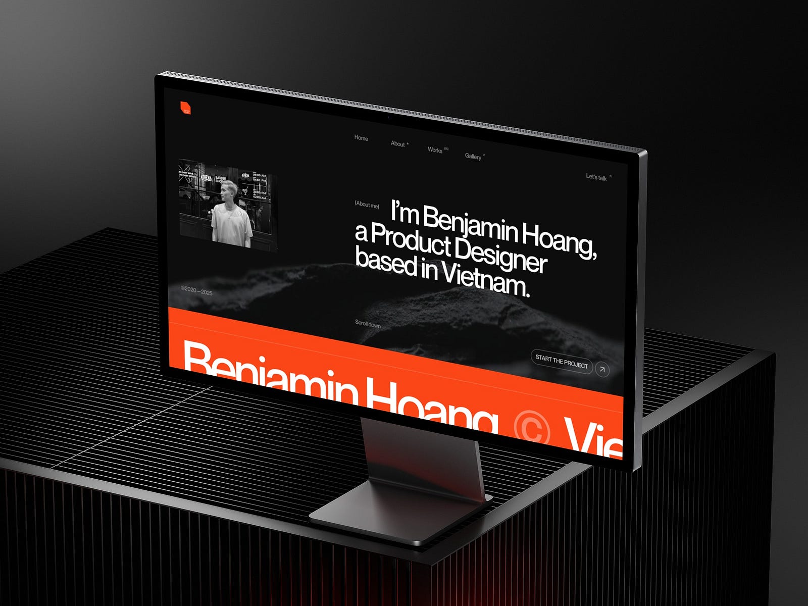
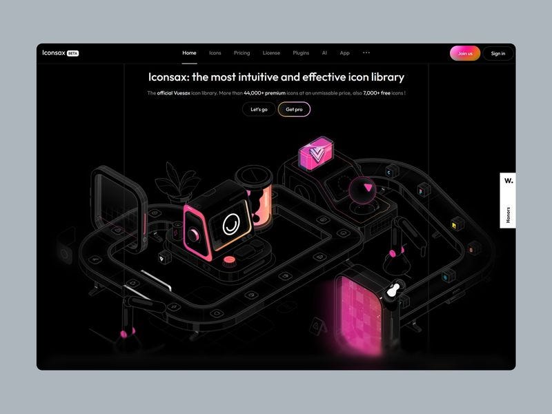
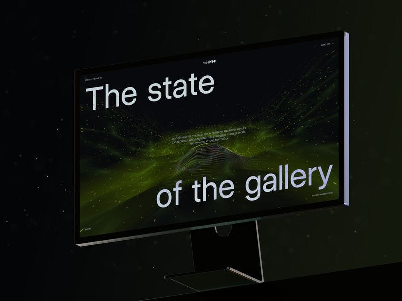
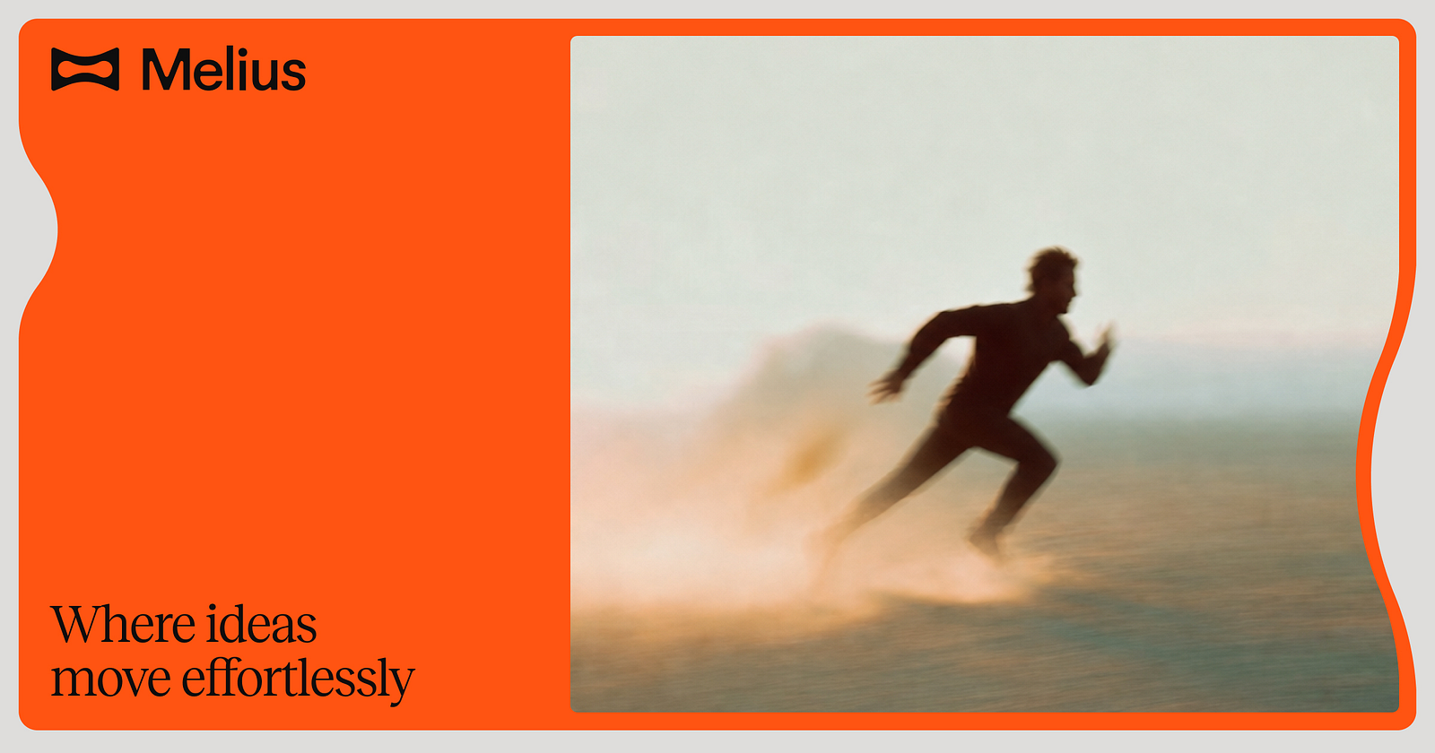

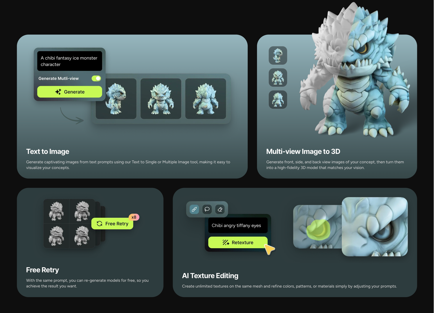

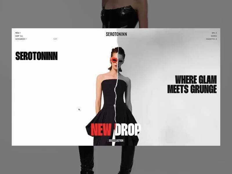
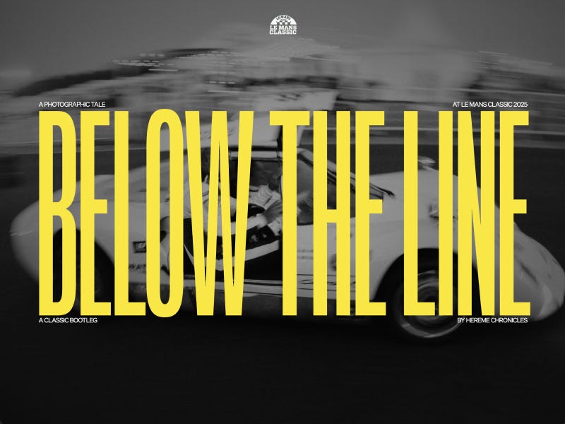
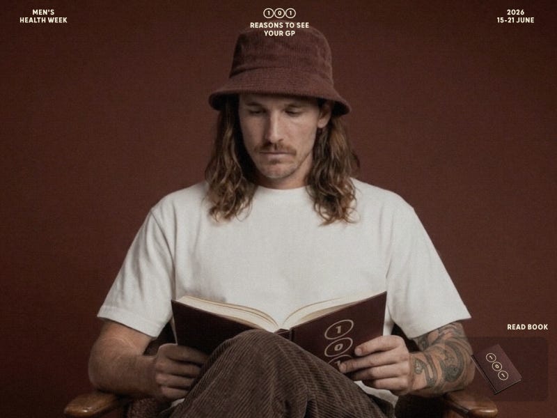
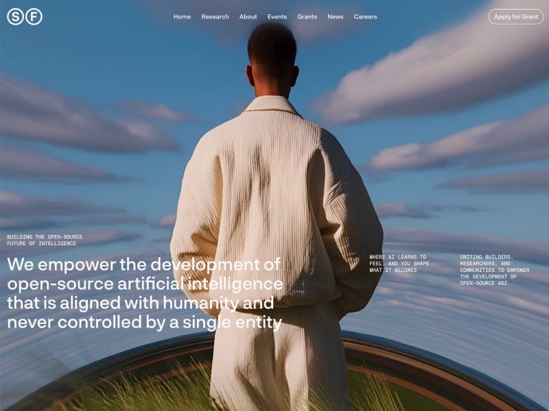
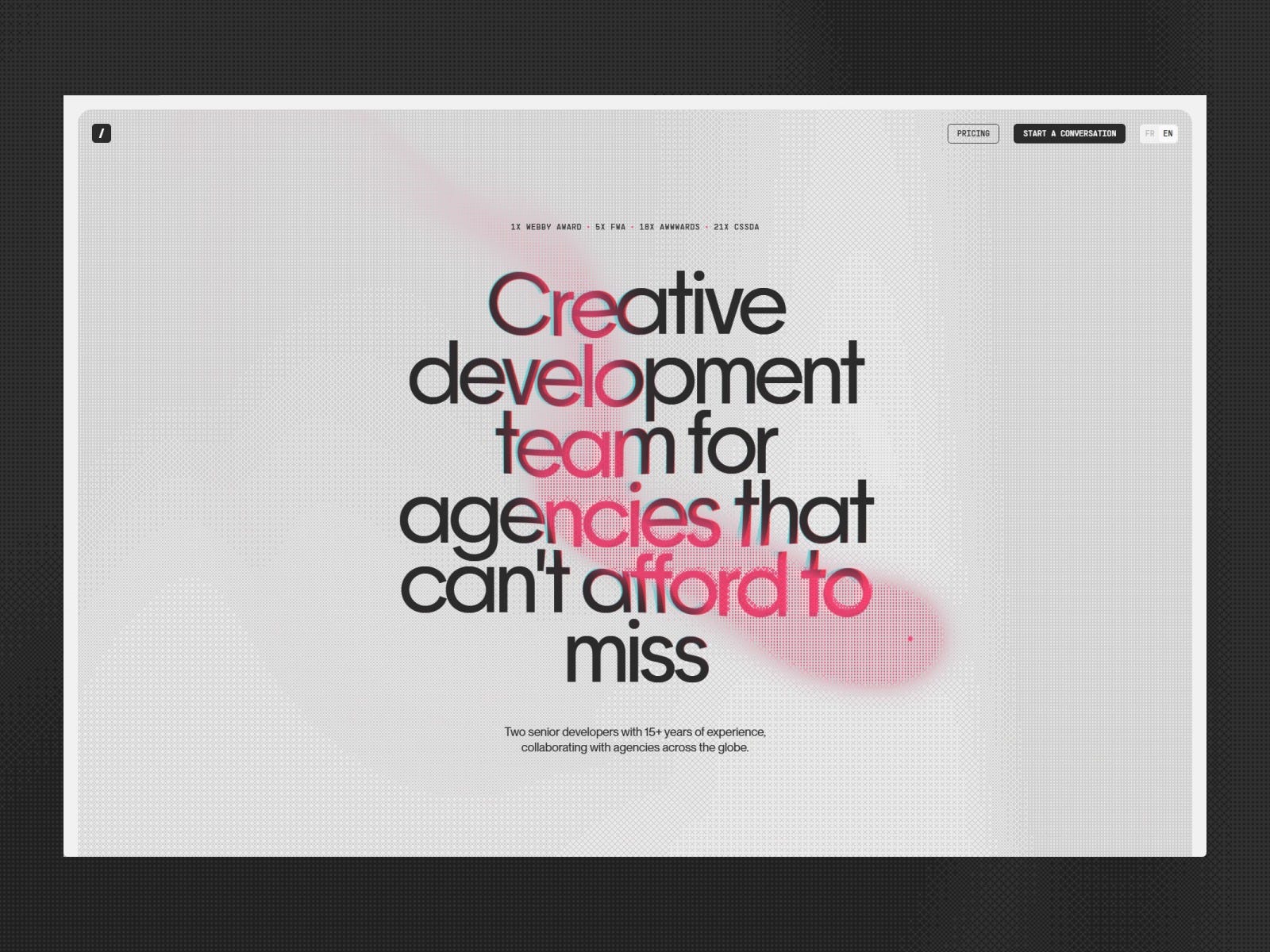
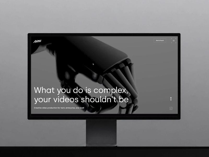
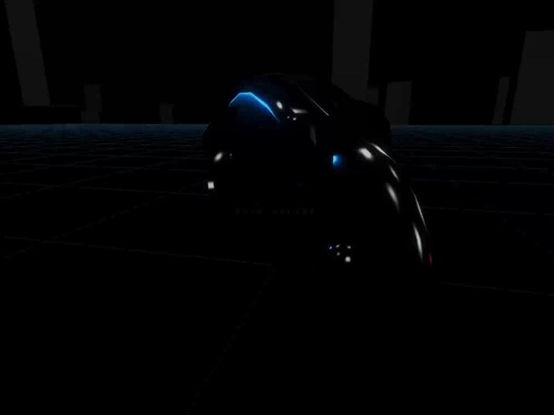
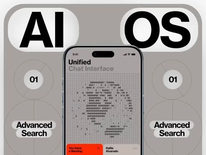
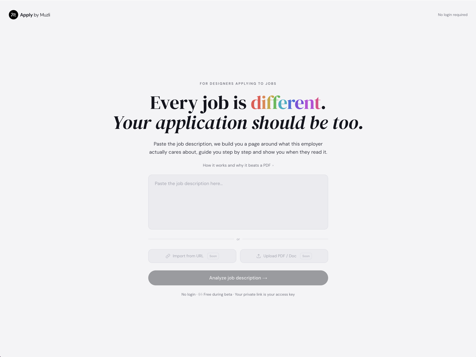
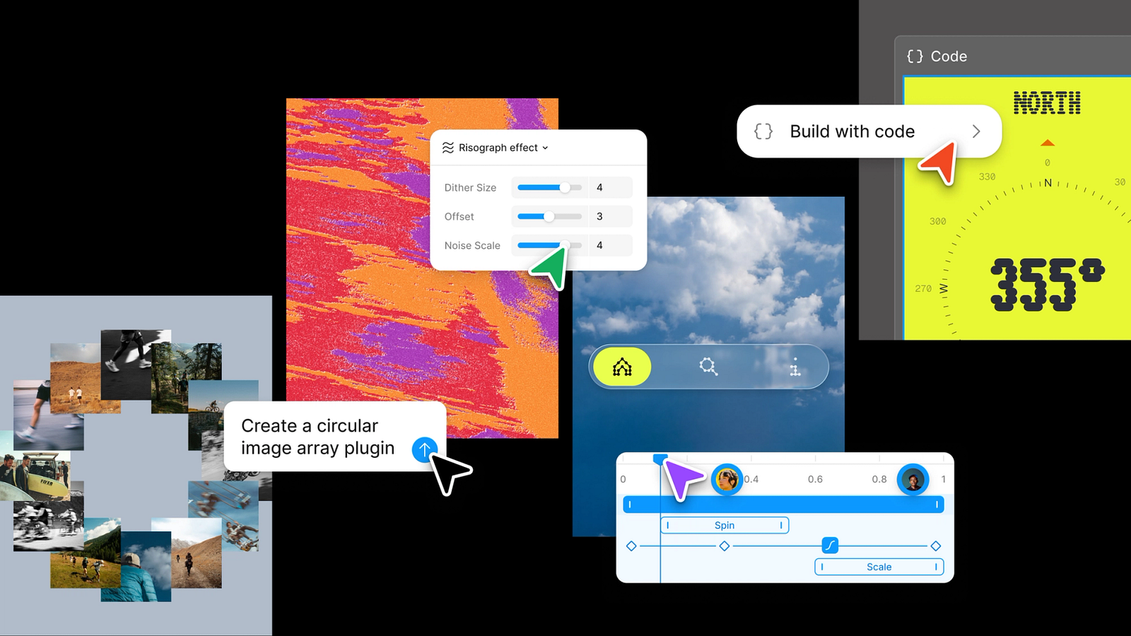
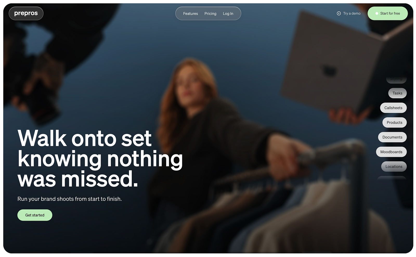
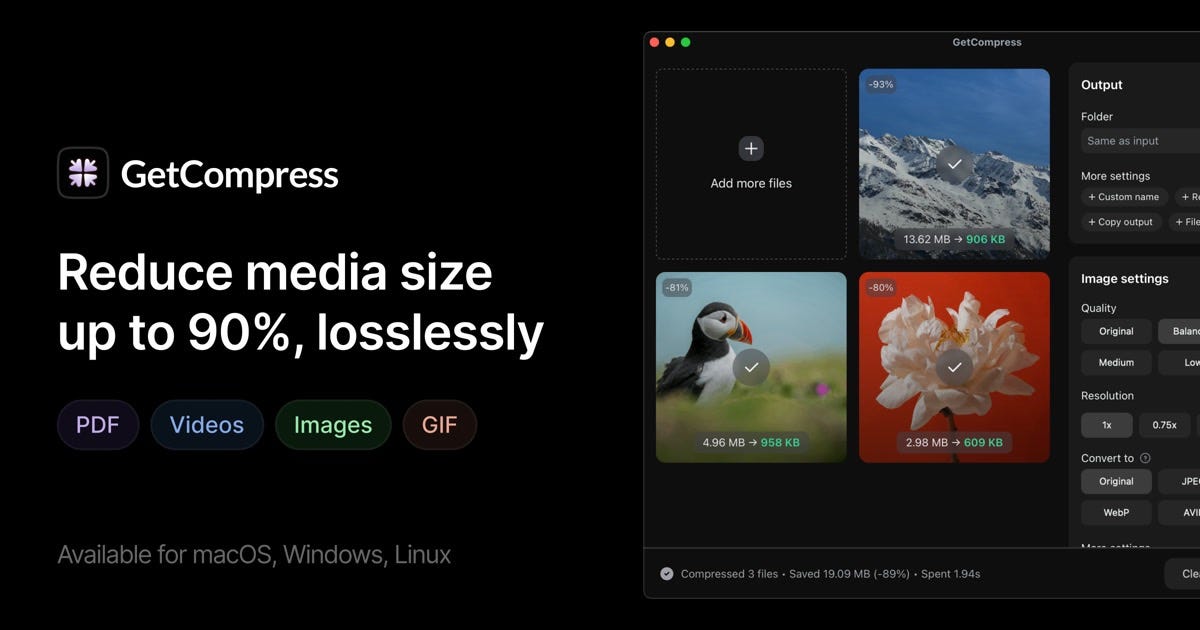

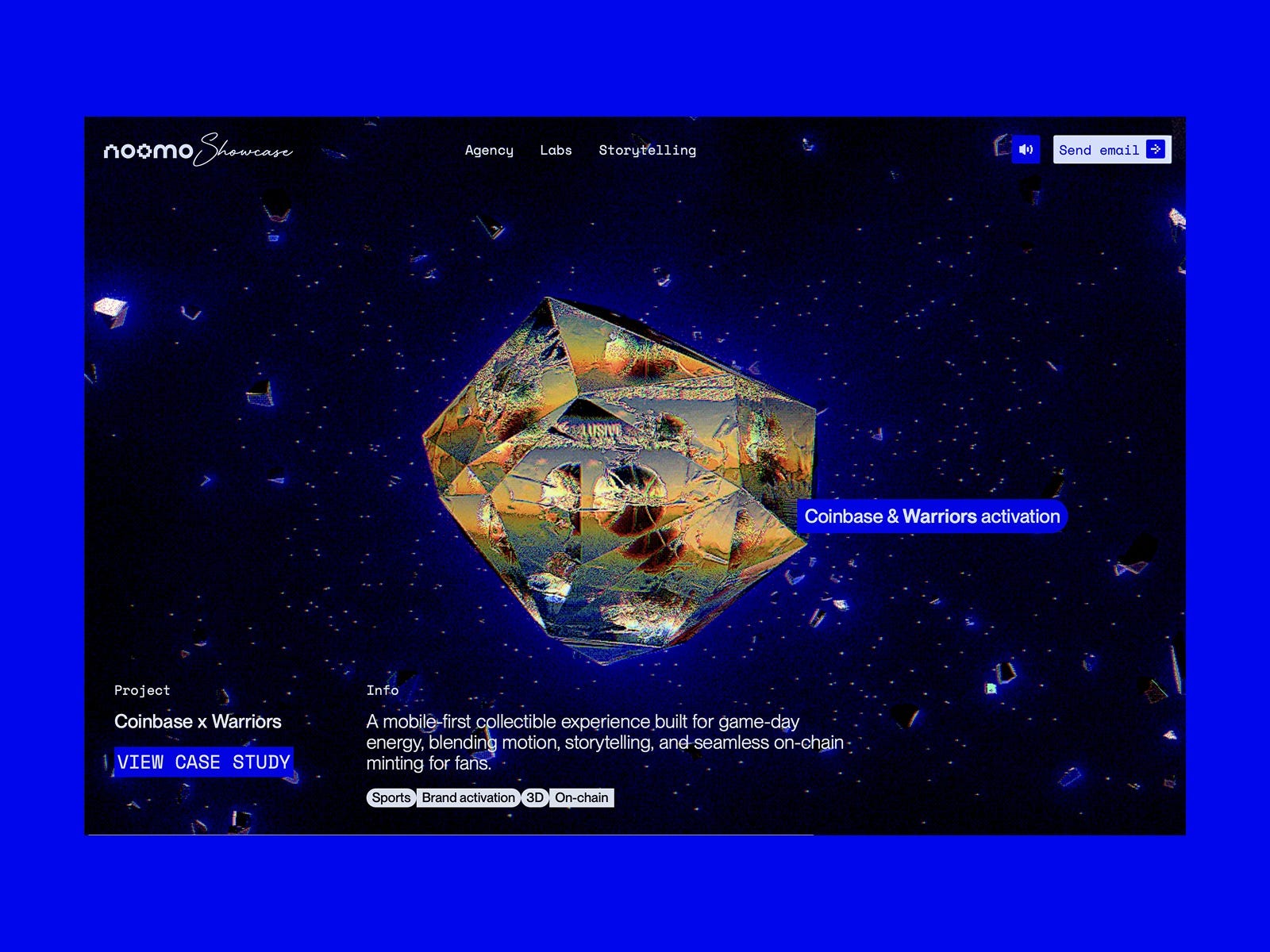
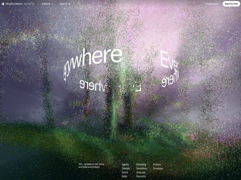
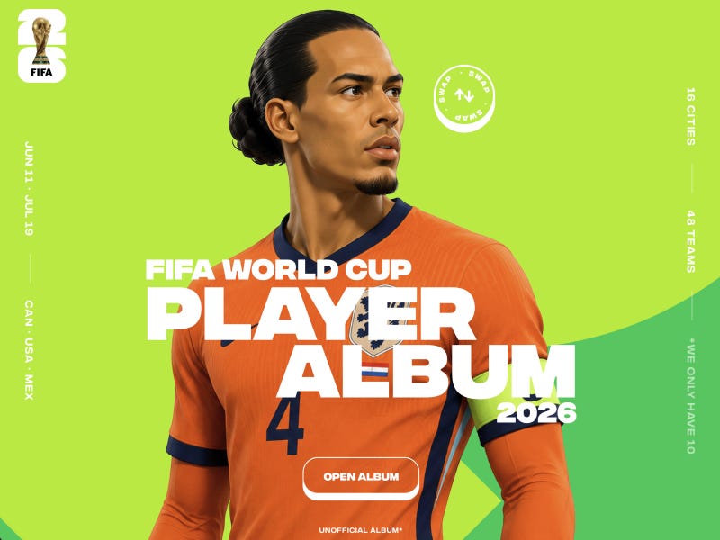


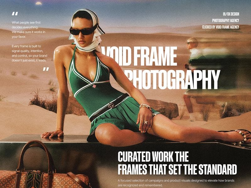
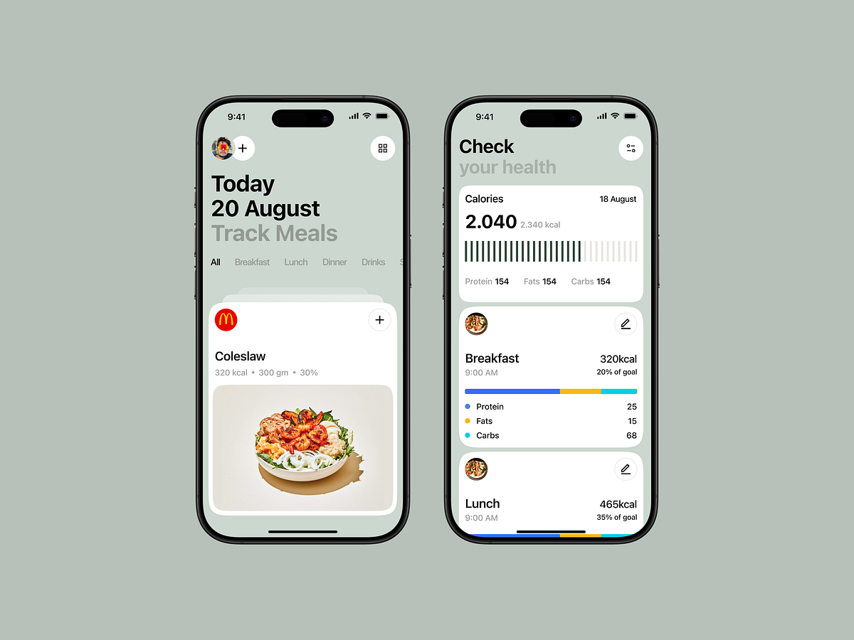
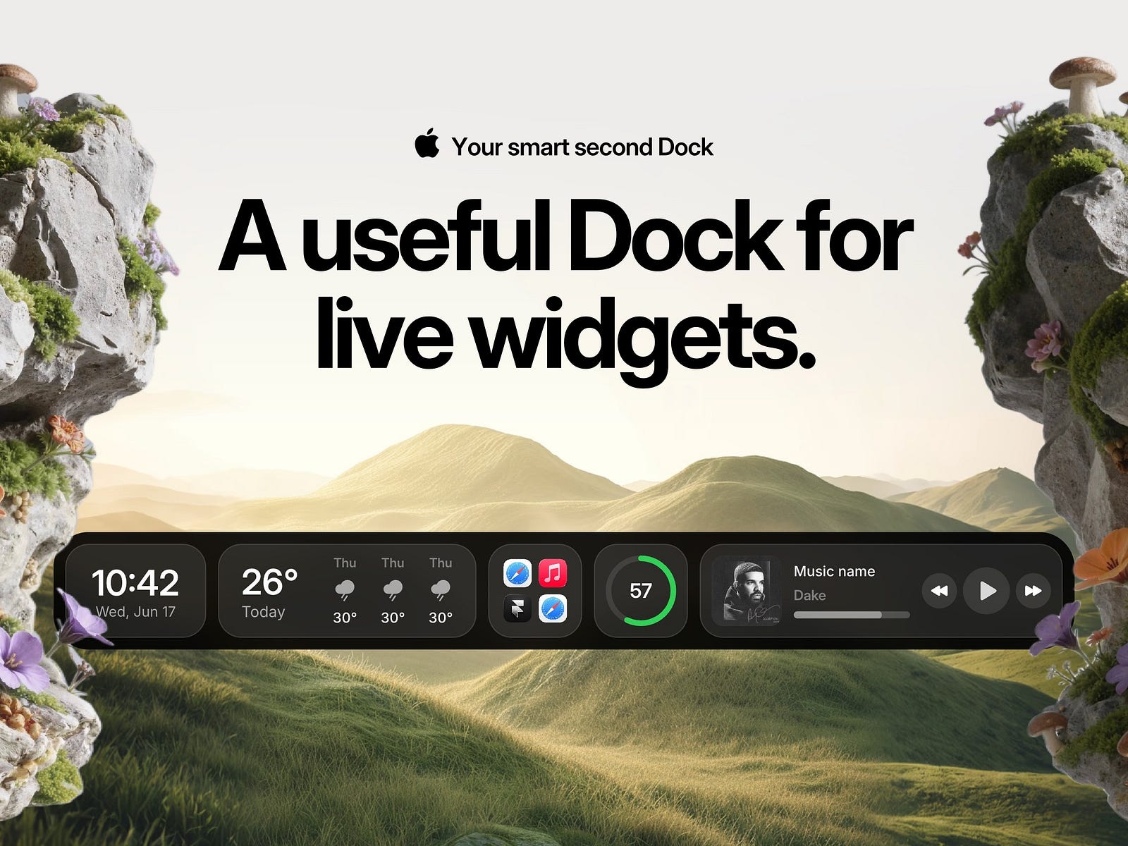
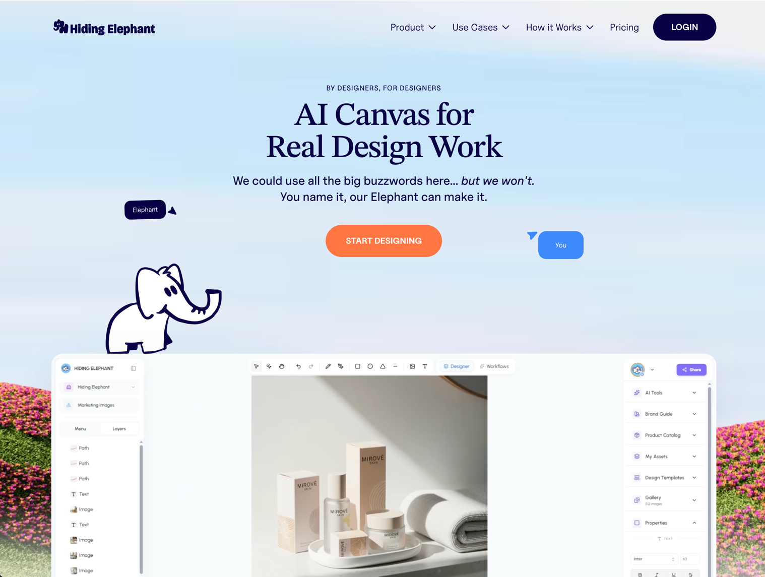
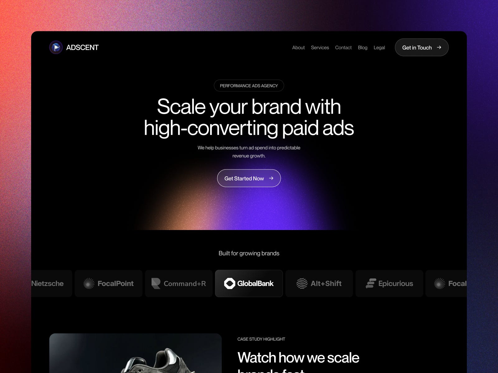

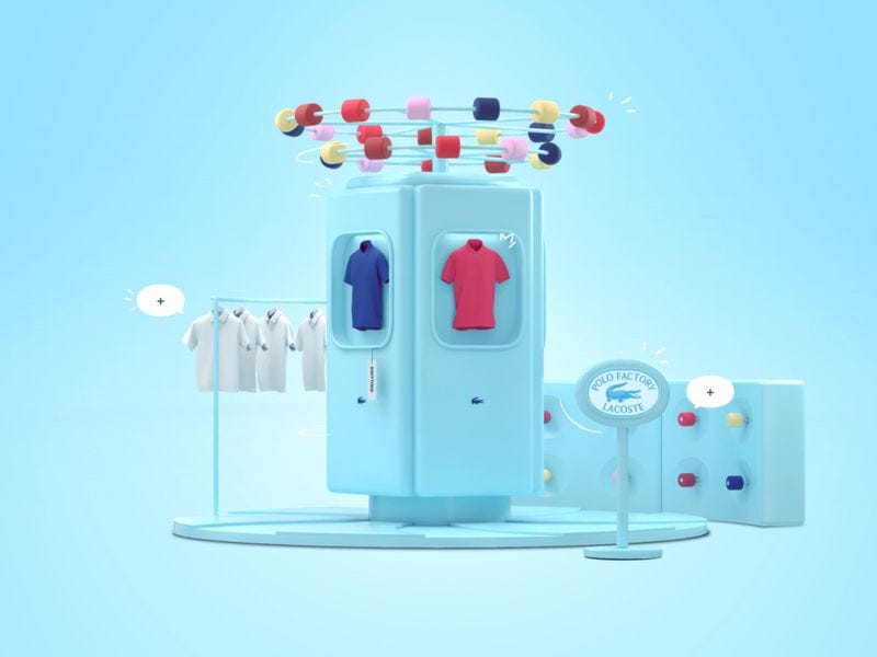
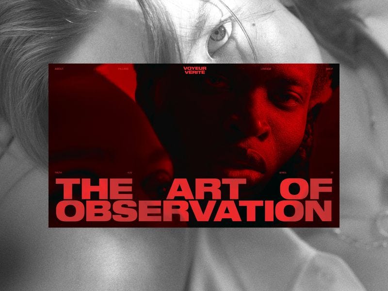
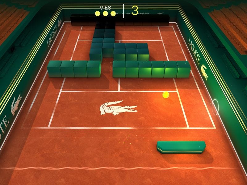
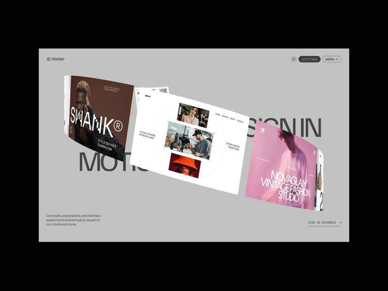
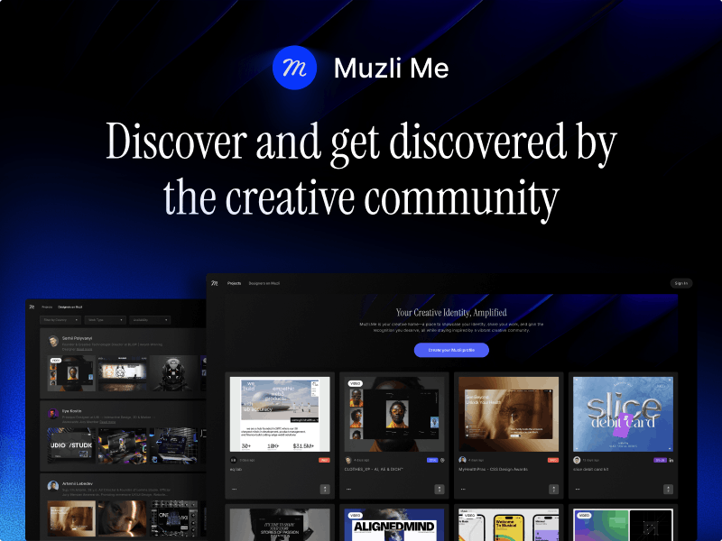
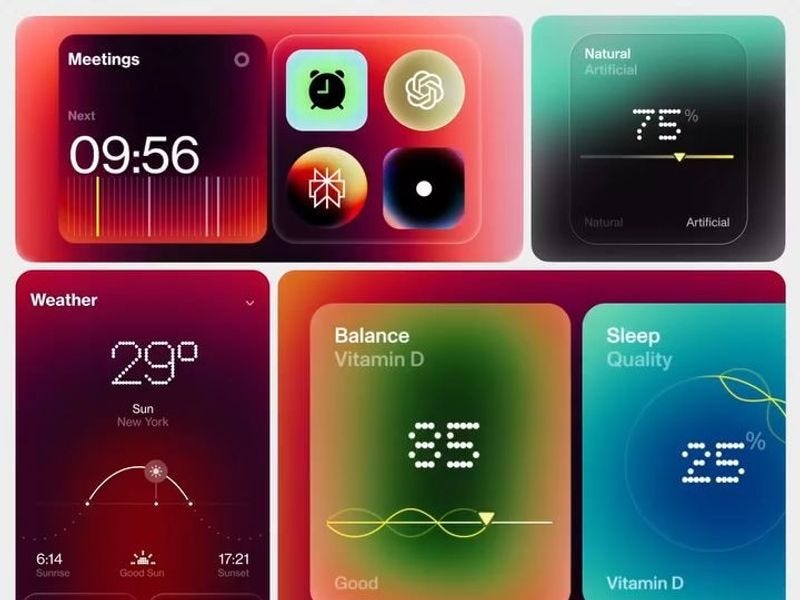
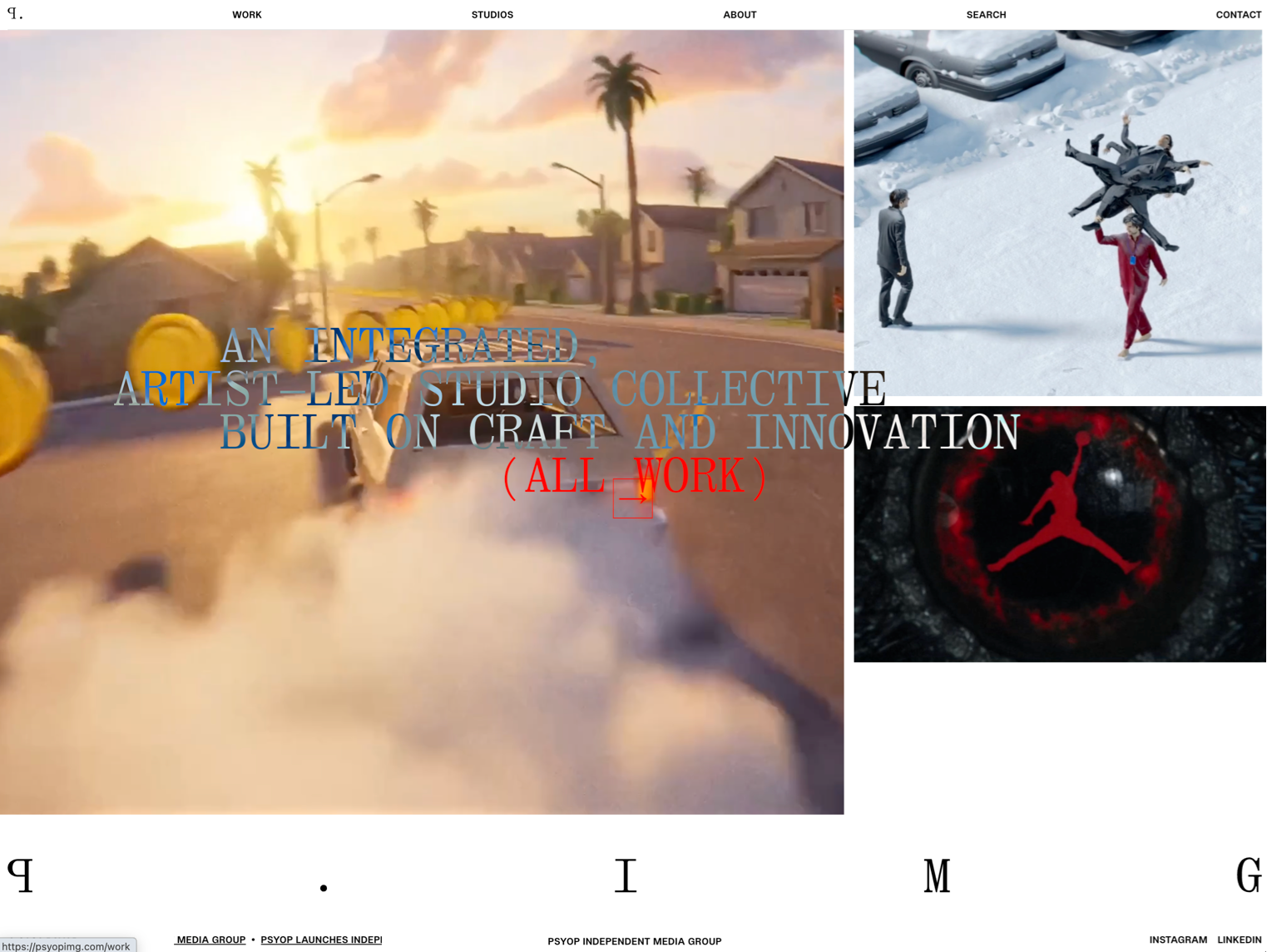
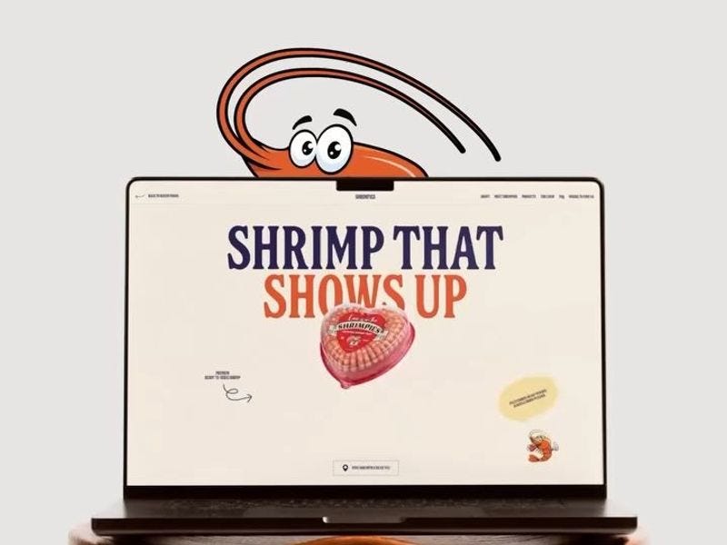
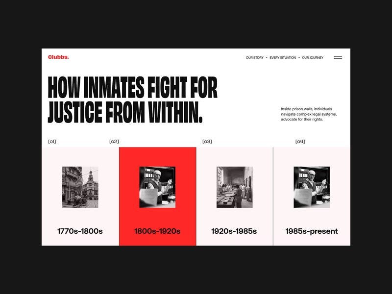
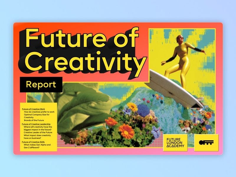
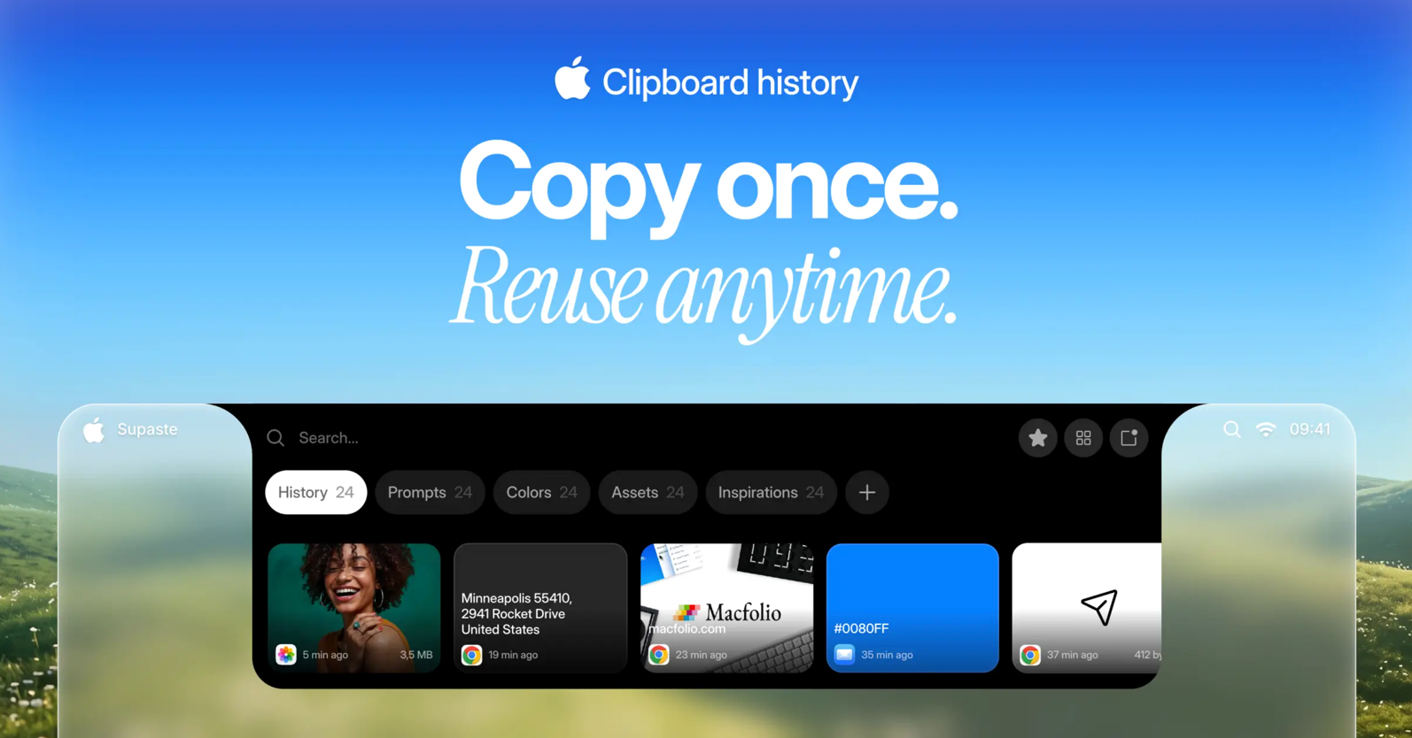
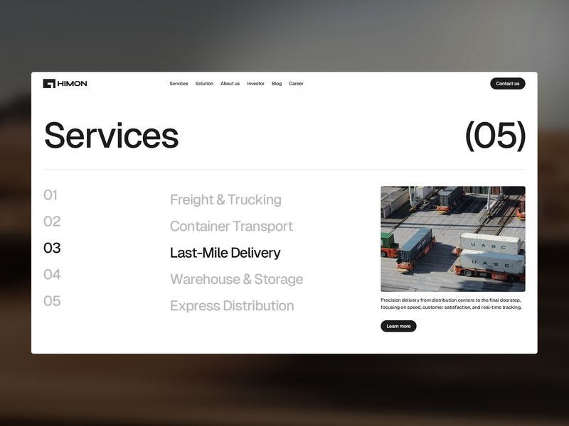
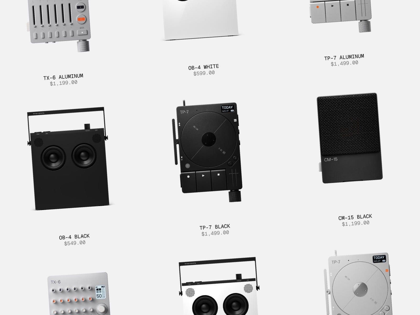


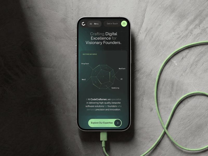
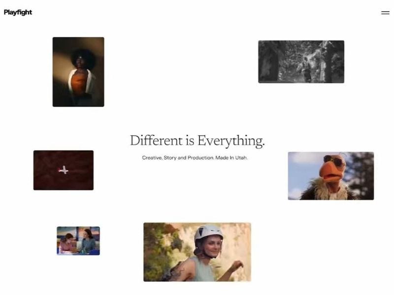
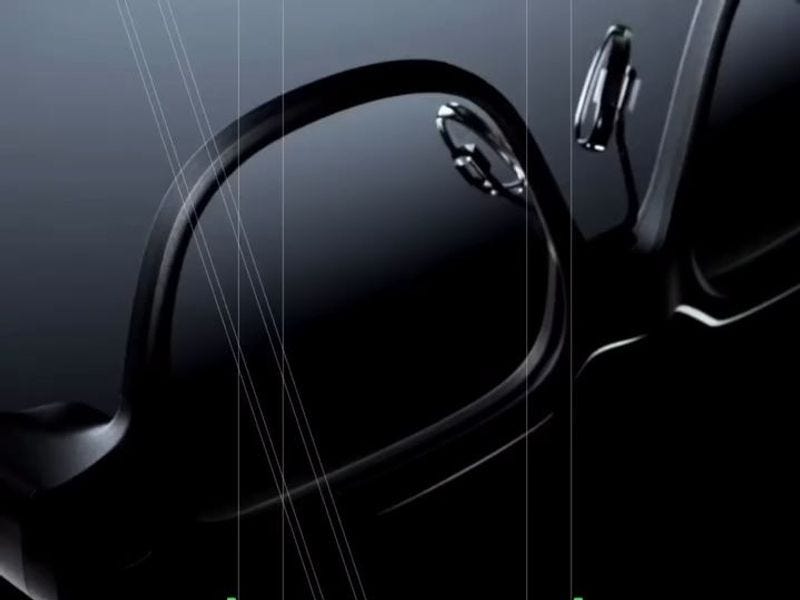
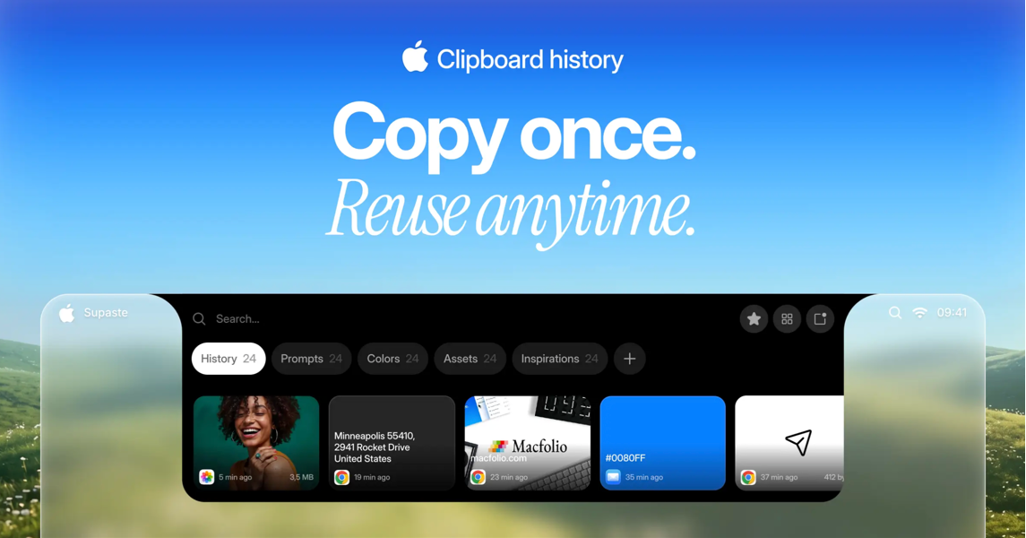
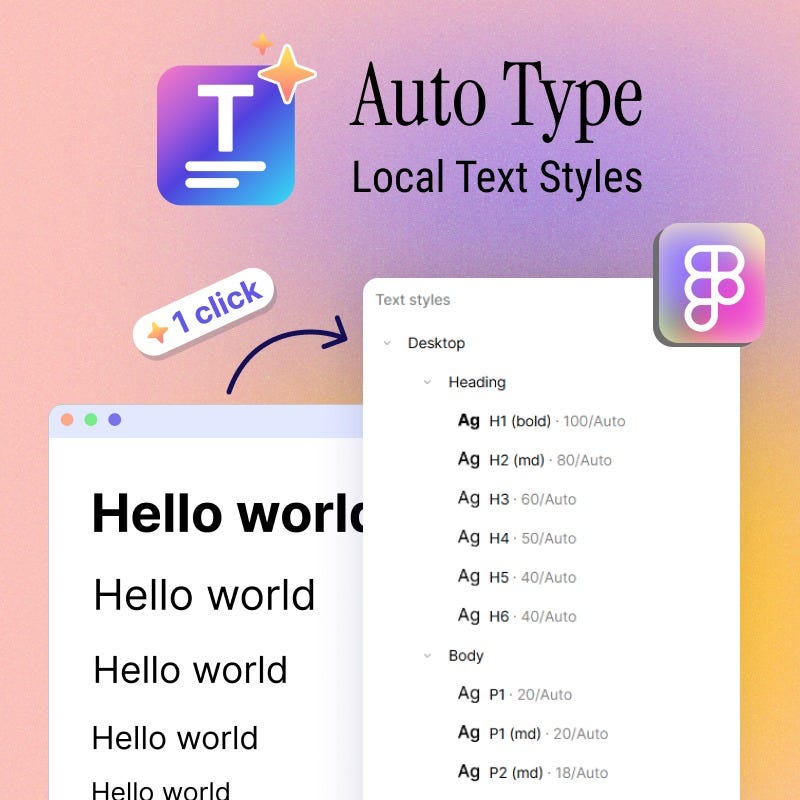
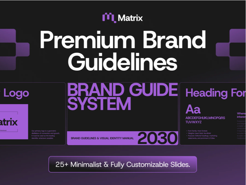

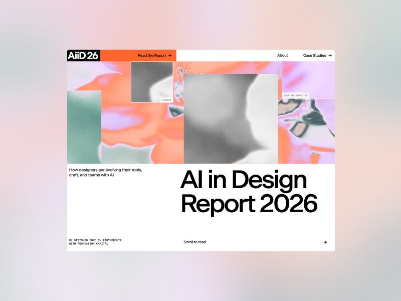
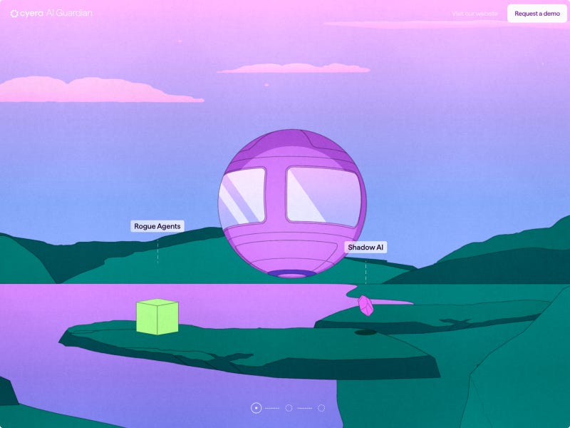
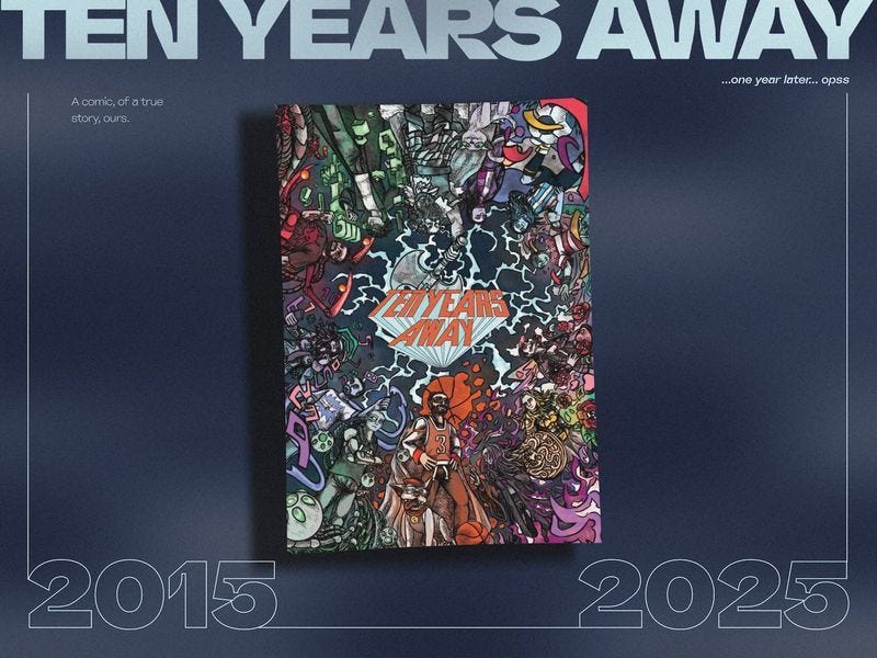

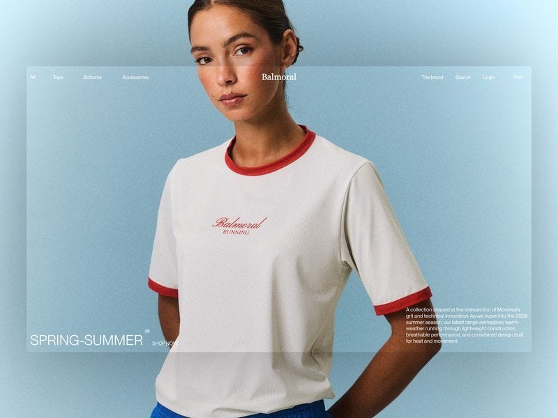
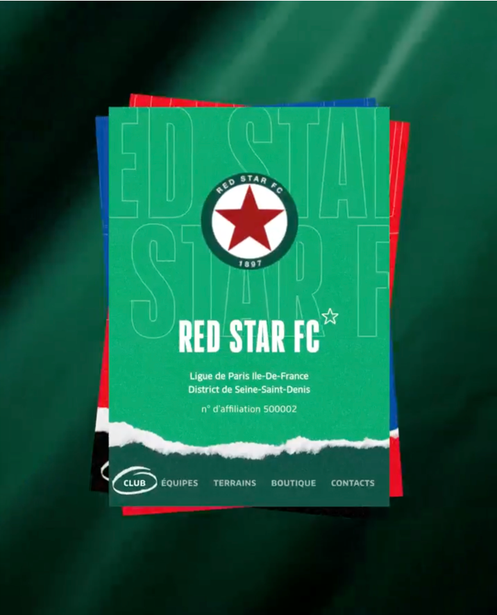
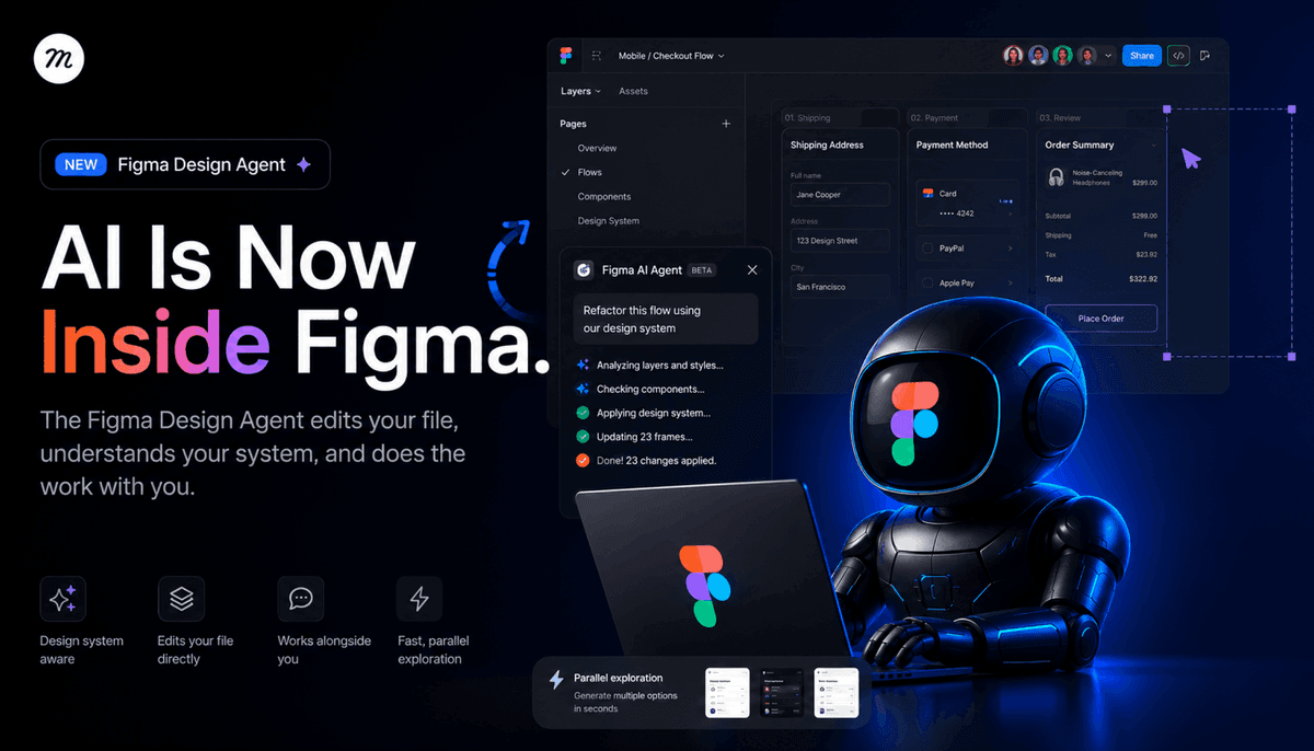
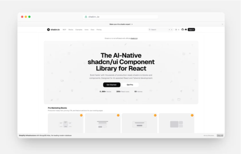
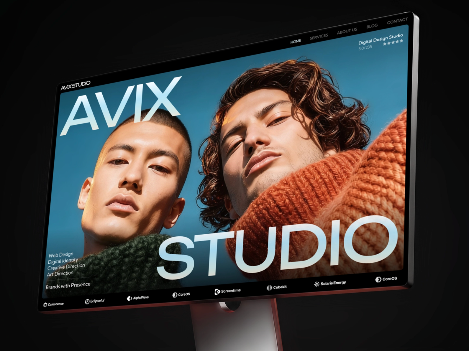


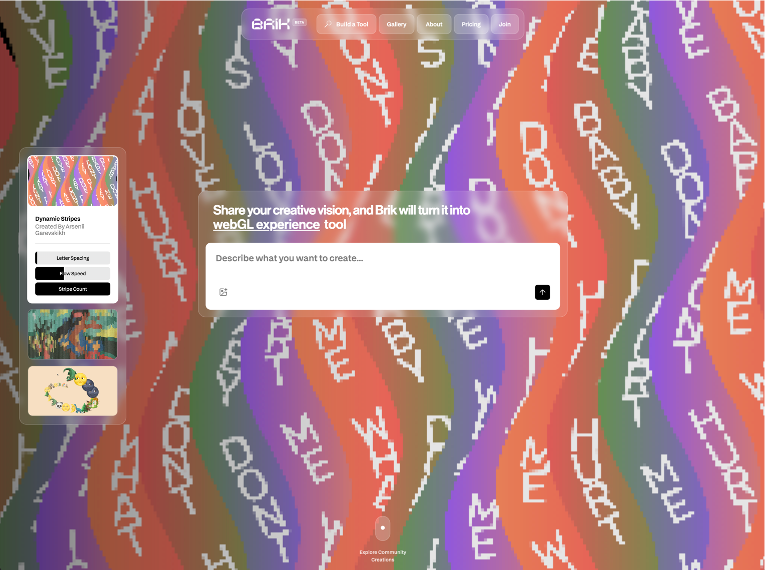

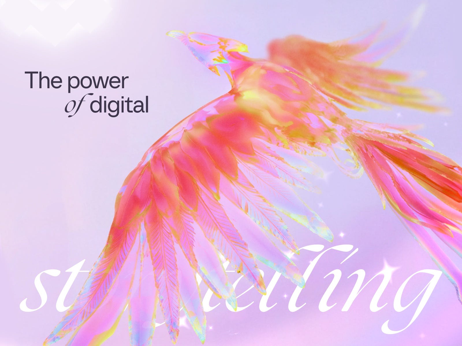


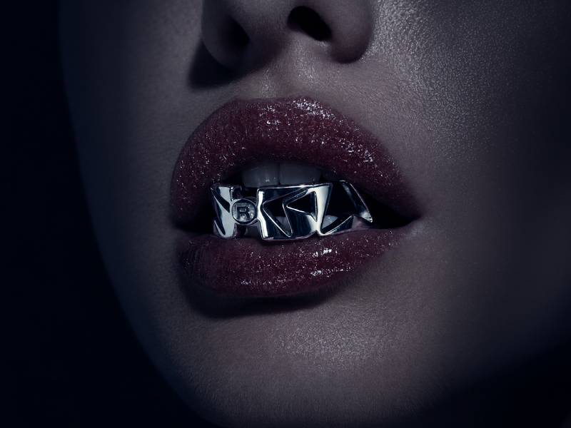

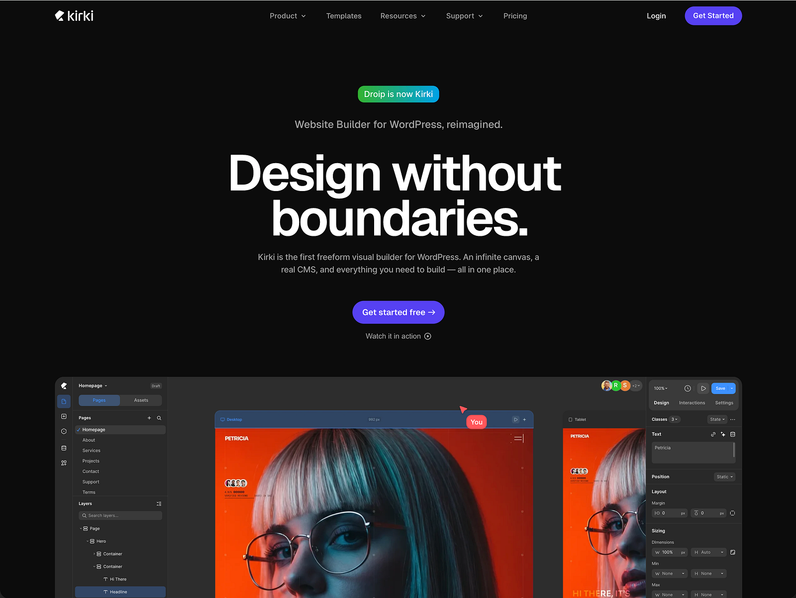

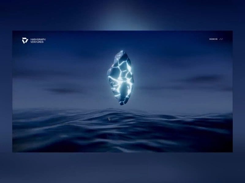
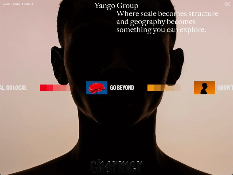

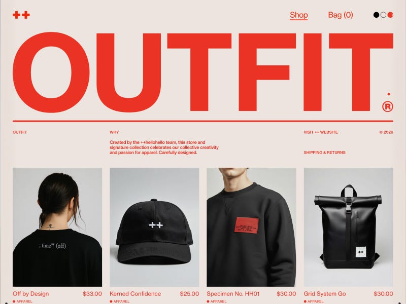

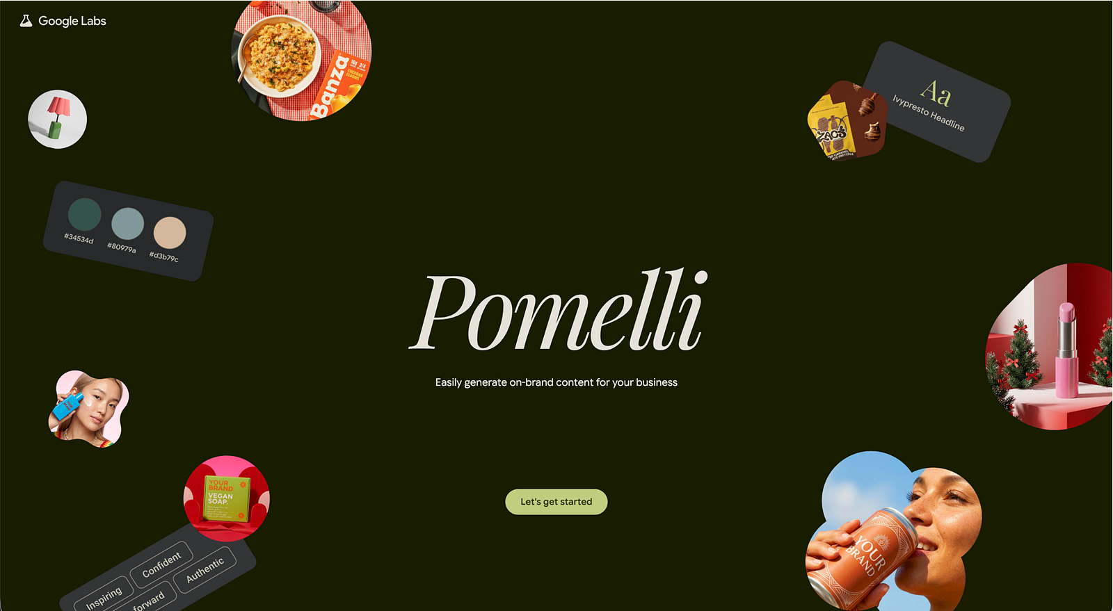


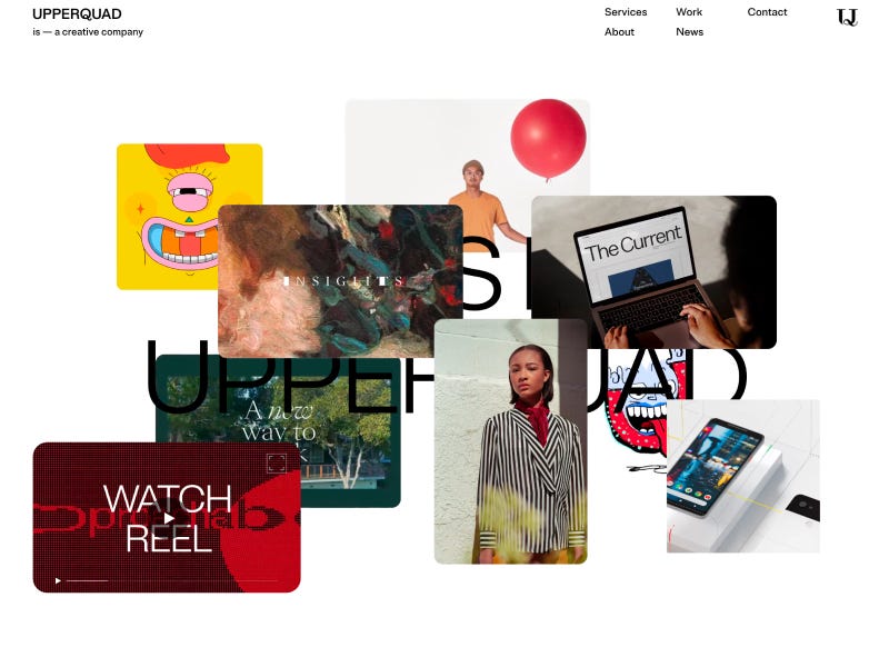

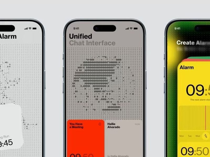
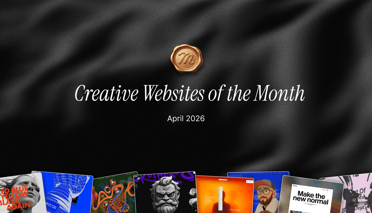


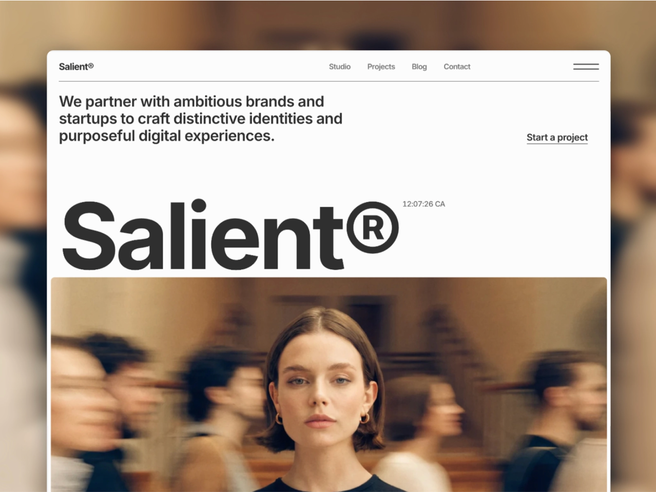
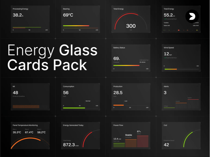
")
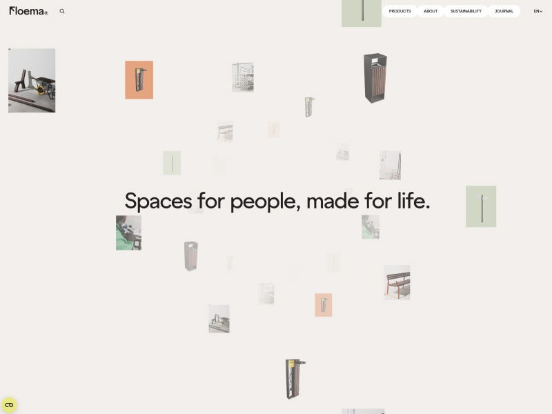


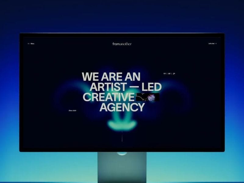


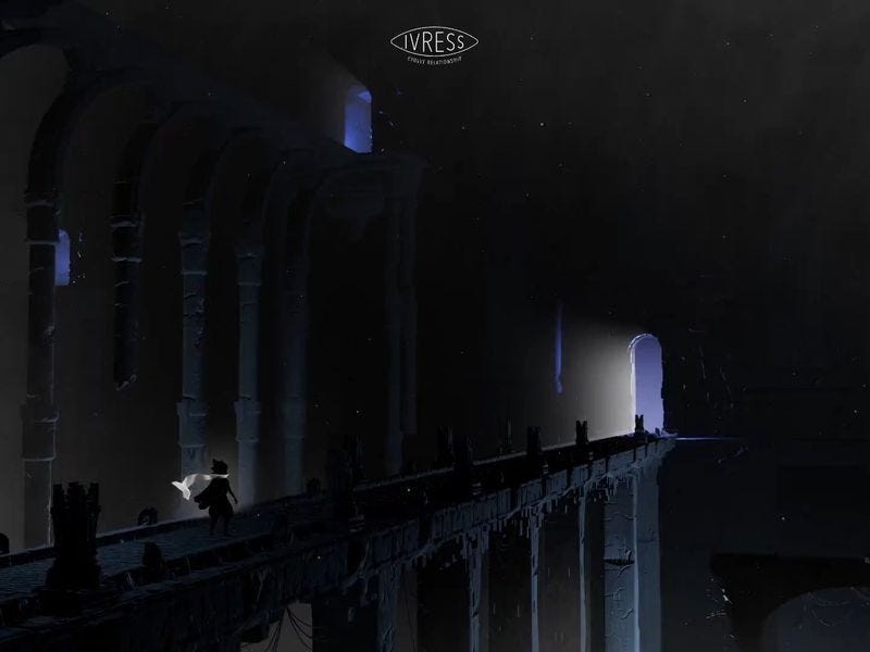
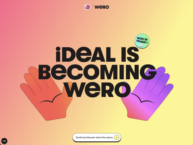


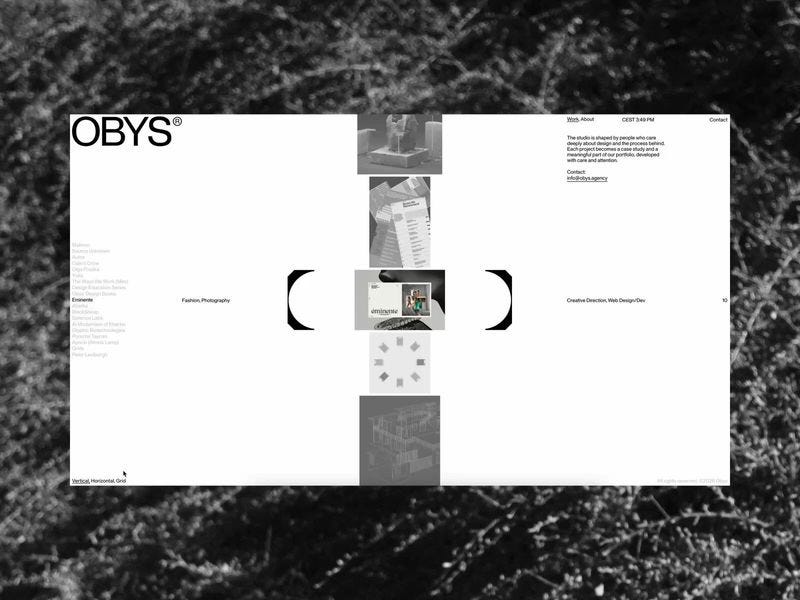


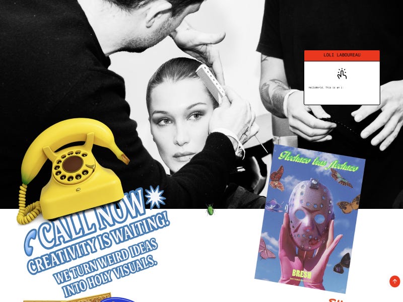


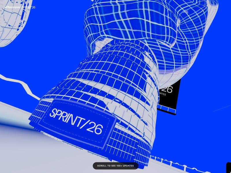
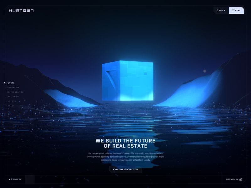


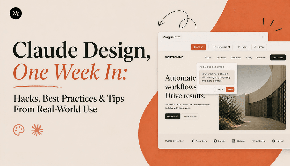


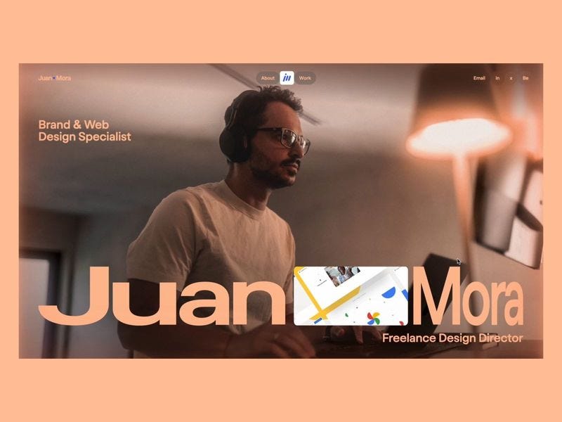

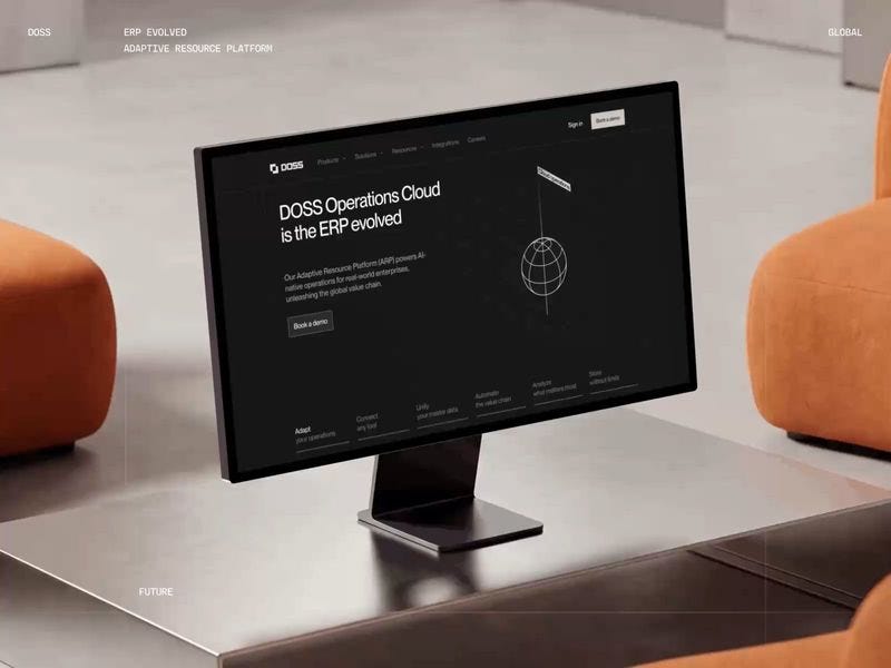
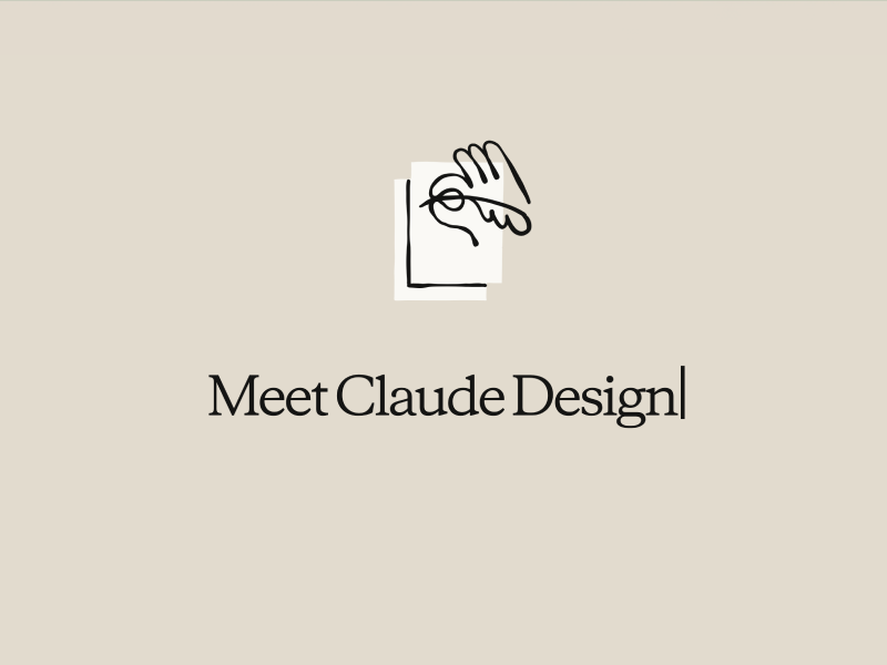


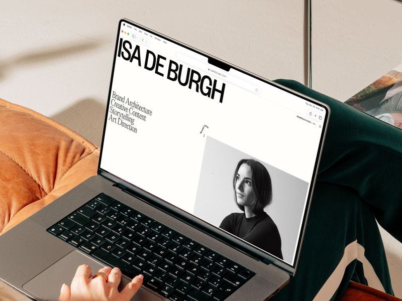
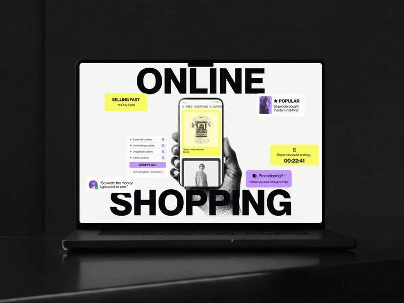

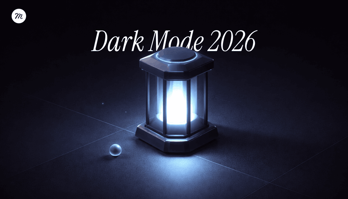


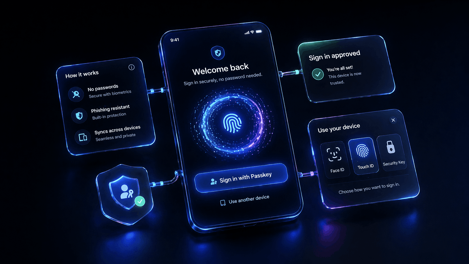
")
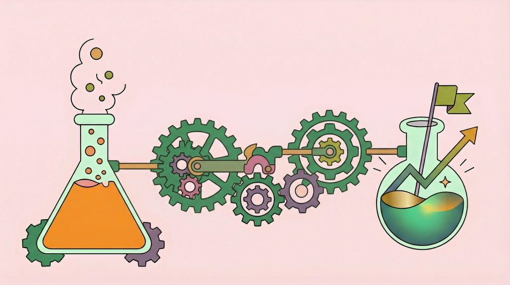
")
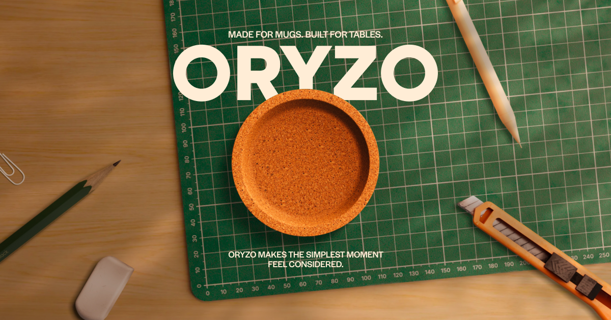

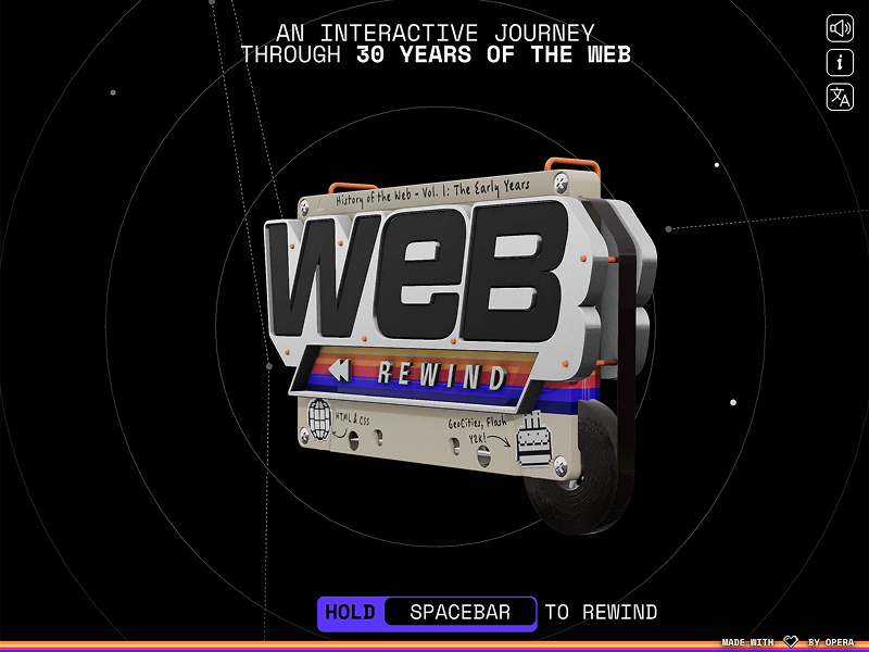
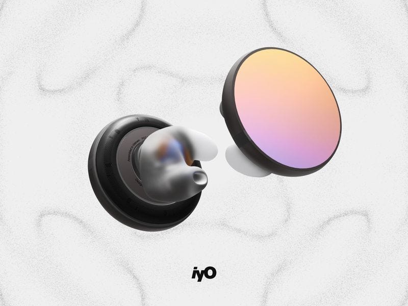
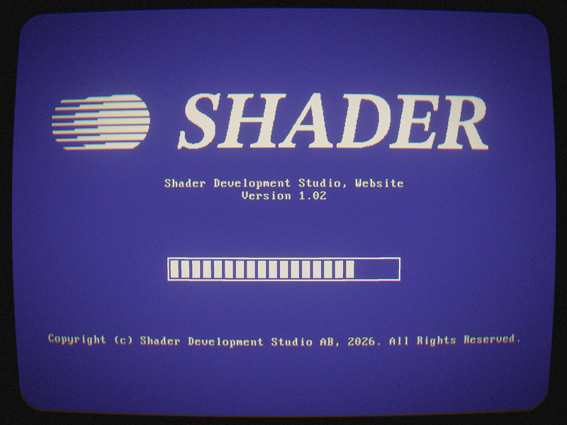


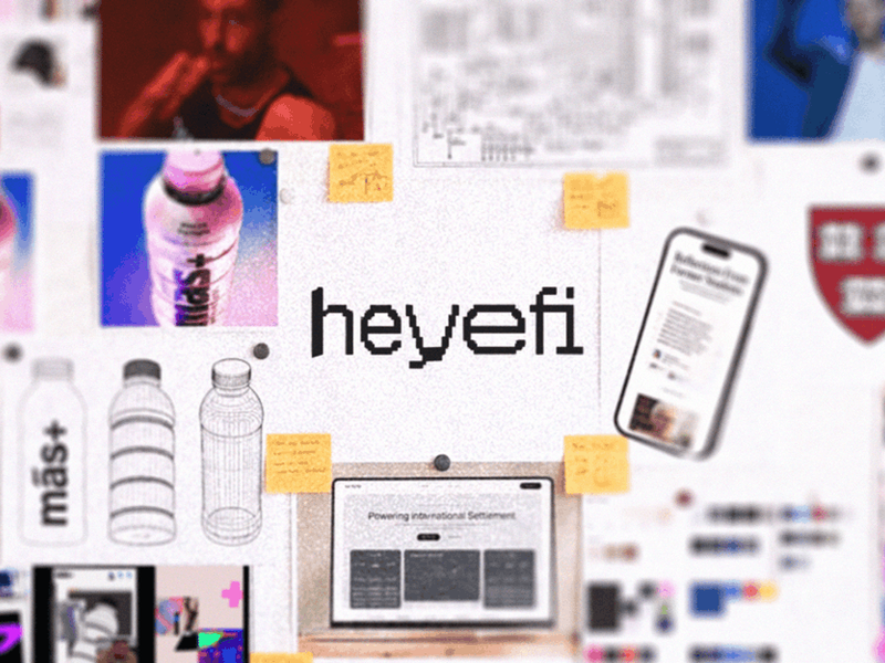
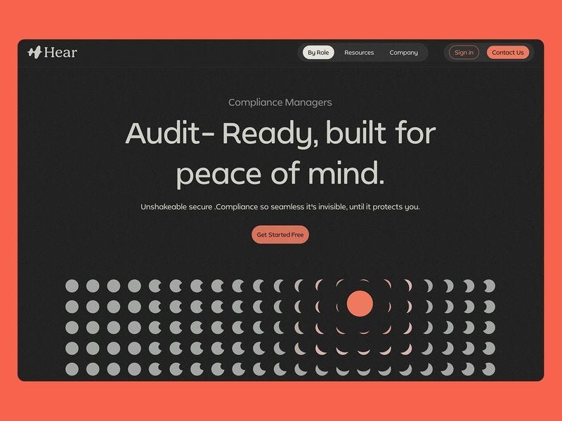
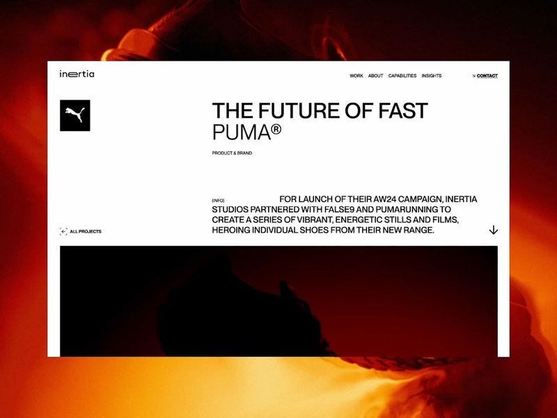
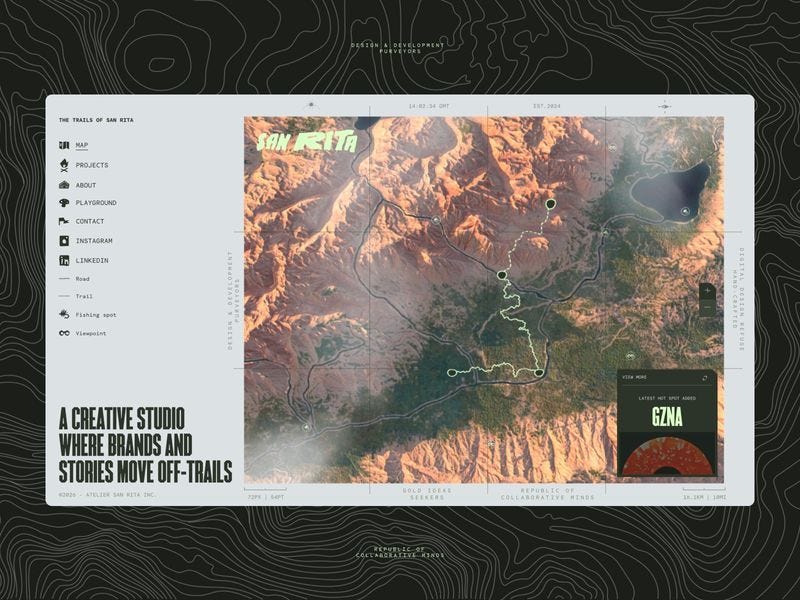

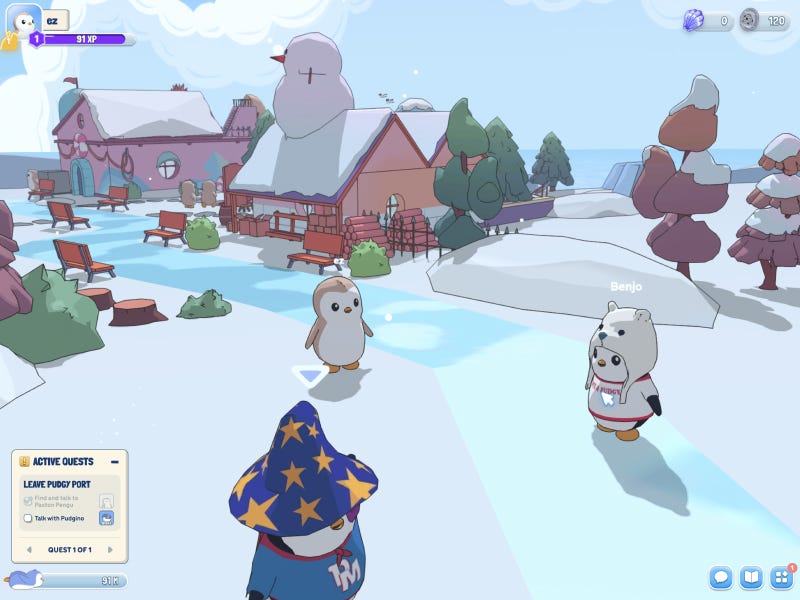
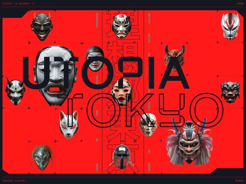

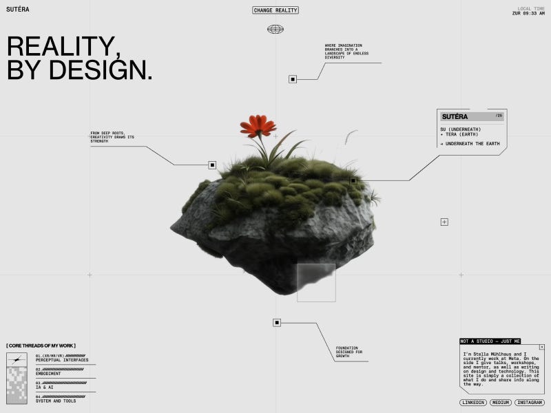

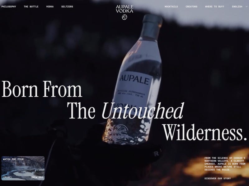

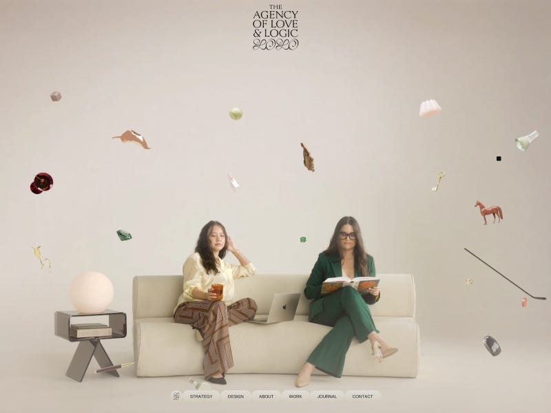
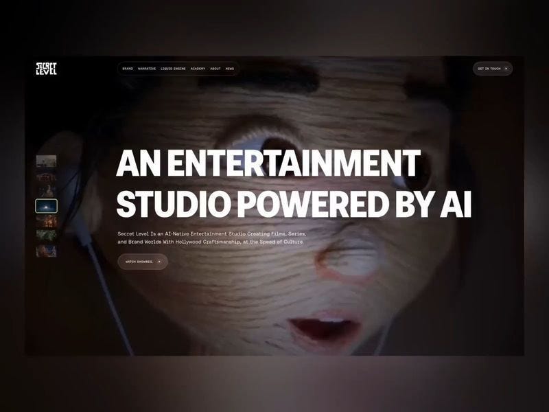

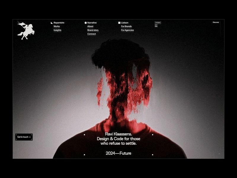
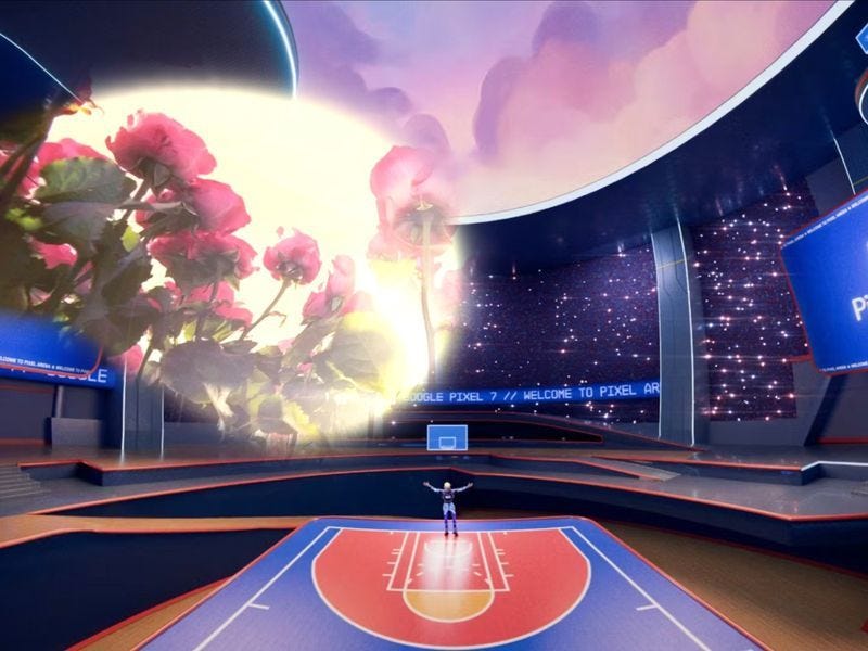

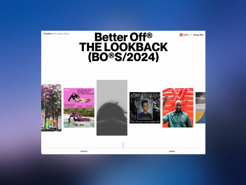


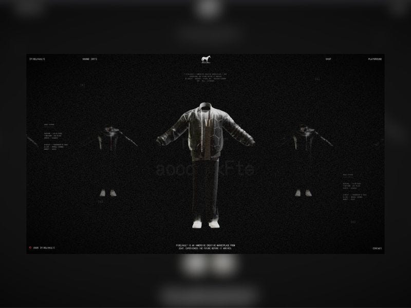
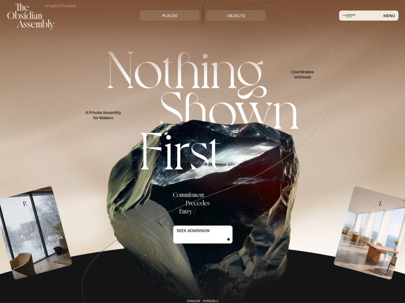


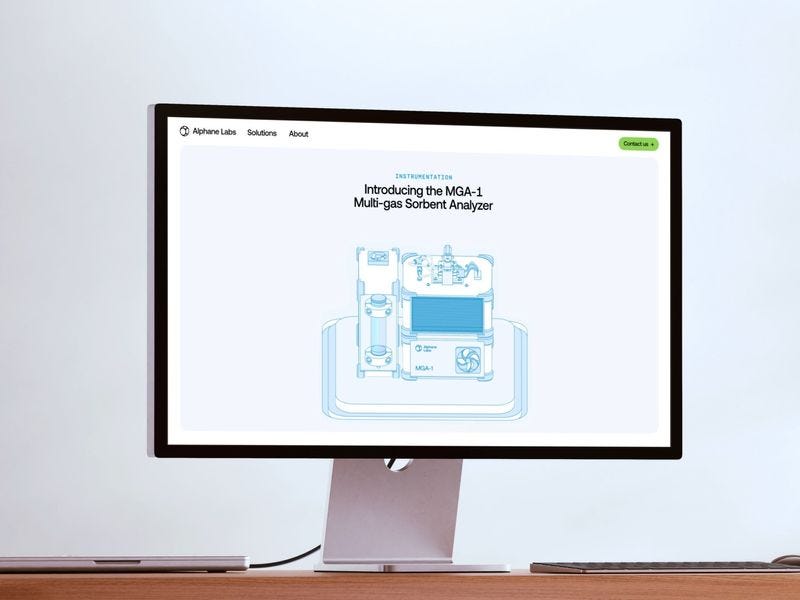


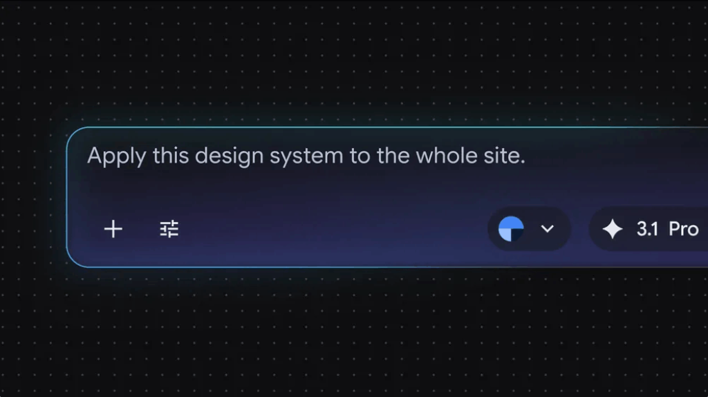


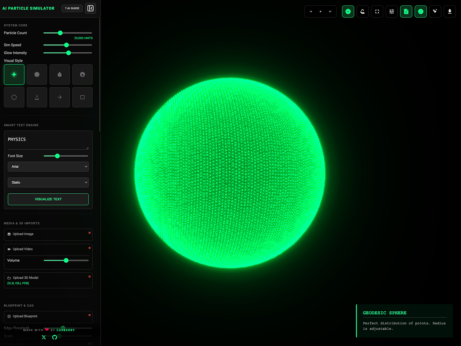


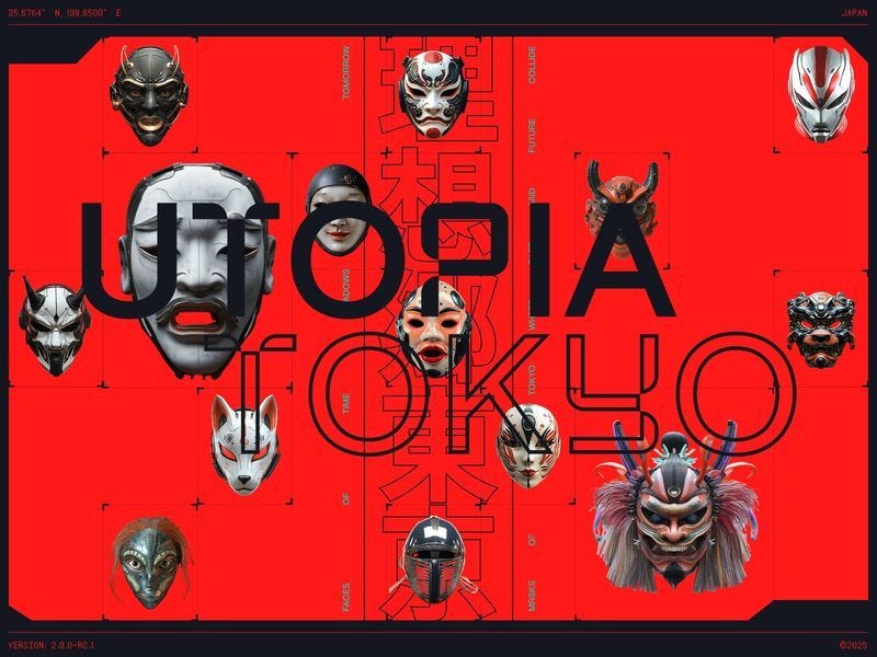


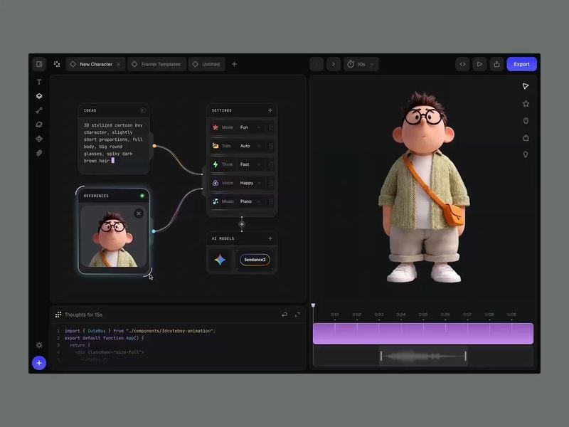


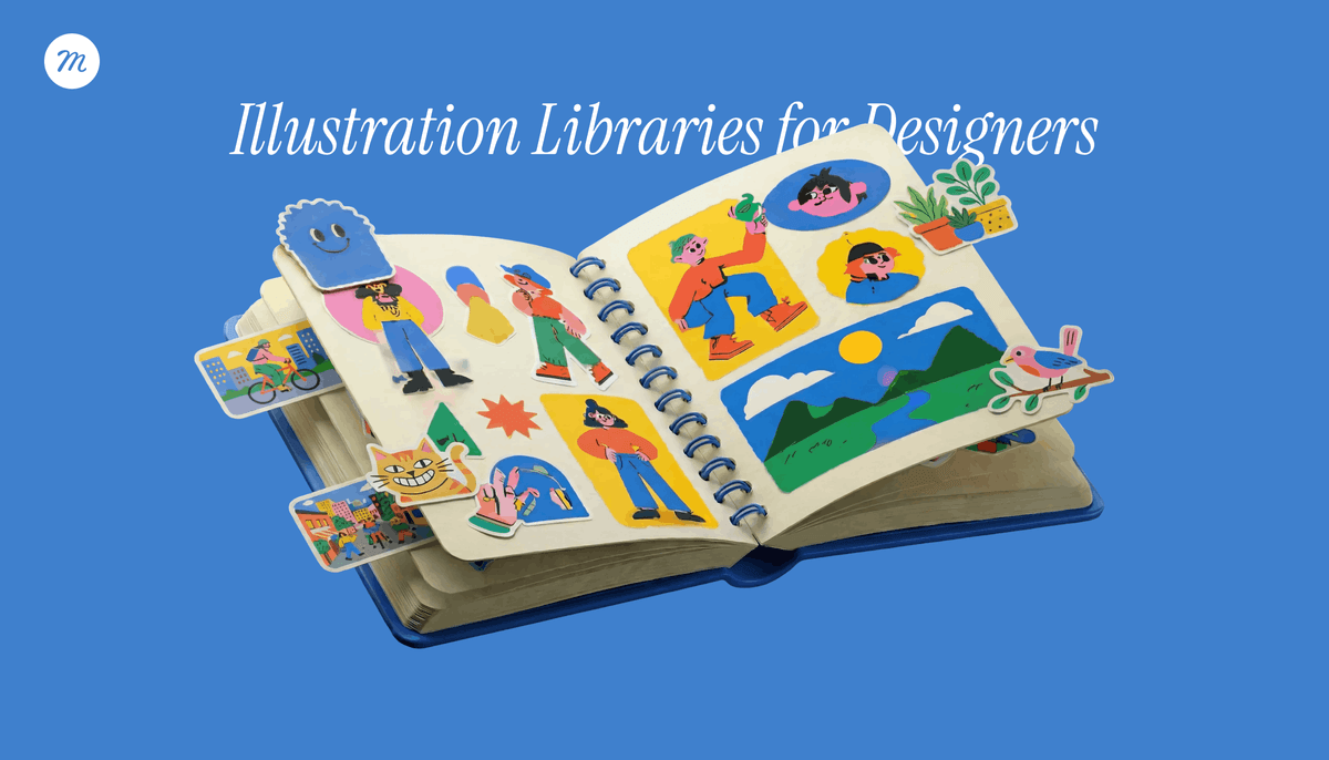
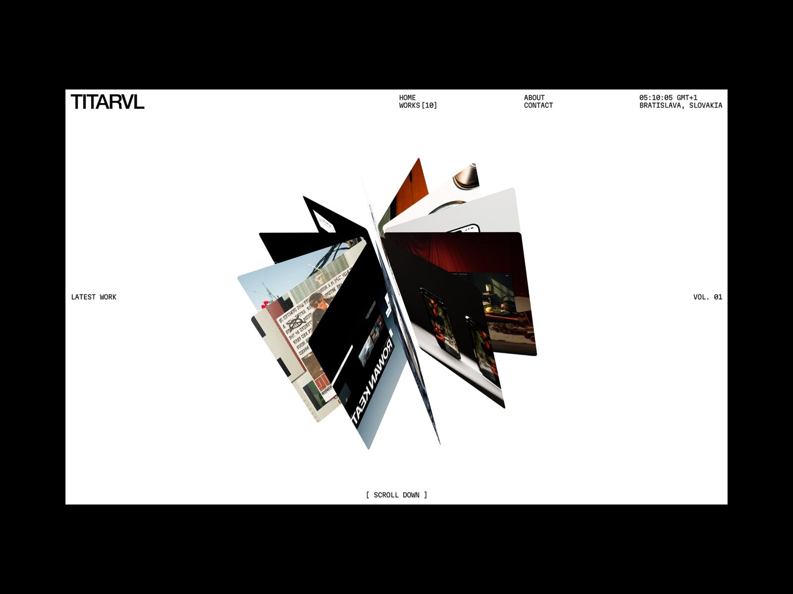


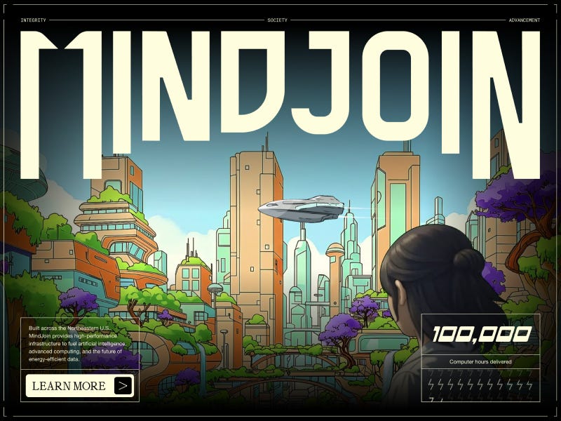
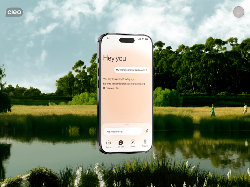
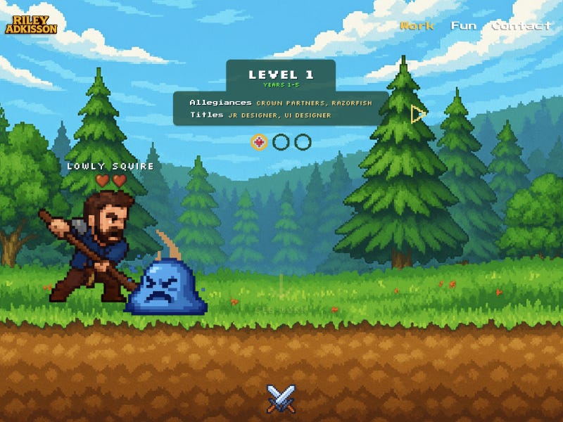


")


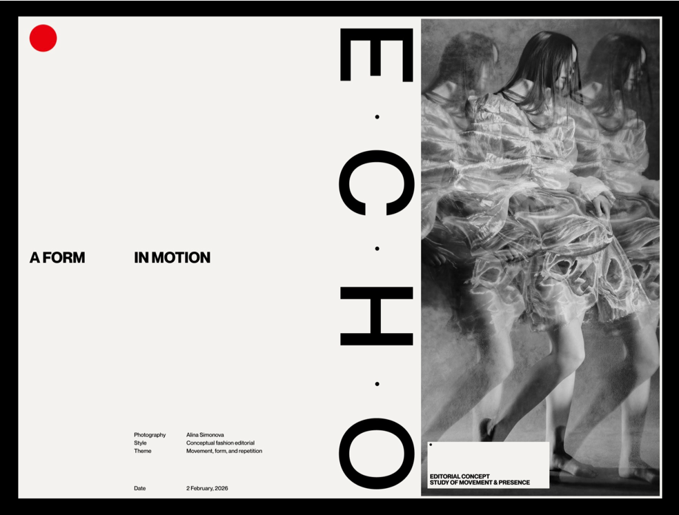
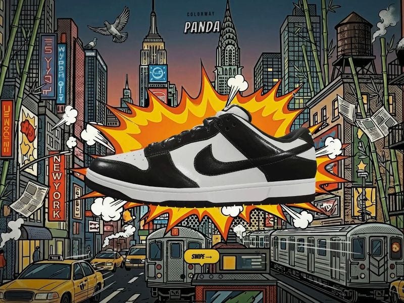


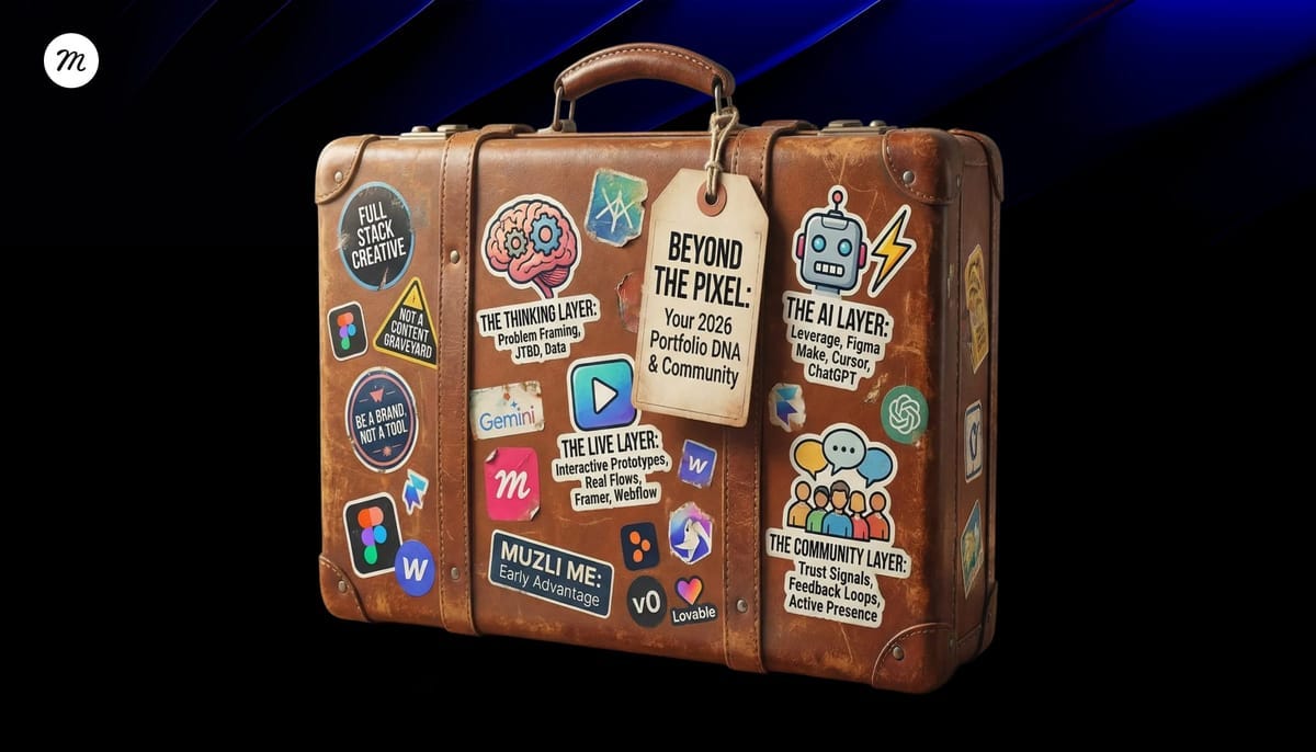


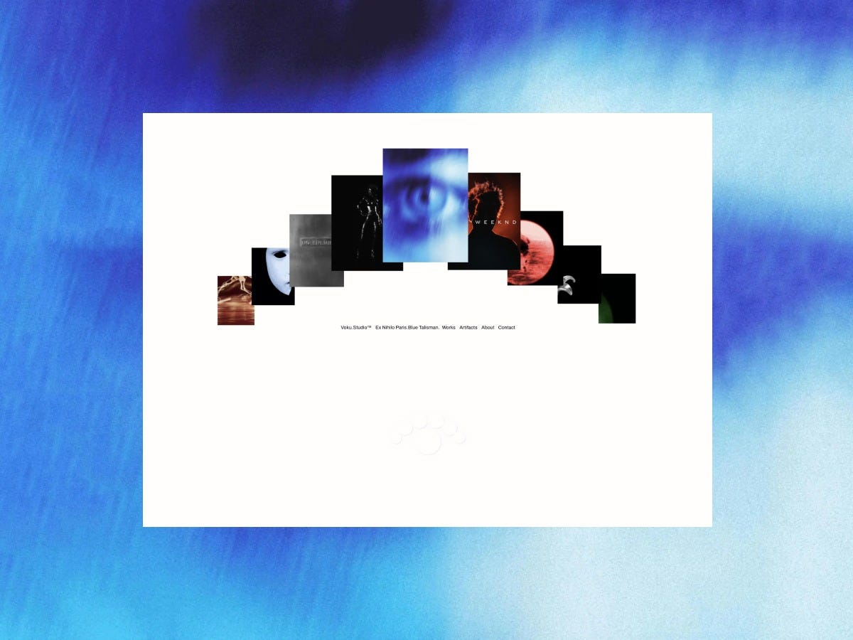
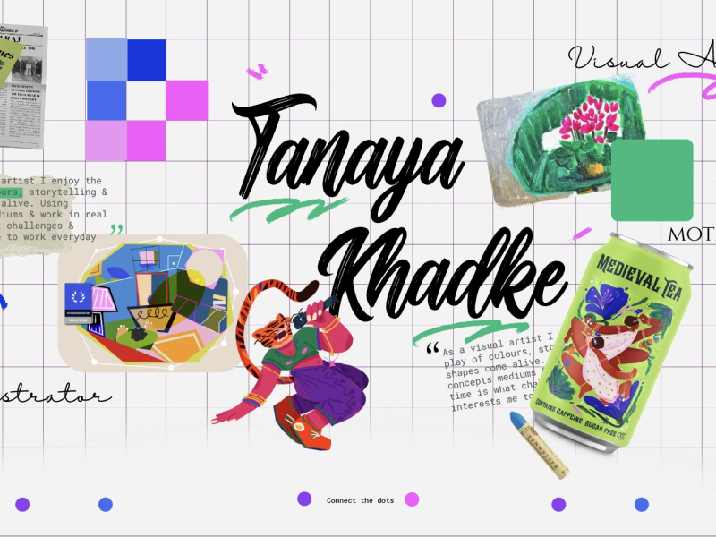
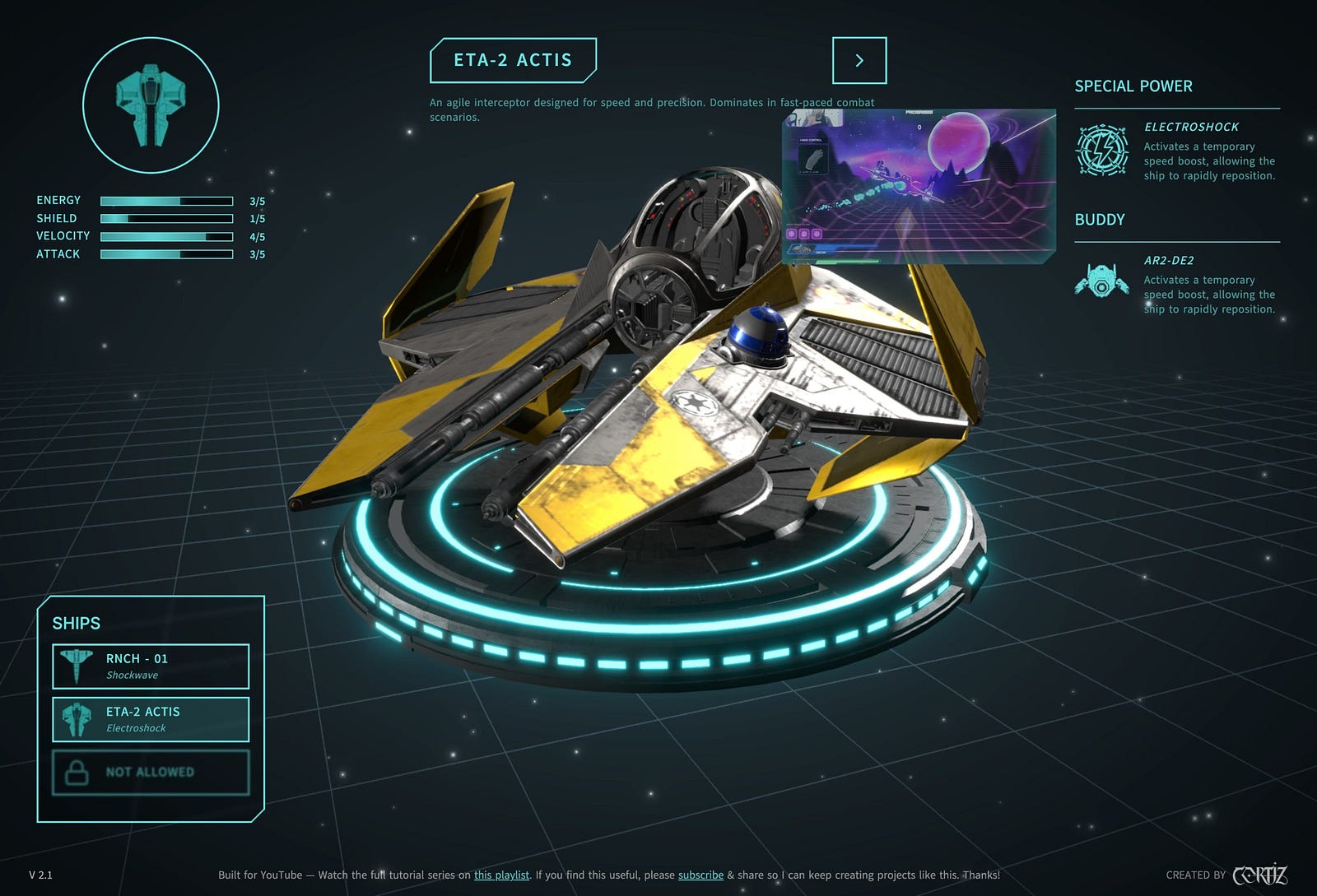


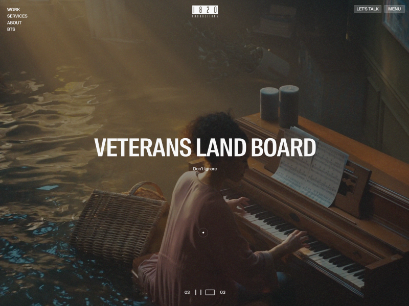

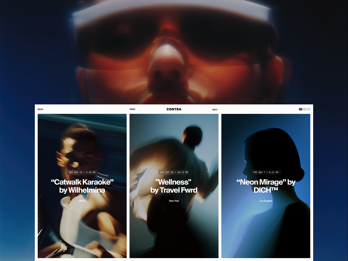


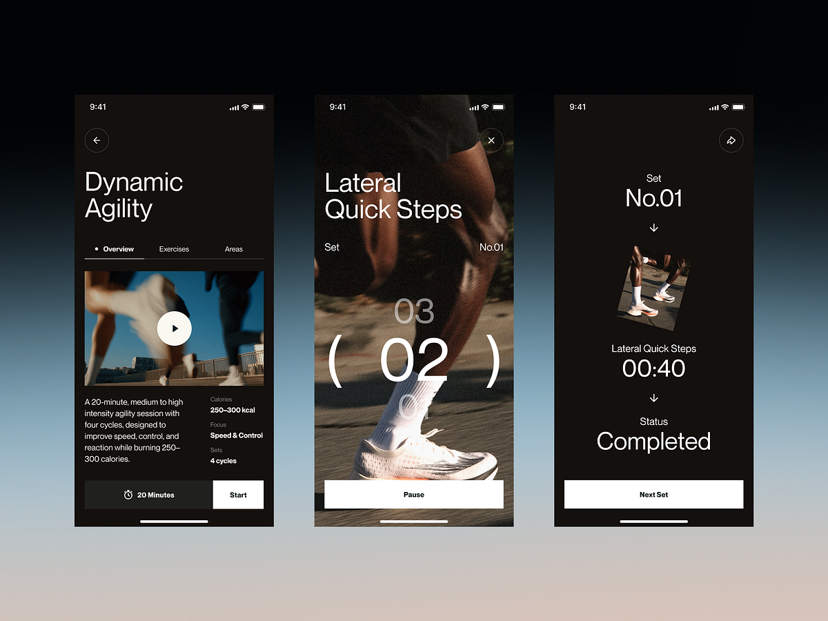
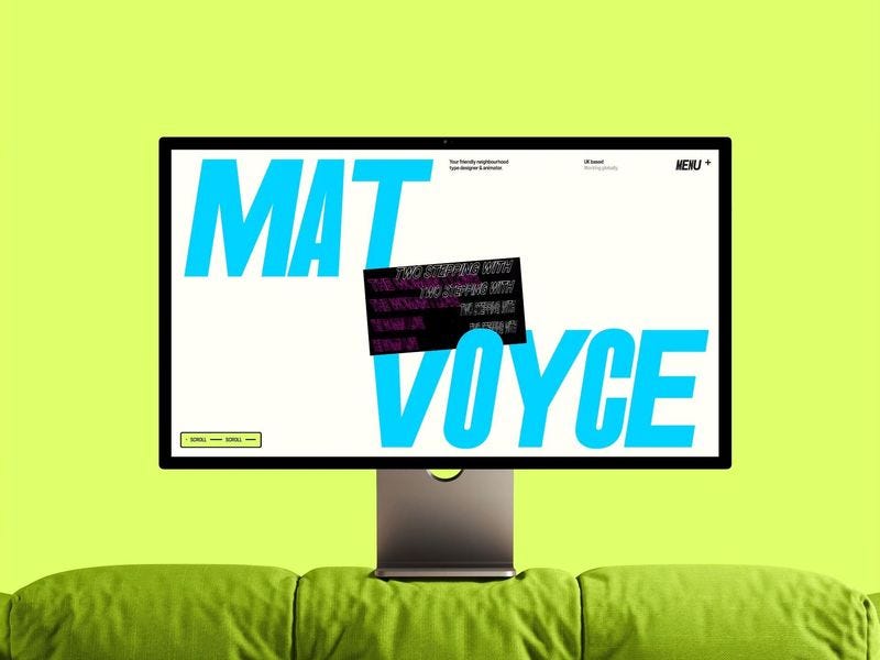


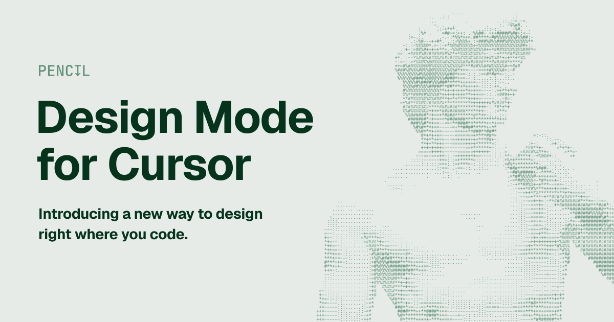
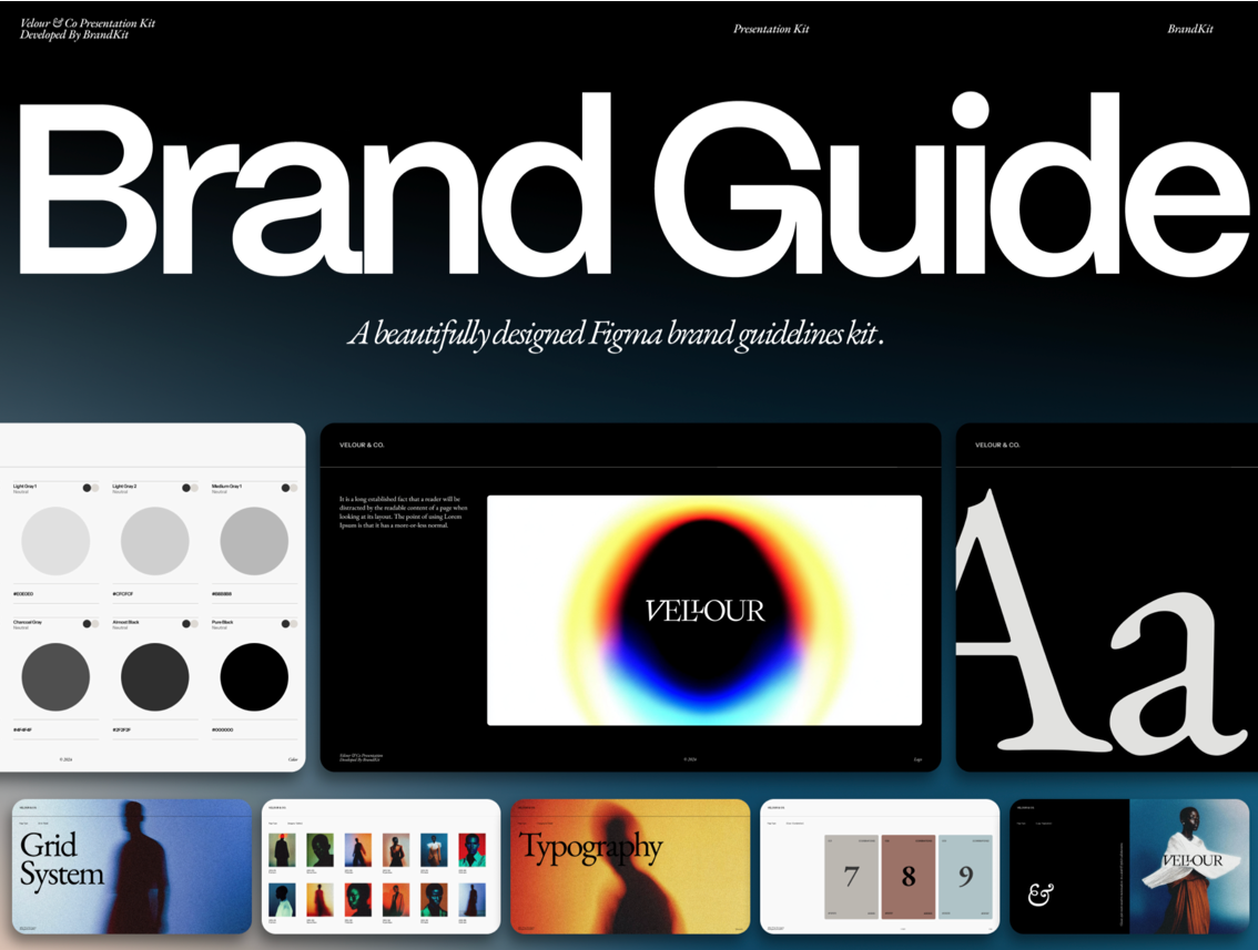


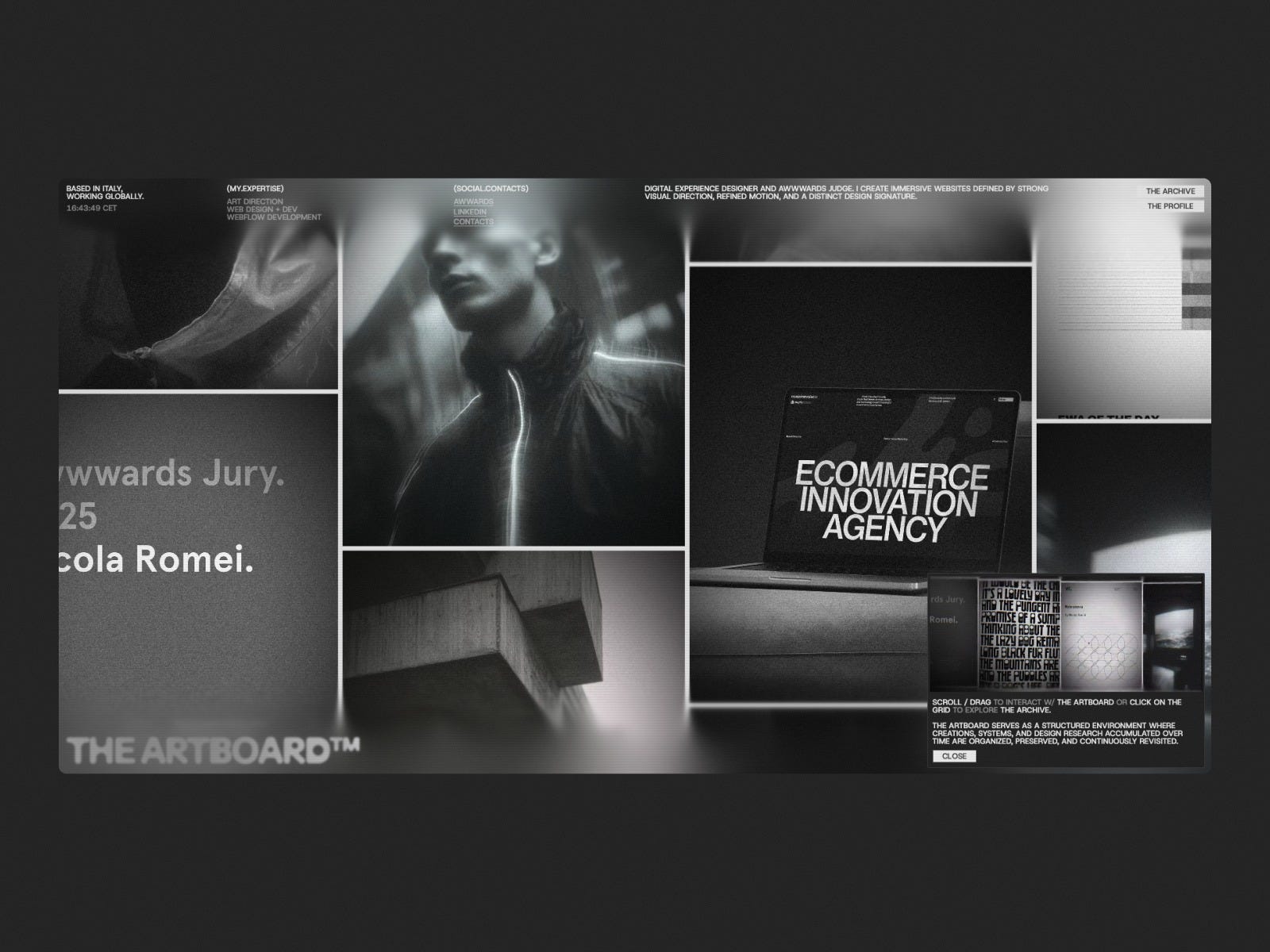


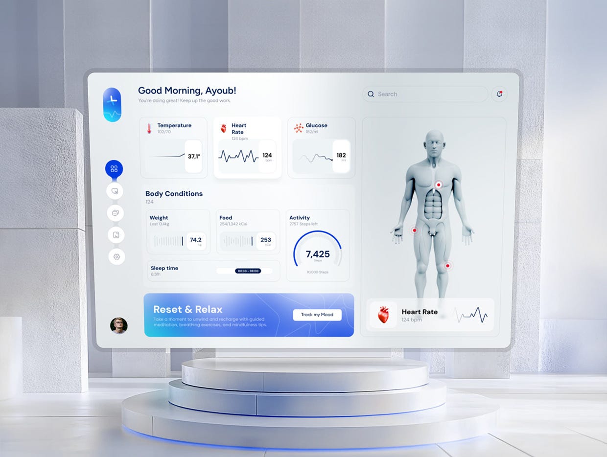


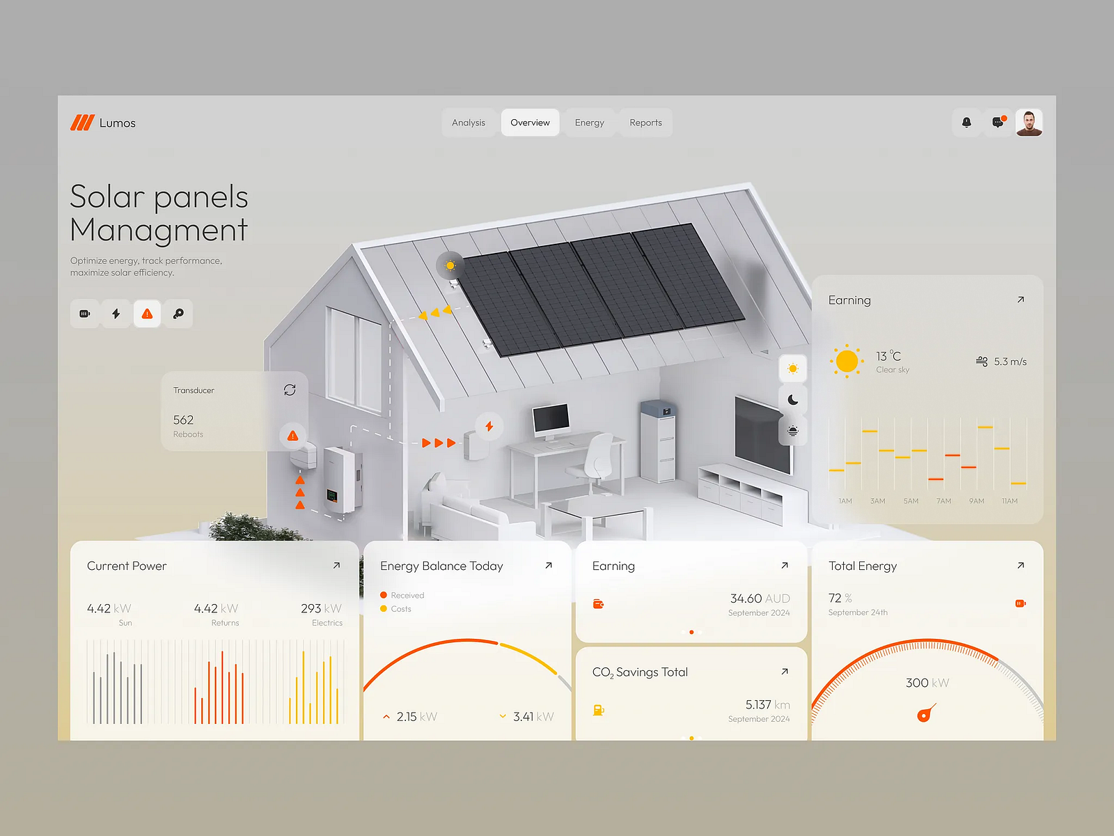


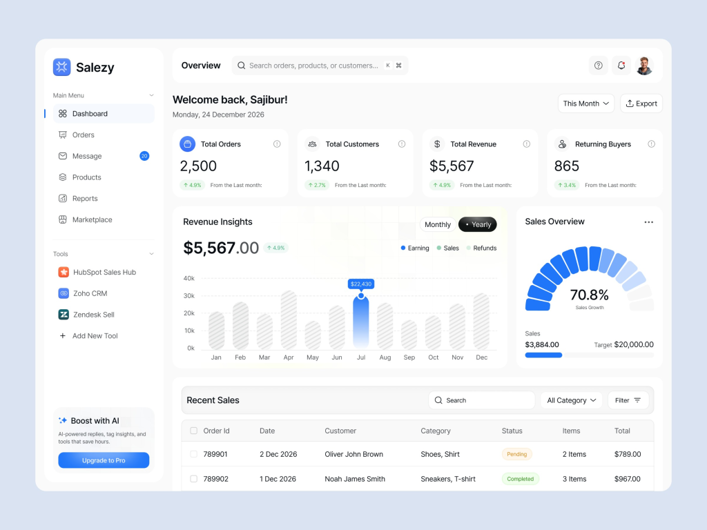
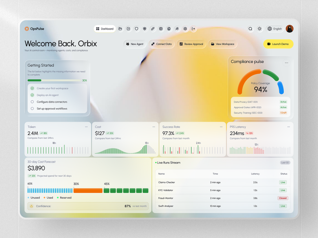
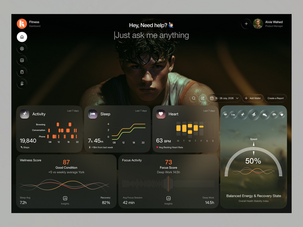
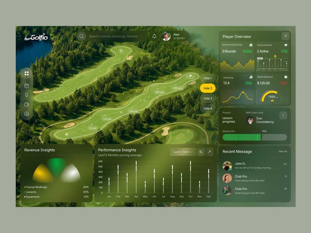
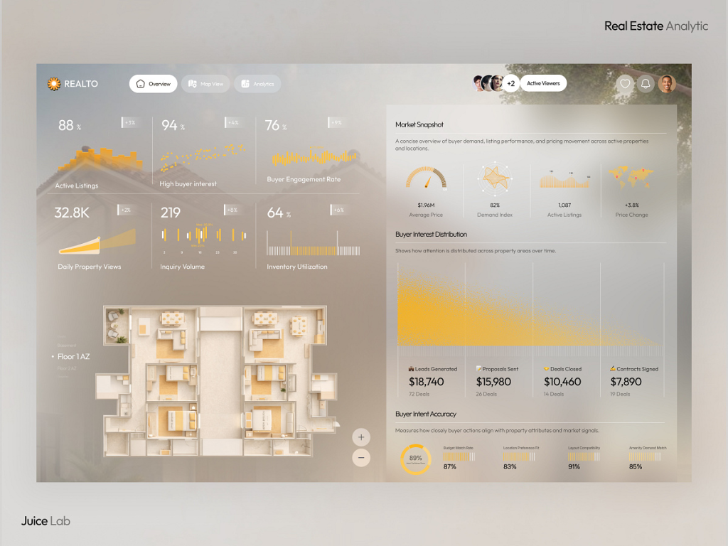
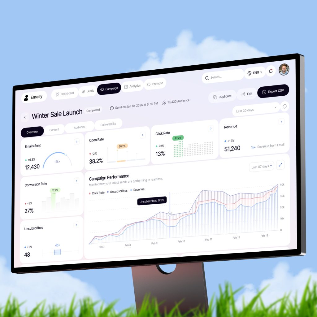
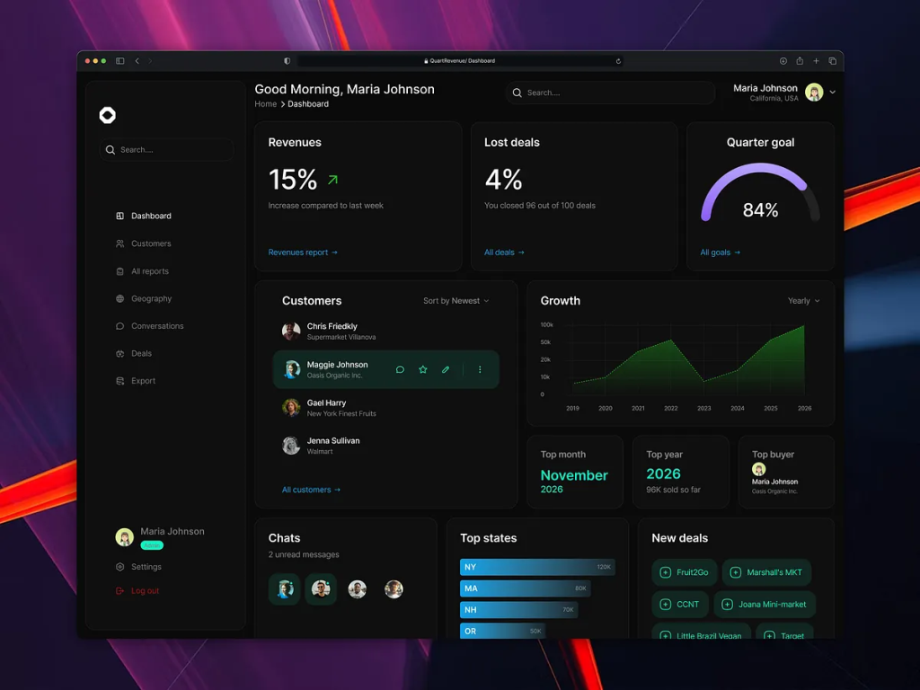
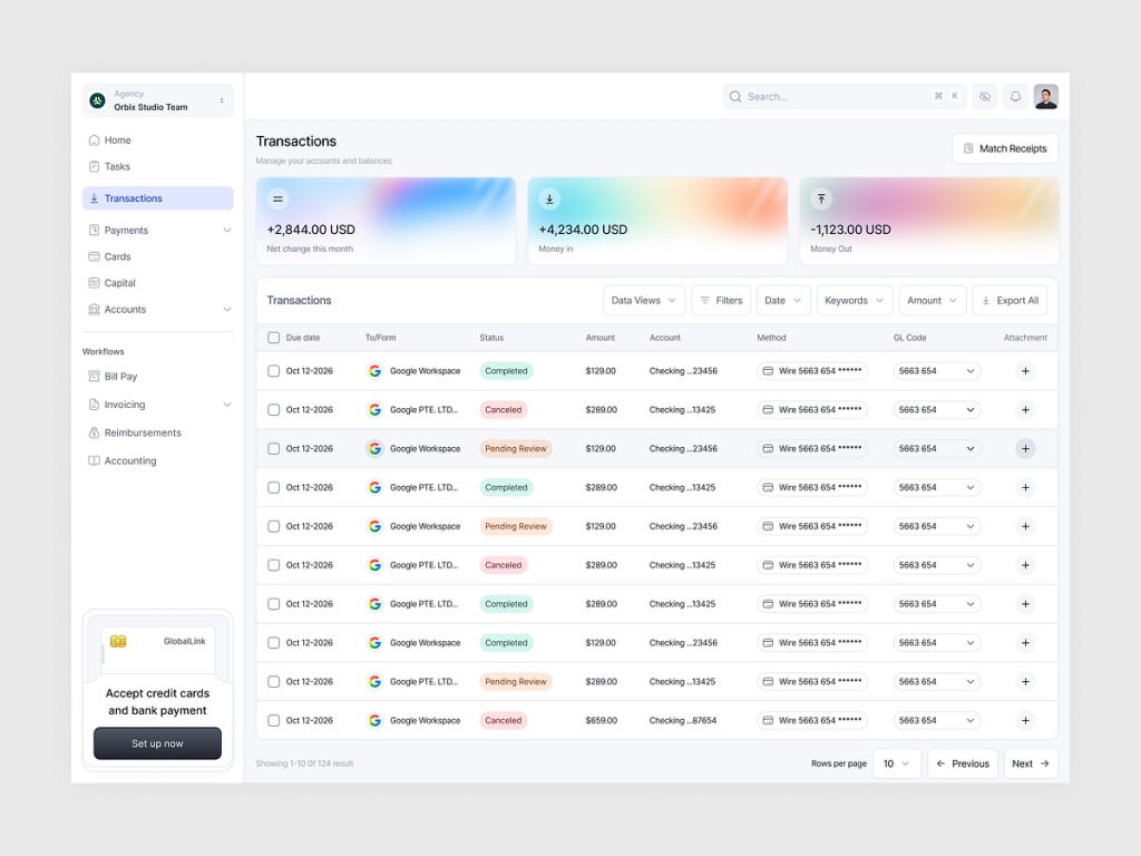
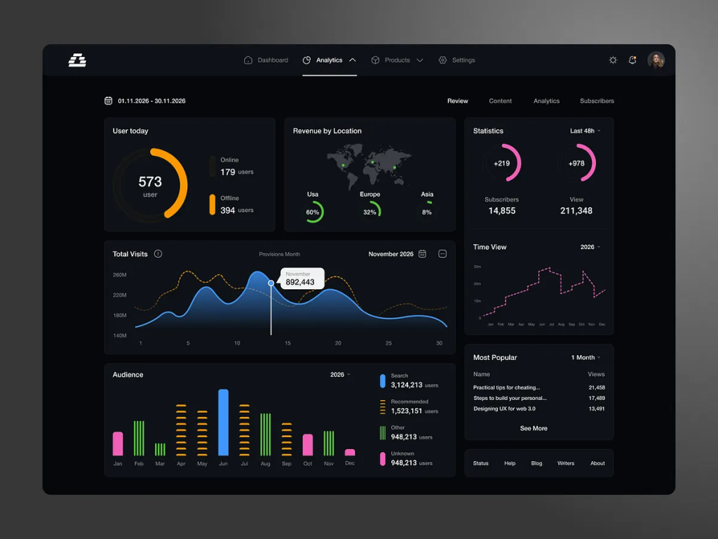
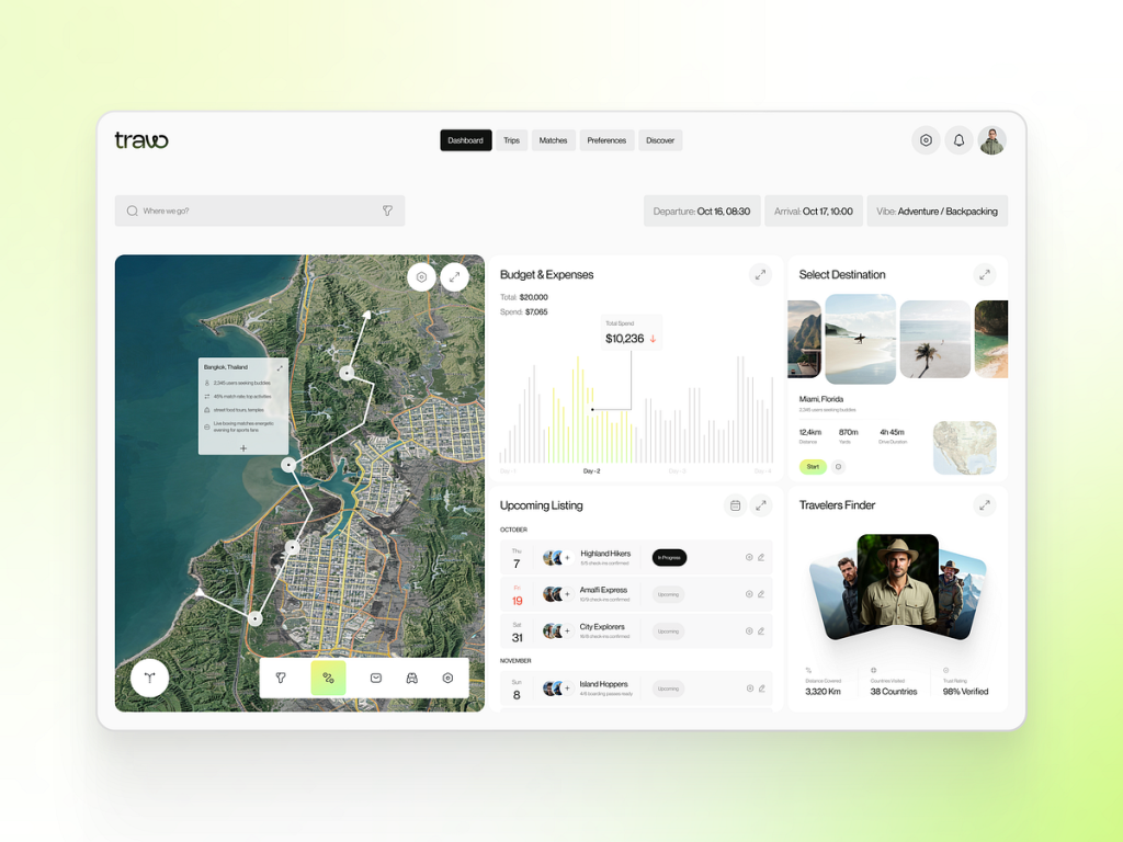
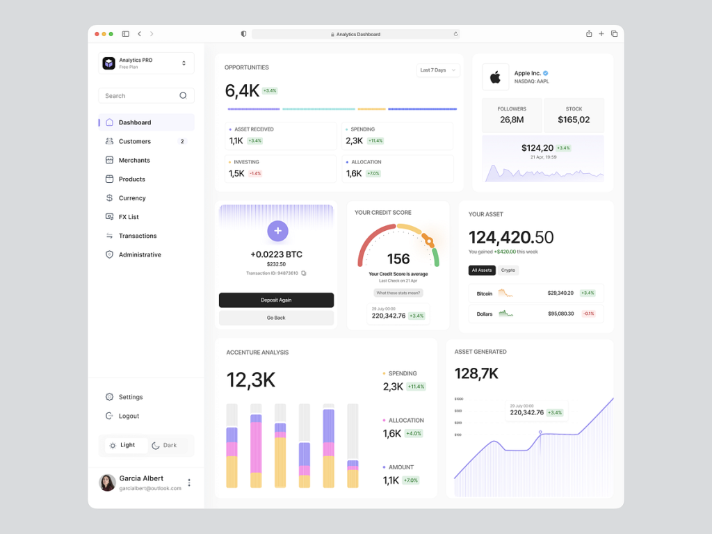
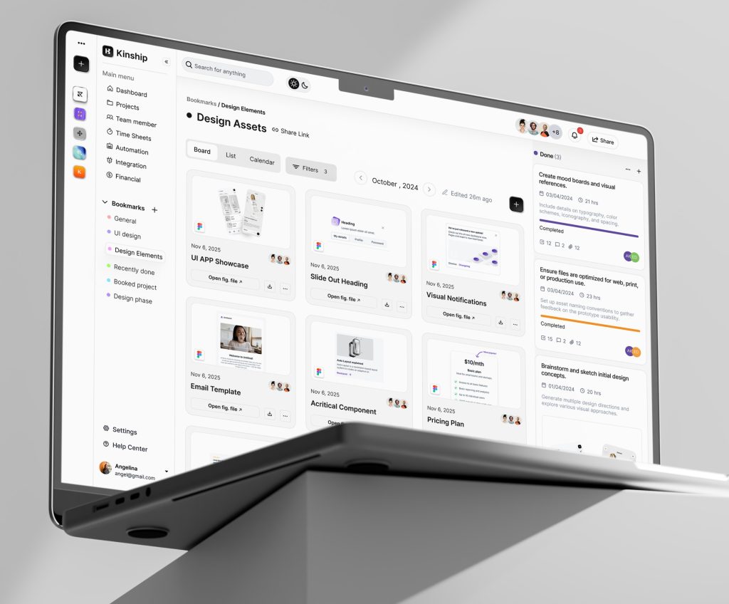
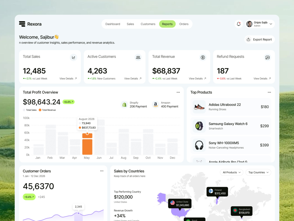
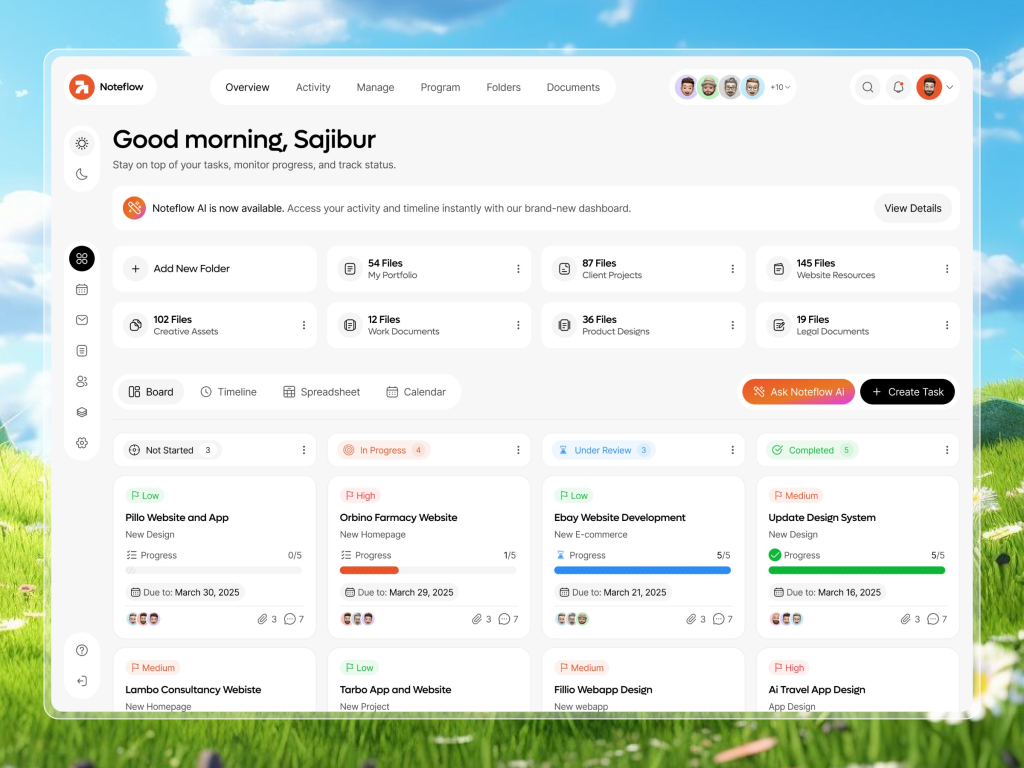
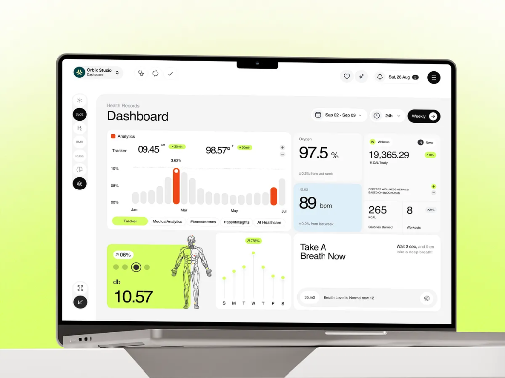
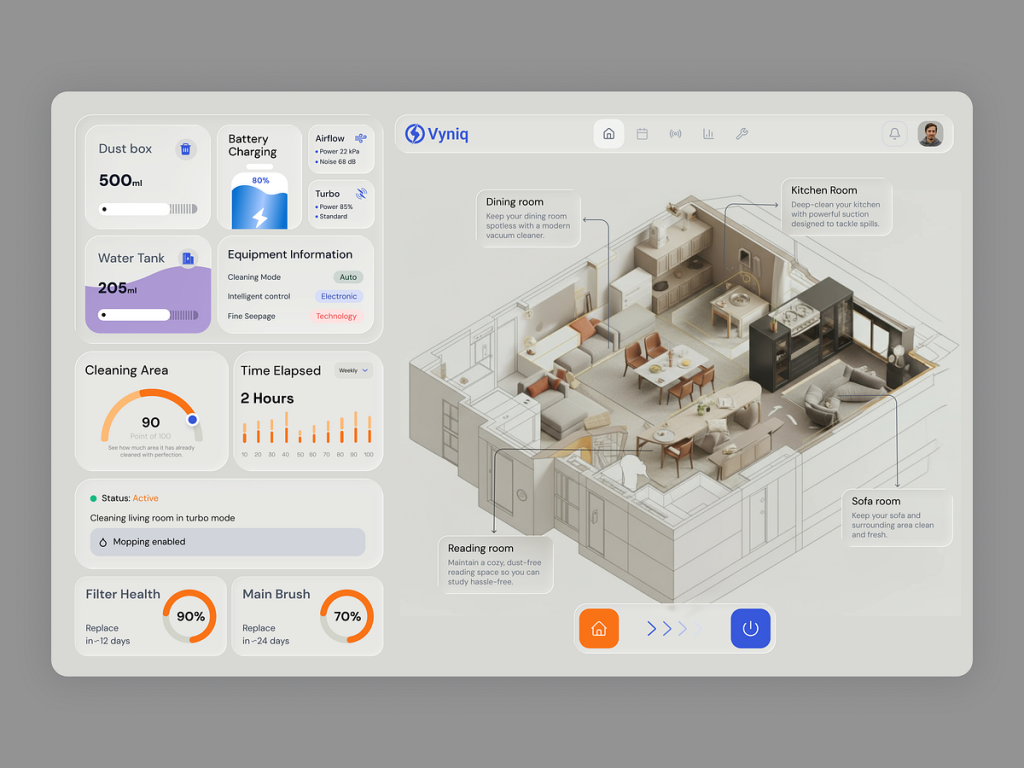
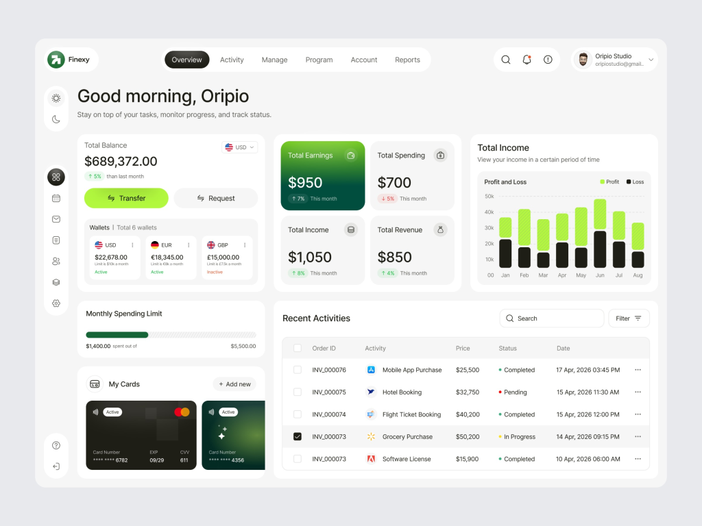
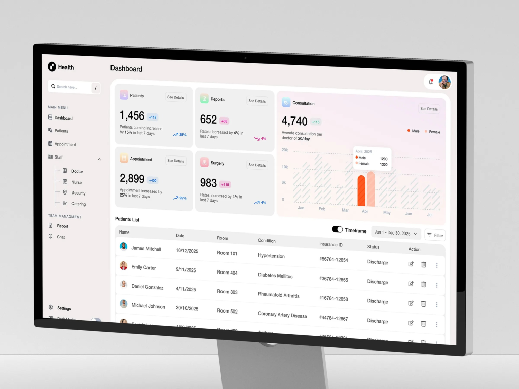
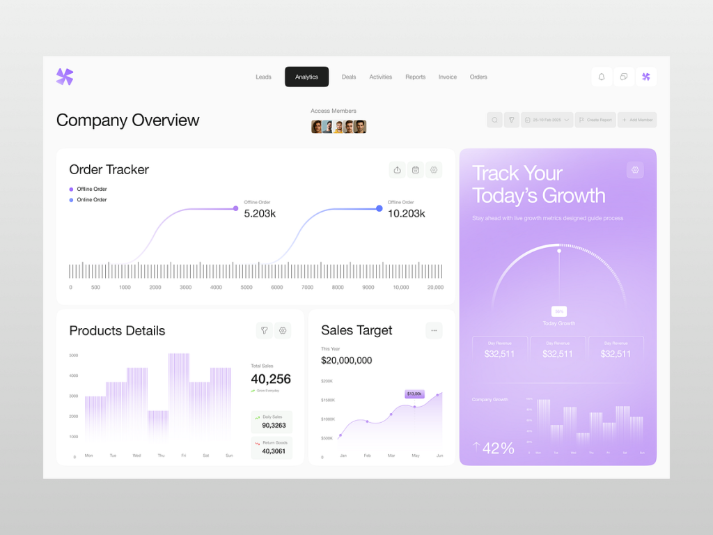
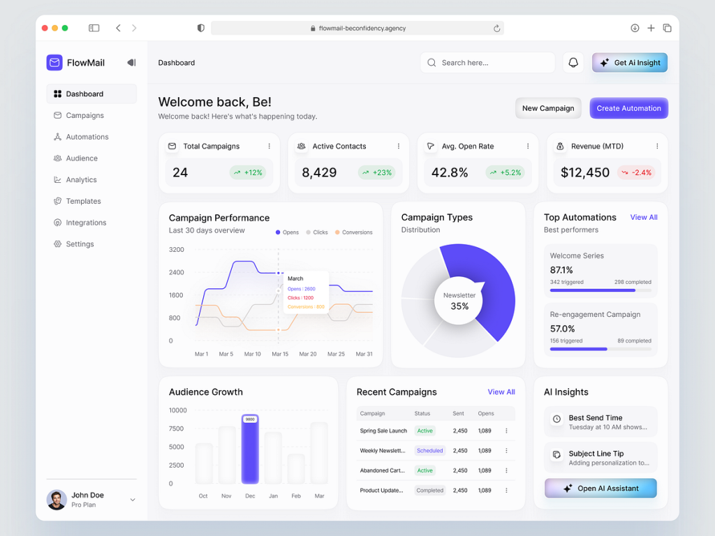
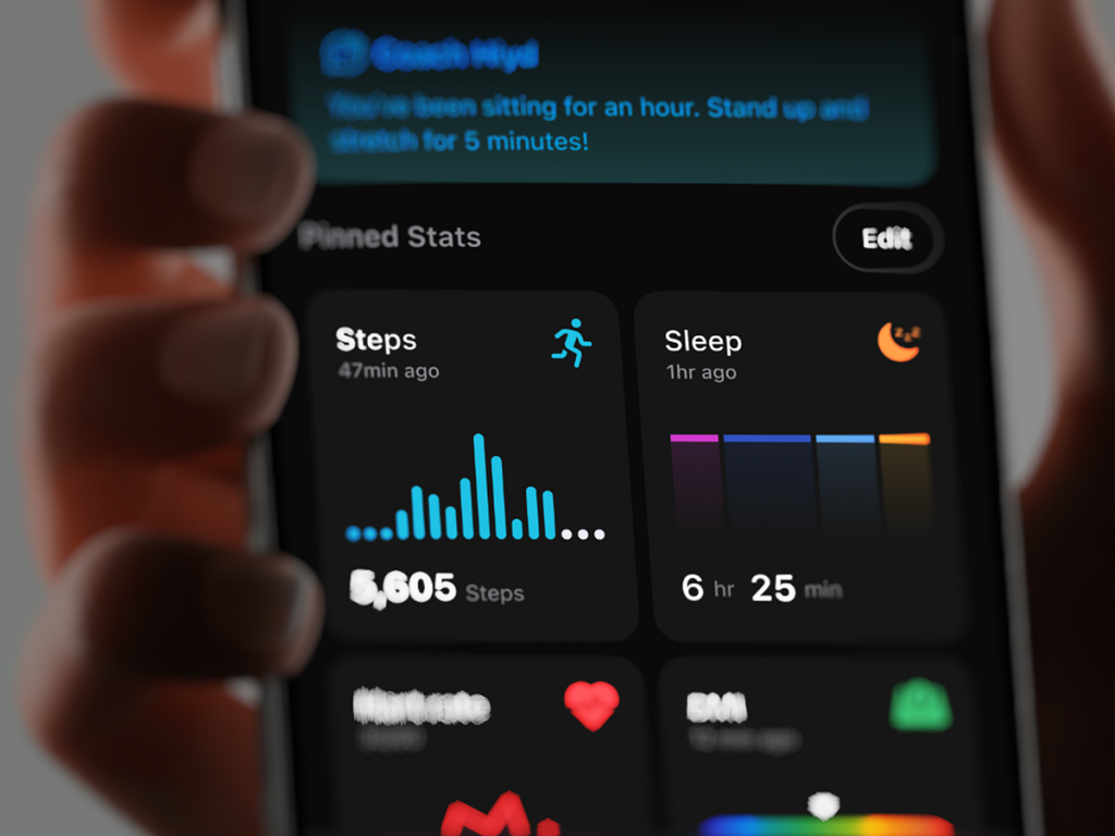
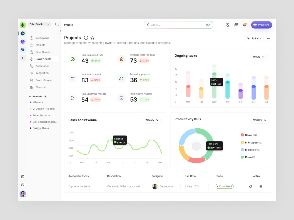
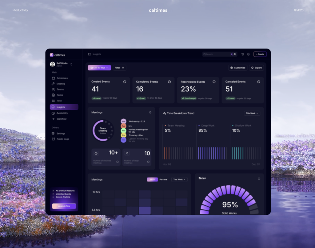
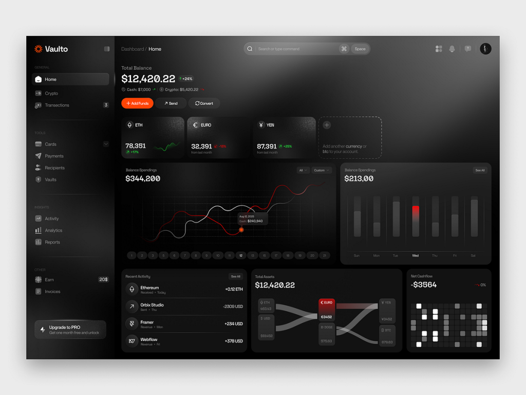


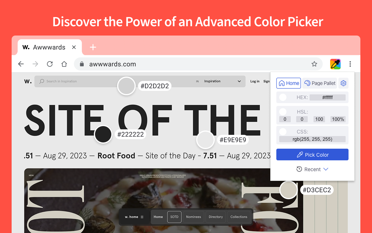
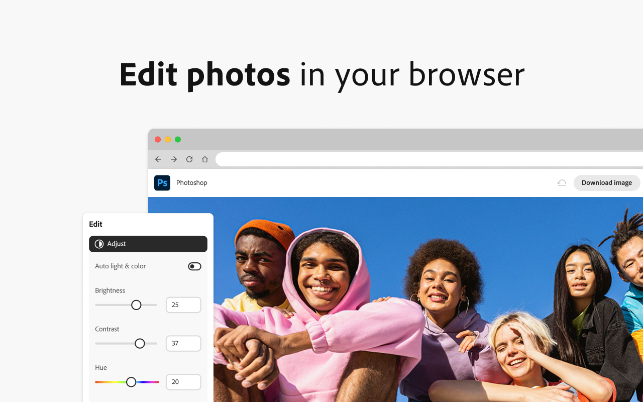

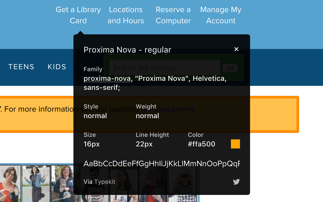

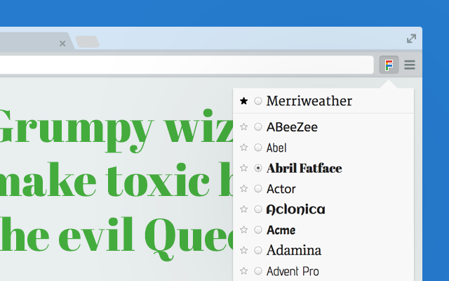
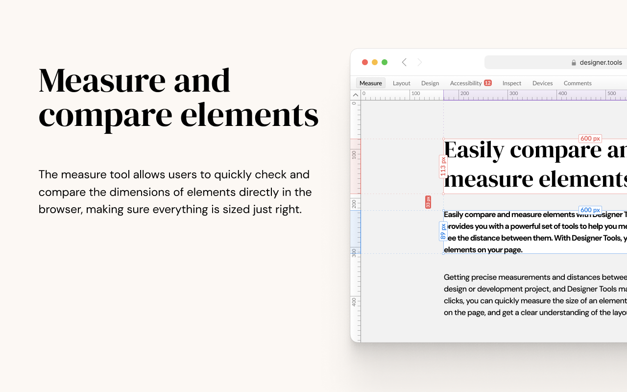


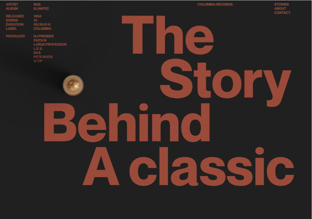


")