Apple finally folded. Designers got the homework | Apple Event 2026

TL;DR

  • đŸ“± The foldable is real. iPhone Duo, 7.6 inches open, $1,999, ships October 23. The crease is still there. Apple never actually said it wouldn’t be.
  • 📾 iPhone 18 Pro got a real aperture. ƒ/1.48 to ƒ/4 on six laser-cut blades, plus manual shutter speed. Actual optics, not a blur slider.
  • 🔒 Photos can now prove they’re photos. Apple Reference Image signs the sensor data. Apple skipped the industry standard to build it.
  • đŸȘŸ Liquid Glass got rebuilt. Users now control transparency themselves, which means your UI has to survive a range instead of a look.
  • 📐 Your layouts need work. Two size classes, three reserved regions, and “poses” instead of orientations. The dock went vertical.
  • đŸ—“ïž iOS 27 shipped September 14. No regular iPhone 18 until spring 2027. First keynote under CEO John Ternus.

Apple’s September keynote is usually a spec sheet with a soundtrack. A number goes up. Someone says “our most advanced ever.” The stock moves two percent.

This one was different.

On September 9, John Ternus walked out at Apple Park as CEO, eight days into the job, and folded an iPhone in half on stage.

Predictably, the internet spent the next 24 hours arguing about a crease.

Fine. But the crease is the least interesting thing that happened. The parts that actually land on your desk happened around the edges: a rebuilt Liquid Glass, a cryptographic receipt for photographs, and a set of layout rules that quietly break a habit iOS has had since 2007.

Here’s all of it, and what it costs you.
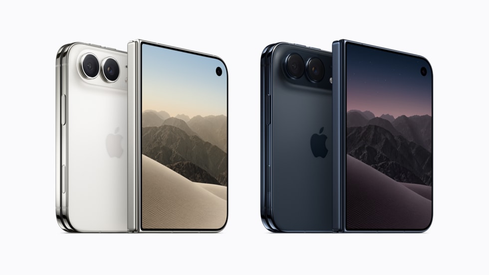
iPhone Duo in Star White and Night Sky
iPhone Duo in Star White and Night Sky. Image: Apple

Everything Apple announced

đŸ“± iPhone Duo

$1,999 / 256GB · Pre-order Oct 16 · Ships Oct 23

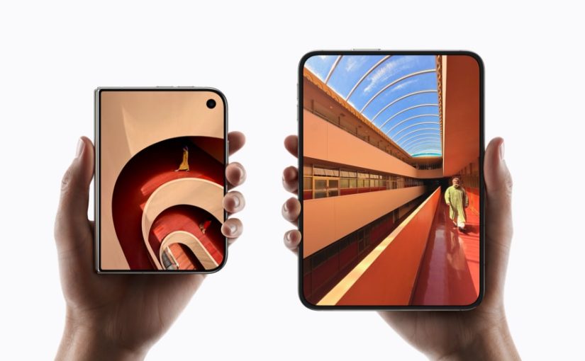
The foldable. 5.4 inches closed, 7.6 open, both displays Super Retina XDR at 3000 nits with ProMotion and always-on.

Grade 5 titanium, mirror-polished, with a 3D-printed hinge cover and a hinge made of more than 100 components. The inner screen gets a nano-texture finish.

Face ID didn’t fit, so Touch ID moved into the side button and the FaceTime camera hides under the inner display. A20 Pro chip, dual 48MP Fusion cameras, 4K120 in Dolby Vision.

Two colors: Star White and Night Sky. Ships in 70-plus countries running iOS 27.1 out of the box.

📾 iPhone 18 Pro and Pro Max

$1,199 / $1,299 · Pre-order Sep 12 · Ships Sep 18

The A20 Pro is the first 2nm chip in a phone. Nice, but not the story.

The story is the camera. A real variable aperture on the main lens, six laser-cut blades moving between ƒ/1.48, ƒ/1.8 and ƒ/4. Manual shutter speed control. Texture and grain sliders in Photographic Styles.

That’s a physical iris in a phone. Depth of field you commit to at capture instead of faking afterward.

Dynamic Island shrank and now holds three live activities. Battery goes to 36 and 45 hours of video. Four finishes: black, silver, glacier, burgundy.

Oh, and there’s no regular iPhone 18 this fall. That one slips to spring 2027. If you wanted a normal iPhone, your options are last year’s or $1,199.

⌚ Apple Watch Series 12 and Ultra 4

$399 / $799 · Ceramic from $899 · Ships Sep 18

New Health Sensing System, S11 chip, a Readiness app, and Audio Intelligence features including Live Rewind, which keeps the last 15 seconds of a conversation. Make of that what you will.

The material news is genuinely better. Ceramic is back after seven years, in pearl white and night blue. Aluminum cases move to Ceramic Shield 2. New Sport Loops use inkjet printing for plaid patterns, and HermĂšs brought a Rocabar Club band with a three-dimensional H.

🎧 AirPods 5

$129 · $149 with wireless charging

ANC is now in the $129 base model and removes up to 50 percent more noise than AirPods 4. The $149 version adds a wireless charging case, stem volume controls and an extra hour.

The cheapest thing announced is also the best value by a mile. Funny how that works.

đŸ’» iOS 27 and the rest

iPadOS 27 · macOS Golden Gate · watchOS 27 · tvOS 27 · visionOS 27 · Sep 14

All shipped September 14.

Also: Siri’s AI features now have a daily usage cap, with expanded access sold separately. Nobody clapped for that one.
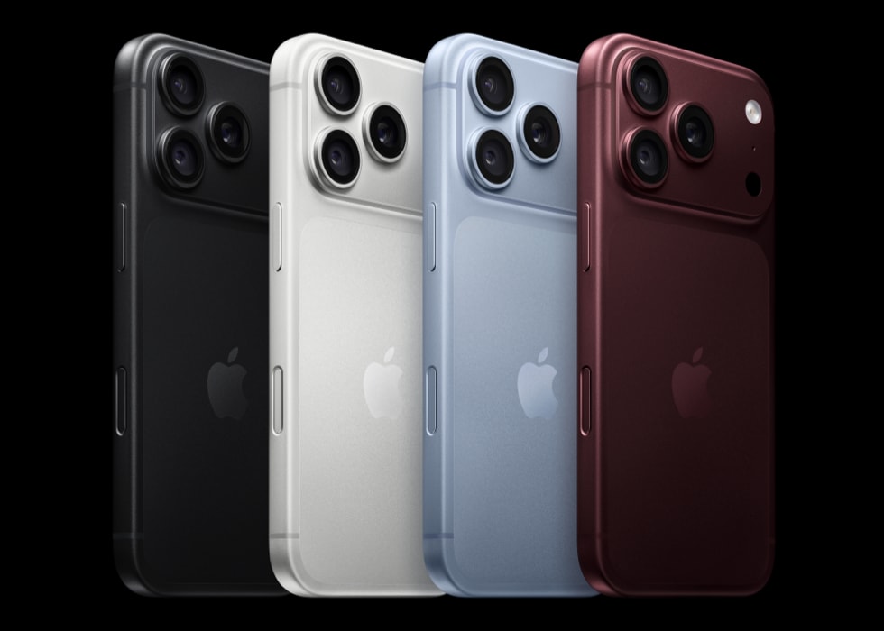
iPhone 18 Pro in black, silver, glacier and burgundy
iPhone 18 Pro, four finishes. Image: Apple

About that crease

Apple’s engineering answer is genuinely clever, and it’s basically expensive bookbinding.

Optically clear adhesives let the display layers slide against each other as the screen folds, so the stack isn’t fighting itself at the bend. Apple’s own words are that the layers glide “like pages in a book.” On top sits a nano-texture finish, a matte surface that scatters the reflection you’d otherwise use to spot the fold.

Clever. Now read the copy again.

Apple says the construction “minimizes stress and crease.” Minimizes. Not eliminates. That is not sloppy marketing, that is a legal team doing its job.

Then there’s the number Apple didn’t publish. Samsung rates the Z Fold8 for 500,000 folds. Apple published no fold-cycle rating at all.

When a company that will happily tell you its glass is 3x more scratch resistant suddenly goes quiet on a durability number, the silence is the number.

Hands-on reports landed within hours. 9to5Google found the crease about as visible as on any Android foldable.

That gap between the engineering story and the thing in your hand is the most honest detail of the whole keynote.
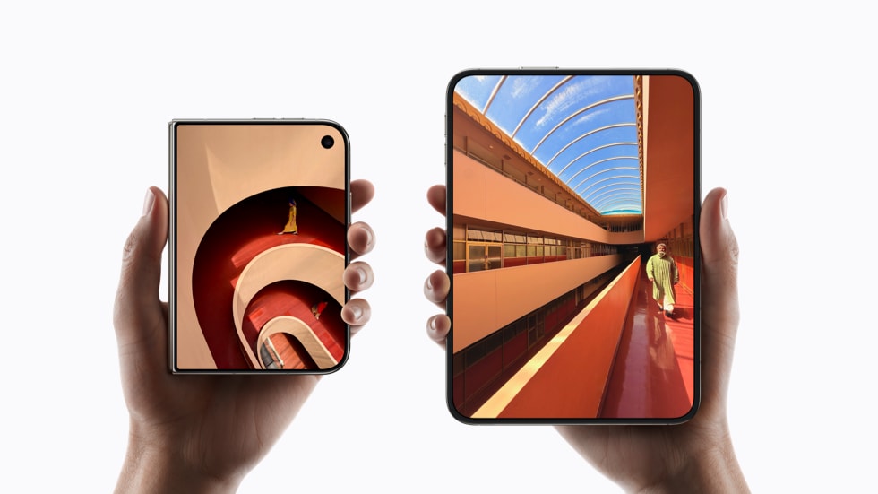
iPhone Duo shown closed and open
5.4 inches closed, 7.6 open. Image: Apple

What designers actually said

The design press was noticeably warmer than the spec-sheet press. There’s a reason.

The Duo is the first foldable that reads as a designed object rather than two phones in a trench coat.

Yanko Design went furthest, arguing it stops being an iPhone without becoming an iPad.

Their best observation is about the asymmetry: two rounded corners on the right, squared geometry at the hinge. Your hand knows which edge to open before your eyes do. They compare it to a small hardcover.

But their sharpest line is about software, not hardware. On the open display, the Dynamic Island rotates sideways along the edge and the dock goes vertical.

As Yanko put it: nobody outside Apple would have been permitted to move that dock.

“New but remarkably familiar, the same size as your passport.”

Molly Anderson, Apple VP of industrial design, to Wallpaper*

That’s better product framing than anything in the actual keynote script.

Now the skepticism, which is just as specific.

Yanko called Touch ID instead of Face ID a real step back on a two thousand dollar phone. Hard to argue.

PetaPixel pointed out the Duo runs the previous-generation main sensor, with no variable aperture and no dedicated telephoto.

Read that again: the most expensive iPhone Apple sells has the worst camera of the three phones announced.

Macworld’s verdict on the event was that it delivered more Shine than Surprise, with one editor summarizing the pricing tiers as: the more you pay, the less fun you get.

PetaPixel did find the one genuinely new creative trick, though. Fold it halfway, stand it on a table, and it’s a tripod that previews your framing on the outer screen while both cameras record.

That isn’t a spec. That’s a shooting posture that didn’t exist last week.

One more piece of context worth having. Alan Dye left for Meta at the end of 2025 after nearly twenty years running design at Apple. Steve Lemay took human interface. Molly Anderson took industrial design.

“Surprise and Shine” is the first launch where both hardware and software carry the new team’s fingerprints end to end. Keep that in mind while you judge it.

Liquid Glass finally grew up

Remember the iOS 26 backlash?

Apple shipped what amounted to a frosted shower door installed in a conference room. Gorgeous in the render. Unreadable in the meeting.

Transparency everywhere, text you had to squint at, and developers annoyed that perfectly working apps suddenly needed a visual pass.

Here’s what I respect: Apple didn’t retreat, it rebuilt.

Shubham Kedia, Apple’s human interface design director, says the material now diffuses complex content behind it far more aggressively while adding depth and separation.

In plain terms: darker outlines around translucent elements, stronger contrast, and backgrounds that actually blur instead of politely tinting.

Three changes hit your work directly.

  • 🎚 There’s a transparency slider now. Users drag Liquid Glass from ultra clear to fully tinted. Which means you’re no longer designing a look. You’re designing a range, and your contrast has to hold at both ends of it.
  • đŸ–Œ App icons changed. Liquid Glass layers are composited into the artwork itself with a new rendering path, so icons come out sharper. Icon Composer is how you build them.
  • 📏 macOS Golden Gate corrects inconsistent corner radii across every app, including third-party ones, with zero developer work.

That last one deserves a second read. Apple is now quietly fixing everyone’s corner radii for them. Whether they asked or not.

Honestly? Half of you needed it.

A photo that can prove it’s a photo

This is the feature I keep thinking about, and almost nobody led with it.

Apple Reference Image on the 18 Pro is, functionally, a birth certificate for a photograph.

The camera captures signed sensor data. Private Cloud Compute develops that into a reference version you can’t alter, which Apple describes as something close to a digital negative. Any edited copy gets checked against it.

Retouched? Generated? The comparison shows it.

Here’s the spicy part. Nikon, Canon and Google all back C2PA Content Credentials, a metadata standard that travels alongside a file.

Apple looked at an open industry standard backed by half the camera business and said no thanks.

And annoyingly, Apple has a point. Metadata is a sticker on the box. It can’t catch an AI edit made to a genuinely credentialed photo. Apple anchored the pixels instead of labeling the file.

Nieman Lab covered it as a newsroom tool, which is exactly the right frame.

If your work is photographic, this is the first mainstream attempt at proving provenance that doesn’t depend on a label nobody checks.
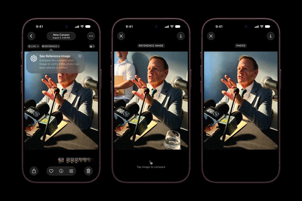
Apple Reference Image in the Photos app
Comparing an edit against its reference image. Image: Apple

Now the homework

Good news first. Apple already updated Design Resources with iPhone Duo and iPhone 18 Pro bezels. Open and closed, both colors, Photoshop and PNG.

Grab them before your PM asks for “just a quick mockup.”

Now the layout rules, which are stricter than they look. The short version lives in the HIG layout guidance. The long version is the Prepare your app for iPhone Duo tech talk.

  • 📐 Design against two size classes, not two screens. Outer display is compact width. Inner is regular width. Apple is blunt about this: avoid fixed widths, breakpoints, or any metric tied to a specific screen. The inner canvas is roughly 80 percent bigger than an iPhone 18 Pro, which is enough for split views, two-column reflows, and tab bars that become sidebars.
  • 🚧 Learn the reserved regions. There are three. The fold itself, which Apple calls a division region and which has zero width when the device is flat. Plus the inner and outer cameras, which only activate when the camera is in use. Think of them as support columns in an open-plan office. You can’t move them, so you plan around them. Sheets, alerts, menus and popovers dodge them automatically. Anything you lay out by hand does not.
  • 🔱 Keep an even number of columns whenever a division region exists, active or not. Memorize that one, it’s the rule people will get wrong.
  • đŸ€ž Think in poses, not orientations. Book pose is half-open and vertical, so alerts and menus shift to the trailing side where the thumb is. Table pose is propped, so glanceable content goes up top and touch controls go to the bottom. Scrolling content is exempt, because scrolling already solved this problem.
  • 🧰 Go look at your toolbar. On the open display, icon-only items rotate to a vertical bar at the edge while text items stay horizontal. If yours mixes icons and labels, it’s about to look broken. I’ll wait.
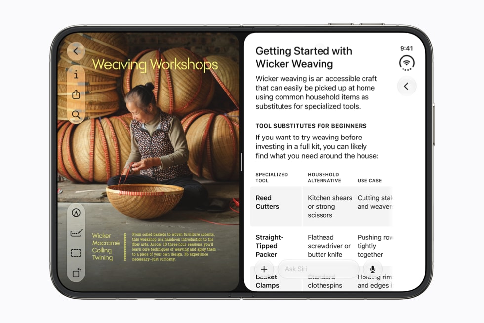
iPhone Duo running two apps side by side
Split View on the inner display. Image: Apple

Worth bookmarking

Everything below is first-party and free. If you only open two, make it Design Resources for the bezels and the Duo tech talk for the layout rules.

📩 Assets to download

  • Apple Design Resources. Device bezels, Sketch and Photoshop libraries, now including iPhone Duo open and closed in both colors.
  • SF Symbols. The icon set, the Mac app, and the variable-weight rules that keep icons matching your type.
  • San Francisco and New York. Apple’s system faces, licensed for interface mockups.
  • Apple Newsroom. Where the photography in this piece came from. High-res press images, free to use editorially.

📖 Guidelines to reread

  • Human Interface Guidelines. The whole thing, updated for iOS 27 and the Duo.
  • Layout. Size classes, safe areas, and the reserved regions the fold introduces.
  • Materials. How Liquid Glass is meant to behave over content, and when not to use it.
  • Toolbars. Read this before your mixed icon and label toolbar meets the vertical bar.
  • Multitasking. Split View and the poses, which now matter on a phone.
  • Accessibility. The contrast section is the one that survived the Liquid Glass backlash.

🛠 Shipping for iOS 27

  • Prepare your app for iPhone Duo. The tech talk with the actual adaptation rules: reflow, displacement, and what never moves.
  • Adopting Liquid Glass. What changed under the material this year, written for people shipping against it.
  • Icon Composer. Builds the layered icons the new rendering path expects.
  • GeometryProxy. Where the reserved-regions API lives if you’re laying out around the fold by hand.

🔍 On provenance

  • C2PA Content Credentials. The standard Apple declined to adopt. Understand it before you pick a side.
  • Designing for iOS. The platform overview, useful as a sanity check when a foldable tempts you into iPad patterns.

So, was it good?

The Duo isn’t the crease-free miracle the supply-chain leaks promised. At $1,999 with the second-best camera in its own lineup, it’s a hard object to defend on a spreadsheet.

But it’s the first foldable where the industrial design has an argument instead of an excuse. And the software concessions Apple made for it are more radical than the hinge.

The rest of the event was a good year, not a strange one. Better cameras. Better watches. Cheaper noise cancellation. Liquid Glass you can finally read.

Apple Reference Image might matter more in five years than the foldable does.

But here’s the thing I’d actually watch: Apple moved the dock. Vertical, after nineteen years, for a device most people will never buy.

That’s not a hardware decision. That’s a company telling you which conventions are still negotiable.

So don’t wait for October. Open Design Resources, drop the Duo bezels into your busiest screen, and see what breaks.

The reserved regions will find your bugs whether you look now or not. Better they find them before your users do.


Sources: Apple Newsroom, MacRumors, Macworld, Yanko Design, Wallpaper*, PetaPixel, 9to5Google, Cult of Mac, Nieman Lab. Product images: Apple.
The Best Creative Websites of the Month (April 2026)

Based on what designers actually clicked on Muzli Picks

Every day, thousands of designers explore Muzli Picks. Some projects get a quick look, others pull people in and keep them there.

This list is based on real clicks, the websites designers chose to open, explore, and revisit.

If you want your work to appear here, create a profile on Muzli Me, upload your project, and it might get featured on Muzli Picks, reaching thousands of designers.


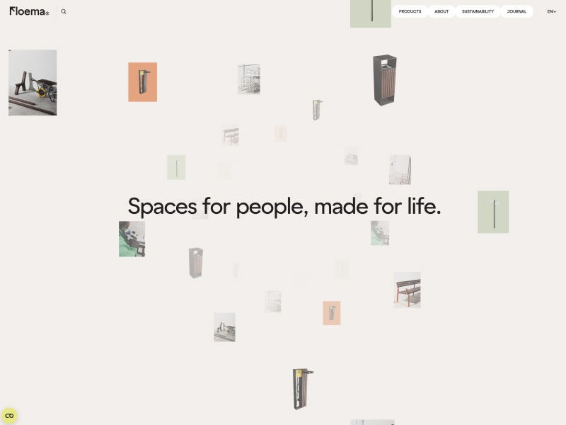
Floema¼ — Spaces for people, made for life.

The Floema website features a refined, minimalist design that seamlessly blends high-quality environmental photography with clean typography and expansive whitespace. Interactive elements and smooth scroll transitions highlight their sustainable urban furniture through a sophisticated, modern editorial lens.

View project

A screenshot of the Floema website homepage featuring a minimalist design with the central slogan ‘Spaces for people, made for life.’ Small, scattered images of outdoor furniture, signage, and manufacturing clips float around the central text against a clean, light-colored background.

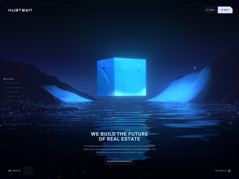
Hubtown

An immersive WebGL experience featuring high-end 3D environments, dynamic data landscapes, and a sophisticated dark aesthetic. The site blends cinematic transitions with interactive mapping to showcase architectural innovation through a sleek, futuristic lens.

View project


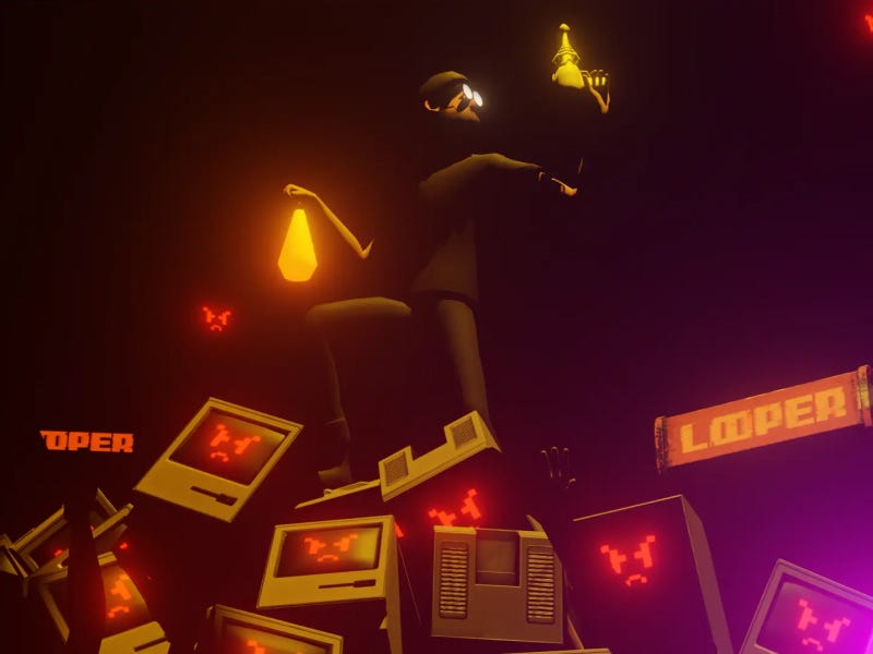
Looper by basement.studio

A visceral WebGL experience merging gritty cyberpunk aesthetics with high-octane interactivity. Featuring a seamless transition from atmospheric character customization to top-down combat, it pushes browser-based gaming limits through dynamic lighting and immersive spatial design.

View project

A stylized 3D character holding a glowing lantern stands atop a pile of vintage computers with red glitching faces, set in a dark, cinematic scene with warm orange and purple lighting and “Looper” signage in the background.

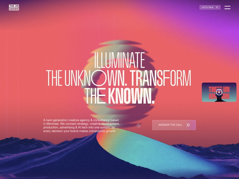
Creative Agency Montreal. Strategy, Film & AI | THE UN KNOWN

A futuristic agency interface blending a dark UI with high-fidelity 3D renderings and structured layouts. The experience moves seamlessly from cinematic storytelling to clean service grids, maintaining a sharp, high-impact digital tone.

View project

A cinematic hero section with bold white typography reading “Illuminate the unknown. Transform the known.” set against a vibrant pink and purple gradient sky, a glowing abstract sphere in the center, and surreal blue-toned mountains with a smooth, colorful path flowing through the landscape.

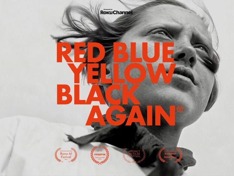
Red Blue Yellow Black Again (by Digital Da Vincis)

A bold, modernist-inspired digital experience built around primary colors, sharp geometry, and a strong grid system. The composition feels like a living canvas, balancing art, motion, and interaction into one cohesive visual statement.

View project

Black and white portrait of a woman with wind-blown hair, overlaid with bold red “Red Blue Yellow Black Again” typography and award laurels

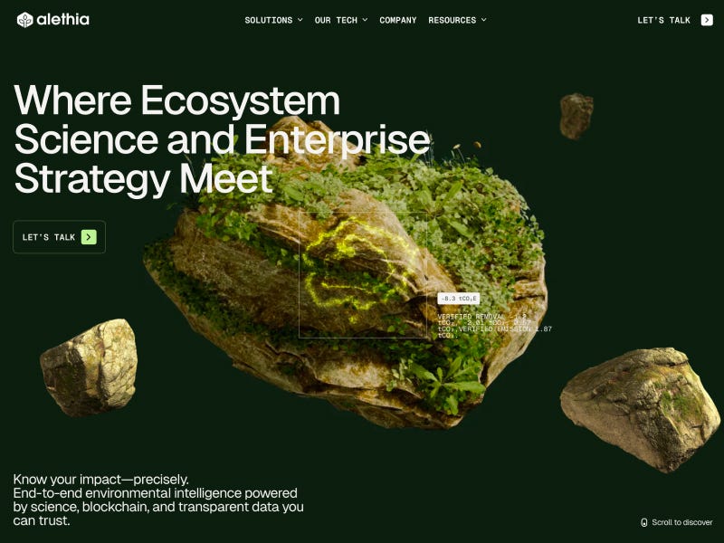
Alethia

A rich, immersive experience combining environmental storytelling with layered visuals and a strong atmospheric tone.

View project

Alethia website hero with floating moss-covered rocks on dark green background and headline “Where Ecosystem Science and Enterprise Strategy Meet”

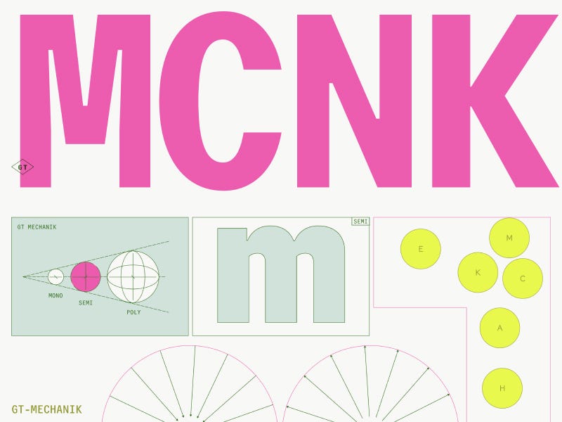
GT Mechanik

A playful yet structured design system combining vibrant colors with mechanical-inspired layouts and interactions.

View project

GT Mechanik visual identity with oversized pink typography, geometric diagrams, and modular design elements on light background

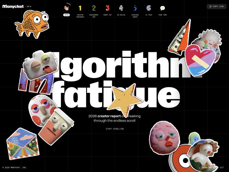
Algorithm Fatigue: A Look At Being A Creator in 2026

An editorial-style experience that blends storytelling with bold typography and strong narrative pacing.

View project

Algorithm Fatigue interactive page with bold white typography on dark grid background and scattered playful sticker-style illustrations

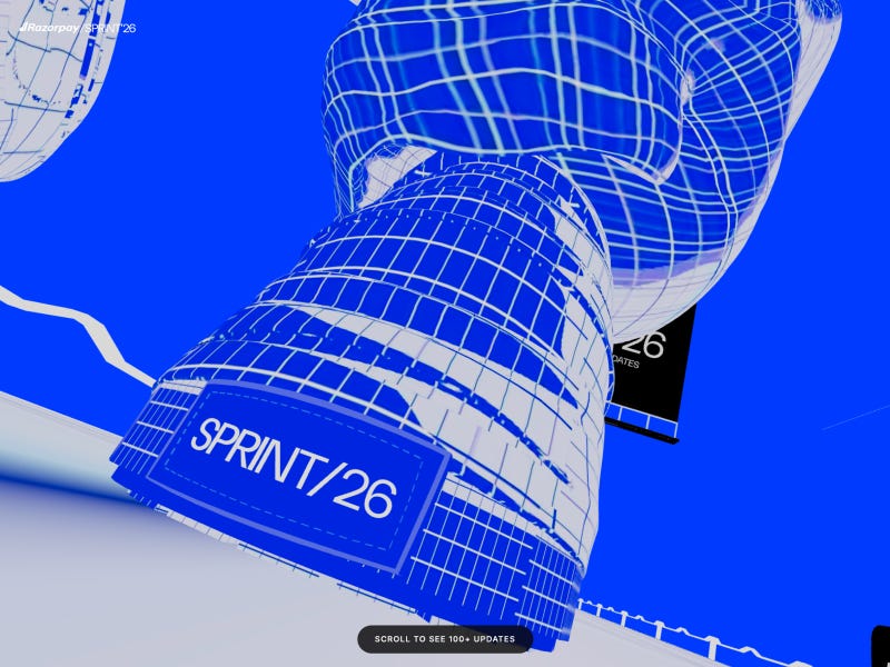
Razorpay Sprint 2026: The Age of AI-Native Payments

A futuristic product launch page combining fintech clarity with AI-driven visual storytelling.

View project

Razorpay Sprint 2026 website with bold blue 3D wireframe structures, futuristic interface, and “SPRINT/26” label in a dynamic perspective scene

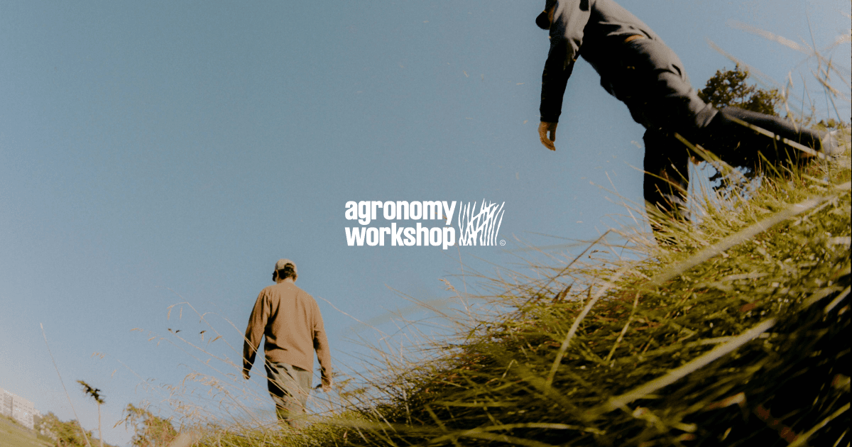
Agronomy Workshop

A refined editorial experience built around typography, spacing, and a calm, grounded visual identity.

View project

Agronomy Workshop website hero showing two people walking through a grassy field under clear sky with natural, documentary-style photography

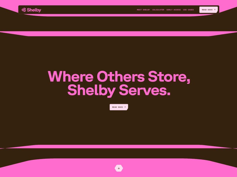
Shelby | Global Object Storage for AI

A product-focused interface with a futuristic tone, combining dark UI with sharp highlights and structured layouts.

View project

Shelby website hero with bold pink typography on dark brown background and headline “Where Others Store, Shelby Serves.”

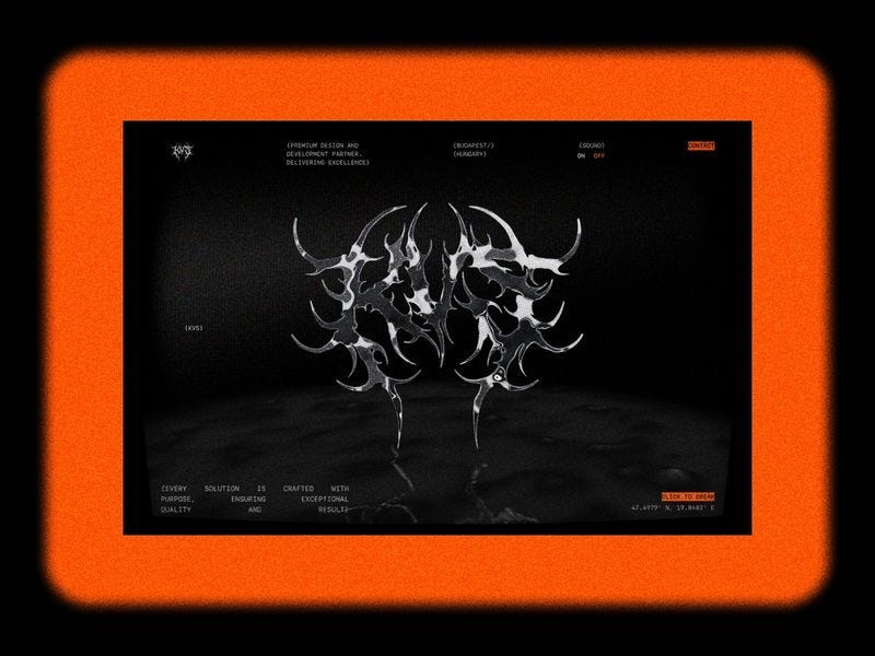
KVS Studio

A bold studio experience combining WebGL, motion, and strong visual identity into a cohesive digital showcase.

View project

KVS Studio website with dark interface, metallic abstract 3D forms at center, and bold orange frame surrounding the layout

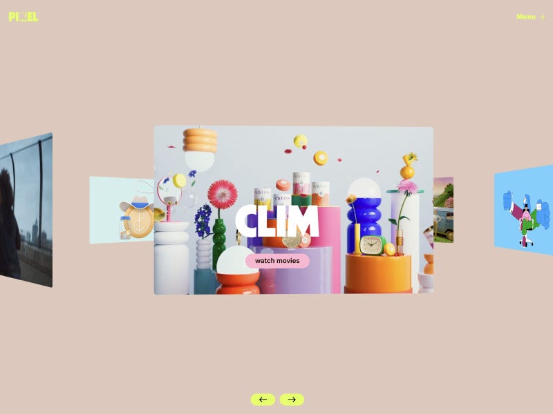
Pixel Melbourne | Creative Production Company for Agencies & Creatives

A cinematic studio site blending production work with strong visual storytelling and layered composition.

View project

Pixel Melbourne website with colorful 3D objects, floating composition, and central “CLM” card in a playful gallery-style layout

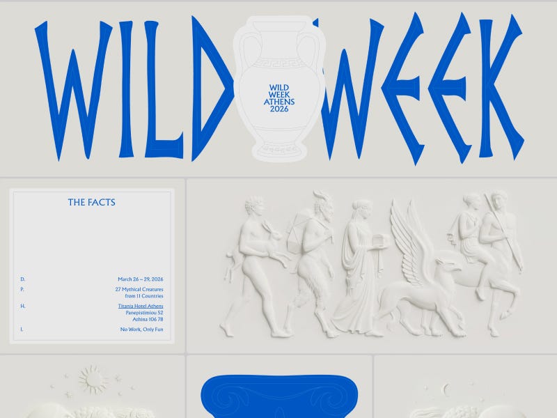
Wild Week — Athens (2026)

A dynamic event experience driven by bold color, strong grid systems, and energetic composition.

View project

Wild Week Athens 2026 website with bold blue typography, classical Greek-inspired illustrations, and sculptural figures on a clean light background

Studio Freight

A clean and restrained agency experience focused on typography, rhythm, and clarity.

View project

Studio Freight website with minimalist black background, white abstract line patterns, and centered monogram logo emblem

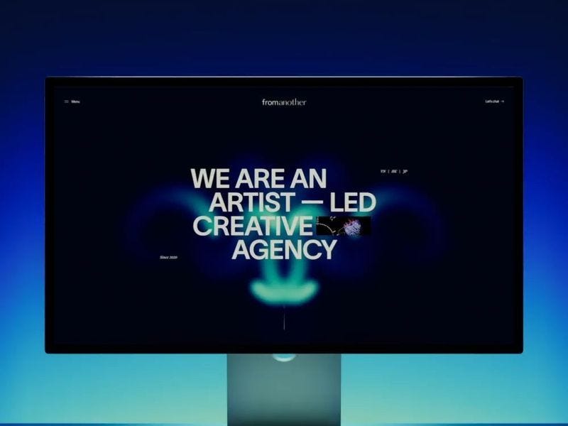
fromanother

An expressive and experimental project combining motion, gradients, and fluid visual storytelling.

View project

fromanother website with dark interface, glowing abstract visuals, and bold “We Are an Artist-Led Creative Agency” headline on a digital screen layout

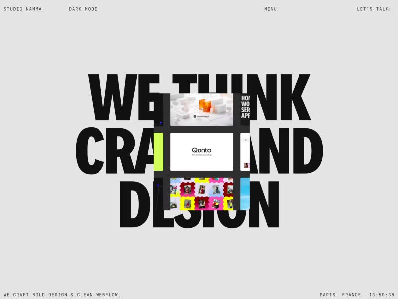
Branding, Design & Webflow Development | Studio Namma

A vibrant agency site with bold typography and a strong brand-driven layout.

View project

Studio Namma website with bold oversized “We Think Craft and Design” typography and layered project previews on a minimal light background

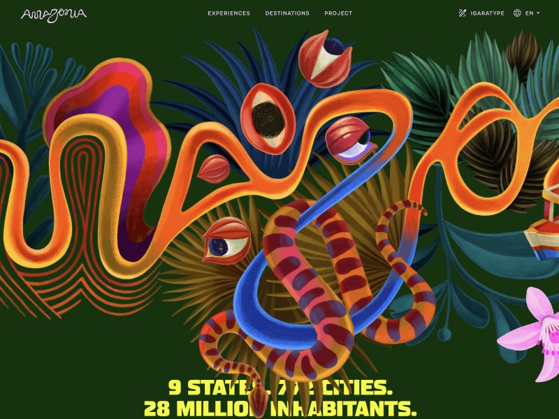
Amazonia

A visually rich experience celebrating nature through color, imagery, and layered storytelling.

View project

Amazonia website with vibrant illustrated jungle scene, colorful organic shapes, and bold typography on deep green background

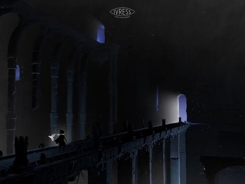
Ivress

A high-end WebGL experience combining lighting, motion, and spatial design.

View project

Ivress website with dark cinematic scene of a figure crossing a bridge inside a vast architectural space, lit by soft glowing light in the distance

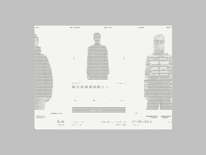
Aino — Design & Technology Agency

A restrained agency experience built on typography, spacing, and subtle motion.

View project

Aino website with minimalist light interface, abstract ASCII-style graphics, and subtle typography arranged in a structured grid layout

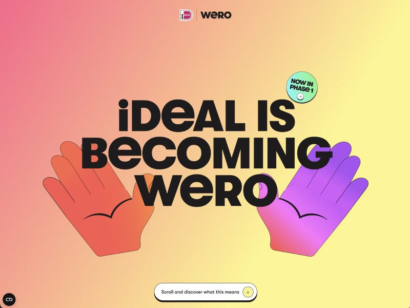
Sowieso Wero — B2B

A structured fintech experience combining clarity with a warm visual palette.

View project

Sowieso Wero website with bold “iDEAL is becoming Wero” headline, gradient background, and illustrated hands in a playful brand transition layout

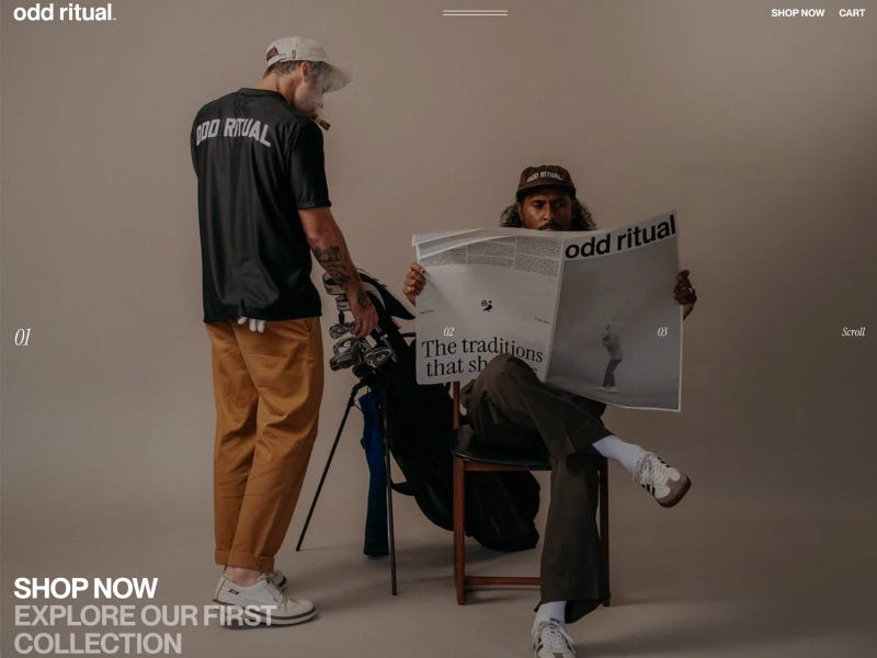
Odd Ritual ‱ A Modern Expression of Heritage — oddritual

A premium brand experience blending heritage storytelling with modern design.

View project

Odd Ritual website featuring lifestyle scene with two people, one reading a newspaper and the other standing with a golf bag, styled in a minimal fashion editorial layout

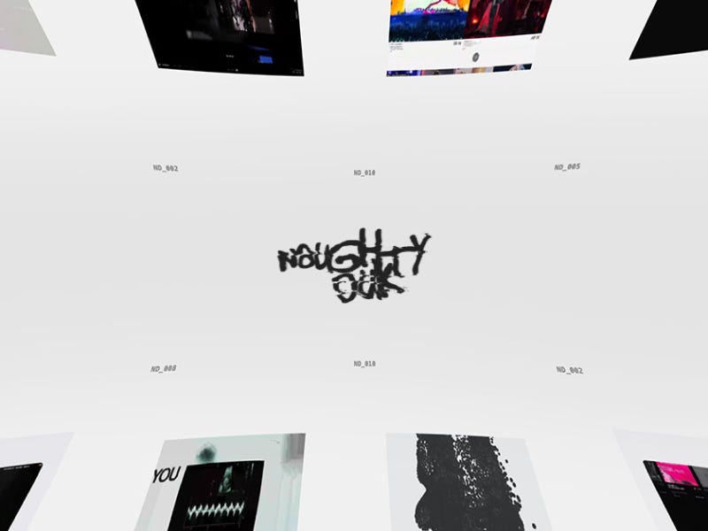
NaughtyDuk© — The Entertainment Industry’s Digital Partner

A bold agency experience combining entertainment energy with sharp digital execution.

View project

NaughtyDuk website with floating grid of visual tiles, central distorted logo typography, and minimal light interface with dynamic perspective layout

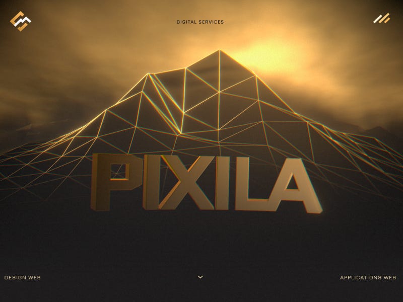
Pixila — Studio web : Sites Internet, Applications web & IntĂ©gration IA

A structured studio website with a balanced mix of visuals and clear product communication.

View project

Pixila website with glowing wireframe mountain, warm golden lighting, and bold 3D “PIXILA” typography in a cinematic digital landscape

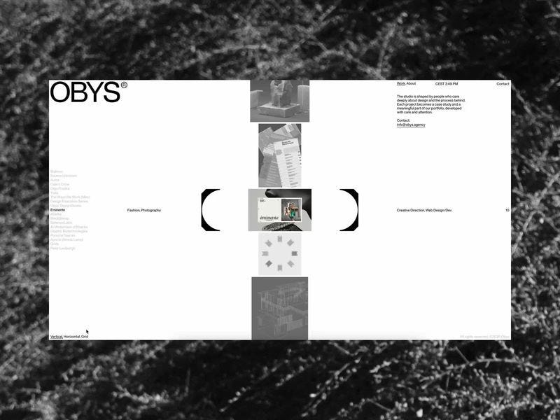
Obys

A polished agency experience driven by motion, typography, and rhythm.

View project

Obys website with minimal black and white interface, grid-based layout, and centered vertical gallery framed by abstract brackets

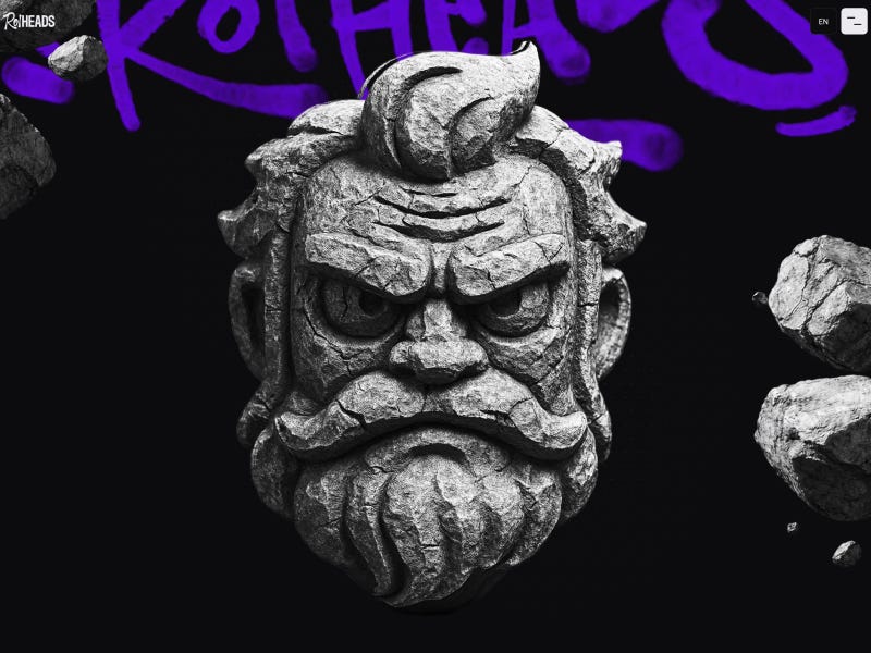
Roiheads

An expressive project with bold visuals and an experimental digital language.

View project

Roiheads website featuring a detailed stone character head on dark background with bold purple graffiti-style typography and floating rock elements

Assistantly

A playful, product-driven experience combining 3D elements, motion, and expressive visuals.

View project

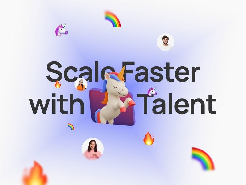
Assistantly website hero with “Scale Faster with Talent” headline, central 3D unicorn illustration, and floating emojis on a soft gradient background

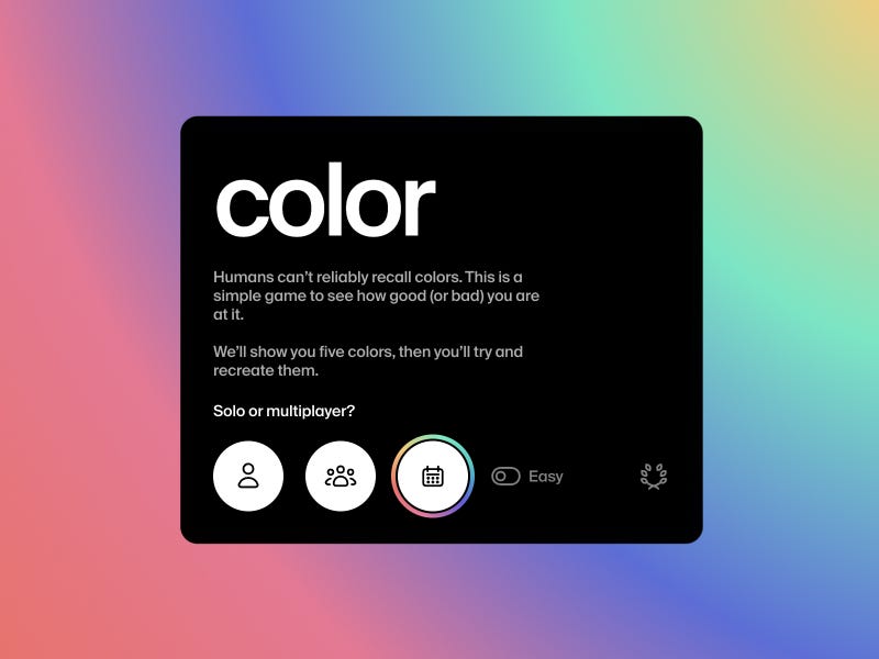
Color Game — How Well Can You Remember Colors?

A simple yet addictive color memory game with a clean and focused interface.

View project

Color Game interface with dark card layout, bold “color” headline, and gradient background with minimal controls for solo or multiplayer play

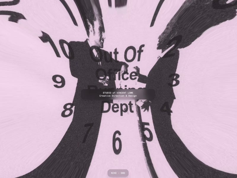
Studio of Vincent Lowe

A refined portfolio with an editorial feel and soft visual direction.

View project

Studio of Vincent Lowe website with distorted clock composition, abstract silhouettes, and layered typography in a surreal editorial-style layout

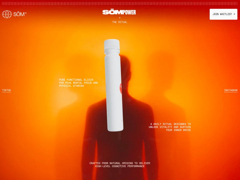
SOM | Modern Elixir From Ancient Core

A bold product experience combining strong color with minimal composition.

View project

SOM Power website with minimal bottle design centered on vibrant orange gradient background, featuring bold branding and ritual-focused messaging

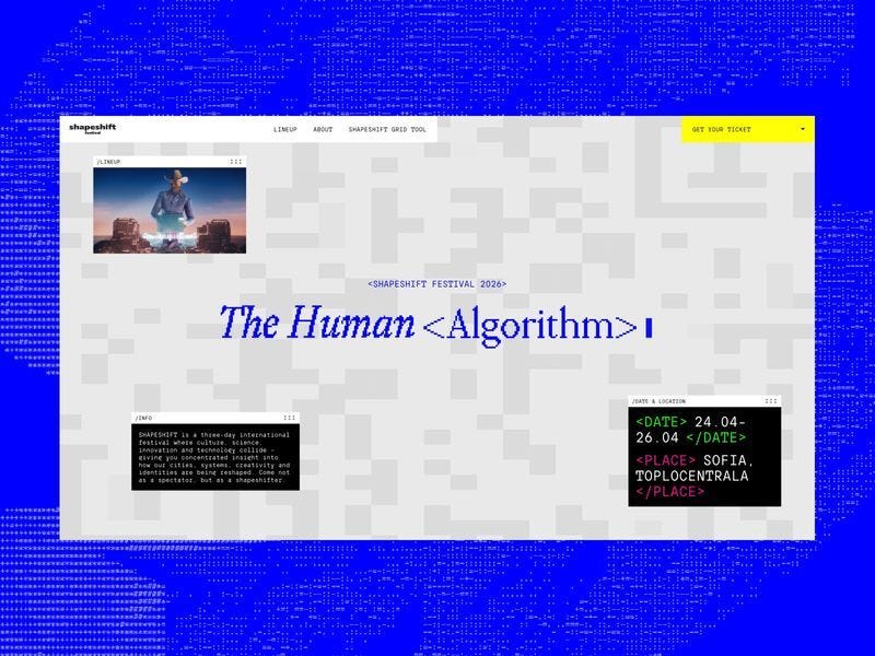
:The Human Algorithm: SHAPESHIFT 2026

A visually experimental festival experience blending digital aesthetics and bold structure.

View project

SHAPESHIFT Festival 2026 website with “The Human Algorithm” headline, experimental grid layout, and bold blue digital-themed background

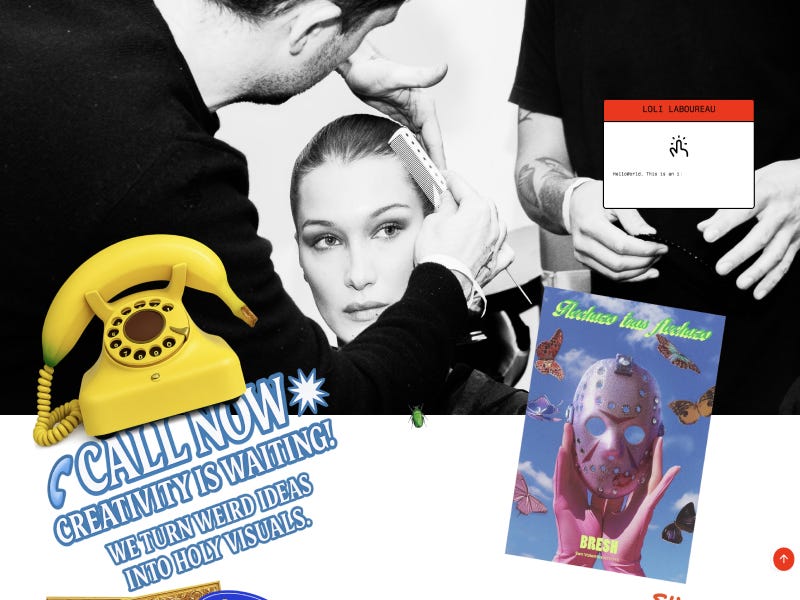
Loli Laboureau

A clean portfolio with an artistic tone and strong layout composition.

View project

Loli Laboureau website with black and white editorial portrait, layered collage elements, and playful graphics including a yellow phone and bold call-to-action typography

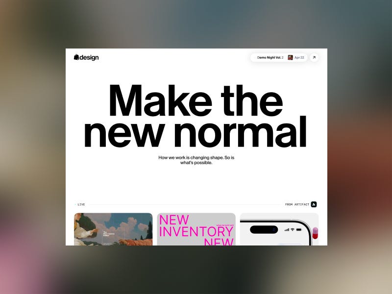
Shopify Design

A clean design system hub with a strong focus on clarity and usability.

View project

Shopify Design website with bold “Make the new normal” headline, minimal layout, and clean typography-focused interface

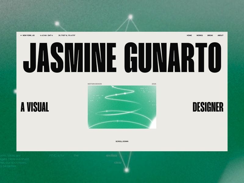
Jasmine Gunarto

A rich editorial portfolio blending motion, typography, and storytelling.

View project

Jasmine Gunarto portfolio website with bold oversized typography, minimal layout, and central motion design preview on a soft green gradient background

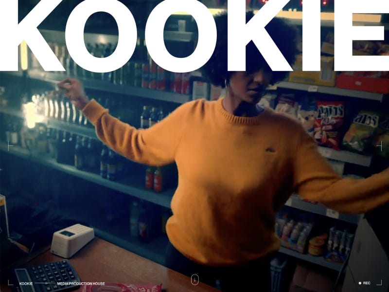
KOOKIE | Production Company, Production Services, CGI & VFX

A cinematic production site showcasing CGI and VFX work through immersive visuals.

View project

KOOKIE production website featuring cinematic scene of a person moving inside a shop, overlaid with bold oversized typography and film-style interface elements

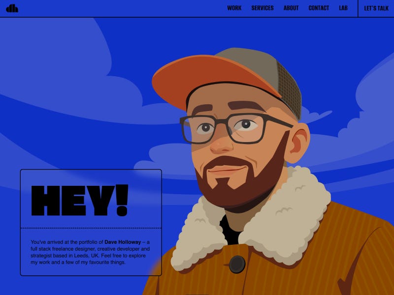
Dave Holloway | Full-Stack Freelance Designer, Creative Developer & Strategist, Leeds (UK)

A bold freelance portfolio blending creative direction, development, and strategy into a vibrant, personality-driven experience. Playful visuals, strong illustration, and confident typography create an engaging and memorable first impression.

View project

Dave Holloway portfolio homepage with illustrated character wearing glasses and cap, bold “HEY!” headline, and blue sky background with clouds

Want to get featured on Muzli Picks?

Create your profile on Muzli Me, upload your project, and it might get featured on Muzli Picks and seen by thousands of designers every day.


💡 Stay inspired every day with Muzli!

Follow us for a daily stream of design, creativity, and innovation.
Linkedin | Instagram | Twitter

Muzli Recap: The Highlights from Figma Config 2025


From Design Tool to Creative Operating System

This year at Config 2025, Figma took another bold leap forward—transforming from a collaborative design platform into a full-stack creation environment. The announcements, which touched everything from prototyping and code to websites and marketing content, made one thing clear: Figma wants to be the one place where everything gets done.

Here’s our recap of the most important updates:


Figma Sites – Publish Live Websites from Inside Figma

Design it. Launch it. No code required.
Figma Sites lets designers build and publish real, responsive websites directly from their design files. The platform includes smart blocks, layout tools, and even text-based animation prompts (e.g. “make text float like a feather”). A CMS layer is expected later this year.
→ It’s a direct challenge to tools like Webflow, Wix Studio, and Framer.


Figma Make – From Text to Functional Code

With Figma Make, users can describe features in plain language and get working code snippets in return. It’s powered by Claude 3.5 and allows designers and product teams to prototype functionality, not just interfaces.
→ Think Copilot, but built into your canvas.


Figma Draw – A New Home for Illustration

Figma is now a vector-based drawing tool, too.
Figma Draw introduces expressive brushes, textures, and real-time stroke effects—making it possible to illustrate logos, icons, and visuals without ever leaving the design environment.


Figma Buzz – Scalable Content Creation for Marketing Teams

Figma Buzz brings AI-assisted content generation to the marketing world. It offers approved templates, AI-generated visuals, and copywriting tools for teams creating emails, ads, and social content at scale.
→ A collaborative, brand-safe alternative to Canva—built into Figma.


Bonus Announcements You Shouldn’t Miss

  • Grid 2.0 – Flexible layout grids with more responsive control
  • AI Prototyping – Generate flows, wireframes, and animations from text
  • Visual Search – Instantly locate components via image-based search
  • Deeper Dev Mode – New “Ready for Dev” and “Focus View” for handoff
  • GitHub Integration – Code-ready assets and tighter workflow alignment

Our Take

Figma continues to expand its territory—from design to development, content, and beyond. The direction is clear: fewer tools, more unified workflows.

And while the excitement is real, so are the questions.
Will designers lose the magic of making when AI fills in the blanks? Can one platform serve everyone—from product to marketing to engineering—without becoming bloated?

Only time (and use cases) will tell.

For now, we’re excited. Inspired. And yes—already experimenting.


Watch all the announcements on config.figma

2024 Black Friday + Cyber Monday Deals for Designers

Ready to snag the best deals of the year?

This Black Friday and Cyber Monday, digital designers, creatives, and artists can score incredible savings on the tools they love and need. From graphic design software to web design assets, creative resources, and more, we’ve rounded up the ultimate list of deals to fuel your inspiration without breaking the bank. 

Stay tuned — many offers will go live closer to Black Friday & Cyber Monday, so bookmark this page and share it with your fellow creatives! Got a deal we missed? Let us know, and we’ll add it to the list.


.

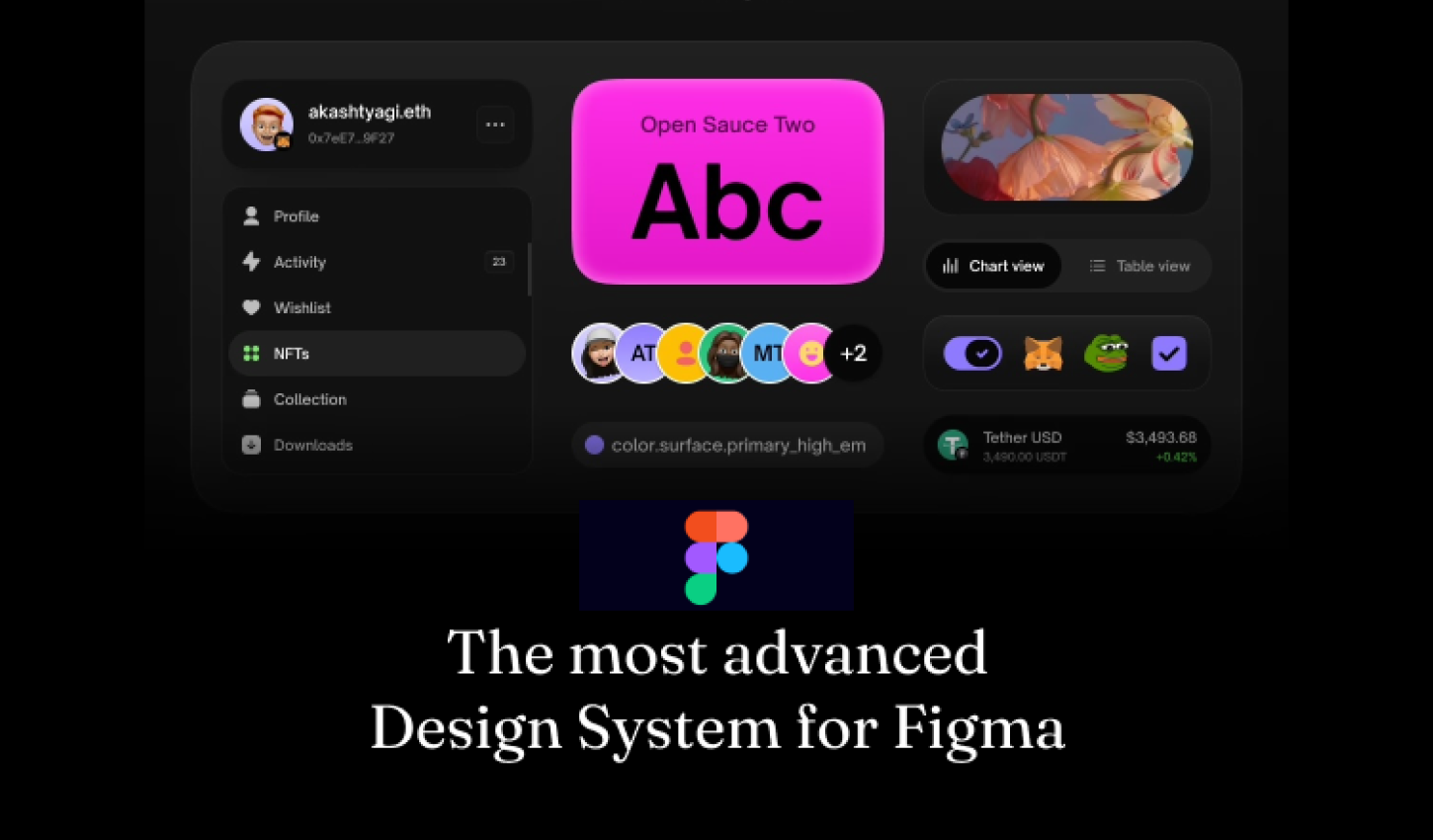
Atomize — The most advanced Design System for Figma

84.75% OFF — code: BLACK9

Atomize — The most advanced Design System for Figma

.

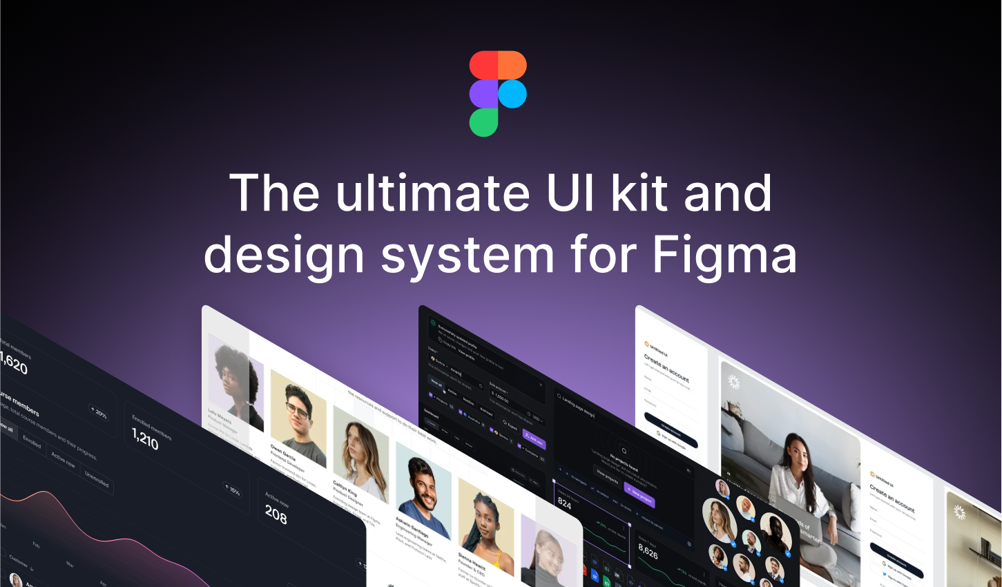
Untitledui — The largest UI kit & design system in the world

13.5% – 28% OFF

Untitledui — The largest UI kit & design system in the world

.

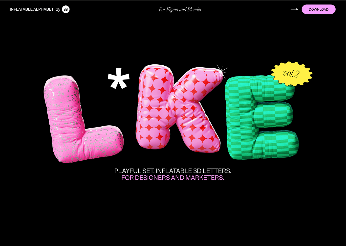
Inflatable 3d alphabet vol.2

Playful set. Inflatable 3d letters. for designers and marketers.

50% OFF

.

Learn UX Design at Your Own Pace | Interactive Courses | Uxcel

Accelerate your UX design career with guided, interactive learning. Learn key skills faster at your own pace in just 5 minutes a day.

62.5 OFF

.

Frameblox – Ultimate Framer UI kit; design system & components library

Frameblox is the ultimate Framer UI kit, design system, and component library. Build and launch your website faster, save countless hours, and elevate your website.

30% OFF – code: BLACKFRIDAY30

.

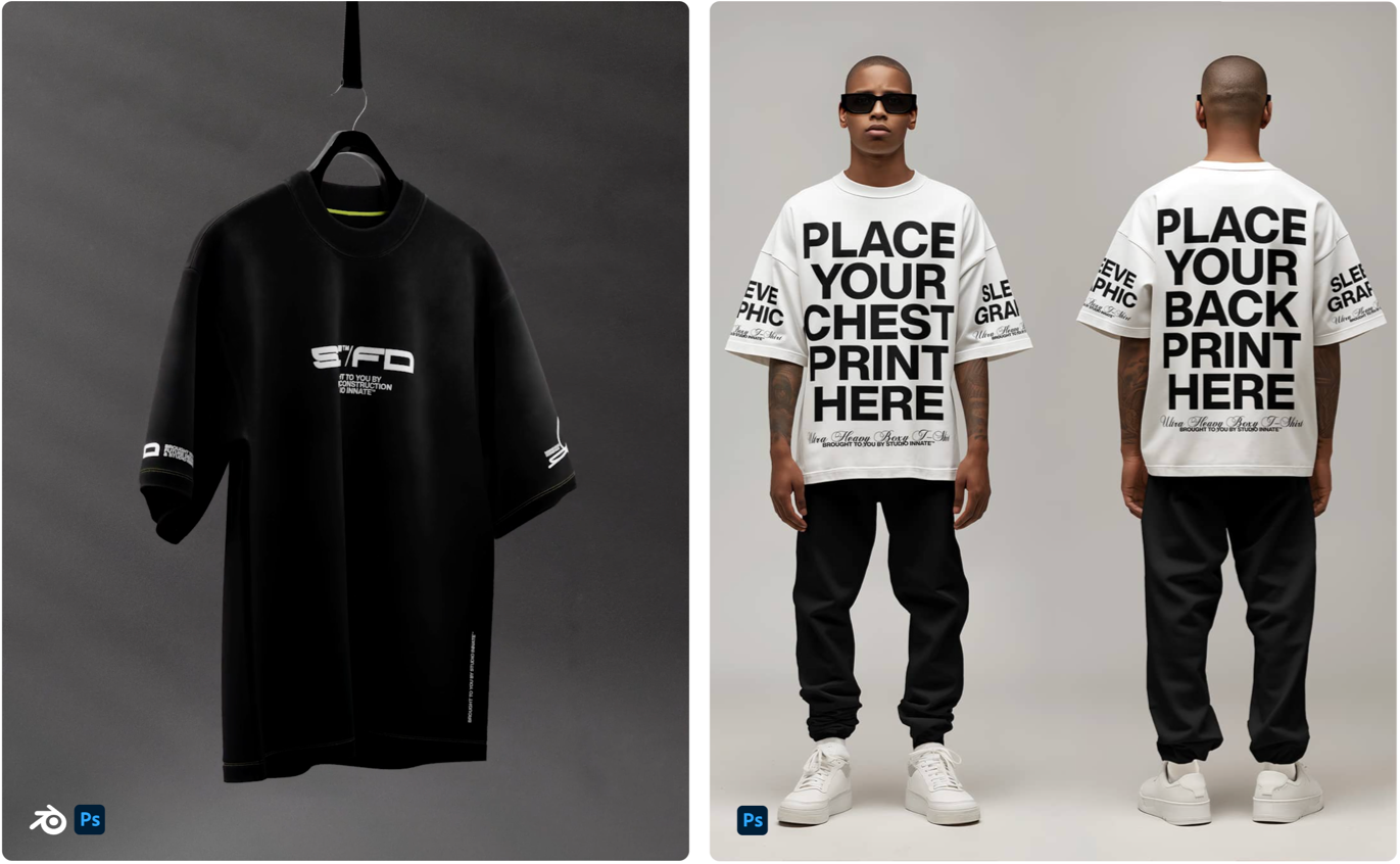
Designer Grade Resources

Discover high-quality mockups and design resources for your creative projects. Studio Innate offers a range of resources for your designs.

20% OFF

Designer Grade Resources

.

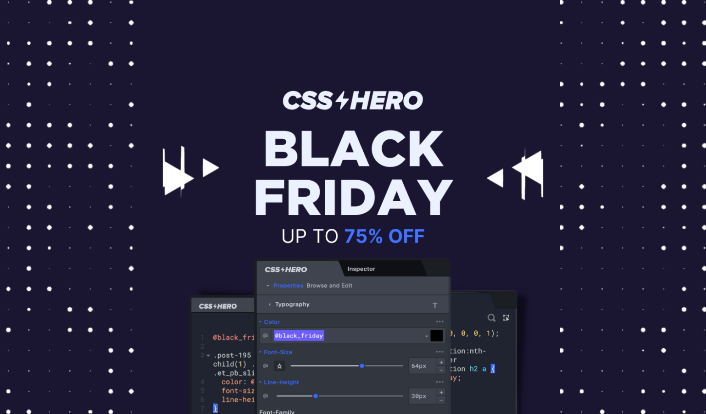
Css Hero — The Live WordPress Theme Editor. No code required.

CSS Hero is the definitive WordPress plugin to easily customize the look of your site, with an easy and intuitive point and click interface.

75% OFF

Css Hero — The Live WordPress Theme Editor. No code required.

.

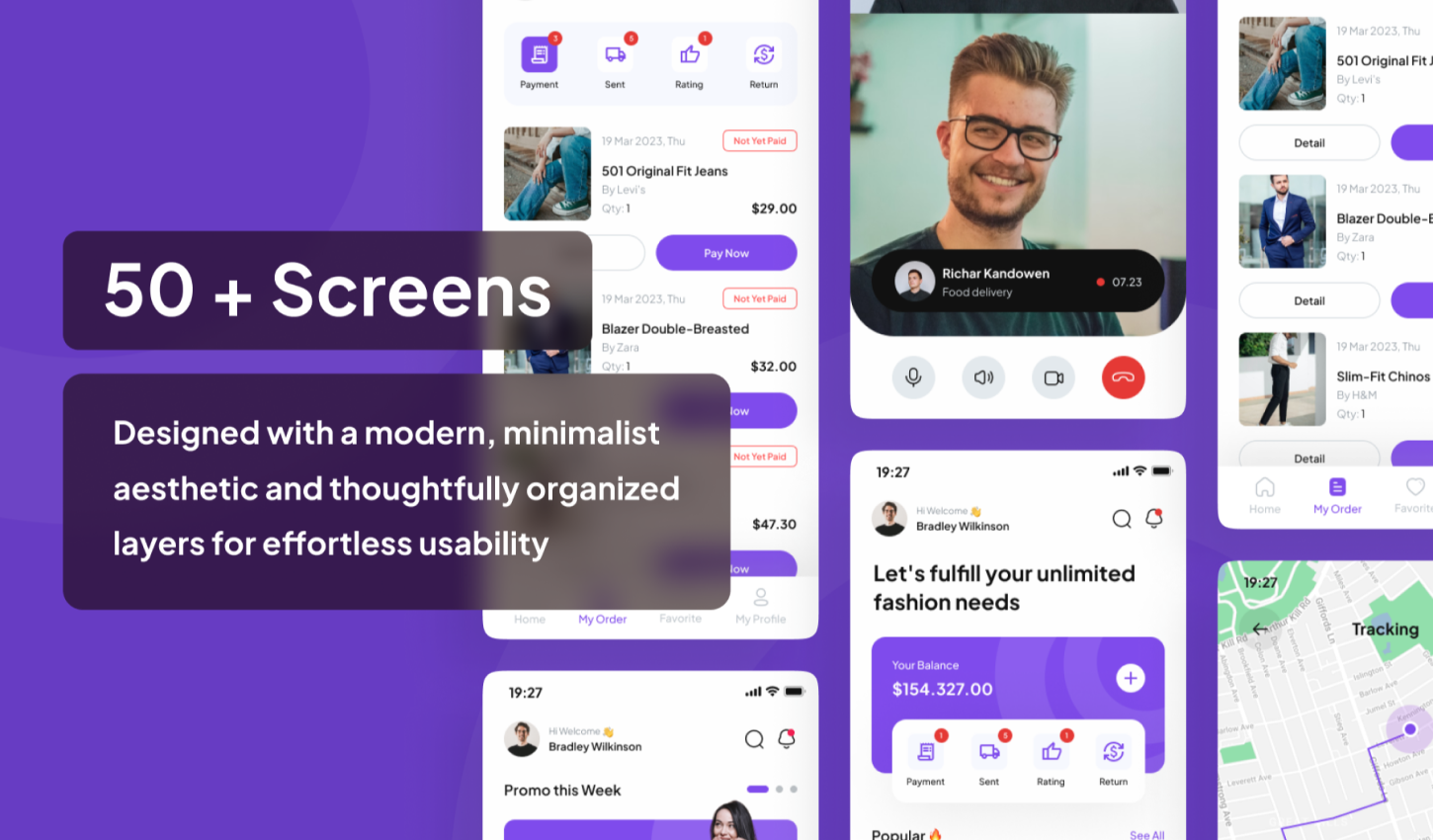
Mall — E-Commerce Complete UI-Kit

Mall is a minimalistic-design UI Kit for E-commerce app

60% OFF — Promo code: K4MDM4NQ

Mall — E-Commerce Complete UI-Kit

.

UI8 — All-Access Pass

Boost your productivity with instant access to all 10,081 existing products and daily new releases.

20% OFF

.

UI8 — Hundreds of premium products for up to 90% off until the end of the month

90% OFF

UI8 — Hundreds of premium products for up to 90% off until the end of the month

.

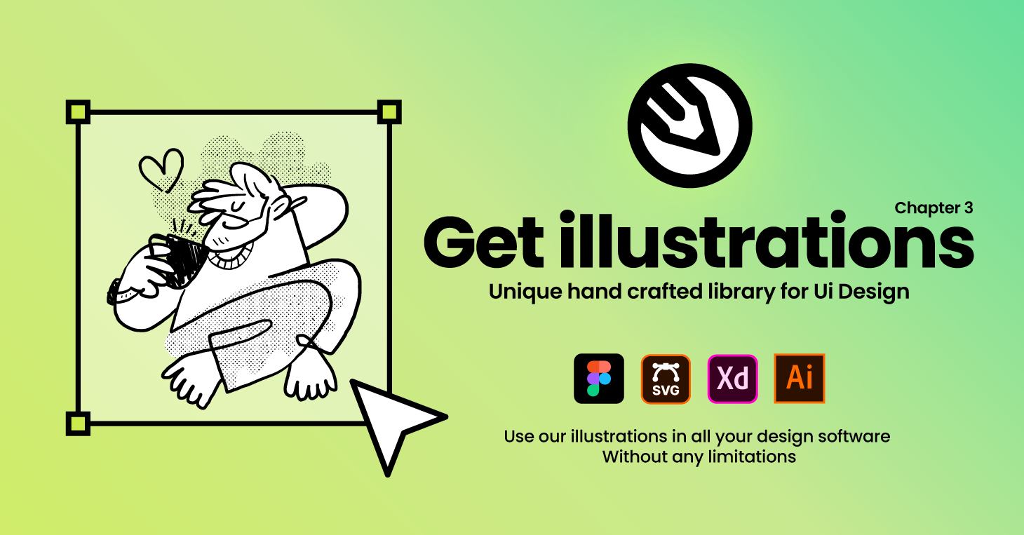
Getillustrations — Get vector illustrations for Websites and applications

40% OFF

Getillustrations — Get vector illustrations for Websites and applications

.

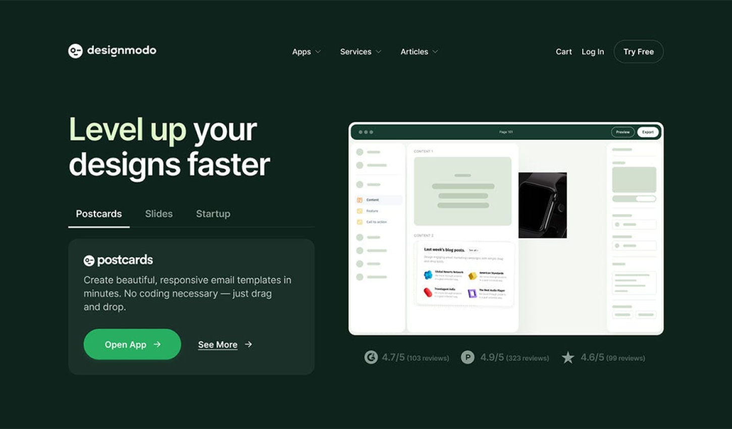
Designmodo: Create Email Newsletter Design & Website

40% OFF

Designmodo: Create Email Newsletter Design & Website

.

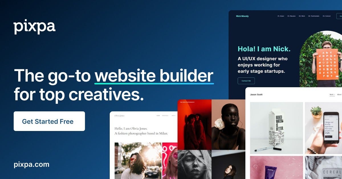
Pixpa— Create Your Awesome Portfolio Website

Create stunning websites, portfolios, stores, and blogs — all in one place. Save time & money!

55% OFF — code: BLFPIXPA5

.

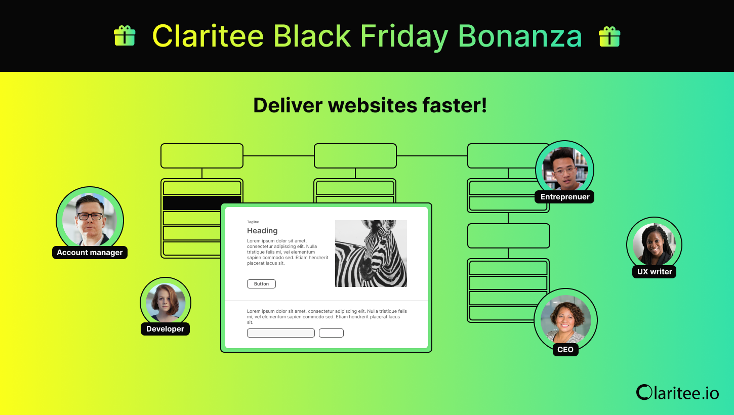
Claritee — Speed through the planning phase of website design with AI-powered sitemaps and wireframes

60% OFF

Claritee: Visual ideation tool for planning digital assets and design projects

.

Envato — Unlimited creative assets, all in one place.

30% OFF

Envato — Unlimited creative assets, all in one place.

.

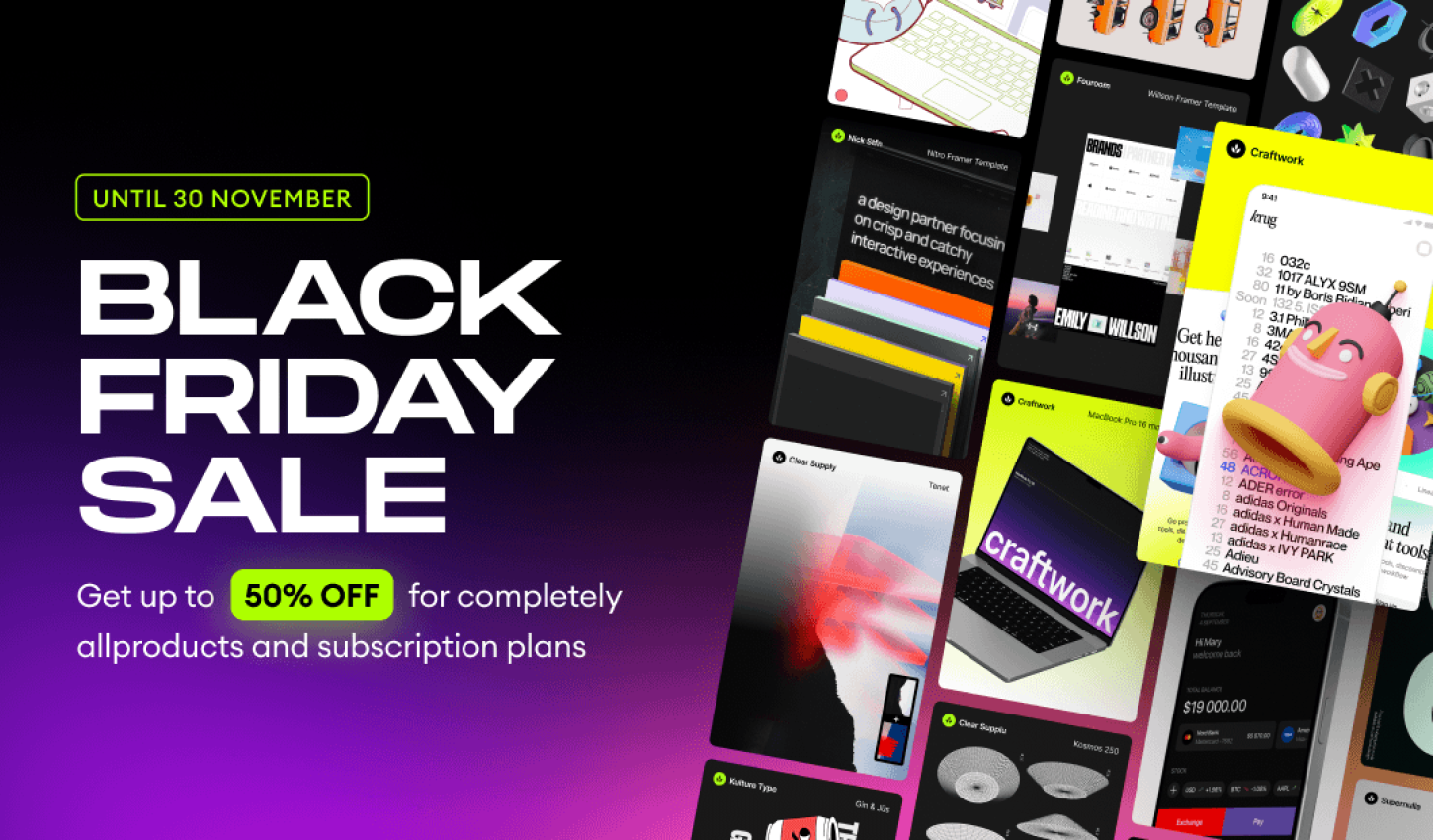
Craftwork : UX/UI kits, illustrations, mockups, fonts and more 

50% OFF

Craftwork : UX/UI kits, illustrations, mockups, fonts and more 

.

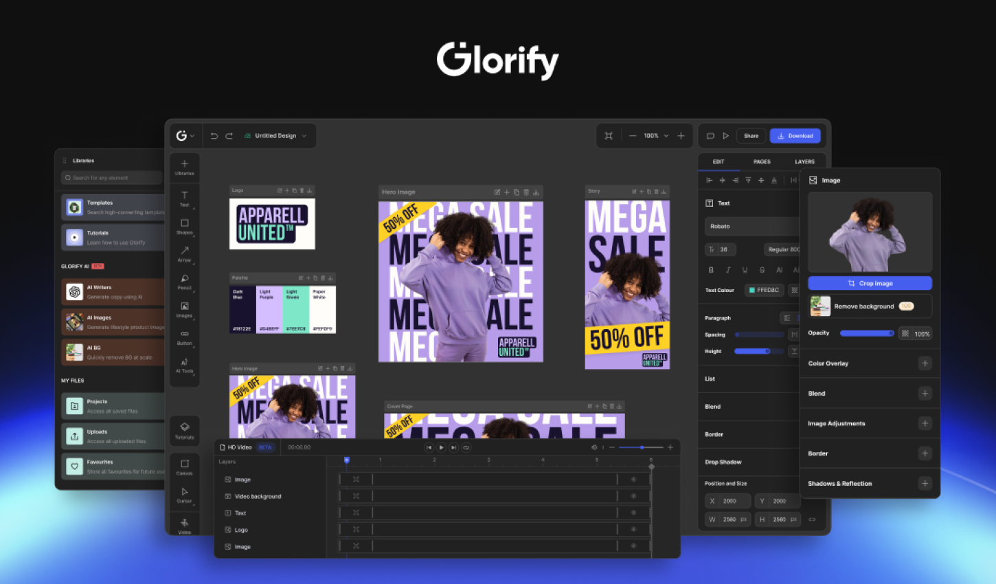
Glorify — Online Graphic Design Tool for E-com Business Owners — Black Friday Lifetime Deal 

78% – 89% OFF

Glorify — Online Graphic Design Tool for E-com Business Owners — Black Friday Lifetime Deal 

.

Landingi — No-code Landing Page Platform for Data-Driven Digital Marketers

29% – 36% OFF

Landingi — No-code Landing Page Platform for Data-Driven Digital Marketers

.

whiteui.store — High-quality UI kits and design resources

50% OFF

whiteui.store — High-quality UI kits and design resources

.

Designerup — Product Design (UX/UI) Course

Become the product designer you are meant to be with UX/UI courses, resources and community for mindful designers

Coupon Code: BF24–20% OFF

Designerup — Product Design (UX/UI) Course

.

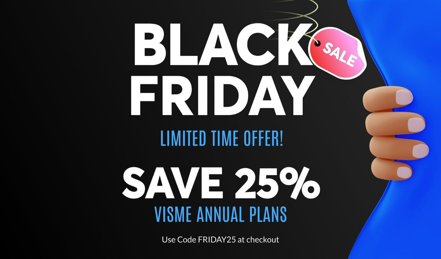
Visme: AI Presentation maker, Infographics, and One pager templates

25% OFF

Visme: AI Presentation maker, Infographics, and One pager templates

.

UENI —  Stunning websites for your small businesses.

67% OFF

UENI —  Stunning websites for your small businesses.

.

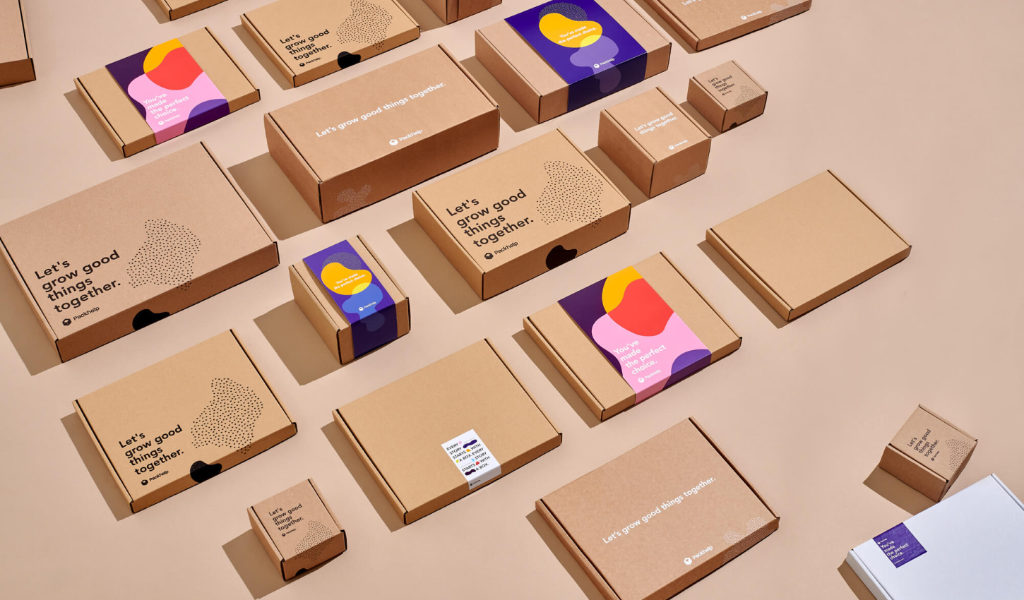
Packhelp — Custom packaging designed to fit your business

50% OFF

Packhelp — Custom packaging designed to fit your business

.

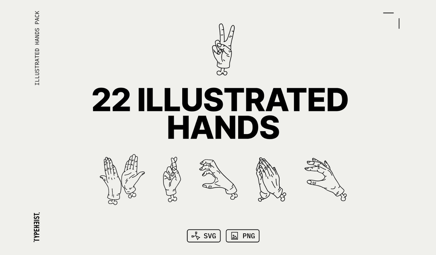
Illustrated Line Hands Pack

A vector pack with 22 hand-illustrated hand gestures in a fineline tattoo style. There are 22 common and quirky gestures in this pack, you’ll find something perfect for your unique designs.
20% OFF

Illustrated Line Hands Pack

.

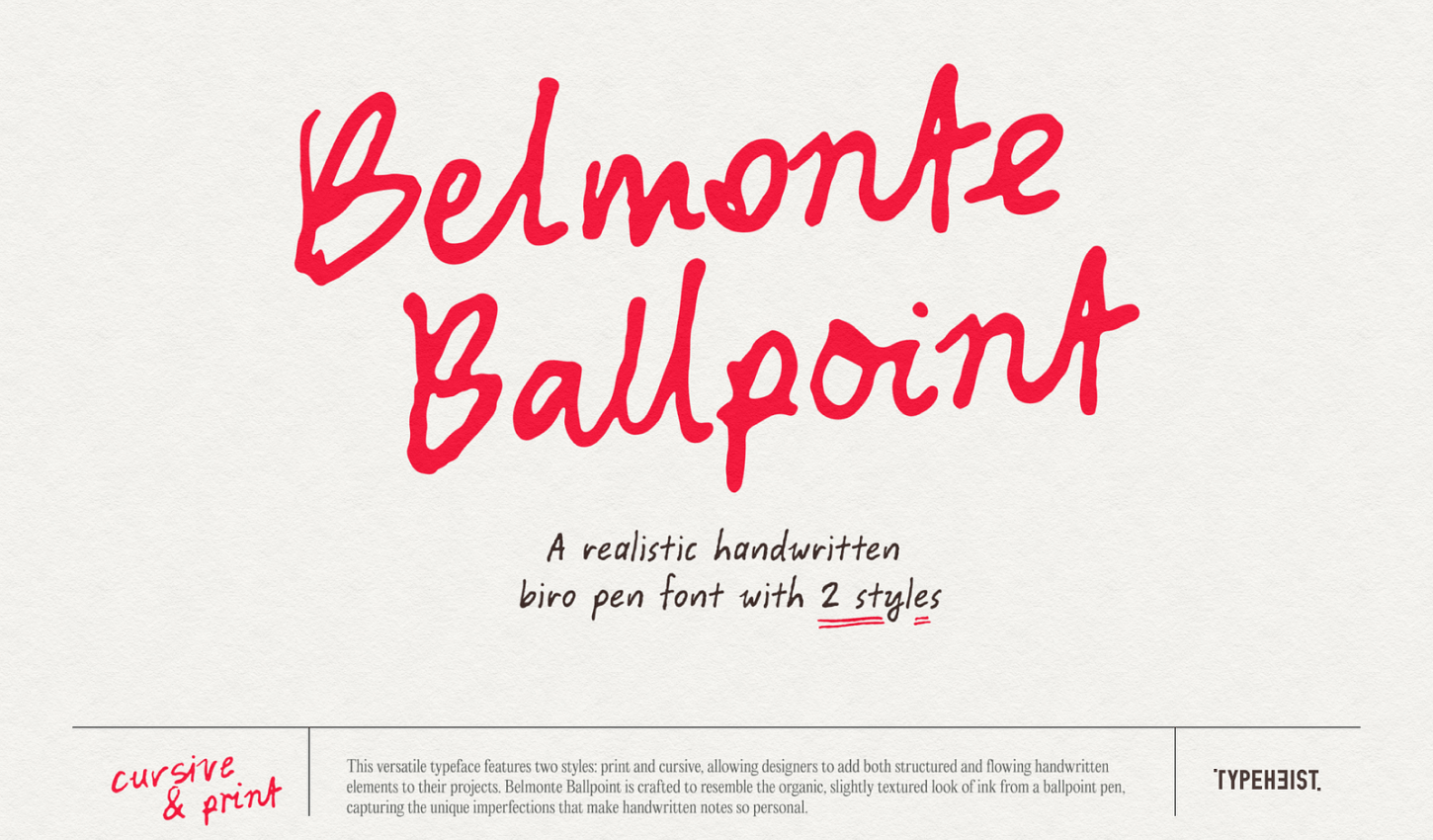
Belmonte Ballpoint

This versatile typeface features two styles: print and cursive, allowing designers to add both structured and flowing handwritten elements to their projects.

20% OFF

Belmonte Ballpoint

.

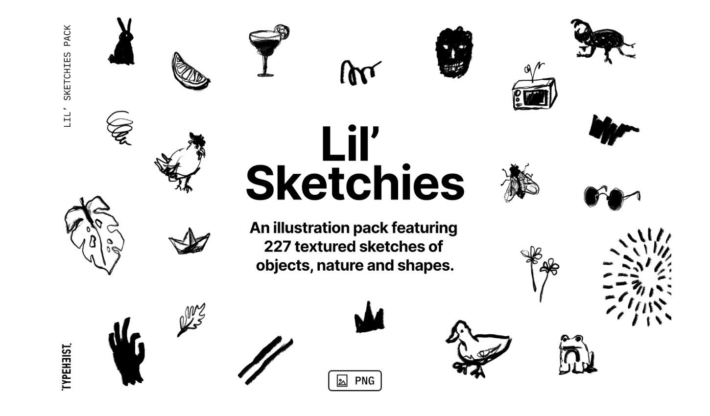
Lil’ Sketchies

Lil’ Sketchies is a scribbly illustration pack featuring 227 textured sketches of objects, nature, shapes and social icons.

20% OFF

Lil’ Sketchies

.

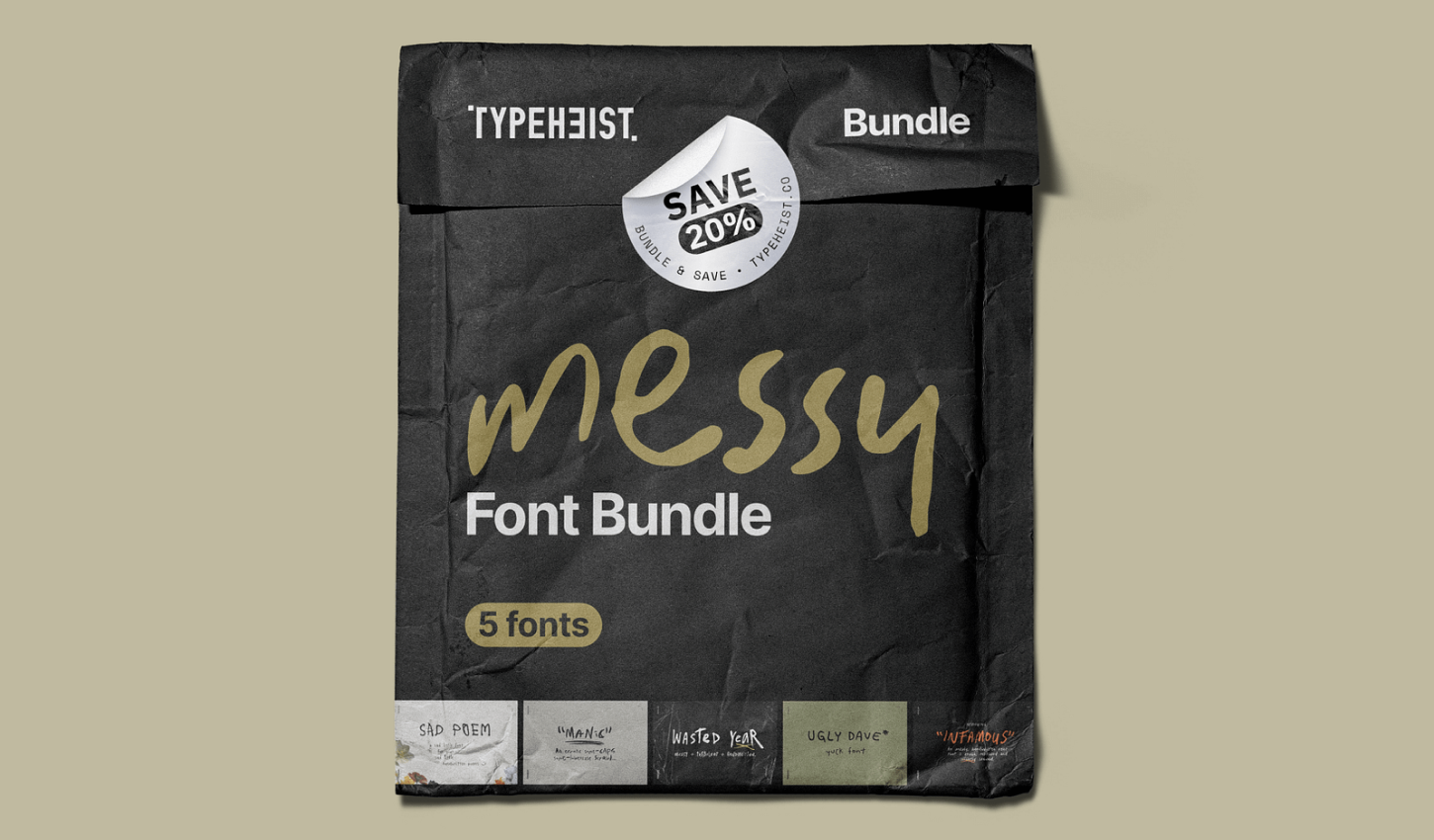
Messy Font Bundle 

What you’ll get in the Messy Font Bundle: — 5 messy handwriting fonts and up to 25% off (for desktop + web bundle) — Manic Erratic Handwriting Font — Ugly Dave Yuck Font — Infamous Unruly Font — Sad Poem Font — Wasted Year Font

20% OFF

Messy Font Bundle 

.

Channelwill: Trusted Shopify Experts for eCommerce Solutions

Boost your BFCM sales with our powerful apps to enhance conversions and customer loyalty. Get 50% off and start your 14-day free trial now!

50% OFF

Channelwill: Trusted Shopify Experts for eCommerce Solutions

.

icons8 , Original stock graphics by our team, plus design apps and AI tools

20% Off

icons8 , Original stock graphics by our team, plus design apps and AI tools

.

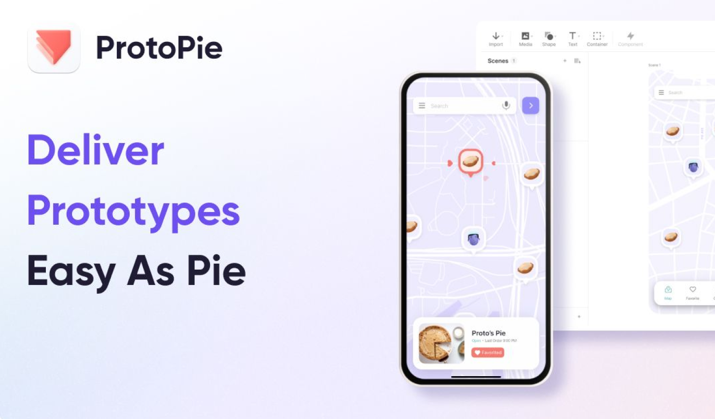
ProtoPie’s — #1 advanced prototyping tool for dynamic & multimodal interactions

up to 40% OFF – code:PRO40

ProtoPie’s — #1 advanced prototyping tool for dynamic & multimodal interactions

.

More Black Friday & Cyber Monday Deal Coming soon

Please share the love with your fellow designers!

Copy and paste the below to share:

2024 Black Friday & Cyber Monday deals for graphic and web designers! https://muz.li/blog/2024-black-friday-cyber-monday-deals-for-designers #BlackFriday #CyberMonday via @usemuzli


Want even more inspiration?
Follow us on social media for your daily dose of design, innovation, and creativity right in your feed!
Linkedin | Instagram | Twitter

Design Spotlight 3

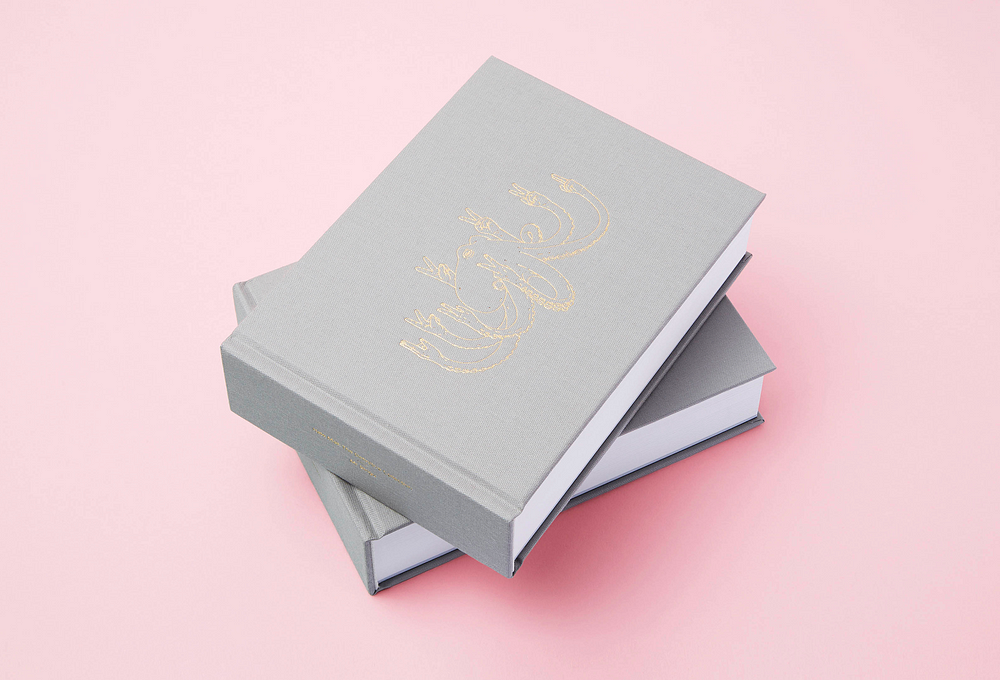
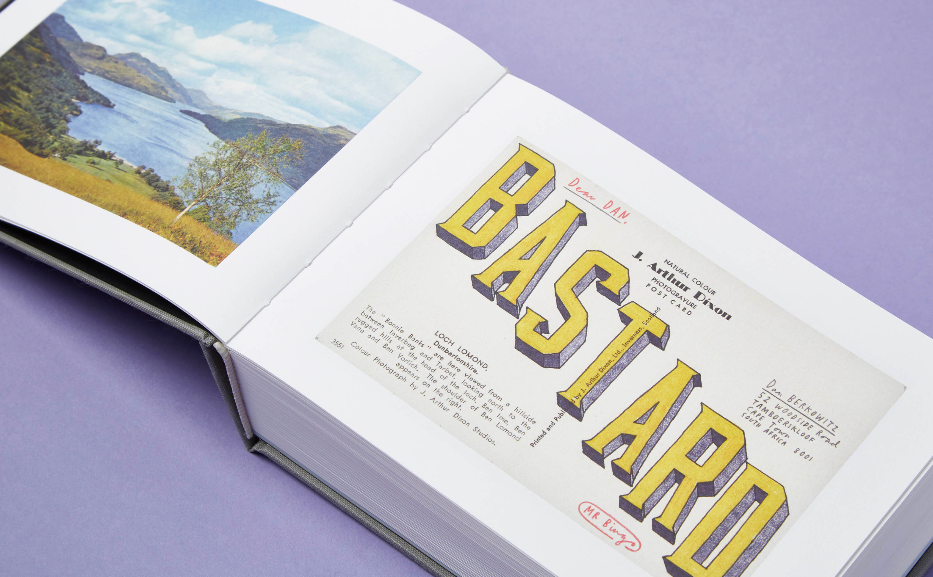
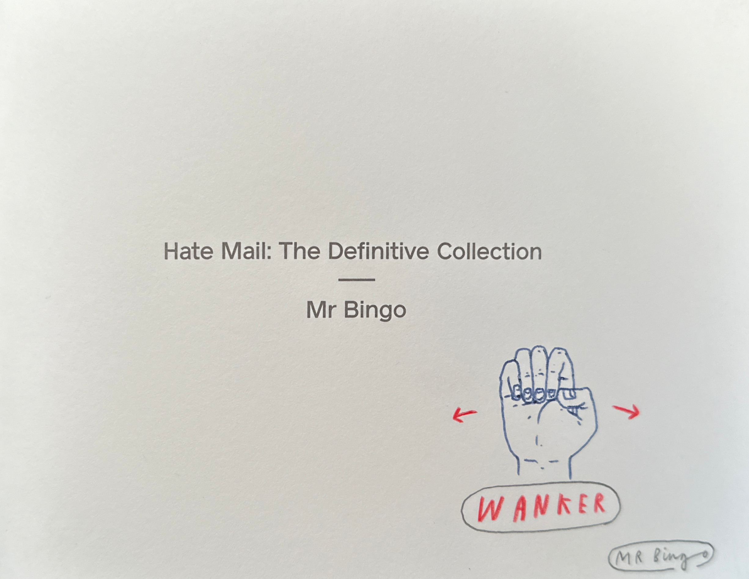
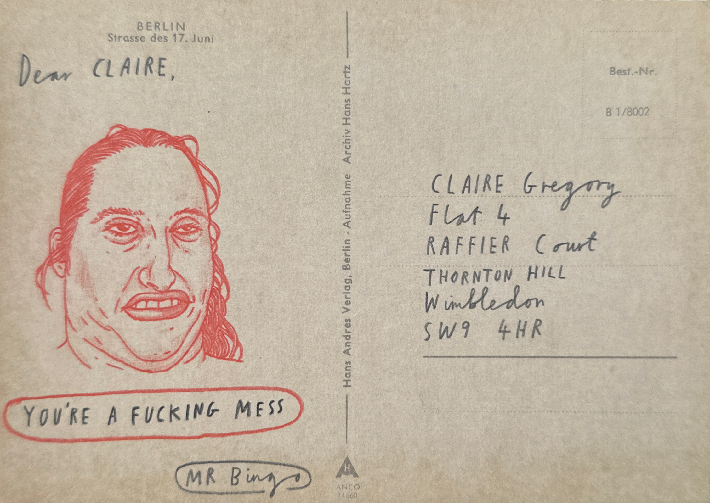
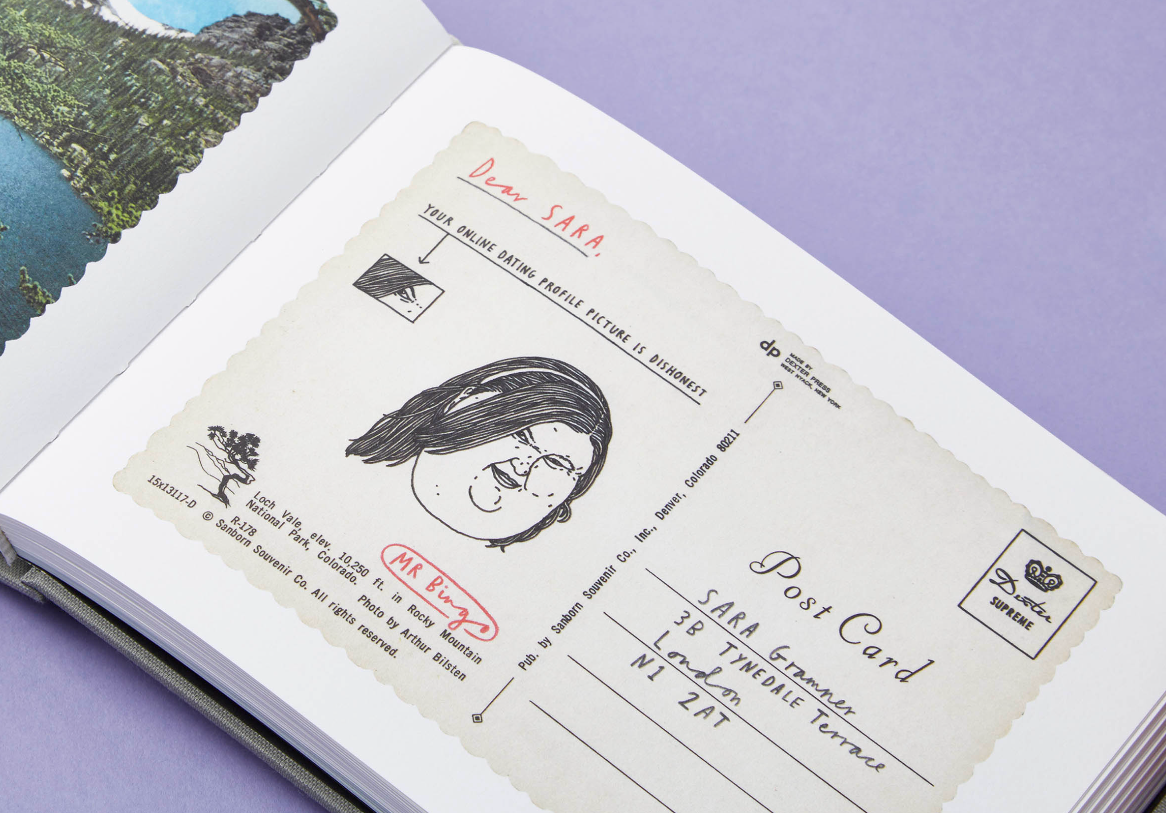
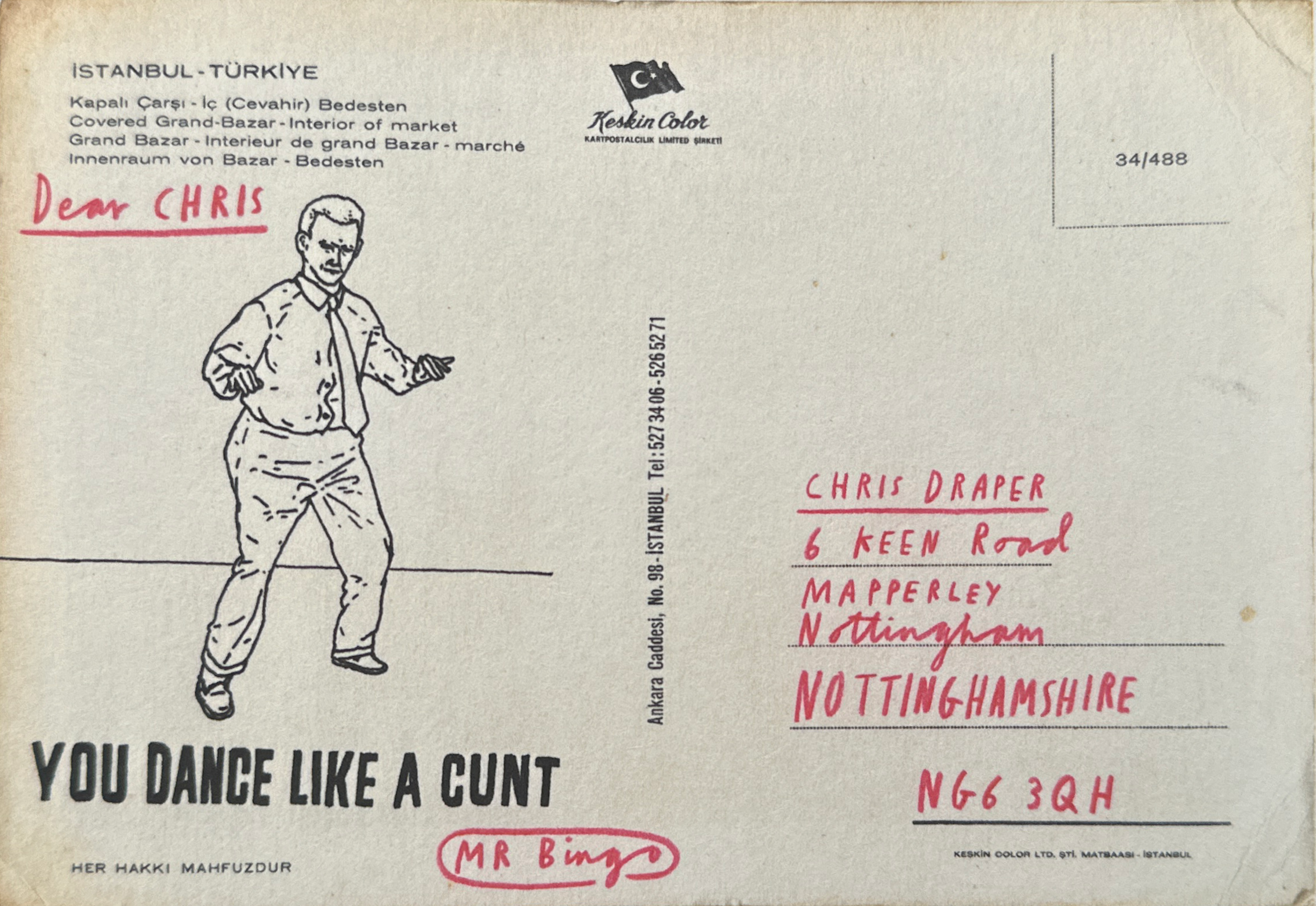
Hate Mail: The Definitive Collection by Mr Bingo

Mr. Bingo’s “Hate Mail” project is a unique fusion of art and provocation. Renowned for his irreverent approach, Mr. Bingo crafts deliberately offensive postcards, turning negativity into art. What began as a personal experiment evolved into a collaborative venture, with contributions from audiences eager to partake in the creation of artistic hate mail. It’s a testament to the transformative power of creativity, where spiteful sentiments are reimagined as thought-provoking works of art.

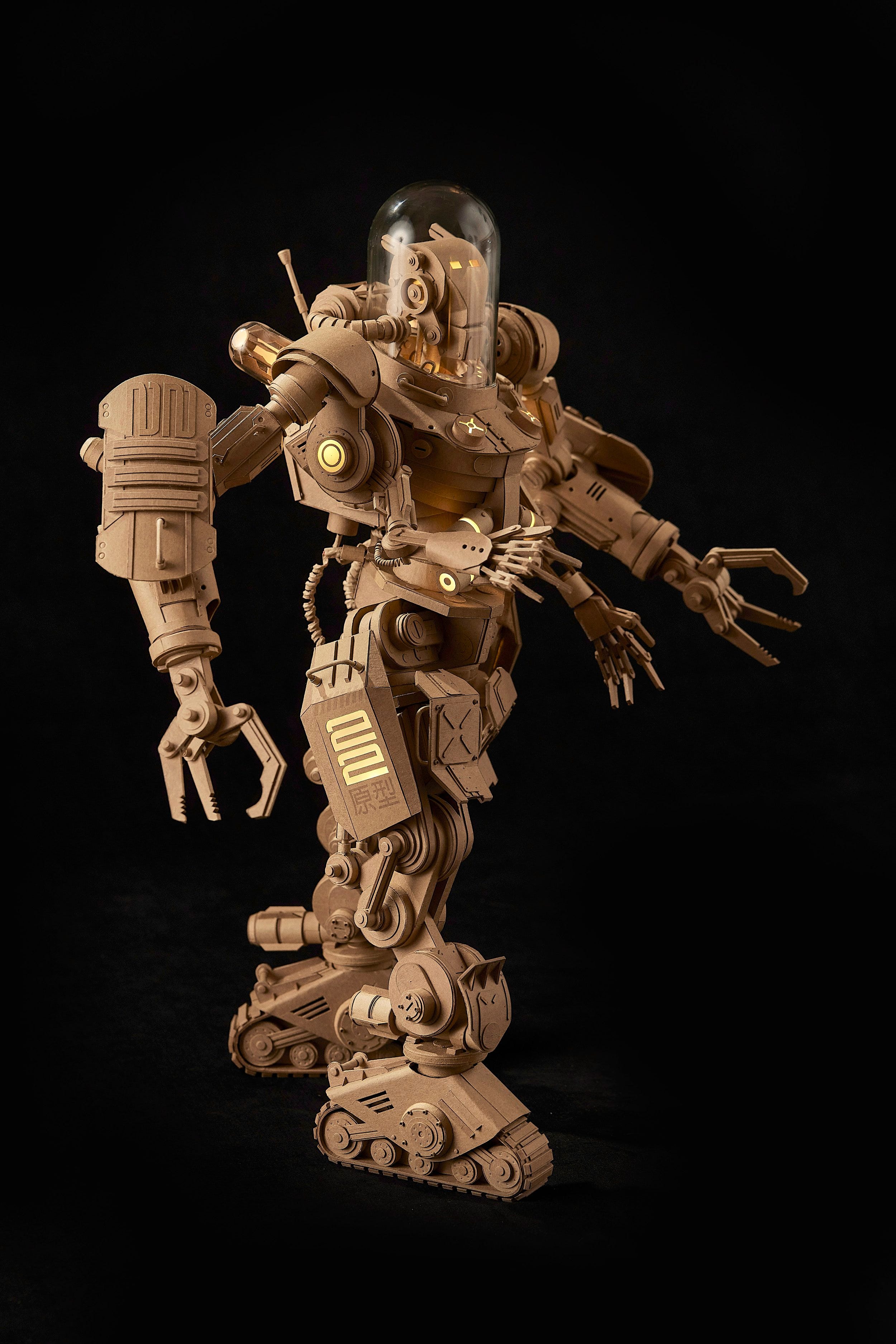
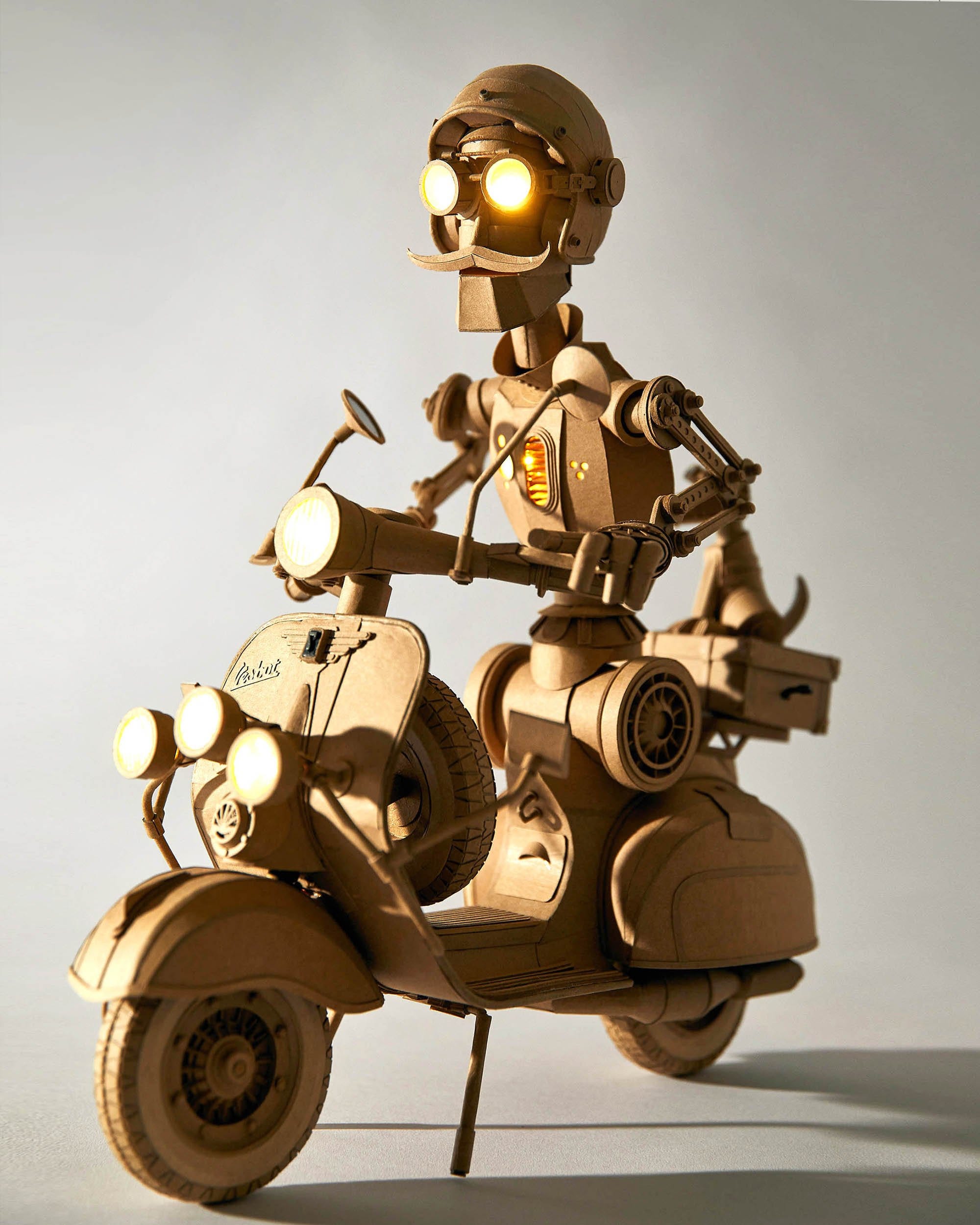
Greg Olijnyk Cardboard Artist

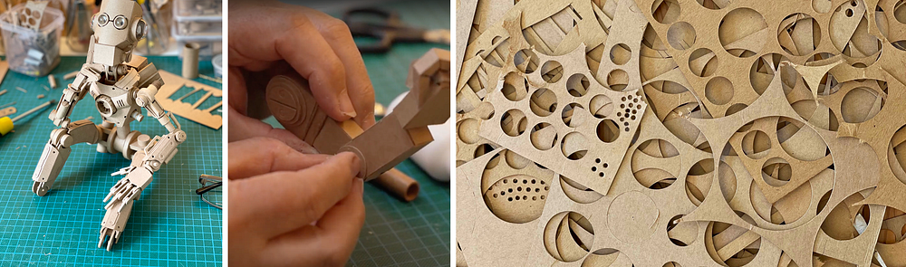
Greg Olijnyk, based in Melbourne, Australia, has been running his graphic design studio for the past three decades. In 2017, he ventured into three-dimensional art, transitioning from keyboards to cardboard. His sculptures transform ordinary cardboard into extraordinary objects, showcasing intricate shapes and mechanisms. From cityscapes adorned with crushed beer cans to robot samurais with feathered hats, Olijnyk’s work brims with whimsical character and storytelling. Crafted without plans or digital aids, Olijnyk relies solely on a scalpel blade to bring his creations to life. Realistic joints and LED lights further enhance the charm of his pieces. Each sculpture evolves organically during creation, with every element influenced by the preceding one. This meticulous process, devoid of shortcuts, results in intricately detailed structures, be it a brick, a girder, or a delicate bird, taking weeks to months to complete.

7 A.M Coffee Packaging Design by Omsky Studio

Embracing the artistry of coffee roasting, Omsky Studio’s innovative packaging for 7 A.M Coffee takes inspiration from the delicate nuances of the process. Through the masterful use of gradient effects, evoking the rich tones of roasted beans, the studio artfully presents the diverse spectrum of roast levels, from subtle light to robust dark blends.

Aware — design by Fibra · Branding & Packaging

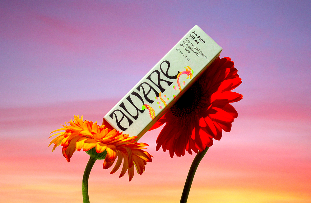
Step into the world of design transformation with Aware Bio. Witnessing the evolution of cosmetic branding, one project stood out: Aware Bio’s rebranding journey.

Their mission was clear: to shine on the global stage while staying true to their organic roots. Inspired by Peru’s natural beauty, we crafted a botanical illustration that captures the essence of Aware Bio.

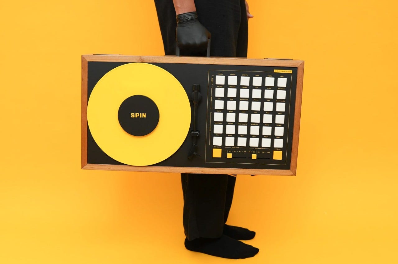
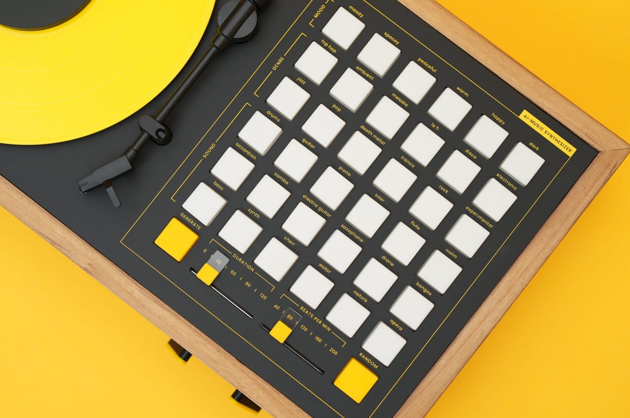
Spin -AI music synthesizer by arvind sanjeev

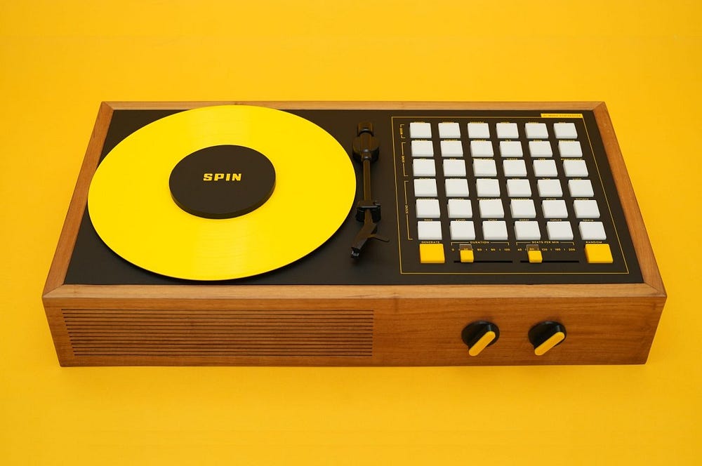
an innovative AI music synthesizer by Arvind Sanjeev. SPIN isn’t just a musical tool — it’s a work of art that showcases the power of AI. Behind its sleek interface lies a combination of off-the-shelf components meticulously assembled to provide both brains and brawn. While using SPIN, you won’t see these inner workings, as they’re cleverly hidden behind a design that encourages playfulness and experimentation. The choice of bright yellow and white colors, uncommon in most synth designs, adds to its jovial character, inviting users to explore new musical territories with joy and creativity.

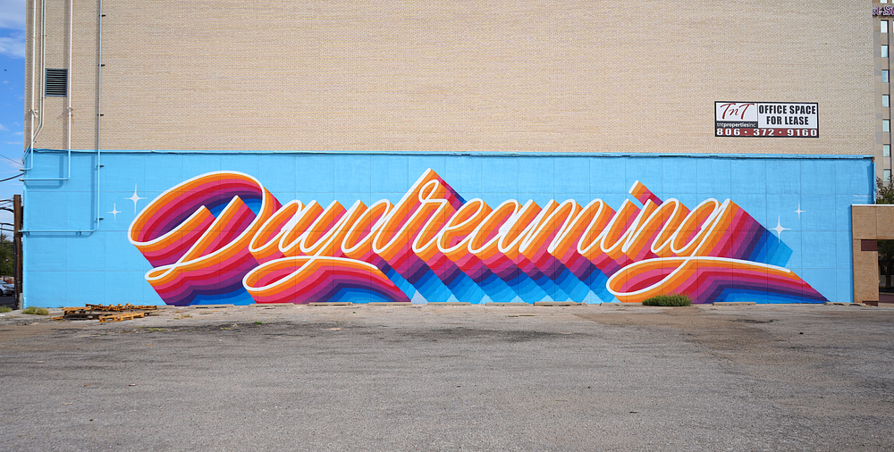
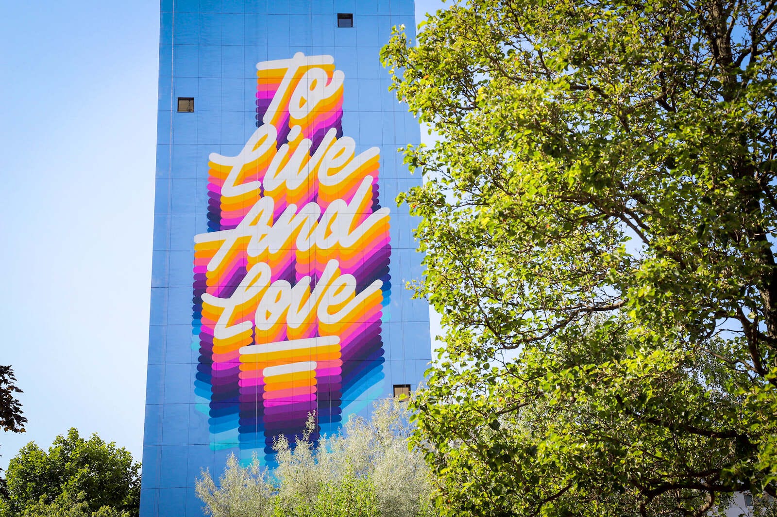
It’s a Living — Ricardo Gonzalez

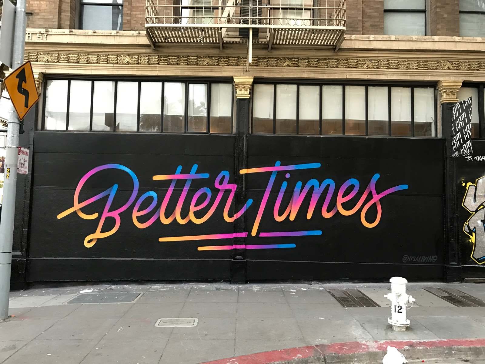
Ricardo Gonzalez, also known as “It’s a Living,” is a visionary artist whose typographic graffiti transcends conventional boundaries. With a background in graphic design, Gonzalez infuses urban landscapes with his signature blend of calligraphy and street art, creating vibrant, dynamic compositions that captivate viewers worldwide.

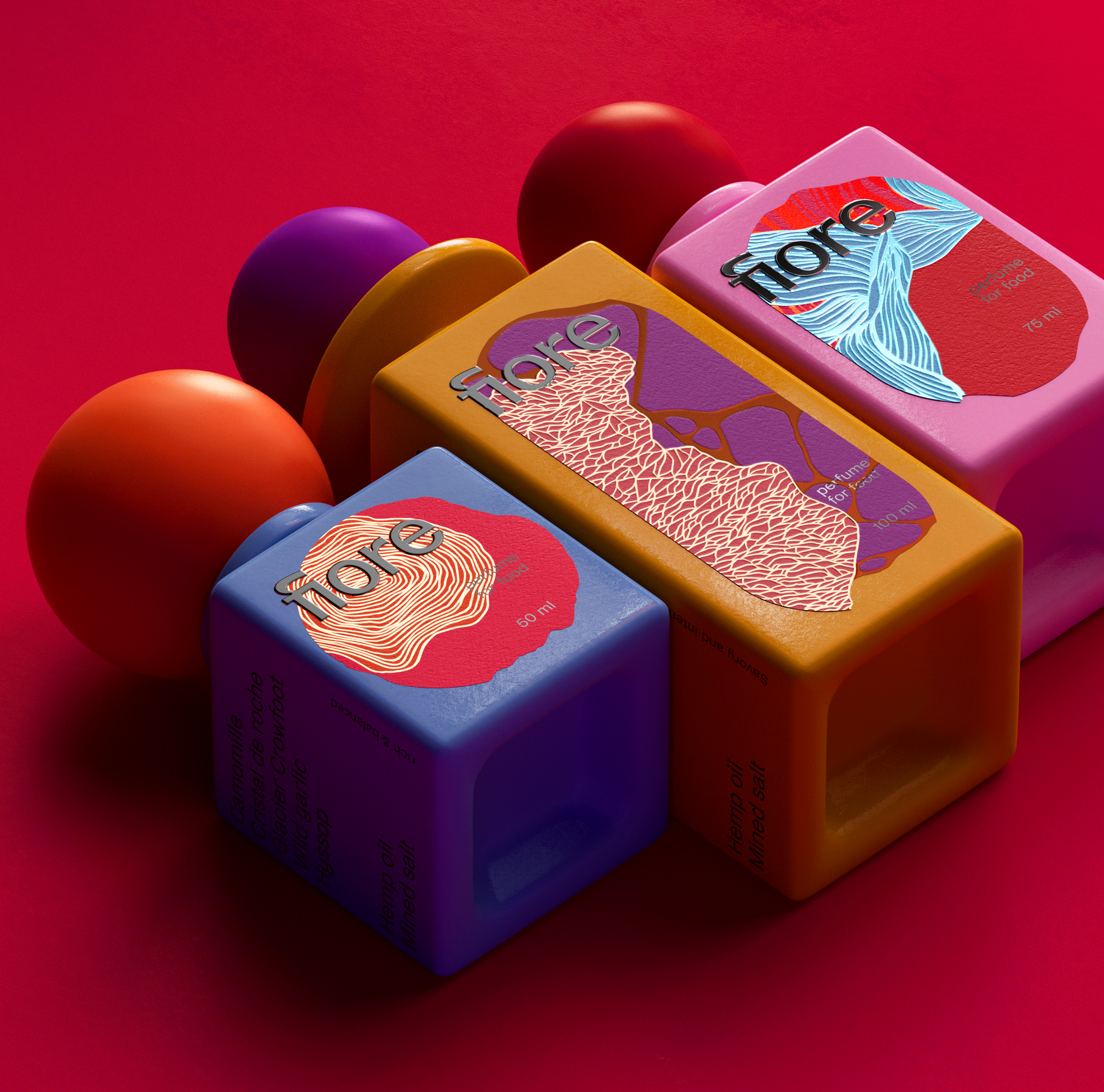
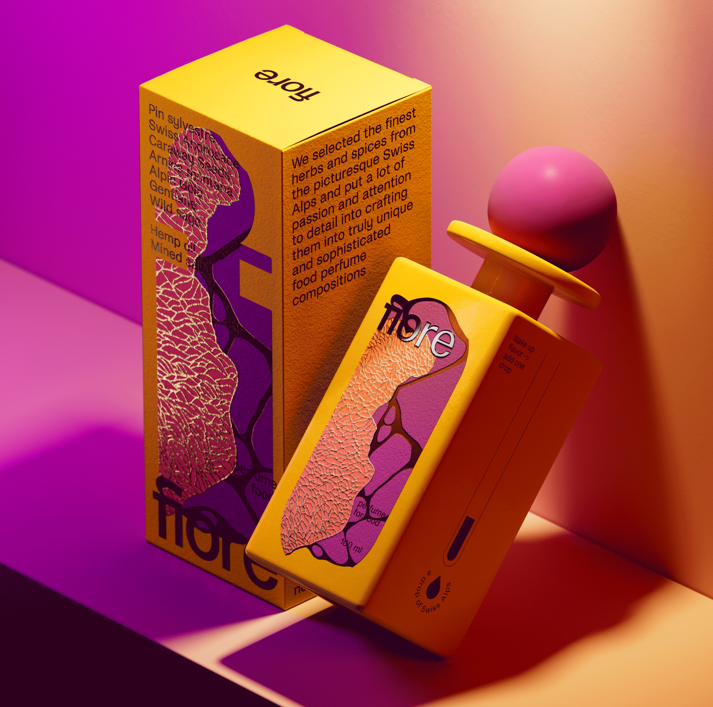
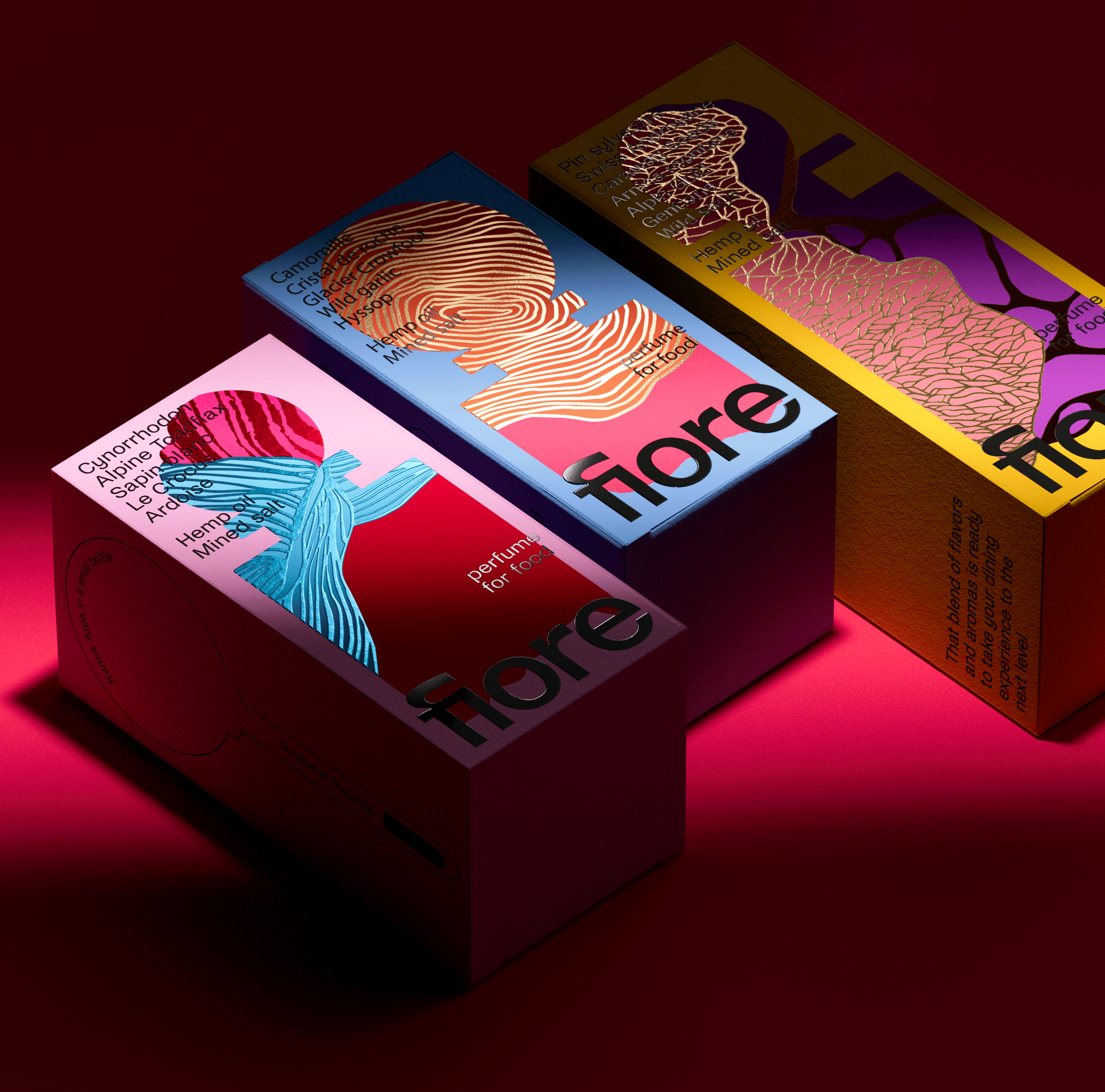
Fiore · CGI

Fiore CGI is a strikingly bold and abstract design project that creatively evokes elements of the natural world.

Design: ARD Agency
Project: Make a Mark III
Developed by: Avery Dennison, Estal & Leonhard KURZ

https://www.behance.net/gallery/191865395/Fiore-CGI


Want even more inspiration?
Follow Muzli on social media for your daily dose of design, innovation, and creativity right in your feed!
Linkedin | Instagram | Twitter

Design Spotlight 2

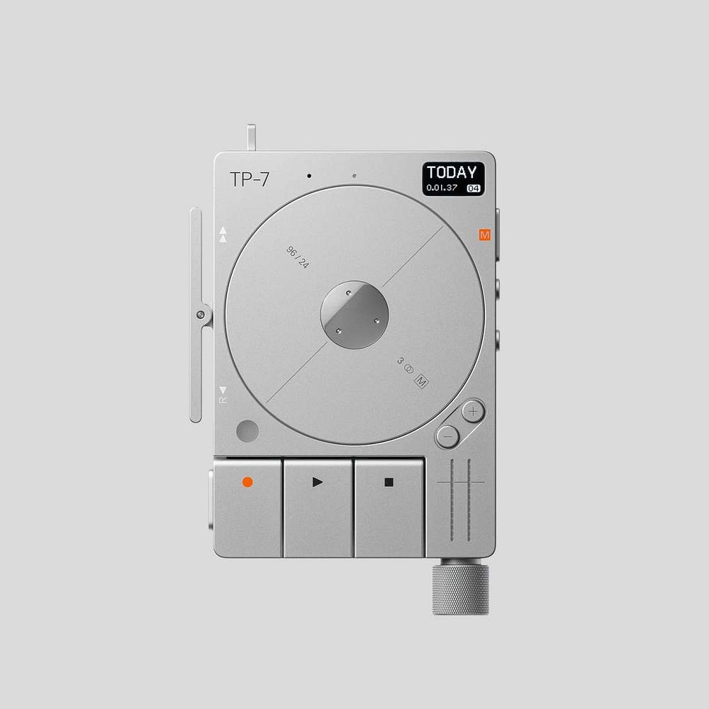
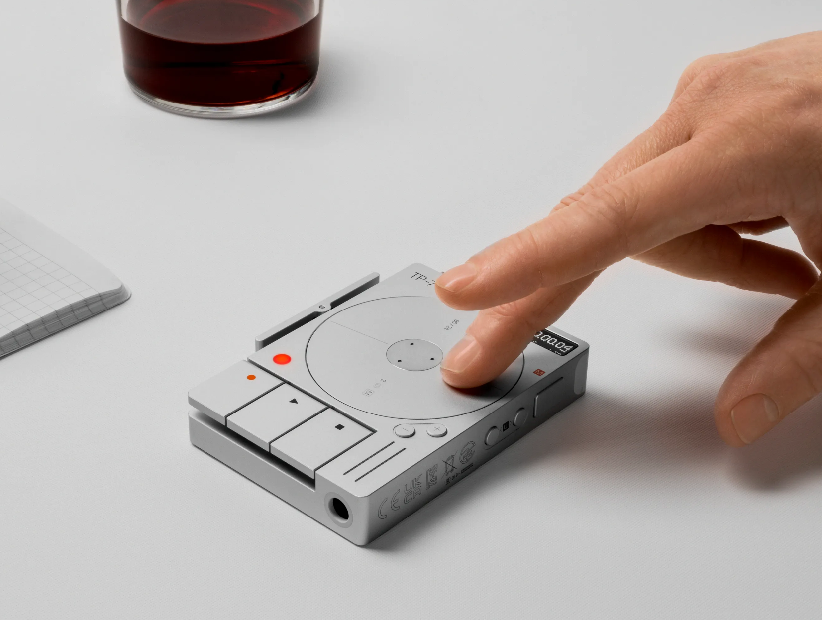
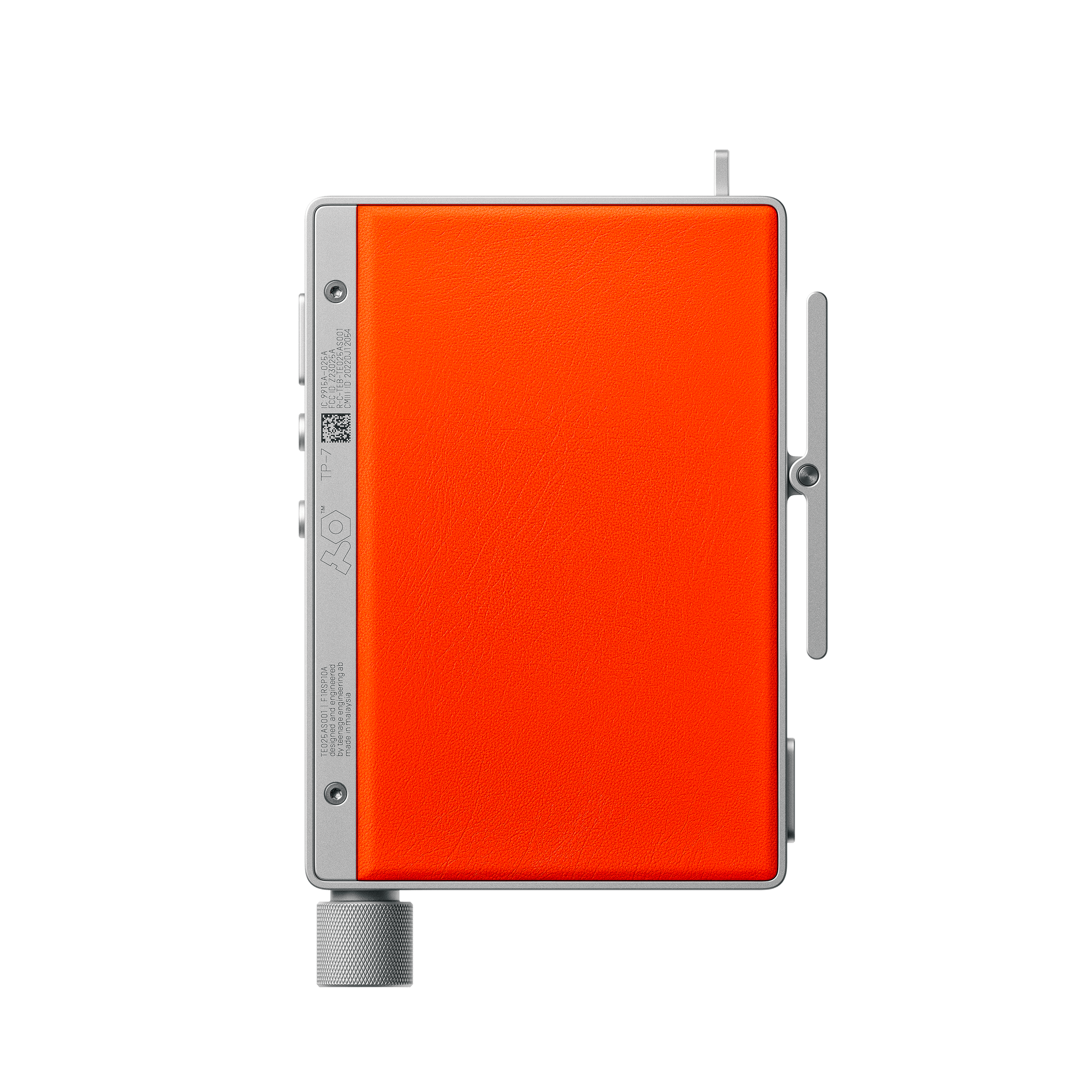
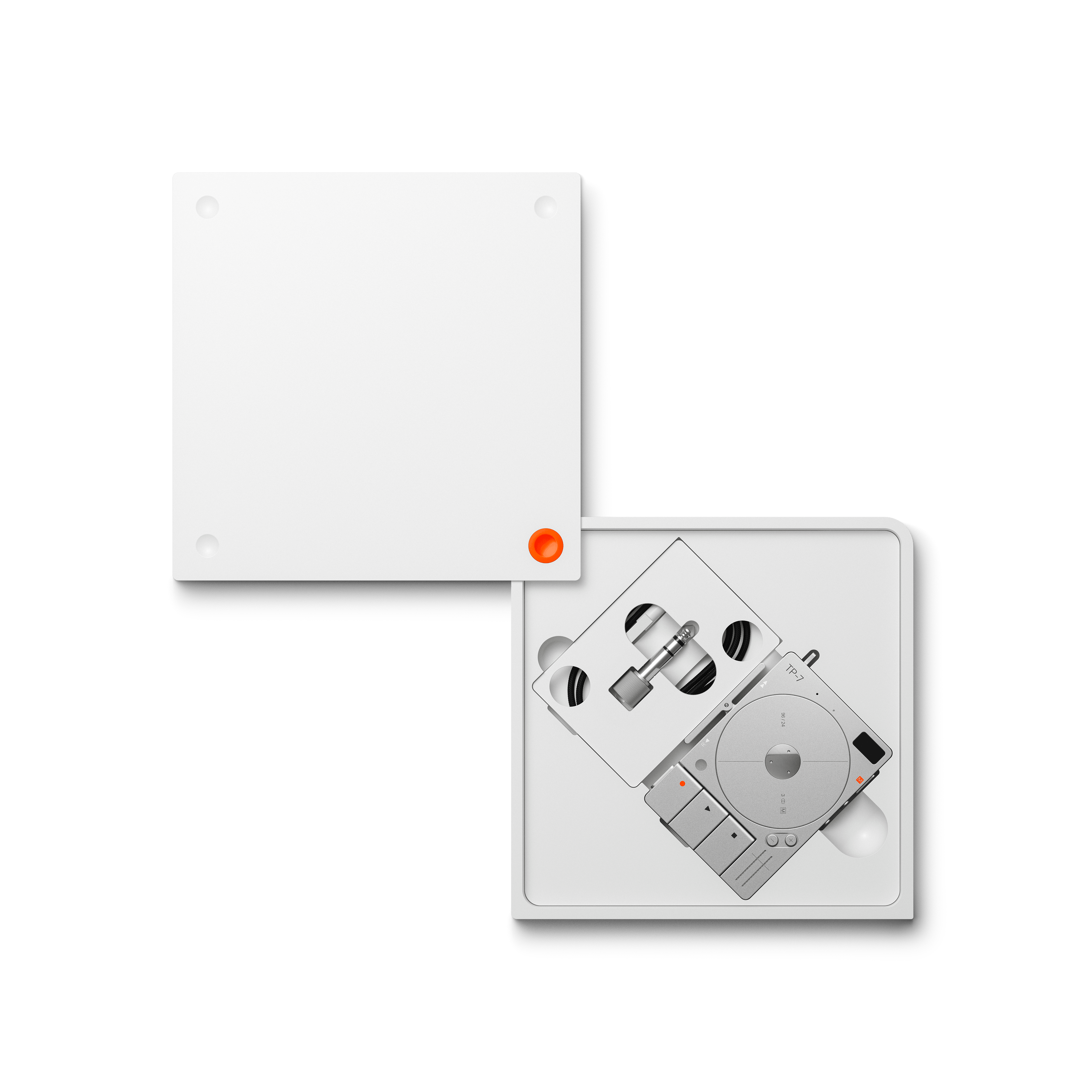
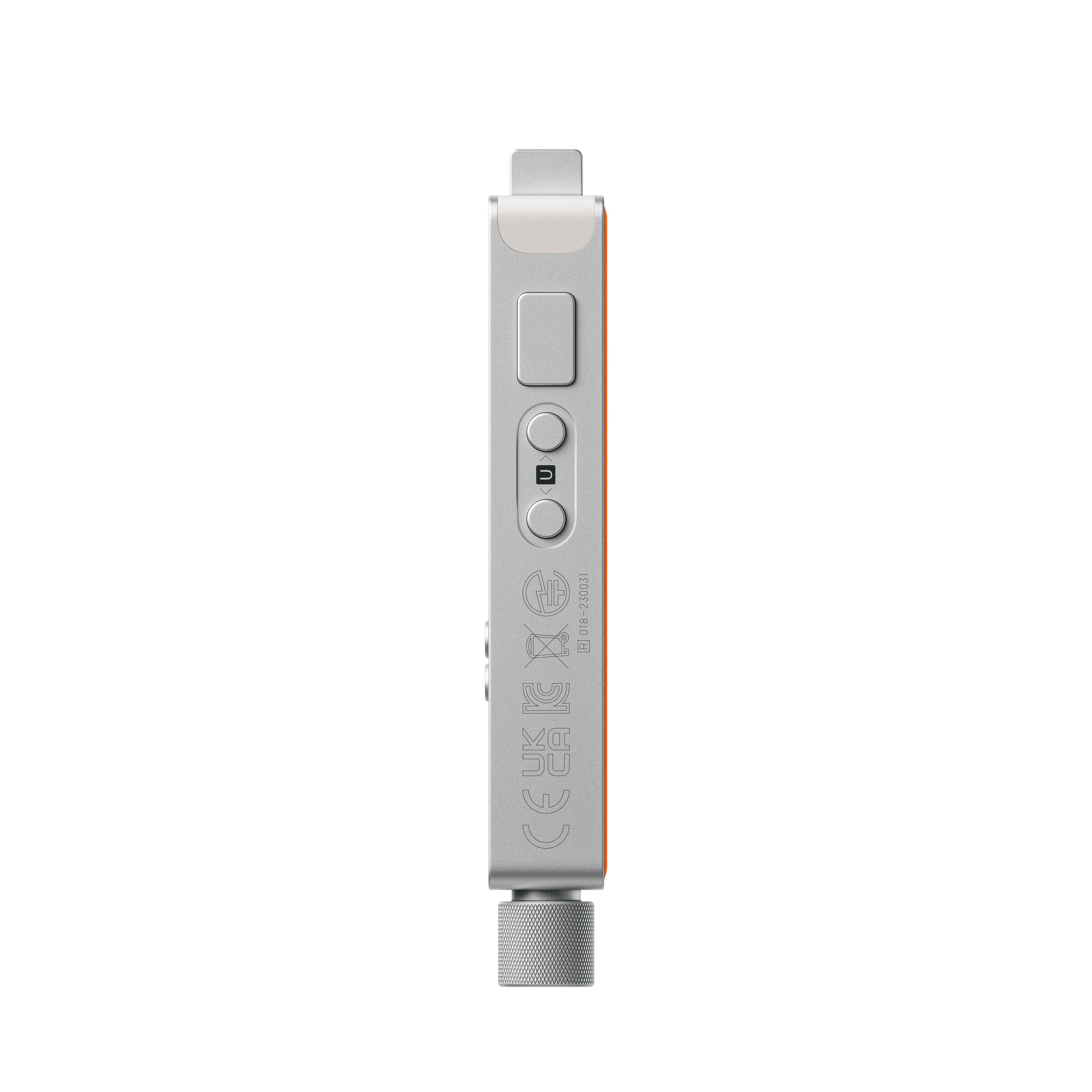
TP–7 FIELD RECORDER

by teenage engineering

Introducing the TP–7 Field Recorder by teenage engineering, a masterpiece of audio design. With a nod to the classic Braun era, this elegantly crafted device captures thoughts, music, and interviews effortlessly. Compact and intuitive, the TP–7 redefines the recording experience, offering a seamless blend of form and function for those who appreciate the art of sound.

TP–7 FIELD RECORDER


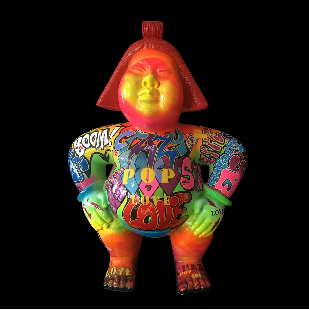
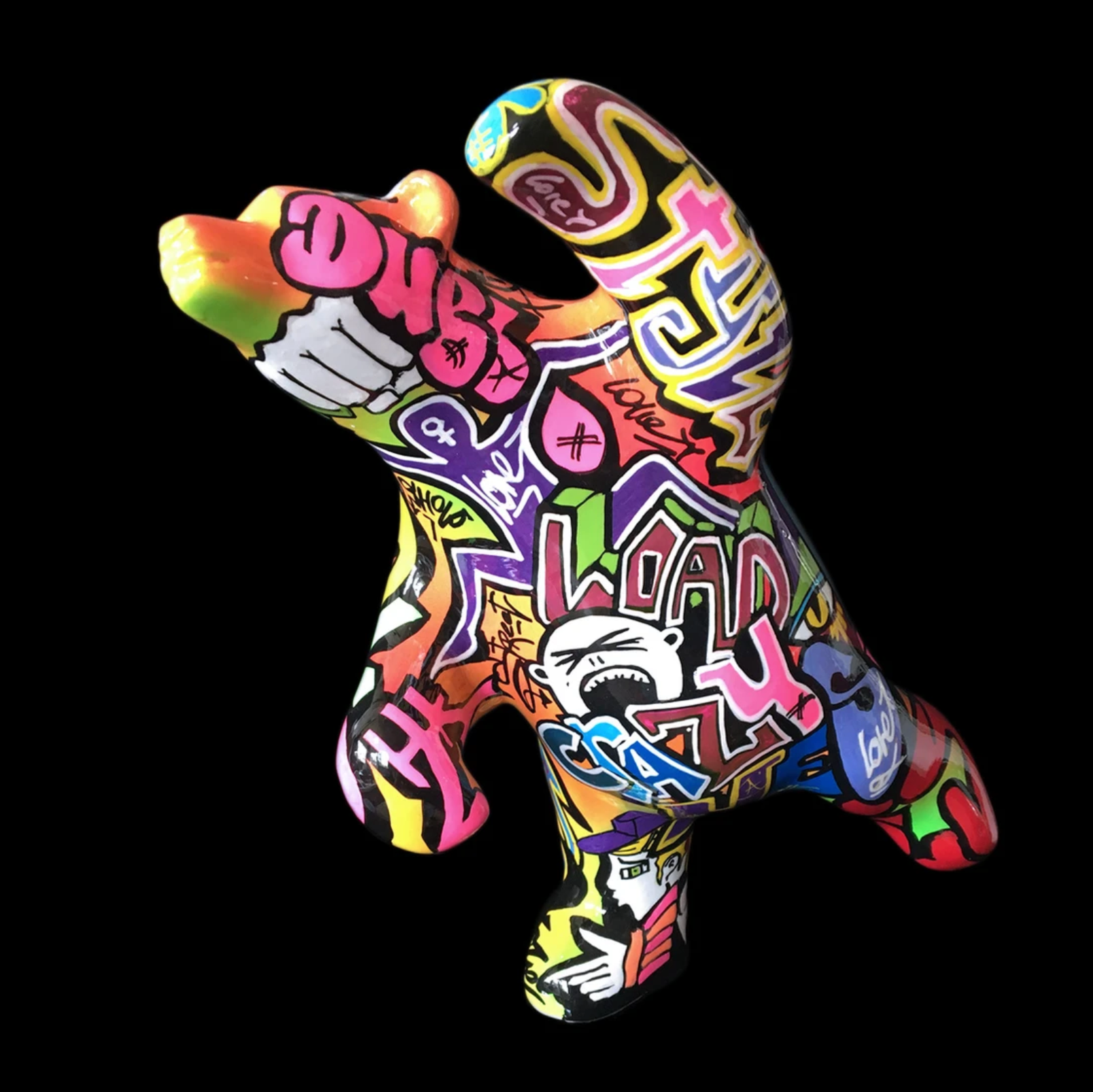
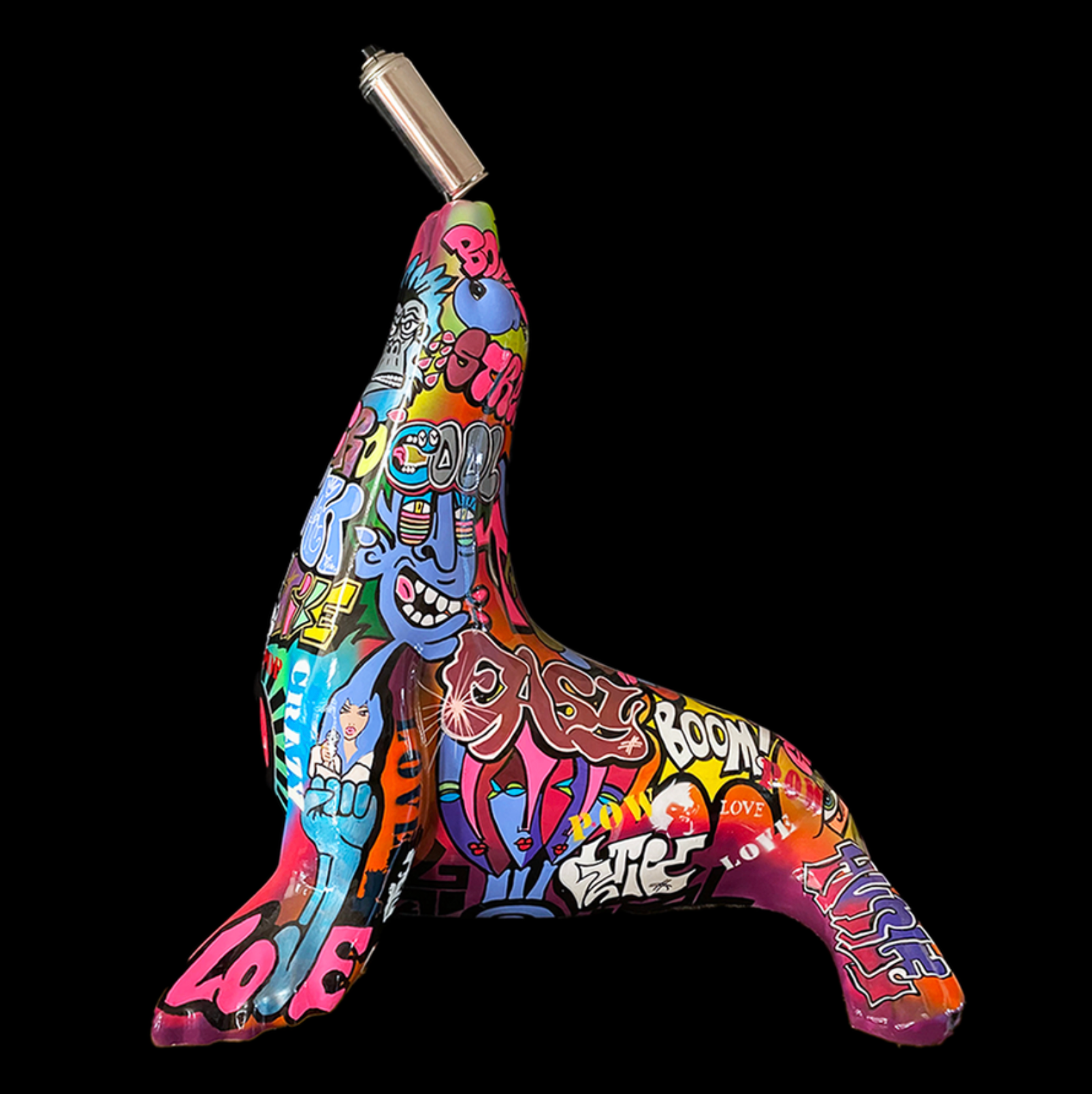
Miko-R

Miko-R, une artiste française autodidacte, trouve sa passion pour la peinture Ă  l’adolescence, influencĂ©e par des maĂźtres tels que Magritte, Vasarely, Folon et Mondrian. InspirĂ©e par la Pop Art et des artistes tels que Klein, Soulages et Keith Haring, elle intĂšgre Ă©galement le street-art dans son expression artistique Ă©phĂ©mĂšre. Initiant son parcours avec des tableaux monochromes, elle explore les couleurs chaudes avec un travail mĂ©ticuleux sur la matiĂšre. Le street-art fusionne la peinture et le volume dans ses crĂ©ations, oĂč elle crĂ©e des sculptures en fibre de verre, les taguant avec des couleurs, des mots et des messages variĂ©s. Son Ɠuvre, empreinte d’humour et d’énergie, se distingue par la gĂ©nĂ©rositĂ© des formes et des messages qu’elle insuffle.

Miko-R


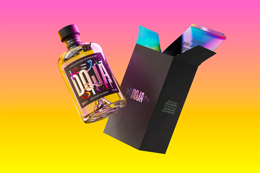
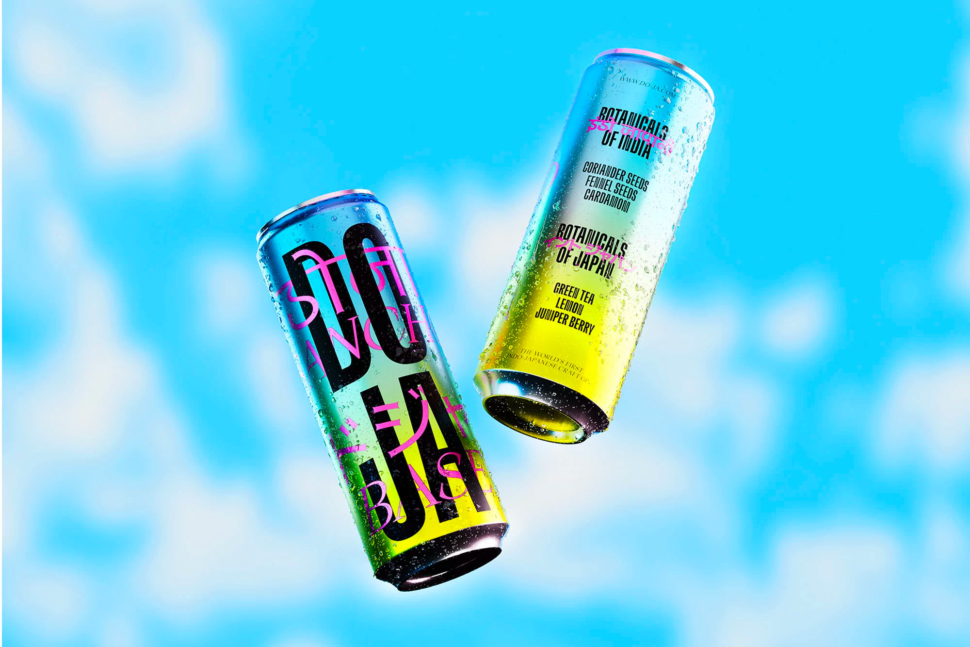
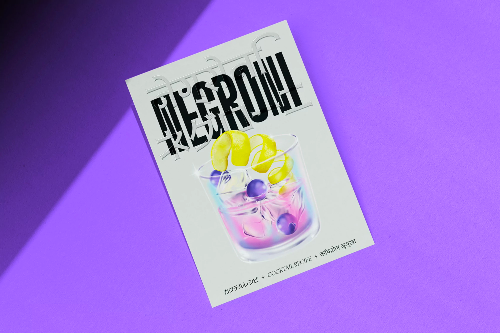
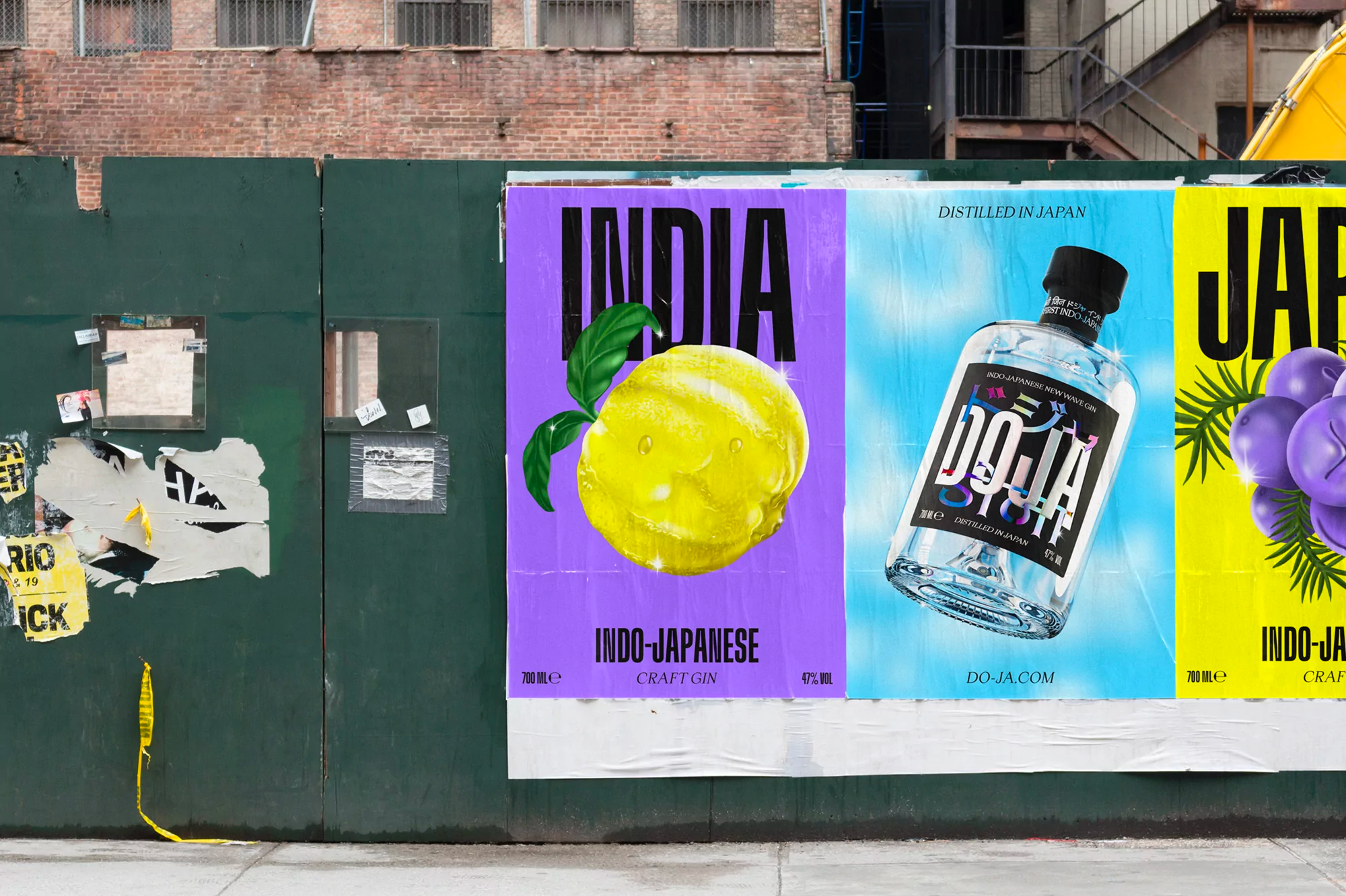
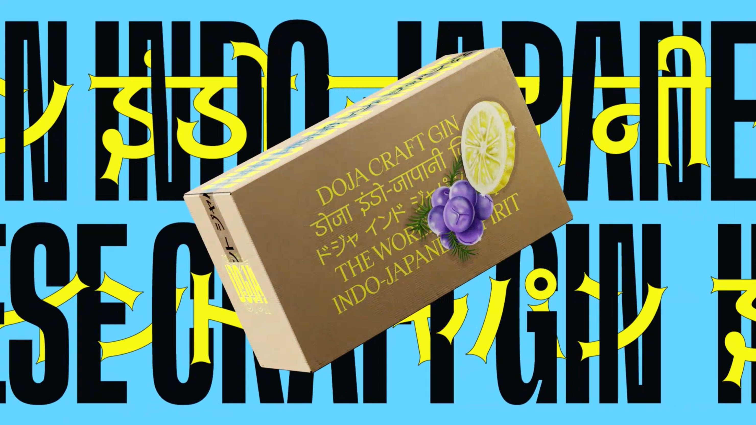
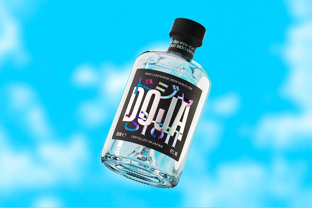
OMSE’s identity for Indo-Japanese spirit DOJA is a joyful mixture of ingredients and cultures

DOJA is the world’s first Indo-Japanese spirit; a mixture of ingredients and cultures that come together to create something new. Crafted by a veteran distiller in Japan’s Wakayama prefecture and produced in Goa-based East Side Distillery, DOJA is a yuzu-dominant gin with hints of cedar, sansho pepper and hinoki in combination with traditional botanicals from India.

Building on the brand’s concept of mixing, London-based studio OMSE delivered an identity for DOJA that honours the two cultures whilst embracing tradition and modernity. This also inspired the name, In(do-ja)panese as well as the distinctive logo; a mixture of typefaces and languages: Japanese, English and Devanagari.


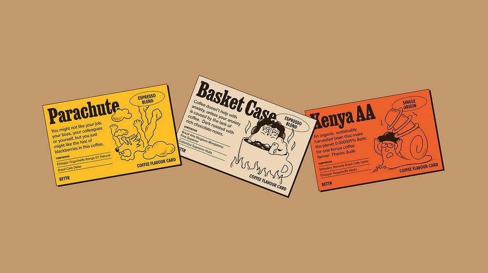
BETTR COFFEE — Scr*w perfect, make impact

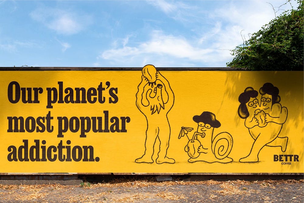
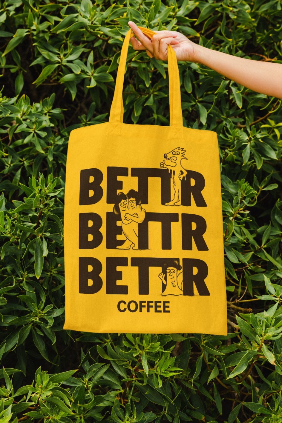
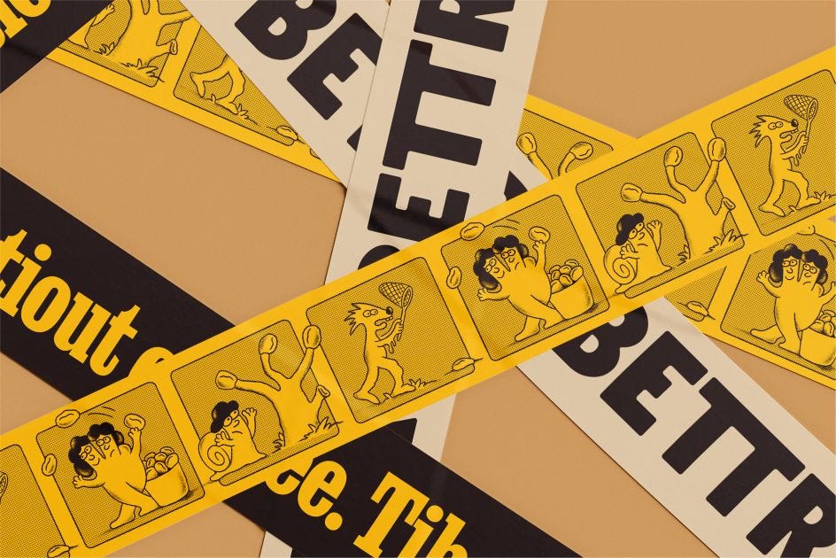
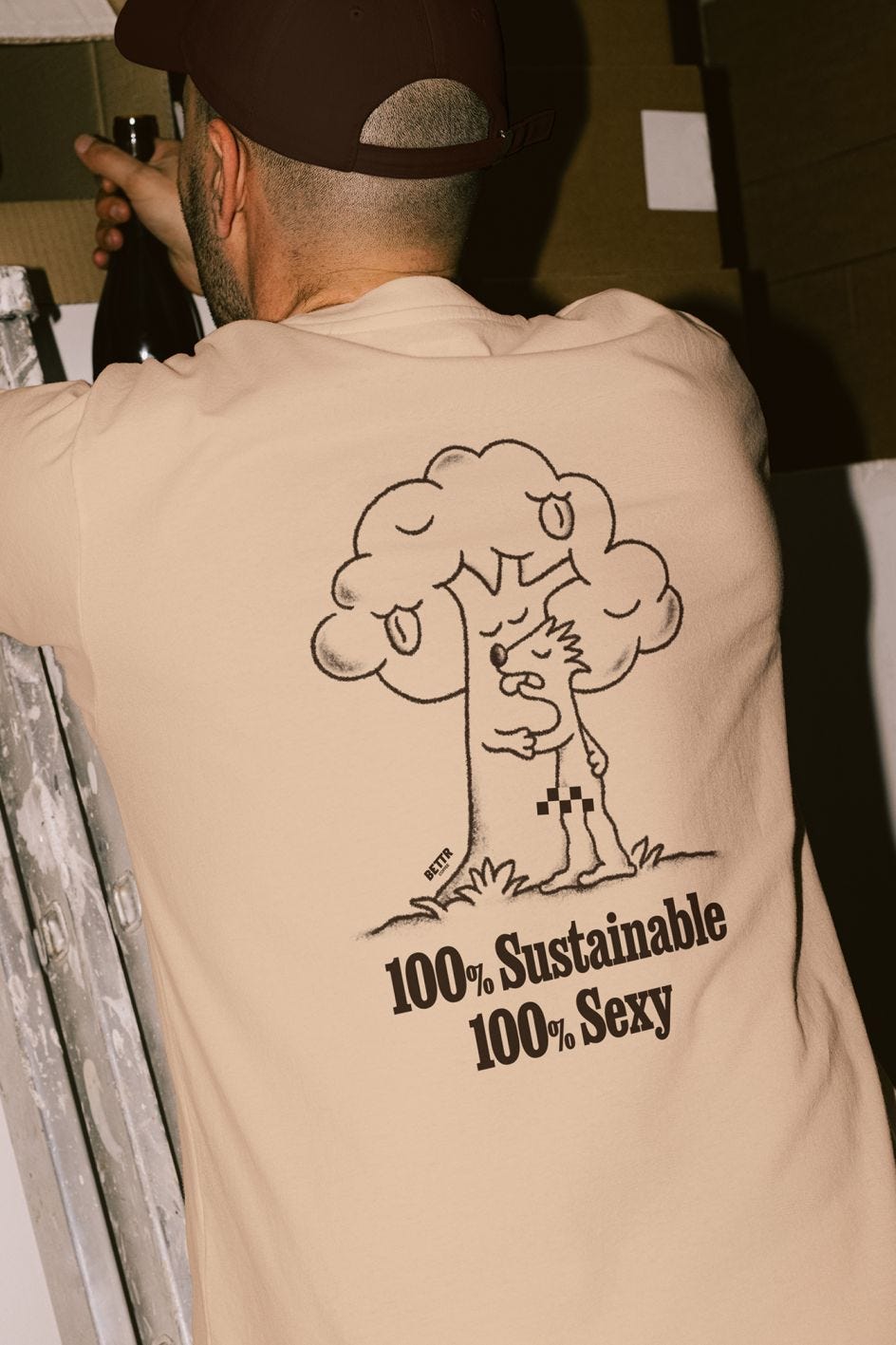
Anak’s Bettr Coffee rebrand embraces imperfection with a visually striking and authentically flawed design. The characters of Planet Bettr, fully realized by Anak, introduce a unique world-building approach, reflecting the messy yet relatable journey toward positive change. The design’s typography strikes a balance between welcoming and readable, the color palette exudes confidence, and quirky characters engage users while conveying a direct message. Anak’s design for Bettr Coffee seamlessly marries impact and entertainment, proving that authenticity, even in design flaws, is a powerful visual narrative.


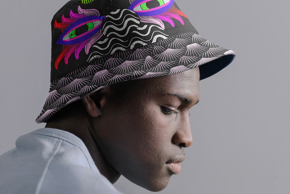
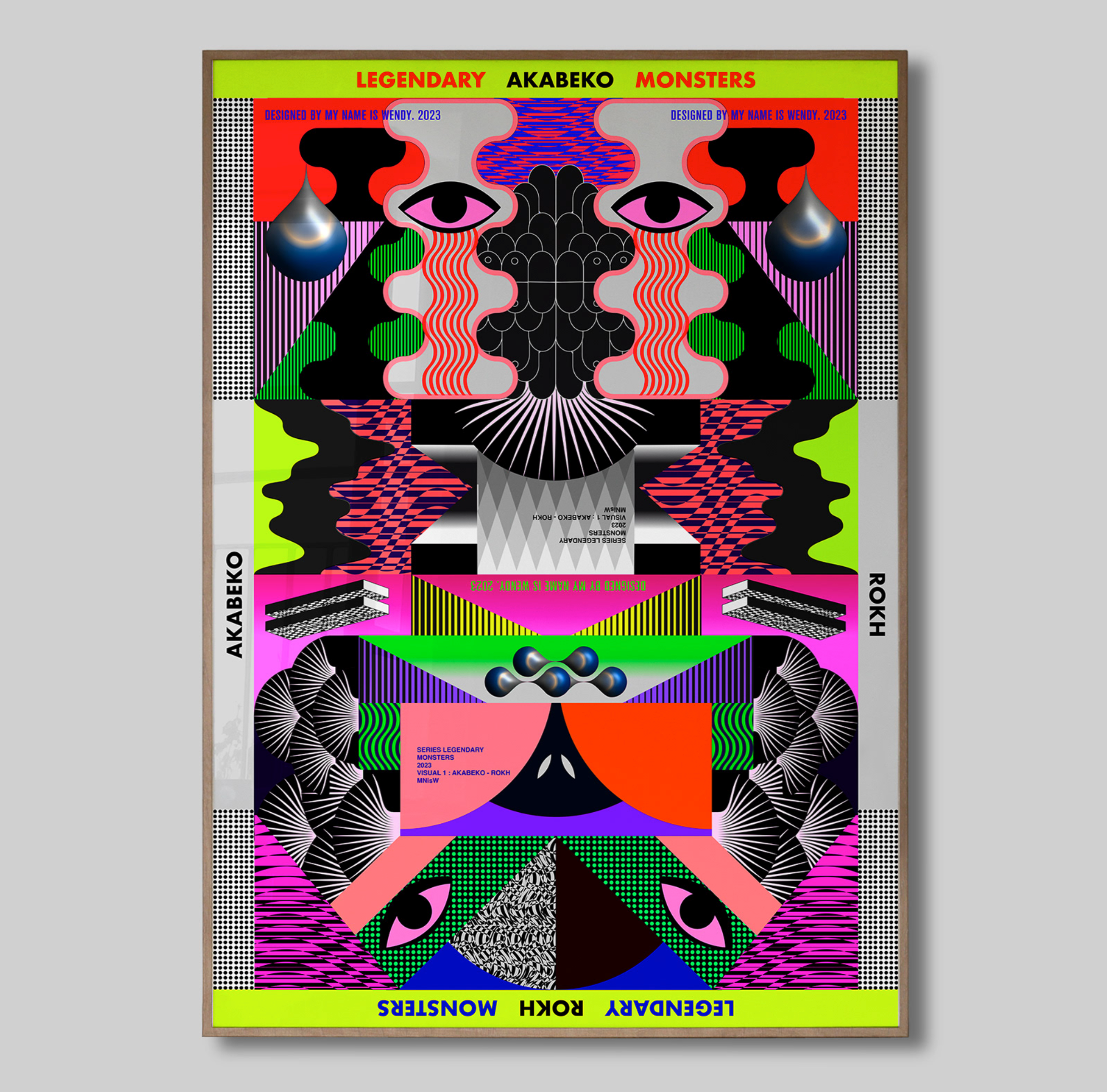
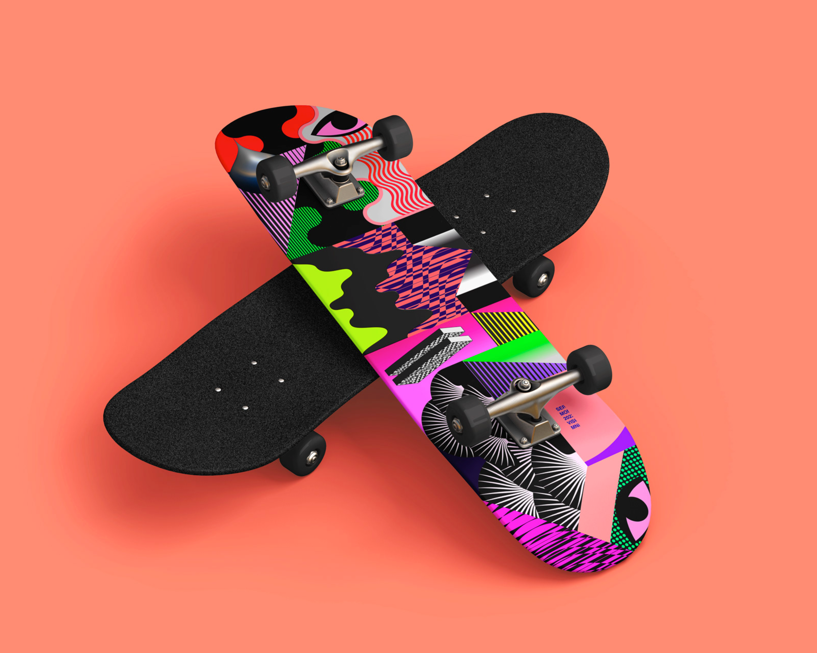
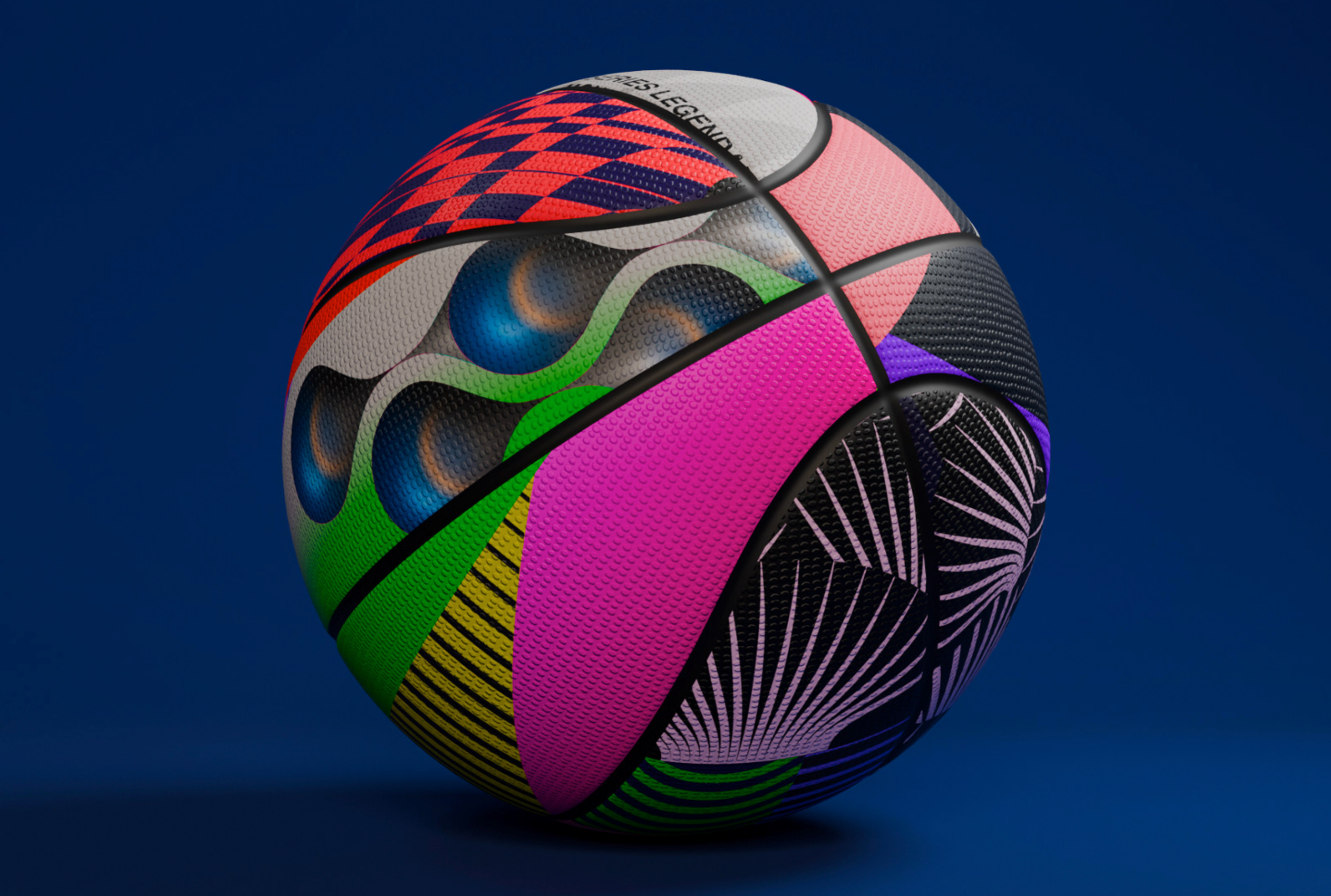
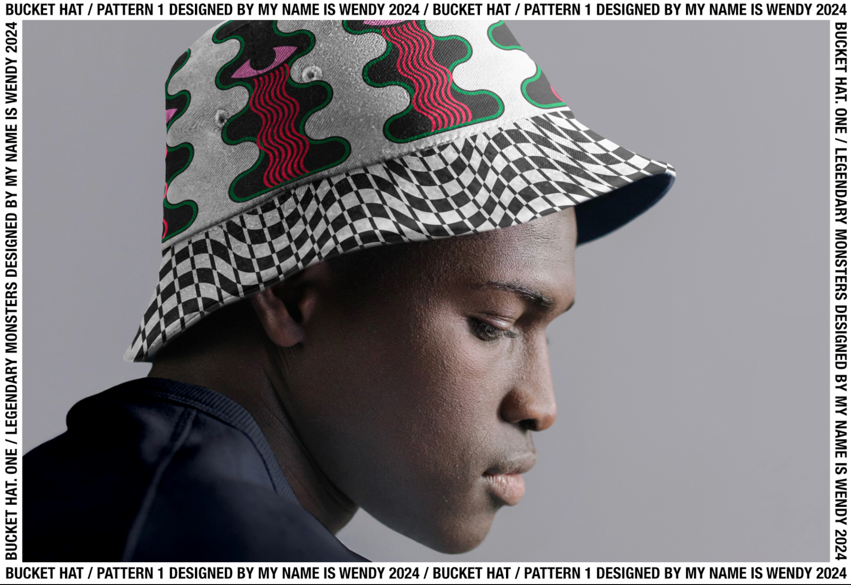
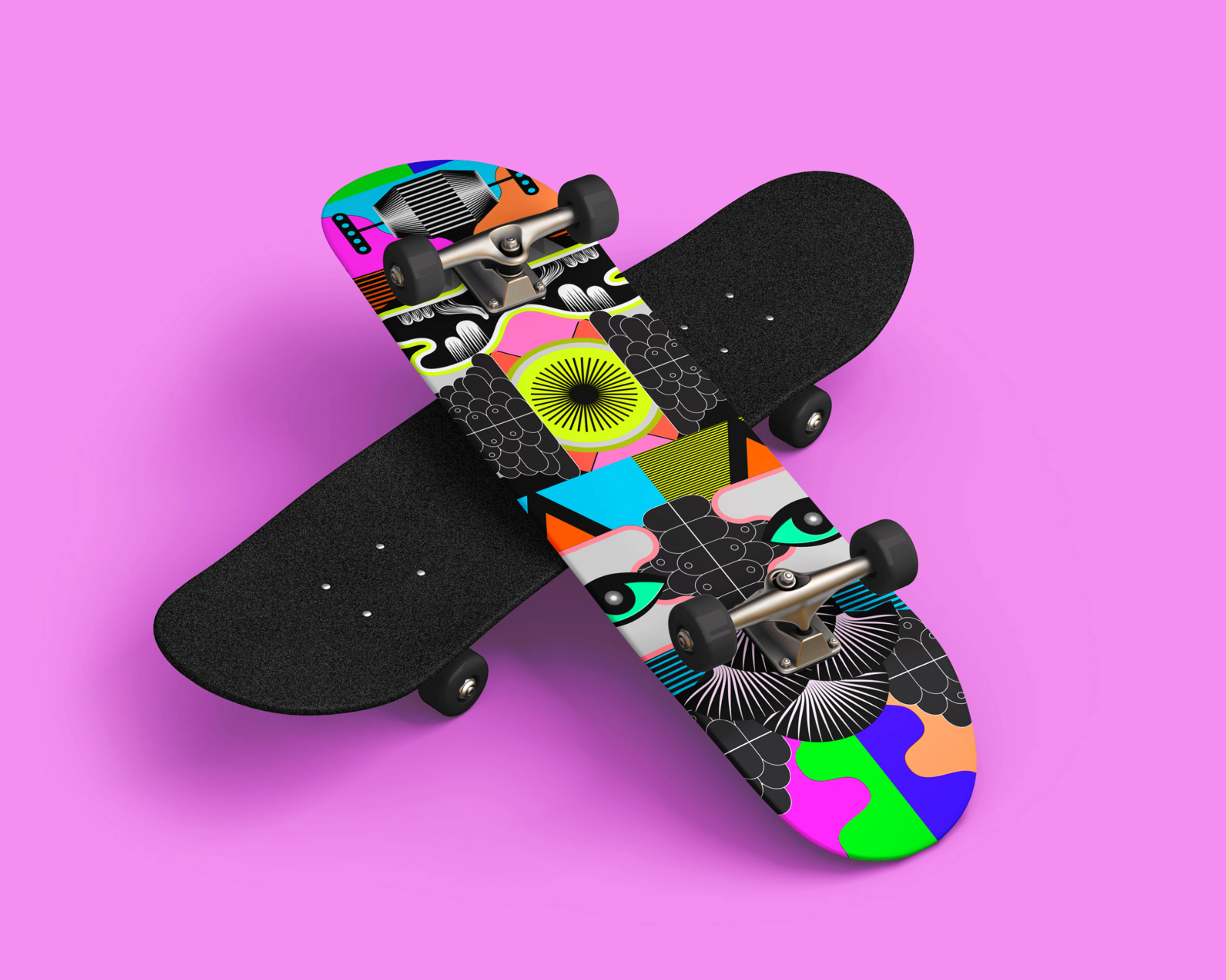
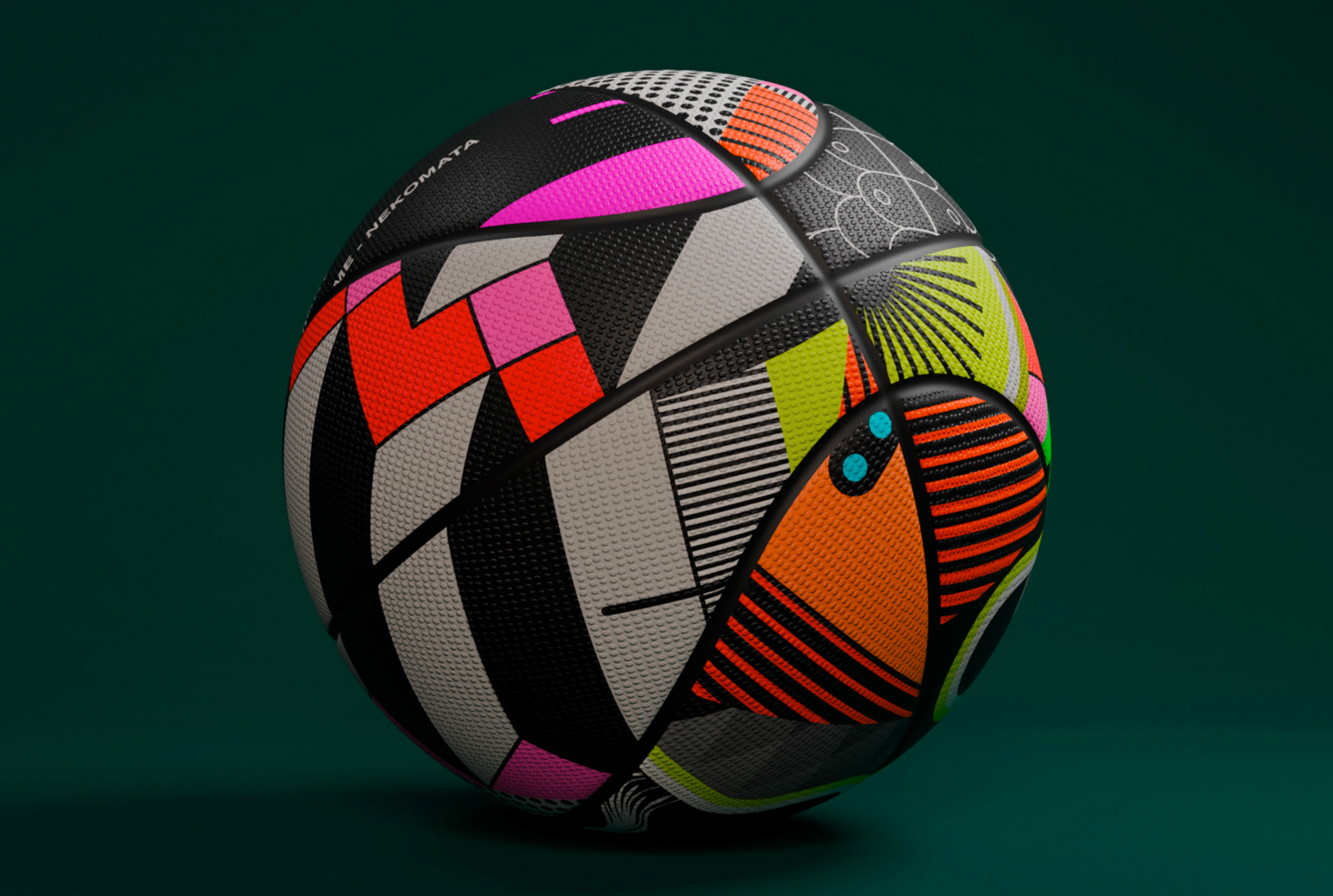
Legendary

by Wendy Studio

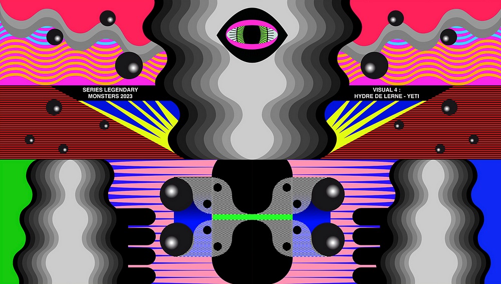
Legendary Monsters is a series of 4 visuals.
Each artwork is composed of interlocking shapes, patterns and graphic modules, giving rise to different visual and formal reinterpretations.


Goïaℱ Variable Typeface

by Almarena Creative
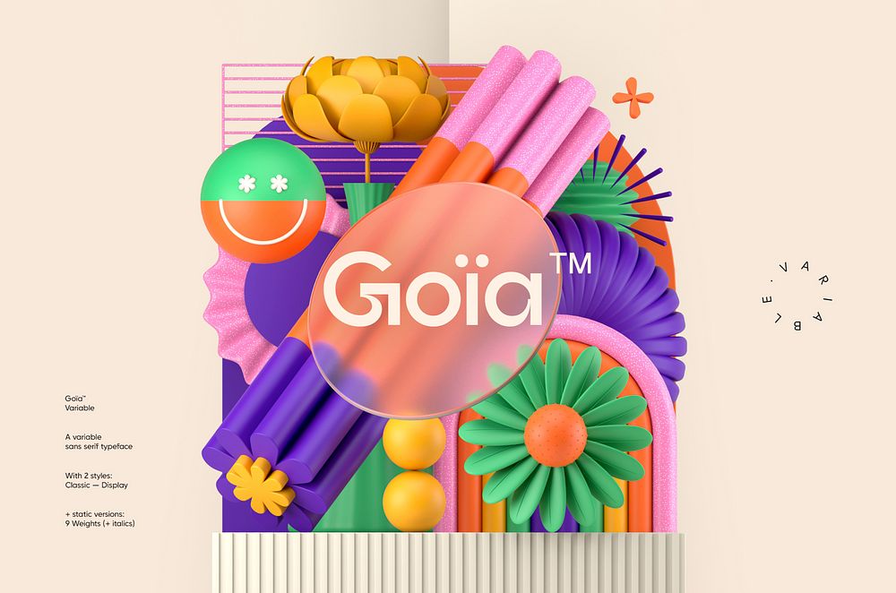
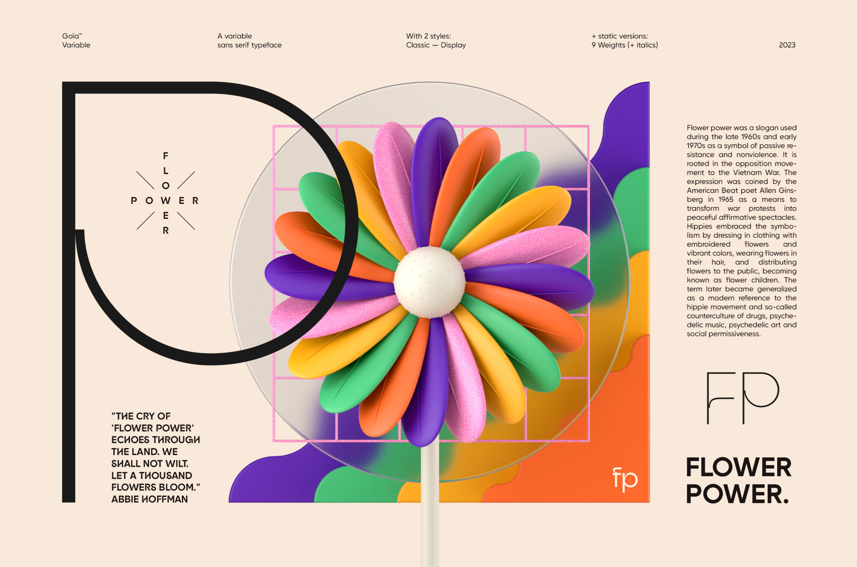
Introducing “Goïa”, a variable sans serif typeface available in 2 styles: A first one, very readable with a touch of originality, ideal for body text and a second one “Display”, more impactful with a more assertive originality. Both styles are available in a variable or static version (9 weights + italics) with many alternates divided into 3 stylistic sets.


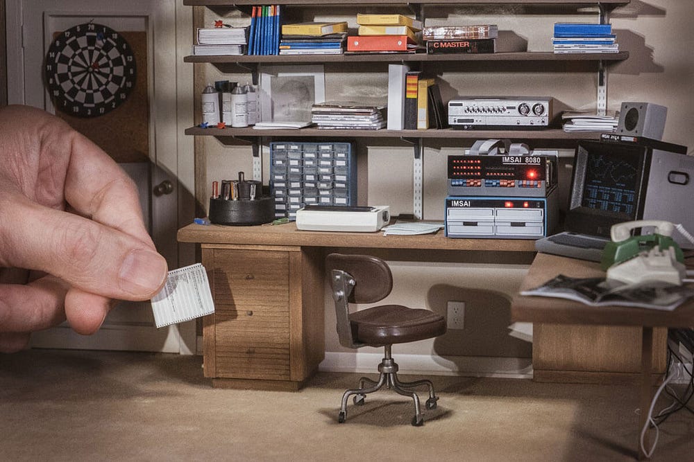
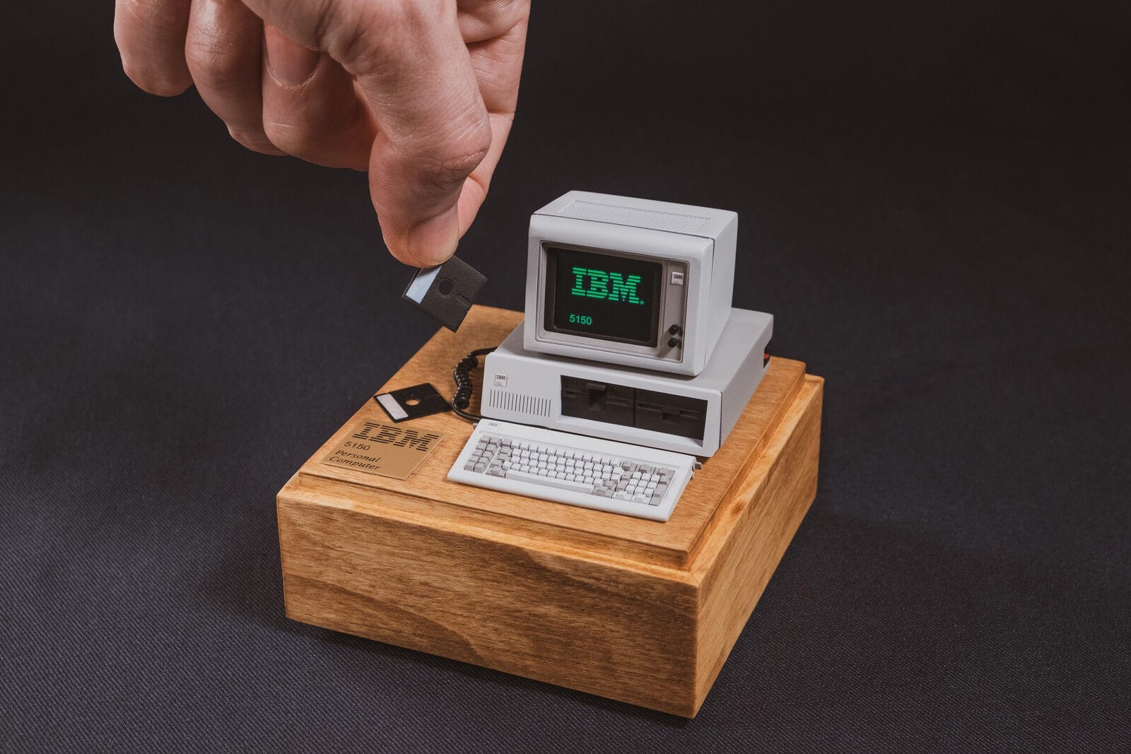
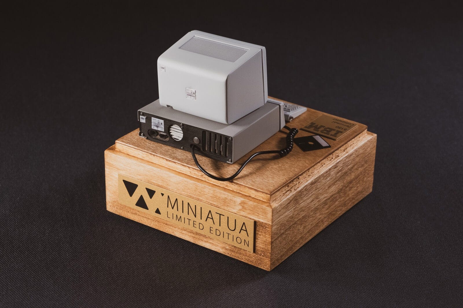
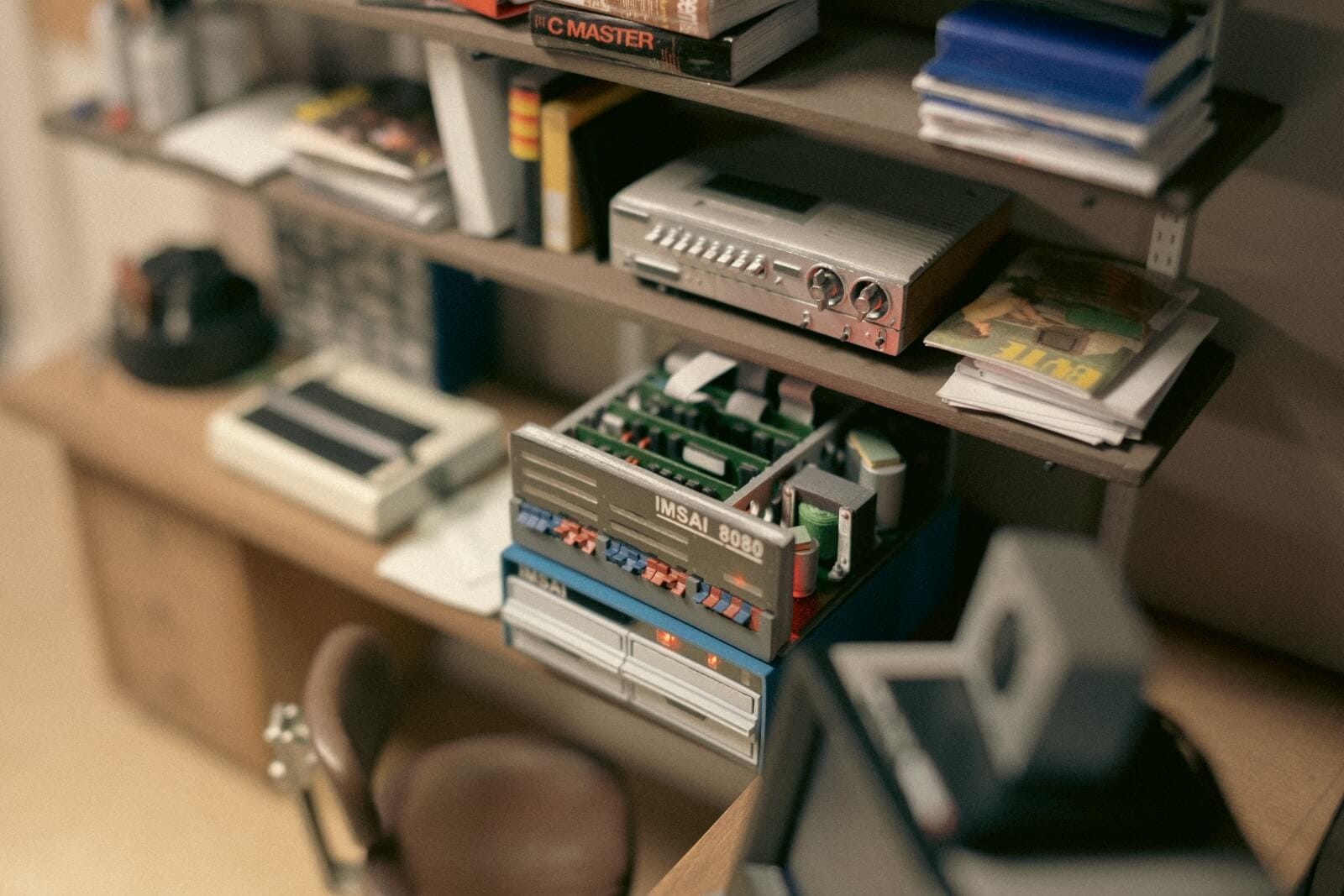
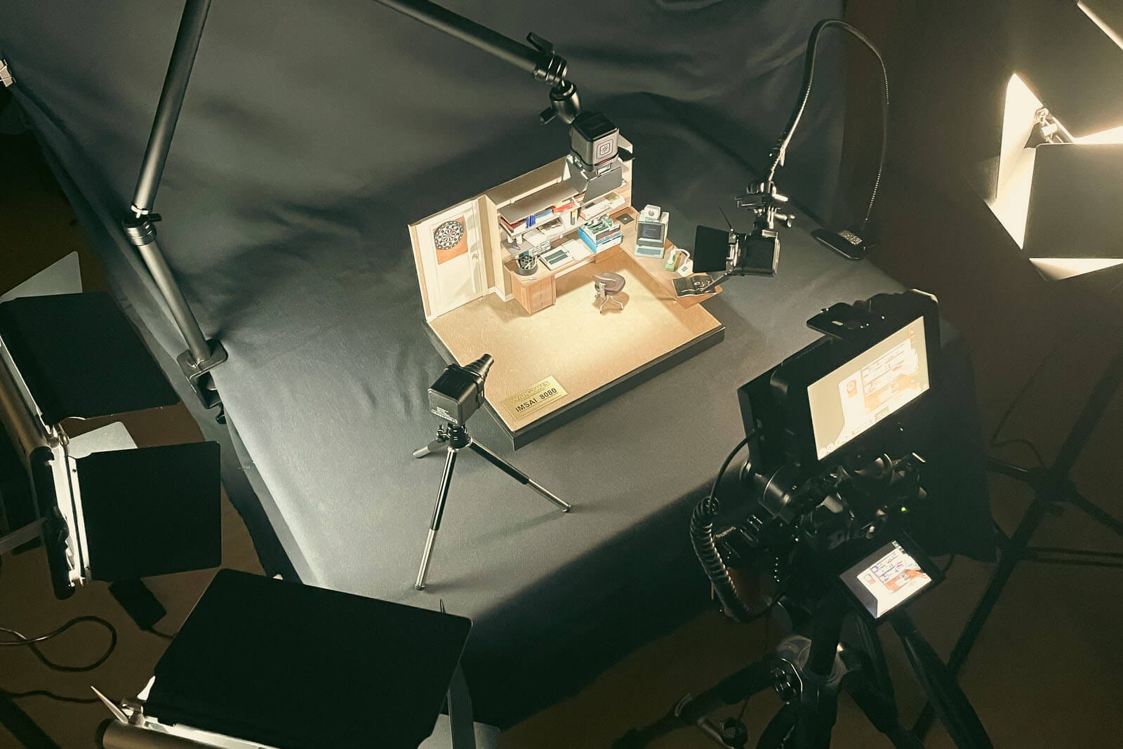
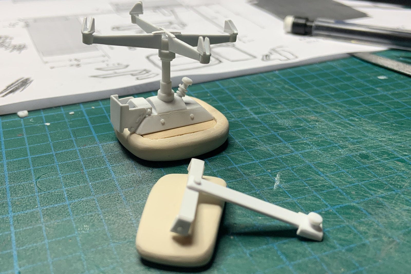
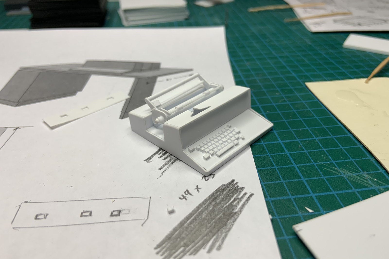
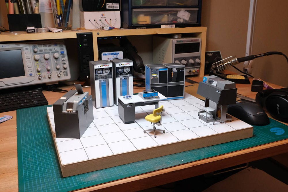
Miniatua: Crafting Timeless Beauty in Miniature Vintage Computers

by Nicolas Temese

Discover the mesmerizing world of Nicolas Temese, also known as Miniatua, a visionary artist who specializes in crafting exquisitely detailed miniature replicas of vintage computers and mainframes.

What sets Miniatua’s work apart is his relentless pursuit of accuracy. Each piece is painstakingly handcrafted with an unwavering commitment to capturing the essence of the original. This dedication to precision has birthed a collection of breathtaking replicas, among them a scaled-down model of the iconic 1959 IBM 5150 personal computer.


Want even more inspiration?
Follow Muzli on social media for your daily dose of design, innovation, and creativity right in your feed!
Linkedin | Instagram | Twitter

Design Spotlight 1

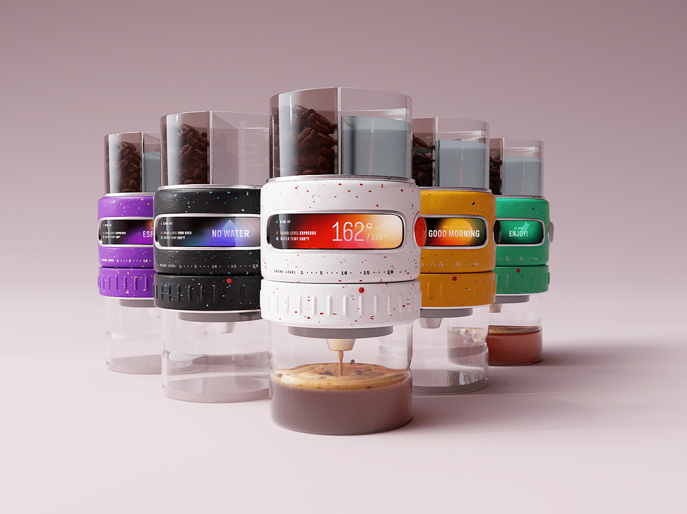
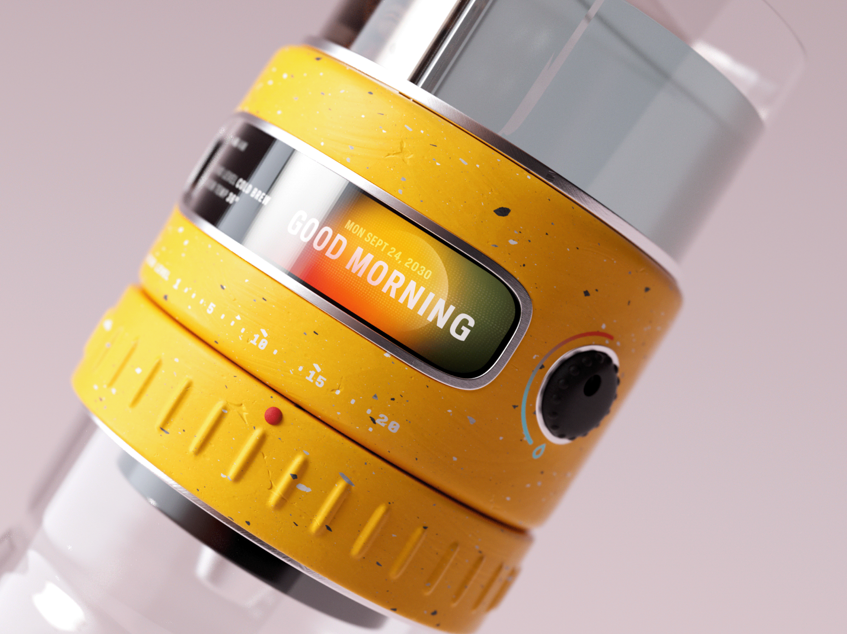
Brewster Machine

by Jeremiah Shaw

Meet Brewster — a battery powered coffee machine of the future that grinds, heats, tamps and pours with dreamy precision. When you start to feel that afternoon grind, pour yourself a Brewster Shot (TM) to finish strong.

Brewster Machine

RYTM.

by Jorge Paez

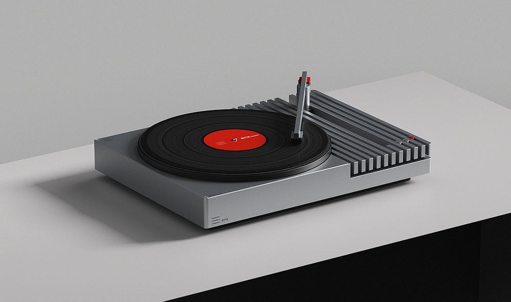
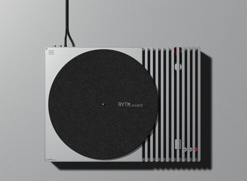
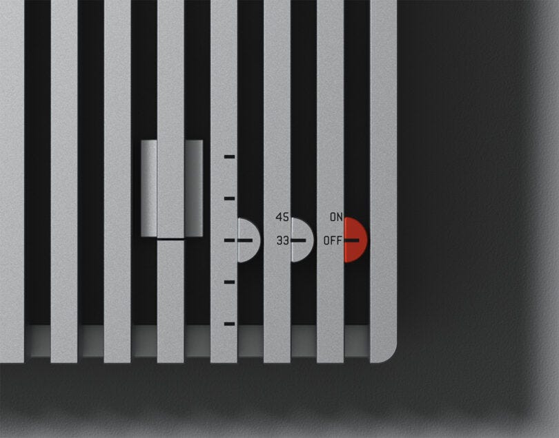
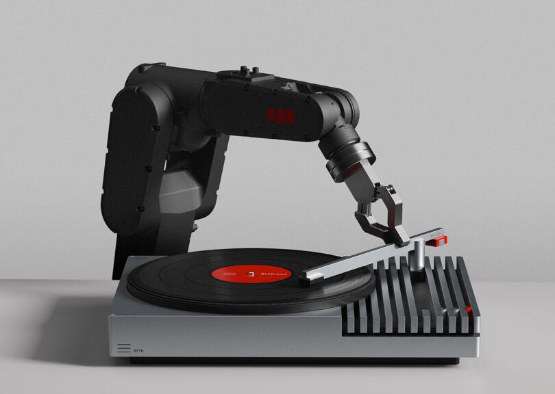
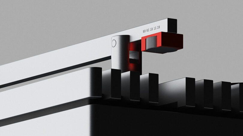
RYTM is a contemporary interpretation of the classic record player, seamlessly blending rhythm and architecture into a modern design. Inspired by the harmony of music and the precision of architecture, RYTM features a unique vertical slat arrangement that uniformly integrates user controls, from the tonearm to the power switch, embodying cutting-edge engineering within a visually engaging form.

RYTM.

Geometric Letter Postcards

by Dina Yeghiazaryan

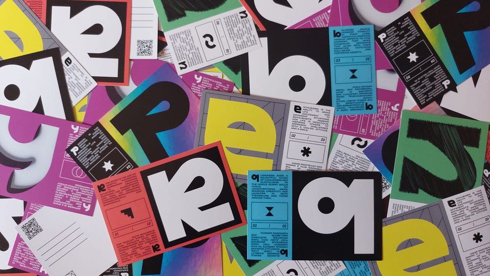
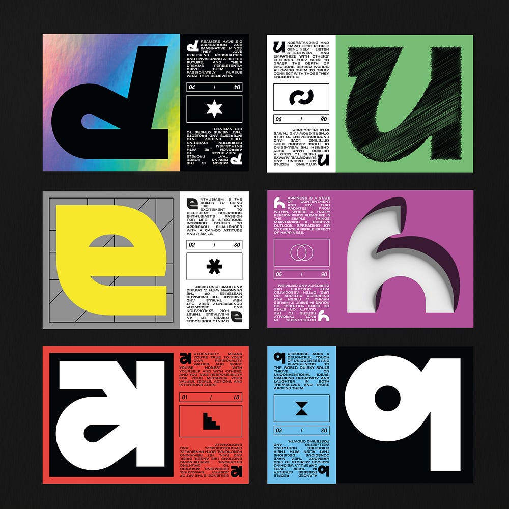
The concept behind these postcards aimed to craft an exceptional and explorative encounter. Every postcard showcases a dual-faced narrative, with each side embodying unique human attributes like ‘balanced,’ ‘quirky,’ ‘resilient,’ ‘happy,’ ‘youthful,’ among others.

Geometric Letter Postcards

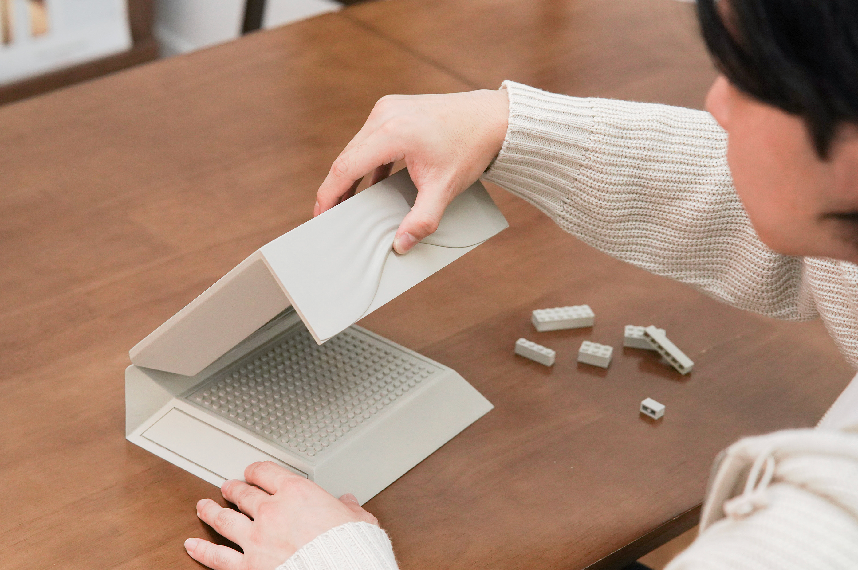
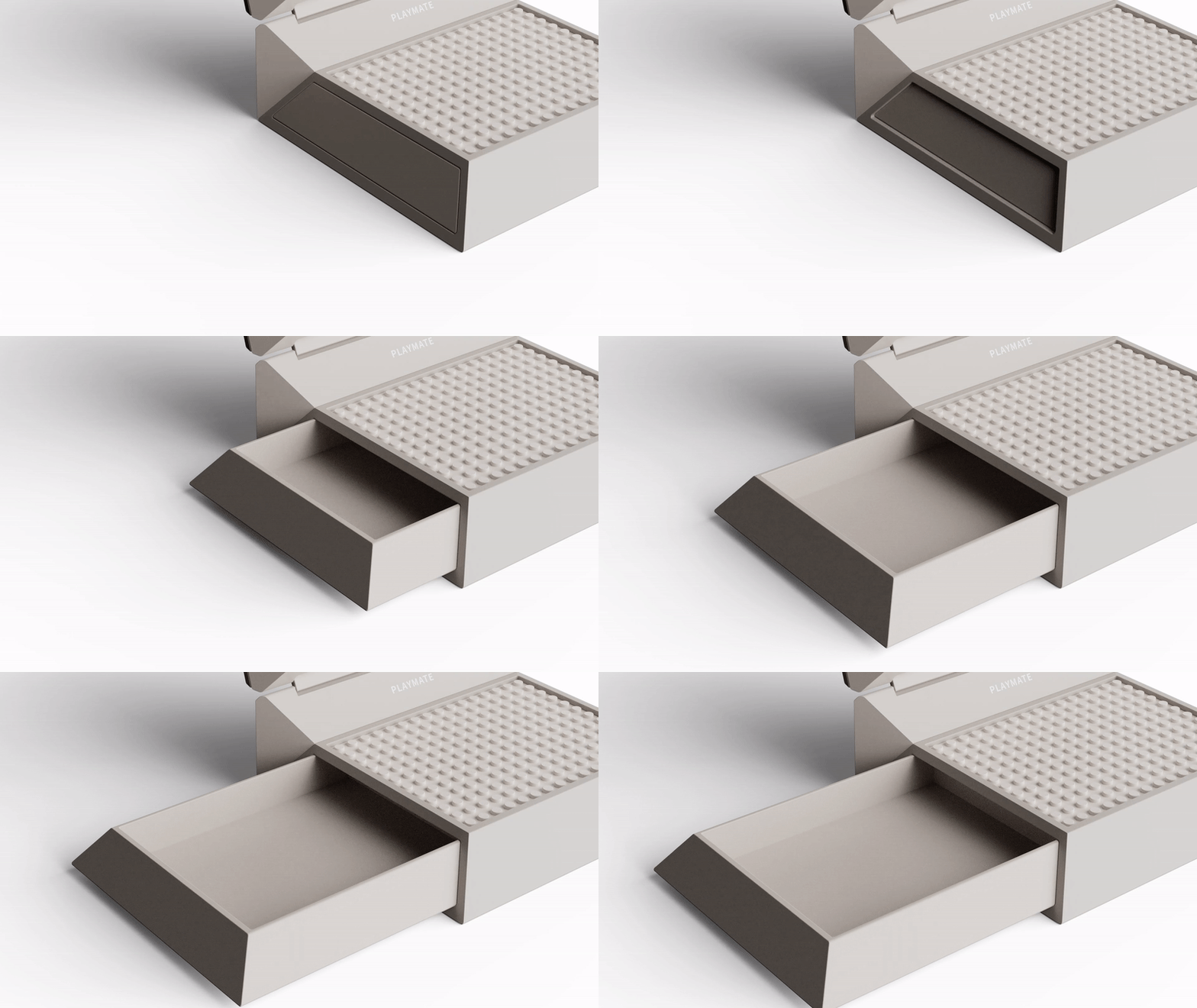
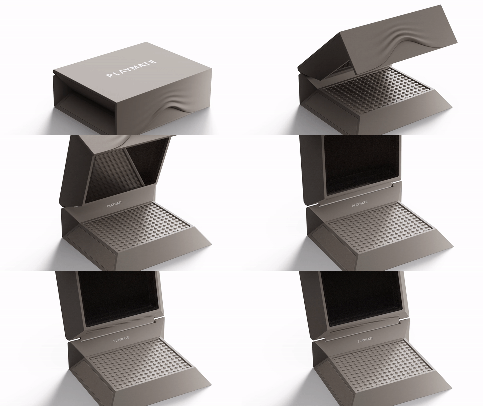
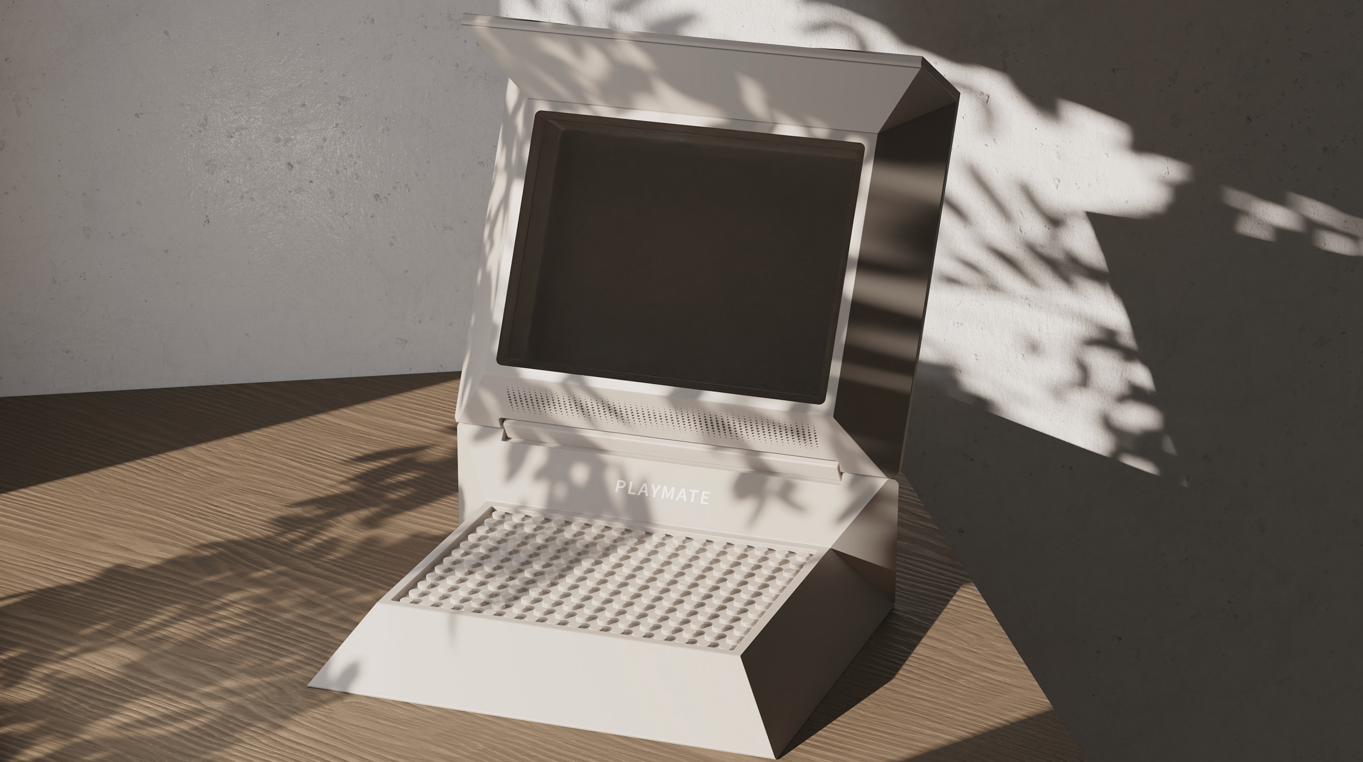
Playmate

by Gun Park

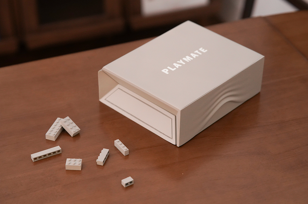
Playmate is a product that provides a social connection for single people without an emotional safety net.

This product creates social connections through ‘play.’ Users of this product can exchange the blocks they have created with each other and share their concerns.

Playmate

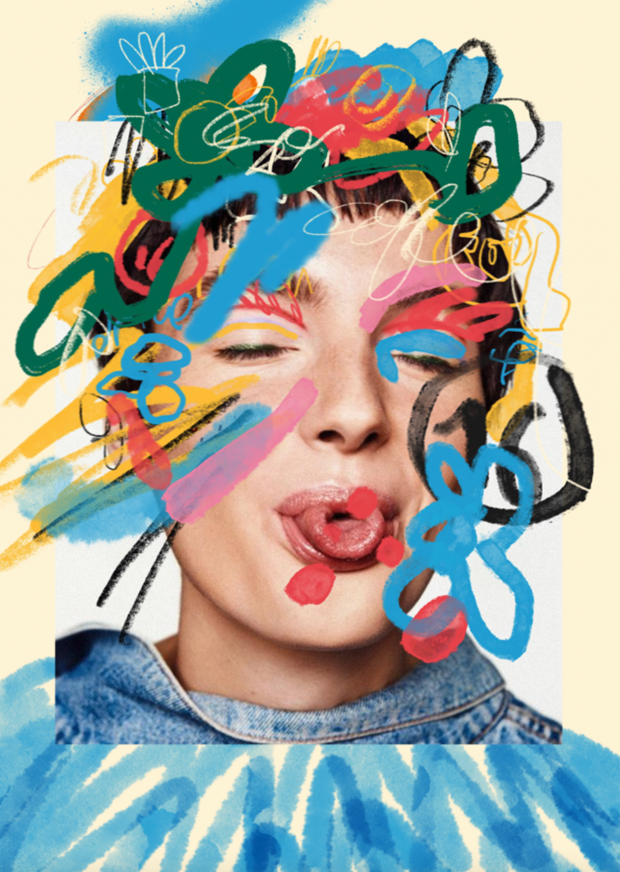
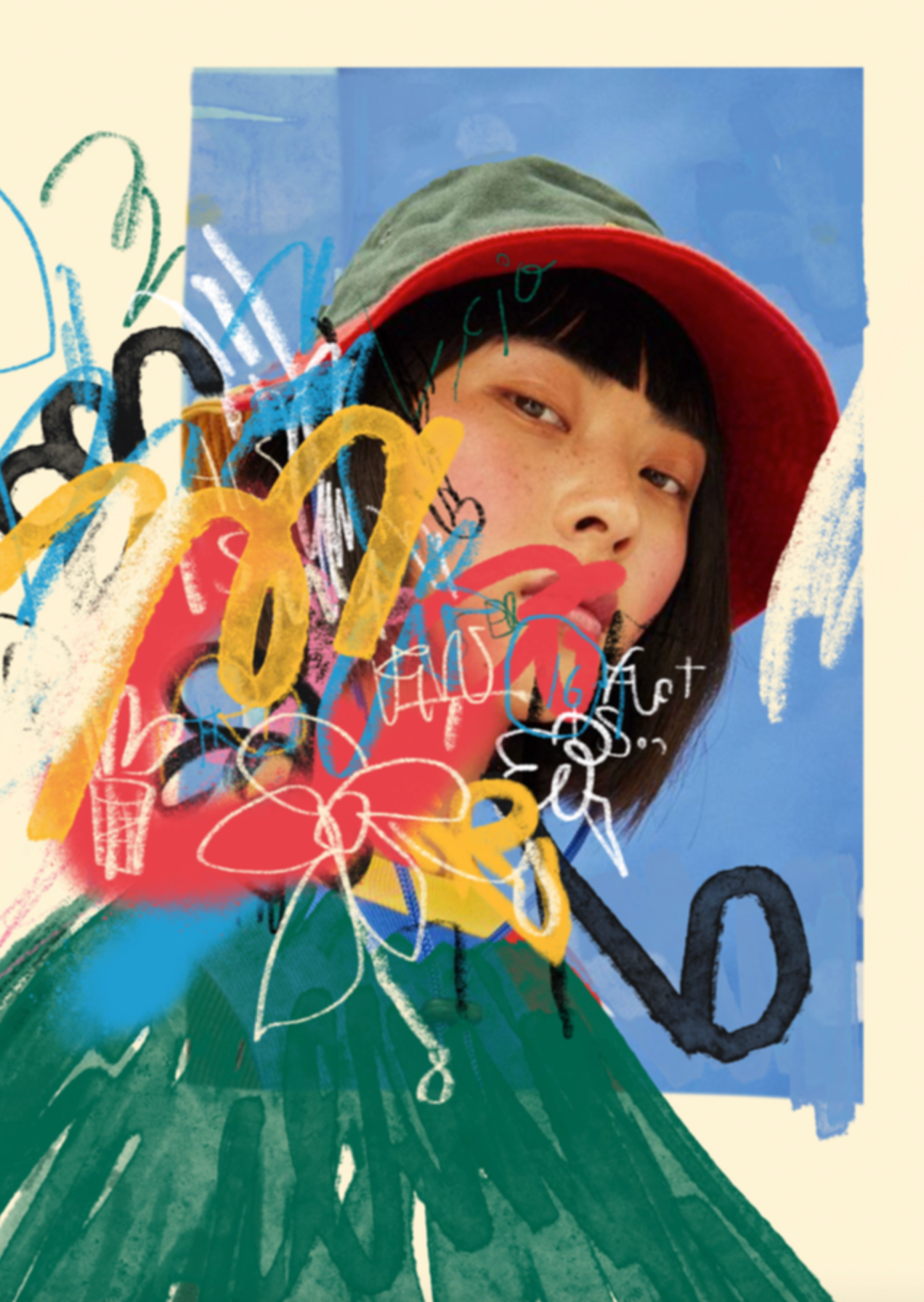
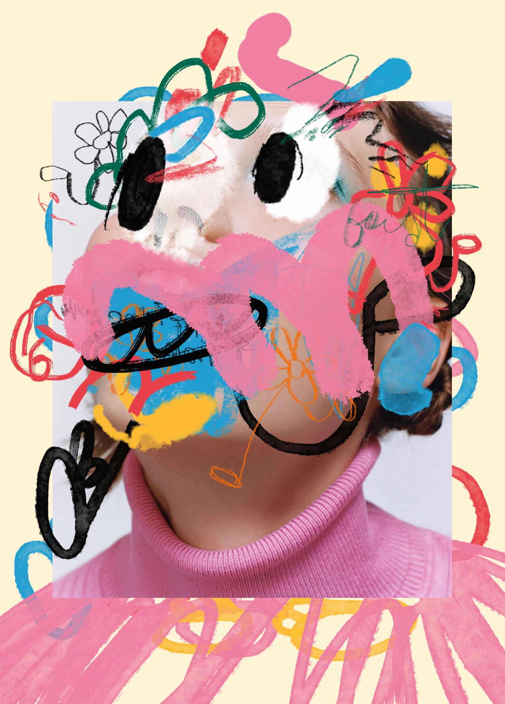
COLLAGE

by Bernardo Henning

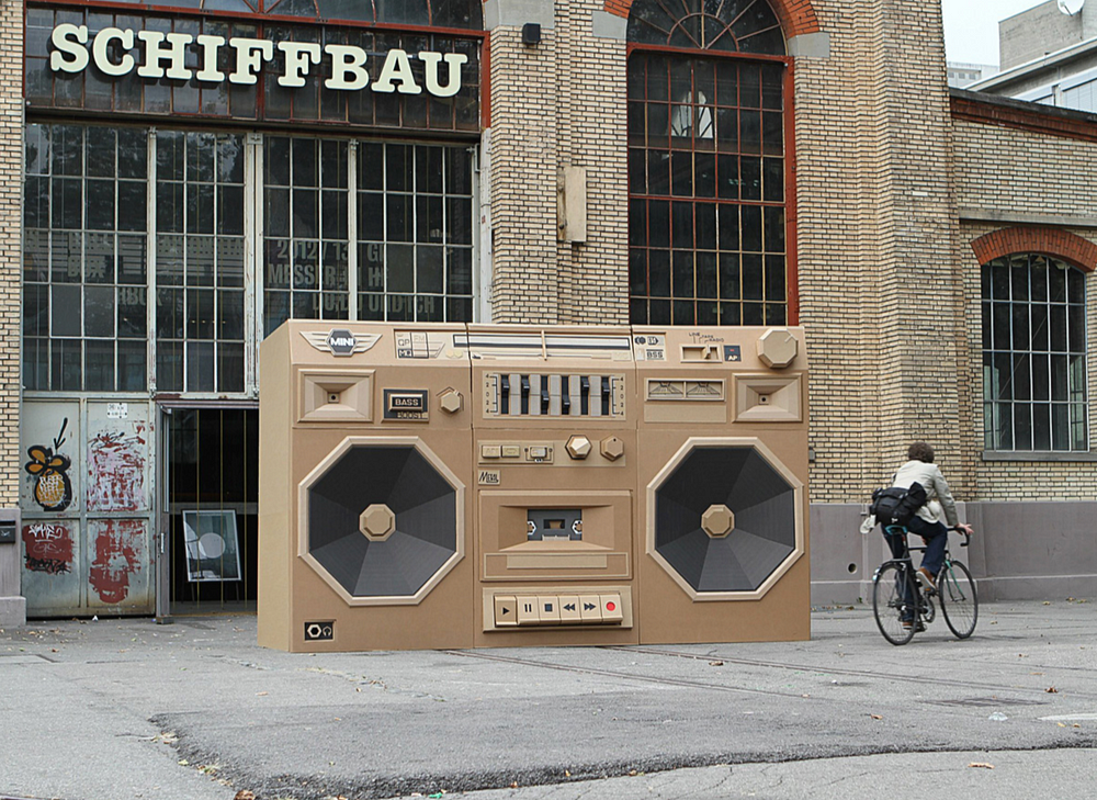
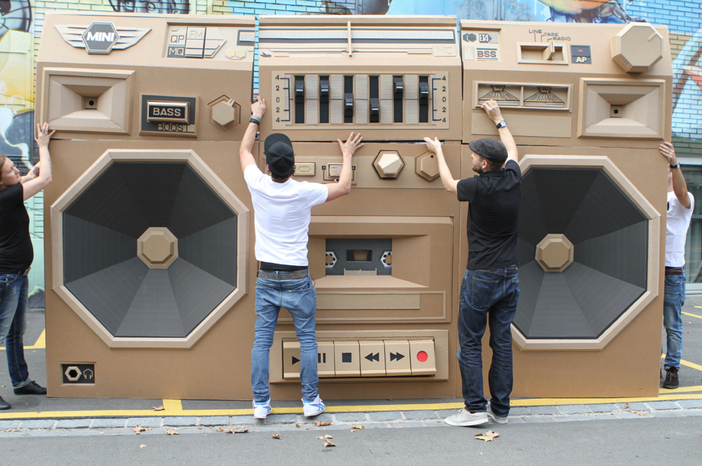
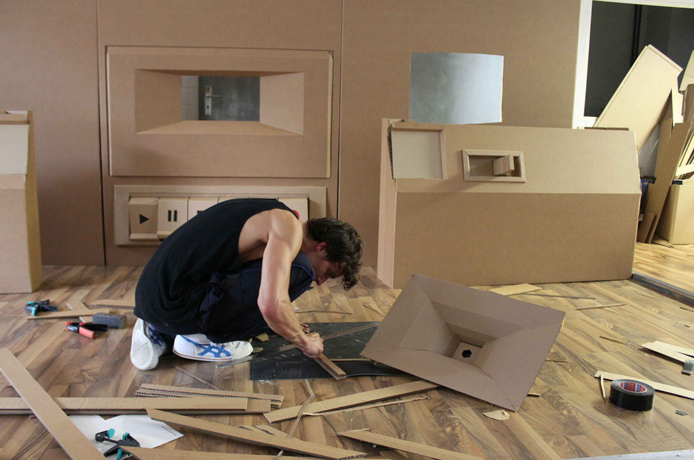
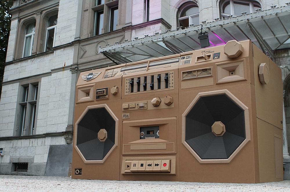
Mini — Ghettoblaster / The Paper Stuff

by Bartek Elsner

Colorful Art & Design

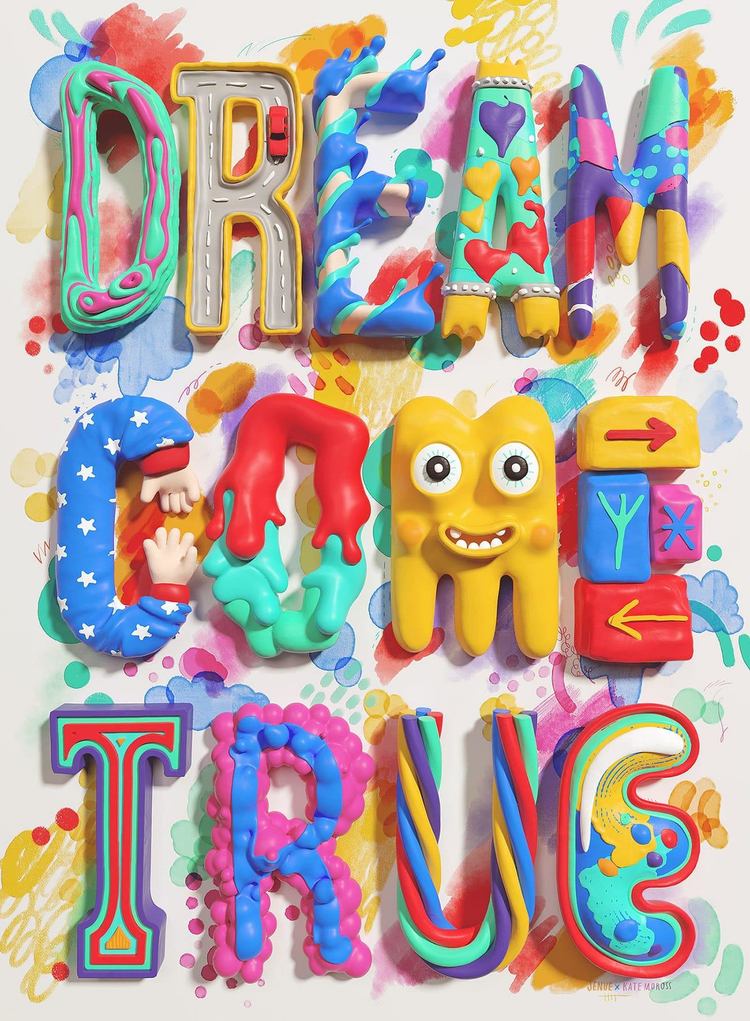
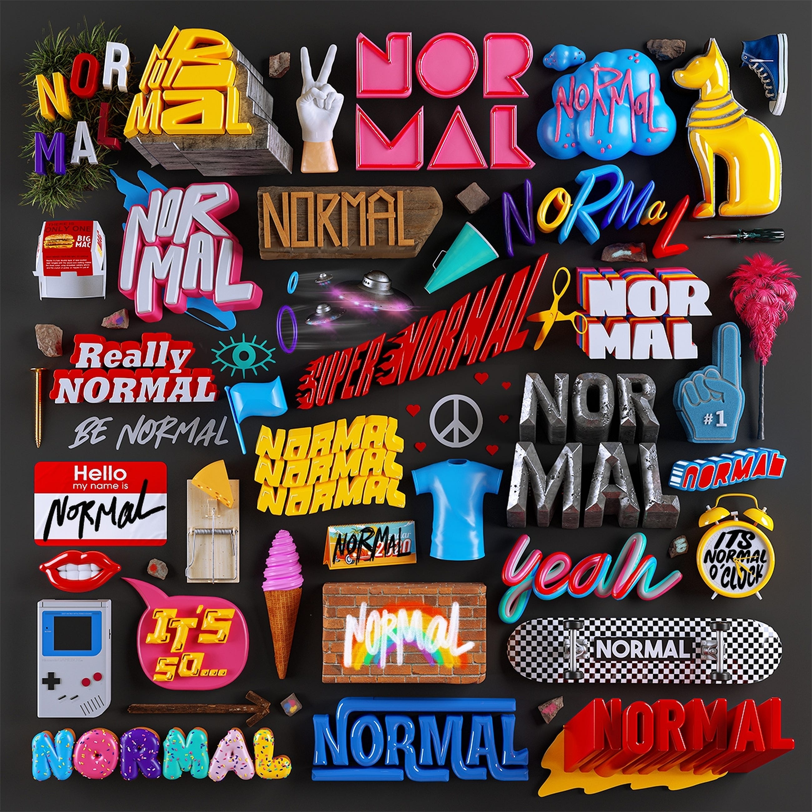
by JENUE DESIGN STUDIO.


Want even more inspiration?
Follow Muzli on social media for your daily dose of design, innovation, and creativity right in your feed!
Linkedin | Instagram | Twitter