TL;DR
- 📱 The foldable is real. iPhone Duo, 7.6 inches open, $1,999, ships October 23. The crease is still there. Apple never actually said it wouldn’t be.
- 📸 iPhone 18 Pro got a real aperture. ƒ/1.48 to ƒ/4 on six laser-cut blades, plus manual shutter speed. Actual optics, not a blur slider.
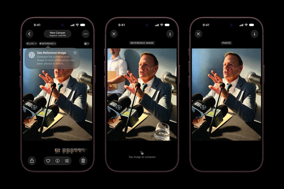
- 🔒 Photos can now prove they’re photos. Apple Reference Image signs the sensor data. Apple skipped the industry standard to build it.
- 🪟 Liquid Glass got rebuilt. Users now control transparency themselves, which means your UI has to survive a range instead of a look.
- 📐 Your layouts need work. Two size classes, three reserved regions, and “poses” instead of orientations. The dock went vertical.
- 🗓️ iOS 27 shipped September 14. No regular iPhone 18 until spring 2027. First keynote under CEO John Ternus.
Apple’s September keynote is usually a spec sheet with a soundtrack. A number goes up. Someone says “our most advanced ever.” The stock moves two percent.
This one was different.
On September 9, John Ternus walked out at Apple Park as CEO, eight days into the job, and folded an iPhone in half on stage.
Predictably, the internet spent the next 24 hours arguing about a crease.
Fine. But the crease is the least interesting thing that happened. The parts that actually land on your desk happened around the edges: a rebuilt Liquid Glass, a cryptographic receipt for photographs, and a set of layout rules that quietly break a habit iOS has had since 2007.
Here’s all of it, and what it costs you.
Everything Apple announced
📱 iPhone Duo
$1,999 / 256GB · Pre-order Oct 16 · Ships Oct 23
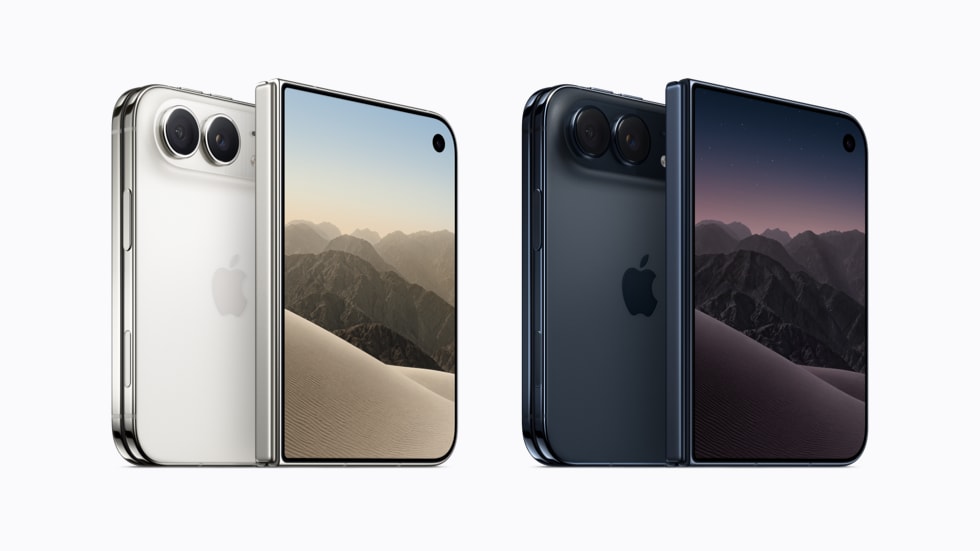
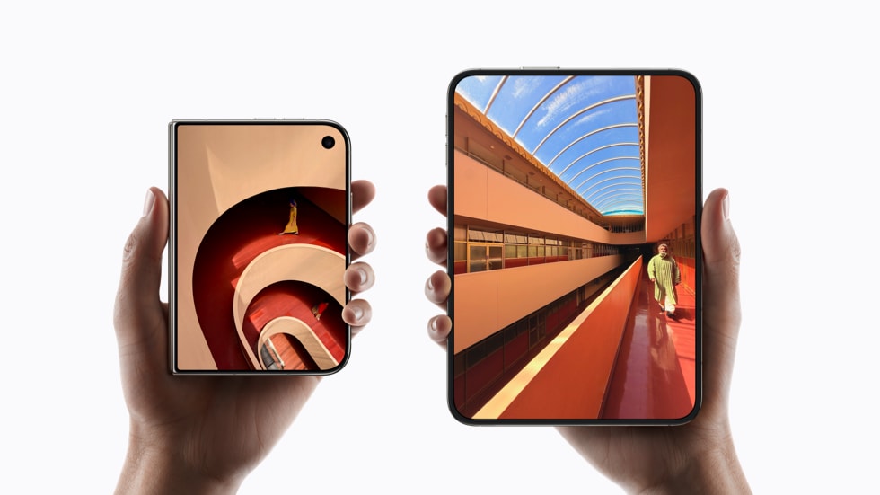
The foldable. 5.4 inches closed, 7.6 open, both displays Super Retina XDR at 3000 nits with ProMotion and always-on.
Grade 5 titanium, mirror-polished, with a 3D-printed hinge cover and a hinge made of more than 100 components. The inner screen gets a nano-texture finish.
Face ID didn’t fit, so Touch ID moved into the side button and the FaceTime camera hides under the inner display. A20 Pro chip, dual 48MP Fusion cameras, 4K120 in Dolby Vision.
Two colors: Star White and Night Sky. Ships in 70-plus countries running iOS 27.1 out of the box.
📸 iPhone 18 Pro and Pro Max
$1,199 / $1,299 · Pre-order Sep 12 · Ships Sep 18
The A20 Pro is the first 2nm chip in a phone. Nice, but not the story.
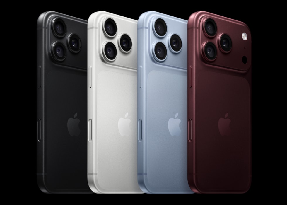
The story is the camera. A real variable aperture on the main lens, six laser-cut blades moving between ƒ/1.48, ƒ/1.8 and ƒ/4. Manual shutter speed control. Texture and grain sliders in Photographic Styles.
That’s a physical iris in a phone. Depth of field you commit to at capture instead of faking afterward.
Dynamic Island shrank and now holds three live activities. Battery goes to 36 and 45 hours of video. Four finishes: black, silver, glacier, burgundy.
Oh, and there’s no regular iPhone 18 this fall. That one slips to spring 2027. If you wanted a normal iPhone, your options are last year’s or $1,199.
⌚ Apple Watch Series 12 and Ultra 4
$399 / $799 · Ceramic from $899 · Ships Sep 18
New Health Sensing System, S11 chip, a Readiness app, and Audio Intelligence features including Live Rewind, which keeps the last 15 seconds of a conversation. Make of that what you will.
The material news is genuinely better. Ceramic is back after seven years, in pearl white and night blue. Aluminum cases move to Ceramic Shield 2. New Sport Loops use inkjet printing for plaid patterns, and Hermès brought a Rocabar Club band with a three-dimensional H.
🎧 AirPods 5
$129 · $149 with wireless charging
ANC is now in the $129 base model and removes up to 50 percent more noise than AirPods 4. The $149 version adds a wireless charging case, stem volume controls and an extra hour.
The cheapest thing announced is also the best value by a mile. Funny how that works.
💻 iOS 27 and the rest
iPadOS 27 · macOS Golden Gate · watchOS 27 · tvOS 27 · visionOS 27 · Sep 14
All shipped September 14.
Also: Siri’s AI features now have a daily usage cap, with expanded access sold separately. Nobody clapped for that one.
About that crease
Apple’s engineering answer is genuinely clever, and it’s basically expensive bookbinding.
Optically clear adhesives let the display layers slide against each other as the screen folds, so the stack isn’t fighting itself at the bend. Apple’s own words are that the layers glide “like pages in a book.” On top sits a nano-texture finish, a matte surface that scatters the reflection you’d otherwise use to spot the fold.
Clever. Now read the copy again.
Apple says the construction “minimizes stress and crease.” Minimizes. Not eliminates. That is not sloppy marketing, that is a legal team doing its job.
Then there’s the number Apple didn’t publish. Samsung rates the Z Fold8 for 500,000 folds. Apple published no fold-cycle rating at all.
When a company that will happily tell you its glass is 3x more scratch resistant suddenly goes quiet on a durability number, the silence is the number.
Hands-on reports landed within hours. 9to5Google found the crease about as visible as on any Android foldable.
That gap between the engineering story and the thing in your hand is the most honest detail of the whole keynote.
What designers actually said
The design press was noticeably warmer than the spec-sheet press. There’s a reason.
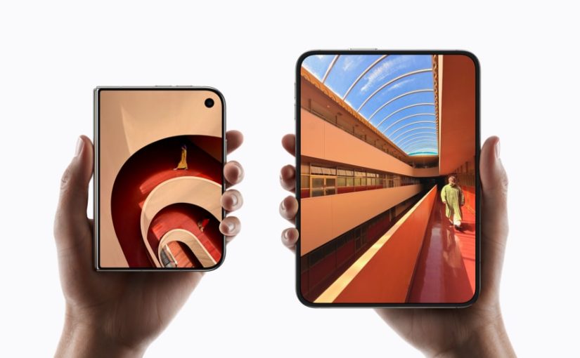
The Duo is the first foldable that reads as a designed object rather than two phones in a trench coat.
Yanko Design went furthest, arguing it stops being an iPhone without becoming an iPad.
Their best observation is about the asymmetry: two rounded corners on the right, squared geometry at the hinge. Your hand knows which edge to open before your eyes do. They compare it to a small hardcover.
But their sharpest line is about software, not hardware. On the open display, the Dynamic Island rotates sideways along the edge and the dock goes vertical.
As Yanko put it: nobody outside Apple would have been permitted to move that dock.
“New but remarkably familiar, the same size as your passport.”
Molly Anderson, Apple VP of industrial design, to Wallpaper*
That’s better product framing than anything in the actual keynote script.
Now the skepticism, which is just as specific.
Yanko called Touch ID instead of Face ID a real step back on a two thousand dollar phone. Hard to argue.
PetaPixel pointed out the Duo runs the previous-generation main sensor, with no variable aperture and no dedicated telephoto.
Read that again: the most expensive iPhone Apple sells has the worst camera of the three phones announced.
Macworld’s verdict on the event was that it delivered more Shine than Surprise, with one editor summarizing the pricing tiers as: the more you pay, the less fun you get.
PetaPixel did find the one genuinely new creative trick, though. Fold it halfway, stand it on a table, and it’s a tripod that previews your framing on the outer screen while both cameras record.
That isn’t a spec. That’s a shooting posture that didn’t exist last week.
One more piece of context worth having. Alan Dye left for Meta at the end of 2025 after nearly twenty years running design at Apple. Steve Lemay took human interface. Molly Anderson took industrial design.
“Surprise and Shine” is the first launch where both hardware and software carry the new team’s fingerprints end to end. Keep that in mind while you judge it.
Liquid Glass finally grew up
Remember the iOS 26 backlash?
Apple shipped what amounted to a frosted shower door installed in a conference room. Gorgeous in the render. Unreadable in the meeting.
Transparency everywhere, text you had to squint at, and developers annoyed that perfectly working apps suddenly needed a visual pass.
Here’s what I respect: Apple didn’t retreat, it rebuilt.
Shubham Kedia, Apple’s human interface design director, says the material now diffuses complex content behind it far more aggressively while adding depth and separation.
In plain terms: darker outlines around translucent elements, stronger contrast, and backgrounds that actually blur instead of politely tinting.
Three changes hit your work directly.
- 🎚 There’s a transparency slider now. Users drag Liquid Glass from ultra clear to fully tinted. Which means you’re no longer designing a look. You’re designing a range, and your contrast has to hold at both ends of it.
- 🖼 App icons changed. Liquid Glass layers are composited into the artwork itself with a new rendering path, so icons come out sharper. Icon Composer is how you build them.
- 📏 macOS Golden Gate corrects inconsistent corner radii across every app, including third-party ones, with zero developer work.
That last one deserves a second read. Apple is now quietly fixing everyone’s corner radii for them. Whether they asked or not.
Honestly? Half of you needed it.
A photo that can prove it’s a photo
This is the feature I keep thinking about, and almost nobody led with it.
Apple Reference Image on the 18 Pro is, functionally, a birth certificate for a photograph.
The camera captures signed sensor data. Private Cloud Compute develops that into a reference version you can’t alter, which Apple describes as something close to a digital negative. Any edited copy gets checked against it.
Retouched? Generated? The comparison shows it.
Here’s the spicy part. Nikon, Canon and Google all back C2PA Content Credentials, a metadata standard that travels alongside a file.
Apple looked at an open industry standard backed by half the camera business and said no thanks.
And annoyingly, Apple has a point. Metadata is a sticker on the box. It can’t catch an AI edit made to a genuinely credentialed photo. Apple anchored the pixels instead of labeling the file.
Nieman Lab covered it as a newsroom tool, which is exactly the right frame.
If your work is photographic, this is the first mainstream attempt at proving provenance that doesn’t depend on a label nobody checks.
Now the homework
Good news first. Apple already updated Design Resources with iPhone Duo and iPhone 18 Pro bezels. Open and closed, both colors, Photoshop and PNG.
Grab them before your PM asks for “just a quick mockup.”
Now the layout rules, which are stricter than they look. The short version lives in the HIG layout guidance. The long version is the Prepare your app for iPhone Duo tech talk.
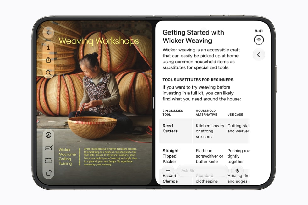
- 📐 Design against two size classes, not two screens. Outer display is compact width. Inner is regular width. Apple is blunt about this: avoid fixed widths, breakpoints, or any metric tied to a specific screen. The inner canvas is roughly 80 percent bigger than an iPhone 18 Pro, which is enough for split views, two-column reflows, and tab bars that become sidebars.
- 🚧 Learn the reserved regions. There are three. The fold itself, which Apple calls a division region and which has zero width when the device is flat. Plus the inner and outer cameras, which only activate when the camera is in use. Think of them as support columns in an open-plan office. You can’t move them, so you plan around them. Sheets, alerts, menus and popovers dodge them automatically. Anything you lay out by hand does not.
- 🔢 Keep an even number of columns whenever a division region exists, active or not. Memorize that one, it’s the rule people will get wrong.
- 🤸 Think in poses, not orientations. Book pose is half-open and vertical, so alerts and menus shift to the trailing side where the thumb is. Table pose is propped, so glanceable content goes up top and touch controls go to the bottom. Scrolling content is exempt, because scrolling already solved this problem.
- 🧰 Go look at your toolbar. On the open display, icon-only items rotate to a vertical bar at the edge while text items stay horizontal. If yours mixes icons and labels, it’s about to look broken. I’ll wait.
Worth bookmarking
Everything below is first-party and free. If you only open two, make it Design Resources for the bezels and the Duo tech talk for the layout rules.
📦 Assets to download
- Apple Design Resources. Device bezels, Sketch and Photoshop libraries, now including iPhone Duo open and closed in both colors.
- SF Symbols. The icon set, the Mac app, and the variable-weight rules that keep icons matching your type.
- San Francisco and New York. Apple’s system faces, licensed for interface mockups.
- Apple Newsroom. Where the photography in this piece came from. High-res press images, free to use editorially.
📖 Guidelines to reread
- Human Interface Guidelines. The whole thing, updated for iOS 27 and the Duo.
- Layout. Size classes, safe areas, and the reserved regions the fold introduces.
- Materials. How Liquid Glass is meant to behave over content, and when not to use it.
- Toolbars. Read this before your mixed icon and label toolbar meets the vertical bar.
- Multitasking. Split View and the poses, which now matter on a phone.
- Accessibility. The contrast section is the one that survived the Liquid Glass backlash.
🛠 Shipping for iOS 27
- Prepare your app for iPhone Duo. The tech talk with the actual adaptation rules: reflow, displacement, and what never moves.
- Adopting Liquid Glass. What changed under the material this year, written for people shipping against it.
- Icon Composer. Builds the layered icons the new rendering path expects.
- GeometryProxy. Where the reserved-regions API lives if you’re laying out around the fold by hand.
🔍 On provenance
- C2PA Content Credentials. The standard Apple declined to adopt. Understand it before you pick a side.
- Designing for iOS. The platform overview, useful as a sanity check when a foldable tempts you into iPad patterns.
So, was it good?
The Duo isn’t the crease-free miracle the supply-chain leaks promised. At $1,999 with the second-best camera in its own lineup, it’s a hard object to defend on a spreadsheet.
But it’s the first foldable where the industrial design has an argument instead of an excuse. And the software concessions Apple made for it are more radical than the hinge.
The rest of the event was a good year, not a strange one. Better cameras. Better watches. Cheaper noise cancellation. Liquid Glass you can finally read.
Apple Reference Image might matter more in five years than the foldable does.
But here’s the thing I’d actually watch: Apple moved the dock. Vertical, after nineteen years, for a device most people will never buy.
That’s not a hardware decision. That’s a company telling you which conventions are still negotiable.
So don’t wait for October. Open Design Resources, drop the Duo bezels into your busiest screen, and see what breaks.
The reserved regions will find your bugs whether you look now or not. Better they find them before your users do.
Sources: Apple Newsroom, MacRumors, Macworld, Yanko Design, Wallpaper*, PetaPixel, 9to5Google, Cult of Mac, Nieman Lab. Product images: Apple.