Published March 24, 2026 · Muzli Design Inspiration – the design hub trusted by 800,000+ creative professionals
Something just shifted in how design gets made.
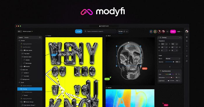
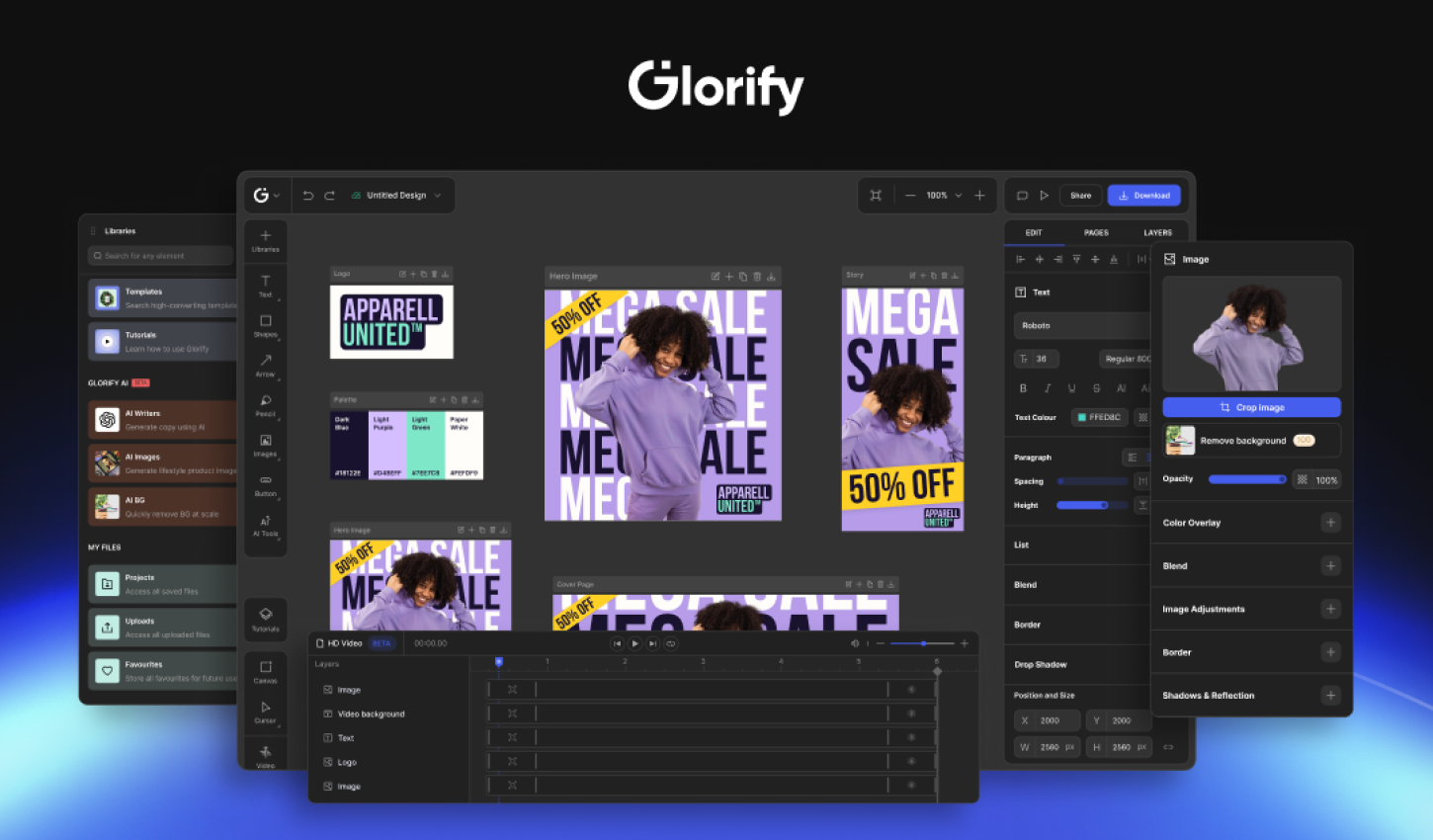
Figma announced today that AI agents can now work directly on the Figma canvas – not just read your files, but actually create and edit components, apply variables, and build designs using your own design system. AI-generated UI still feels generic, detached from the conventions teams spend months building. That’s the specific problem this announcement takes aim at.
Here’s what changed, what it enables, and why it matters.
The Problem With AI Design (Until Now)
Every design team knows the frustration. You prompt an AI to generate a screen, and what comes back looks like a wireframe assembled by someone who’s never seen your product. The right font isn’t there. The components don’t match. The spacing feels arbitrary.
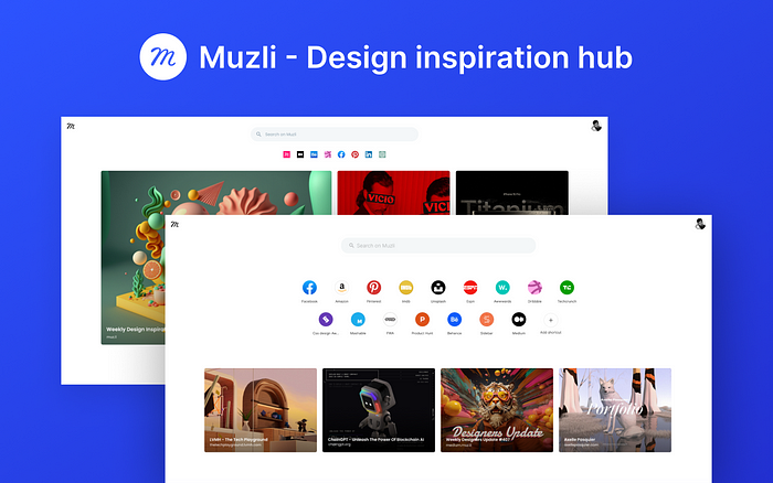
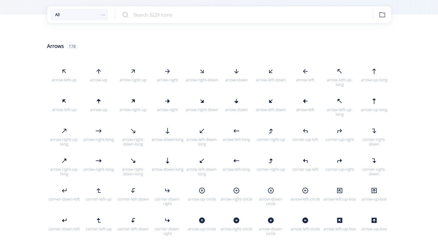
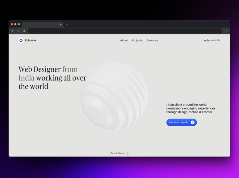
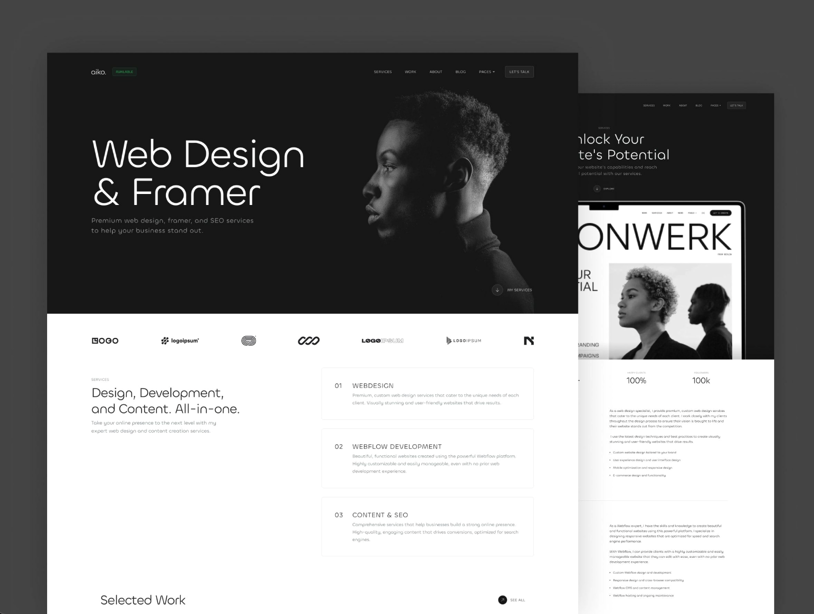
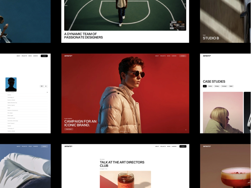
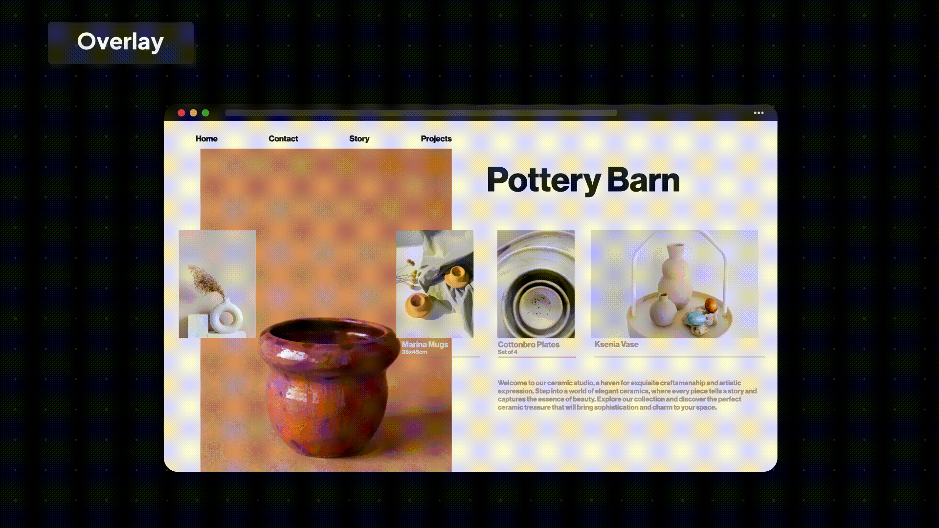
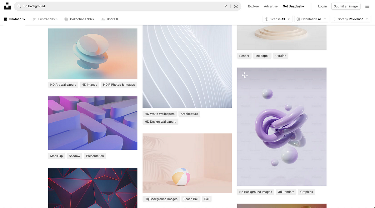
At Muzli, we surface thousands of new designs every week from the world’s top creative sources – Dribbble, Behance, and 120+ others. The difference between AI-generated work and human-crafted design is immediately visible: one belongs to a system, the other doesn’t. The gap has always been context.
The core issue: AI agents have had no access to the decisions your team made. No knowledge of your color tokens, your component library, your spacing system, your voice and tone. They’ve been operating without context – which is exactly why the results look contextless.
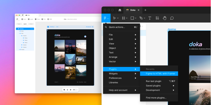
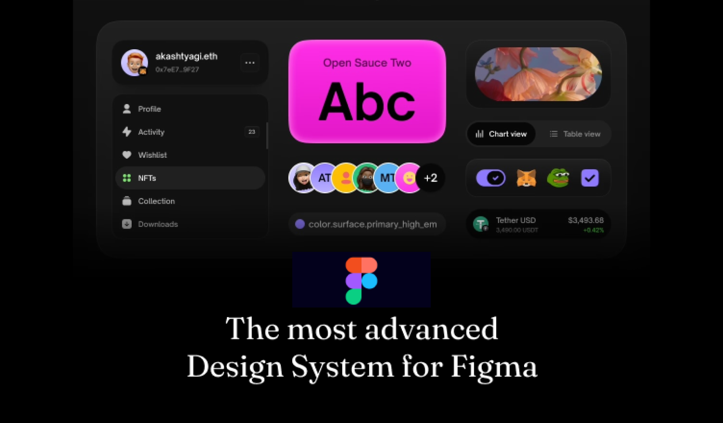
What Figma Is Announcing
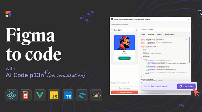
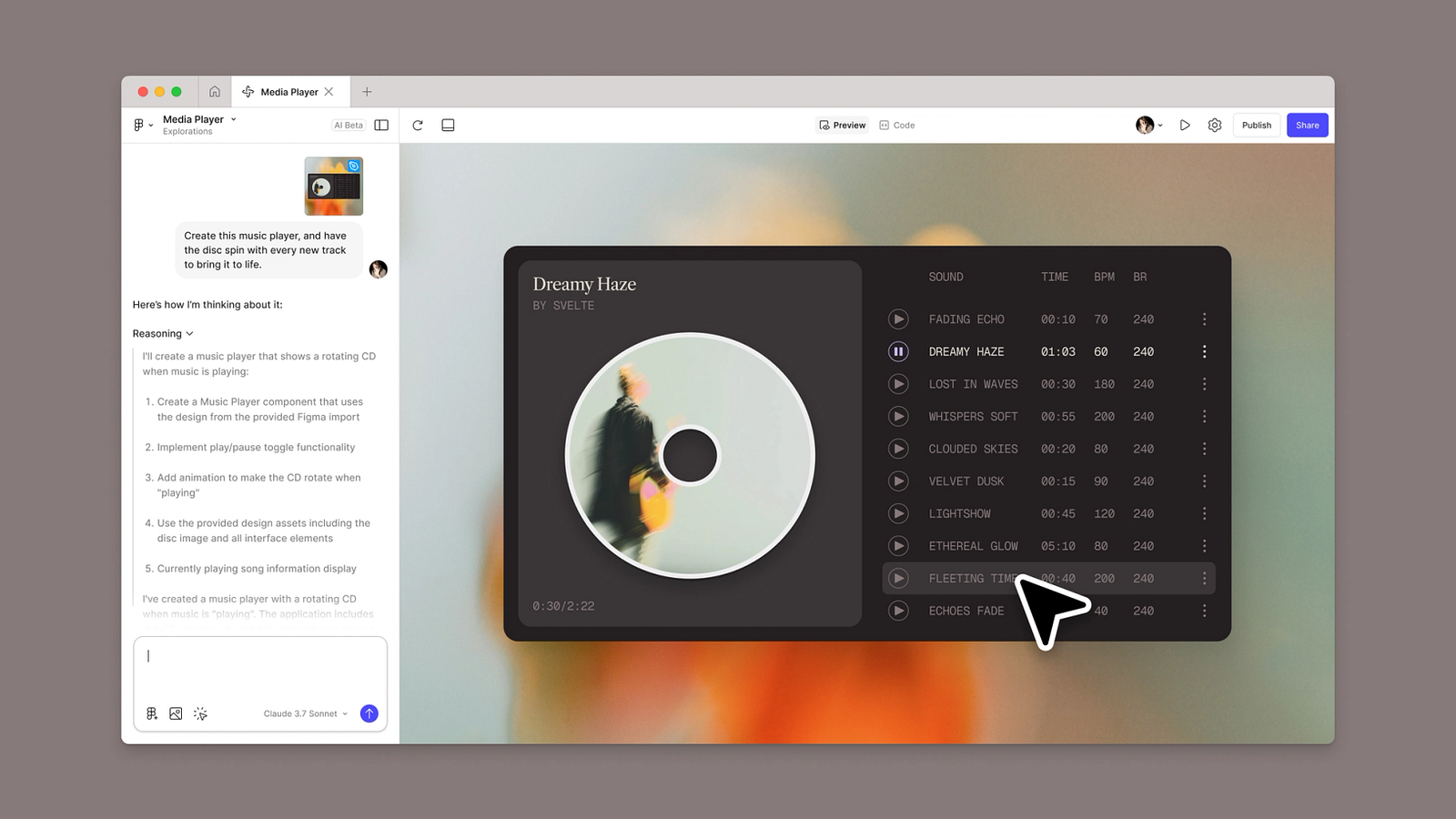
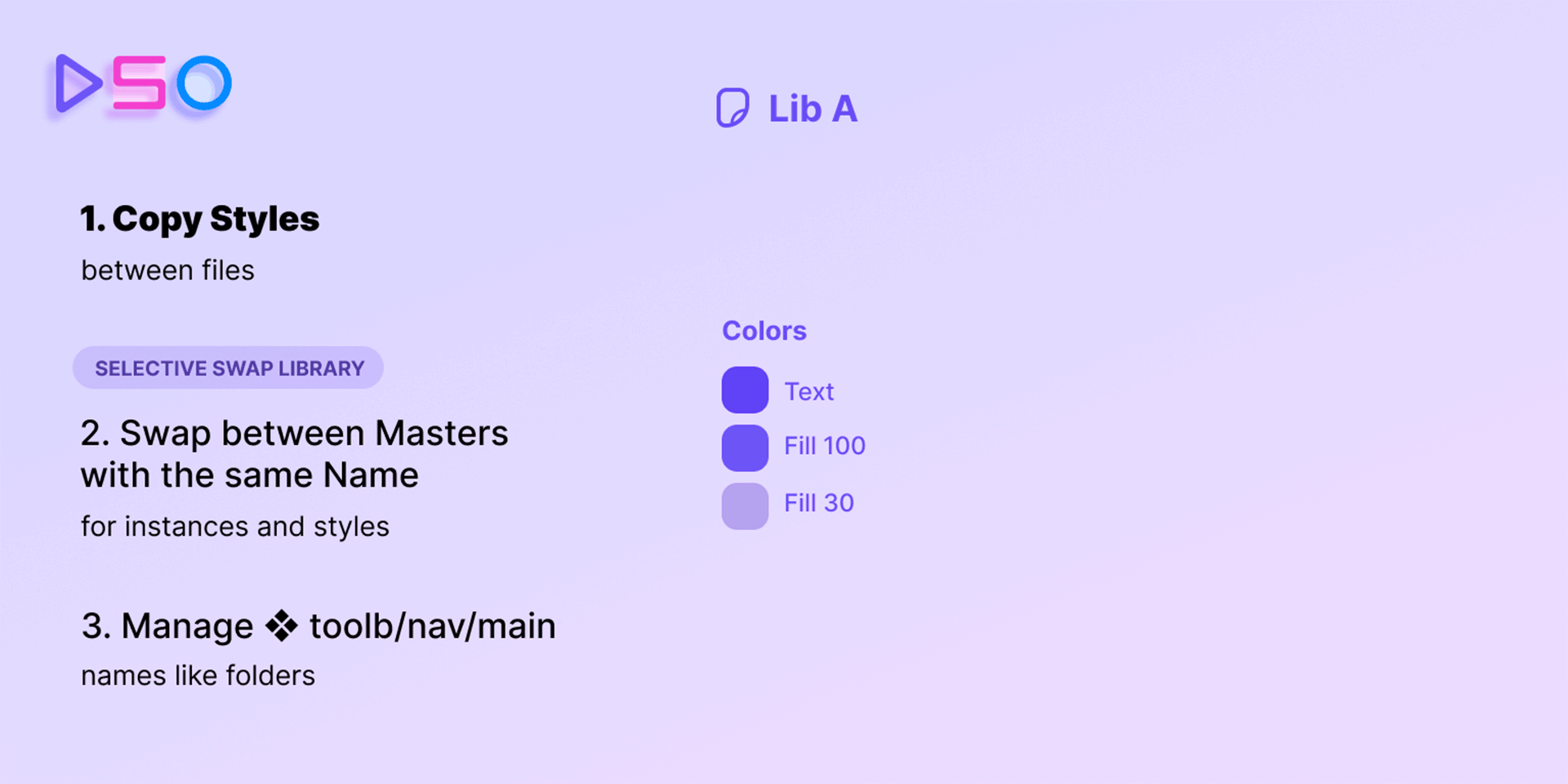
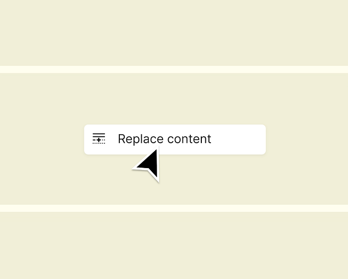
Through Figma’s MCP server, agents can now write directly to your Figma files using the new use_figma tool. That means Claude Code, Codex, Cursor, and other MCP-compatible agents can generate and modify design assets that are genuinely linked to your design system.
This is different from the existing generate_figma_design tool, which translates live HTML and websites into editable Figma layers. The two tools are complementary: when code and design drift apart, generate_figma_design brings the current UI into Figma. From there, use_figma can edit those designs – or create new ones – using your actual components and variables.
The result: agents that work inside your design system, not around it.
Skills: Teaching Agents How Your Team Works
The most interesting part of this announcement isn’t the use_figma tool itself – it’s Skills.
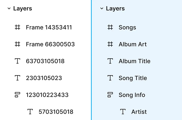
Skills are markdown files that define how an agent should behave on the Figma canvas. They encode your team’s conventions, sequencing, and intent – what steps to take, which components to reach for, how to handle edge cases. Instead of hoping an agent figures it out from a prompt, you teach it once, and it applies that knowledge consistently.
The foundational skill, /use-figma, gives agents a shared understanding of how Figma works structurally. Teams customize from there. Crucially, anyone can write a skill – no plugin development, no code required. It’s just a markdown file.
Nine community-built skills launched today:
/figma-generate-library– Create new components in Figma from a codebase/figma-generate-design– Create new designs using existing components and variables/apply-design-system– Connect existing designs to system components (Edenspiekermann)/create-voice– Generate screen reader specs from UI specs (Uber)/cc-figma-component– Generate Figma components from structured JSON contracts (One North)/rad-spacing– Apply hierarchical spacing with variables and fallbacks (Rad Collab)/sync-figma-token– Sync design tokens between code and Figma variables with drift detection (Firebender)/edit-figma-design– Orchestrate design workflows using Warp (Warp)/multi-agent– Run parallel workflows across Augment (Augment Code)
Self-Healing Loops
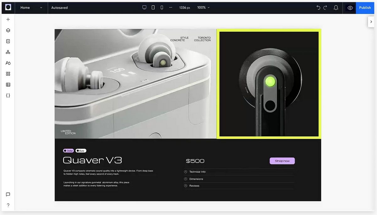
One of the quieter details in the announcement is worth paying attention to: agents can screenshot their output and iterate on what doesn’t match.
Because agents are working with real components, variables, and auto layout – not just drawing pixels – those corrections interact with your actual system. The agent isn’t patching an image. It’s adjusting a component property, updating a variable, changing a layout constraint. The structure remains intact.
This matters because AI models are non-deterministic by nature. The same prompt produces different results. Skills reduce that variance by encoding specific steps and guidelines. Your team’s conventions stop being documentation nobody reads and become rules the agent follows every time it runs.
What This Means for Design Teams
The shift here is subtle but significant. Design systems have always been written for humans – component libraries, usage guidelines, spacing scales. They’re how teams encode taste, decisions, and standards. Until now, agents couldn’t access any of it meaningfully.
Skills make design systems machine-readable in a more actionable way. Your Figma library isn’t just a reference anymore – it’s context an agent can draw on while it works.
Designers who regularly study what polished, mature design systems look like in the wild – the kind of work that appears daily in Muzli’s curated feed – will be best positioned to build skills that actually produce great output. Taste is still the input. The agent is just the output mechanism.
That opens up some genuinely interesting possibilities:
- Spinning up new screen variants using existing components without manual assembly
- Keeping code and design in sync as products evolve, automatically
- Generating accessible annotations (VoiceOver, ARIA specs) directly from UI designs
- Applying spacing systems and token hierarchies without manual component-by-component work
Who It Works With
The use_figma tool currently integrates with: Augment, Claude Code, Codex, Copilot CLI, GitHub Copilot in VS Code, Cursor, Factory, Firebender, and Warp.
It’s available free during the beta period. Usage-based pricing will follow.
The Bigger Picture
Figma has been steadily repositioning its canvas as shared infrastructure – the place where code and design meet, where decisions get made, where product work comes into focus regardless of where it started.
This announcement accelerates that thesis. When agents can operate directly in Figma with access to your design system, the canvas becomes less of a deliverable and more of a live artifact – something that agents and designers work in together.
The practical takeaway for teams: your design system quality just became significantly more important. The rigor you put into naming tokens, structuring components, and documenting patterns directly determines what agents can do with them. Messy systems will produce messy outputs. Mature, well-organized systems will produce something genuinely useful.
Figma is betting that teams who’ve invested in their design systems will get the most out of this. Based on how it’s been built, that bet seems well-placed.
Explore the skills library at figma.com/community/skills, or read Figma’s guide to getting started with the MCP server.
Stay on top of the tools and trends shaping the design industry – Muzli curates the best design, tech, and inspiration from 120+ sources, delivered fresh every day at muz.li.
Muzli is the design inspiration hub used by over 800,000 designers worldwide. We surface the best creative work, tools, and industry news – so you never miss what matters.
")


")


 Article by