Mobile app design in 2026 isn’t about flashy new concepts. It’s about patterns that survived contact with real users. Here are the UI shifts that actually affect what you ship.
Most “mobile design trends” articles read like wishlists. Somebody saw a design shot with a blurred card, called it a trend, and moved on. That’s not how design actually evolves. Patterns don’t become patterns because they look good in a case study. They become patterns because they solve problems that enough teams keep running into.
Mobile app design in 2026 is shifting, but not in the ways the trend forecasters predicted two years ago. The biggest changes aren’t visual. They’re structural: how navigation works when there’s no back button, how interfaces adapt when AI knows your habits better than you do, how authentication feels when passwords finally die. The visual layer matters, but it’s the interaction model underneath that’s actually changing.
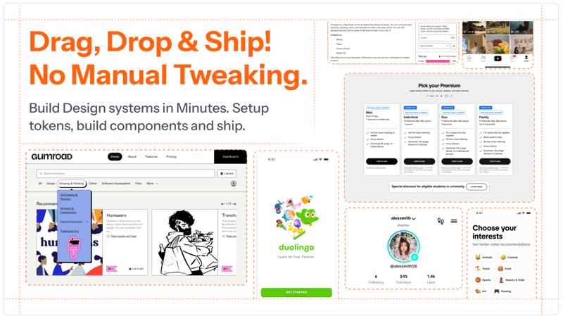
Seven UI patterns are reshaping mobile apps right now. Not concepts. Not predictions. Patterns that are shipping in production apps, solving real problems, and creating new expectations that your users already have.
AI-Native Adaptive Interfaces
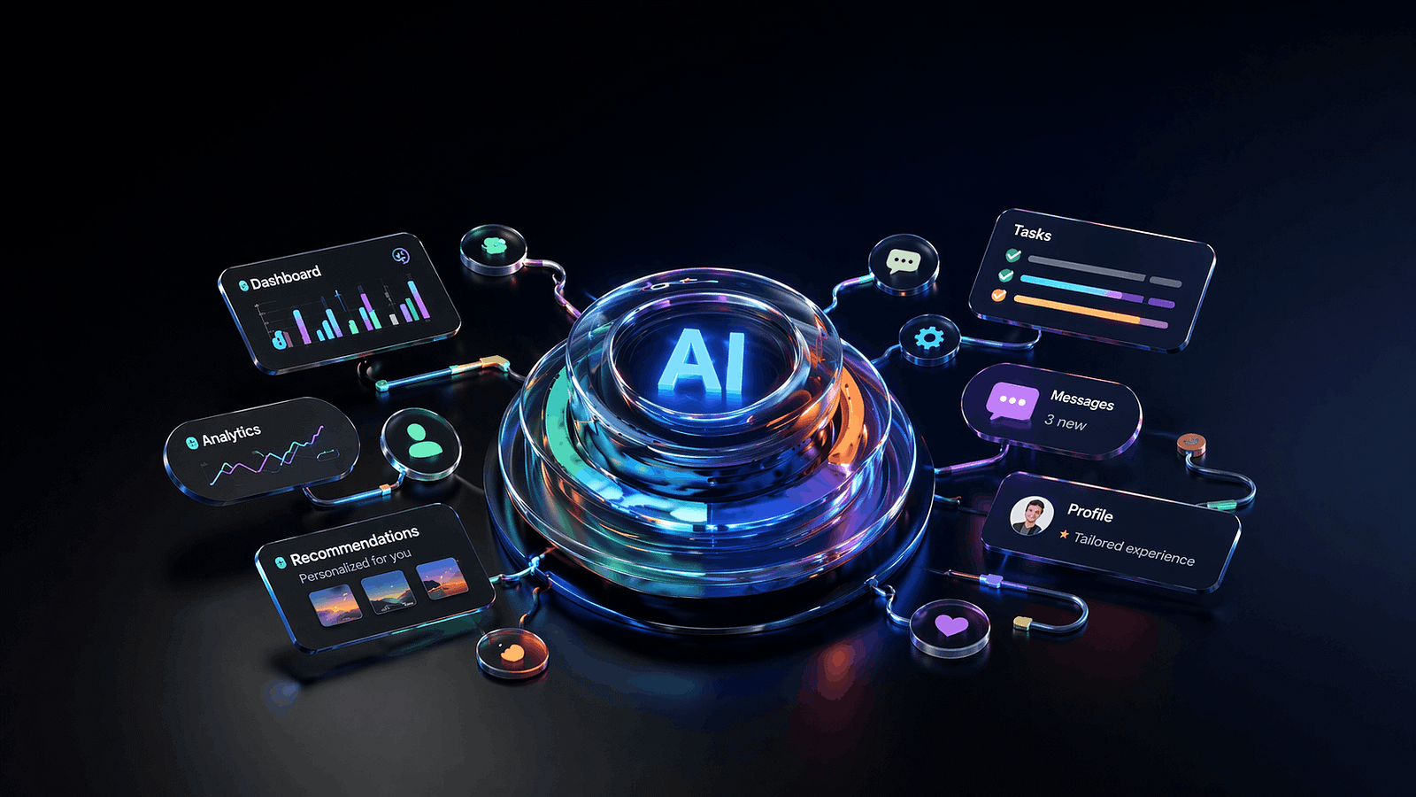
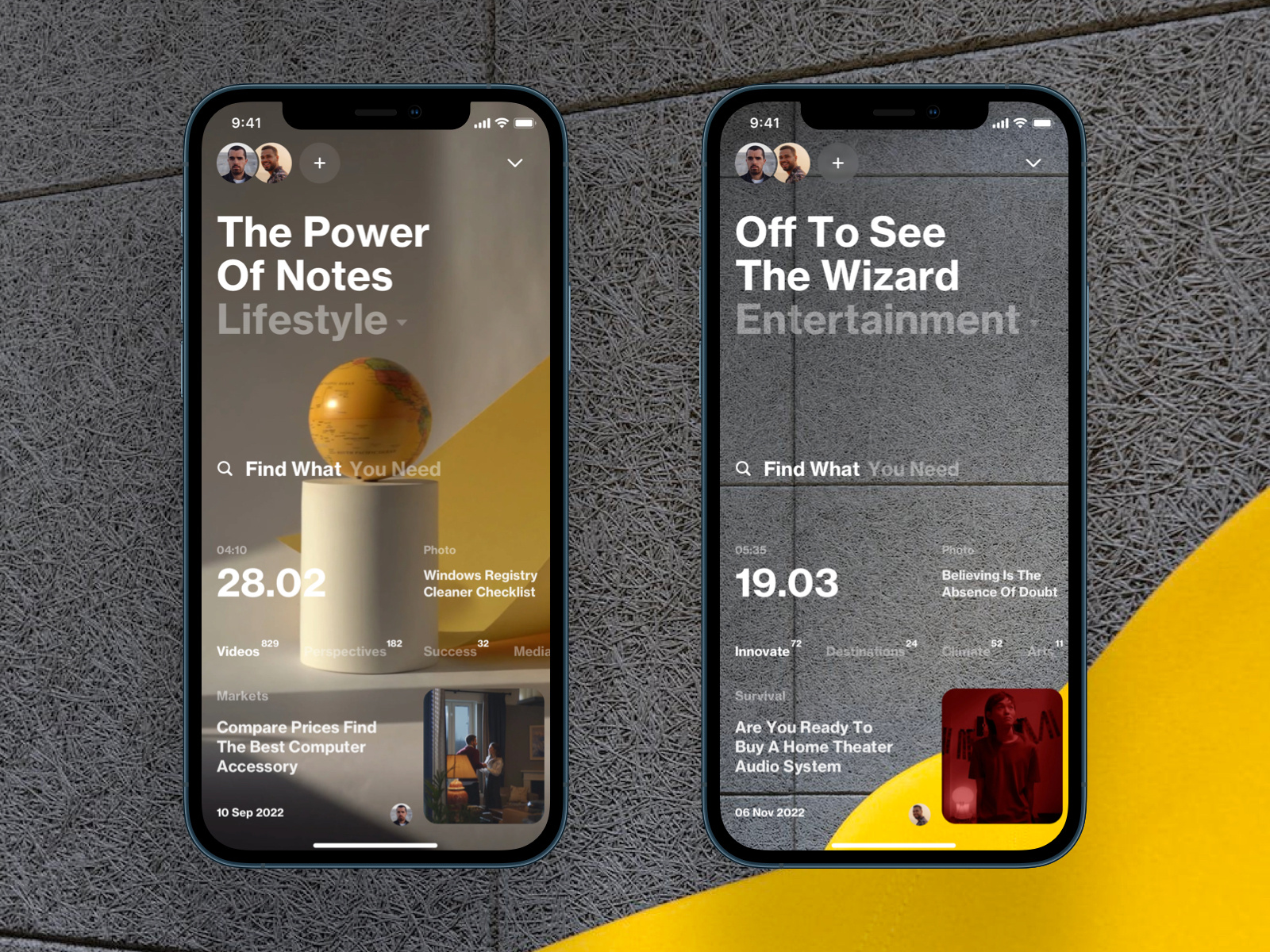
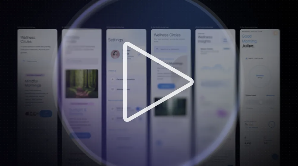
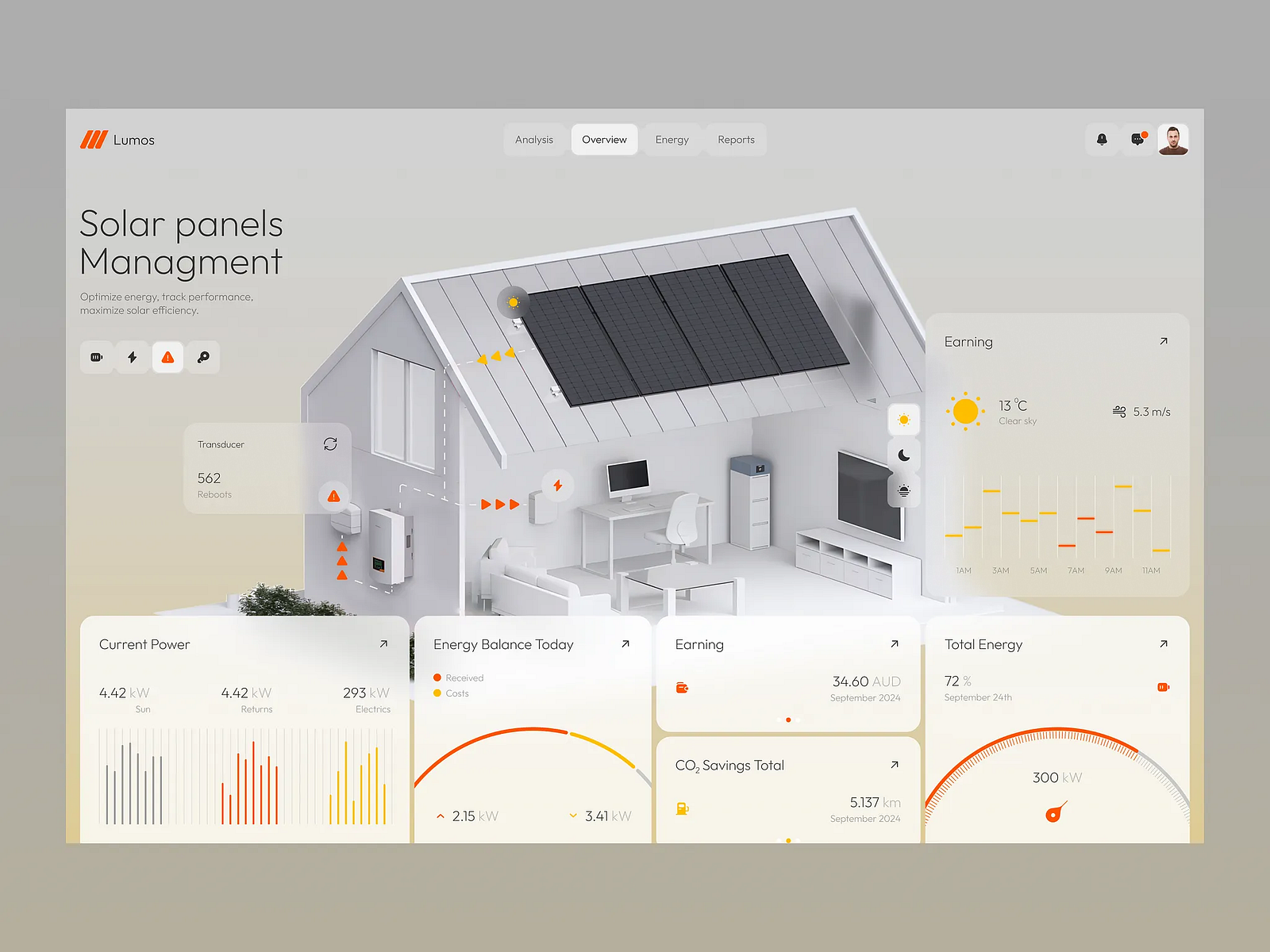
The idea of “personalized UI” has been around for a decade. Netflix recommends shows. Spotify builds playlists. That’s content personalization. What’s new in 2026 is layout personalization: apps that restructure their interface based on how you actually use them.
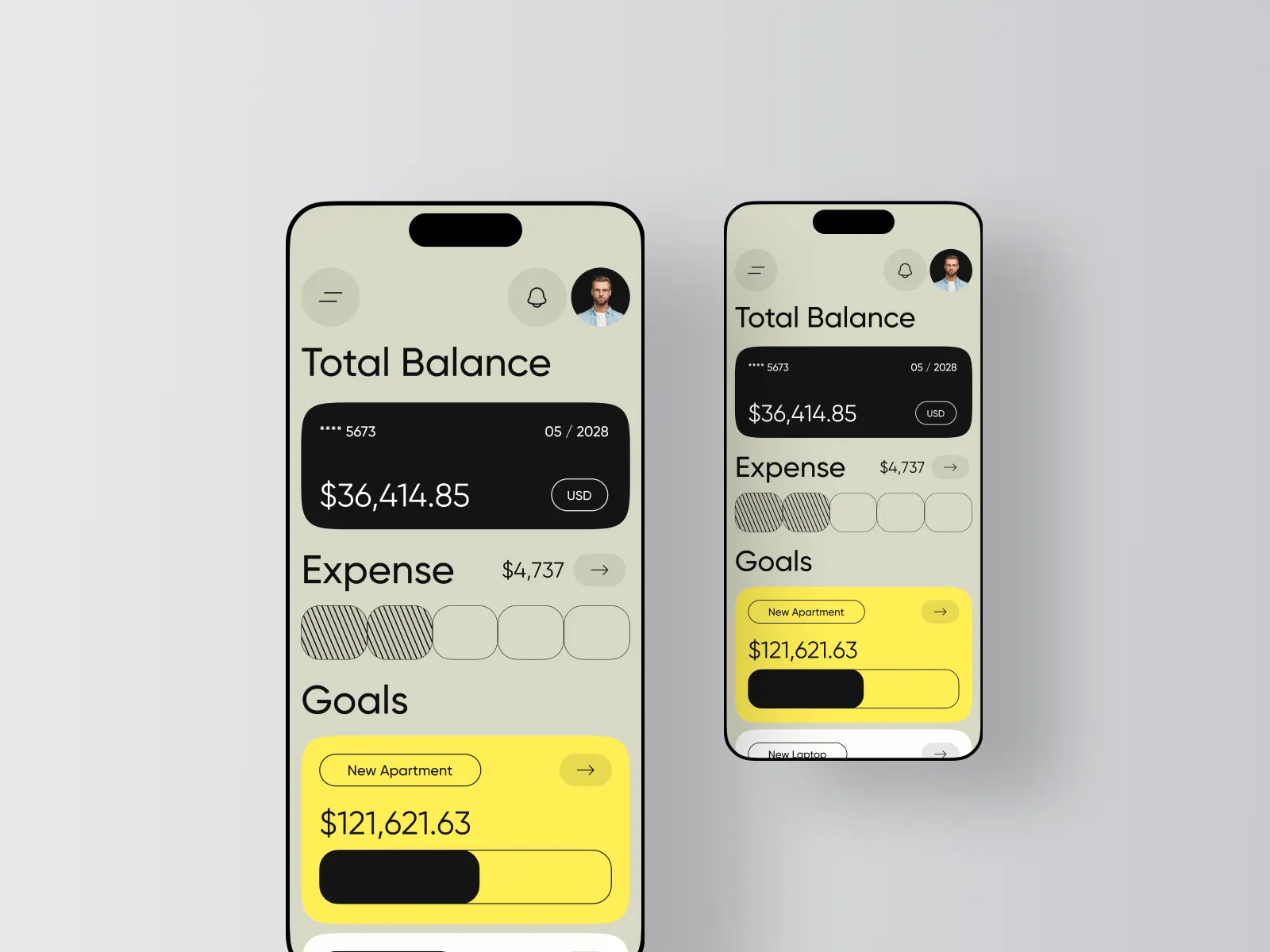
Spotify did this quietly with its home screen redesign. If you mostly use Spotify in the morning for podcasts, the podcast shelf rises to the top. If you’re a playlist person, playlists lead. The layout isn’t static. It’s a reflection of your behavior, rebuilt on each session. Apple’s iOS 18 took a similar approach with the redesigned Control Center, where frequently used toggles surface automatically based on time, location, and usage patterns.
Google Maps goes further. The app presents entirely different interfaces depending on context: commute mode in the morning (minimal, focused on your usual route), exploration mode on weekends (restaurants, ratings, photos front and center), navigation mode when driving (stripped to essentials). Same app, three different products.
What makes this work: The adaptation has to be invisible. The moment a user notices the layout shifted, you’ve created confusion instead of convenience. The best implementations feel like the app “just works” without the user realizing the structure changed. Spotify succeeds because the content types are familiar even when their position changes. The mental model stays intact.
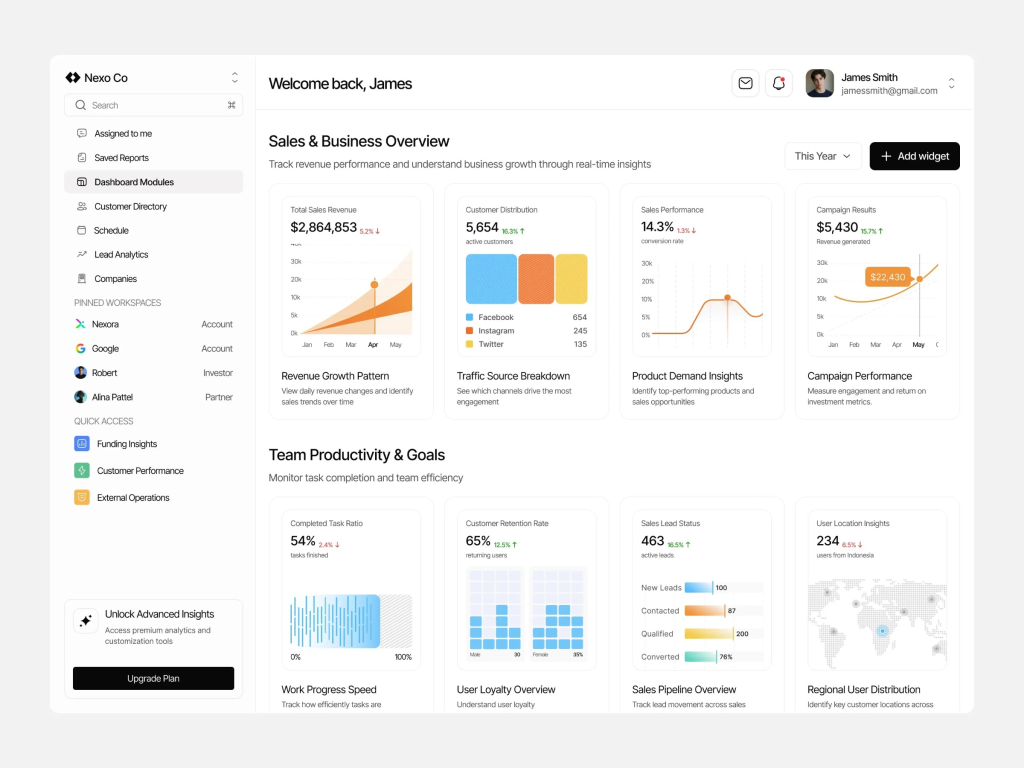
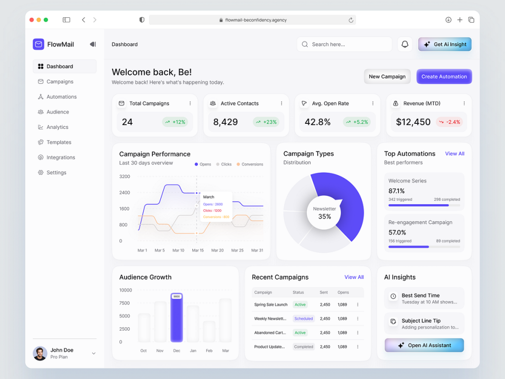
When to skip it: If your app has fewer than three distinct use cases, adaptive layouts add complexity without value. A calculator app doesn’t need to reorganize itself. A note-taking app with a clear primary action (write a note) doesn’t benefit from shuffling its interface. Adaptive UI earns its cost in apps where users have meaningfully different sessions: a banking app (check balance vs. pay someone vs. invest), a fitness app (log workout vs. track nutrition vs. review progress), or a communication app (quick reply vs. browse vs. compose).
Implementation note: Start with time-of-day and frequency data before reaching for anything more complex. Most of the value comes from surfacing the user’s most common action first. You don’t need a recommendation engine. You need a sorted list.
Gesture-Based Navigation Is Growing Up
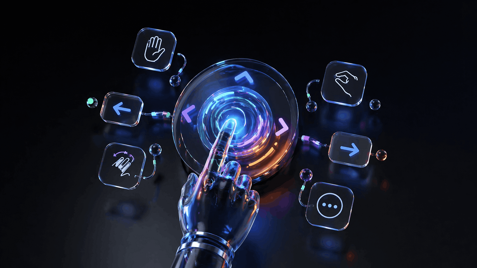
When Apple killed the home button in 2017, gesture navigation was an experiment. Nine years later, it’s the primary interaction model for every major mobile platform, and the patterns are finally maturing beyond “swipe up to go home.”
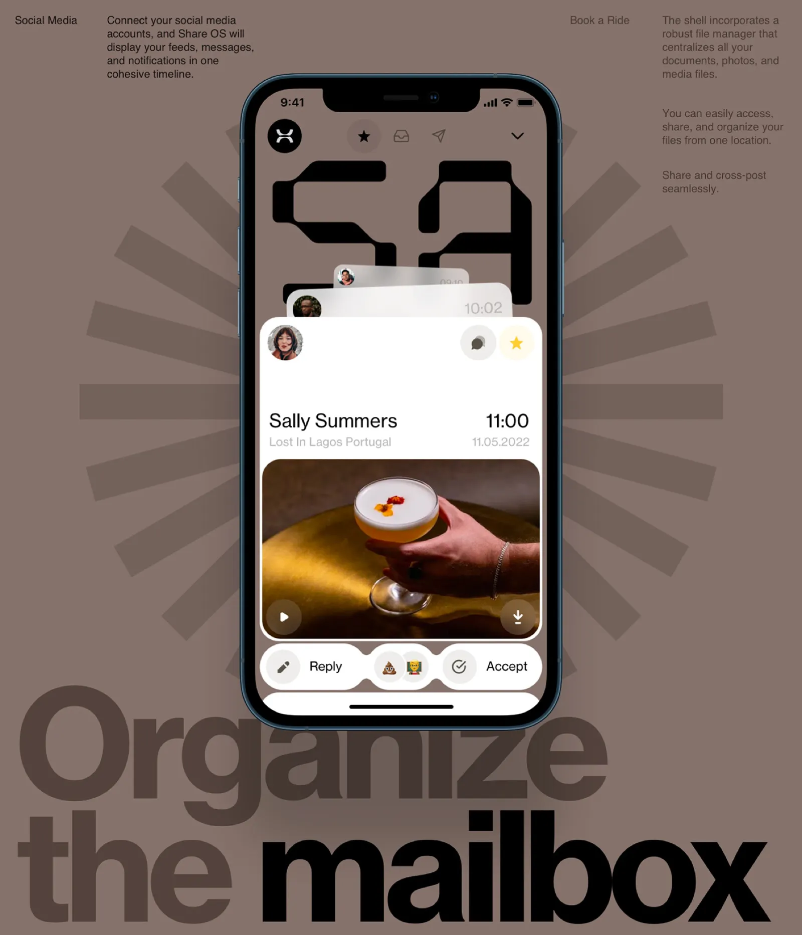
The shift in 2026 is from simple gestures (swipe, tap, pinch) to compound gestures with feedback layers. Telegram’s chat interface is a good example: swipe left to reply, swipe right to mark as read, long-press for reactions, pull down to search. Each gesture has distinct haptic feedback, so your thumb knows what it triggered before your eyes confirm it. The haptic layer turns gesture navigation from “I hope this works” to “I felt it work.”
Instagram introduced swipe-between-tabs navigation years ago, but the newer pattern is contextual gesture discovery. TikTok’s interface teaches gestures through use: the first time you pause on a video, a subtle animation shows you can long-press for more options. The gesture isn’t hidden in a tutorial. It’s revealed at the moment you need it.
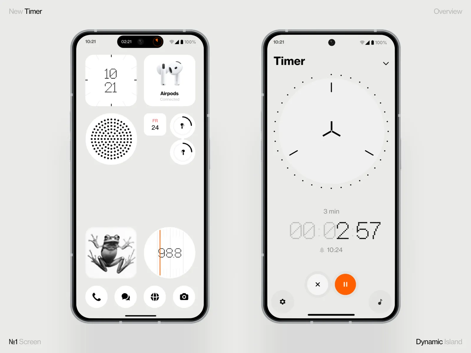
Apple’s Dynamic Island expanded this further. It introduced a persistent gesture target that changes based on context: tap for a glance, long-press for expansion, swipe to dismiss. One area, multiple gestures, multiple functions. That pattern is spreading to third-party apps that use the Live Activities API.
The discovery problem: Gestures are powerful but invisible. If users don’t know a gesture exists, it doesn’t exist. The best apps in 2026 solve this with progressive disclosure: start with visible buttons, then introduce gesture shortcuts as the user demonstrates competence. Superhuman (the email client) does this brilliantly, showing keyboard shortcuts inline until the user starts using them, then fading the hints.
When to skip it: Accessibility. Not every user can perform complex gestures. Any gesture-dependent interaction needs a visible fallback. If your swipe-to-delete doesn’t have a tap-based alternative, you’ve excluded users with motor impairments. Gestures should accelerate, not gatekeep.
Implementation note: Always pair gestures with haptic feedback. iOS provides three intensity levels through UIImpactFeedbackGenerator (light, medium, heavy) and three semantic types (success, warning, error). Android’s HapticFeedbackConstants offer similar control. A gesture without haptics is a guess. A gesture with haptics is a confirmation.
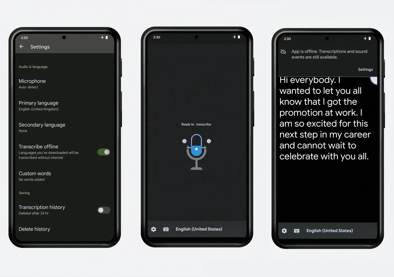
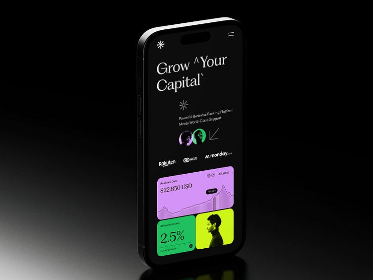
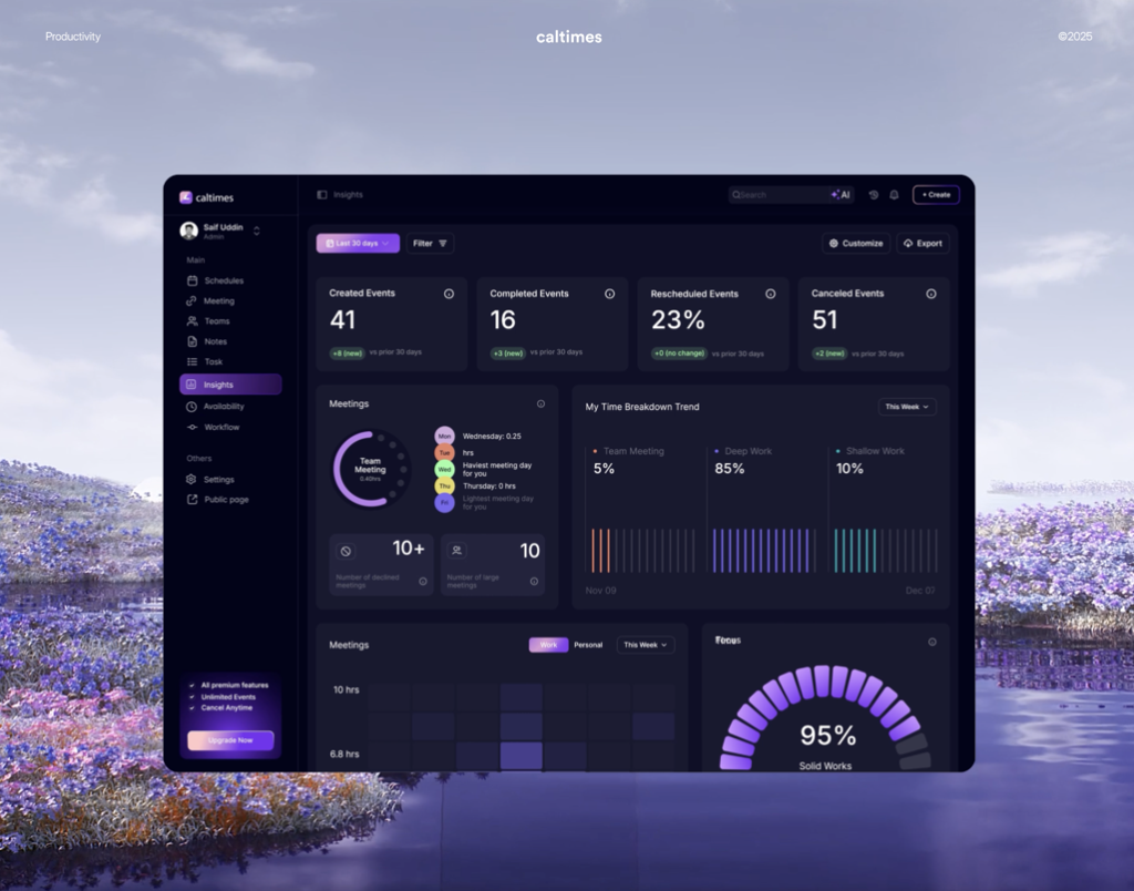
The Dark Mode Default

Dark mode used to be a toggle buried in settings. In 2026, it’s the default for a growing number of apps, and the ones doing it well are treating it as the primary design surface rather than an afterthought inversion.
The technical case is now overwhelming. OLED screens (which represent the vast majority of flagship phones sold since 2023) use zero power for true black pixels. Apps that default to dark mode on OLED devices measurably extend battery life. Google confirmed that YouTube’s dark mode uses 43% less power than light mode at full brightness on OLED. That’s not a design preference. That’s an engineering decision.
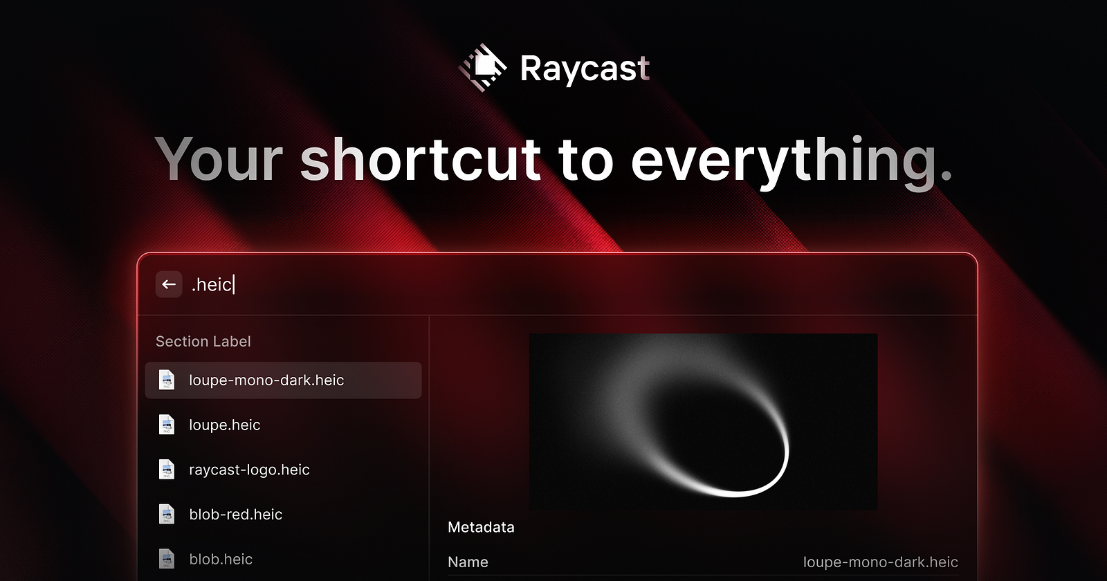
But the more interesting shift is perceptual. Apps like Arc Browser, Linear, Warp (the terminal), and Raycast all launched dark-first. Their light modes exist but feel secondary. The dark interface is the “real” version, and the design language was built around it: accent colors that pop against dark backgrounds, subtle borders instead of shadows for depth, luminance hierarchy instead of weight hierarchy.
What “dark-first” actually means: It’s not inverting your light theme. It’s designing your color system, contrast ratios, and depth cues with a dark canvas as the starting point. Shadows don’t work on dark backgrounds. You need borders, subtle gradients, or luminance shifts to create separation. Elevation in Material Design 3 uses tonal surfaces (lighter shades of a dark base) instead of drop shadows. That’s a fundamentally different approach to visual hierarchy.
The readability trap: Long-form reading is still better on light backgrounds for most users. Apple’s own research supports this, which is why Apple Books defaults to light even when the system is in dark mode. If your app involves extended reading (articles, documentation, long messages), offer dark mode but don’t force it for content areas. The hybrid approach (dark chrome, light content well) is gaining traction in apps like Notion and Readwise.
When to skip it: Apps targeting older demographics, medical or health apps where clinical clarity matters, or any context where users need to read dense text for extended periods. Default to light, offer dark, and respect the system setting.
Implementation note: Design your dark palette with at least four surface levels: a true background, an elevated surface, a secondary elevated surface, and an overlay level. One shade of dark grey is not a dark mode. It’s a grey app.
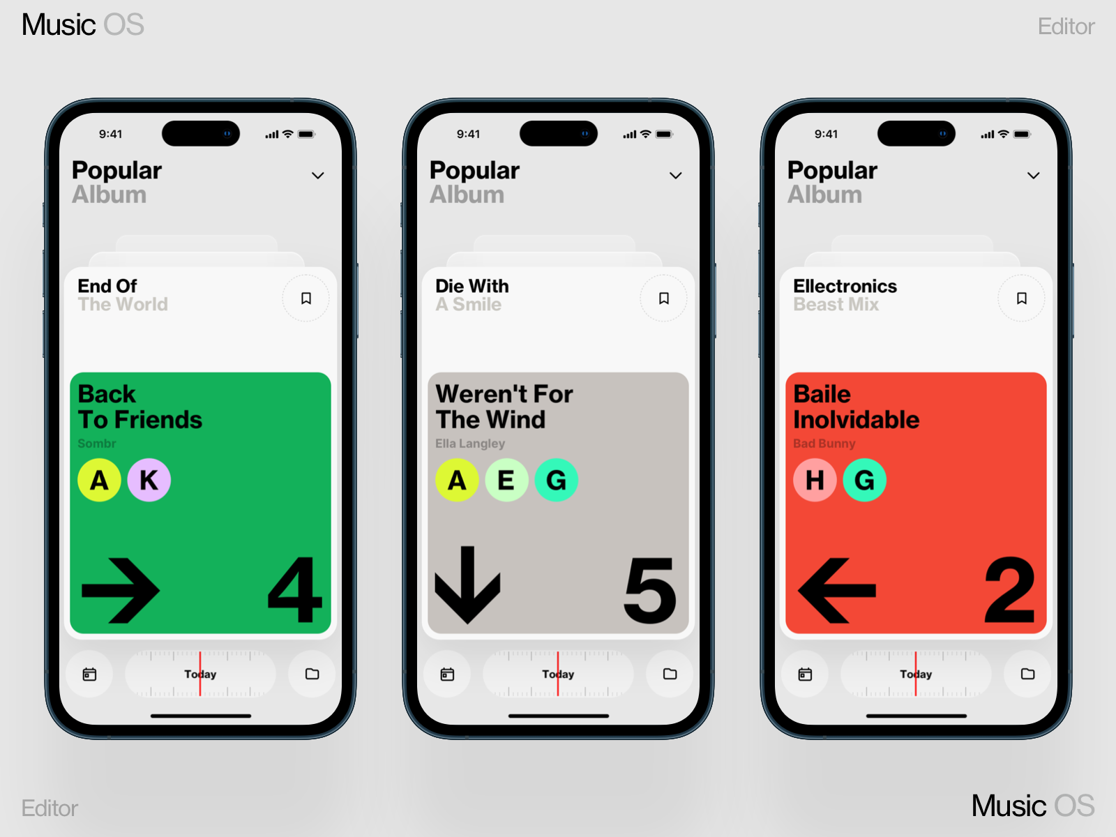
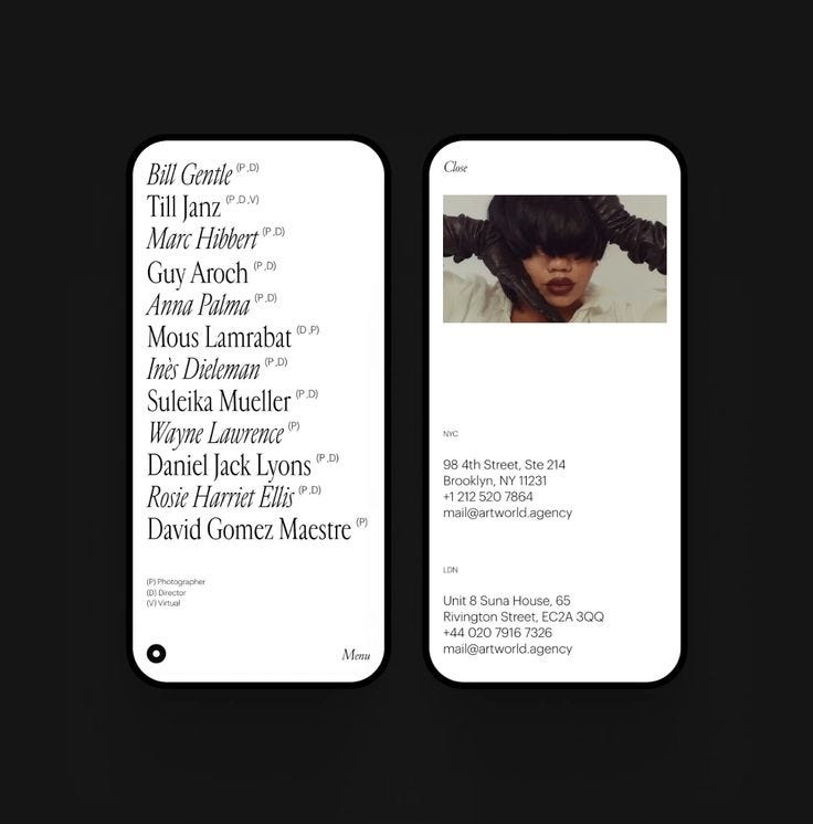
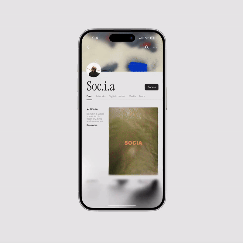
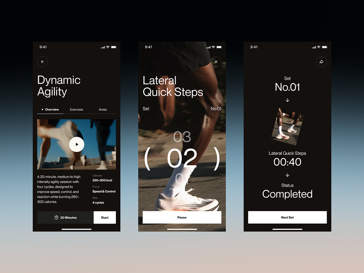
Thumb-Friendly Design Is Non-Negotiable

This isn’t new. It’s newly urgent. Screen sizes have grown. The percentage of one-handed phone usage hasn’t shrunk. The result: the top 40% of a modern phone screen is a dead zone for comfortable reach, and apps that put primary actions there are fighting their users’ anatomy.
The data is clear. Steven Hoober’s updated touch research (published late 2025) confirms that 75% of phone interactions use a single thumb. The comfortable reach zone is the bottom third of the screen plus a curve along the side closest to the dominant hand. Everything above the screen’s midpoint requires a grip shift or a second hand.
Apple acknowledged this years ago with the reachability gesture, but that’s a band-aid. The real solution is architectural: put the actions where the thumb already is.
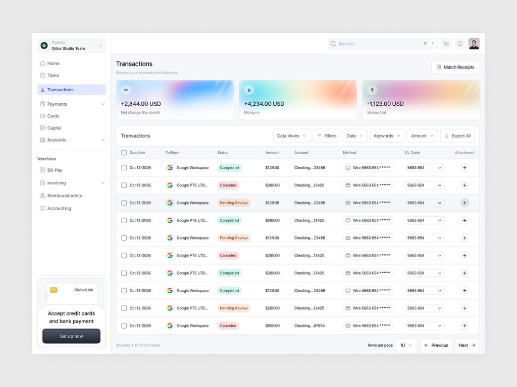
Apps getting this right: The most notable shift is bottom-centric navigation expanding beyond the tab bar. Telegram moved its search to a pull-down gesture from the chat list. Apple Maps put its entire search and suggestion interface in a bottom sheet that the user pulls up. Spotify’s “Your Library” redesign moved filtering controls to a horizontally scrollable chip row at the top of a bottom sheet. The common thread: the primary interaction surface is below the screen’s midpoint.
The bottom sheet pattern (a draggable panel anchored to the screen bottom) has become the dominant container for secondary content. Apple standardized it with UISheetPresentationController in iOS 15, and by 2026 it’s the expected pattern for anything that doesn’t deserve a full-screen takeover: settings, filters, confirmations, previews, sharing options.
The floating action button question: Google’s Material Design championed the FAB for a decade. It’s still valid for single-primary-action interfaces (compose in Gmail, create in Figma). But FABs that stack (multiple floating buttons) or FABs that cover content are losing ground to bottom bar actions. The trend is toward integrating primary actions into the navigation bar itself rather than floating them above content.
When to skip it: Tablet and foldable layouts. Thumb zones are irrelevant when the device is held with two hands or propped on a surface. If your app targets iPad or foldable phones in expanded mode, optimize for pointer precision and larger touch targets instead.
Implementation note: Test your layouts with the thumb zone overlay in Figma (several community plugins generate these). If your most-used action requires a reach into the top third, move it. The effort of repositioning one button will save thousands of micro-frustrations.
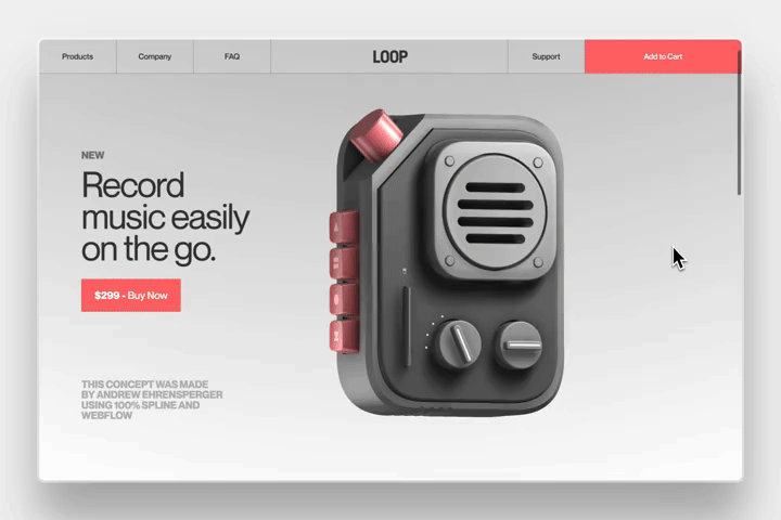
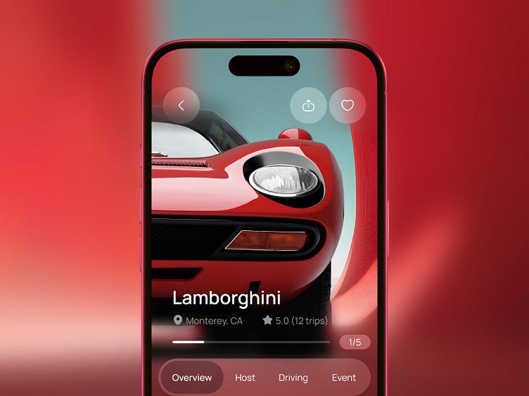
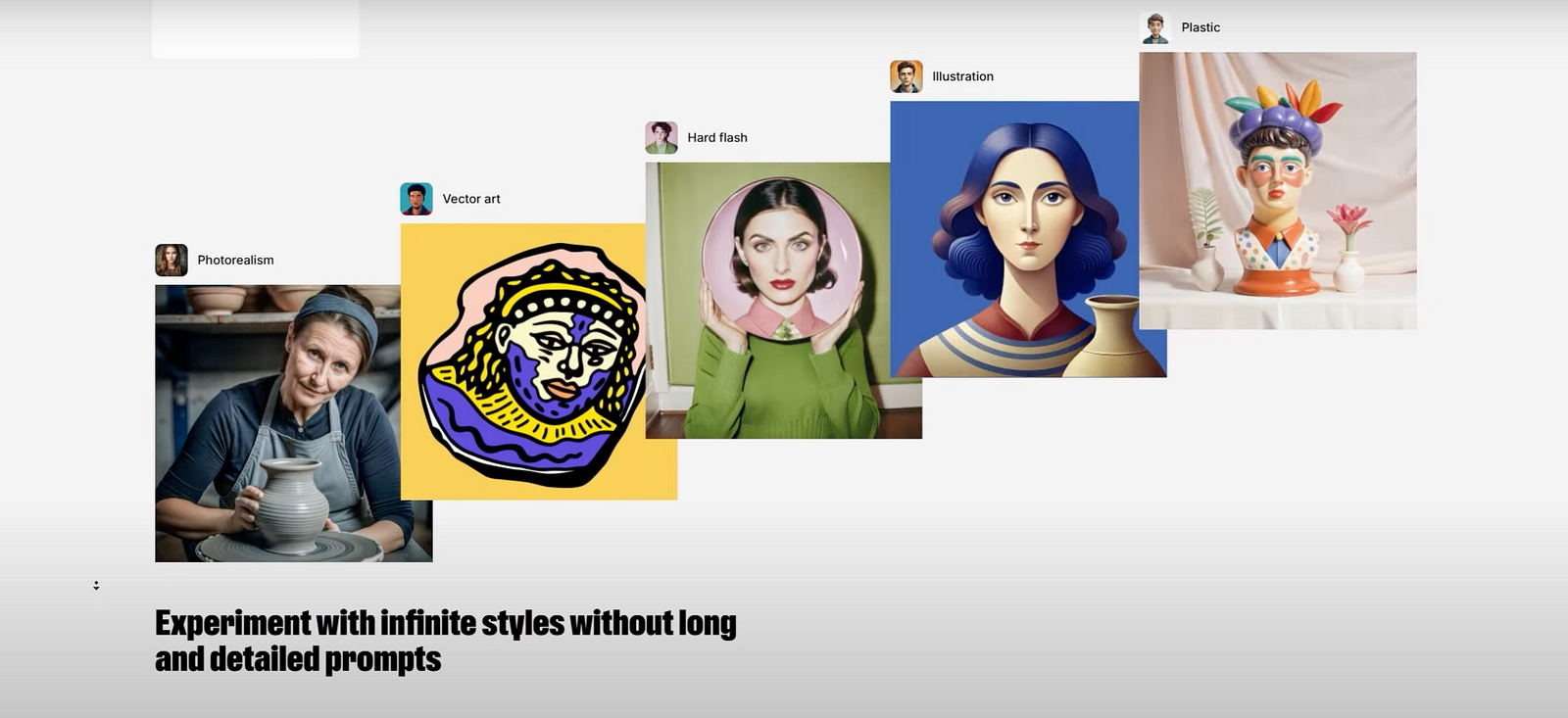
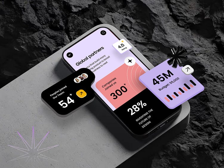
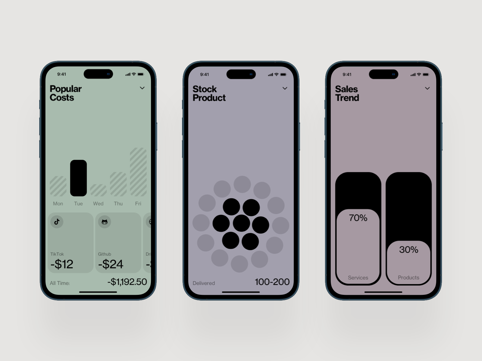
Glassmorphism 2.0 (And When to Skip It)

Glassmorphism (frosted glass effects, translucent backgrounds with backdrop blur) hit peak hype around 2021. Then it got overused, performance-tanked on mid-range devices, and designers moved on. In 2026, it’s back in a more disciplined form.
The difference between the 2021 version and today’s implementation is restraint. Early glassmorphism tried to make everything translucent. The 2026 version uses it surgically: overlay cards, notification panels, media controls, and contextual menus that float above primary content. The blur serves a purpose: it says “this layer is temporary, the content behind it still exists.”
Apple’s visionOS design language accelerated this. The entire spatial computing interface is built on layered translucency. That visual language is trickling down into iOS and Android apps. The system-level precedent made glassmorphism feel less like a trend and more like a platform convention.
Where it works:
- Notification overlays and toasts: The blur signals impermanence. The content behind it remains contextually visible.
- Media player controls: Music apps (Spotify, Apple Music) use translucent overlays for now-playing controls that don’t fully obscure the album art.
- Modal confirmations: A blurred background behind a confirmation dialog maintains spatial context.
- Navigation overlays: Bottom sheets and slide-over menus with subtle transparency feel lighter than opaque panels.
Where it fails:
- Data tables and dashboards: Translucency behind numbers is visual noise. Dense information needs clean, opaque backgrounds with clear contrast.
- Forms and input fields: Blurred backgrounds behind text inputs reduce contrast and make labels harder to read. Accessibility fails.
- Low-contrast environments: Glass effects depend on sufficient contrast between the blurred background and the foreground content. On a predominantly white or light screen, the effect disappears into mush.
Performance reality: Backdrop-filter blur is GPU-intensive. On flagship phones, no problem. On budget Android devices (which represent the majority of global smartphone sales), heavy blur effects cause dropped frames and battery drain. If your audience includes mid-range devices, use static blurred backgrounds (pre-rendered) instead of real-time backdrop-filter. The visual result is close enough. The performance difference is massive.
Implementation note: CSS backdrop-filter is now widely supported, but test on real mid-range hardware, not just your M-series MacBook simulator. Set a fallback: if the device can’t handle the blur, show a semi-transparent solid color instead. The design should degrade gracefully, not break.
Spatial UI Foundations: Pre-AR Patterns

You don’t need to design for Apple Vision Pro to benefit from spatial UI thinking. The design patterns emerging from spatial computing are already improving flat mobile interfaces.
Spatial UI is about depth as information. Not decoration: information. When a card has a subtle shadow and a slight scale increase, it communicates “this is above the base layer, it’s interactive, it’s temporary.” That’s a spatial signal, and it works on a flat screen just as well as it works in 3D space.
Depth layers as hierarchy: The most practical spatial pattern for mobile is explicit layering. Instead of distinguishing elements through color alone, apps are using elevation (shadow + scale + blur) to create a z-axis hierarchy. Apple’s latest Human Interface Guidelines formalize this with three explicit layers: base content, raised elements, and overlay elements. Each layer has defined shadow values, corner radii, and interaction behaviors. This isn’t skeuomorphism. It’s using depth as a functional signal.
Parallax and motion depth: Subtle parallax (background moves slower than foreground on scroll) gives interfaces a sense of physical space. Apple’s Weather app uses this constantly: the background condition animation scrolls at a different rate than the forecast cards. It’s not flashy. It’s just enough to make the interface feel like it has actual layers rather than painted ones.
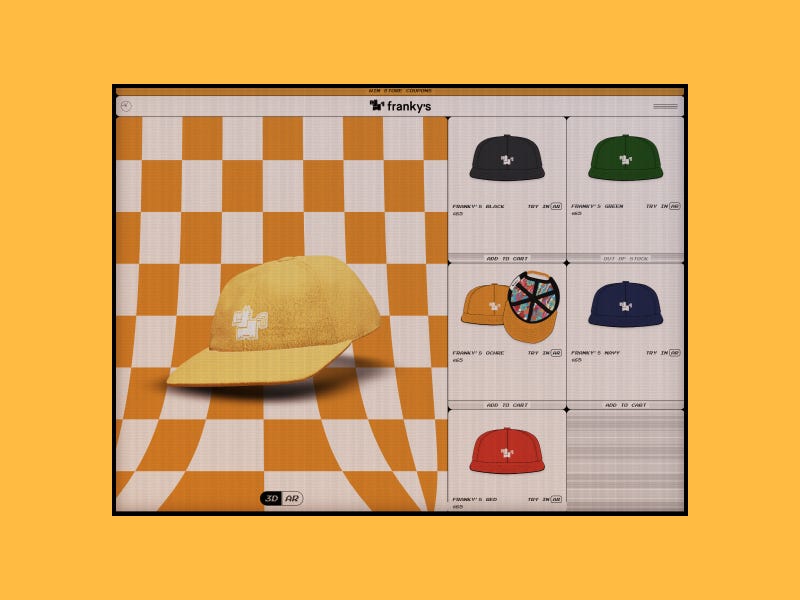
3D-aware components: Apps like Nike and IKEA have used AR for product previews for years. The newer pattern is 3D-aware UI components that respond to device orientation. Tilt your phone and the card shadows shift. Rotate and the lighting on a product image adjusts. Apple’s gyroscope API makes this trivial to implement, and the effect is surprisingly engaging without being distracting.
When to skip it: Any interface where speed matters more than delight. Parallax scrolling on a messaging app’s chat list would be absurd. Depth effects on a checkout flow add friction. Spatial UI works for content that benefits from a sense of place: portfolios, media browsers, product showcases, editorial layouts. It doesn’t belong in utility interfaces where the user wants to complete a task and leave.
Implementation note: Start with shadows and elevation before adding motion. A well-designed shadow system (2–3 levels with consistent light direction) gives you 80% of the spatial benefit with zero performance cost. Parallax and gyroscope effects are the remaining 20% and should only appear where they genuinely improve comprehension.
Passwordless Authentication Changes Everything
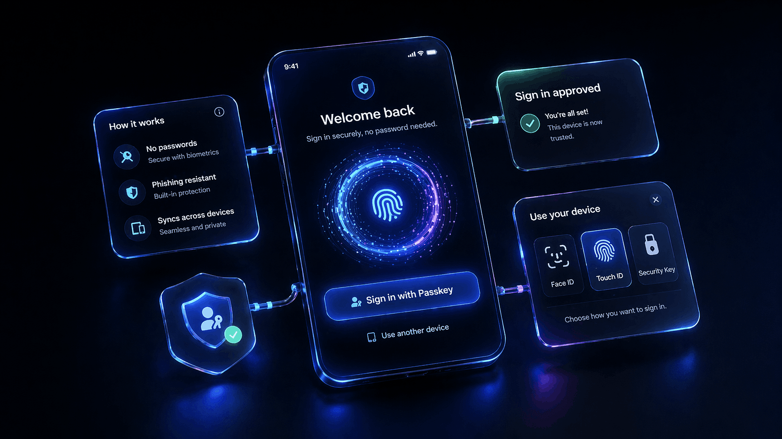
This one isn’t a visual pattern. It’s an interaction architecture shift that changes how your app’s first 30 seconds feel, and those 30 seconds determine whether users stay.
Passkeys (built on the FIDO2/WebAuthn standard) are now supported natively by iOS, Android, and every major browser. Google, Apple, and Microsoft have all committed to passkeys as the primary authentication method. GitHub, PayPal, eBay, Kayak, and TikTok have shipped passkey support. The technology is no longer experimental. It’s infrastructure.
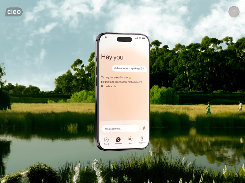
What passkeys change for designers: The login screen, one of the most designed screens in any app, is becoming simpler. No password field. No “forgot password” link. No password strength meter. No CAPTCHA. The flow becomes: enter email (or select from an autofill suggestion), confirm with Face ID or fingerprint, done. Two steps instead of six. The cognitive load drops dramatically.
The design challenge: Passkeys are invisible by nature. Users don’t see a passkey. They see a biometric prompt. This means the traditional login screen (which often carried brand personality, illustrations, onboarding messaging) shrinks to almost nothing. The “moment of entry” that used to be a design opportunity becomes a half-second biometric confirmation. Designers need to find other moments for brand expression: the loading state after auth, the first screen, the welcome-back animation.
Fallback UX matters: Not every user has biometrics set up. Not every device supports passkeys yet. The fallback path (usually email magic link or SMS code) needs to be just as smooth, not a punishment for having an older phone. The best implementations (Linear, Vercel) present passkey as the primary option with a subtle “other methods” link that doesn’t make the alternative feel second-class.
When to skip it: You can’t skip it. Passkey support is quickly becoming a baseline expectation, similar to how supporting dark mode went from “nice to have” to “required” in three years. The question isn’t whether to implement passkeys. It’s how quickly you can make them your primary auth flow.
Implementation note: Apple’s Authentication Services framework and Google’s Credential Manager API handle the heavy lifting. The design work is in the transition: what happens between “authenticated” and “first meaningful screen.” That 0.5 to 2 second window is your new onboarding moment. Use it well.
What This Means for Your Next Project
These seven patterns share a common thread: they all reduce friction by working with the user’s physical reality instead of against it. Thumbs have a natural reach zone. Eyes prefer dark backgrounds on OLED. Fingers remember gestures better than they remember passwords. The patterns that matter in 2026 are the ones that respect those constraints.
If you’re starting a mobile project today, here’s the practical priority stack:
- Non-negotiable: Thumb-friendly layout, passkey authentication, dark mode support (as a first-class citizen, not an inverted afterthought)
- High value: Gesture navigation with haptic feedback, bottom-sheet architecture for secondary content
- Context-dependent: Adaptive interfaces (only if your app has distinct use modes), glassmorphism (only for overlays on capable devices), spatial UI foundations (only for content-rich experiences)
The biggest mistake designers make with patterns like these is treating them as a checklist. They’re not. Each one is a response to a specific problem. If your app doesn’t have that problem, the pattern is decoration, not design.
The mobile apps that feel best in 2026 aren’t the ones using every new pattern. They’re the ones that picked the right three and executed them precisely.
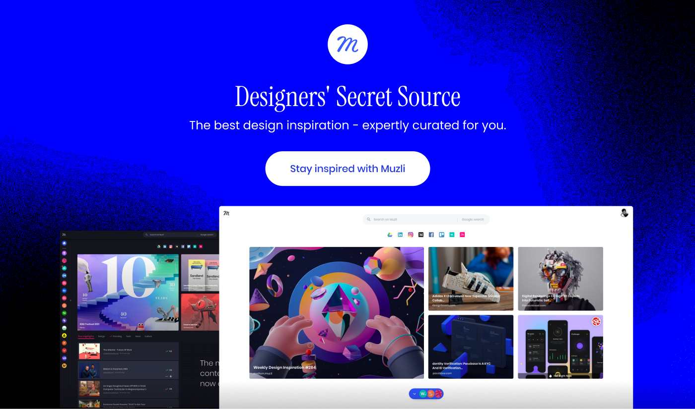
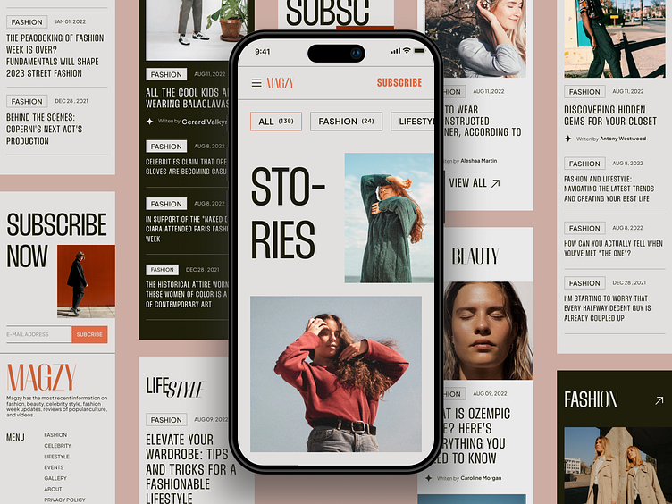
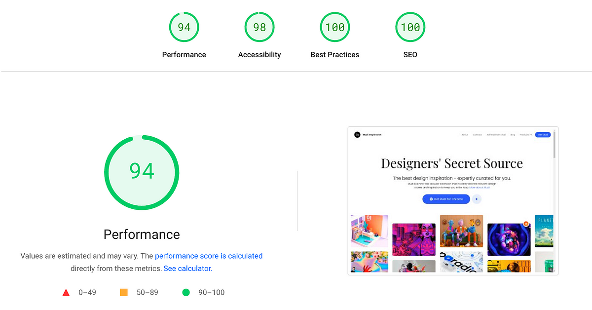
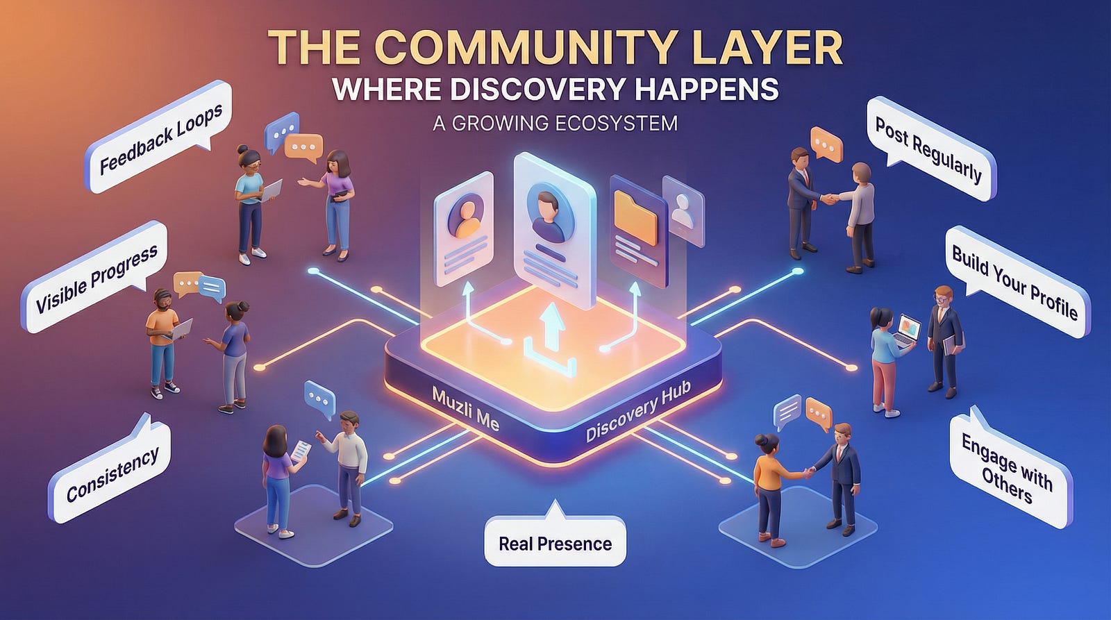
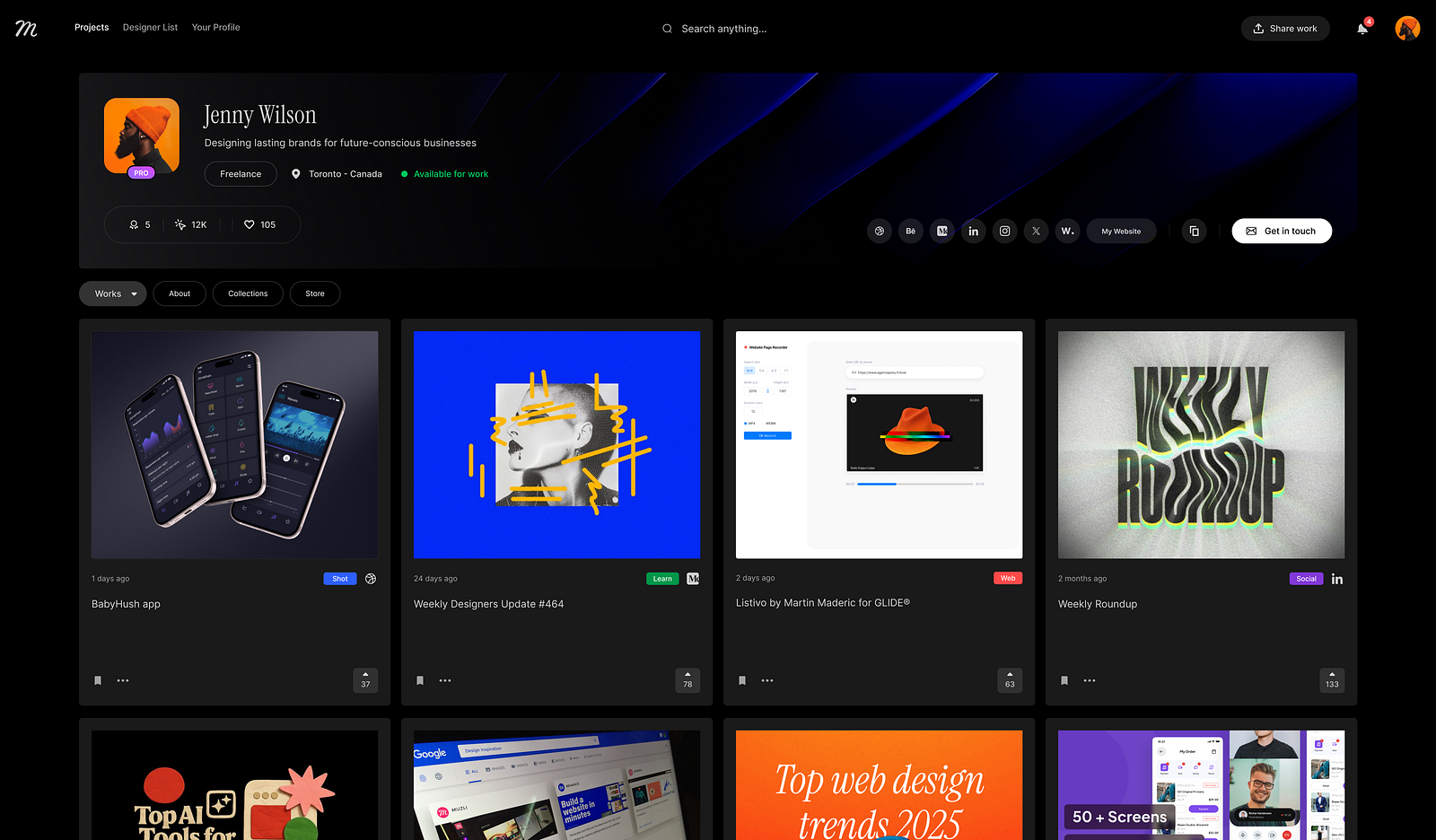
If you’re building your portfolio around mobile work, the patterns you choose to showcase signal how current your thinking is. Muzli Me is where designers curate their creative identity and stay visible to the teams that are hiring for exactly this kind of expertise.
For more on the broader design shifts shaping this year, including how these mobile patterns connect to what’s happening on the web, check out our Web Design Trends 2026 breakdown.
……
💡 Stay inspired every day with Muzli!
Follow us for a daily stream of design, creativity, and innovation.
Linkedin | Instagram | Twitter
")
")


")


")