How to Build a Design System in Figma: A Practical Guide (2026)

Most design systems become component graveyards. This guide shows how to build one in Figma that teams actually adopt: from tokens to theming to ship-ready components.

Here’s a pattern you’ve probably seen: a design team spends three months building a component library. It’s beautiful. The spacing is perfect. The variants are thorough. Six months later, nobody uses it. Designers detach components “because it’s faster.” Engineers build their own versions because “the Figma one doesn’t match the code.” The system exists in Figma. The product exists somewhere else.

This happens because most design system guides focus on what to build. The hard part was never building components. The hard part is building components that survive contact with real projects, real deadlines, and real people who didn’t design them.

This guide starts from the real problem.

Why Most Design Systems Fail

They fail at adoption, not at craft.

A design system succeeds when three things are true: designers use it by default (not by mandate), engineers trust it enough to not rebuild it, and it updates without breaking things. Everything else: the beautiful documentation site, the component showcase, the naming convention debate: is secondary.

The most common failure modes:

  • The museum problem. The system is perfect but untouchable. Making a change requires three approvals, so designers work around it instead.
  • The translation gap. Figma components don’t match code components. Names are different, properties are different, states are different. Two systems pretending to be one.
  • The coverage trap. The system tries to cover every edge case before shipping. It takes so long that the product evolves past it.
  • The style guide disguise. What’s called a design system is actually a color palette and a font choice. There’s no structure underneath.

If you’ve been through any of these, this guide is for you.

The Foundation Layer: Tokens Before Components

A 3D visual diagram in a transparent glass style showing the chain of values in a design system: Raw, Core, Semantic, and Component, ending with a teal "Add to cart" button.

Don’t start with buttons. Start with decisions.

Design tokens are the atomic decisions that everything else is built from. Before you draw a single component, define the values that your entire system shares.

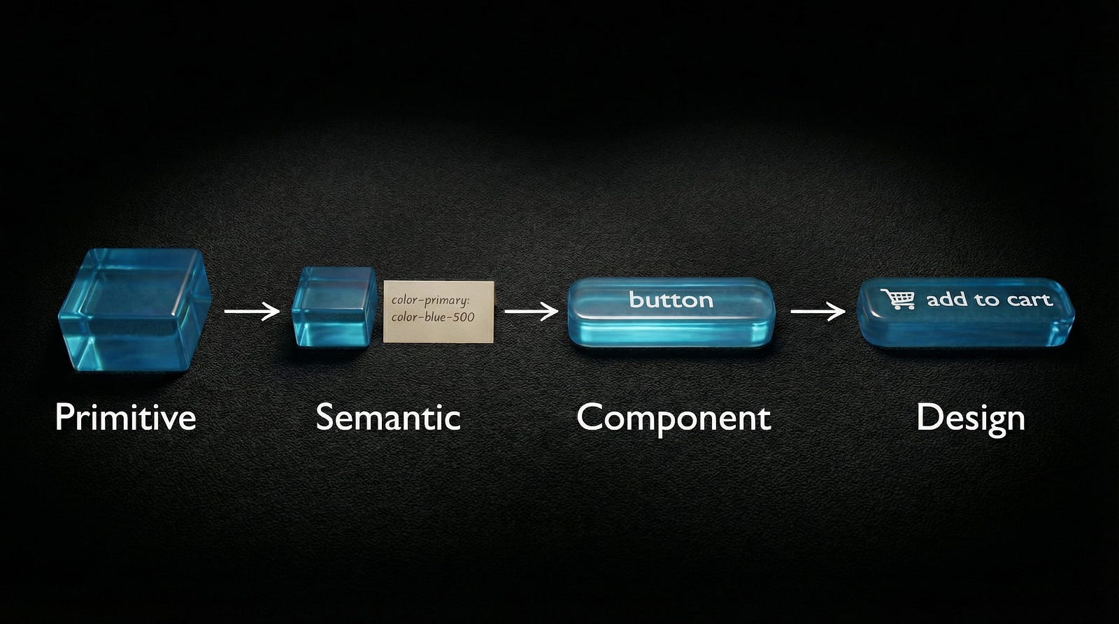
The three-tier token architecture:

Tier 1: Primitive tokens, the raw values.

An open black professional display case containing neatly organized rows of material and color samples in smooth cube shapes, including textures of marble, wood, metal, and colored glass.


These are your actual numbers and colors. They answer the question “what exists?”

  • color-blue-500: #0835fb
  • spacing-4: 16px
  • radius-sm: 4px
  • font-family-sans: Inter

You never apply these directly to designs. They’re the ingredient list.

Tier 2: Semantic tokens, the purpose layer.

A translucent blue glass cube placed on a dark fabric next to a note reading “color-primary: color-blue-500

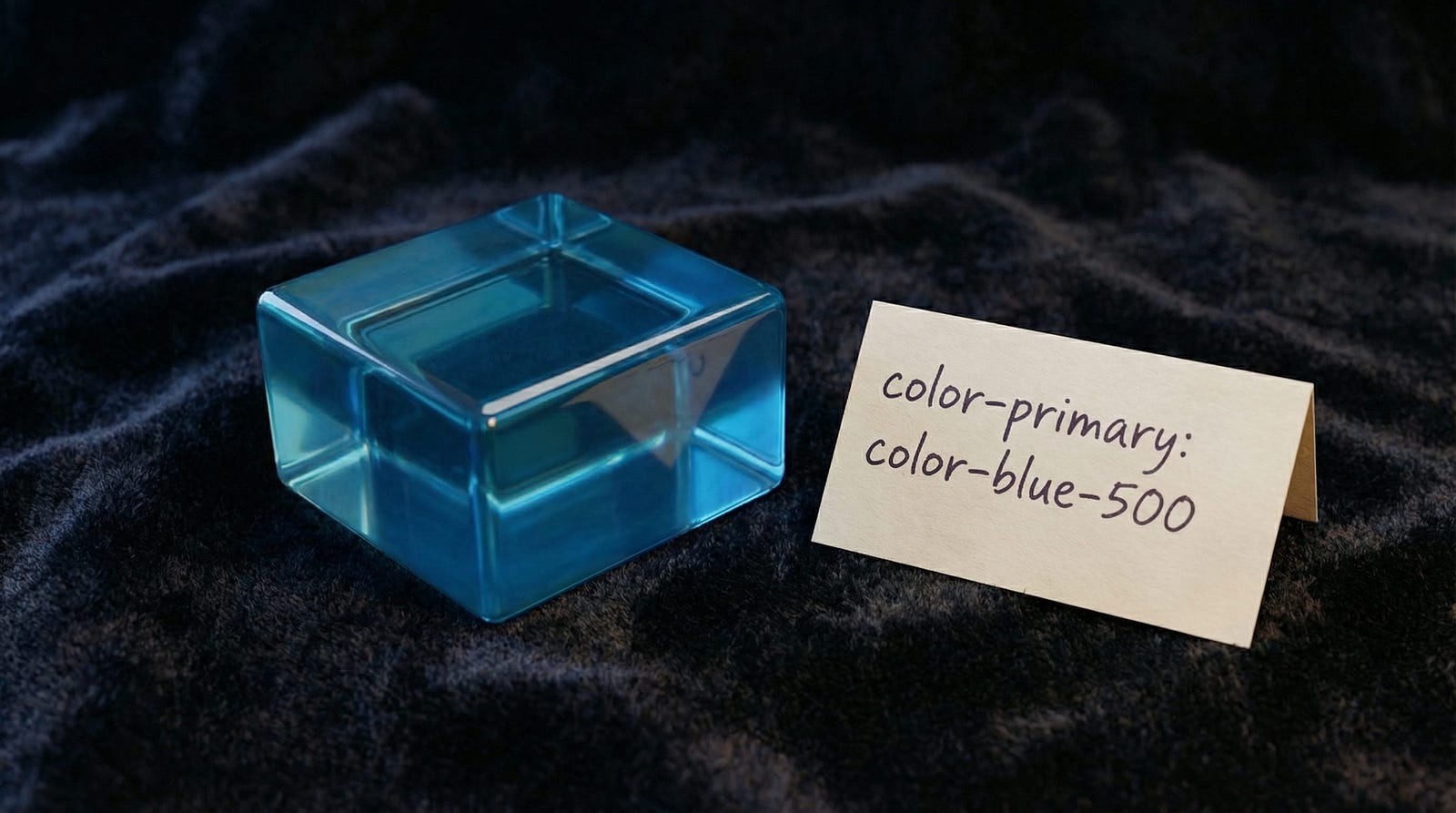
These reference primitives but add meaning. They answer “how should this be used?”

  • color-primary: color-blue-500
  • color-text-muted: color-gray-400
  • spacing-section: spacing-8
  • radius-input: radius-sm

This is what you apply to designs most of the time.

Tier 3: Component tokens, the specific layer.

A high-quality 3D render of a rounded, rectangular translucent blue glass button with a shopping cart icon and the word "button" in white sans-serif typography.

These reference semantic tokens and map to exact component properties. They answer “where exactly does this go?”

  • button-primary-bg: color-primary
  • input-border-color: color-border-default
  • card-padding: spacing-section

You only need this tier if you’re building at enterprise scale. For most teams, semantic tokens are enough.

Setting this up in Figma:

Create three Variable Collections:

  1. Primitives, all raw color, spacing, and radius values
  2. Semantic, purpose-driven aliases that reference primitives
  3. Components (optional), component-specific aliases

Name them clearly. Add descriptions to every variable. Future-you will thank present-you.

Figma Variables in 2026: What Actually Changed

Figma’s variable system has grown significantly. Here’s what matters for your design system:

Extended variable types. Beyond Color and Number, you now have String for labels and paths, Boolean for toggles and states, and the new Composite type for grouped values like shadows and borders. This means fewer workarounds and more of your system lives in variables instead of loose styles.

Modes got more powerful. More modes per collection means your Light and Dark themes, brand variations, and density options can all live in one structured system. Before, you’d create separate components for each theme. Now, one component switches modes.

Variable import and export. This is the big one for teams. You can now sync tokens between Figma and your code repository. Changed a color in Figma? Export it. Your CI/CD pipeline picks up the change. This makes single source of truth an actual reality instead of a slide in a presentation.

Component Slots. These let designers customize specific areas of a component instance without detaching it. Instead of building 15 variants of a card component for different content arrangements, you build one card with slots.

AI features that help. Figma’s Check Designs catches inconsistencies, for example a text layer using Inter Regular 15px when your system defines 16px. Visual Search finds duplicate components hiding in your file. These are maintenance tools, not generation tools. They keep your system clean.

MCP integration. Figma’s Model Context Protocol lets AI tools like Claude and Cursor read your design system directly. This means code generation tools can reference your actual tokens and components, not guess at them. If you use variable fonts in your system, MCP ensures the code inherits the right font settings.

Building Components That Survive Real Projects

Three rules. Every component should follow all three.

Rule 1: Start with the states, not the default.

Most designers build the default state first, then add hover, active, disabled, error, and loading as afterthoughts. Reverse this. Map out every state a component needs before you design any of them. If you start with the default and add states later, the structure breaks.

States to define for every interactive component:

  • Default
  • Hover
  • Active or Pressed
  • Focused
  • Disabled
  • Loading
  • Error
  • Success

Rule 2: Auto Layout everything.

If a component doesn’t use Auto Layout, it will break the moment someone adds content that’s longer than your placeholder. Every single time.

Auto Layout rules:

  • All spacing is defined by variables, not magic numbers
  • Padding uses semantic spacing tokens
  • Fill container for flexible-width elements, hug contents for fixed elements
  • Nested Auto Layouts for complex arrangements such as header, body, and footer

Rule 3: Name it like a developer reads it.

Your Figma layer names should match your code component names. If your button’s primary variant is called Type=Primary, Size=Medium, State=Default in Figma, that should map to <Button variant="primary" size="md" /> in code.

Naming matters more than aesthetics in a design system. It’s the bridge between design and engineering.

Component architecture tips:

  • Base components are private (prefixed with . or _). They contain the raw structure.
  • Composed components are public. They combine base components into what designers actually use.
  • Use component properties for simple variations (on/off icon, text content). Use variants for visual changes (primary/secondary/ghost).
  • The detach test: have someone unfamiliar with your system try to use it. If they detach a component to make it work, your system failed at that point. Fix the component, not the person.

Theming: Light, Dark, and Multi-Brand

A large translucent cube illuminated by a diagonal beam of light, casting soft gradients on its surface in a dark room.

With Figma Modes, theming is finally structured instead of hacky.

Setting up your first Light/Dark theme:

  1. In your Semantic color collection, create two modes: Light and Dark
  2. Map each semantic token to different primitives per mode:
  • color-bg-primary → Light: white, Dark: gray-900
  • color-text-primary → Light: gray-900, Dark: white
  • color-border-default → Light: gray-200, Dark: gray-700

3. Apply semantic tokens to all components: not primitives

4. Switch modes on any frame to see the theme change instantly

The swap test: select any component instance, change the mode from Light to Dark. If anything breaks: wrong contrast, invisible borders, text that disappears: your token mapping has a gap. Fix it now.

Multi-brand theming:

For multi-brand systems, create a separate collection for brand tokens:

  • brand-primary, brand-secondary, brand-font-heading
  • Each brand gets its own mode in this collection
  • Semantic tokens reference brand tokens, which resolve to the correct brand values

This lets one Figma file serve multiple brands. The structure is the same. The values change.

The Adoption Problem (And How to Solve It)

A top-down view of a dark workbench featuring a precise arrangement of physical tools like screwdrivers and a hammer alongside digital UI components made of blue glass and geometric material samples.

You’ve built the system. Now comes the part nobody writes about: getting people to use it.

The 3-minute test. Sit a designer who’s never seen your system down in front of it. Time them. Can they find a button, place it, and configure it correctly in 3 minutes? If not, your system is too complex. Simplify the entry point.

Documentation that people actually read:

  • One page per component, not one document for everything
  • Visual examples first, rules second
  • When to use and when not to use, the negative guidance is often more useful
  • Keep it inside Figma if possible. External docs get forgotten

Getting buy-in from engineers. Speak their language:

  • Tokens equal CSS variables
  • Component properties equal props
  • Modes equal themes
  • If an engineer can look at your Figma system and immediately understand the code equivalent, adoption is almost guaranteed

The one metric that matters: component usage rate. Track how many component instances versus detached components exist across your team’s files. If the detach rate is above 20 percent, something in your system isn’t meeting real needs. Find out what and fix it.

According to Figma’s data, teams with mature component libraries see a 34 percent improvement in task completion speed. The ROI is real, but only if the system is actually used.

The Ship-It Checklist

Before you call it v1, make sure:

  • Token architecture defined, Primitive to Semantic at minimum
  • Core colors, spacing, radius, and typography as Figma Variables
  • Light and Dark modes working and tested
  • 10 core components built: Button, Input, Select, Checkbox, Radio, Card, Modal, Badge, Avatar, Toast
  • Every component uses Auto Layout
  • Naming convention documented on one page
  • At least one full page built using only system components
  • Engineer handoff tested, one developer can build from your system
  • Usage guidelines written, under 500 words per component
  • The detach test passed with a designer outside your team

What not to do for v1:

  • Don’t build every component. Ship 10, learn, then build more
  • Don’t write perfect documentation. Write good-enough documentation and improve it based on real questions
  • Don’t wait for consensus on naming. Pick a convention, document it, move on

A shipped system that covers 60 percent of cases beats a perfect system that covers 100 percent of cases but lives in a branch nobody merges.

Design systems aren’t products you launch. They’re gardens you maintain. Start small, grow what works, prune what doesn’t. The teams that treat their system as a living thing, versioned, measured, iterated, are the ones whose systems survive year two.

Looking for design system references and component libraries? Explore curated resources on Muzli.

……

💡 Stay inspired every day with Muzli!

Follow us for a daily stream of design, creativity, and innovation.
Linkedin | Instagram | Twitter

The Complete Vibe Coding Guide for Designers (2026)

How to work smart with AI, maintain your Design System, and build products that feel real

In 2026, nobody is impressed by “I made a prototype with AI” anymore.

Everyone has seen stunning UI generated in an hour. Everyone has seen demos that look flawless on the first screen, then completely fall apart on the second.

The questions that matter now are not “Does it work?” but:

How was it built?
Is it consistent?
Can it scale?

Will someone be able to continue from this in a month?

What’s impressive today is a designer who can take an idea and turn it into something that feels like a real product: with rules, consistency, a Design System, proper behavior, and a process you can trust.

This is exactly where Vibe Coding transforms from a trend into a real craft.

 — -

What Is Vibe Coding (In Designer Terms)

Vibe Coding is not “learning to code”, and it’s not classic No-Code either.

It’s a workflow where you describe intent, and AI translates it into output: screens, flows, states, sometimes data, sometimes code.

But the real story isn’t the tool.

The real story is you.

Good Vibe Coding forces designers to shift from thinking in “screens” to thinking in “systems”:

  • Components that repeat themselves
  • Hierarchy that serves tasks
  • Real states (not just pretty UI)
  • Fixed rules for spacing and typography
  • Screens that feel like one product, not a collection of pages
What Is Vibe Coding (In Designer Terms)

 — -

How Designers Are Measured in 2026

Tools change. The criteria stay the same.

If you want to work properly with Vibe Coding, measure every tool by six questions:

1. Speed to Demo

2. Design System Fidelity

3. Component Consistency

4. States and Behavior

5. Path to Continuation

6. Data Connection

 — -

The Biggest Advantage of 2026: Tools That Talk to Each Other (MCP)

Today, the big difference isn’t “which tool is smartest”.

The difference is whether your tools work like a team.

MCP (Model Context Protocol) is what makes that possible.

MCP in Plain Language

MCP is a connection layer that allows AI tools to work with your sources of truth instead of guessing.

Instead of every tool starting from zero and trying to “understand the design”, it can receive real context:

  • Components
  • Auto Layout
  • Variables and tokens
  • System naming conventions
  • Code project structure
  • Existing rules you’re already working with

In designer terms: MCP transforms AI from someone trying to imitate your design into someone translating it.

Without context, AI guesses:

“I think this is an H1”
“I think the spacing is 16px”
“I think this is a Primary button”

With real context, AI knows:

“This is your system’s H1”
“This is your spacing token”
“This is your existing Button/Primary component”

And that’s the difference between “same vibe” and “same product”.

If you want to see what this looks like in a real workflow, I broke it down step by step in a separate article that follows design intent from Figma all the way to code, without losing context at handoff points.

>>From Design to Code Without Losing Context: An MCP-First Workflow

 — -

Connections That Actually Make a Difference

MCP isn’t theory. It changes outcomes.

Here are the connections that matter:

Figma → Cursor

Cleaner implementation, less guessing, more precision.

Figma → Claude (or other models)

Extract rules from the Design System: what exists, what’s allowed, what must stay consistent.

Repo → Cursor

Less duplication, fewer “new components by accident”, less spaghetti code.

 — -

The Biggest Danger: Letting AI Replace the Designer’s Brain

The most common bug in Vibe Coding isn’t technical.

It happens in your head.

AI can generate something that looks good, works, and runs fast.

Then it becomes dangerously easy to say: “I trust it”, and stop thinking like a designer.

At that moment, you stop designing and start approving.

Symptoms appear fast:

  • Visual hierarchy that doesn’t support the user’s task (but “looks fine”)
  • Spacing inconsistencies that slowly creep between screens
  • Components that look similar but aren’t actually the same thing
  • A product that feels like a collection of pretty screens, not a real system

There’s an even deeper layer.

AI will generate a solution even when it has no idea if it makes sense UX-wise.

It’s not worried about edge cases, cognitive load, emotional context, or user mental models.

It’s committed to giving an answer.

That’s why your job stays critical.

Ask yourself:

  • Why is this element here, does it support the task or just fill space?
  • Is the sequence logical, or does it just “flow visually”?
  • What happens before, after, and in edge cases?
  • Would you defend this in a user interview?

The right framing is simple:

AI is the intern.

You’re the Lead.

It runs fast.

You decide what ships.

The Biggest Danger: Letting AI Replace the Designer’s Brain

 — -

The 3 Layers of Vibe Coding (So You Pick the Right Tools)

Don’t ask “What’s the best tool?”

Ask:

What stage am I working in right now?

Layer 1: Exploration

Experiments, variations, quick demos.

Layer 2: MVP

A small working product with real flows and basic data.

Layer 3: Engineering

Quality, consistency, cleanliness, components, Git, continuation.

Most tools are great at Layer 1 or 2.

The real advantage in 2026 is bringing work to Layer 3 without losing your mind.

If you want a practical overview of which AI design tools actually hold up in real workflows, this guide breaks it down clearly: Best AI Design Tools for UI/UX Designers in 2026.

The 3 Layers of Vibe Coding (So You Pick the Right Tools)

 — -

The Tools That Actually Matter for Designers in 2026

There’s no “one winning tool”.

There’s a pipeline.

Think like a small studio: pick tools based on the job, then move forward.

Figma Make

The most natural tool for designers because it starts from your language and your design files.

Best for: Layer 1 → Layer 2

Strengths: Native Figma flow, fast iteration, familiar mental model

Limitations: Can get messy without system discipline

Figma Make ui

— –

Lovable

Excellent when you need a working MVP with logic and data.

Best for: Layer 2

Strengths: Full-stack generation, data integration, fast MVP velocity

Limitations: Less control over pixel-perfect visual details

Lovable UI

— –

v0 by Vercel

Clean React components with a production-ready feel.

Best for: Layer 2 → Layer 3 transition

Strengths: High-quality code output, component-driven structure

Limitations: Requires some technical comfort to customize deeply

v0 by Vercel ui

— –

Cursor

Where everything becomes real: polish, consistency, unified components, and code you can continue from.

Best for: Layer 3

Strengths: Full IDE capabilities, codebase understanding, precise control

Limitations: Steeper learning curve, requires basic coding literacy

Cursor ui

— –

Bolt

A great exploration tool to find direction fast without commitment.

Best for: Layer 1

Strengths: Super fast prototyping, no setup

Limitations: Not meant for production

Bolt ui

— –

Claude Code (Optional)

Powerful for cleanup, refactoring, structure, and reducing chaos in AI-generated code.

Best for: Engineering support

Strengths: Intelligent refactoring, consistency support

Claude Code ui

 — -

The Right Pipeline for Designers (2026)

The biggest mistake is choosing one tool and locking into it forever.

The right way is to move between stages.

Figma-First Route (Maximum Fidelity)

Figma → Figma Make → Cursor → Production

Best when you have a detailed Design System and need pixel-perfect implementation.

Fast MVP Route (Maximum Movement + Data)

Figma as reference → Lovable → Cursor → Production

Best when you need something functional quickly with real flows.

Direction-Finding Route

Idea → Bolt → Figma Make or Lovable → Cursor

Best when you’re still exploring and need validation fast.

 — -

How to Achieve Maximum Precision Without Fighting AI

Precision doesn’t come from longer prompts.

Precision comes from clearer rules.

If you want output that feels like the same product:

Start with a Golden Screen

Pick one screen that perfectly represents your system. Use it as the reference point.

Don’t Let AI Invent Components

Always reference real components by name.

Say: “Use Button/Primary”

Not: “Make a blue button”

Introduce States Early

Loading, error, empty, success. From day one.

Work With Tokens, Not “Make It Pretty”

Say: “Use spacing-4 (16px)”

Not: “Add some space”

Do Polish Where You Have Full Control

Usually that’s Cursor.

Most importantly:

AI doesn’t get anxious when something doesn’t make sense.

You do.

And that’s your advantage.

 — -

Advanced Techniques: Using AI as Your Hands, Not Your Brain

Build a System Prompt Library

Reusable prompts that encode your system rules.

Example:

“All buttons use Button/Primary, Button/Secondary, or Button/Ghost.

Never create new button variants.”

Use Visual References

Don’t just describe. Show.

  • Screenshot your Figma components
  • Include them in prompts
  • Reference component names

Build Incrementally

Start simple, then add complexity:

1. Static layout with placeholder content

2. Add one interaction

3. Add states for that interaction

4. Add the next feature

5. Refactor when you see patterns

Version Control Is Your Friend

Even with AI-generated code:

  • Commit after each working feature
  • Write clear commit messages
  • Roll back when AI goes sideways

 — -

Common Pitfalls (And How to Avoid Them)

Pitfall 1: “Let’s Make Everything at Once”
Build one flow completely before moving to the next.

Pitfall 2: “The AI Should Just Know”
Be explicit about your system every time.

Pitfall 3: “This Demo Is Good Enough”
Ship demos. Build for continuation.

Pitfall 4: “I’ll Fix Consistency Later”
Consistency is easier to maintain than to retrofit.

Pitfall 5: “I Don’t Need to Understand the Code”
You don’t need to write it, but you must be able to read the structure.

 — -

If I Had to Pick Only 2 Tools to Cover 80% of What You Need

If you’re starting today and you want the simplest setup that still gets real results, pick:

1. Figma Make

Fastest way to go from idea to a living demo, without switching mental models.

2. Cursor

The place where demos become a product foundation: consistent components, real structure, continuation-ready code.

In short:

Figma Make gets you to “this feels real” fast.

Cursor gets you to “this is buildable” long-term.

 — -

The Skills That Matter Most in 2026

Technical skills are table stakes.

What separates good from great:

  • Systems Thinking
  • Clear Communication
  • Knowing When to Stop
  • Quality Bar Maintenance
  • Comfort With Iteration

 — -

In Summary: Vibe Coding Doesn’t Replace Designers, It Replaces Waiting

The advantage of a designer in 2026 isn’t knowing one more tool.

It’s knowing how to produce output that’s fast, precise, consistent, and feels like a real product.

AI can generate UI.

But only a designer can build a system with direction, rules, and logic.

Tools used to be isolated.

Now they’re starting to understand each other.

And when tools stop guessing and start working from shared context, Vibe Coding stops being magic and starts being a craft.

— –

The Practical Playlist (Start Here)

The Perfect Cursor AI Workflow (3 Simple Steps)

— –

I Built My Entire Design System in 4 Hours With AI. Full Tutorial (Claude + Cursor + Figma)

— –

Figma MCP + Cursor — Full Tutorial

— –

How To Move Your Lovable Project to Cursor (QUICK & EASY)

— –

DESIGN in v0, FINISH in Cursor | AI coding Tutorial

2024 Black Friday + Cyber Monday Deals for Designers

Ready to snag the best deals of the year?

This Black Friday and Cyber Monday, digital designers, creatives, and artists can score incredible savings on the tools they love and need. From graphic design software to web design assets, creative resources, and more, we’ve rounded up the ultimate list of deals to fuel your inspiration without breaking the bank. 

Stay tuned — many offers will go live closer to Black Friday & Cyber Monday, so bookmark this page and share it with your fellow creatives! Got a deal we missed? Let us know, and we’ll add it to the list.

….

Atomize — The most advanced Design System for Figma

84.75% OFF — code: BLACK9

Atomize — The most advanced Design System for Figma

.

Untitledui — The largest UI kit & design system in the world

13.5% – 28% OFF

Untitledui — The largest UI kit & design system in the world

.

Inflatable 3d alphabet vol.2

Playful set. Inflatable 3d letters. for designers and marketers.

50% OFF

.

Learn UX Design at Your Own Pace | Interactive Courses | Uxcel

Accelerate your UX design career with guided, interactive learning. Learn key skills faster at your own pace in just 5 minutes a day.

62.5 OFF

.

Frameblox – Ultimate Framer UI kit; design system & components library

Frameblox is the ultimate Framer UI kit, design system, and component library. Build and launch your website faster, save countless hours, and elevate your website.

30% OFF – code: BLACKFRIDAY30

.

Designer Grade Resources

Discover high-quality mockups and design resources for your creative projects. Studio Innate offers a range of resources for your designs.

20% OFF

Designer Grade Resources

.

Css Hero — The Live WordPress Theme Editor. No code required.

CSS Hero is the definitive WordPress plugin to easily customize the look of your site, with an easy and intuitive point and click interface.

75% OFF

Css Hero — The Live WordPress Theme Editor. No code required.

.

Mall — E-Commerce Complete UI-Kit

Mall is a minimalistic-design UI Kit for E-commerce app

60% OFF — Promo code: K4MDM4NQ

Mall — E-Commerce Complete UI-Kit

.

UI8 — All-Access Pass

Boost your productivity with instant access to all 10,081 existing products and daily new releases.

20% OFF

.

UI8 — Hundreds of premium products for up to 90% off until the end of the month

90% OFF

UI8 — Hundreds of premium products for up to 90% off until the end of the month

.

Getillustrations — Get vector illustrations for Websites and applications

40% OFF

Getillustrations — Get vector illustrations for Websites and applications

.

Designmodo: Create Email Newsletter Design & Website

40% OFF

Designmodo: Create Email Newsletter Design & Website

.

Pixpa— Create Your Awesome Portfolio Website

Create stunning websites, portfolios, stores, and blogs — all in one place. Save time & money!

55% OFF — code: BLFPIXPA5

.

Claritee — Speed through the planning phase of website design with AI-powered sitemaps and wireframes

60% OFF

Claritee: Visual ideation tool for planning digital assets and design projects

.

Envato — Unlimited creative assets, all in one place.

30% OFF

Envato — Unlimited creative assets, all in one place.

.

Craftwork : UX/UI kits, illustrations, mockups, fonts and more 

50% OFF

Craftwork : UX/UI kits, illustrations, mockups, fonts and more 

.

Glorify — Online Graphic Design Tool for E-com Business Owners — Black Friday Lifetime Deal 

78% – 89% OFF

Glorify — Online Graphic Design Tool for E-com Business Owners — Black Friday Lifetime Deal 

.

Landingi — No-code Landing Page Platform for Data-Driven Digital Marketers

29% – 36% OFF

Landingi — No-code Landing Page Platform for Data-Driven Digital Marketers

.

whiteui.store — High-quality UI kits and design resources

50% OFF

whiteui.store — High-quality UI kits and design resources

.

Designerup — Product Design (UX/UI) Course

Become the product designer you are meant to be with UX/UI courses, resources and community for mindful designers

Coupon Code: BF24–20% OFF

Designerup — Product Design (UX/UI) Course

.

Visme: AI Presentation maker, Infographics, and One pager templates

25% OFF

Visme: AI Presentation maker, Infographics, and One pager templates

.

UENI —  Stunning websites for your small businesses.

67% OFF

UENI —  Stunning websites for your small businesses.

.

Packhelp — Custom packaging designed to fit your business

50% OFF

Packhelp — Custom packaging designed to fit your business

.

Illustrated Line Hands Pack

A vector pack with 22 hand-illustrated hand gestures in a fineline tattoo style. There are 22 common and quirky gestures in this pack, you’ll find something perfect for your unique designs.

20% OFF

Illustrated Line Hands Pack

.

Belmonte Ballpoint

This versatile typeface features two styles: print and cursive, allowing designers to add both structured and flowing handwritten elements to their projects.

20% OFF

Belmonte Ballpoint

.

Lil’ Sketchies

Lil’ Sketchies is a scribbly illustration pack featuring 227 textured sketches of objects, nature, shapes and social icons.

20% OFF

Lil’ Sketchies

.

Messy Font Bundle 

What you’ll get in the Messy Font Bundle: — 5 messy handwriting fonts and up to 25% off (for desktop + web bundle) — Manic Erratic Handwriting Font — Ugly Dave Yuck Font — Infamous Unruly Font — Sad Poem Font — Wasted Year Font

20% OFF

Messy Font Bundle 

.

Channelwill: Trusted Shopify Experts for eCommerce Solutions

Boost your BFCM sales with our powerful apps to enhance conversions and customer loyalty. Get 50% off and start your 14-day free trial now!

50% OFF

Channelwill: Trusted Shopify Experts for eCommerce Solutions

.

icons8 , Original stock graphics by our team, plus design apps and AI tools

20% Off

icons8 , Original stock graphics by our team, plus design apps and AI tools

.

ProtoPie’s — #1 advanced prototyping tool for dynamic & multimodal interactions

up to 40% OFF – code:PRO40

ProtoPie’s — #1 advanced prototyping tool for dynamic & multimodal interactions

.

More Black Friday & Cyber Monday Deal Coming soon

Please share the love with your fellow designers!

Copy and paste the below to share:

2024 Black Friday & Cyber Monday deals for graphic and web designers! https://muz.li/blog/2024-black-friday-cyber-monday-deals-for-designers #BlackFriday #CyberMonday via @usemuzli


Want even more inspiration?
Follow us on social media for your daily dose of design, innovation, and creativity right in your feed!
Linkedin | Instagram | Twitter

5 professional, free & paid Figma Design Systems, 2024-2025

A Design System is an invaluable resource for designers, serving as a single source of truth that ensures consistency, efficiency, and scalability throughout the design process.

By providing a comprehensive library of reusable components, guidelines, and patterns, it streamlines collaboration across teams, eliminates redundant work, and fosters a unified visual language across projects. Designers can focus more on solving complex problems and crafting user-centric experiences rather than reinventing basic elements for every project.

Additionally, a well-maintained Design System bridges the gap between design and development, making implementation smoother and reducing the risk of inconsistencies. It’s not just a tool—it’s a foundation that empowers designers to work faster and smarter while delivering cohesive, high-quality products.

Untitled UI / $129

Untitled UI is the largest UI kit and design system for Figma in the world.

Untitled UI has been a staple in the market for years, earning its reputation as one of the most popular UI kits and design systems for Figma.

It provides everything needed for any design project, from simple websites to complex web applications, all in one comprehensive package.

Staying true to traditional component creation, Untitled UI is expertly built with 100% Auto Layout 5.0, intelligent variants, Figma’s latest variables features, and a strong emphasis on accessibility. Boasting over 10,000 components and variants, 900+ global styles for colors, typography, and effects, and an impressive library of 420+ beautifully designed mobile and desktop page examples, it stands out as one of the most extensive and versatile UI kits available.


Detachless / Free

The Detachless UI Kit for Figma is an excellent free resource designed to simplify and speed up web design. It offers a wide range of components and styles to help you craft stunning designs with minimal effort.

Detachless allows you to kickstart your web projects effortlessly, providing all the essential tools for a seamless and cohesive design workflow. It’s a valuable asset for any designer looking to enhance their efficiency and unleash their creativity in Figma.

Get Detachless here


Frames X / $77

Created by Dmitriy Bunin in late 2021, Frames X is a standout example of a mid-weight design system for Figma.

Frames X includes over 5,500 reusable components and variants, all built with Auto Layout and supporting dark mode. It also features color styles, icons, and more than 420 “building blocks” to kickstart your website and app designs.

Get Frames X here


Keep / $99

Keep is a streamlined design system that stands out by offering seamless integration for both Figma and React, bridging the gap between design and development. Unlike traditional design systems that often focus solely on design tools, Keep provides a cohesive framework that ensures consistency across design and code.

With its dual compatibility, designers can effortlessly prototype and refine their ideas in Figma, while developers can implement those designs with precision using React components. This end-to-end solution not only accelerates the workflow but also reduces the risk of misalignment between design and implementation, making Keep an essential resource for teams aiming for efficiency and collaboration.

Get Keep here


Atomize / Free & $59

Used by over 12,000 designers and teams from companies like Thoughtworks, Blurb, Latch, and more, Atomize empowers designers to create modern and visually appealing user interfaces and websites, while eliminating tedious tasks.

Get Atomize here


Bonus- All-In-One

All-Access Pass to UI8.
Instant access to all 10,006 existing products and daily new releases.
Unlock $270,453 worth of assets including UI Kits, fonts, Design Systems, mockups, icons, illustrations, themes & templates.

Get All-Access Pass Here


Want even more inspiration?
Follow us on social media for your daily dose of design, innovation, and creativity right in your feed!
Linkedin | Instagram | Twitter