
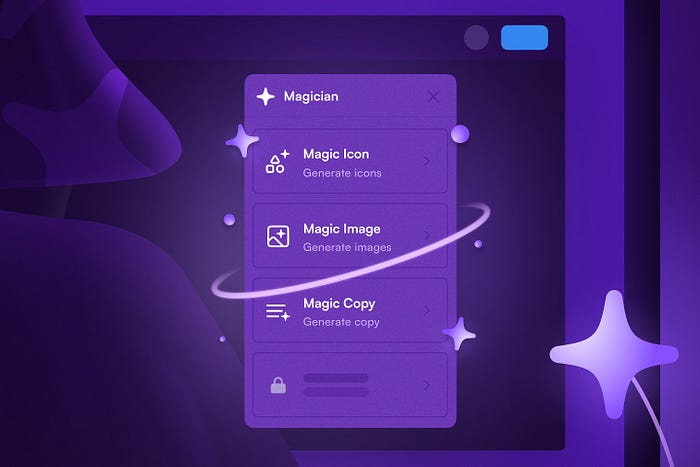
How to Select the Best Icons for Your SaaS Product in 2024

Icons are a small but mighty part of SaaS product design. They help users navigate, understand, and interact with your product seamlessly. But with so many icon sets out there, how do you choose the right one? Let’s dive into what you need to consider and explore some inspiring options.
Key Considerations for Choosing an Icon Set
1. Icon Variety
Ever fallen in love with an icon set only to find it lacks the icons you need? It’s frustrating, especially for large projects. When choosing an icon set, ensure it offers a wide range of icons. A comprehensive set covers all your needs, from common actions like saving and deleting to specific functions unique to your product. This variety helps maintain a consistent look and feel across your entire project.
2. Vector Icons for Scalability
Scalability is crucial. Icons need to look good on all screen sizes, from mobile to desktop. Vector icons, especially SVGs, are perfect because they can be resized without losing quality. They’re also easy to customize — change colors, shapes, or sizes to fit your design without any loss of detail. Plus, vector icons are lightweight, which means faster load times and a better user experience.
3. Icon Font Libraries
Icon font libraries like Font Awesome or Material Icons are incredibly convenient. You can treat icons just like text, applying CSS properties to change their color, size, and more. This makes them highly flexible and easy to manage. They also scale well, ensuring your icons look sharp on any device. And with thousands of icons available, these libraries usually have you covered for any design need.
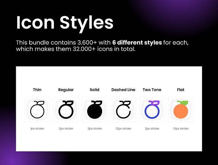
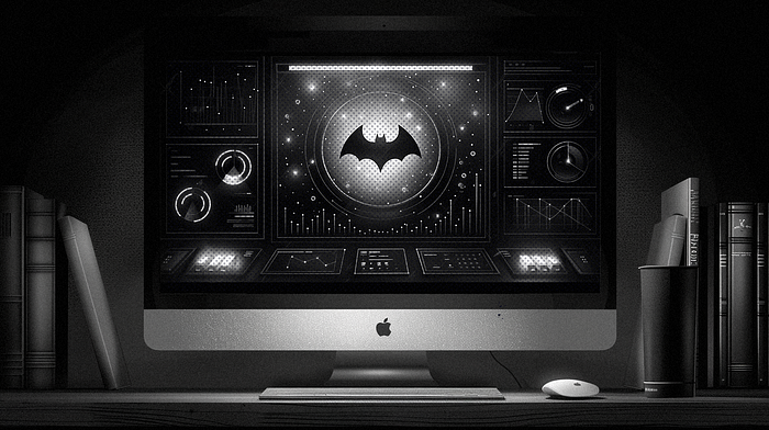
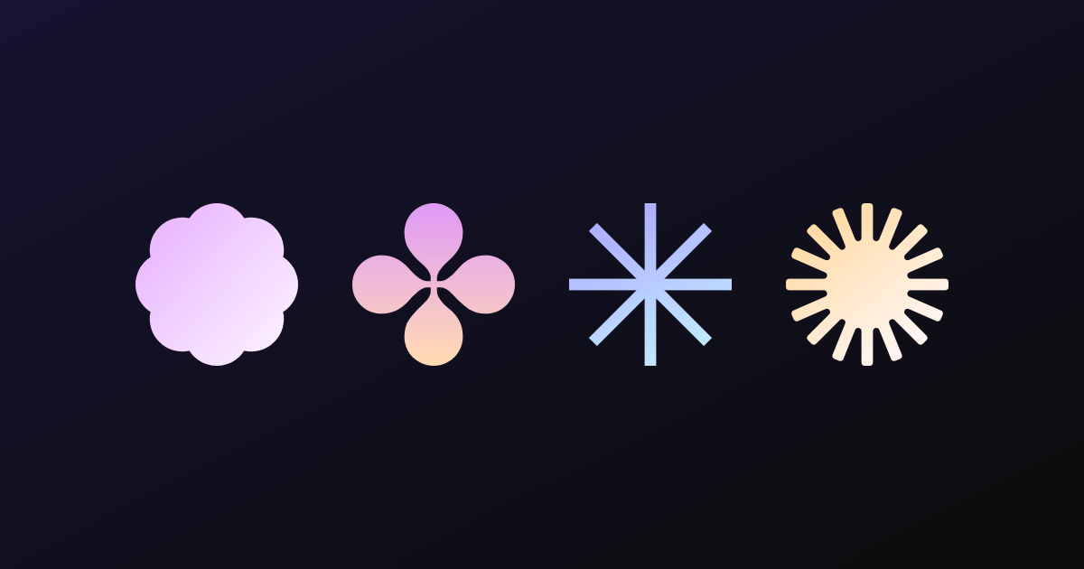
4. Multiple Styles in Icon Sets
Flexibility is key. Icon sets that offer multiple styles — like line, filled, and colorful versions of the same icon — give you the versatility to adapt to different design contexts while keeping a consistent visual language. For example, you might use line icons for secondary actions and filled icons for primary actions. This differentiation helps users quickly understand and interact with your interface.
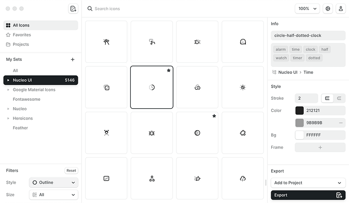
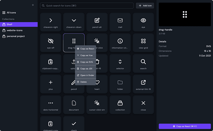
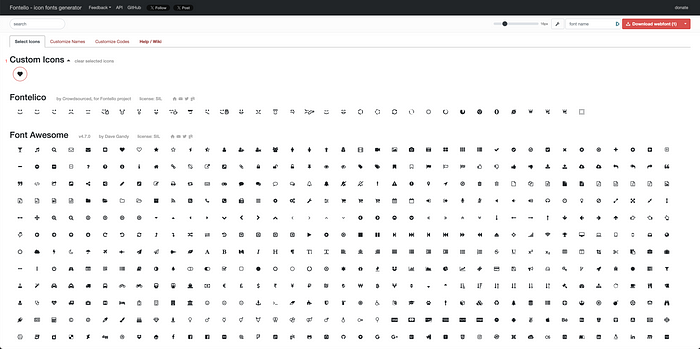
Tools for Managing Icon Libraries
Managing a large icon library can be daunting, but organizing them properly in a design system or using the right tools can make a huge difference:
IconJar: This tool lets you organize and manage your icons efficiently. You can search, drag and drop, and export icons easily. It’s perfect for keeping your icon collection tidy and accessible.
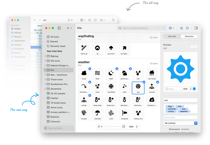
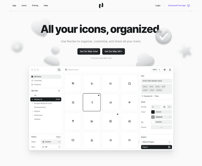
Nucleo: With Nucleo, you can organize, customize, and export icons seamlessly. It also offers a large library of icons in multiple styles. It’s a great tool for maintaining consistency and ease of use in your design projects.
IconShelf: IconShelf is a powerful tool for organizing and managing your icon libraries. It supports various formats and allows you to keep all your icons in one place, making it easy to find and use them when needed.
Fontello: Fontello allows you to create custom icon fonts from a selection of icons, simplifying the integration of icons into your projects. It helps in managing icon fonts effectively, ensuring that your icons are scalable and easy to use.
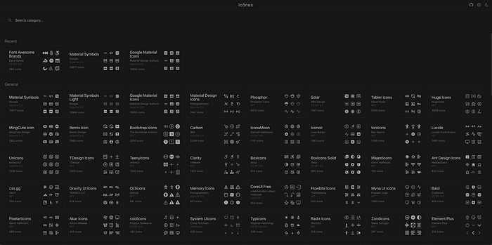
Icones: is a comprehensive platform for browsing and exploring a vast collection of icons from various sources. It provides an intuitive interface for searching and previewing icons, making it easy to find the perfect icons for your projects and integrate them seamlessly.
Websites for Purchasing High-Quality Icons
If you’re looking to buy high-quality icons, here are some excellent websites to consider:
- UI8: UI8 offers a wide range of high-quality icons and other design assets, perfect for professional use.
- Iconscout: Provides a vast library of icons, illustrations, and other design resources. You can purchase individual items or subscribe for access to their entire collection.
- Iconfinder: Offers a vast collection of icons in various styles. You can purchase individual icons or subscribe for unlimited downloads.
- The Noun Project: Provides a wide range of icons created by designers from around the world. You can buy icons individually or subscribe for unlimited access.
- Icons8: Offers a large library of free and premium icons in multiple styles. Icons8 also provides tools for customizing and managing icons.
- Flaticon: Features a huge selection of free and premium icons. You can download icons in various formats and styles.
- Streamline Icons: Known for its high-quality, detailed icons, Streamline Icons offers a comprehensive library that’s perfect for professional projects.
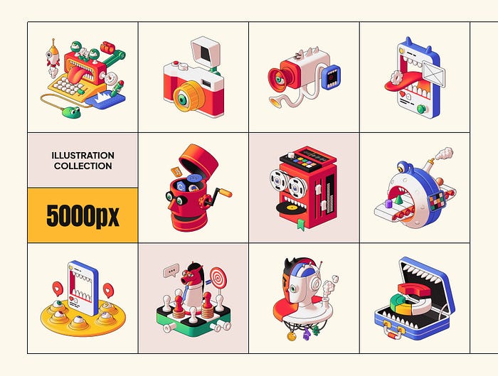
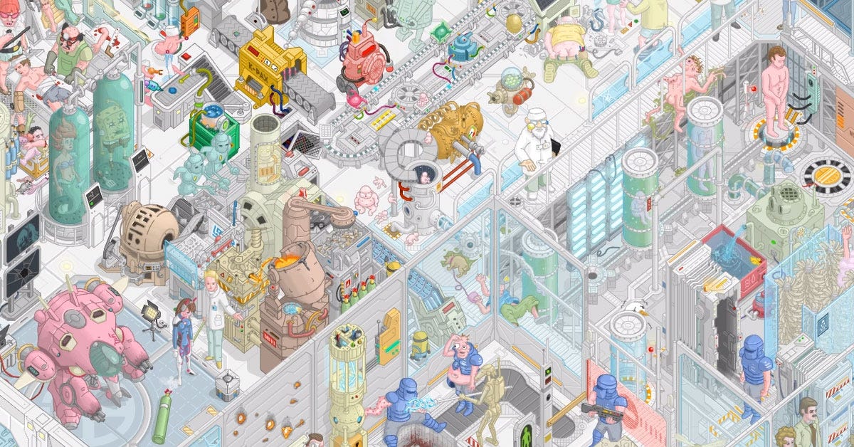
Inspirational Icon Sets
Here are some top-notch icon sets to consider:
- Feather Icons: Simple, elegant, and open-source, Feather Icons are perfect for modern, clean interfaces.
- Font Awesome: This popular library offers a vast range of icons with extensive customization options.
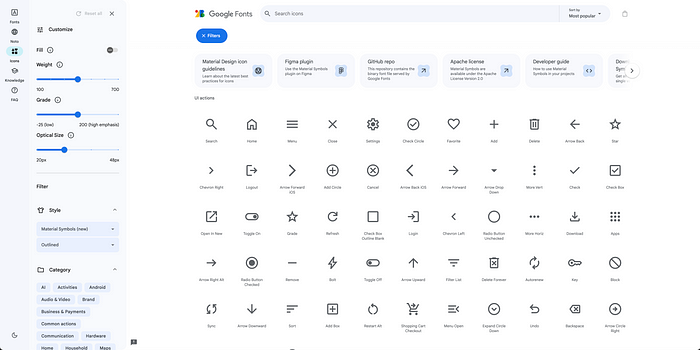
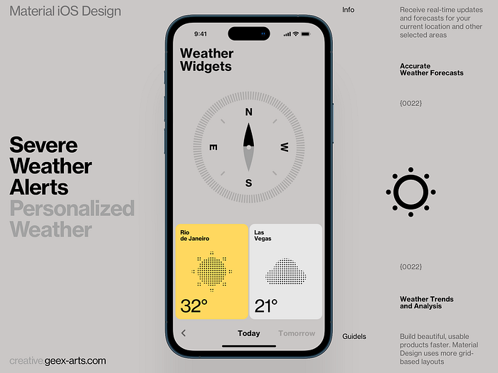
- Material Icons: Created by Google, these icons follow Material Design guidelines and come in both line and filled versions.
- Heroicons: Beautiful, hand-crafted SVG icons available in outline and solid versions, suitable for various design needs.
Conclusion
Choosing the right icon set is crucial for creating a seamless, intuitive user experience. Look for a set with a wide variety of icons, opt for scalable vector icons, consider using icon font libraries, and choose sets with multiple styles for flexibility. Tools like IconJar, Nucleo, and Fontello can help you manage your icons efficiently. By keeping these tips in mind, you’ll be well on your way to selecting the perfect icons for your SaaS product, ensuring it’s both functional and visually appealing.
Remember, the right icons do more than just look good — they enhance usability and make your product more intuitive and enjoyable for your users.
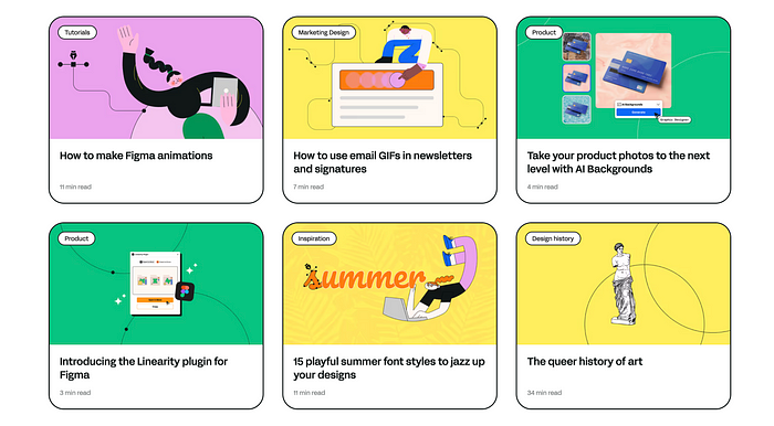
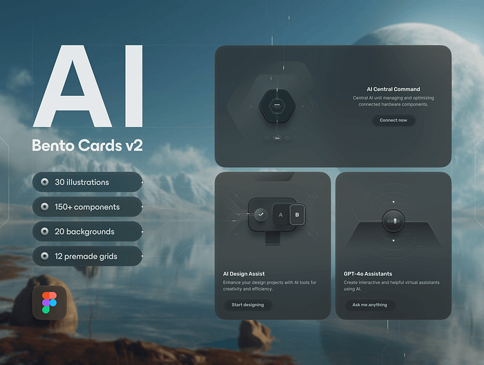
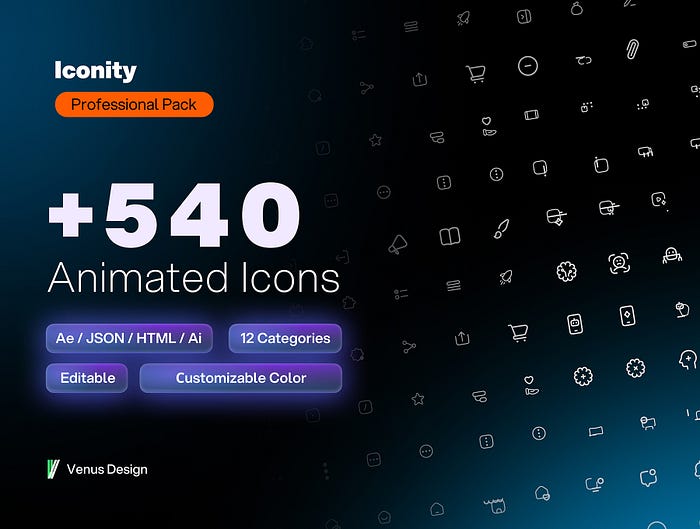
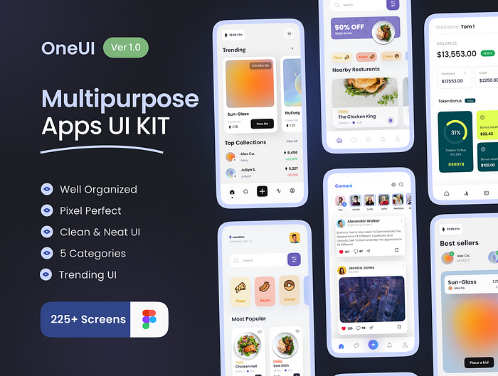
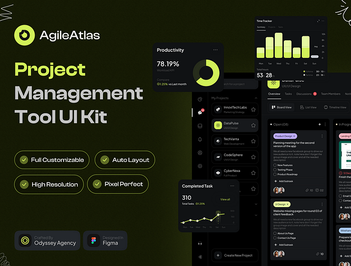
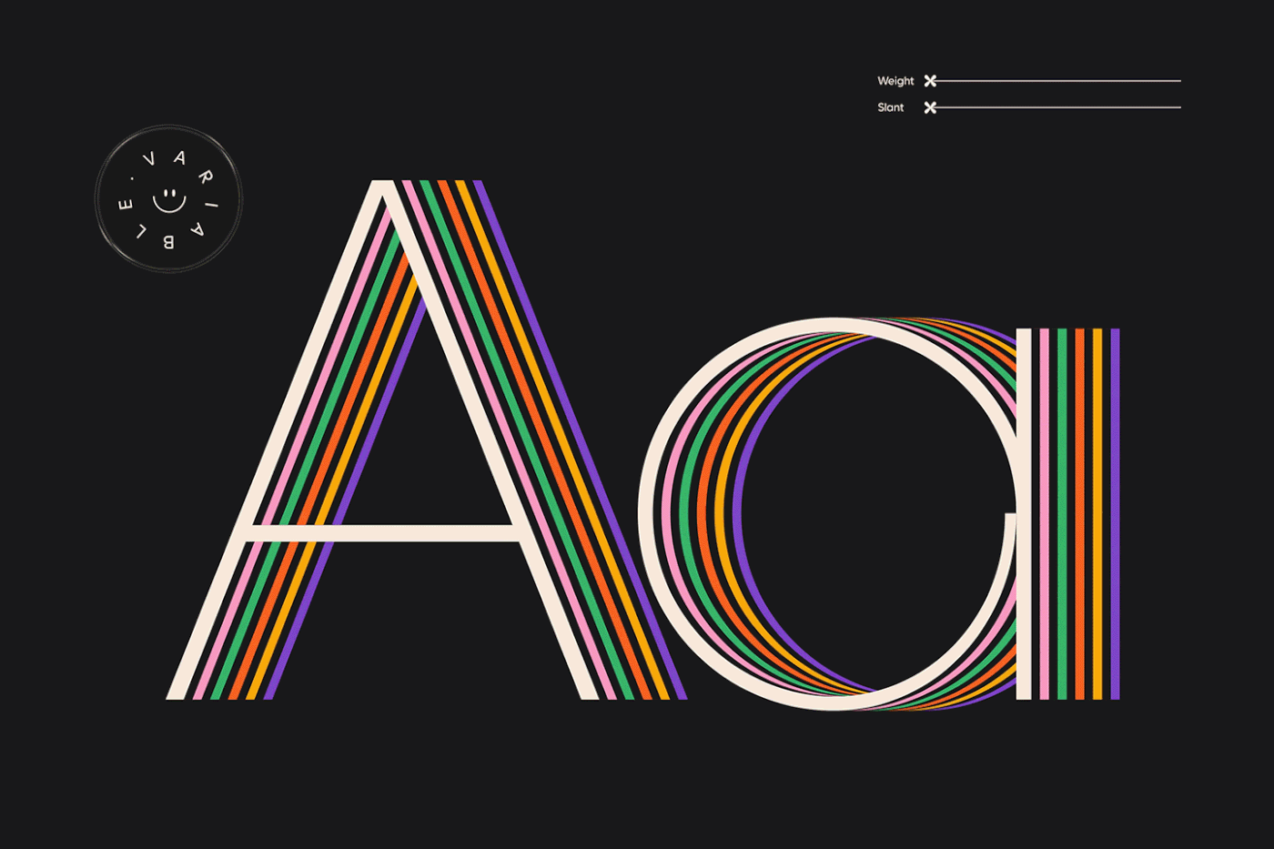
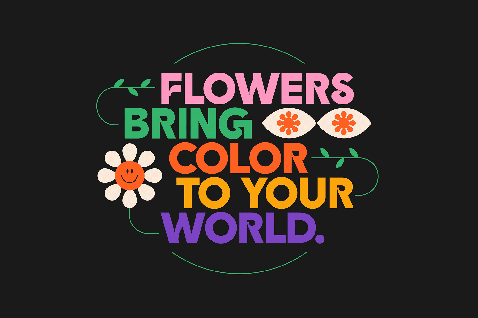
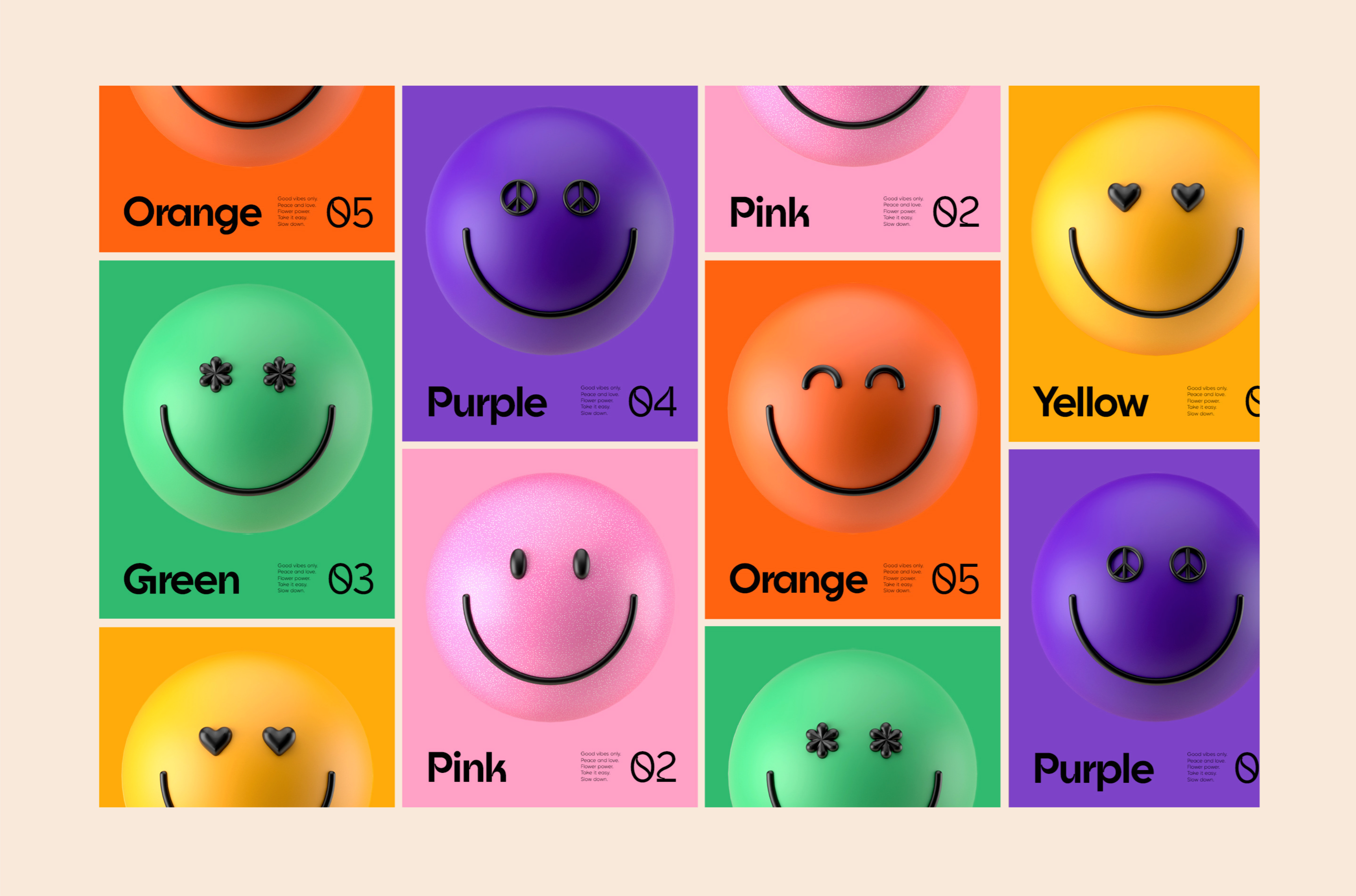
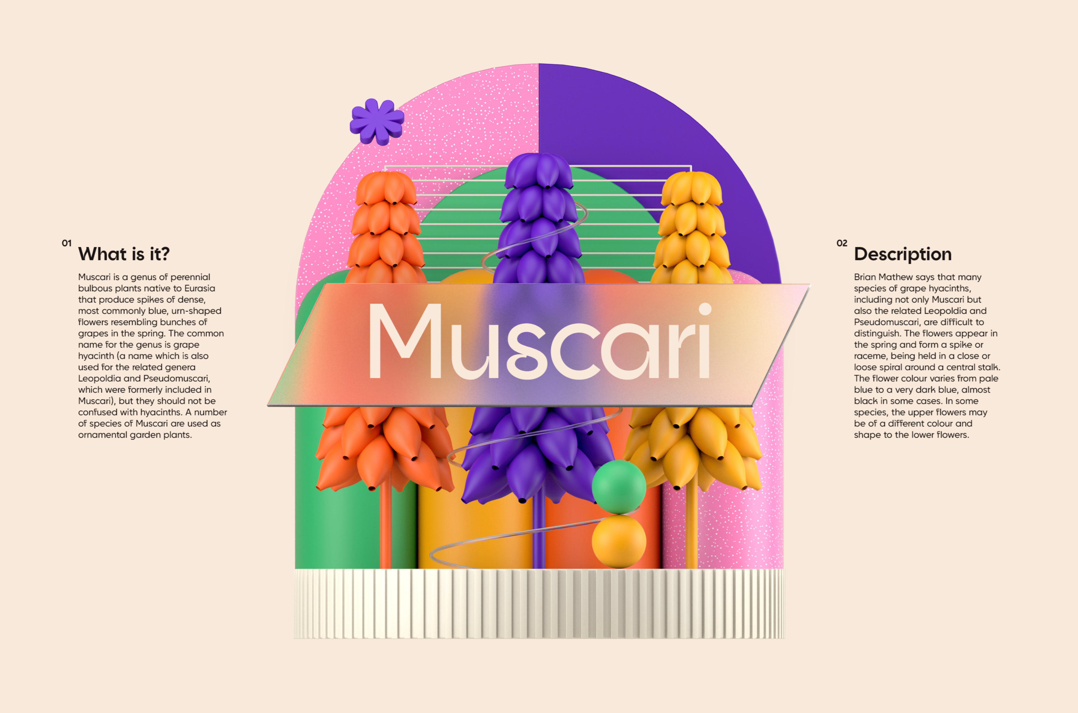
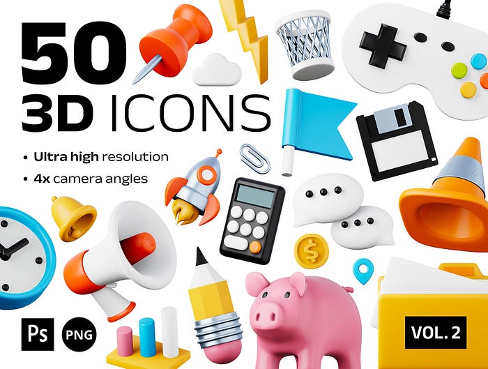
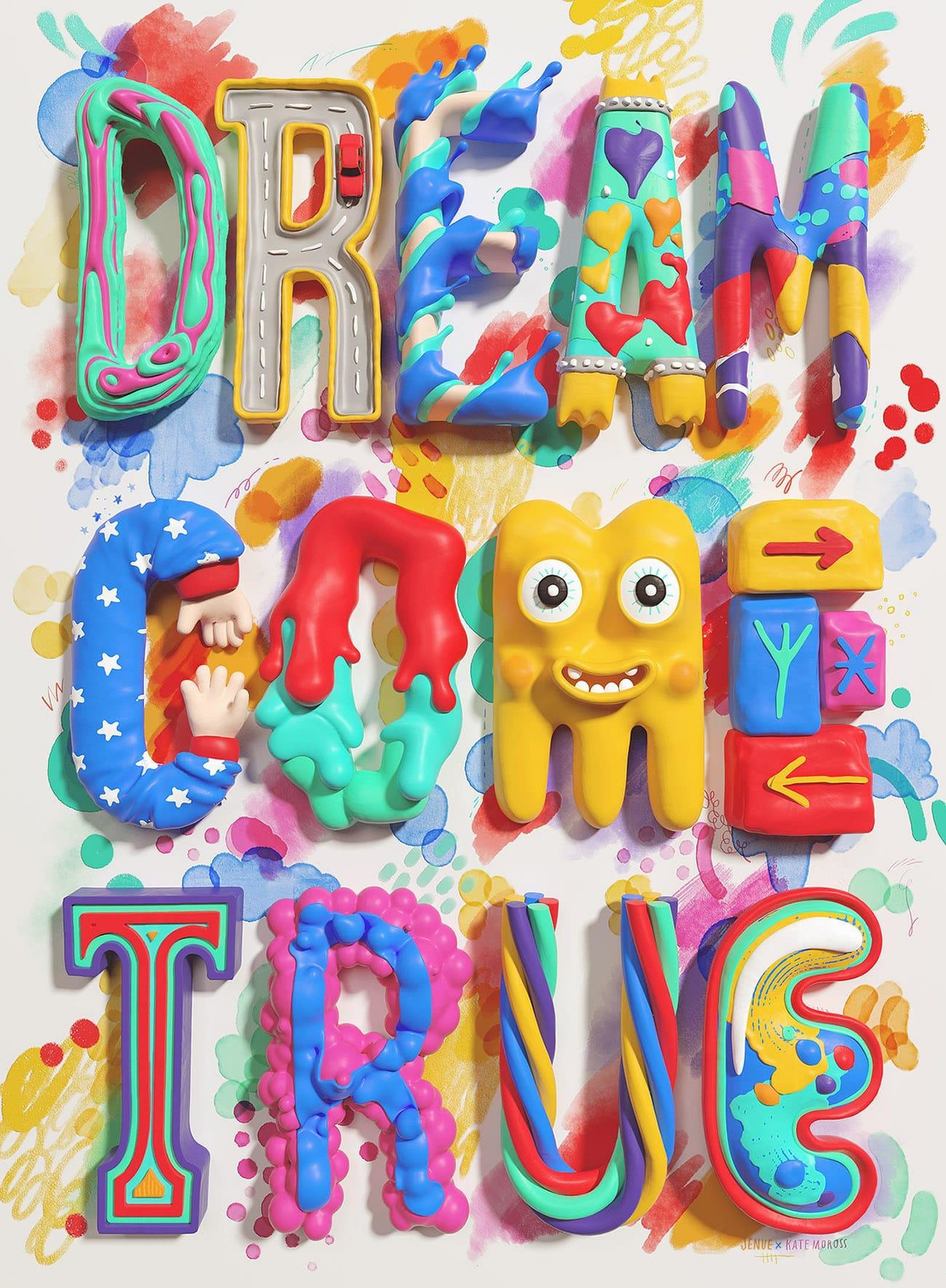
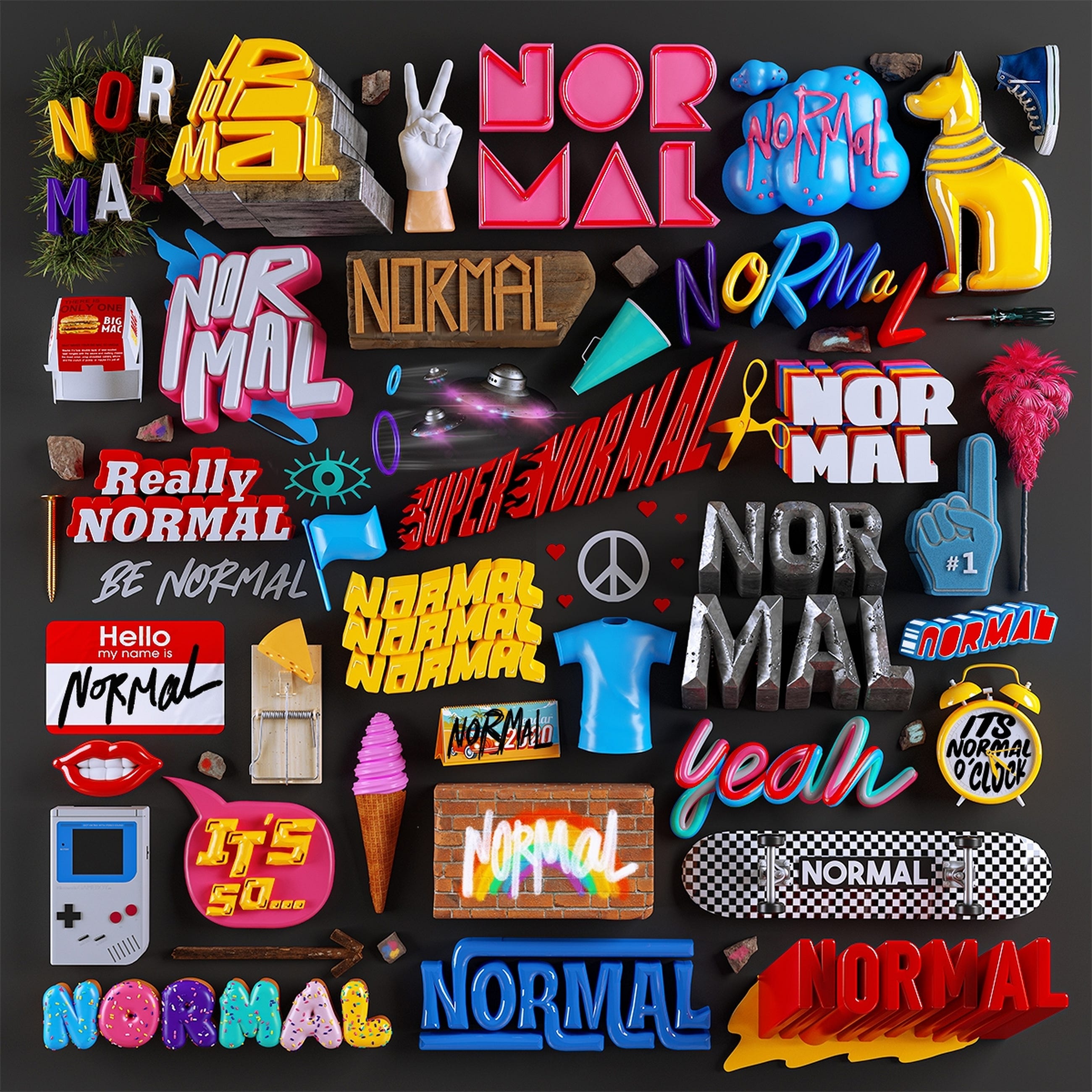
And finally, how can we end without a bit of icon inspiration? Here are some excellent icon sets to get your creative juices flowing:
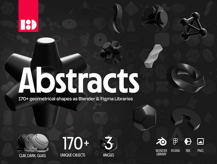
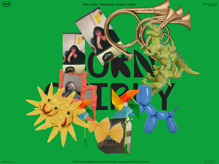
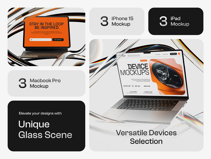
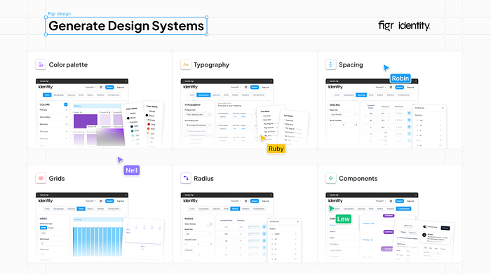
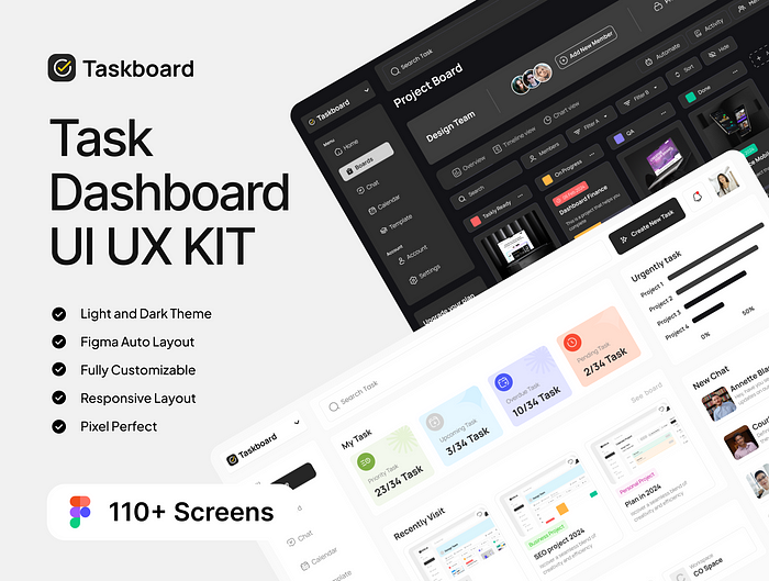
ICONSAUR — User Interface Icon Set
2400+ unique handcraft UI icons. Based on Bootstrap. SVG, PNG, and Figma components inside.
.
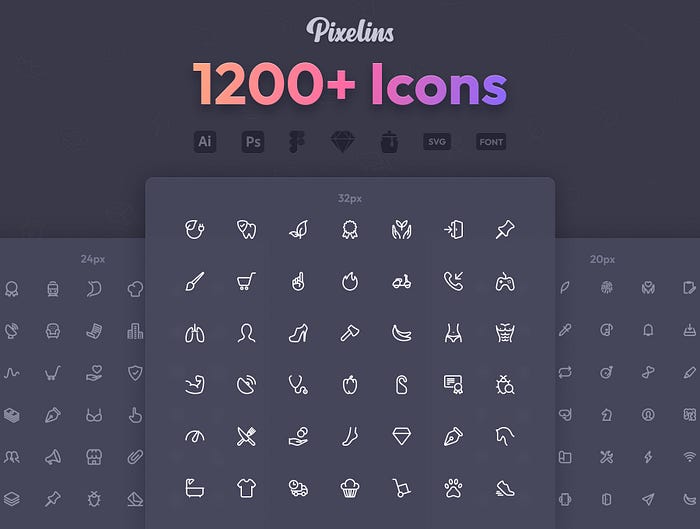
Pixelins Thin Icons
high-quality icon set with 1236 icons carefully crafted on 20–24–32px grid sizes, including hand-optimized 1 & 2px stroke variations for each grid. 1236 icons × 3 grids × 2 strokes, in total you get 7416 pixel perfect icons.
.
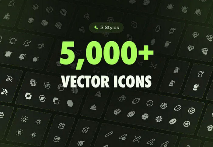
Emerald Icons — 5,000+ Icons
5000+ icons & 150+ social media icons and company logos. Emerald Icons is a high-quality vector UI icons library that provides multiple formats and styles. Made for designers and developers.
.
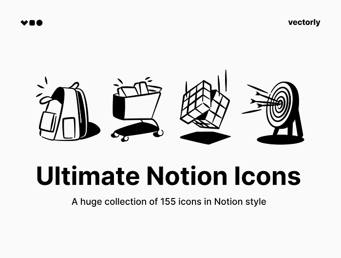
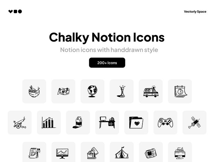
Ultimate Notion Icons
A huge collection of 155 icons in Notion style. These icons illustrations will fit nicely into the design of your presentations, web pages, UI design and social media posts.
.
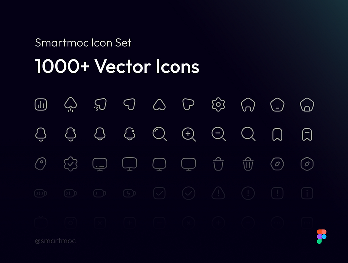
Smartmoc Icon Set | 1,000+ Icons
1,000+ high-quality icons for professional websites & apps — ready to use in all your projects
.
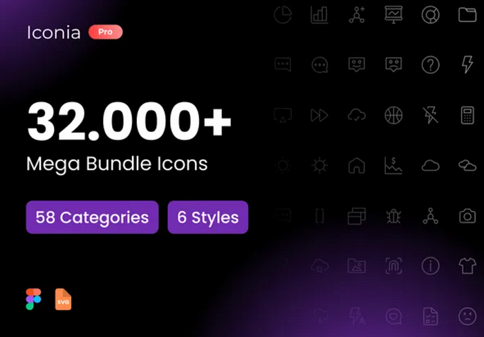
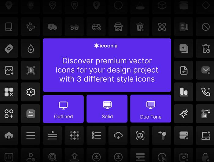
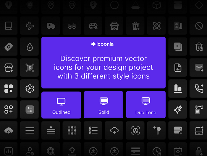
Icoonia Pro | 8.000+ Ultimate Vector Icon
8000+ system icons for your project websites, desktop, mobile apps and your de
.
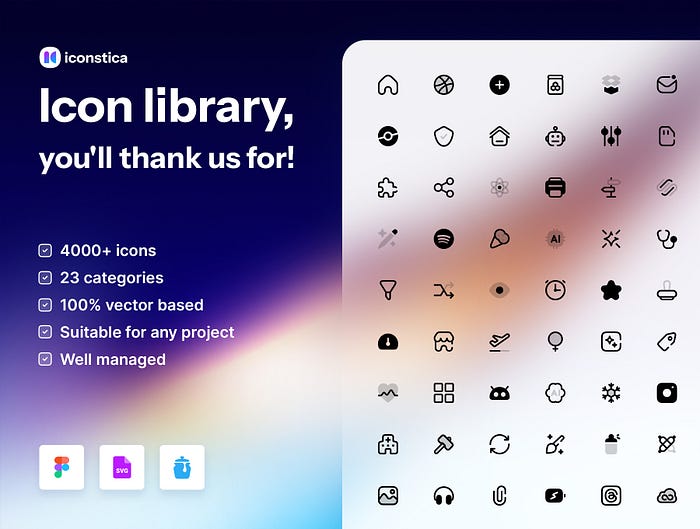
Iconstica Icon Pack — 4000+ Icons Set
High-quality icons in 23 categories for professional websites, web & mobile apps
Want even more inspiration?
Follow Muzli on social media for your daily dose of design, innovation, and creativity right in your feed!
Linkedin | Instagram | Twitter


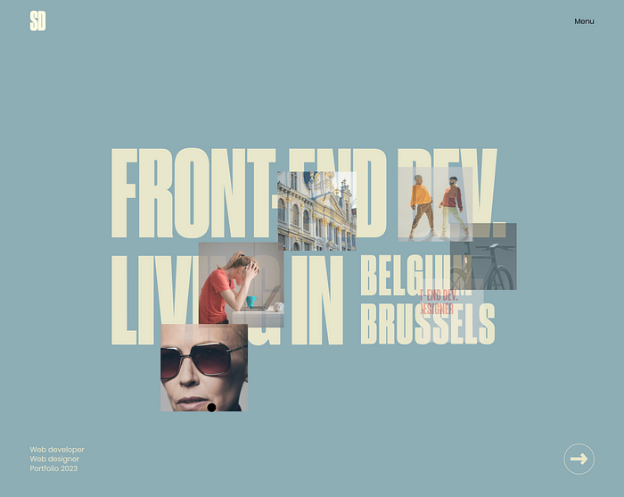
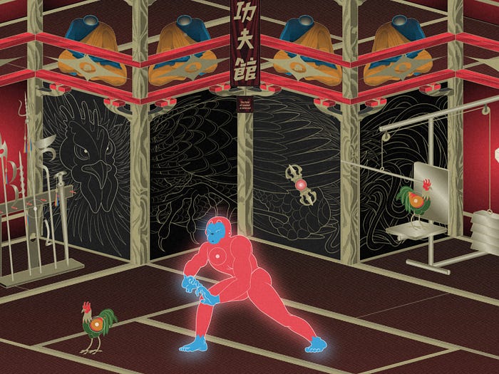
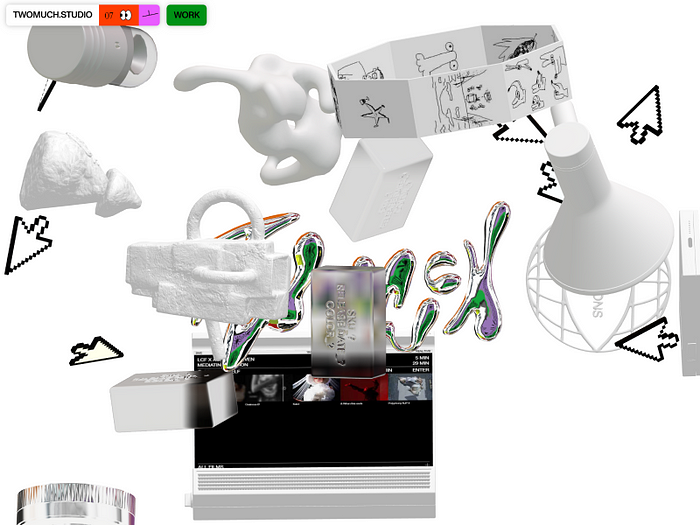
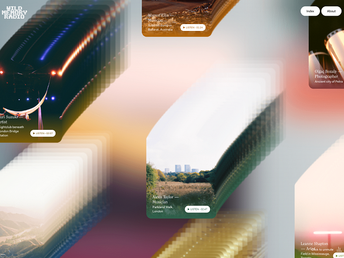
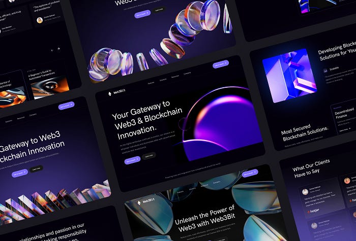
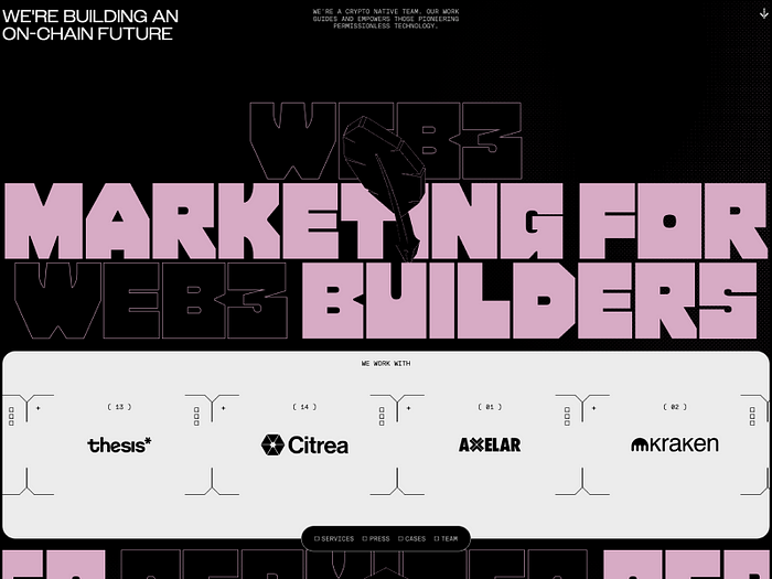
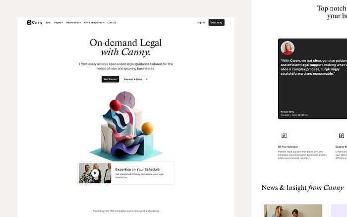
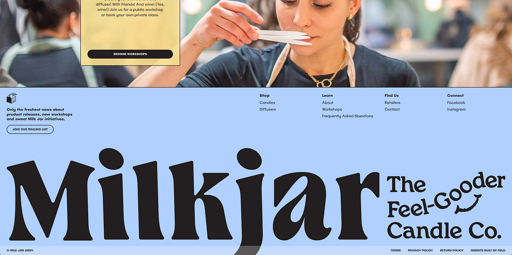
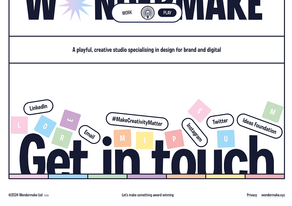
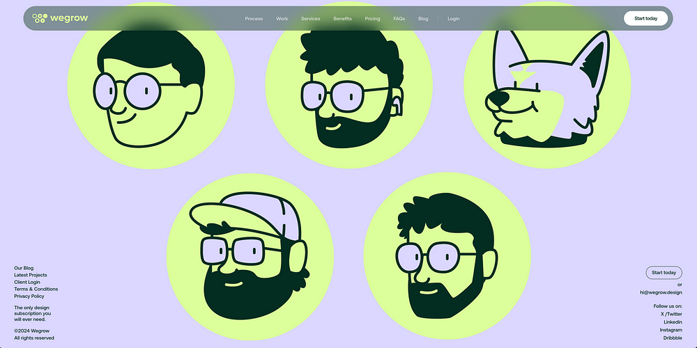
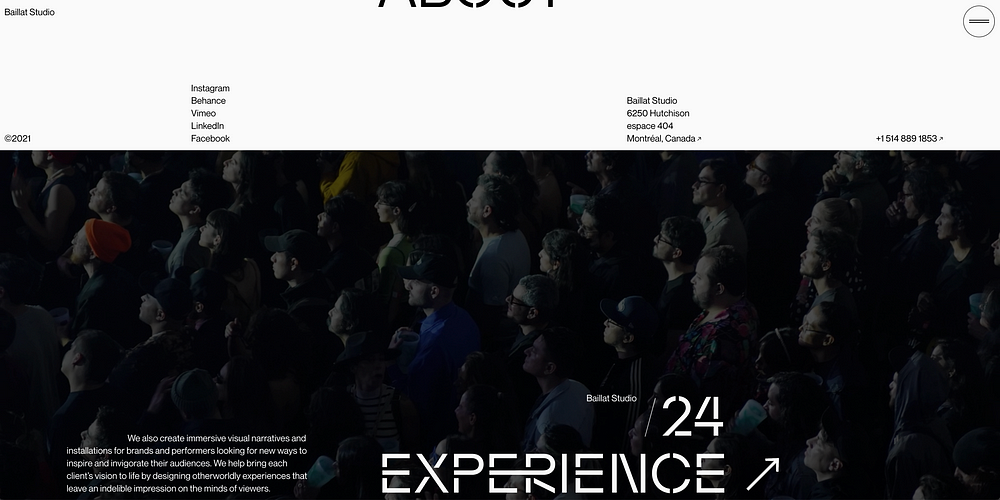
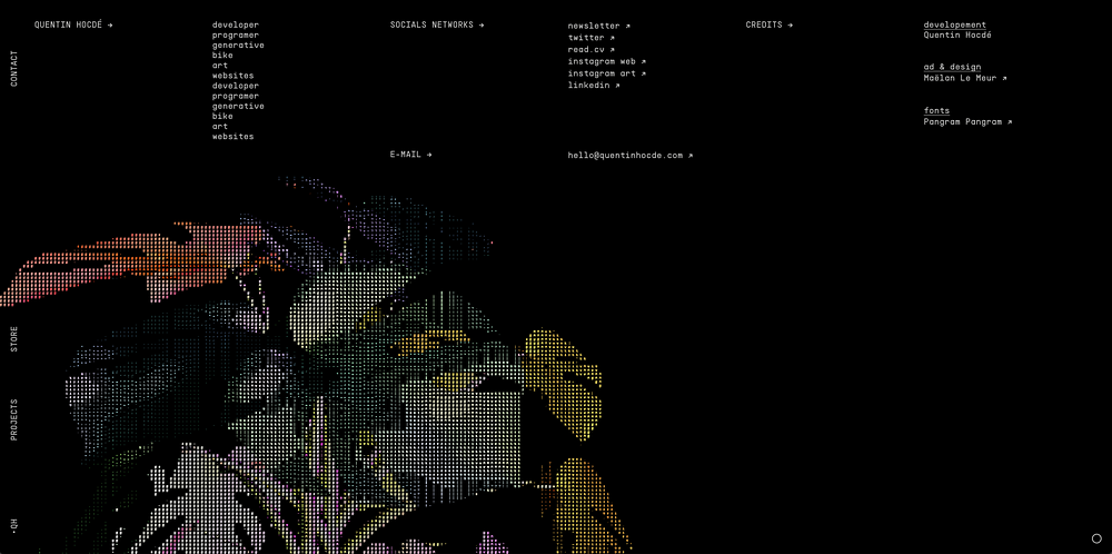
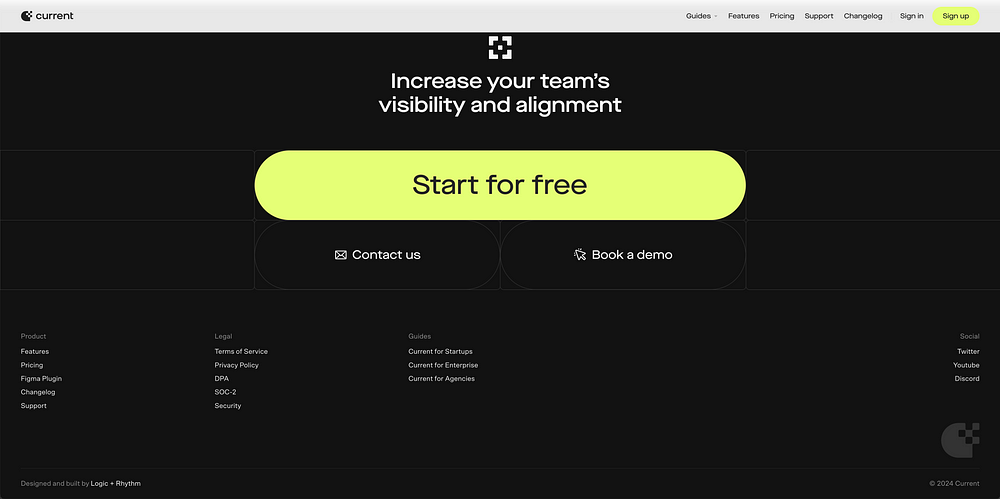
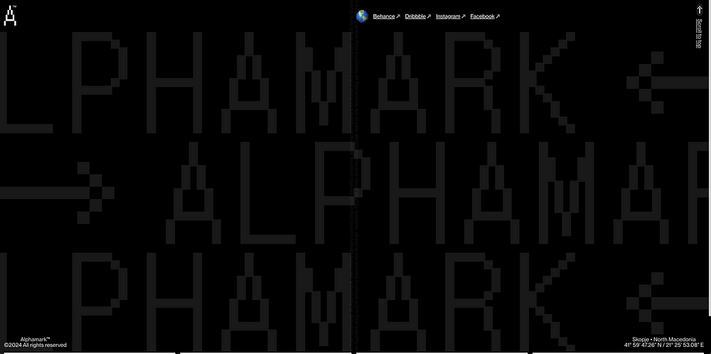
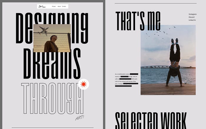
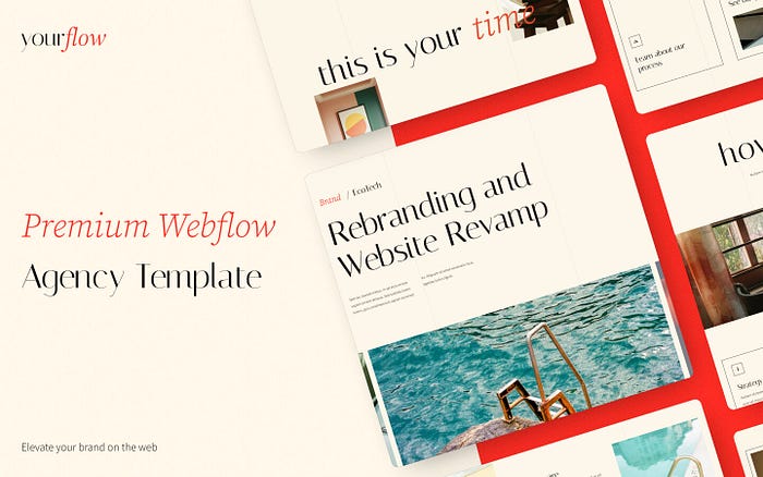
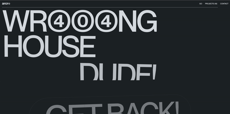
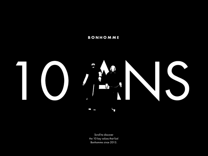
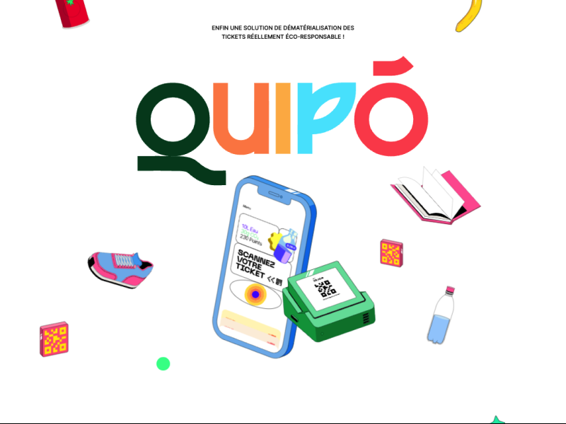
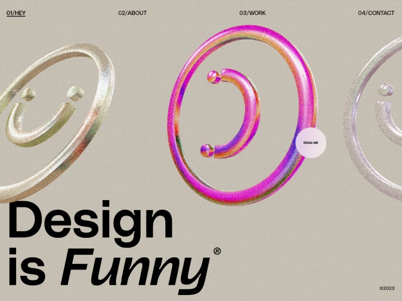
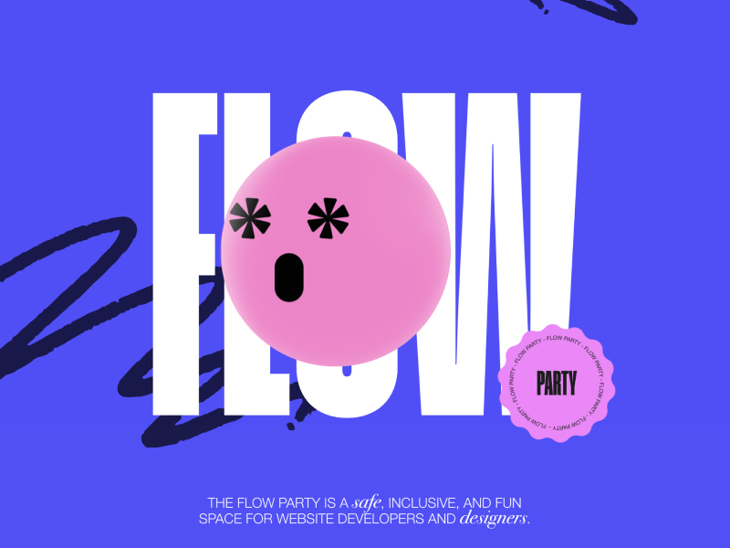
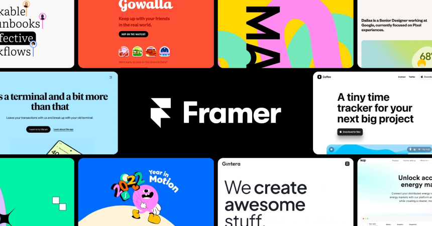
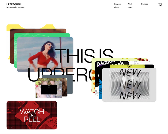
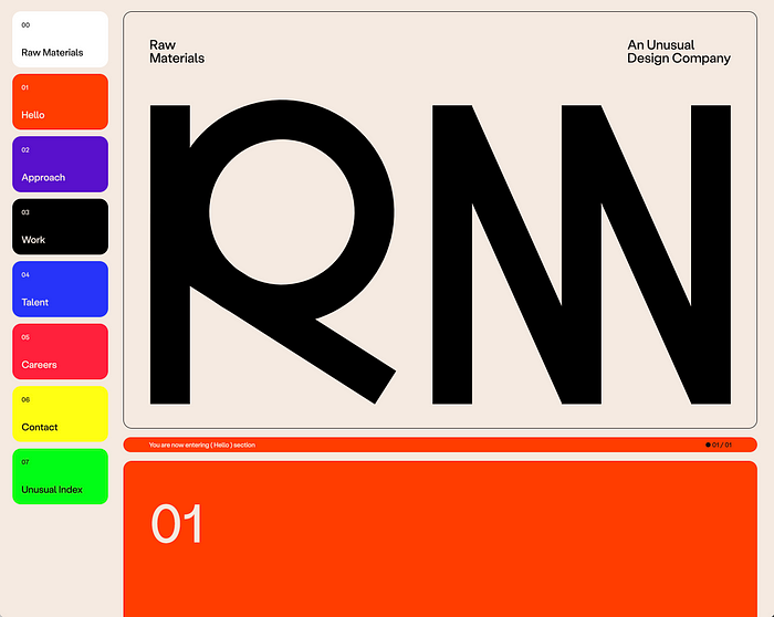
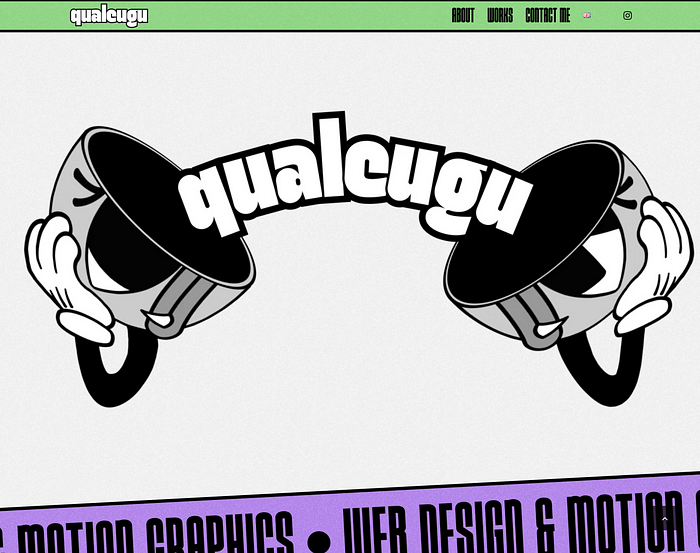
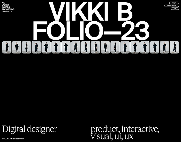
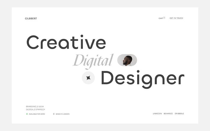
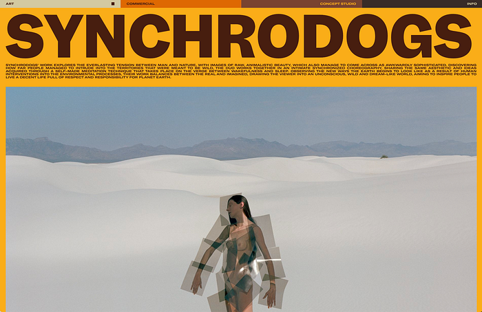
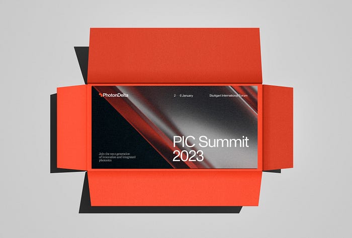
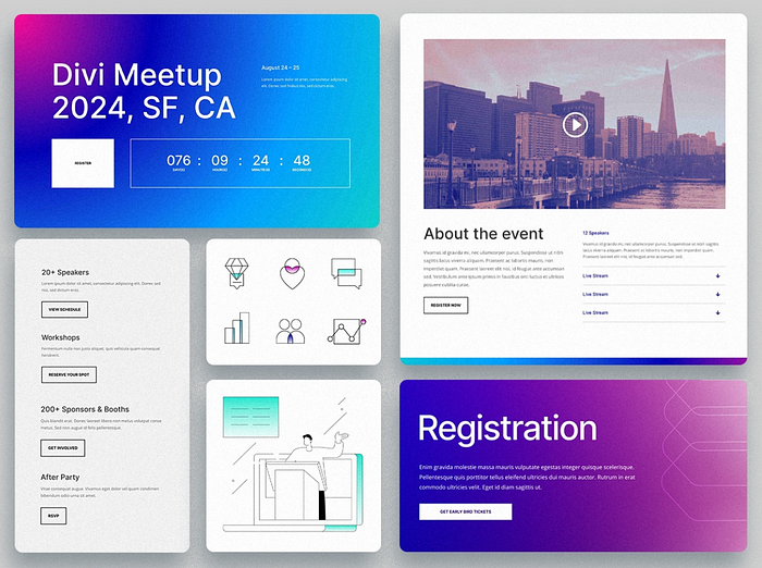 Meetup website design by
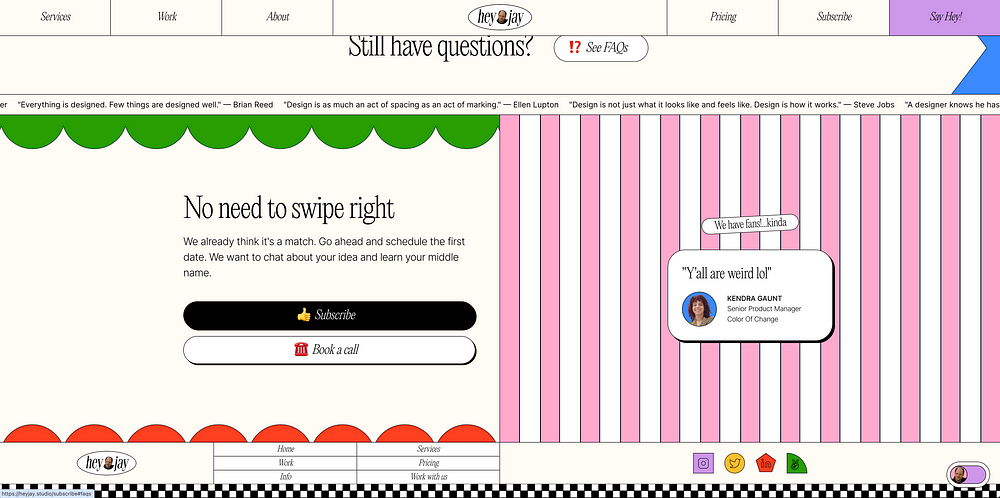
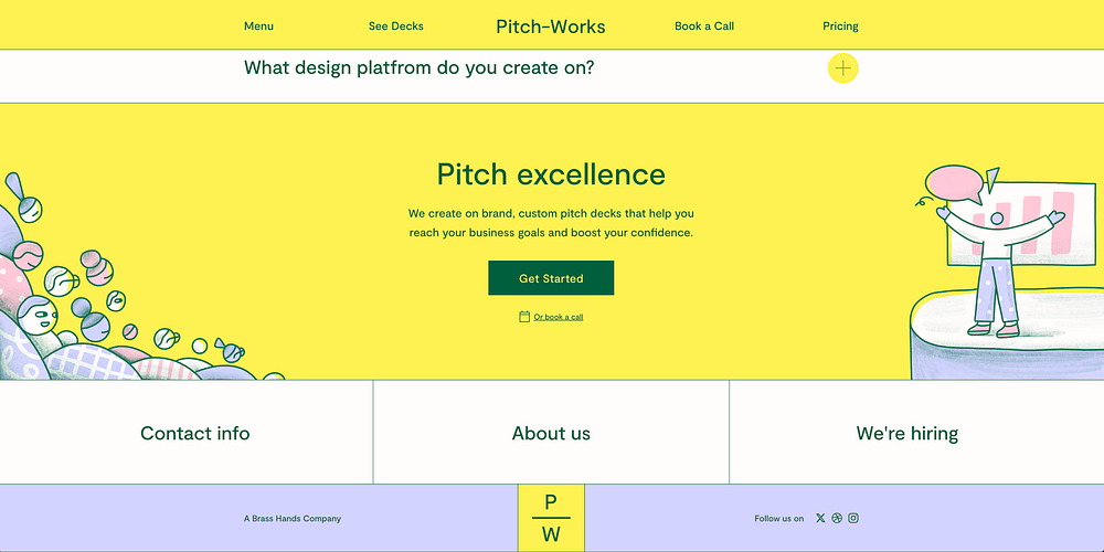
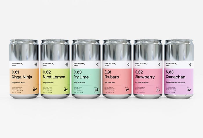
 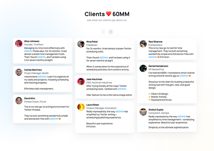 Testimonial page design by 60MM
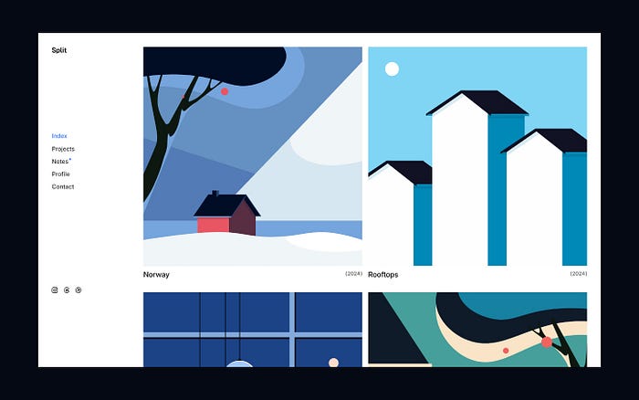
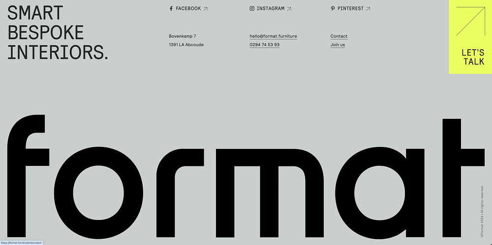
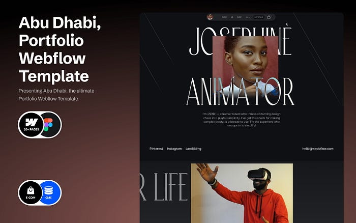
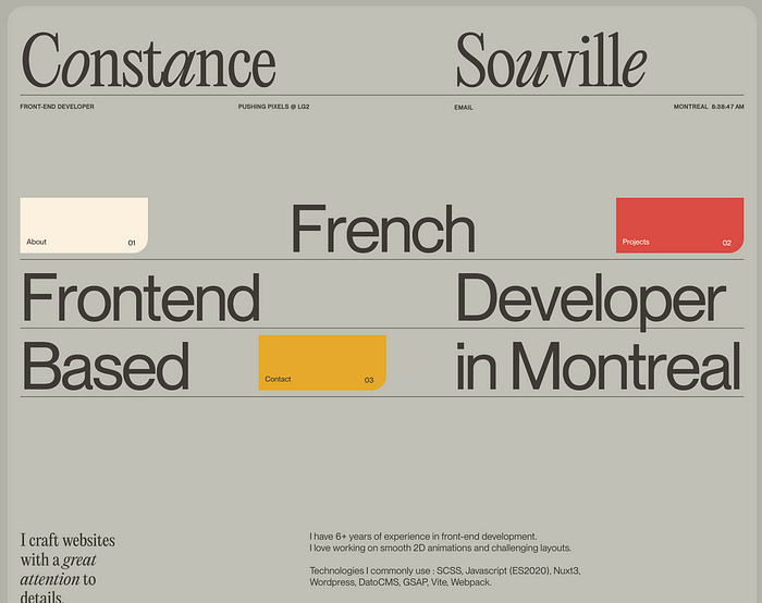
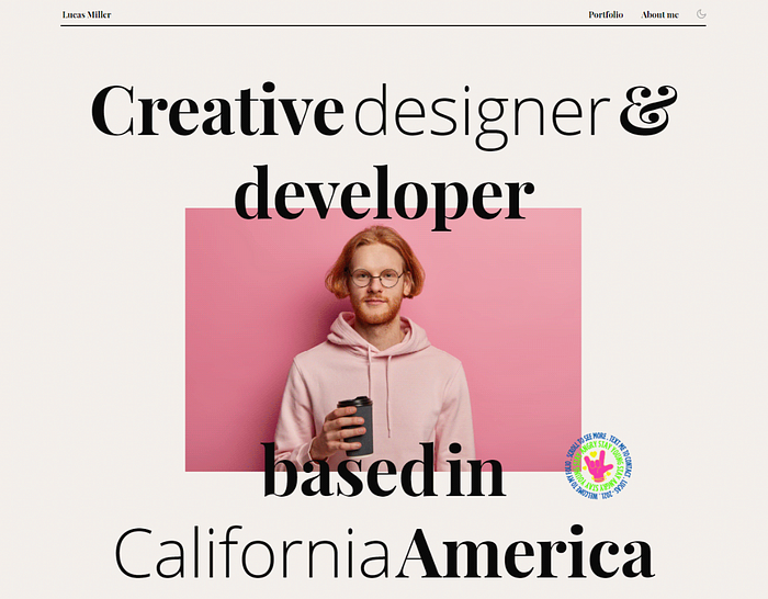 Portfolio website
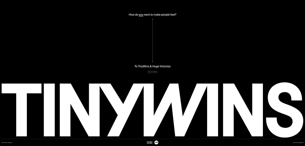
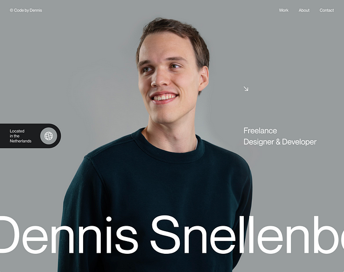
  Portfolio website design by


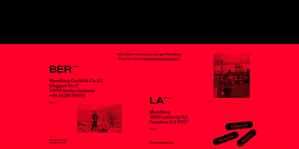
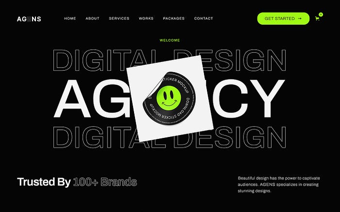
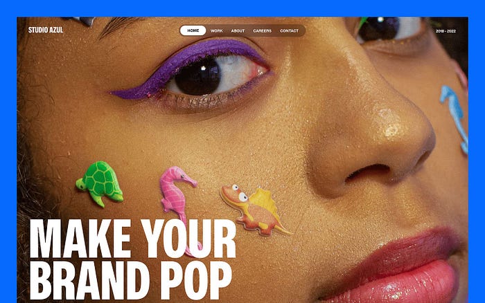
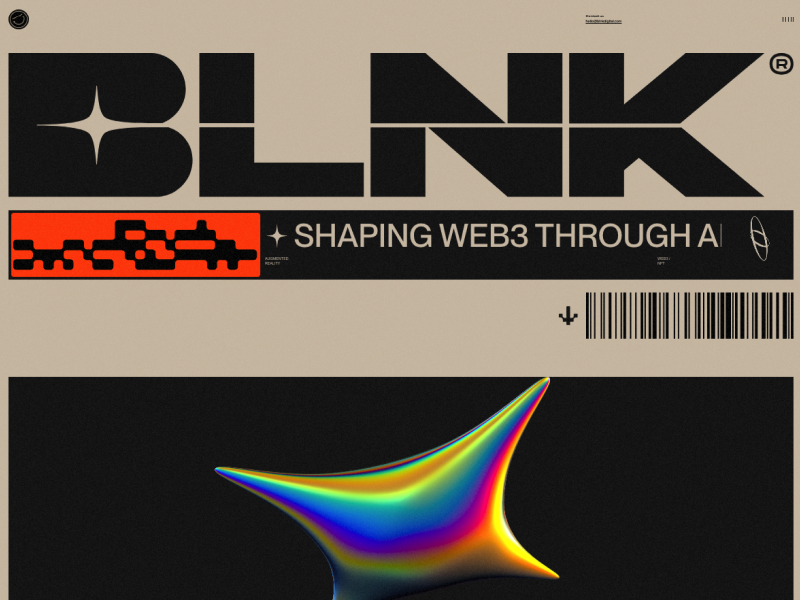
 Bank by
 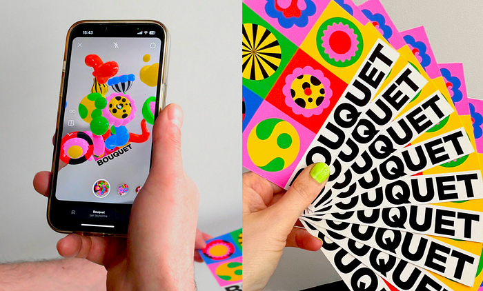 Bouquet — Augmented Reality Card by
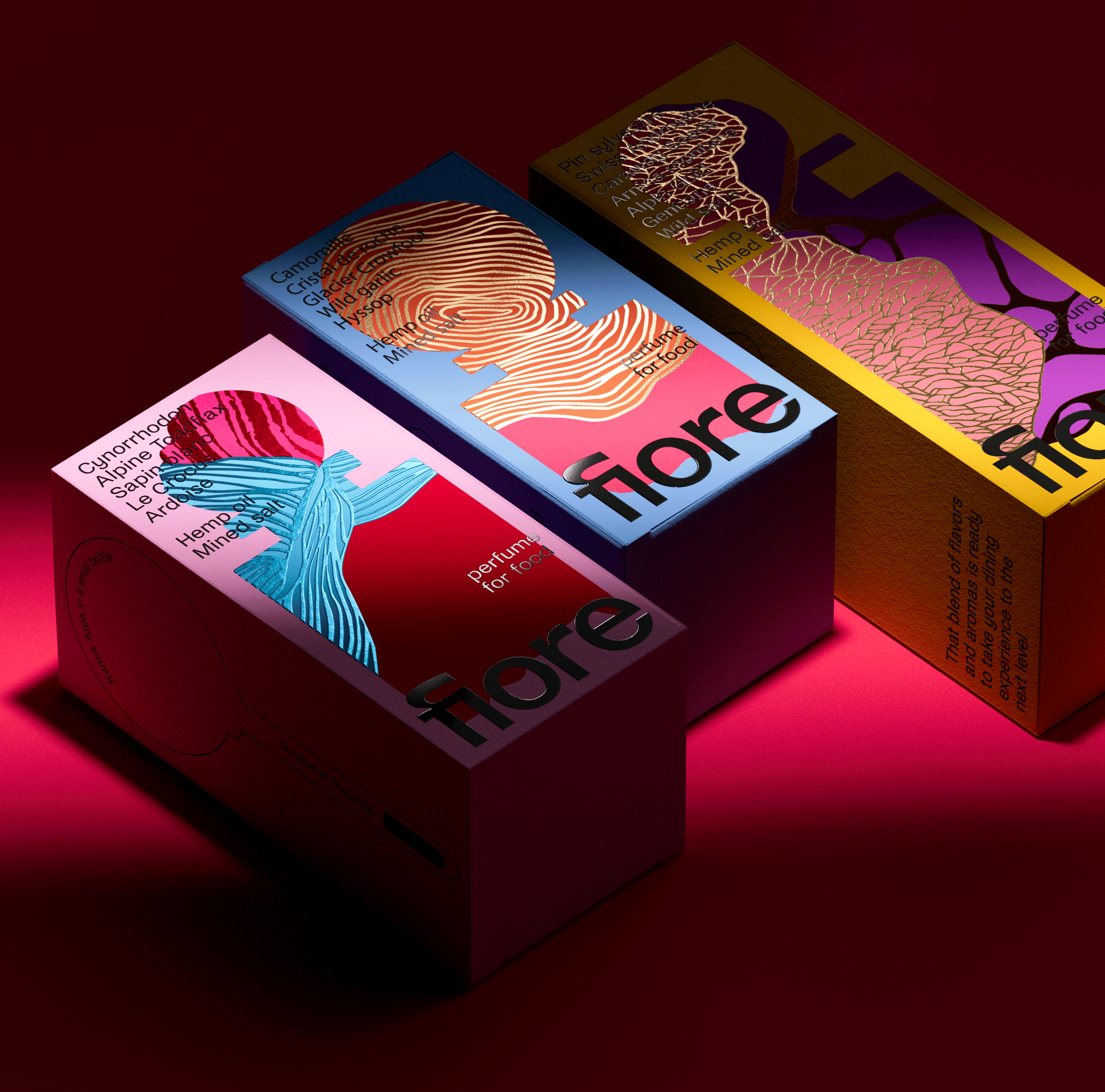
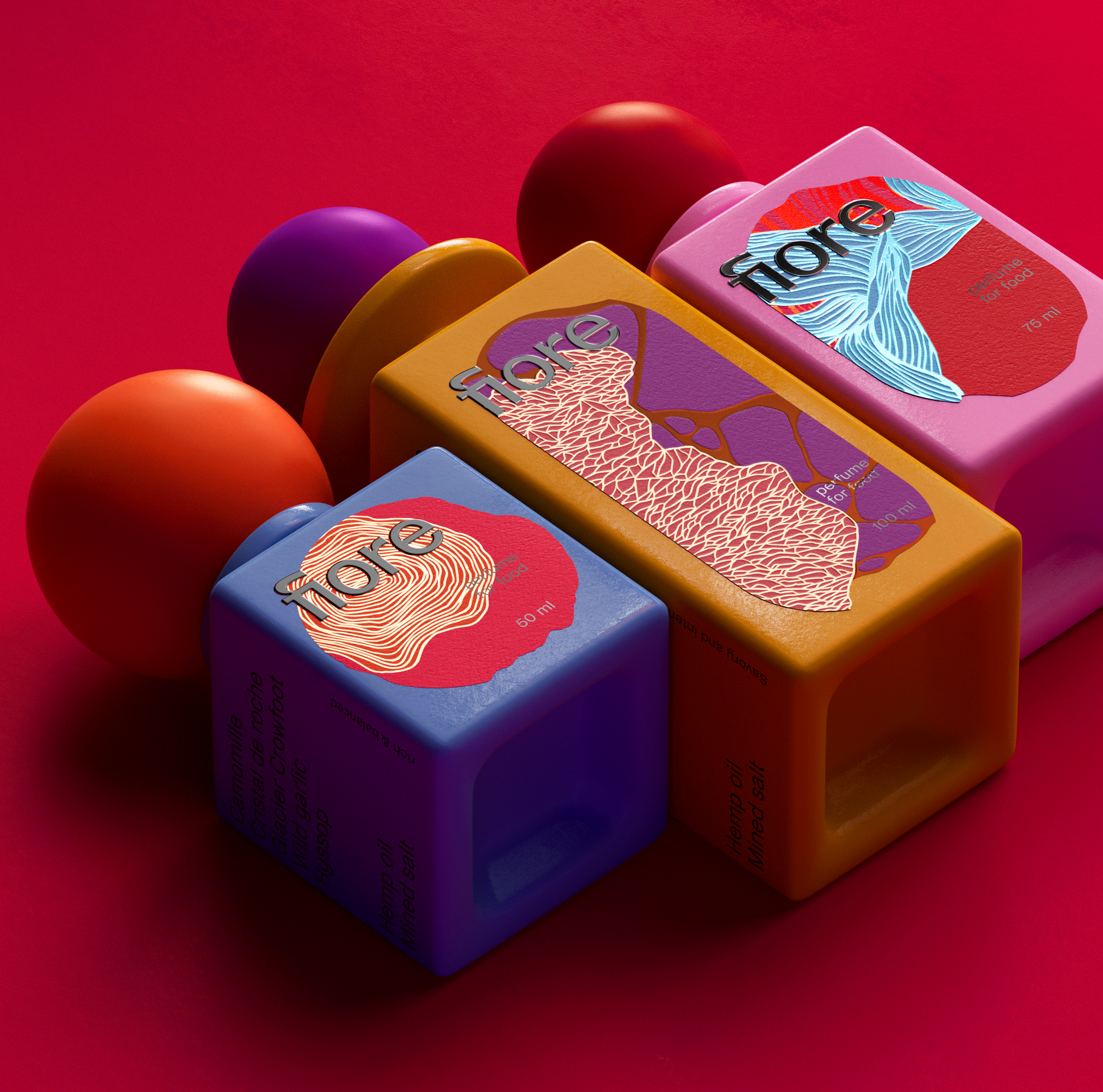
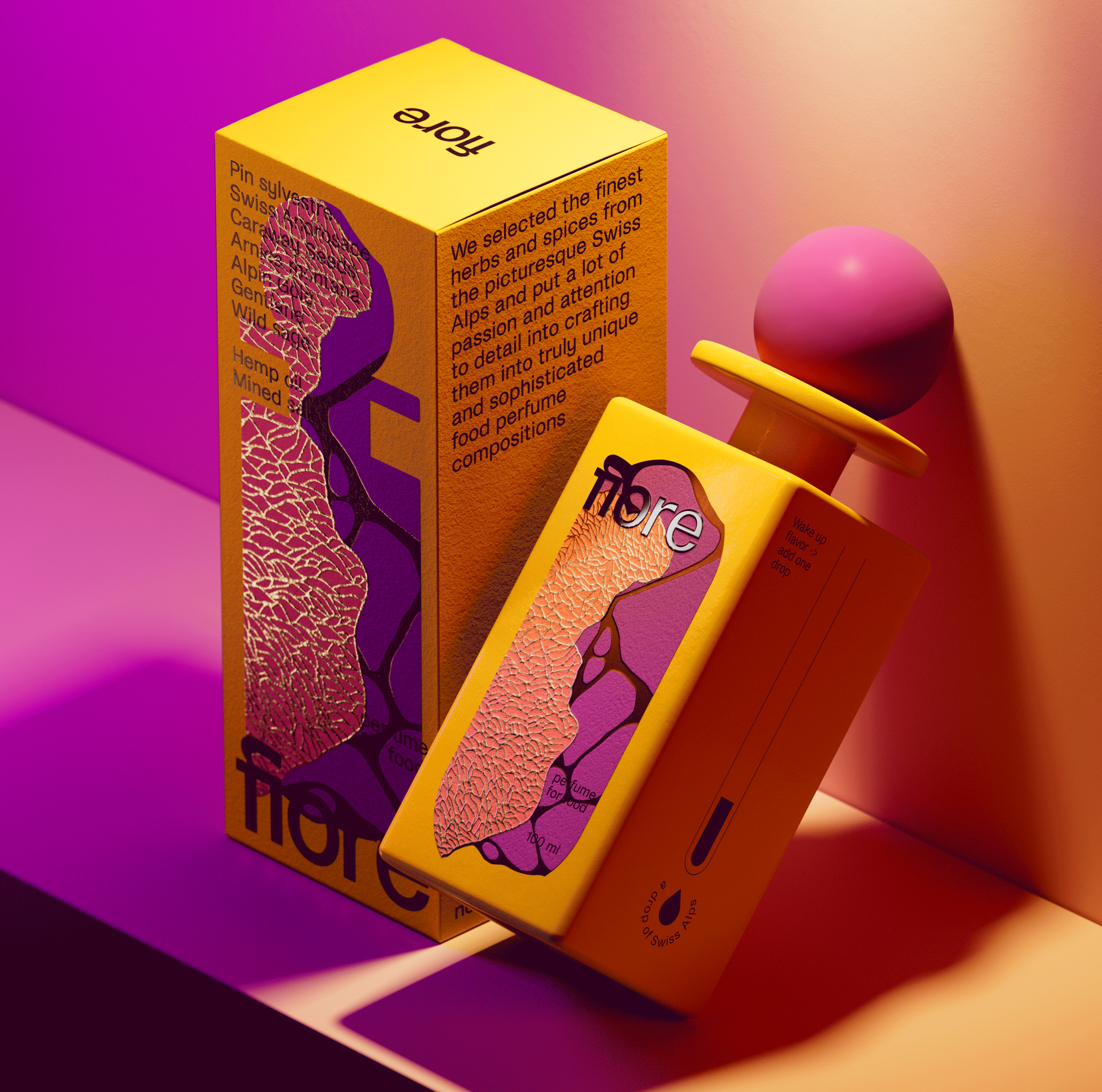
 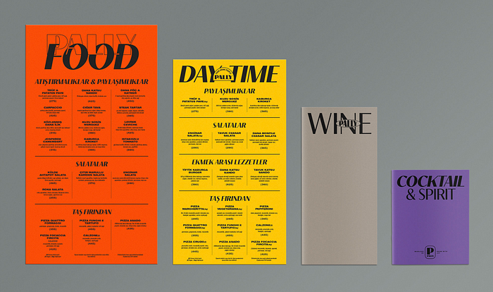 Pally | Restaurant Branding by velvele ™, Valeryia Herasimava and
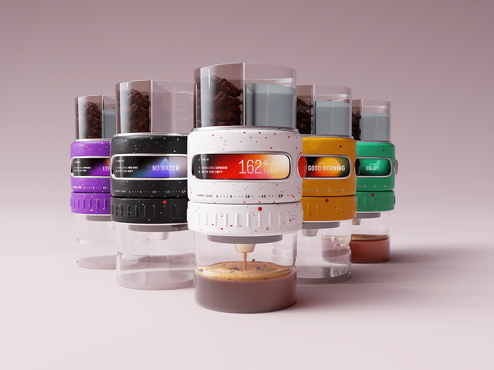
 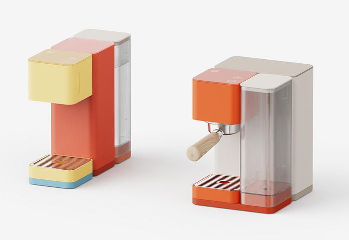 FOOD Coffee Block by
 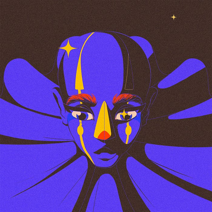 The Blue Clown by
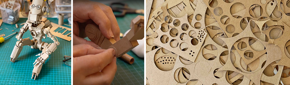
 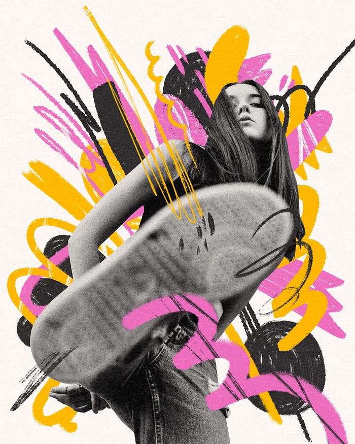 by
by 

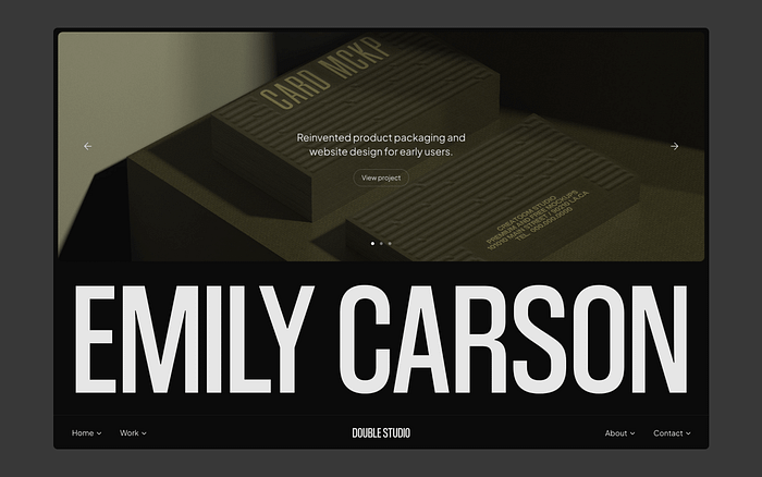
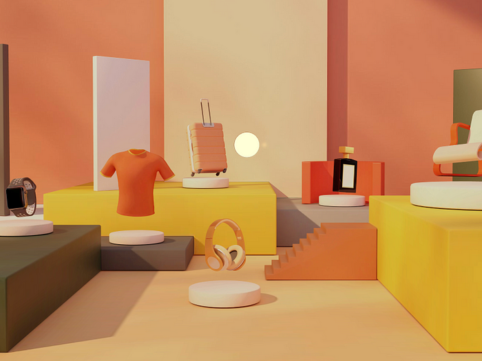
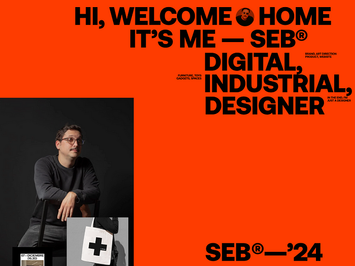
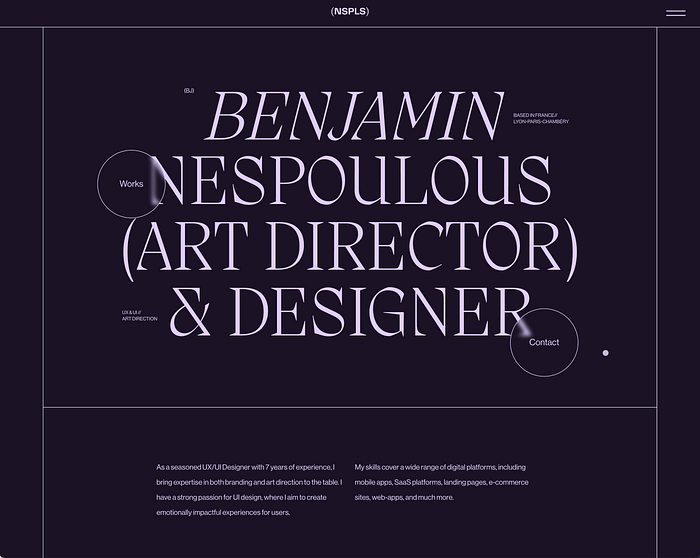
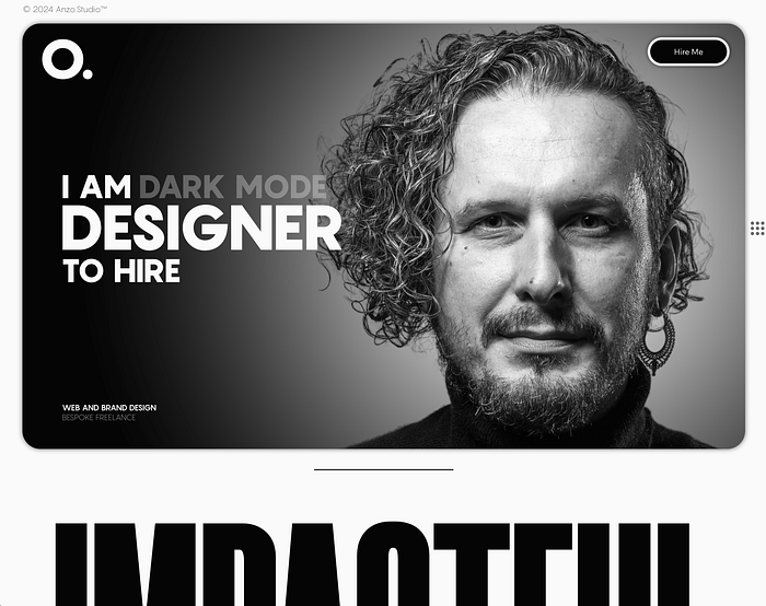
 Impressive portfolio by

 Web design project by


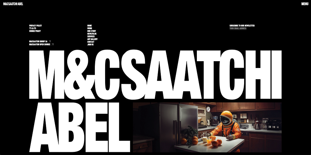
 Dubai Design District by
  DANZERS by Fabien Rousseau,
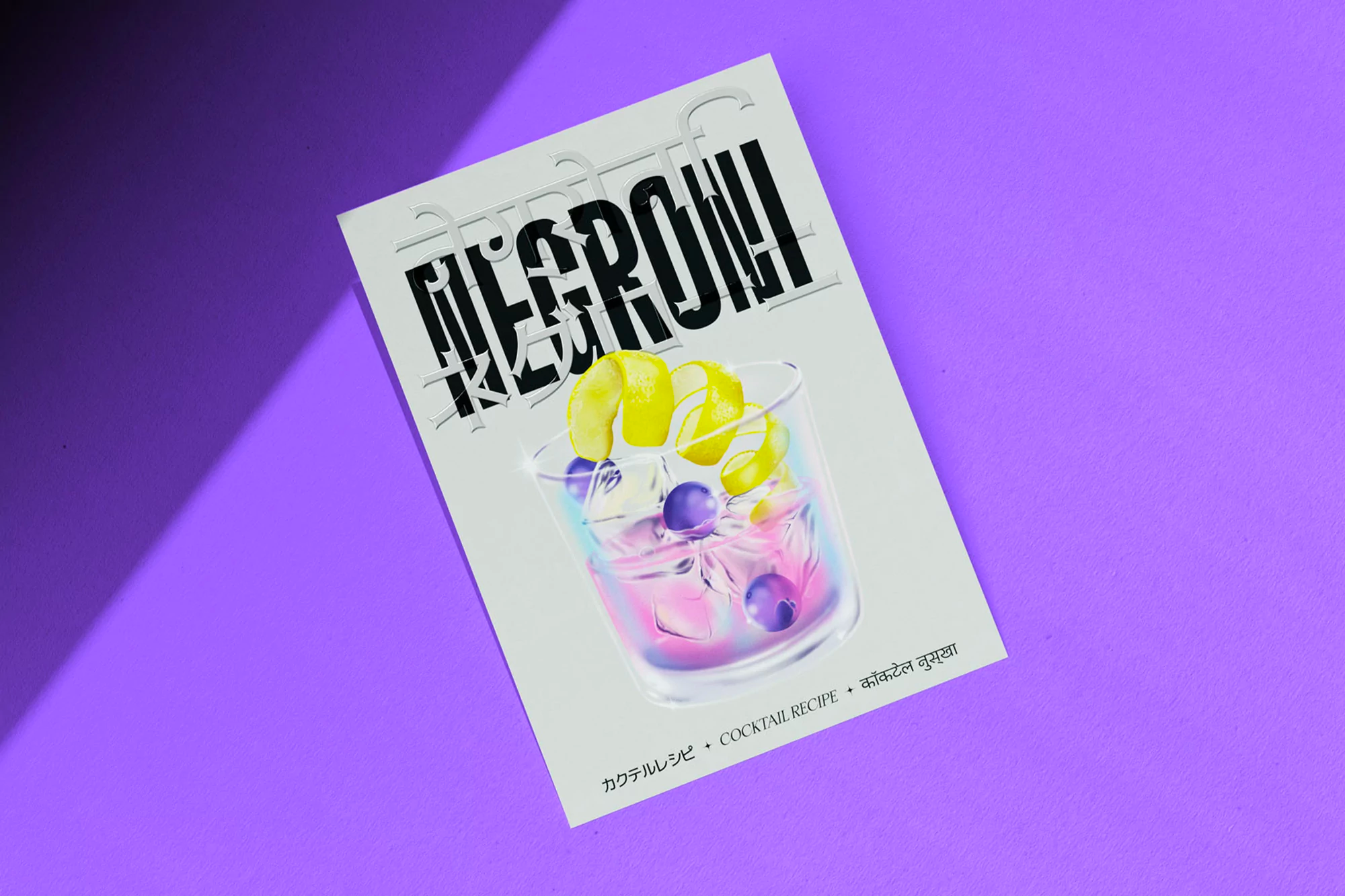
  HOTEL TANGO | Pride Vodka by
  EARTHPURE SYSTEMS® by
 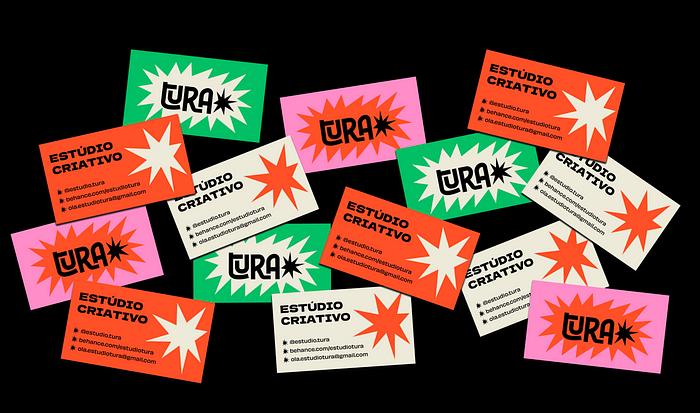 Estúdio Tura by


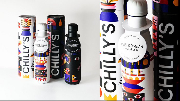 Chilly’s Bottles Collaboration by
 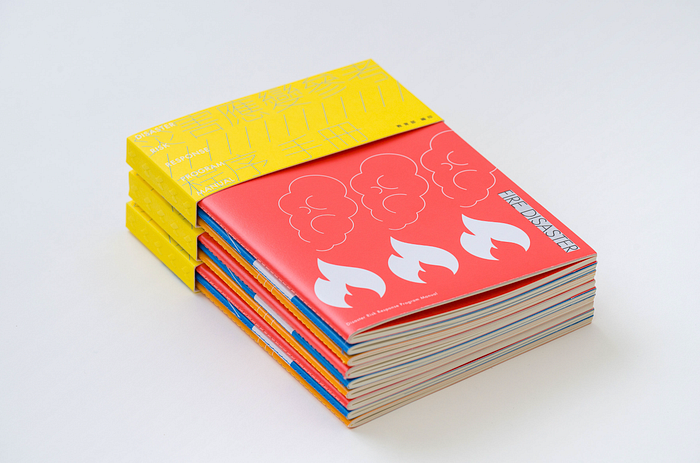 Disaster Risk Response Program Manual by
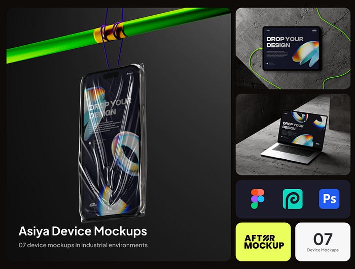
 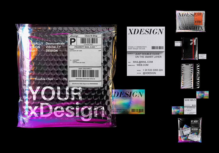 Holographic Brand Identity Mockups by

 Instinto by
 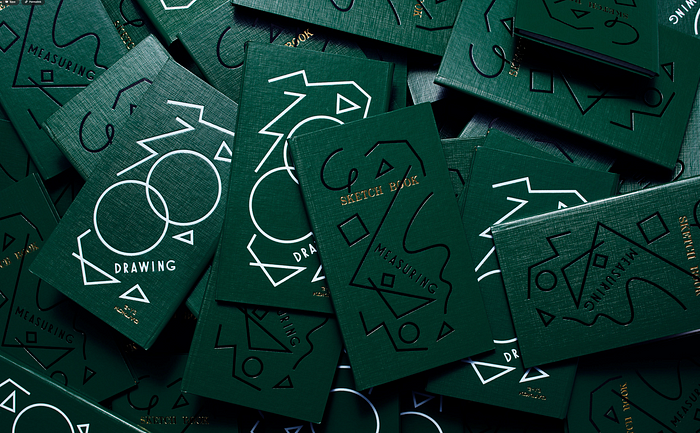 KOKUYO Sketch Book by
 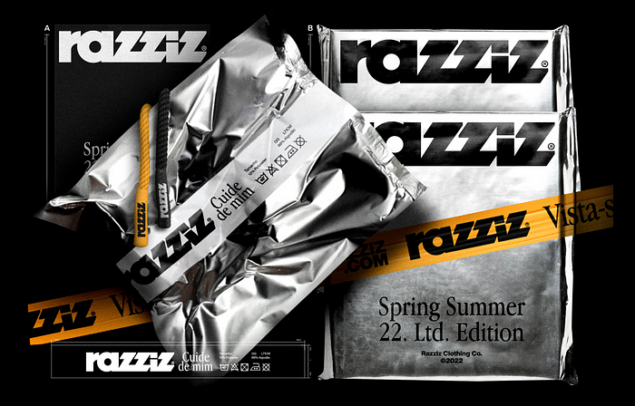 Razziz® by
  RANDOM ILLUSTRATIONS by
  [ watashidayo ] — It’s me by
  Hidden Heroes — Packaging Illustration by
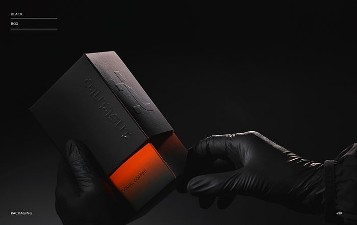


")
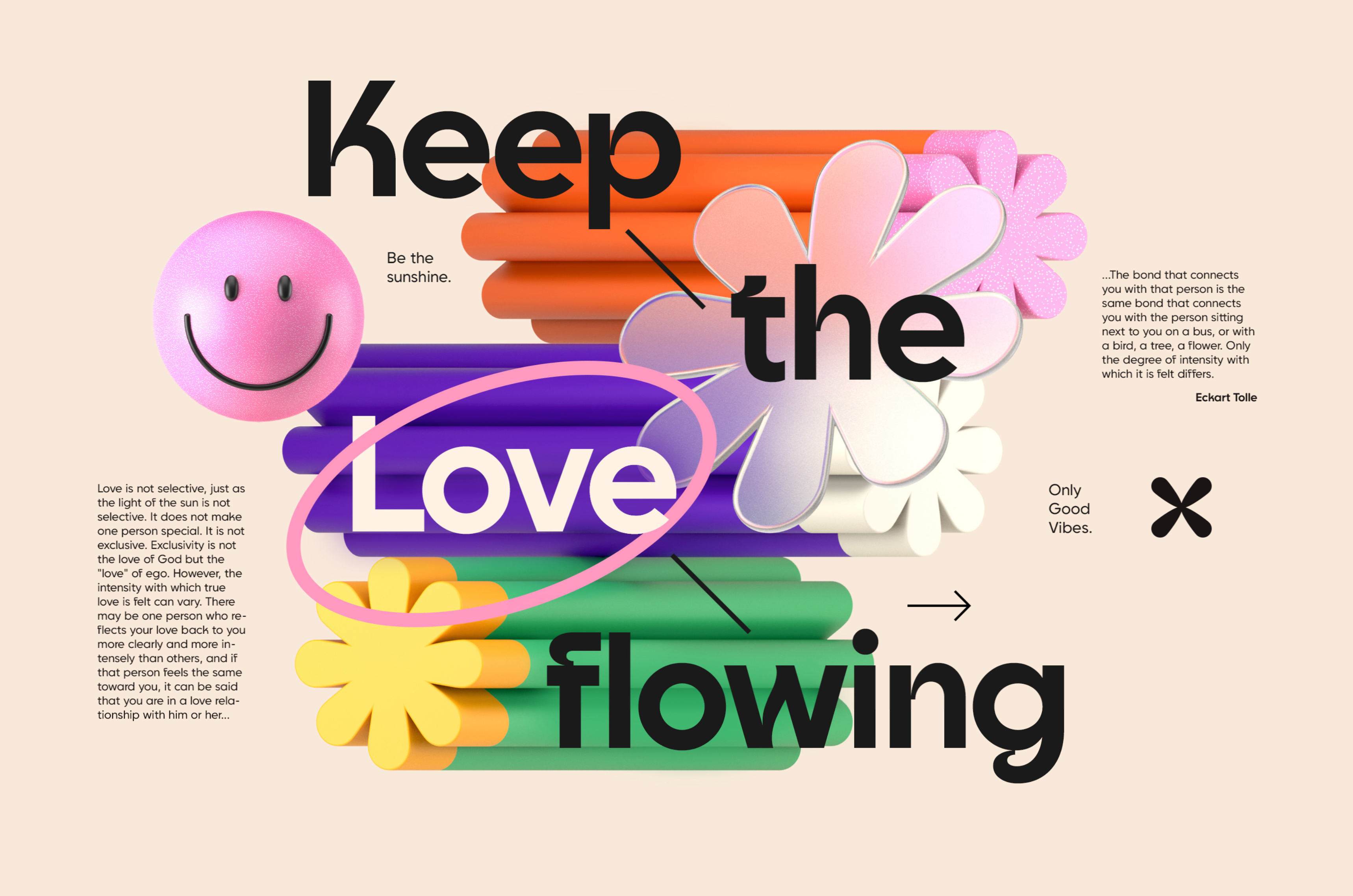
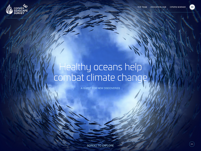
 Good luck trying to stand out in Times Square. Owen Barker ©
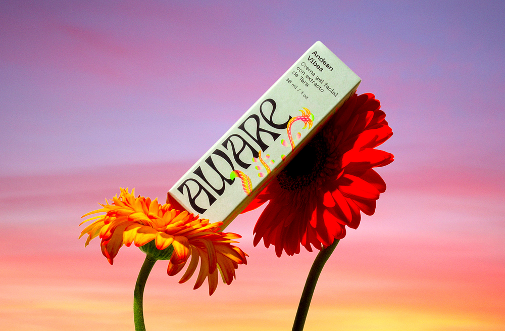
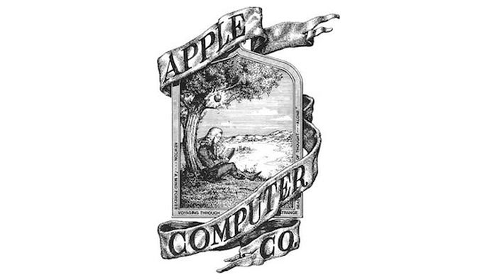 Did you know that the first Apple logo featured Isaac Newton sitting under the apple tree?
 Blue is by far the most popular colour choice for logos.
 We gave one of the generators a go. What do you think about the results?
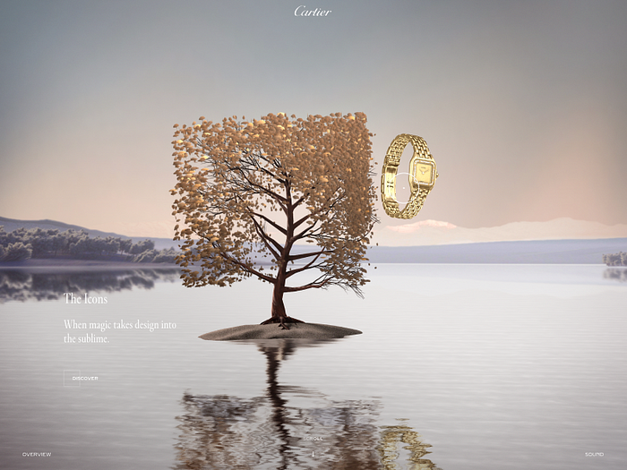
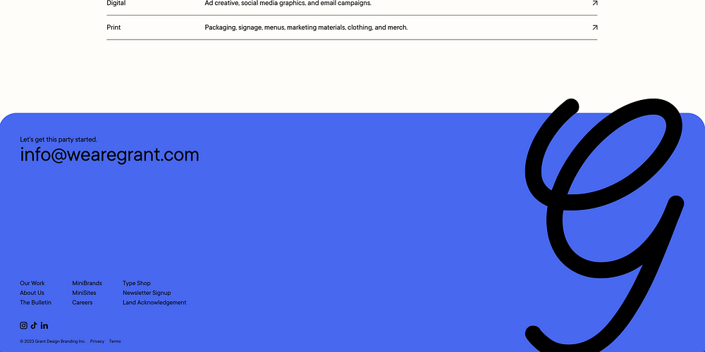
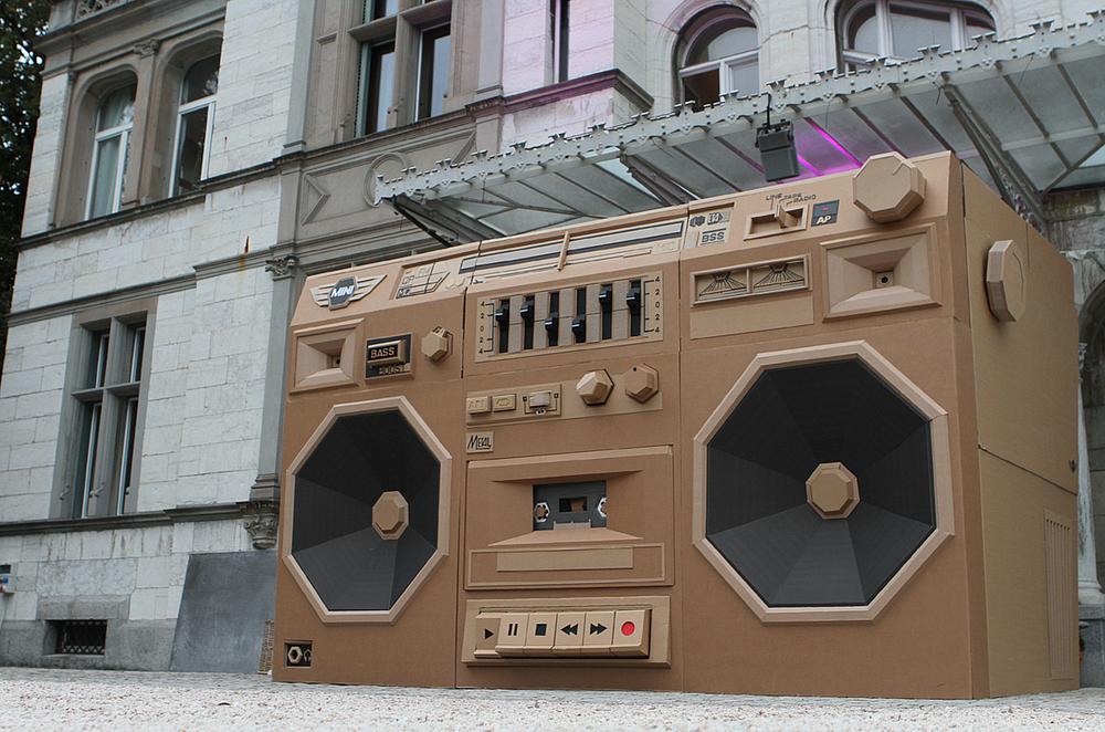
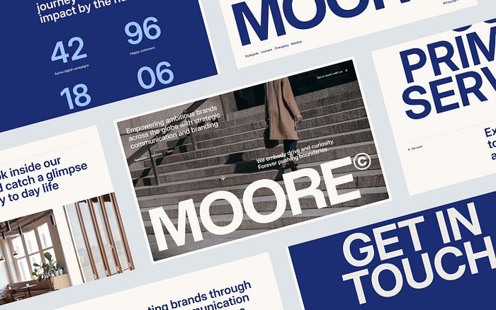
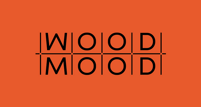 Wood Mood by No5 Istanbul
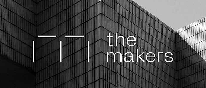 The Makers by
 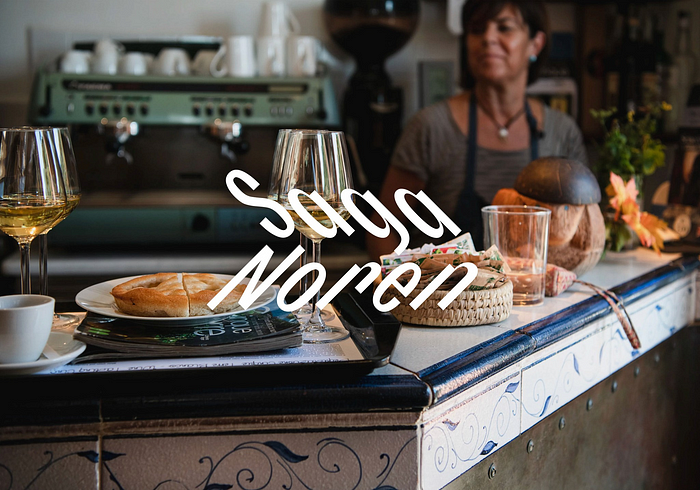 Saga Noren by
  Mononova by
  Tacos Del Alma by
  Sao Gerald by
  Grin by
  Joyful Woof by
  Curv Studio by
  Legg by
  Ballpark by
 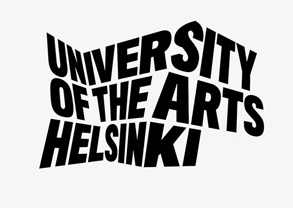 University of the Arts Helsinki by
 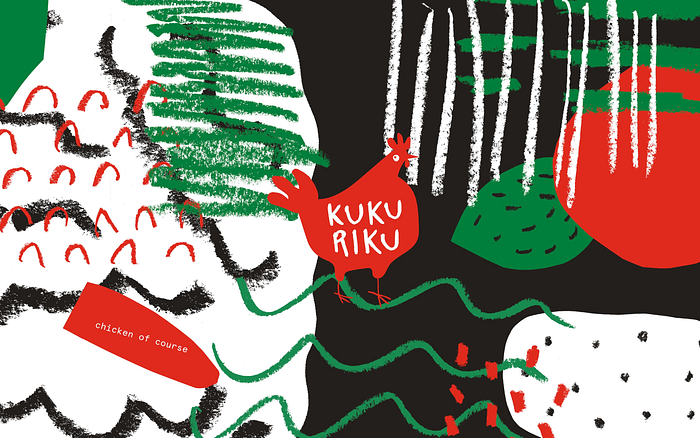 Kukuriku by
 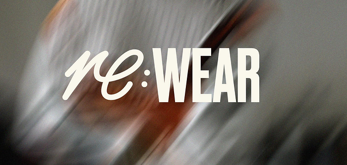 Re:Wear by
 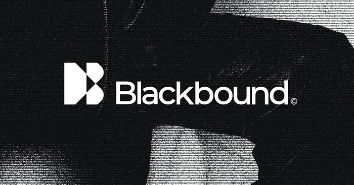 Blackbound by
  The Frida Cinema by
  Offe by
  Zapier by
  Tilda by
  Woove by
 Cubic by
  Squirrels by
  Fluency by
  Mosaica by
  Jetter by


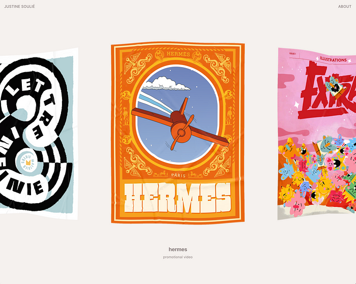
 Derprosa Relife by
 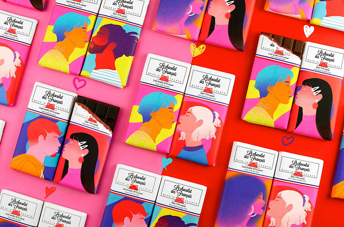 Le Chocolat des Français — Packaging illustration by
 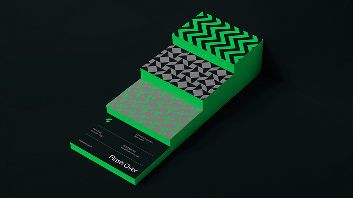 Flash Over by

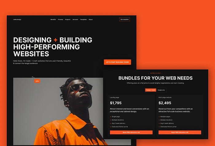
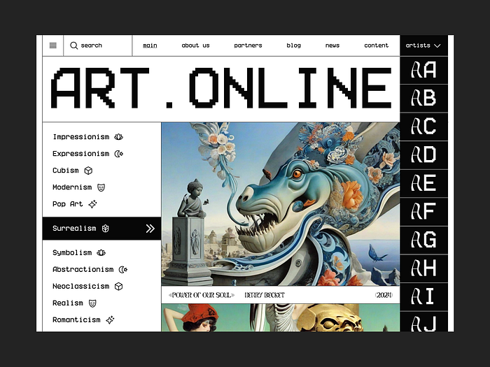 Art Website Design by
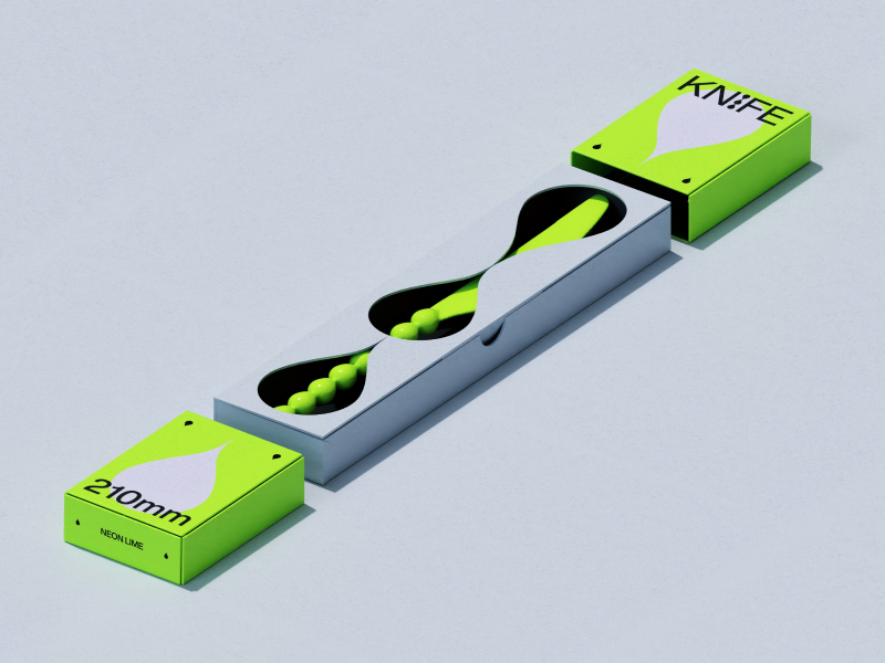
 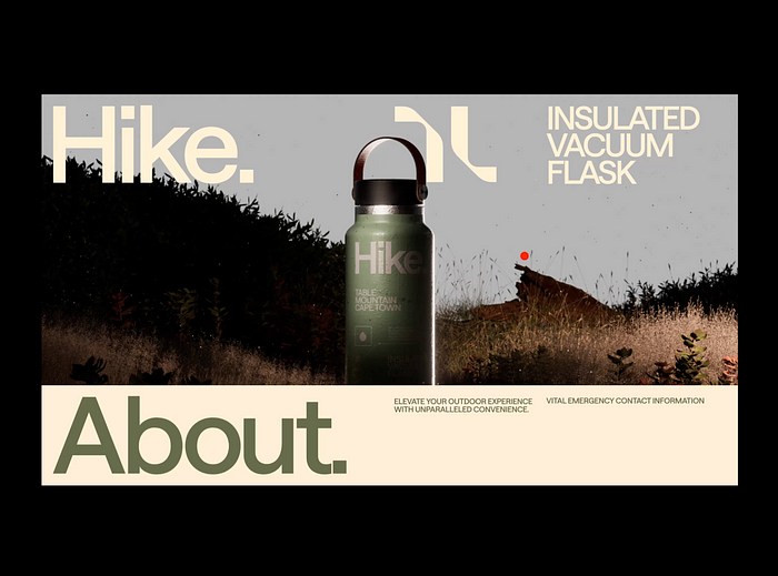 Hike Flask №003 by
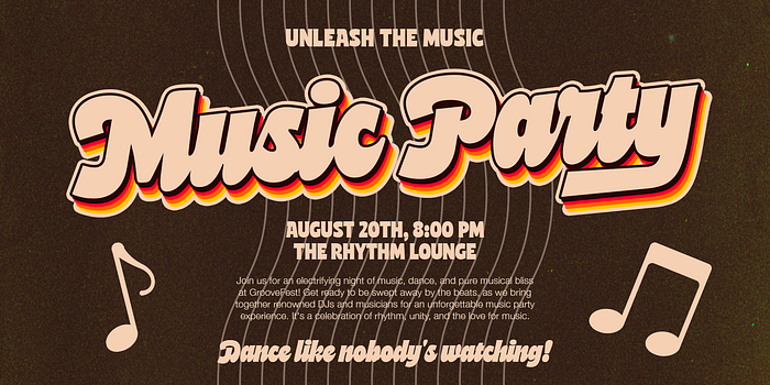
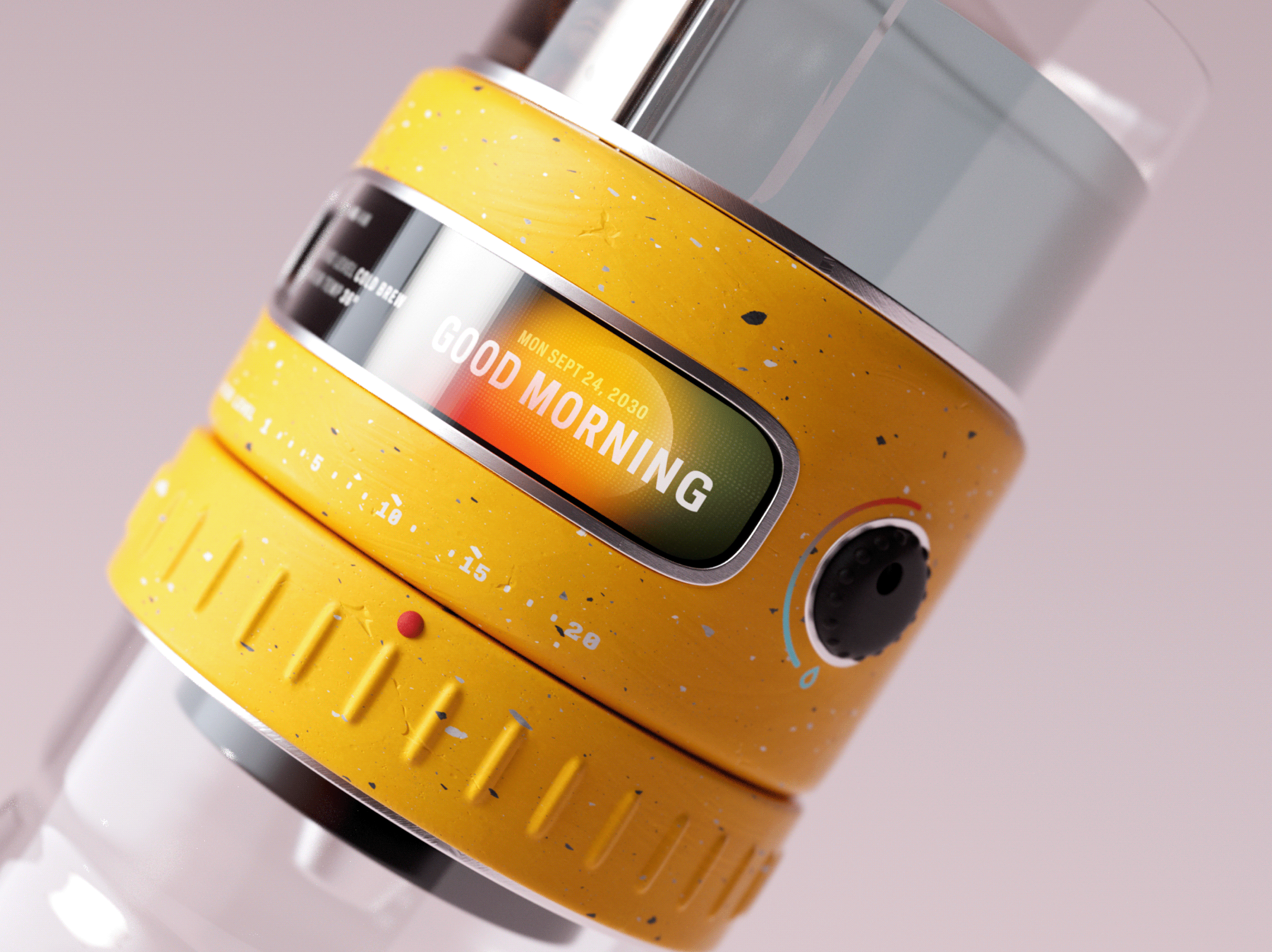
  Music by
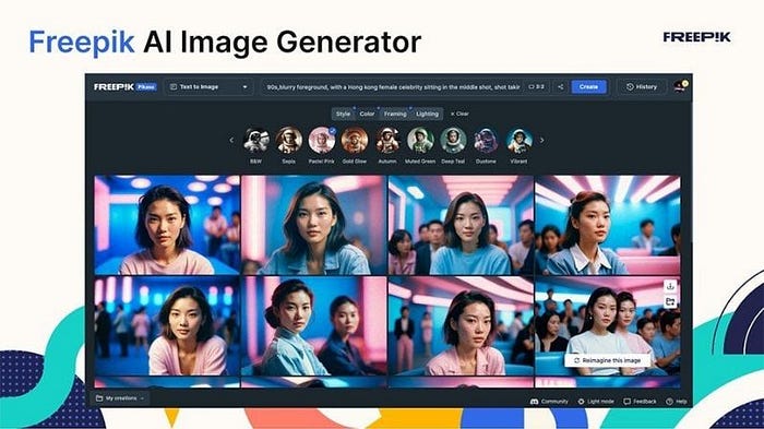
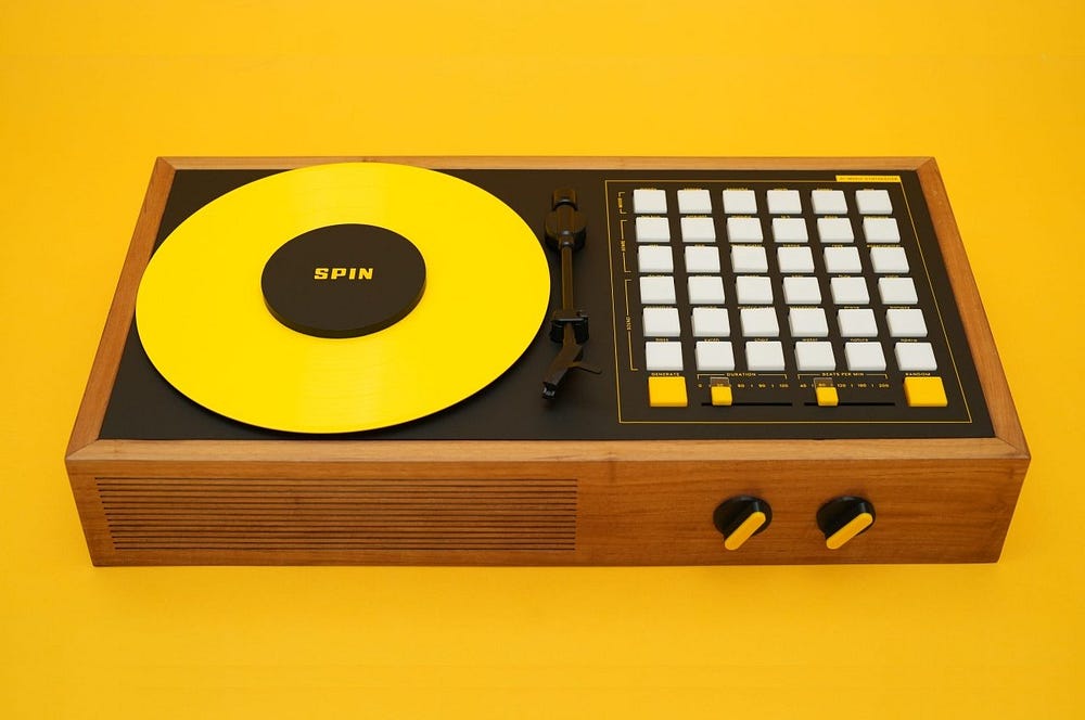
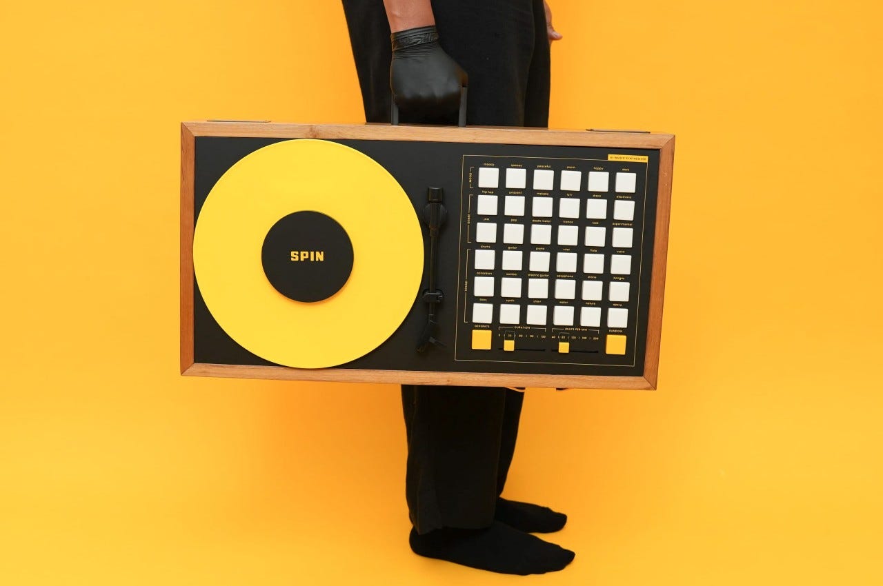
  FREEPIK X ILUSTRONAUTA by
 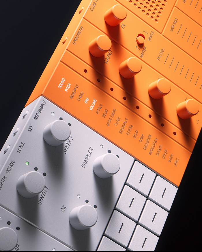 Yamaha SEQTRAK CGI by
 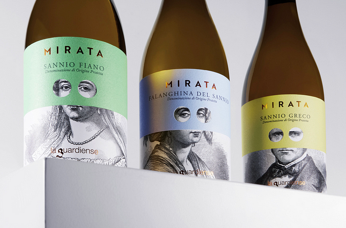 Mirata by
 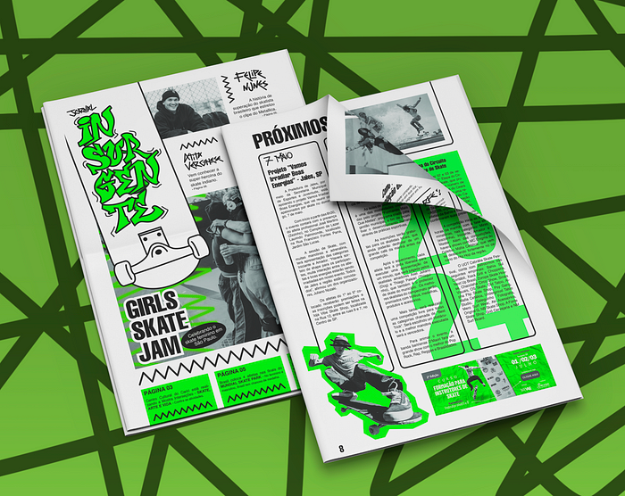 Jornal Insurgente | Skate Style by

 Podcast by
 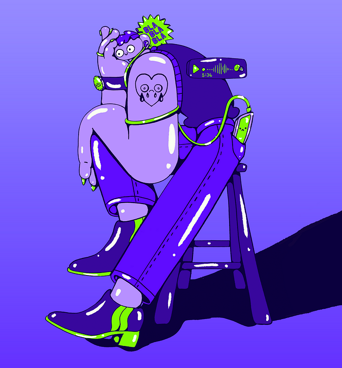 BLABLABLA! by
  Life goes on by
 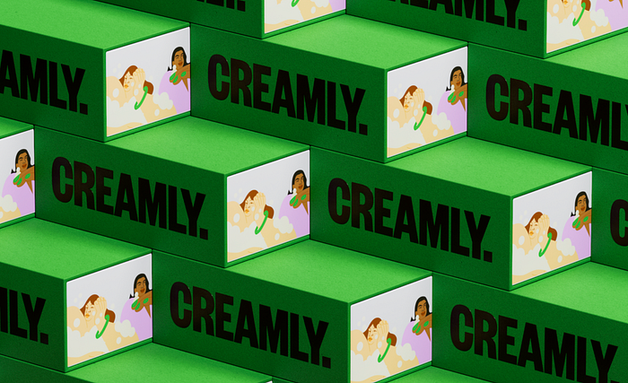 Creamly. by
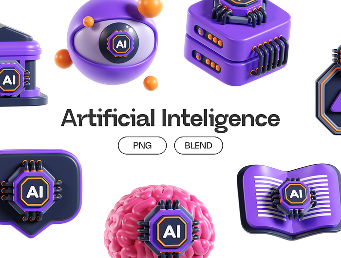
 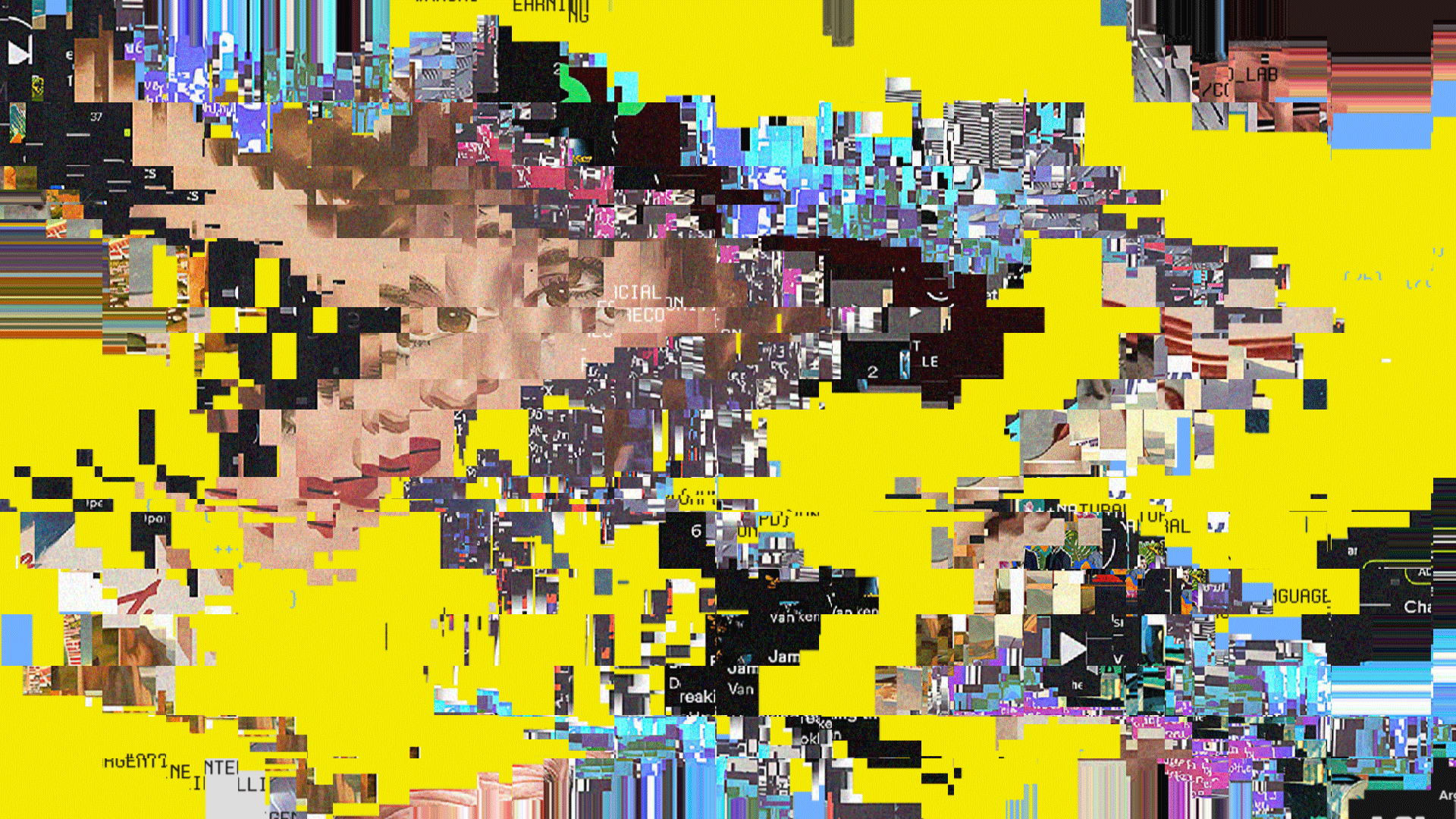 AI — Argentine Intelligence by
 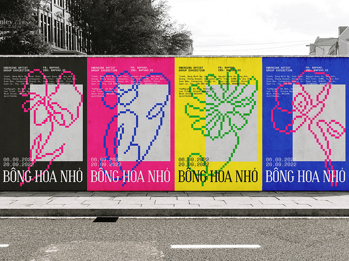 Bong Hoa Nho exhibition by
 Article by
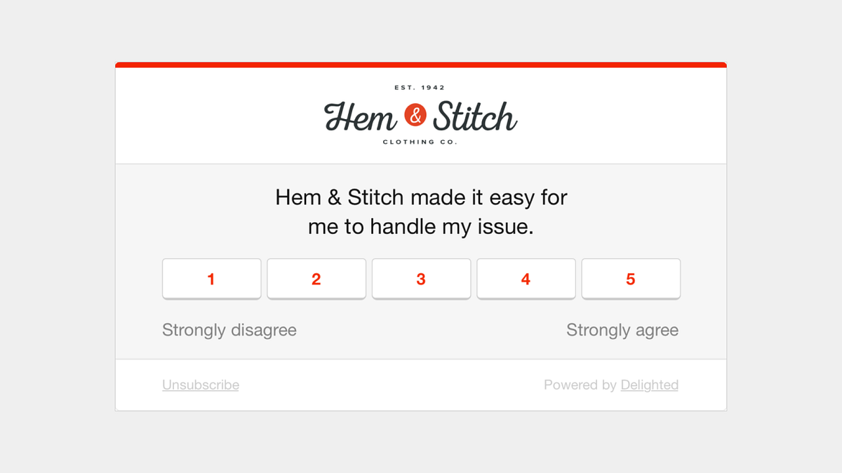 CES on a clothing website
 The navigation bar of a popular design studio

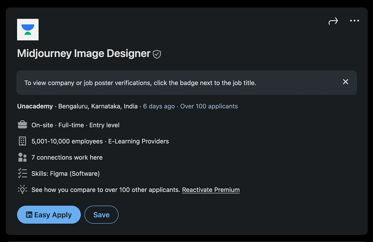 A job post from a major ed-tech company


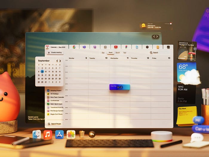
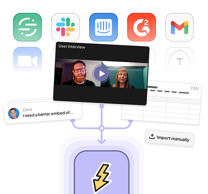
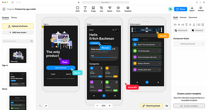
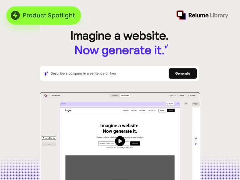
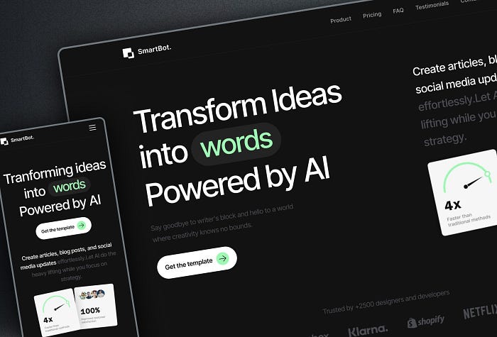
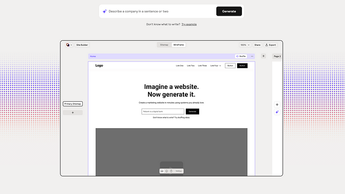
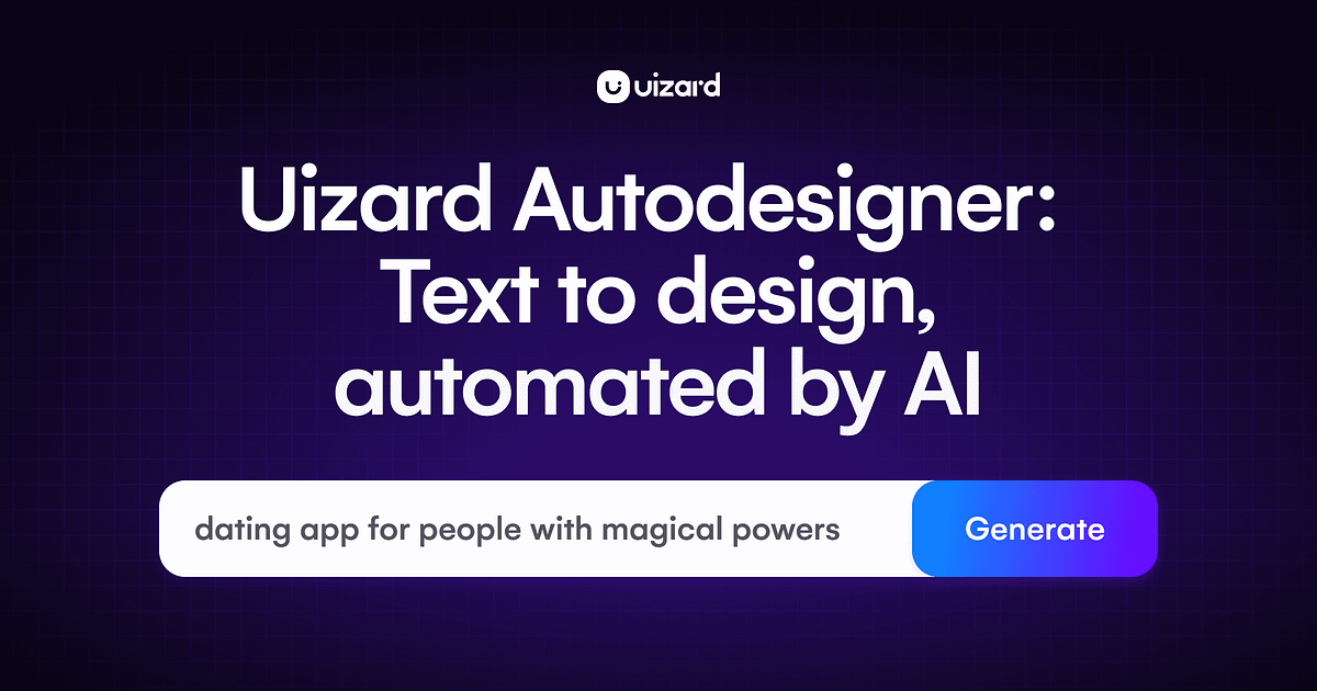 Uizard AI Design Tool

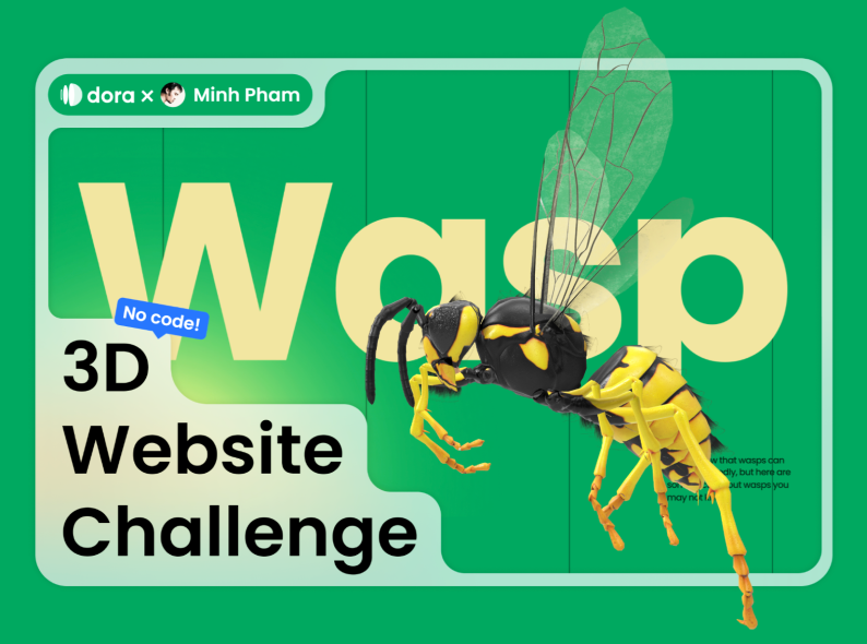
 Podcast by
  Website Design exploration : web motion graphics by
  SOPHIE | Queer Magazine by
 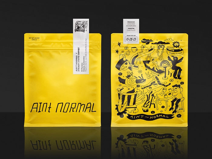 Ain’t Normal Coffee by
 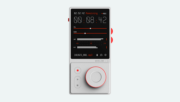 Wavelink-1 by
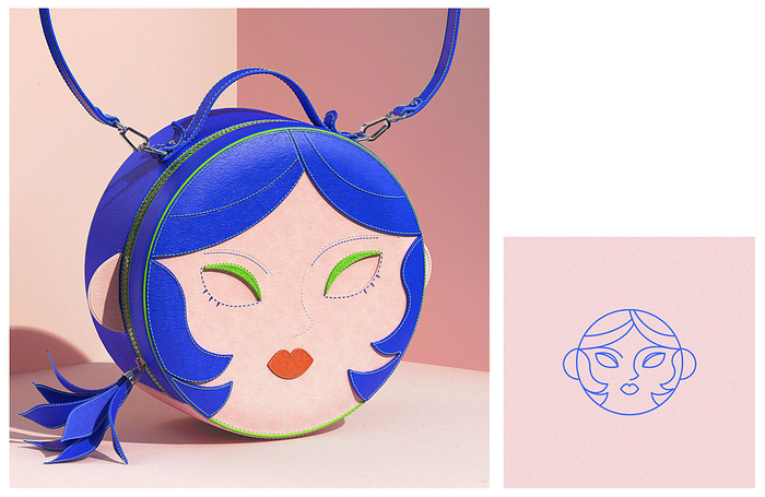

 Article by
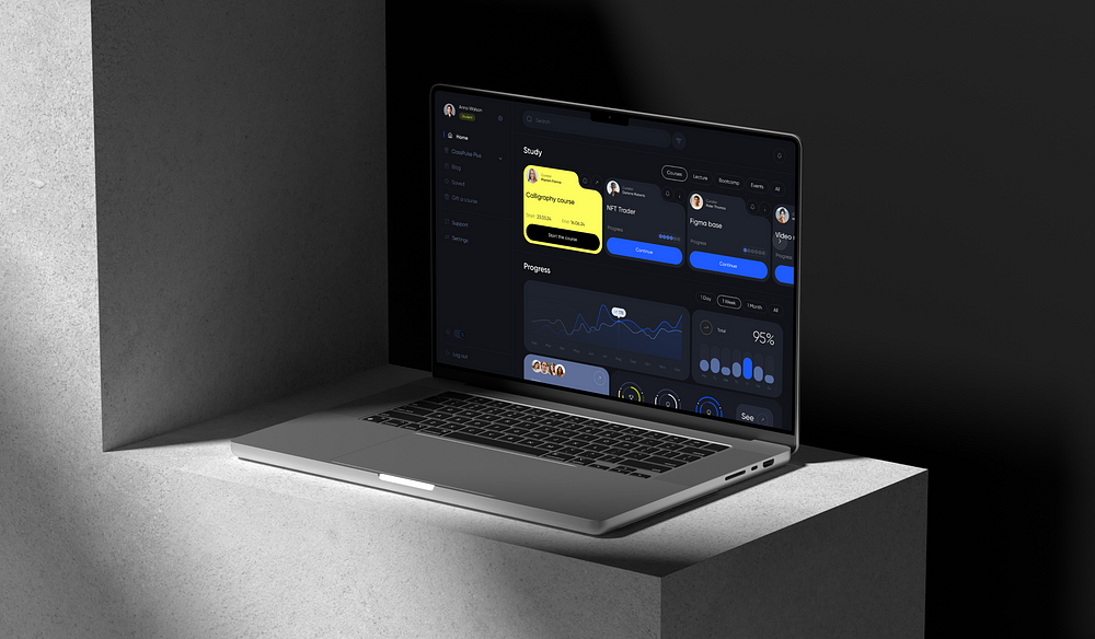


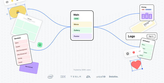
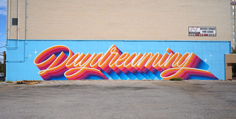
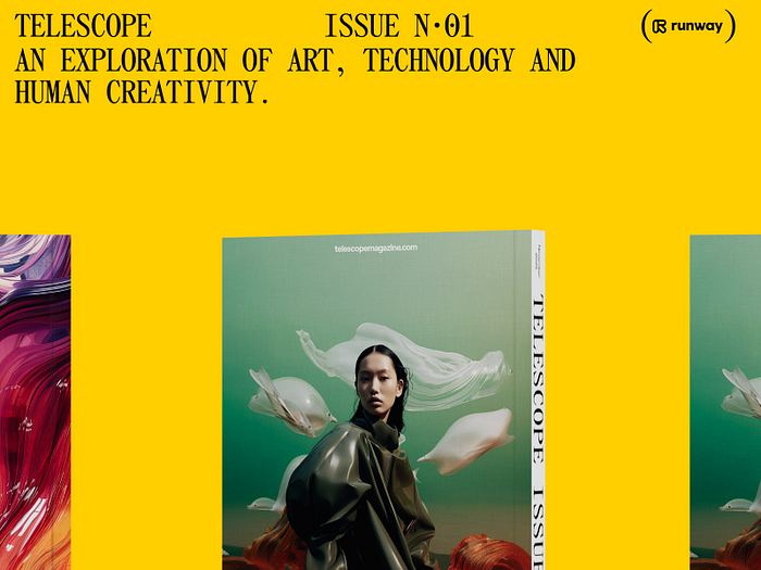
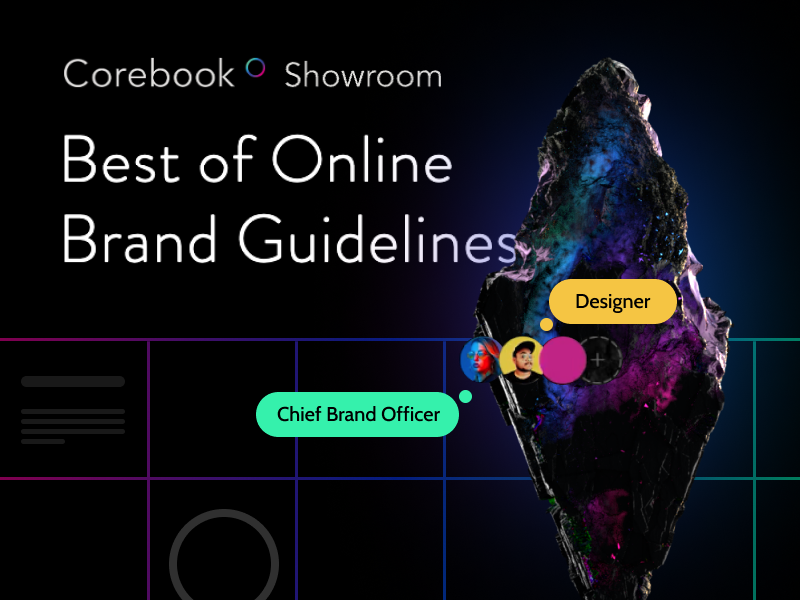
 Kynest — Product storytelling by
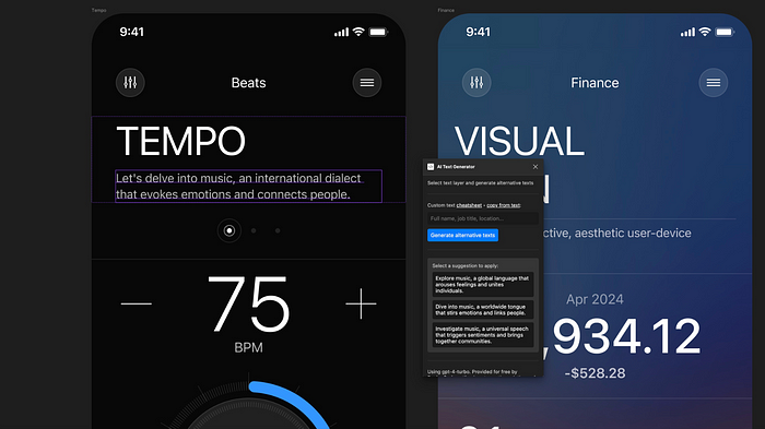
 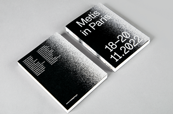 Metis in Paris — Editorial by
 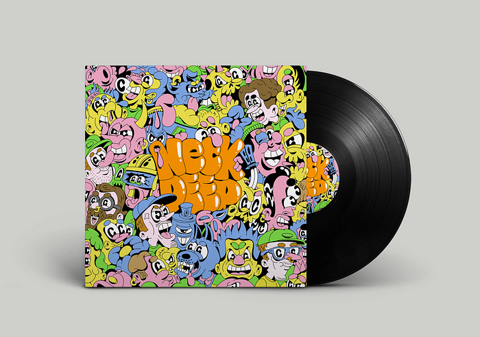 Neck Deep by
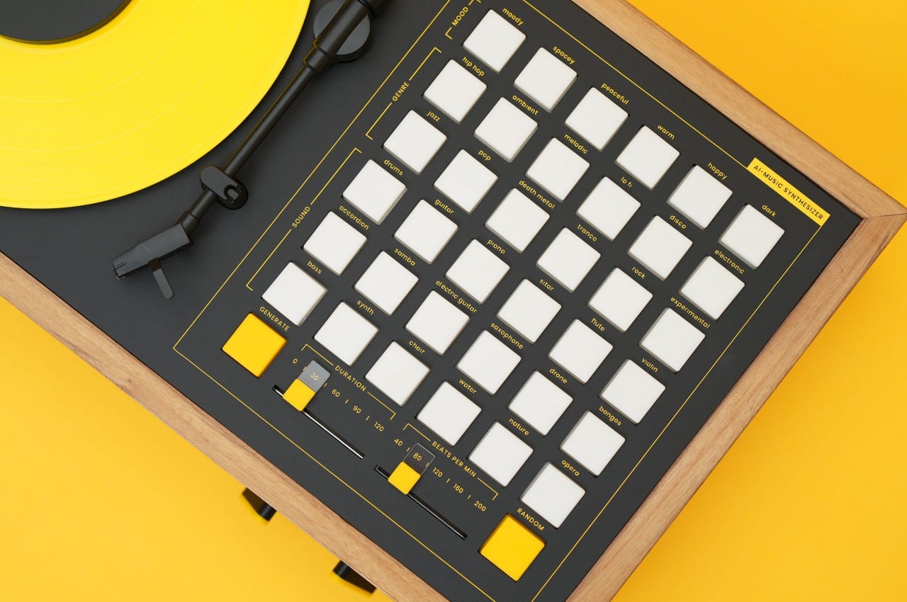
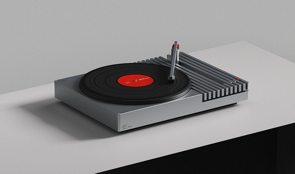
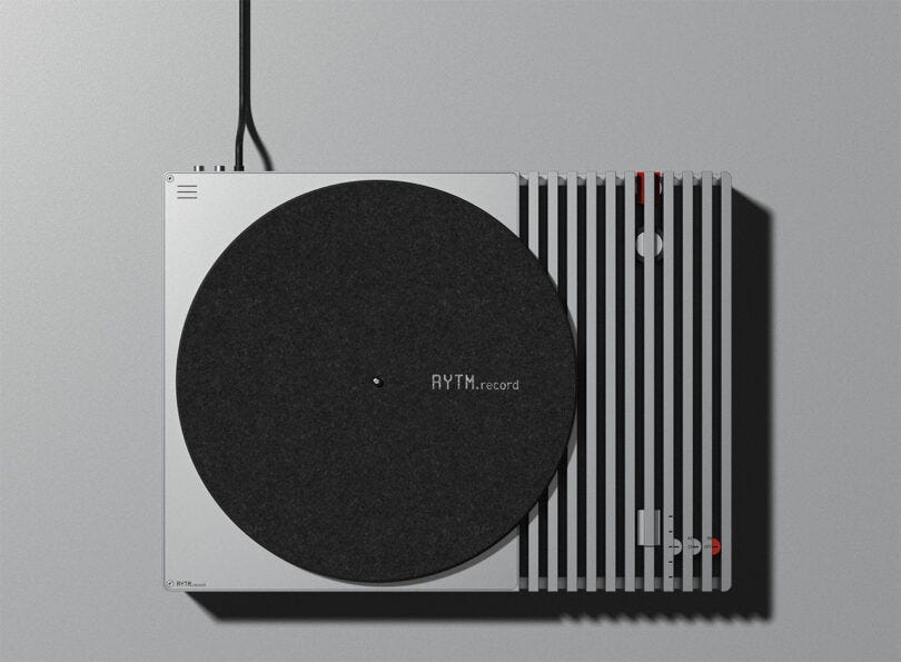
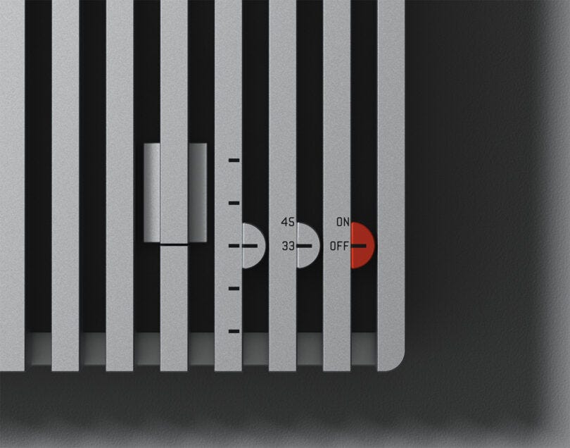
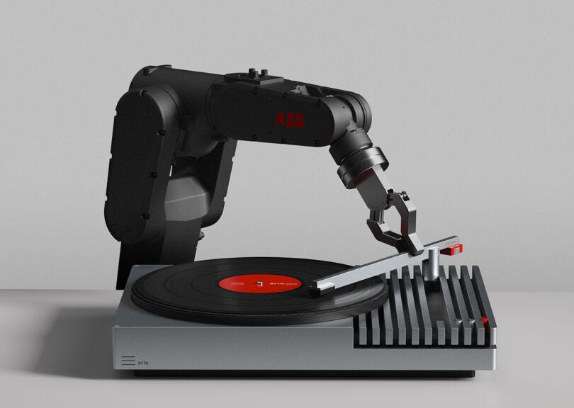
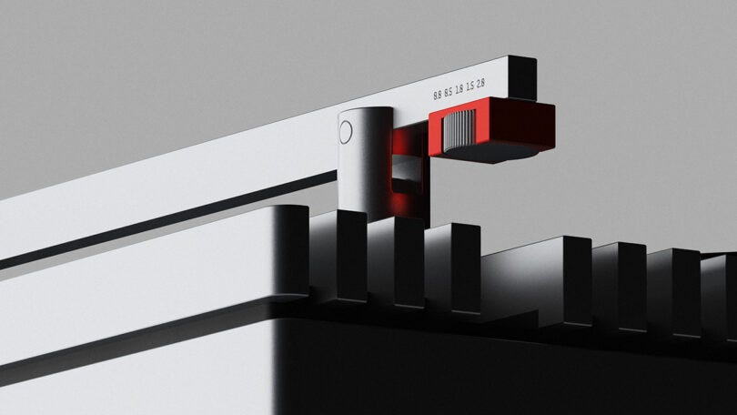
  Vibrary Digital LP Player by
 Article by
 Article by
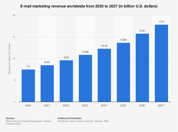
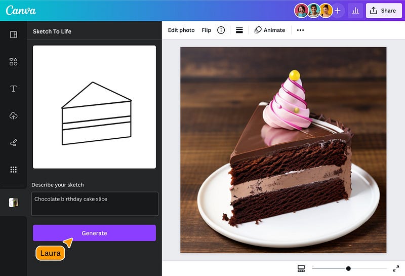
  Image by Author, made on Canva. Based on a slide from
  Image by Author, made on Canva. Based on “


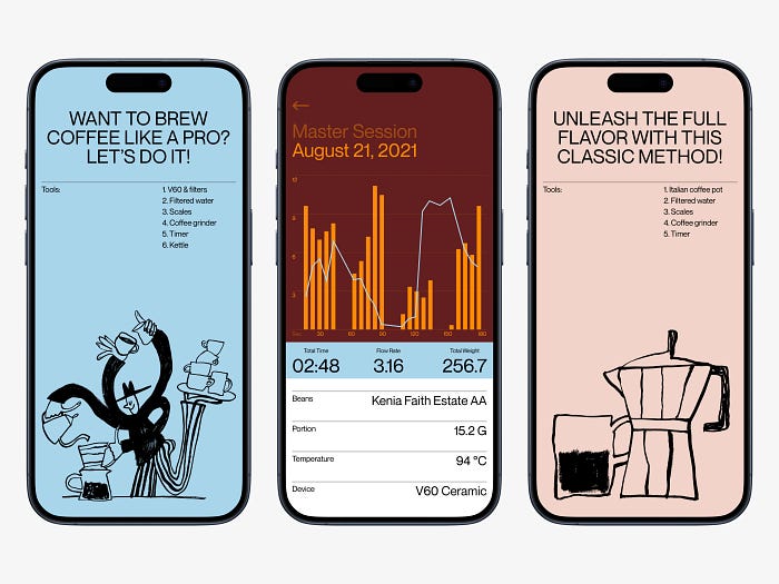 Master Session by
  Share Sphere App by
  INPRNT by

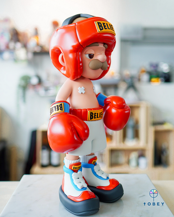 the ‘P’ BELIEF by
 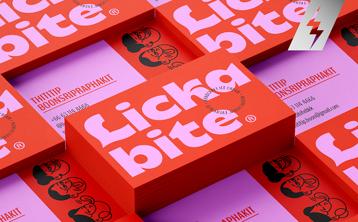 LICKABITE by
 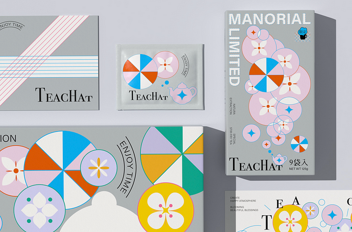 TEACHAT by TEACHAT and
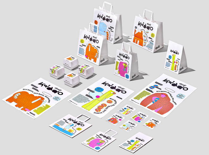 DINO KIDDO by
 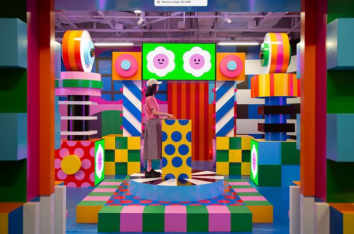 Zoom Out by
 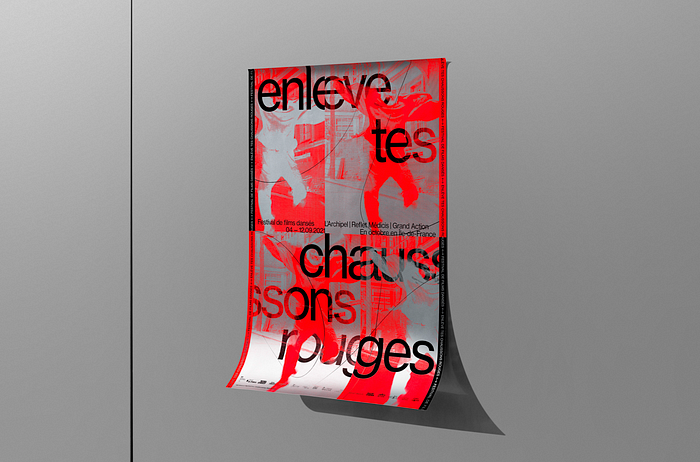 Enlève tes chaussons rouges 2021 by
 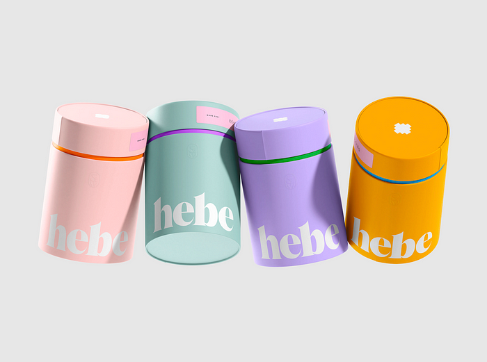 ©Hebe Science by


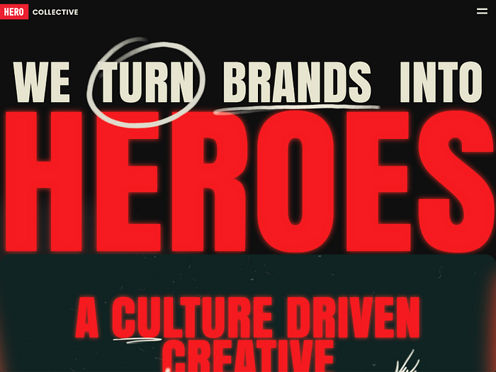
 Hero Collective Mobile by
  NIKE // CNCPT E-commerce by
 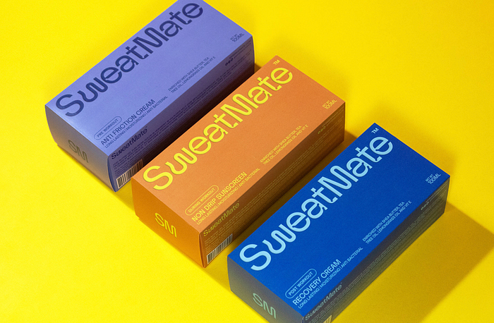 SweatMate by
  Posters 2023 by
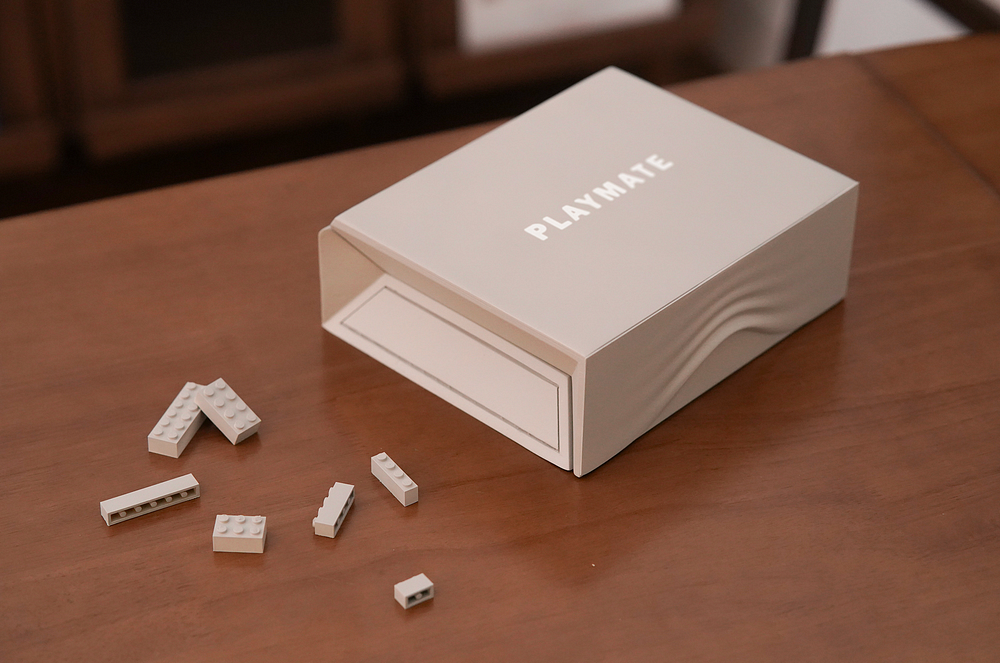
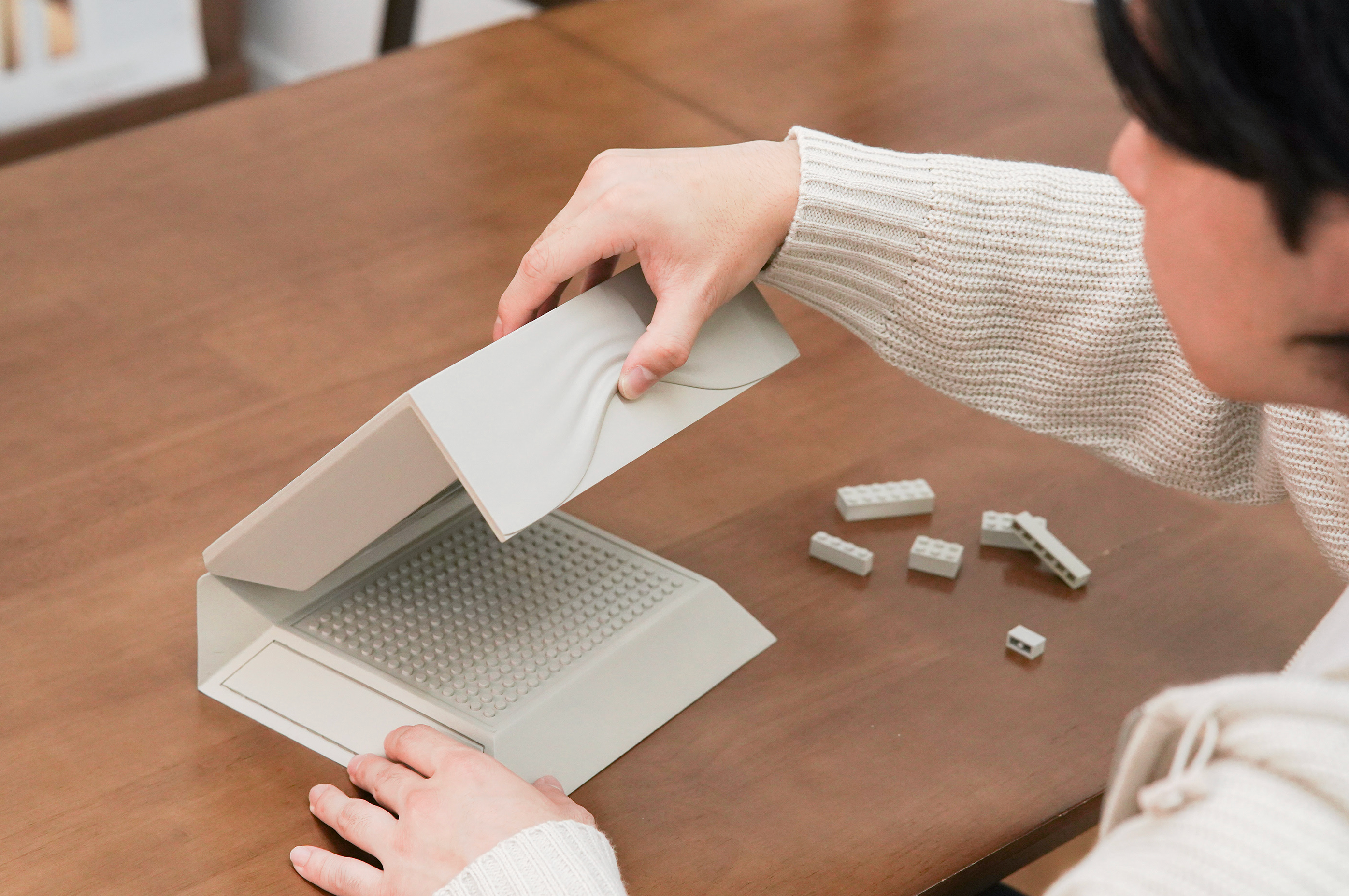
  KOOKYCREAM — NEW YEAR GIFT BOX by


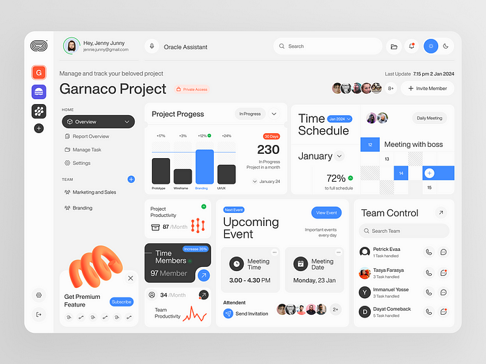
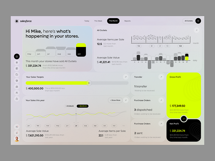
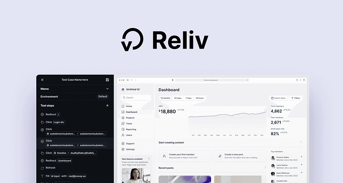
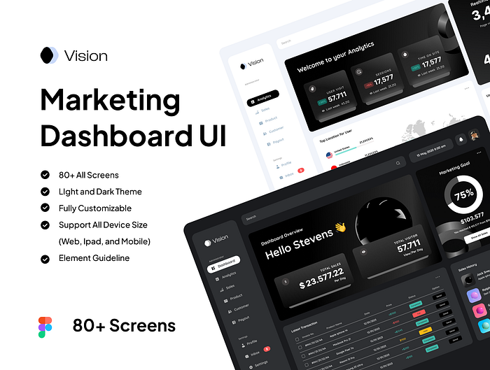
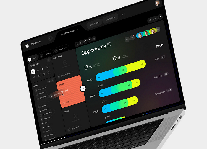
 Salesforce CRM — Sales Analytics Software by


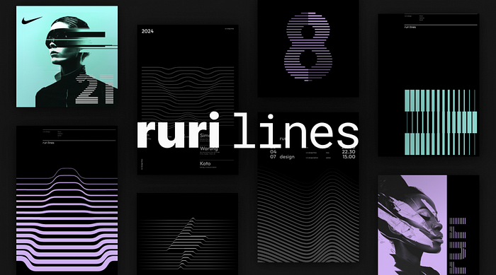
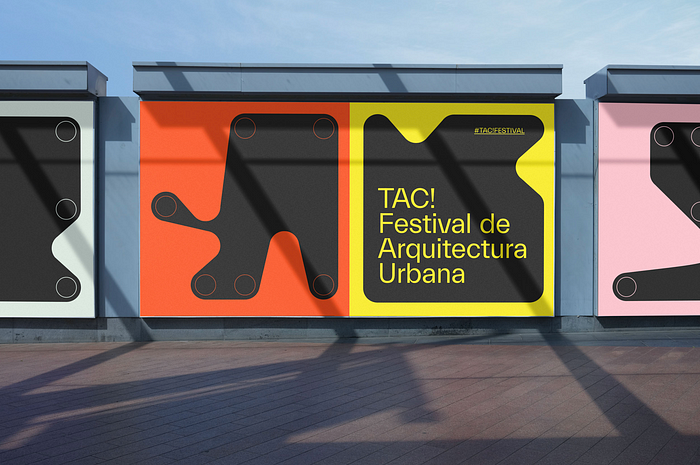 TAC! Festival Branding by
  Exploration in texture and color by


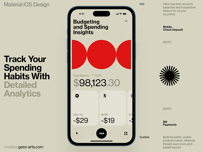
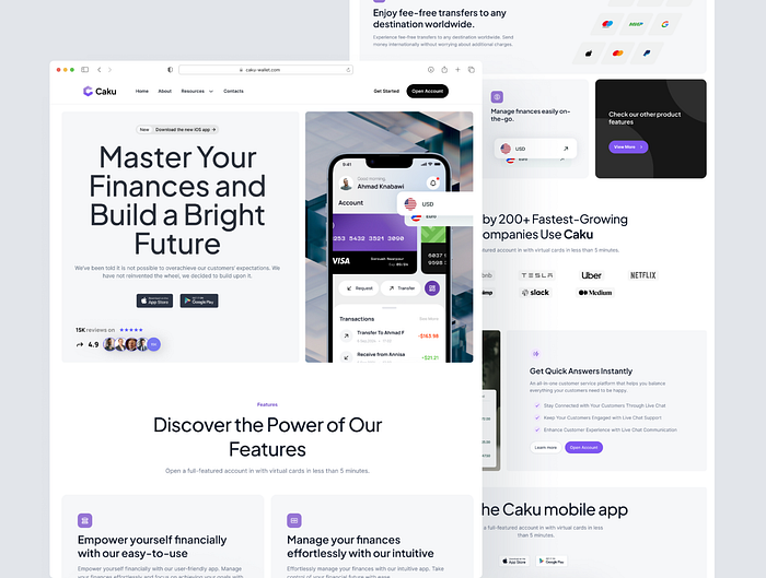
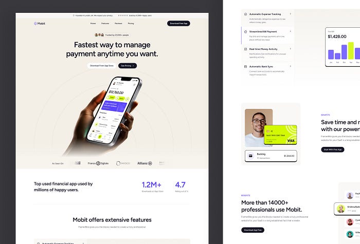
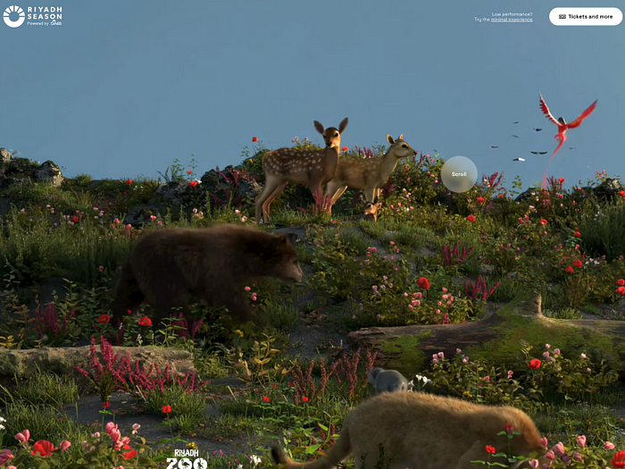
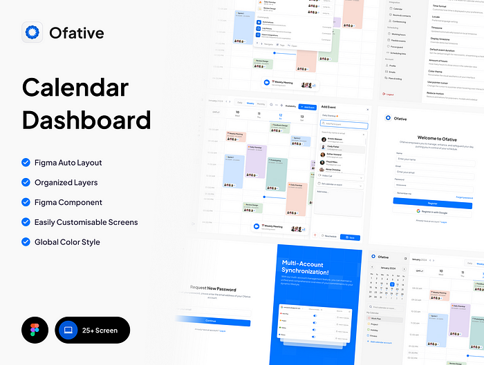
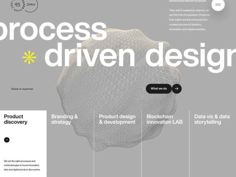
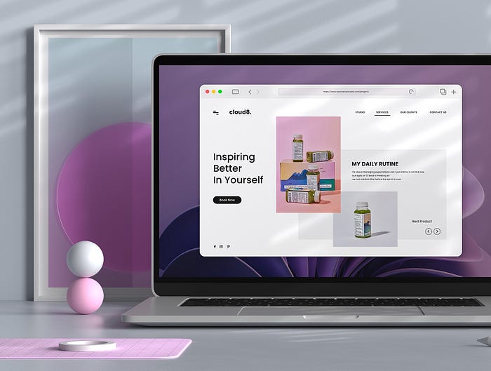
 Fincare — Banking App by
  Live Streaming Selling Mobile Experience by
  Simple Investment app design by
  few illustrations from 2023 by
  Spark Graduation Visual Identity by
  ESTADIOS by


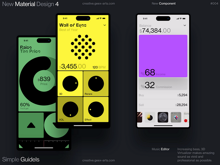 Music Editor by
  Visual Journal is curated by
  Visual Journal is curated by


 つづく by
 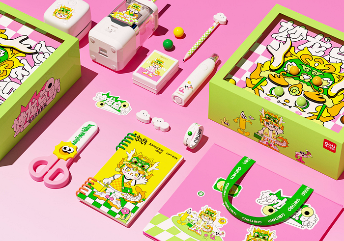 Deli Stationery NewYear interactive packaging得力文具交互新年礼盒 by
 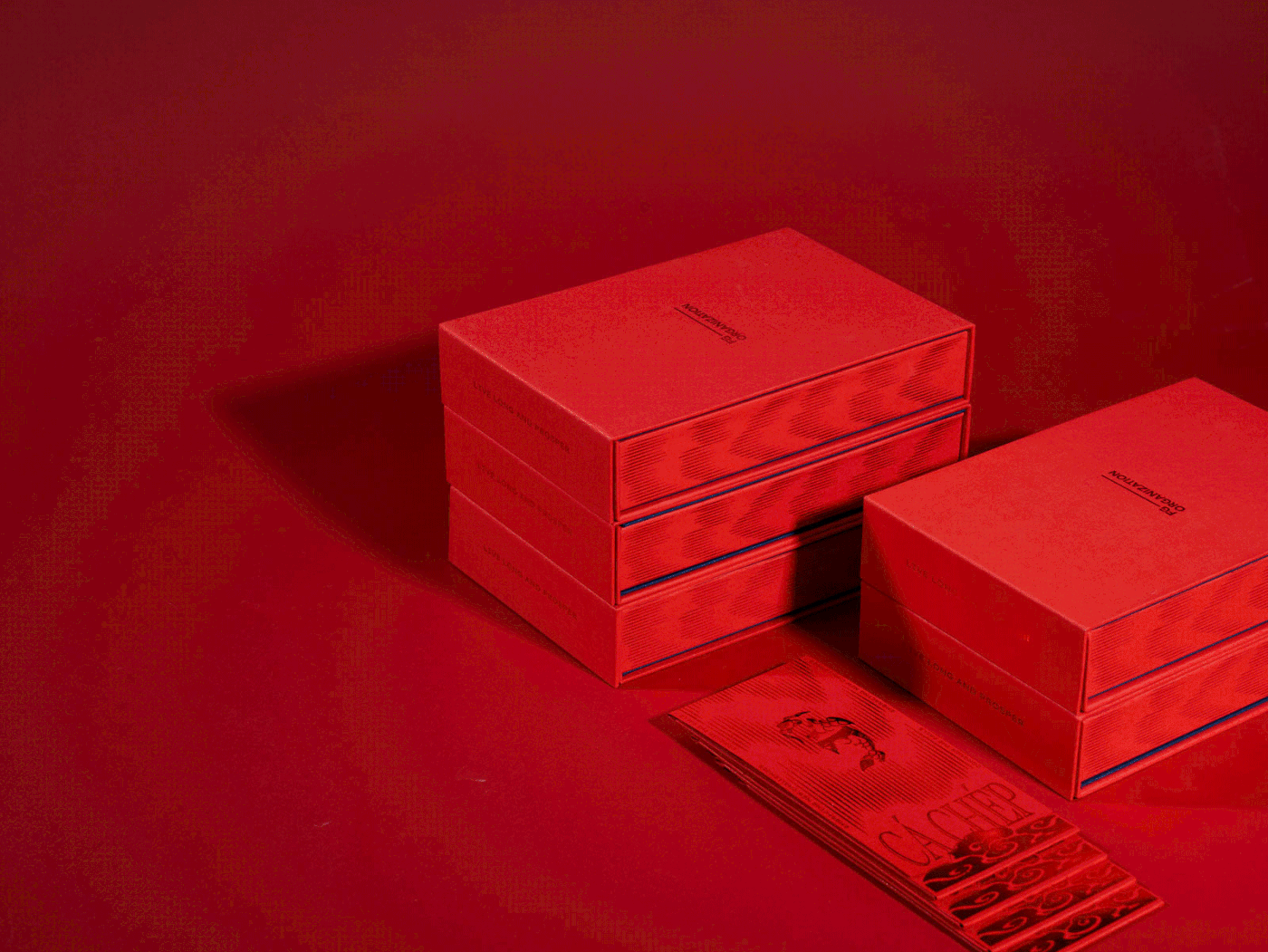 LUNAR NEW YEAR Gift Box 2024 | FG Organization by
 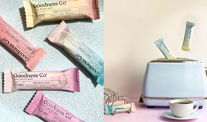 Goodness Co. — Branding & Packaging by
 Crypto Wallet App Design by
 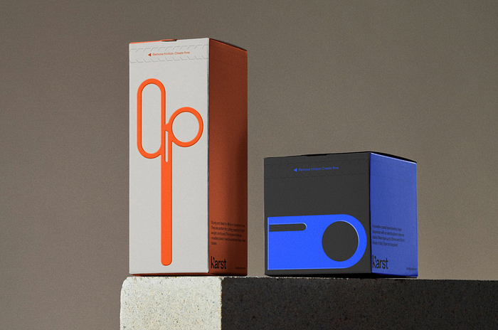 Karst by
  小红书 阳台改造箱 by
 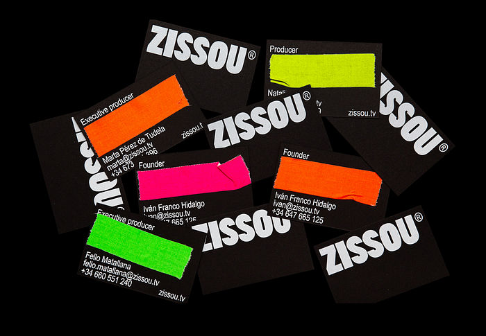 ZISSOU®. Identity by


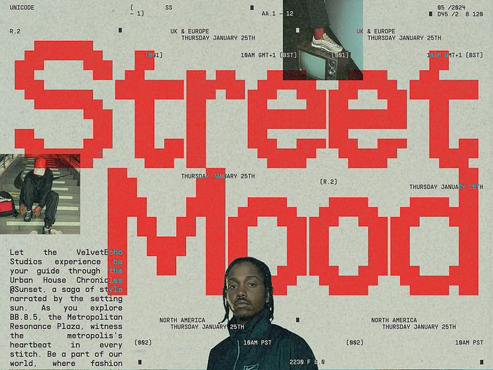 Mood by
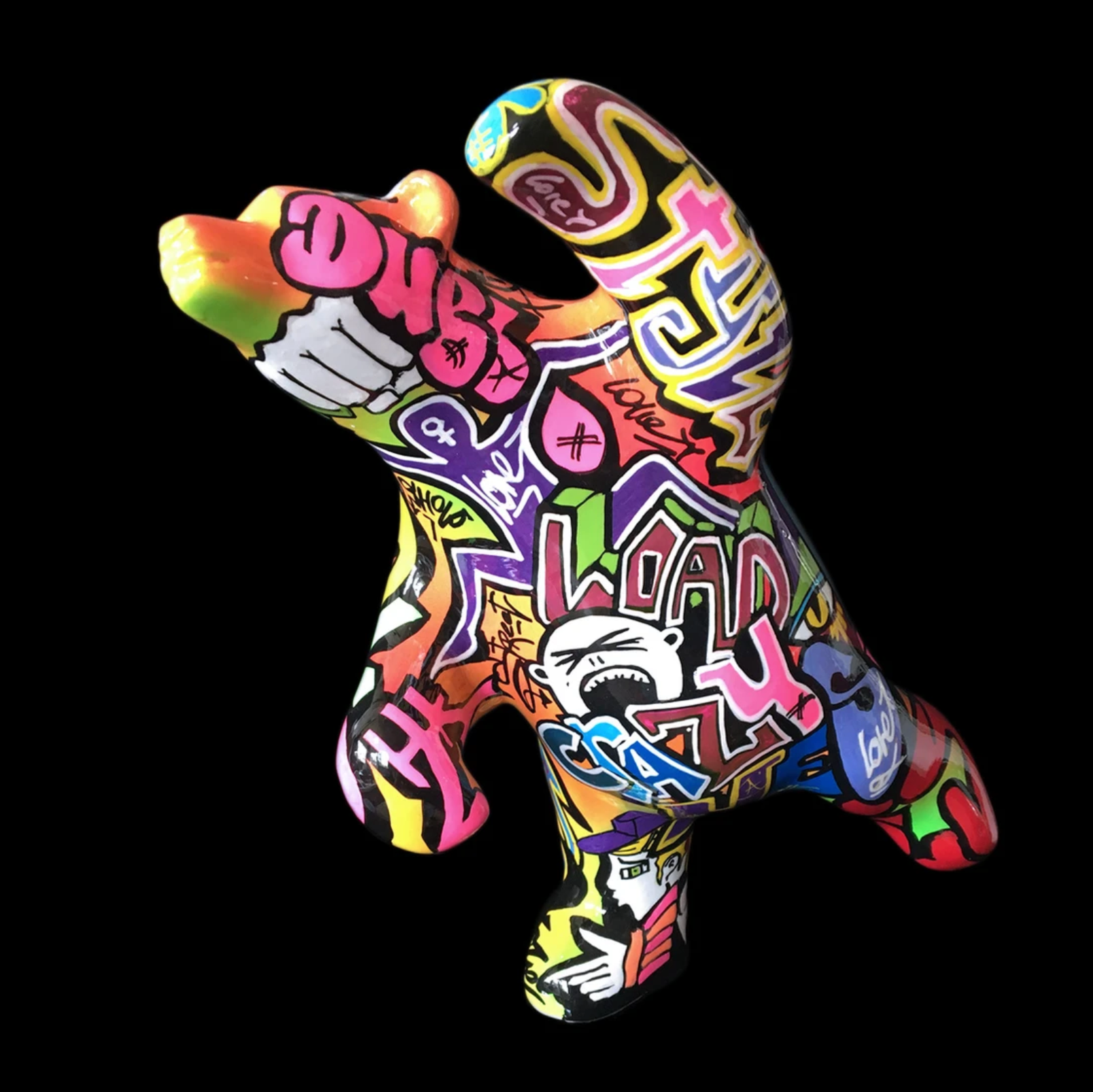
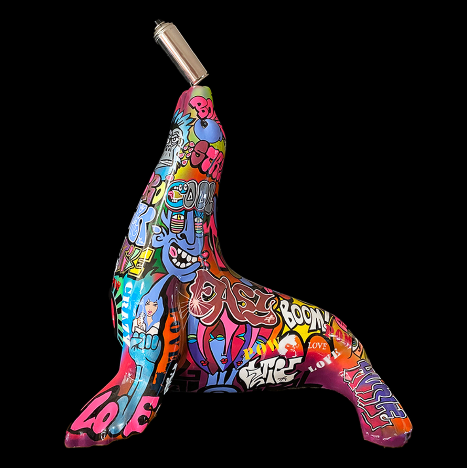
 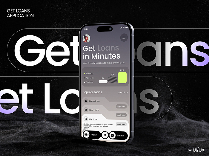 Loan Application by
 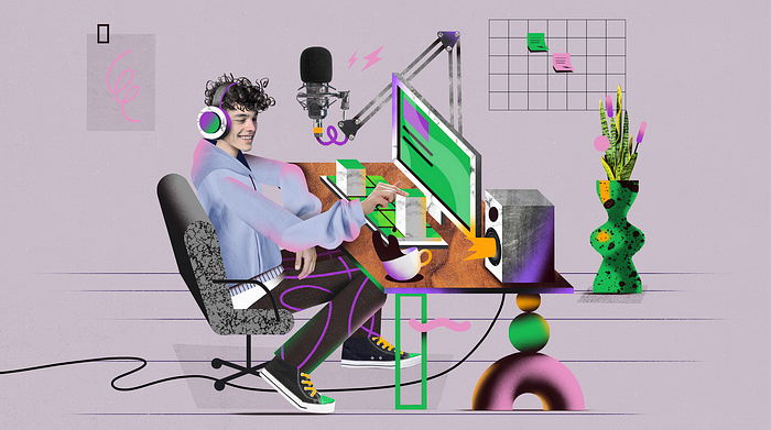 Trippy Board Game by
 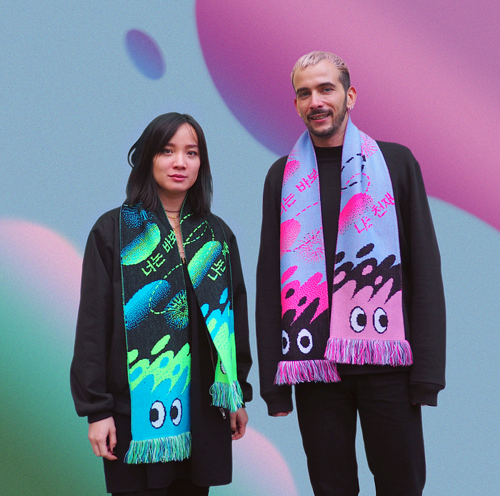 “I’m a genius. You’re a fool” Scarves (2021) by
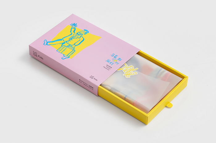 《马蒂斯的旅行》绘本衍生品 by


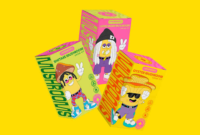 Characters for the new mushroom brand from Wiz Khalifa by
 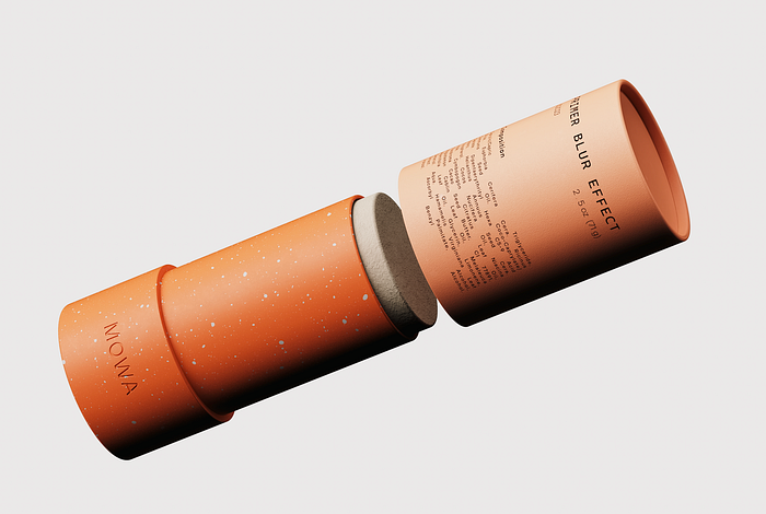 MOWA® by
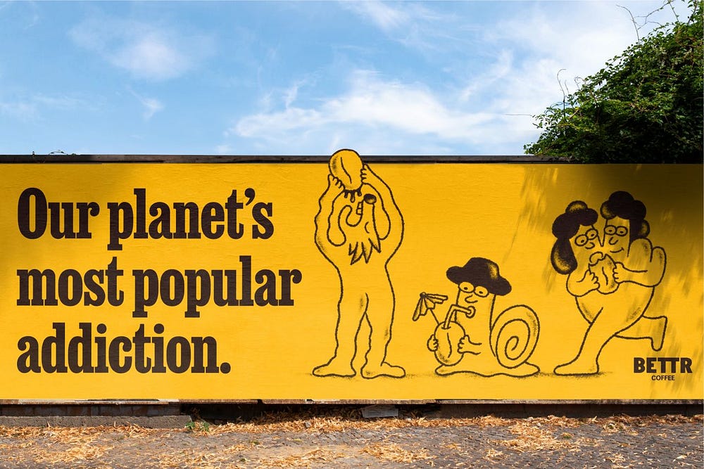
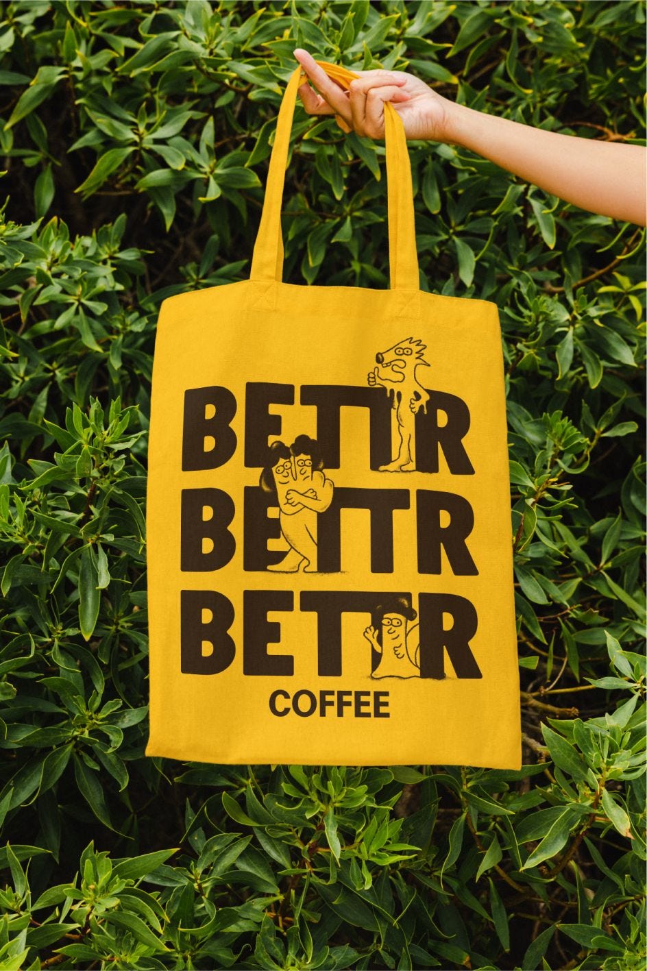
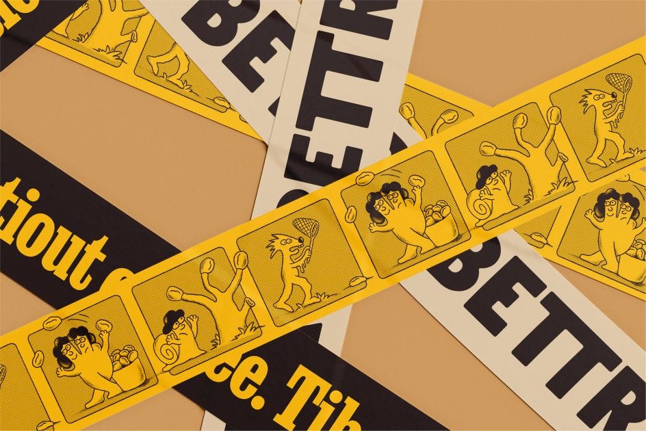
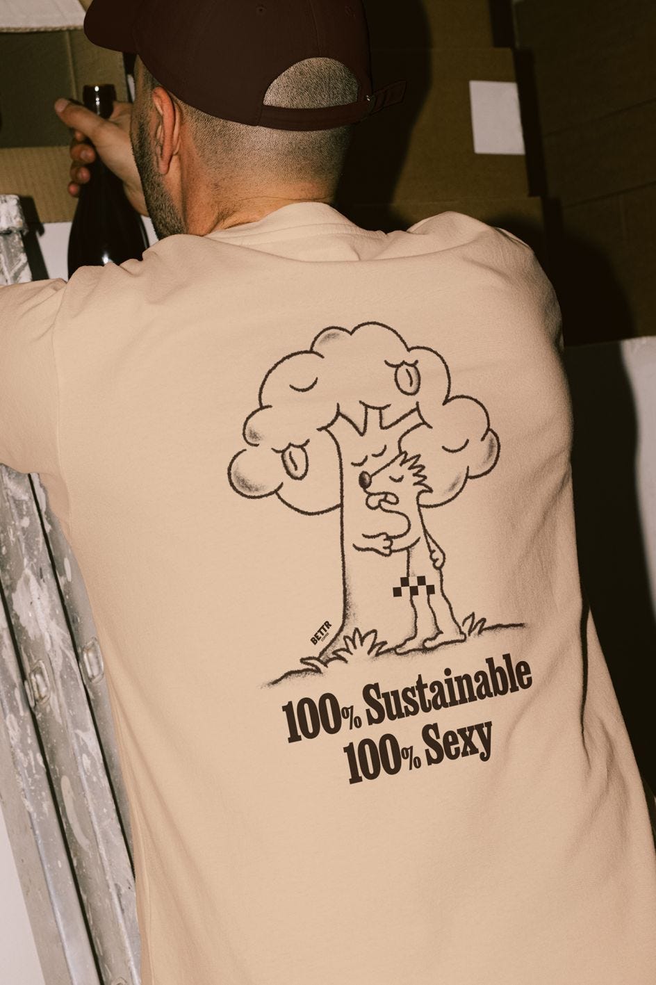
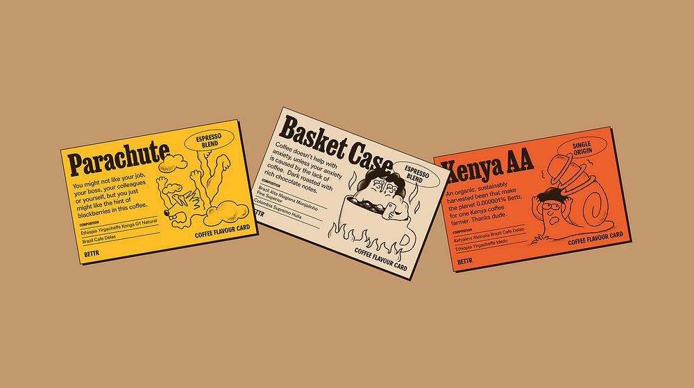
 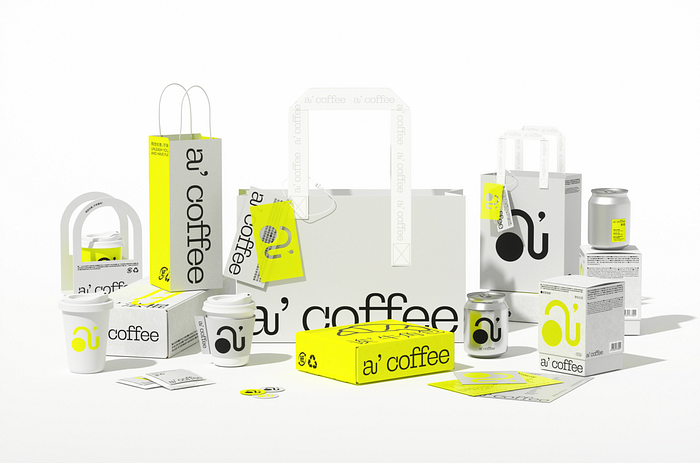 a’ coffee brand design by


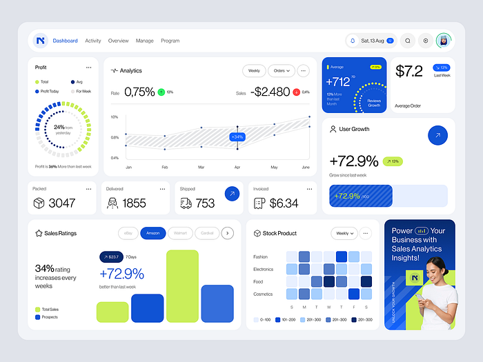
 Sugar CRM — SaaS UX UI Design by
  WELCOME TO MY WORLD by
  Based on a true story by
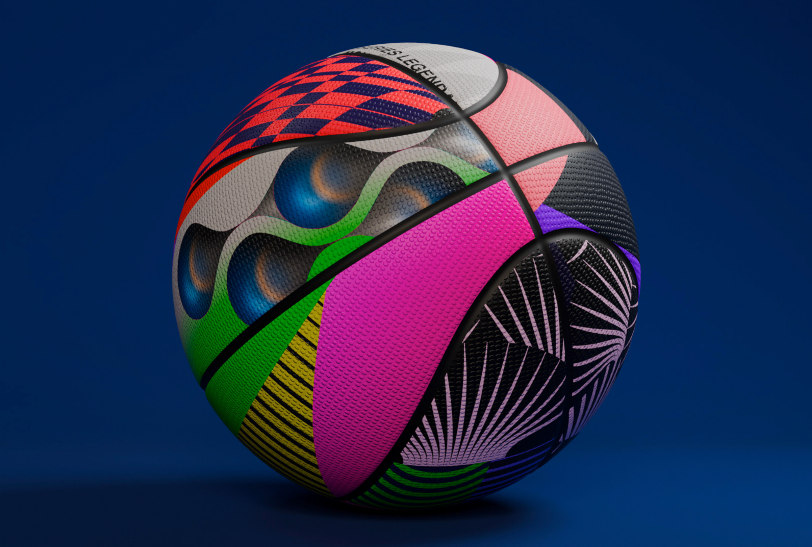
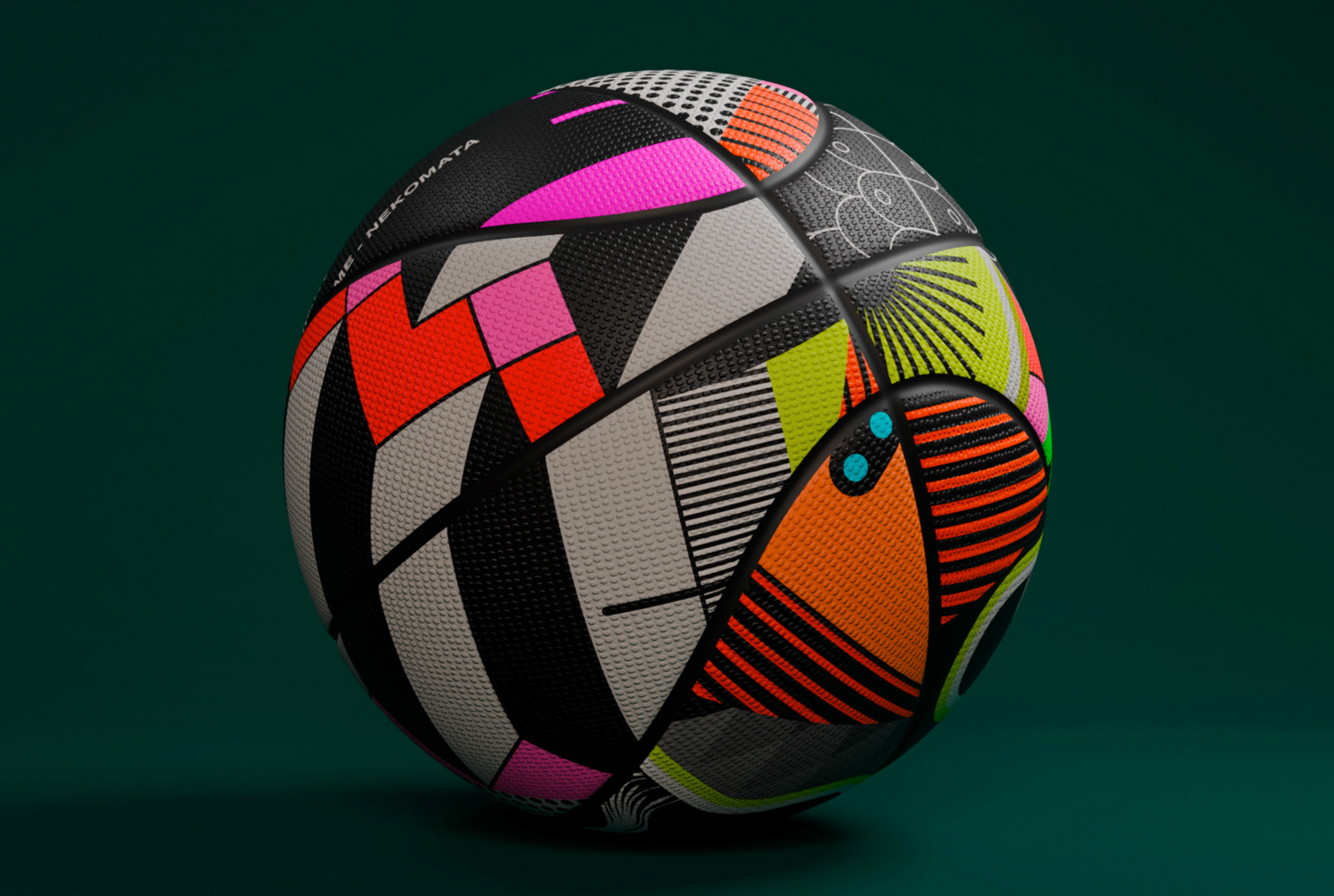
 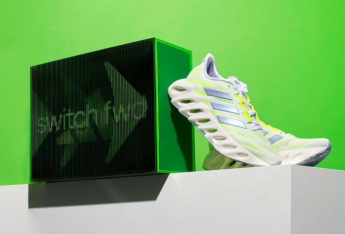 adidas switch fwd kit by
 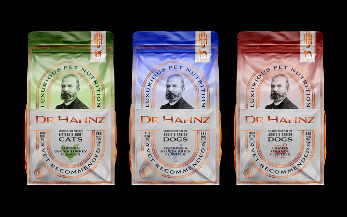 Dr Hahnz Brand Reinventing by
 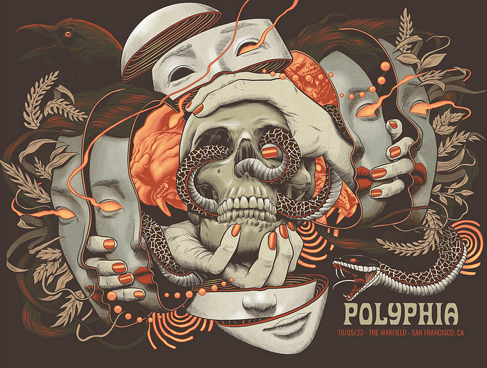 Gig Posters 2023 by
 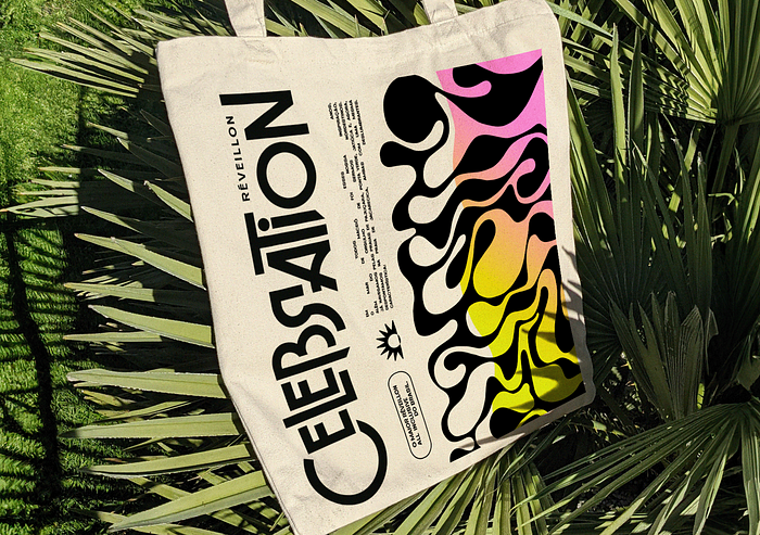 Réveillon Celebration | Visual Identity by


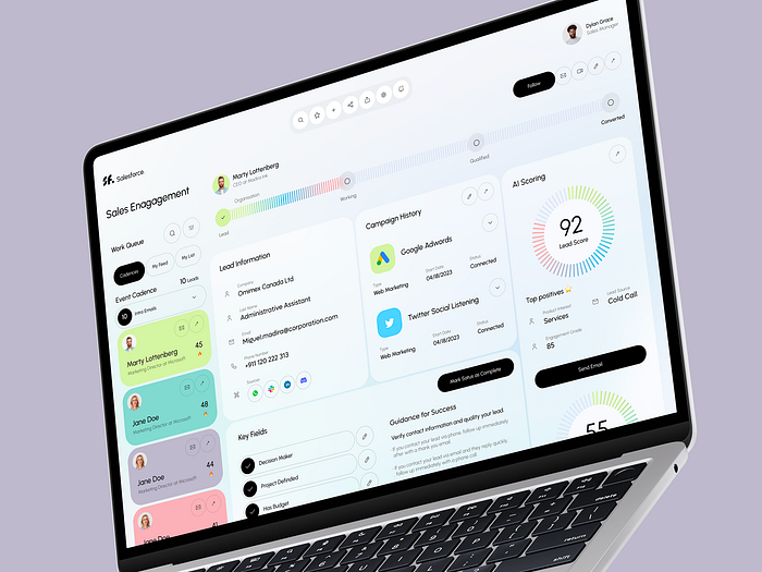 Salesforce CRM — Sales Engagement Platform by
  ‘SURFACE PLAY’ by
  Wholesome by
 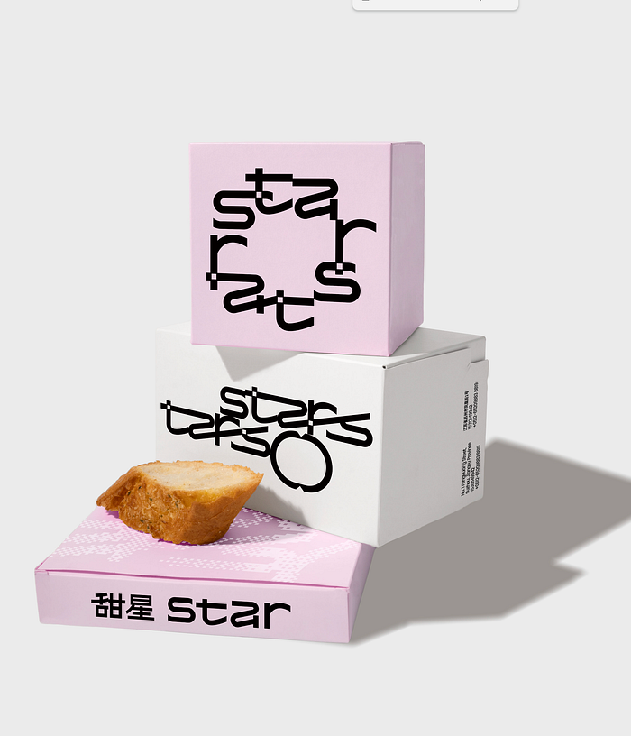 甜星Star | brand identity &packaging by


")


