")
A practical guide to building your personal brand as a designer in 2026. No hashtag strategies. No influencer playbooks. Just a system that works without making you hate yourself.
Let’s get the uncomfortable part out of the way. Most personal branding advice is terrible. It’s written by people whose entire personal brand is “giving personal branding advice.” It involves posting daily, building an “audience,” and using words like “thought leader” without irony. If that makes your skin crawl, good. You’re the target audience for this article.
Here’s the thing though: the concept behind personal branding is sound. It’s just been hijacked by LinkedIn gurus. Stripped to its core, personal branding is this: when someone mentions your name in a Slack channel, what do the people who’ve never met you think? That’s your brand. You already have one. The question is whether you’re shaping it intentionally or letting it form by accident.
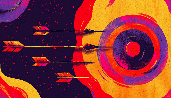
For designers specifically, this matters more than ever. The 2026 job market is competitive. Freelance clients have options. Conference organizers have options. The designers who get opportunities aren’t always the most talented. They’re the ones people think of first. That’s not a talent problem. It’s a visibility problem. And it’s solvable without becoming someone you’d unfollow.
Why Designers Need a Brand (Not Just a Portfolio)
Your portfolio shows your work. Your brand shows your thinking.
A portfolio is reactive. Someone searches, finds you, reviews your cases studies. That’s a job application model. It depends on being discovered at the exact moment someone is looking.
A brand is proactive. It creates familiarity before anyone needs to hire you. When a design director hears your name, they already have an impression: “She’s the one who writes those sharp critiques of SaaS onboarding flows” or “He’s the design systems person who posts those Figma teardowns.” That impression was built over time, not in a single portfolio visit.
We covered this territory in Beyond the Pixel, exploring why your portfolio needs more than great work. This article picks up where that one left off, with the practical system for building visibility without losing your integrity.
The gap between “great designer with no presence” and “good designer with strong presence” usually favors the second person. Not because the world is unfair (it is, but that’s not the point). Because people hire, recommend, and collaborate with people they feel they already know.
The DNA Framework: What Makes You Recognizable
Personal branding for designers breaks down into three elements. Call it the DNA Framework:
D: Design Philosophy. What do you believe about design that not everyone agrees with? This isn’t your bio (“I’m passionate about creating meaningful experiences”). It’s your actual point of view. “I think most design systems are over-engineered.” “I believe prototyping in code is faster than prototyping in Figma for most teams.” “I think designers should own their product metrics, not just their mockups.” A philosophy gives people something to agree or disagree with. Both responses build recognition.
N: Niche Focus. What’s the specific domain or skill where you go deeper than most? “UX design” is not a niche. “Enterprise data visualization for financial products” is. “Mobile design” is not a niche. “Gesture-based navigation patterns for health apps” is. Niche doesn’t mean narrow. It means specific enough that when someone has that exact problem, your name comes up.
A: Artifacts You Produce. What do you put into the world beyond client work? Artifacts are the evidence of your thinking. They can be LinkedIn posts, case study breakdowns, Figma community files, short tutorials, conference talks, or even well-crafted replies in design communities. The format matters less than the consistency. One artifact per week, every week, for six months will build more recognition than a viral post that people forget in 48 hours.
Most designers have strong D. Some have clear N. Almost none produce regular A. That’s the bottleneck.
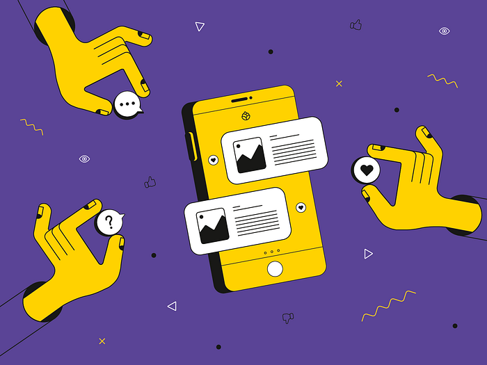
Platform Strategy: Where to Show Up (And Where Not To)
The biggest personal branding mistake designers make is trying to be everywhere. You don’t need to be everywhere. You need to be consistent somewhere.
LinkedIn: Yes, seriously. The design community’s relationship with LinkedIn is complicated. The platform feels corporate. The content can be performative. But in 2026, it’s where hiring managers, recruiters, and potential collaborators actually spend time. A well-crafted LinkedIn post about a design decision you made reaches more relevant people than a polished Dribbble shot. Focus on: process breakdowns, tool opinions, lessons from real projects, short design critiques. Skip: motivational quotes, “I’m humbled to announce” posts, anything with the word “journey.”
Your personal site. Non-negotiable. Not just as a portfolio, but as a home base that connects everything. Your site should answer: who are you, what do you care about, what’s your work, how to reach you. Keep it simple. Update it quarterly, not daily. The best designer personal sites in 2026 feel like a well-organized room, not a content platform.
Twitter/X: Optional but powerful. If you enjoy short-form, opinionated writing, Twitter is where design conversations happen in real time. The format rewards sharp takes, quick reactions to new tools or trends, and genuine engagement with other designers. If you don’t enjoy it, don’t force it. A miserable Twitter presence is worse than no Twitter presence.
Dribbble/Behance: Declining for brand-building. These platforms still work for discovery (someone searching for “dashboard design” might find your work). But they’re not where relationships form. If you’re actively looking for freelance clients or agency work, keep your profiles updated. If you’re building a long-term brand, invest that time in LinkedIn or your own site instead.
Substack/Medium: If you write long-form. If you enjoy writing 1,000+ word articles about design, these platforms give you distribution. But writing is a commitment. A blog with three posts from 2024 looks worse than no blog at all. Only start if you can commit to at least two pieces per month for six months.
The rule: pick two platforms. One primary (where you create), one secondary (where you engage). Do those two well for a year before adding a third.
Content That Builds Authority (Without Sounding Like a Thought Leader)
The word “content” makes designers cringe because it implies performing for an audience. Reframe it: content is just sharing your thinking in public. You do this in Slack channels and team meetings every day. The only difference is writing it down for a wider audience.
Five content formats that work for designers:
1. Process breakdowns. Take a design decision you made this week and explain your reasoning. Not the whole project. One decision. “We chose a bottom sheet over a modal for this settings panel, and here’s why.” This takes 15 minutes to write and demonstrates real-world judgment.
2. Tool opinions. “I switched from X to Y and here’s what happened.” Designers love hearing how other designers work. These posts get engagement because everyone has an opinion about tools. Be honest. Say what didn’t work too.
3. Design critiques. Pick a public product (an app, a website, a feature launch) and break down what works and what doesn’t. Be specific, be fair, and always explain what you’d do differently. This shows taste and reasoning simultaneously.
4. Micro-tutorials. Quick “here’s how to do this one thing in Figma” posts. They’re useful, shareable, and position you as someone who helps others. The bar is low: a 4-image carousel showing how to set up auto layout for a specific pattern can outperform hours of written content.
5. Honest reflections. What failed this quarter. What you learned from a bad client experience. What you’d tell yourself two years ago. Vulnerability done well (specific, not performative) builds trust faster than expertise alone.
What doesn’t work: generic design “tips” that everyone already knows, hot takes with no substance, humblebrags disguised as lessons, and anything that starts with “Most designers don’t know this.”
Visual Consistency Across Platforms
You’re a designer. Your profiles should look like you care. This doesn’t mean a full brand identity with a logo and a style guide. It means coherence.
Quick wins that take less than an hour:
- Same profile photo everywhere. Recent. Professional enough. Not a logo, not an avatar, not a photo from 2019.
- Consistent name formatting. If you’re “Sarah Chen” on LinkedIn, don’t be “s.chen.design” on Twitter. People should recognize your name across platforms.
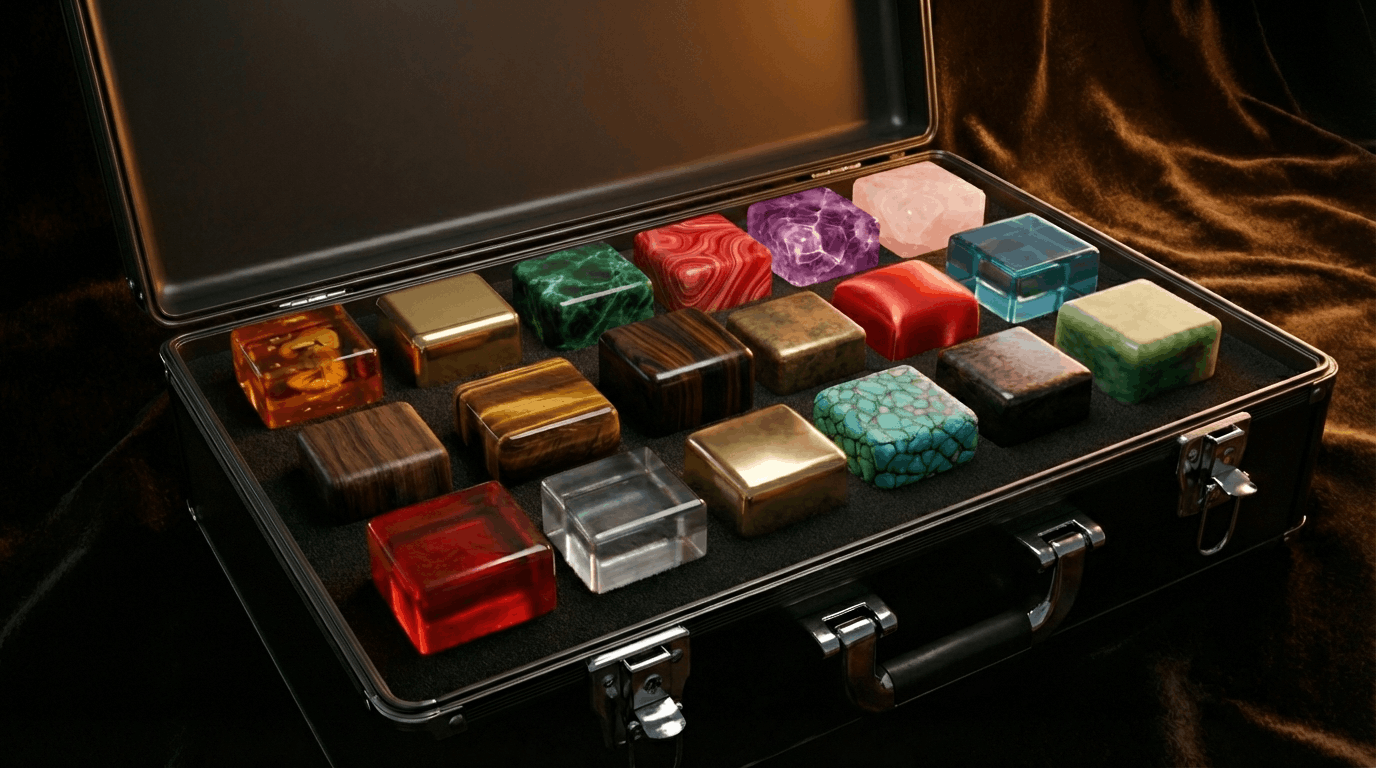
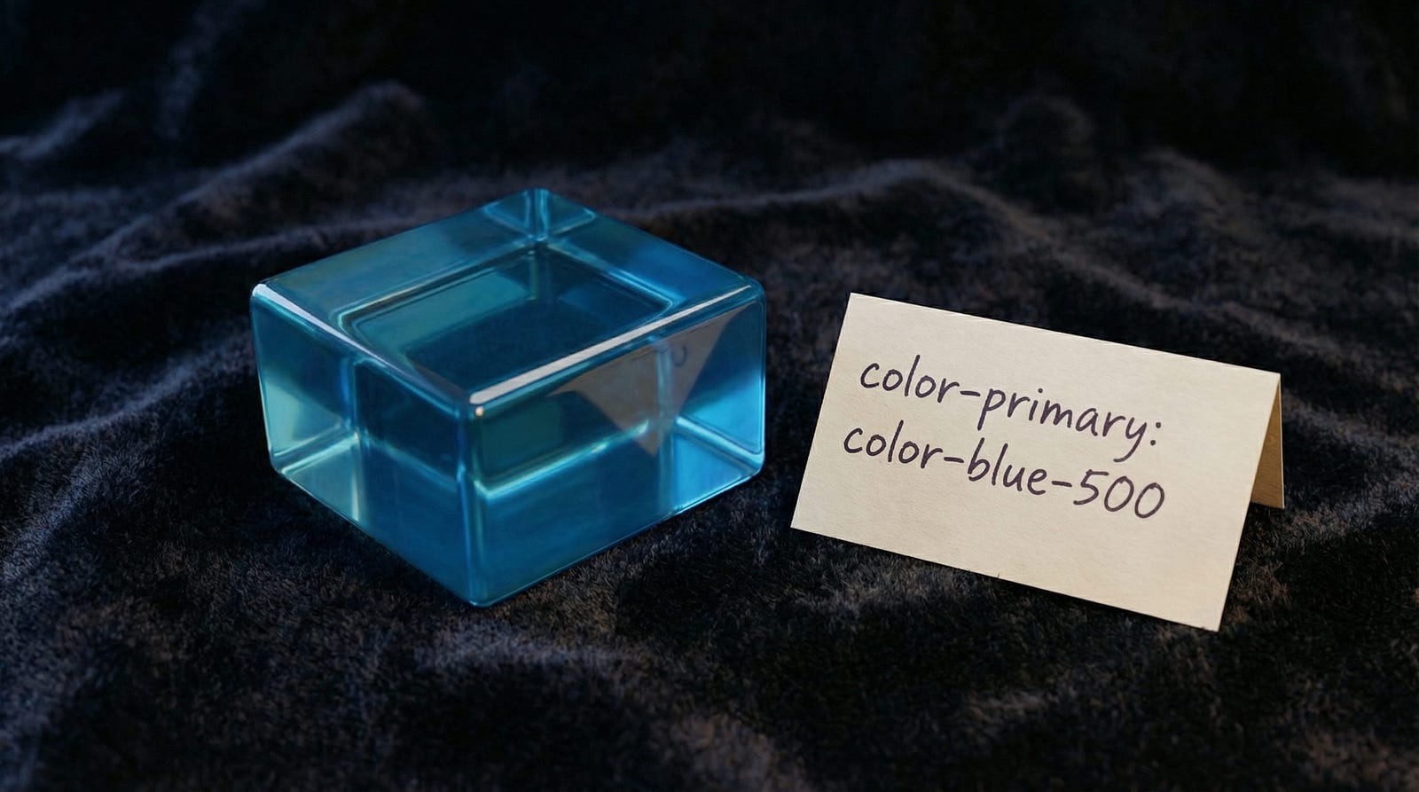
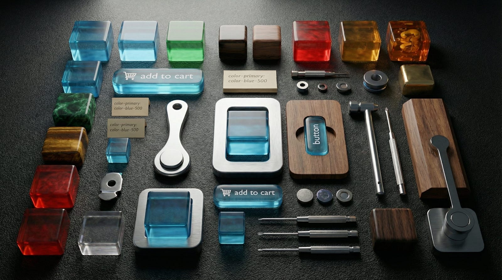
- One color. Pick a single accent color and use it in your banner images, portfolio, and social graphics. This sounds minor. It’s not. Visual consistency across platforms creates subconscious recognition.
- One typeface for graphics. When you make social posts with text overlays, use the same font. Every time. This is the cheapest brand consistency you can buy.
- Bio alignment. Your one-line description should be recognizably the same everywhere, adapted for format but consistent in positioning. “Product designer specializing in complex B2B interfaces” should be the thread, not “creative thinker / pixel pusher / coffee addict” on one platform and “Senior UX Designer at Company” on another.
The goal isn’t perfection. It’s recognition. Someone who sees your LinkedIn post and then visits your portfolio should feel like they’re meeting the same person.
The Cringe Test: How to Know If You’ve Gone Too Far
Personal branding goes wrong when it stops being about your work and starts being about your brand. Here are the warning signs:
- You spend more time on your LinkedIn post about a project than you spent on the project itself.
- You describe yourself as a “thought leader” in your bio. (If you have to say it, you’re not one.)
- You use the phrase “personal brand” in conversation with other designers. Just say “my work” or “my presence.” The terminology reveals the performance.
- You optimize content for engagement metrics rather than genuine usefulness. A post that 500 people liked but nobody learned from is noise.
- You avoid sharing opinions that might lose followers. If everyone agrees with everything you post, you’re not saying anything interesting.
- You repost your own content with “In case you missed this.” Nobody missed it. They scrolled past it.
The litmus test: would you share this post if nobody could see how many likes it got? If yes, share it. If no, reconsider.
From Portfolio to Platform: Building Your Creative Identity
Your portfolio shows what you’ve done. Your personal brand shows how you think. But where does it all live?
The fragmentation problem is real. Your work is on your portfolio. Your opinions are on LinkedIn. Your visual style is on Dribbble. Your code experiments are on GitHub. A recruiter or potential collaborator has to visit four different URLs to understand who you are. That’s four chances for them to get distracted, lose interest, or form an incomplete picture.
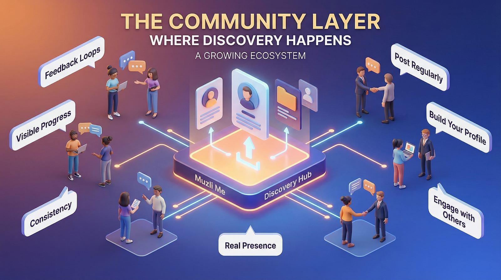
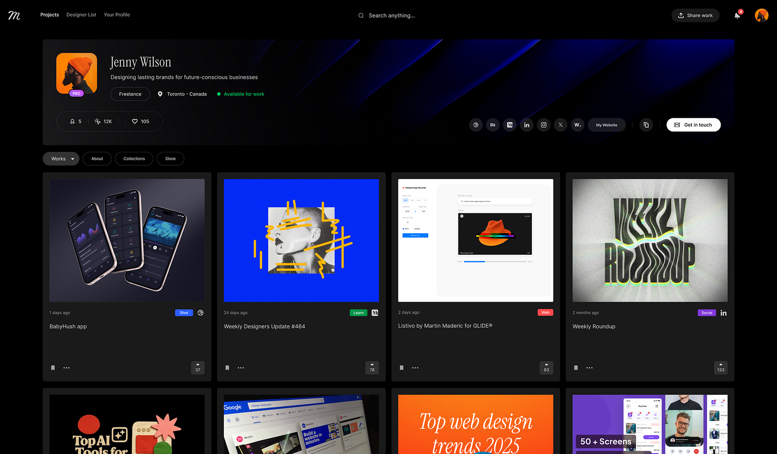
This is exactly the problem that tools like Muzli Me are designed to solve: a single place where your creative identity comes together. Your work, your influences, your expertise, your point of view, all connected in one coherent profile. Think of it as the connective tissue between your portfolio, your social presence, and your professional reputation.
The principle behind it is simple: make it easy for someone to understand you. The easier you are to understand, the more likely you are to be remembered. And being remembered is the entire point of having a personal brand.
Personal branding isn’t about being loud. It’s about being findable, recognizable, and clear about what you bring to the table. Do that consistently, and the opportunities find you.
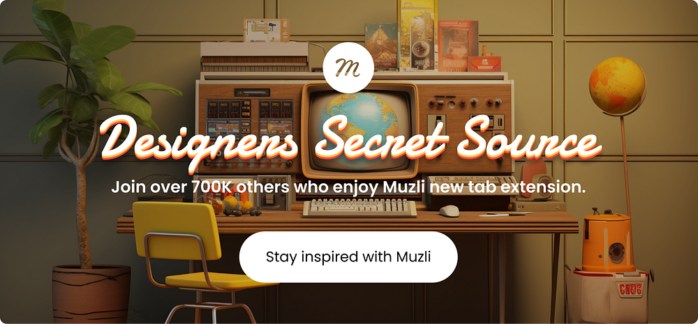
Discover more design career resources and build your creative identity at Muzli
……
💡 Stay inspired every day with Muzli!
Follow us for a daily stream of design, creativity, and innovation.
Linkedin | Instagram | Twitter

")


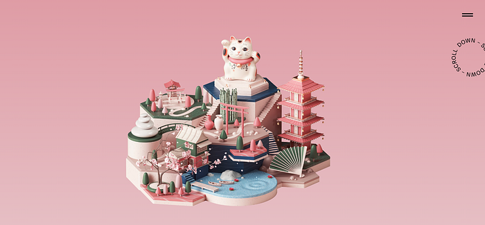
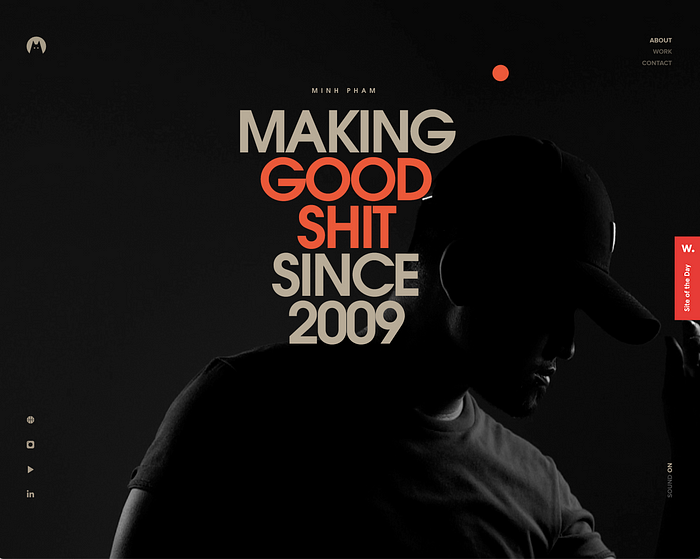
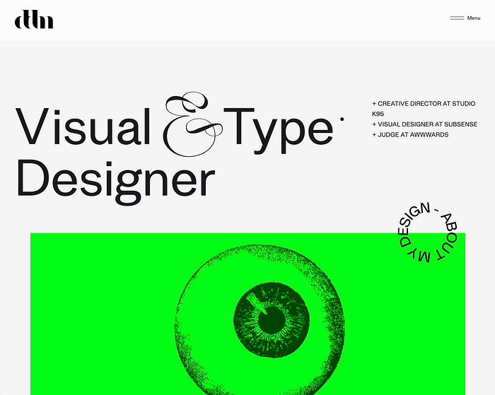
 Impressive portfolio by
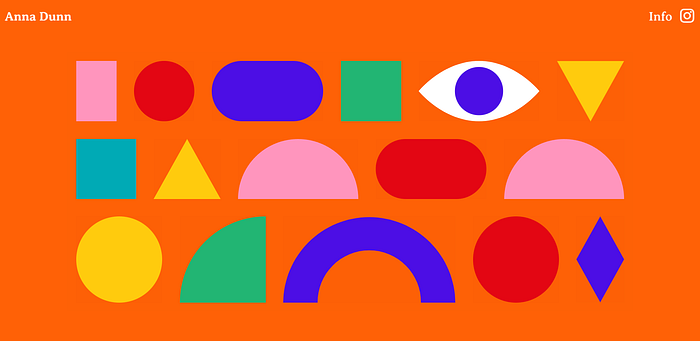
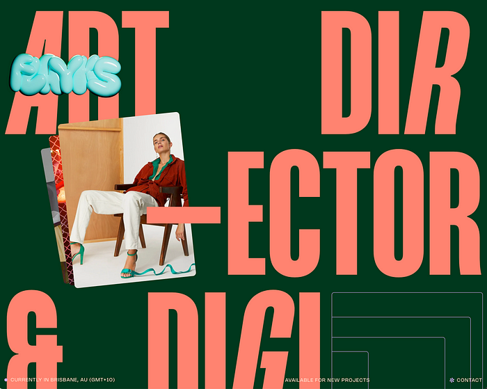
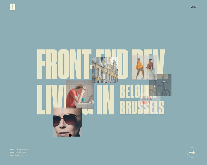
 Web design project by
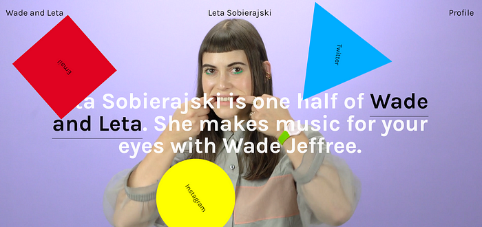


")
 Good luck trying to stand out in Times Square. Owen Barker ©
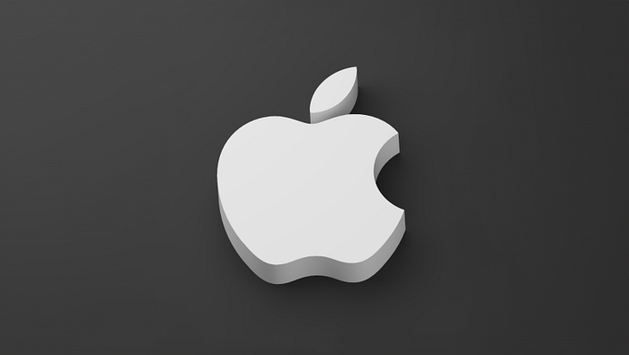
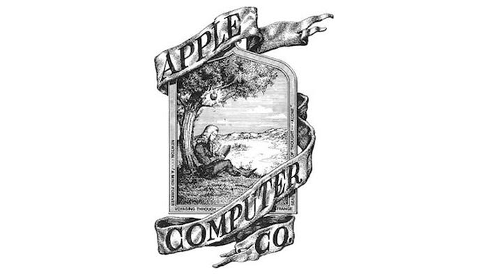 Did you know that the first Apple logo featured Isaac Newton sitting under the apple tree?
 Blue is by far the most popular colour choice for logos.
 We gave one of the generators a go. What do you think about the results?
 Wood Mood by No5 Istanbul
 The Makers by
  Saga Noren by
  Mononova by
  Tacos Del Alma by
  Sao Gerald by
  Grin by
  Joyful Woof by
  Curv Studio by
  Legg by
  Ballpark by
 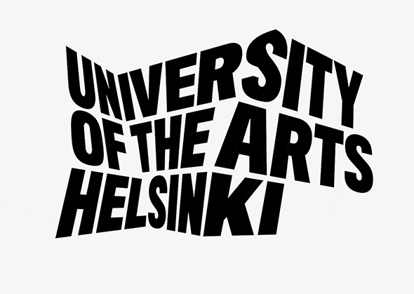 University of the Arts Helsinki by
 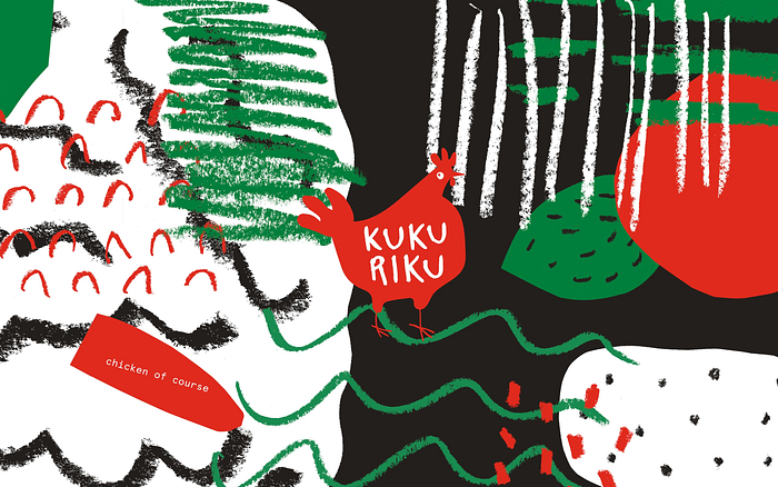 Kukuriku by
 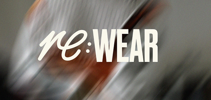 Re:Wear by
 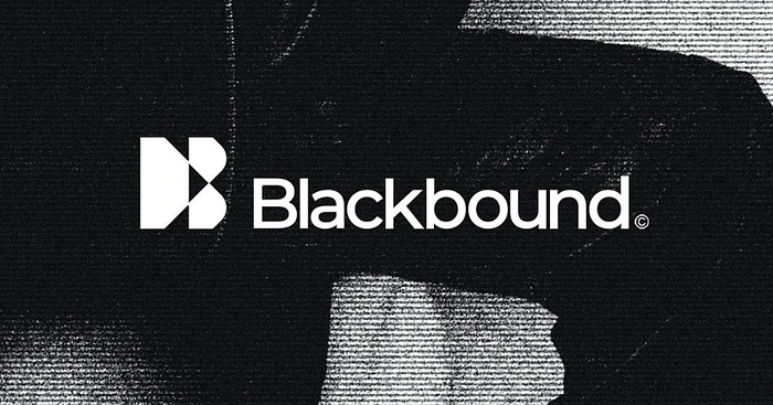 Blackbound by
  The Frida Cinema by
  Offe by
  Zapier by
  Tilda by
  Woove by
 Cubic by
  Squirrels by
  Fluency by
  Mosaica by
  Jetter by
 Article by