Grab a coffee, this one is long. Design process is a big subject and I have opinions about it. The TL;DR below doubles as a menu, so tap the part you came for.
TL;DR
- 💎 The Double Diamond lost its own author in 2023. Richard Eisermann led the Design Council team that drew it. On its twentieth anniversary he wrote that it probably no longer fits, and named generative AI as one reason.
- 💸 The process was a price tag, and the price changed. You researched for weeks because building the wrong thing cost months. Two AI models recently built my three studio briefs in 8 to 81 minutes each. One did all three for $1.88.
- 🔁 Designers now make first and decide second. The designer who led design for Claude says mocks fell from about two thirds of her time to about a third. In a survey of 1,478 designers, the most-used tool after Figma is Claude.
- 💍 So I drew a new diagram and called it the Diamond Ring. One small diamond, where you make many and choose one, set on a loop of build, launch, measure and learn. Taste sits in the middle.
- 🏗️ How we build things at Muzli. Prototype the same day, launch to half, put telemetry on everything, and read the results like pessimists.
- 🧠 Design thinking survives as two questions. Are we making the right thing, and did we make it well? The paperwork around those questions is what is dying.
- 🏆 Taste is mileage, and yes, this is where I sell you Muzli. You learn what good looks like by seeing a lot of it, every day.
- 🌱 Starting out? Build real things, and don’t let the tool do your learning. In an Anthropic trial, people who had AI do the task scored 17% lower on a quiz about what they had just built.
- 🎖️ Twenty years in? Your judgment went up in value and your rituals went down. Seniority is no obstacle. Leads and principals build with AI far more than designers without a lead title.
- 🧰 A short tool stack, nine habits and five prompts to paste. One tool per job, and the habits matter more than the tools.
OK. Let’s start by remembering what designers have actually been doing all these years.
If you have worked in design for longer than a week, you have seen the picture. Two diamonds, side by side.
It is called the Double Diamond, and it is the best-known drawing of how design is supposed to happen. It has four steps, and all four start with a D:
- Discover. Go and research the problem. Talk to people.
- Define. Boil that research down to one clear problem.
- Develop. Come up with lots of possible answers.
- Deliver. Pick one, finish it, ship it.
Each diamond opens wide and then narrows. First you collect, then you choose. You do that once for the problem and once for the solution.
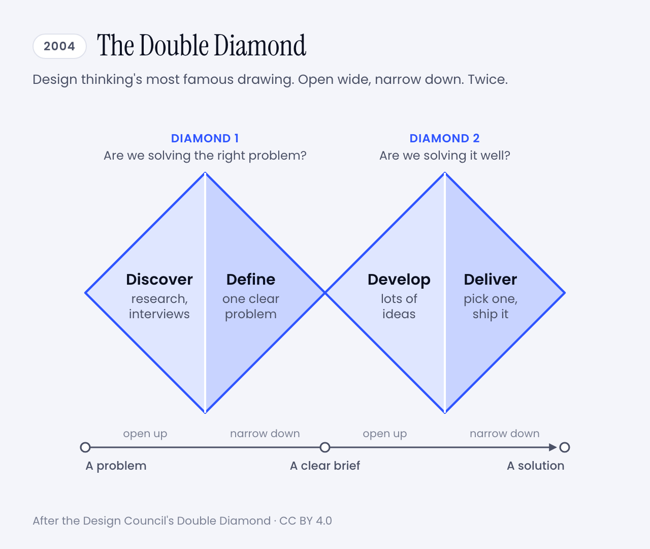
This is design thinking in its most famous form, the method most of us were taught and have been using for years. I certainly have. Research first, sticky notes second, pixels much later. If your portfolio has a slide with personas on it, you know the family.
And it worked. For twenty years this was how we explained ourselves, planned projects and won budgets.
Then, one afternoon, a product manager typed a paragraph into a box and had a working prototype before the meeting ended. Nobody discovered or defined anything. The diamonds never came up.
I did not invent that scene. In Anthropic’s launch post for Claude Design, a product manager at Datadog says the team now goes from a rough idea to a working prototype before anyone leaves the room.
No wonder the question got loud. In March, Lenny’s Podcast, an interview show for people who build software products, gave an episode the title The design process is dead.
So is it? And is design thinking going down with it?
I have been designing and building software for more than twenty years, and I have seen a few tectonic shifts in that time. Flash died. Phones ate the desktop. Photoshop gave way to Sketch, and Sketch to Figma.
Each one felt like the end of the craft for about six months. Then it was simply how we worked.
So my short answer is no. The useful answer is longer, and it comes with a plot twist. The man who led the team that drew those diamonds stopped defending them three years ago.
Here is the route. First where the process came from and what broke it. Then how good designers work now, a new diagram to replace the old one, and how we do it at Muzli. Then advice, in two letters. One is for beginners and one is for people who remember slicing PSDs. Tools and prompts wait at the end.
Sixty seconds of vocabulary
One pit stop before the story, so nobody gets lost later.
- Design thinking. The workshop method that IDEO and Stanford’s d.school spread in the 2000s: empathize, reframe the problem, brainstorm, prototype, test, implement. The one with the Post-its.
- Mock and prototype. A mock is a picture of a screen. A prototype is something you can click. A code prototype is the real thing, unfinished.
- Agent. An AI that takes steps on its own instead of only answering. It opens files, writes code, runs it, looks at the result and tries again.
- Vibe coding. Building software by describing what you want to an AI and running the code it writes without reading every line.
- Brief. What you hand the AI. The same thing you would hand a freelancer, and just as decisive.
- Rules file. A plain text file that holds your design rules, so the AI reads them every time. You will meet it as CLAUDE.md, DESIGN.md or a skill.
- Design system. The shared kit a product is built from: colours, type, spacing, components.
- A/B test. Show version A to half of your users and version B to the other half, then see which half does better.
- Telemetry. Counters built into a product that tell its makers what people did with it.
That is the whole glossary. Back to the diamonds.
💎 What changed: the diagram lost its author first
The origin story matters here, so bear with me for a minute.
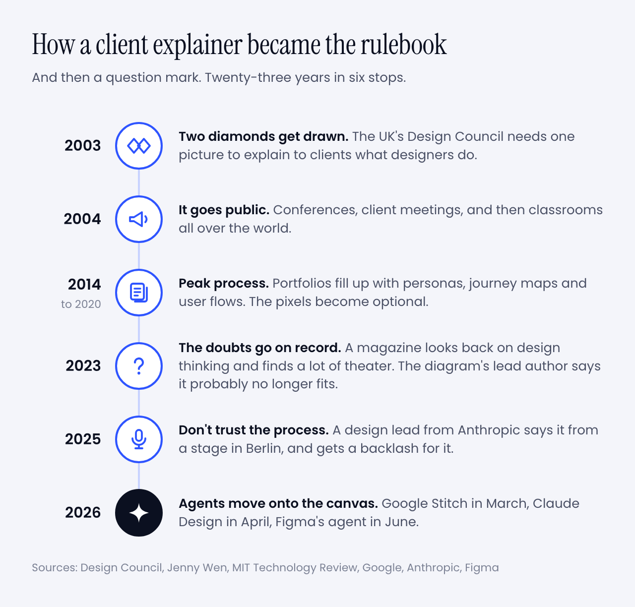
In 2003 the UK’s Design Council had an awkward problem. It was telling businesses to take design seriously, and it had no standard way to describe what designers do.
Its new director of design and innovation was Richard Eisermann, a designer who had worked with Ettore Sottsass in Milan and then at IDEO and Whirlpool. He put the question to his team. They reviewed their own projects, borrowed from forty years of earlier models, and came back with two diamonds and four words picked to be easy to remember.
Now look at what it was for. Eisermann has written that the goal was a framework to help clients understand the work. It had to be quick to get through and easy to remember, and nobody was supposed to get precious about it.
Then the explanation became the job.
I lived through the middle of that timeline. You probably did too.
Jenny Wen led design for Claude at Anthropic and ran the FigJam and Slides teams at Figma before that. In an essay from 2024 she dates the peak to 2014 through 2020. Portfolios stopped showing the product and started showing journeys, flows, personas and user stories. Proof that someone had followed the process. The pixels became the unserious part.
Design thinking was getting the same treatment. In February 2023, before any of today’s design agents existed, MIT Technology Review looked back on two decades of it. It found agencies that ran the workshops, handed over recommendations and left before anything shipped. It also had a name for box-ticking that changes nothing: innovation theater.
And now the twist I promised.
Three months later, for the diagram’s twentieth anniversary, the Design Council published a piece by Eisermann himself, asking whether the Double Diamond was still fit for purpose. His answer took two words: “probably not”.
His reasons read like a forecast. The diagram is a straight line. It has no step for measuring whether the design worked. And generative tools, he wrote, let you begin anywhere, by putting a finished-looking thing on the table and asking what if.
The tools he had in mind were ChatGPT and Midjourney, which tells you how long ago 2023 was. This year alone, Google Stitch became a design canvas with an agent in it, Anthropic shipped Claude Design, and Figma put an agent into every paid plan.
My favourite detail is in Google’s announcement for Stitch. It says you can skip the wireframe and start from the business goal and the feeling you are after. A company that size is now selling the reversed order as a feature.
So the diamonds were wobbling long before AI. Why did AI finish the job? Follow the money.
💸 The process was a price tag
Measure twice, cut once is good advice when wood is expensive. The Double Diamond is that advice with better typography.
You spent weeks discovering and defining because building was the costly part, and building the wrong thing meant months gone. The process was insurance.
Simon Willison did the arithmetic after watching Wen’s talk. A wrong direction used to waste months of development. With AI doing the building it wastes days, so you can afford more risk and more exploring.
For a first version, even days is out of date. I know because I timed it.
In September I wrote three briefs, the kind a studio gets from a client: a product website, a title sequence and a gesture prototype. Claude Opus 5.5 built each one in 50 to 81 minutes. A week later GPT-6.1 Sol built the same three in 17, 8 and 11 minutes, for $1.88 in total. Nobody at Muzli edited the results.
Here is one of them. Go on, scroll it.
Vendors tell the same story through their customers. That Datadog product manager says a week of briefs, mockups and review rounds turned into a single conversation. It is a testimonial in a launch post, so season to taste. My stopwatch agrees with it anyway.
When the cut is nearly free, you stop measuring twice. You cut five times and keep the best one.
That is the whole change. Everything else in this article follows from it.
One caution before I get carried away. The wood got cheap, and the room it has to fit in stayed the same size. A user’s attention costs what it always did. So does the trust you burn by shipping something half right. I’ll come back to that, because it is the reason design thinking is not going anywhere.
But first, the fun part. What does a designer’s week look like now?
🔁 How people design now
Let’s start with one person’s week, because she was kind enough to put numbers on it.
Wen told Lenny’s Podcast that a few years ago 60 to 70% of her time went to mocking and prototyping. Now it is 30 to 40%. Another 30 to 40% goes to sitting with engineers while they build. And a new slice is writing code herself, the last-mile polish designers used to file tickets about.
Then: mocks 60-70% · with engineers ~20% · meetings ~10%
Now: mocks 30-40% · with engineers 30-40% · plus her own code
The rest of her picture is just as interesting:
- Vision shrank. The two-to-ten-year vision deck became a direction for the next three to six months, often delivered as a prototype.
- Research stayed. Her team has a researcher running studies and surveys, and everyone reads them. She still prototypes and still mocks. The proportions changed.
- Figma stayed too. She uses it to lay eight or ten directions side by side. A coding tool pulls you down one path and you get attached to it.
- Shipping moved earlier. Her team releases things early, labels them as previews and repairs them in public. She is blunt about the condition. It only works if the fixes keep coming.
She also says the classic process, the one designers were taught to trust, is basically dead, and that it was dying before AI arrived.
You could say that is one unusual team at an AI lab, and you would be partly right. So let’s look at everybody else.
Figma’s 2026 AI report draws on three years of surveys of designers, developers and product managers. In the last year the share of designers taking part in development doubled, to 41%. Developers doing design work went from 44% to 60%. Two years ago 7% said AI had meaningfully changed how their team works together. Now 41% say so.
Then there is the question of what designers open every week. UX Tools asked 1,478 of them this spring.
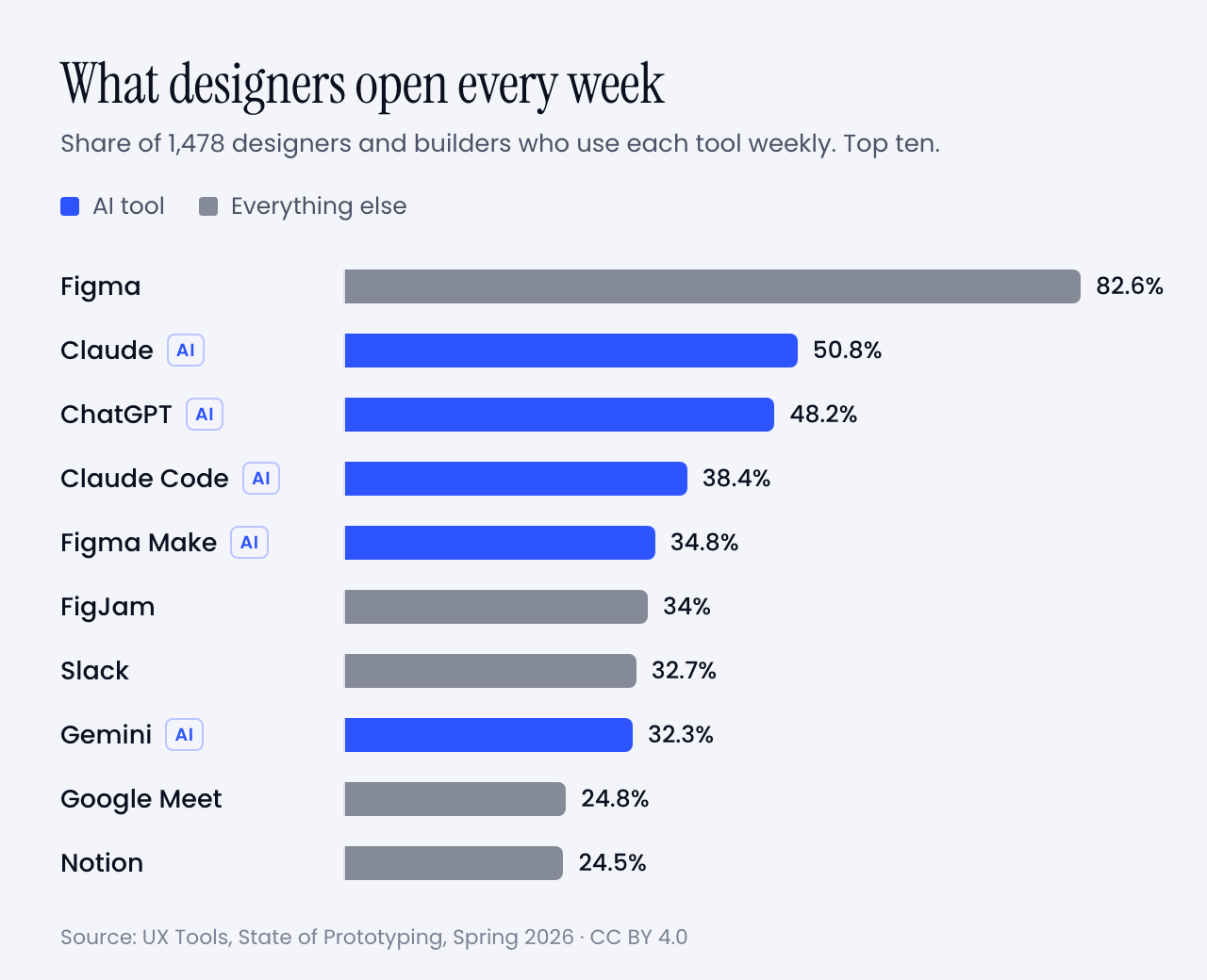
Read that sample with care. It came through a tools newsletter and its sponsors, several of which sell AI prototyping, so it leans toward the curious. Even so, a few numbers made me sit up:
- 59.1% built their own tool or app with AI in the previous six months.
- 71.1% added AI to their workflow or made it central in the same period.
- 1.4% trust AI output with no oversight. The largest group, 34.2%, treats it as a first draft to edit heavily.
- 37.7% have not started. Same companies, same Slack channels.
It is also messier than any of this sounds, and I would rather say so. Wen says keeping up is hard, for designers and engineers alike. In the same survey the top obstacle was time to learn the tools, at 55.7%. Too many tools came next at 53%, then the quality of what AI produces at 52.2%.
So the old diagram is retired and the new way of working is a bit of a blur. That felt like a job for a new diagram.
💍 So I drew a new one: the Diamond Ring
The Double Diamond got famous because it had a shape you could draw on a napkin and a name you could say in a meeting. The new way of working deserves the same courtesy. Here is my attempt.
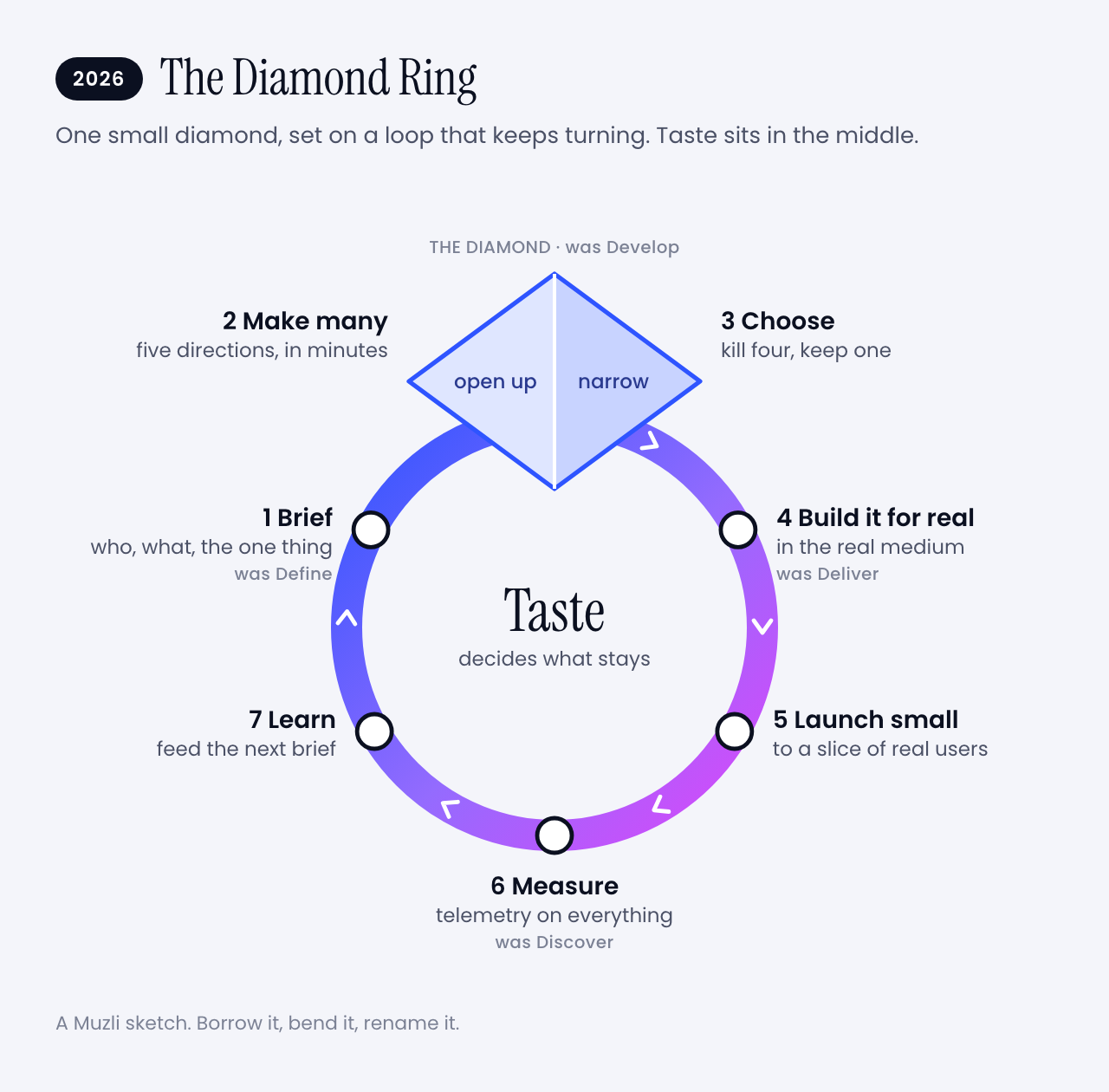
I kept one diamond, because opening wide and then narrowing down is still how good ideas happen. I made it small, because it now takes an hour instead of weeks. And I set it on a ring, because the work never reaches the right-hand edge of the page any more. It goes round.
The four old words are all still in there. They changed places. Let’s walk the ring.
✍️ 1. Brief
You write down who it is for, what it has to do, the one thing people should remember and what you refuse to ship. Twenty minutes, one page. This used to be called Define and it came second. Now it comes first, and everything after it is only as good as this page.
🌀 2. Make many
Ask for five directions that disagree with each other. Then five more. This is the opening half of the diamond, and it used to be the part budgets killed. Anthropic pitches Claude Design on exactly this. Designers usually explore two or three directions because that is all the schedule allows.
✂️ 3. Choose
Kill four out of five. Wen’s thesis is that once making is open to everybody, the skill is in choosing and curating. Nobody can do this part for you, and it is where the design happens. The old diagram never drew it.
🔧 4. Build it for real
Take the survivor into the real medium. Fix the spacing yourself. Tune the motion in code. The handoff ceremony goes away because you are already standing in the code.
🚀 5. Launch small
Ship it to some of your users, with a label that says it is early. Wen’s team does this in public and keeps the fixes coming. At Muzli we show a new thing to half of new users and keep the other half as they were. More on that in a minute.
📏 6. Measure
Count what people do with it. This is the step Eisermann said his own diagram forgot.
🔍 7. Learn
This is Discover, moved from the first step to the last, and it never stops. The Design Council’s own updated guidance allows for it. Early ideas can be built and tested as a way of discovering. For AI products there is no alternative. Wen points out that you can’t mock every state of something that answers differently each time.
You still talk to people first when you know nothing about them. What stopped is waiting for the research to finish before anyone is allowed to make something.
Then you go round again, with a better brief.
And the middle of the ring? That is taste. It decides which of the five directions survives, which fix matters and when a thing is good enough to show. Hold on to that word. I am going to try to sell you something with it later.
It is a sketch, of course. Borrow it, bend it, rename it. Just please don’t turn it into a certification programme.
🏗️ How we build things at Muzli
That was the theory. Here is what it looks like in an ordinary week at Muzli, because we would feel like frauds selling you a ring we don’t wear ourselves.
1. We prototype in the real thing. Big changes still start in Figma. Small ones start as a working build, usually on the day the idea turns up, with Claude Code doing most of the typing. We review what runs. We rarely review a picture of it.
2. We launch to half. The Trending row in the Muzli new tab went from an idea to a live test in one day. Half of the people who installed Muzli after that got it. The other half did not, and they are our control group.
3. We test small things on purpose. Which category is ticked by default when you set up Muzli. Whether a row sits on the left or the right. Which store an install button opens. Usually a few of these run at the same time, and they are built so they don’t trip over each other.
4. Telemetry goes in before the feature does. Every experiment gets its own label in our analytics before the build ships. Every step of onboarding reports in. Every click knows which row and slot it came from. If we can’t measure a thing, it is not ready to launch.
5. We read the results like pessimists. Before a test starts, we work out how many people it needs and write down the date we will look. When a release seems to have helped, we run the same comparison on dates when nothing shipped. Embarrassingly often, nothing also gets a lift.
6. We let a flat result be an answer. One of our tests looked like a clear win after two weeks. Then we split it by install date, and the whole win came from three days of installs. It is still running. Plenty of tests simply come back flat, and that is fine. A flat result is a decision in three weeks instead of an argument for three months.
7. Where there is too little traffic for a test, we use judgment. Some pages will never get enough visitors. There we ship on taste, write down the numbers from before, and compare after.
None of this needs a big team. It needs the habit of asking what would prove you wrong before you get attached.
Which is, when you think about it, exactly what the two diamonds were trying to teach us.
🧠 Is design thinking still viable?
Time for the question in the headline. Yes, as a way to think. No, as a list of deliverables.
Being wrong got cheap in the prototype. It is as expensive as ever in production.
A wrong prototype costs you an afternoon. A wrong product still costs you users and their trust. NN/g, which is nobody’s idea of a hype shop, expects trust to be a major design problem for AI products this year, because people who were let down by one AI feature are slow to try the next.
That keeps the two questions at the centre of the diamonds alive. The first diamond asks whether you are solving the right problem. The second asks whether you solved it well. No tool has made either one optional.
What is dying is the paperwork around them:
- The persona with a stock photo and an alliterative name. Goodbye, Busy Brenda.
- The journey map made to be presented, then never opened again.
- The rule that nothing starts until discovery is finished.
- The handoff as a ceremony.
- The five-year vision deck.
Now for the part I find funny. The two loudest camps in this argument agree with each other.
Wen’s talk is called Don’t Trust the Process, and the conference that hosted it describes it as no rejection of research or strategy. NN/g’s State of UX 2026 says the jobs that remain will ask for judgment and range more than deliverables, warns against performing the rituals of design without results, and calls research more important than before.
One side says the process is dead. The other says design deeper. Both are telling you to stop producing proof of process and start producing judgment.
Why judgment in particular? Because everyone now gets the same first draft.
- Researchers have measured it. A study in Science Advances had 293 people write short stories, some of them with AI-generated ideas. Readers rated the AI-assisted stories higher, and the weakest writers gained the most, enough to catch up with the strongest. The strongest gained nothing. The AI-assisted stories were also more alike. It was stories, and interfaces may behave differently. The pattern will still look familiar.
- I saw it in my own tests. Opus 5.5 and GPT-6.1 Sol got the same title-sequence brief a week apart. An easing curve is the shape of an animation’s acceleration, and both models named one of theirs shunt. Both read the festival’s name, Offset, as a printing term. Neither had seen the other’s work.
- NN/g expects the same of interfaces. Before long, anybody will be able to produce one that looks fine until you get close.
AI raised the floor and left the ceiling where it was.
That is why 90% of the people Figma surveyed say design matters at least as much as it did before AI, and nearly six in ten say more.
One warning, from the person best placed to give it. Wen thinks AI will get better at taste, and that designers may be leaning on that word too hard. What she expects to stay human is narrower. Someone has to decide what gets built, and someone has to answer for it.
So don’t build a career on the claim that machines have no taste. Build it on being the one who decides.
Which raises a fair question. Where do you get the taste to decide with?
🏆 Where taste comes from (yes, this is where I sell you Muzli)
I have now used the word taste a dozen times, so let me be useful about it.
Taste is mileage. You get it by looking at a lot of good work, noticing why it is good, and doing the same again tomorrow. Nobody is born knowing why one landing page works and its neighbour does not.
That happens to be what Muzli has been doing for twelve years.
Muzli is a browser extension that puts design worth seeing into every new tab you open. It draws on Dribbble, Behance, Awwwards and hundreds of other sources, and people sort it every day. More than 900,000 people have signed up for it.
The sorting is the point. In 90 days this summer, 190,636 things came through Muzli’s pipes. Eyal Zuri, Muzli’s co-founder and creative director, gave 114 of them a Pick. The flood is the argument for the filter.
Put it next to the ring above. A model can make you fifty landing pages before lunch. Knowing which of the fifty is good is the part in the middle, and you train it one new tab at a time.
So yes, this is the ad break. It is also my honest answer to the question above.
Get Muzli, it is free. And when all these tools help you make something you are proud of, share it on Muzli Me and nominate it for a Pick. I care about the work far more than about which tool wrote the code.
Right. Two letters now. The first is for people at the start of the road.
🌱 If you are starting out
The market first, without sugar. NN/g says entry-level openings are still rare and hard to land, and that people hoping to get into UX will keep outnumbering them. It adds that if your work is assembling components from a design system, AI can already do it.
Now the good half of the story. Wen says most companies hire only seniors these days, and she thinks they are missing something. A newcomer who is humble, eager and has no rituals to unlearn is one of the three kinds of designer she most wants.
You have less to throw away than anyone else in the building.
Here is what I would do with that:
- Build real things and put them online. This is Wen’s whole advice to young designers: make a lot, share it, find people who do the same. A project that runs beats a case study about a project.
- Don’t let the tool do your learning. Ask it why, every time, and rebuild one thing by hand each week. The evidence for this one is below the list.
- Learn the fundamentals the tool can’t judge for you. Type, hierarchy, spacing, colour, accessibility. You can’t direct what you can’t name. If you can’t say why a layout feels off, all you can type is
make it better, and so can everyone else. - Look at great work every day. See the ad break above. I mean it, though.
- Learn the old process anyway, as questions. Know the Double Diamond. Run one real test with people who aren’t your friends. You will need the vocabulary in every interview, and the habit of asking who this is for never expires.
- Show the cuts. In your portfolio, show the five directions you killed and say why. Choosing is the skill nobody can generate. Keep the brief and the rejects.
- Go deep in one thing before you go wide. Wen’s other two profiles are the strong generalist and the deep specialist. Nobody starts as the first. Pick type, motion, illustration, research or code, get good enough that people notice, then widen.
About number 2. Anthropic ran a controlled experiment with 52 mostly junior engineers learning a new code library. The group with AI help scored 17% lower on a quiz about what they had just built, 50% against 67%.
The exception matters more than the average. People who used the AI to ask why and to get explanations averaged 65% or more. People who handed the whole task over averaged under 40%. Those groups were small, and the researchers call it a pattern rather than proof.
The trial also used code, so the jump to design is my bet. I would still make it. A gym only works if you lift the weight yourself.
One last number, and it is an encouraging one. In the UX Tools survey, students and people between jobs were the group least likely to call AI central to how they work, at 21.7%. At startups it was 38.8%. It is a small group in the sample, so hold it loosely. But the people competing for the scarcest jobs appear to be using the tools least, and that is a gap you can close in a month.
And now the second letter, for my own generation.
🎖️ If you have been doing this for twenty years
First, the irritation is reasonable. Wen says her talk drew a backlash from people whose careers rest on the old process. NN/g lists being told you will be replaced unless you vibe code among the things practitioners are tired of hearing. Both are fair. Neither changes the arithmetic.
Happily, the arithmetic is kinder than the mood. Seniority is no obstacle. In the UX Tools survey, 56.8% of leads and principals spend half or more of their building time on AI-generated code. Among designers without a lead title it is 35%. Managers sit at 46.6%.
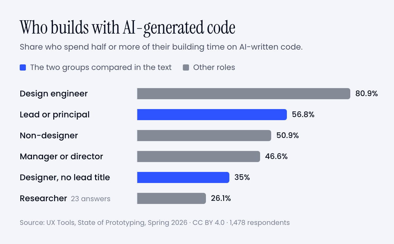
So the old dogs are learning the trick faster than the young ones. And look at what you already own that just went up in value:
- A library of what good looks like, built from thousands of decisions.
- The reflex to ask who it is for before asking what it looks like.
- Scars. You know which pretty ideas die in production, and why.
- The standing to say no in a room, and to answer for it afterwards.
What to put down: the handoff, the gate, the deck, and the belief that pixels in code are someone else’s job.
And what to pick up:
- Don’t learn React. Learn the tools. That is Wen’s advice to senior designers. You don’t need to build from scratch. You need the coding tools in your kit. Start with the last mile. Fix the spacing yourself and see what happens to your Tuesday.
- Write your taste down. Your instincts are an asset only when the machine and the team can read them. Put them in a rules file. Twenty years of opinions, finally in a format something will obey.
- Become the editor. You used to review one direction on Friday. Review ten on Monday morning. Critique is the skill you have practised longest, and the one the new workflow is shortest of.
- Keep one research habit and speed it up. A prototype in the morning, three users in the afternoon. You know how to run that session. Most people generating prototypes don’t.
- Hire the beginner. They bring no habits to unlearn. You bring the judgment. It is the fairest trade on the market right now, and Wen says most companies are passing it up.
- Buy yourself the time. The biggest obstacle in the survey was time to learn the tools. Block two hours a week and defend them like a client meeting.
That is the pep talk done. Let’s get practical.
🧰 Tools and hints
You don’t need twelve tools. Too many tools was the second-biggest complaint in the survey. You need one for each job on the ring.
🎨 For making many and choosing: Figma
Figma agent · open beta on all paid plans since 24 June 2026 · code layers on a waitlist
Still the weekly tool for 82.6% of the survey. The agent can draft and rework designs inside your file, take over the repetitive chores and critique what is there. You can give it your own files and rules to work from.
Open it when you need ten options side by side. The Muzli blog covered what the agent does inside a file in May.
🧪 For a first working version: Claude Design or Google Stitch
Claude Design · included in all paid Claude plans
Stitch · from Google Labs · exports your rules as DESIGN.md
Describe the thing, get a first version, then comment on it the way you would comment on a junior’s work. Claude Design can read your codebase and design files to build a design system, so the output stays on brand. Stitch lets you talk to the canvas out loud.
Open one when the question is whether an idea deserves a second hour. The Muzli blog has a getting started guide and a one-week follow-up for Claude Design.
🛠️ For building it for real: Claude Code, Codex or v0
Claude Code · included in Claude Pro, $20 a month · runs in a terminal, a code editor, Slack or the desktop app
For the last mile, and for prototypes that have to behave like the product. Codex is OpenAI’s version of the same idea. v0 gives you a hosted app from a prompt with nothing to install.
Open one when a static frame can’t show what you mean. The setup is in my Opus 5.5 piece, start to finish.
🗣️ For thinking out loud: the assistant you already pay for
Claude and ChatGPT are the second and third most-used tools in the survey. Use one to pull themes out of interview notes, to argue against your concept, or to draft a test script.
Then do the interviews yourself.
Nine habits that matter more than the tool
1. Brief like a studio. Who it is for, the mood in three words, the one memorable thing, what moves. The full template is in my Opus 5.5 piece.
2. Ask for directions before you ask for a design. This is the fix for the one-path problem Wen describes.
Before designing anything, give me five different
directions for [what] for [who]. Make them disagree
with each other. For each one: a name, the idea it is
built on, who would love it and who would hate it.
Do not blend them. Wait for me to pick.
3. Ban the defaults by name. Left alone, a model falls back on a house style. List what you never want to see again, and add to the list every time it annoys you.
4. Put your taste in a file. Let the AI interview you for it.
Interview me to write my design rules. Ask ten
questions, one at a time, about type, spacing, colour,
motion, and what I never want to see. Push back when
I am vague. Then write the rules as a short file I can
give to any design or coding tool.
5. Make it look at its own work. In my model tests, this loop is the reason the builds worked.
Take screenshots at desktop and phone width. As an art
director, list the three weakest things you see and the
principle each one breaks. Fix only those. Then tell me
what you would still not show a client.
6. Ask why, every time. This is the habit that separated the people who learned from the people who didn’t in Anthropic’s trial.
Explain the five decisions in this design that a senior
designer would question. For each one: the principle,
why it matters here, and how I can check it myself next
time. Do not fix anything yet.
7. Test the real thing the same day.
Here is my prototype: [link or description]. Write a
20-minute test for three people who match [audience].
Five tasks, no leading questions, what to watch for in
each, and the result that would prove my idea wrong.
8. Decide what would prove you wrong before you ship. Write down the number or the behaviour that says it worked. Then go and look on the date you promised yourself.
9. Keep the receipts. Save the brief, the rejects and the reason for each kill. That is your case study now.
Try it this week
🌱 If you are new
- Pick one small real problem: a friend’s shop, a club’s sign-up page, your own portfolio. Write the one-page brief.
- Run the directions prompt in any tool above. Kill four. Write one sentence on each kill.
- Run the why prompt on the survivor. Then rebuild one section by hand in Figma, and put both versions online.
🎖️ If you are experienced
- Run the interview prompt and save the rules file it writes.
- Take one open ticket you would normally spec. Build it instead, with the rules file loaded.
- Sit with one engineer for an hour and finish the last mile together.
👥 If you run a team
- Replace one status meeting with a review of five generated directions.
- Give everyone two protected hours a week to learn one tool. One.
- Pick one thing you are about to ship to everyone. Ship it to half instead, and write down what you expect to see.
Worth bookmarking
📚 The argument, from the people making it
- Don’t trust the (design) process. Jenny Wen’s 2024 essay. Two minutes, and the whole idea is there.
- Her Hatch Conference keynote. The 25-minute version, with examples from Figma and Anthropic.
- The design process is dead. The Lenny’s Podcast episode where the time split and the hiring profiles come from.
- The Double Diamond design process, still fit for purpose? Richard Eisermann’s own verdict. Three minutes.
- State of UX 2026. NN/g’s case for depth, and the job market without spin.
📊 The numbers
- State of Prototyping, Spring 2026. The UX Tools survey. The full dataset is open, so check my reading of it.
- Figma’s 2026 AI report. Who does whose job now.
- How AI assistance impacts the formation of coding skills. The trial behind the 17%.
- Generative AI enhances individual creativity but reduces the collective diversity of novel content. The story study. Free to read.
🧰 The tools
- Everything announced at Config 2026. Figma’s own list of what is in beta and what is on a waitlist.
- Claude Design. The place to start if you never want to see code.
- Claude Code. The agent, with plans and install steps.
- Introducing vibe design with Stitch. Google’s announcement, including DESIGN.md.
- v0. Prompt in, hosted app out.
- The Double Diamond. The original, free to reuse, with its history.
🧪 From Muzli
- Opus 5.5: three live demos and the prompts. The brief template and the setup.
- GPT-6.1 Sol on the same three briefs. Side by side, with time and cost.
- Muzli. The daily taste training, free.
The landing
That was a lot, so let me land it.
My verdict: the design process is alive, and in better shape than it has been for years. It lost the paperwork and kept the thinking.
The detail I am watching is the word taste. It has become the profession’s safe room. The person who led design on Claude says the machines will get better at that too. That leaves a skill that is narrower and harder: deciding what gets made, and putting your name on the decision.
So skip the deck this week. Take the next thing you would normally spec. Before you write the spec, build three versions of it. Show them to one person who would use it. Then write two lines on which ones you killed and why.
Those two lines are your process now. And if anyone asks which method you follow these days, tell them you are engaged.
The diamonds were how we explained the work to the people paying for it. Now you can show them the work.
Sources: Design Council, Richard Eisermann, Jenny Wen, Lenny’s Podcast, Simon Willison, MIT Technology Review, Figma, NN/g, UX Tools, Anthropic, Google, Science Advances. Charts and diagrams: Muzli. Survey data: UX Tools (CC BY 4.0). Double Diamond: Design Council (CC BY 4.0).