From Design to Code Without Losing Context: An MCP-First Workflow

A practical example of preserving design context across AI and development tools

AI tools are now involved in every stage of product development, but most workflows still break at the handoff points. This article presents a practical example of an MCP-first design to development workflow, showing how design, AI, and development tools can work together as one continuous system.

The process described here is one example among many. Its purpose is not to define a single correct workflow, but to demonstrate how shared context and clean handoffs can turn disconnected tools into a coherent product process.


Why this matters now

Over the past year, AI has quietly entered almost every part of the product lifecycle.

Design teams experiment with AI inside design tools.
Developers rely on AI-assisted coding environments.
Product teams look for ways to speed things up across the board.

And yet, the biggest problem has not been capability.

It has been fragmentation.

Design intent gets lost between tools.
AI reinterprets decisions instead of continuing them.
Development often starts with partial context and missing assumptions.

This is where an MCP-first approach becomes useful.


MCP as a connective principle

MCP, Model Context Protocol, is not a specific product or platform.

It is a way of thinking about how context moves between tools.

Instead of each tool starting from scratch, MCP enables tools to share structured context such as:

  • component structure
  • naming conventions
  • design rules
  • system constraints
  • decisions already made

The goal is not more automation.
The goal is continuity.

Each step should continue the previous one, not reinterpret it.


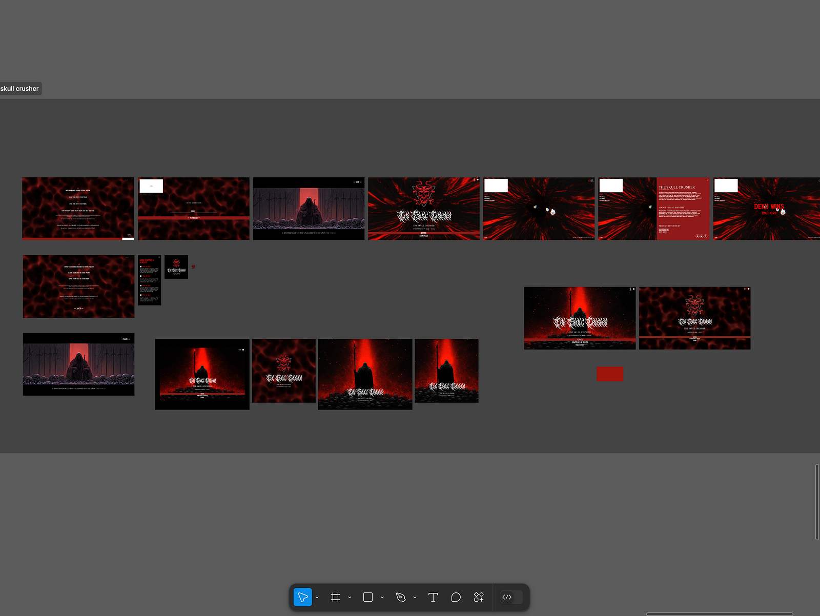
Starting point: a finalized design in Figma

This workflow begins after exploration and discovery.

At this stage, there is a finalized Figma file that represents real product decisions:

  • defined components
  • a connected design system
  • design tokens
  • a clear hierarchy
  • states and behaviors

Figma acts here as a source of intent.

Not only how the interface looks, but how it is meant to behave, scale, and remain consistent.

For an MCP-based workflow to work well, the design needs to be reasonably structured and system-aware.
AI does not fix messy foundations. It amplifies them.


Connecting Figma to a language model via MCP

The next step is creating an MCP connection between Figma and a language model.

The model does not receive screenshots or flattened exports.
It receives structured design context:

  • component names
  • hierarchy
  • relationships
  • tokens
  • references to the design system

Claude is used here as an example, but it is not a requirement.
The same approach can be applied with other language models, including internal or open-source ones.

What matters is the model’s ability to read structured context, reason about design decisions, and produce precise, execution-oriented output.


The language model as a design interpreter

In this workflow, the language model is not acting as a designer.

Its role is to interpret the existing design and translate it into explicit instructions.

Using a dedicated skill or structured process, the model produces a specification that describes:

  • component structure
  • rules and constraints
  • token usage
  • interactions and states

This is not a creative prompt.
It is a specification.

This step is the core of the workflow.
It turns visual intent into something downstream tools can execute reliably.


Creating a prototype in Figma Make using the specification

Figma Make is used next, but not in isolation.

It is already connected to:

  • the design system
  • the token setup
  • the same naming conventions used in the design

The specification produced by the language model is provided as input.

This means the prototype is not generated directly from the design file itself, but from a clear interpretation of it.

The result is a prototype that is consistent, aligned with prior decisions, and suitable as a foundation for further development.


Moving the result into GitHub

Once the prototype is created, it needs to become part of the broader product workflow.

With a single push, the output of Figma Make is moved into GitHub as part of the existing project.

The key idea here is the transition itself.

What was created in a design-driven environment becomes a shared technical baseline that development tools can work with and build upon.

GitHub serves as the meeting point between design, AI, and development, and allows the work to continue without losing context.


Continuing development in Cursor

From GitHub, the workflow continues in Cursor.

Cursor does not start from a blank state.
It works with an existing structure that already reflects:

  • design intent
  • system rules
  • previous decisions

At this stage, teams can add logic, connect data, refine interactions, and move closer to a production-ready product.

AI here is not inventing the product.
It is continuing it.

MCP setup between GitHub and Cursor

Pulling a project from GitHub into Cursor


The workflow at a glance

At a high level, this MCP-first design to development workflow looks like this:

  • Figma defines intent
  • a language model interprets that intent
  • a structured specification bridges design and execution
  • Figma Make generates a prototype
  • GitHub becomes the shared baseline
  • Cursor continues development

MCP is what keeps this chain intact.


Why this approach works in real teams

The value of this workflow is not speed.

It is alignment.

Design decisions are preserved instead of reinterpreted.
AI works with context rather than guessing.
Development continues from a shared understanding instead of reconstructing intent.

Each step hands over context, not just output.

The tools can change.
The order can evolve.
The models can be replaced.

What should remain is the principle that tools should continue each other, not reinterpret each other.

That is the difference between experimenting with AI and actually building products with it.

……

💡 Stay inspired every day with Muzli!

Follow us for a daily stream of design, creativity, and innovation.
Linkedin | Instagram | Twitter

Best Free Variable Fonts for UI and Web Design (2026)

Looking for free variable fonts that actually work in UI? A practical list of the best variable fonts for product, web, and interface design in 2026.


Variable fonts didn’t arrive with much noise.
They didn’t replace anything overnight. They just slowly became useful.

Instead of loading multiple font files for different weights and styles, a variable font gives you continuous control inside a single file. Less payload, fewer compromises, and more consistency across real interfaces.

If you design products, dashboards, SaaS tools, or web interfaces, this matters more than it sounds. Typography decisions show up everywhere in UI, especially at small sizes and across breakpoints.

This list focuses on free variable fonts that actually hold up in production UI, not display typefaces and not typographic experiments. Every font here was chosen because it behaves well in real interfaces.


What actually makes a font “variable”?

Most designers are used to fonts with fixed weights:
Regular, Medium, Bold.

A variable font works differently.

A simple example

You’re designing a button label.

With a regular font:

  • 400 feels slightly too light
  • 500 feels slightly too heavy
  • You have to pick one

With a variable font:

  • You can use 450
  • Or 480
  • Exactly where it feels right

Same font. Same layout.
A very different level of control.

That’s the difference between having many weights and having a continuous typographic range.


Why variable fonts work so well for UI

Variable fonts aren’t about visual tricks.
They’re about stability.

They become especially useful when:

  • You design responsive layouts
  • You need several weights without loading several files
  • You work with design systems or shared components
  • Performance and consistency matter

In good UI, typography doesn’t draw attention to itself. It just stays out of the way.


Inter

Inter

Best for: Product UI, dashboards, SaaS platforms

Inter is one of the most widely used UI fonts today, and for good reason. It was designed specifically for screens, with strong readability at small sizes and very predictable behavior across weights.

Why it works well:

  • Clear, readable letterforms in dense UI
  • Designed from the start for interfaces
  • Broad language and symbol support

Good to know:
It’s very common. If visual differentiation matters, it often works best as a neutral base paired with a more expressive secondary font.

Official website: https://rsms.me/inter
License: SIL Open Font License


Source Sans 3

Source Sans 3

Best for: Content-heavy interfaces, text-driven products

Source Sans 3 is a refined evolution of a familiar typeface. The variable version feels calm, balanced, and easy to read over long sessions.

Why it works well:

  • Professional, unobtrusive tone
  • Excellent readability for long text
  • Handles responsive layouts gracefully

Official website: https://adobe-fonts.github.io/source-sans/
License: SIL Open Font License


Roboto Flex

Roboto Flex

Best for: Advanced design systems, deep typographic control

Roboto Flex was built as a variable font from day one. It includes a wide range of axes and allows precise control over weight, width, and optical size.

Why it works well:

  • Extremely flexible
  • Ideal for token-based typography systems
  • One file can replace an entire font family

Good to know:
It’s powerful, and easy to overuse. Best suited for teams that know how to define clear constraints.

Official website: https://fonts.google.com/specimen/Roboto+Flex
License: Apache License 2.0


Manrope

Manrope

Best for: Modern interfaces, marketing sites

Manrope sits between functional and expressive. It feels contemporary and friendly without becoming distracting in UI contexts.

Why it works well:

  • Clean, modern character
  • Good contrast across weights
  • Works well for approachable, product-led design

Official website: https://manropefont.com
License: SIL Open Font License


Space Grotesk

Best for: Creative products, brand-forward interfaces

Space Grotesk brings personality without sacrificing usability. It’s often used in products that want a distinctive feel without drifting into decoration.

Why it works well:

  • Clear typographic voice
  • Still readable in interface contexts
  • Strong for headings and key UI elements

Official website: https://floriankarsten.github.io/space-grotesk/
License: SIL Open Font License


IBM Plex Sans Variable

IBM Plex Sans Variable

Best for: Complex products, enterprise tools

IBM Plex Sans was designed for information-heavy systems. It feels structured, reliable, and very clear even in crowded layouts.

Why it works well:

  • Strong hierarchy across weights
  • High readability in dense interfaces
  • Excellent multilingual support

Official website: https://www.ibm.com/plex/
License: SIL Open Font License


How to choose the right variable font

A practical rule of thumb:

  • Dashboards and SaaS: Inter, IBM Plex Sans
  • Content-heavy products: Source Sans 3
  • Creative interfaces: Space Grotesk, Manrope
  • Advanced design systems: Roboto Flex

The goal isn’t variety.
It’s consistency you don’t have to think about.


Variable fonts won’t fix bad design.
But they remove friction from good design.

They simplify typography, reduce compromises, and give you control where UI work actually lives: in small decisions repeated hundreds of times.

By 2026, variable fonts aren’t a trend anymore.
They’re just part of doing UI work properly.

……

💡 Stay inspired every day with Muzli!

Follow us for a daily stream of design, creativity, and innovation.
Linkedin | Instagram | Twitter

Case Study: Merging Design and Technology to Create Immersive Digital Experiences

Visual Identity Studio
Web Design & Branding Agency


Introduction

The boundaries between art, design, and technology are becoming increasingly blurred. This case study delves into the creation of The Skull Crusher website — an experimental extended reality (XR) project that uses hand-tracking technology to immerse users in a digital art experience. Through this, we’ll explore the process of merging creativity with technology and provide actionable insights for designers and developers in the art and design industry.

The Concept: Blurring Lines Between Art and Interaction

The Skull Crusher website wasn’t just a project — it was a vision to merge art with cutting-edge technology. By combining hand-tracking mechanics with a story-driven environment, the goal was to create an engaging and artistic digital product. The key takeaway? Digital products in the art and design industry must evoke an emotional connection while maintaining functionality.

Actionable Insight: Always start with a compelling narrative or artistic vision. This becomes the foundation for both the design and technical approach.

Challenges: Turning Vision Into Reality

  1. Achieving Seamless Hand Tracking: Designing intuitive hand controls in a browser-based XR environment required technical precision.
  2. Maintaining Aesthetic Appeal: Balancing performance optimization with high-quality visuals posed significant challenges.
  3. Creating a Cohesive Experience: Integrating storytelling, sound, and interaction into a single, seamless experience demanded a holistic approach.

Actionable Insight: When tackling technical challenges, prioritize the user experience above all. Technology is a means to an end, not the end itself.

The Process: Designing for Immersion

The Process: Designing for Immersion

  1. Ideation and Storyboarding
  • The project started with brainstorming sessions to conceptualize the storyline and interactions. A simple narrative — a battle against a dark magician — formed the core.

2. Building With Three.js

  • The 3D environment was created using Three.js, allowing for realistic lighting and interactive objects.
  • Hand-tracking mechanics were developed using Google Mediapipe to recognize gestures like aiming, shooting, and stopping.

3. Iterative Testing

  • User feedback was crucial to refining the controls and ensuring they felt natural.
  • Multiple rounds of testing helped optimize performance without compromising visual quality.

Actionable Insight: Iteration is your best friend. Build, test, refine — and repeat until you strike the right balance.

Results: Impact Beyond the Screen

Results: Impact Beyond the Screen

The Skull Crusher website demonstrated how art and technology could merge to deliver:

  • Emotional Engagement: Users felt a deep connection to the story and interactions.
  • Technical Innovation: A seamless hand-tracking interface showcased the potential of XR on the web.
  • Creative Inspiration: The project has inspired other designers and developers to explore similar intersections of art and technology.

Actionable Insight: Measure success not just by metrics but by the emotional and creative impact your product leaves on users.

Takeaways for Designers and Developers

  1. Embrace Emerging Technologies: Stay curious and experiment with tools like hand tracking and XR to push boundaries.
  2. Collaborate Across Disciplines: Work closely with storytellers, sound designers, and developers to create holistic experiences.
  3. Focus on User-Centric Design: Always prioritize the end-user’s experience, ensuring technology serves a purpose.

Conclusion

Designing and building digital products in the art and design industry is about more than aesthetics — it’s about crafting experiences that resonate. The Skull Crusher project showcases how creativity and technology can converge to create something truly immersive. By focusing on storytelling, iterative design, and user-centric innovation, we can continue to push the boundaries of what digital products can achieve.

What’s Next? If you’re inspired by this case study, consider how you can integrate emerging technologies into your projects. Start with a bold idea and let creativity and technology guide you to something extraordinary.

……

Want even more inspiration?
Follow us on social media for your daily dose of design, innovation, and creativity right in your feed!
Linkedin | Instagram | Twitter