The best color palette tools for designers in 2026 split into four categories: AI-powered generators (Coolors, Khroma, Muzli AI Colors, Huemint), classic palette builders (Adobe Color, Paletton), accessibility and contrast tools (Stark, WebAIM, Inclusive Colors), and system/image-based extraction tools (BrandColors, ColorKit). This comprehensive comparison covers 18 tools with specific use cases for brand design, accessibility audits, and design system workflows.
The best color palette tools and generators for designers in 2026: from AI-powered generation to accessibility checking. Tested, compared, and curated.
Color is the first thing a user feels and the last thing most designers systematize. You can spend hours tweaking hex values by instinct, or you can use the right tool and get to a working palette in minutes.
We tested these tools against four criteria: speed to a usable palette, accessibility support built in (not bolted on), integration with Figma and code workflows, and whether the tool does something a random color picker doesn’t. The ones that survived are here.
AI-Powered Palette Generators
Coolors:
The Swiss Army knife of color tools. Best for everything from quick palette generation to deep exploration.
– Generate palettes by tapping spacebar, lock colors you like, keep exploring
– AI mode suggests harmonious extensions of your starting color
– Export to Figma, Adobe, CSS, Tailwind, and more
– Image-based palette extraction (upload a photo, get the colors)
– Free tier is generous. Pro adds collaboration and unlimited palettes.
– Why it works: it does ten things well. Most tools do one.
Khroma:
AI that learns your color preferences. Best for designers who know what they like but can’t articulate why.
– Train it by choosing 50 colors you’re drawn to
– Generates infinite palettes, gradients, and type pairings based on your taste profile
– The “personal color AI” angle actually works: results improve with use
– Skip if: you need precise brand work. It’s exploratory, not systematic.
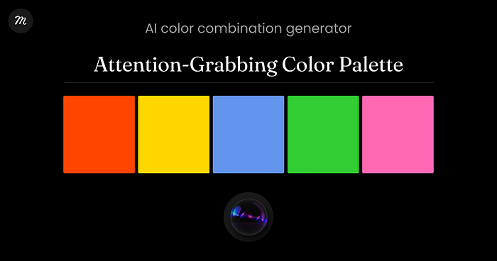
Muzli AI Colors:
AI-driven color palette tool from the Muzli ecosystem. Best for designers who want quick, production-ready palettes with export to design tools.
– Generate palettes from keywords, moods, or reference colors
– Instant export to Figma, CSS, and Tailwind
– Connected to the Muzli design resource ecosystem
– Accessible from [Muzli Colors](https://colors.muz.li)
– Why it works: the speed from idea to usable palette is genuinely fast, and the Figma export is clean
Huemint:
AI color palette generator for brands, websites, and graphics. Best for applying palettes to real mockup contexts.
– Generates palettes AND shows them applied to website templates
– Adjust “creativity” slider from safe to wild
– See how your palette looks on an actual layout, not just swatches
– Why it works: seeing color in context is fundamentally better than seeing it in a strip
Colormind:
AI palette generator trained on real-world color schemes from photos, movies, and art. Best for cinematic or editorial color work.
– Results feel less “algorithmic” and more “curated from real sources”
– Simpler interface: generates one palette at a time
– Skip if: you need export integrations. It’s a generator, not a workflow tool.
Classic Palette Generators
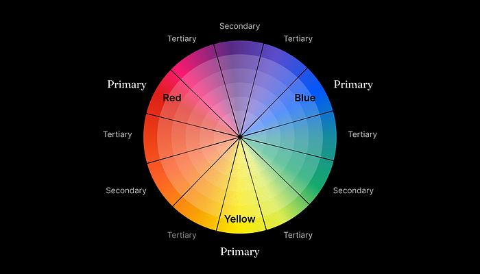
Adobe Color:
Adobe’s color wheel and palette builder. Best for teams in the Creative Cloud ecosystem.
– Color harmony rules (analogous, complementary, triadic, etc.)
– Extract palettes from images
– Saves directly to Creative Cloud Libraries
– Accessibility contrast checker built in
– Why it works: if you’re in Adobe, the integration is frictionless
Muzli Color Palette Generator
Lightweight palette generator for fast, practical work. Best for designers who want a clean palette without overthinking.
– Create color palettes manually or start from a base color
– Simple controls for tweaking and refining combinations
– Built for speed: no setup, no learning curve
– Export-ready palettes you can actually use in real projects
– Part of the Muzli ecosystem, alongside tools and inspiration designers already use
– Why it works: it removes friction. When you just need a solid palette and want to move on, this gets you there fast.
Paletton:
Old-school color wheel with fine-tuned control. Best for designers who think in color theory first.
– Adjust hue, saturation, and brightness per swatch
– Presets for common harmonies
– Preview on light and dark backgrounds
– Skip if: you want AI magic. This is manual precision.
ColorSpace:
Generates palettes from a single seed color. Best for quick “give me something that works with this blue.”
– Enter one color, get a dozen palettes in different styles
– Gradient generator included
– Simple, fast, no account needed
– Why it works: the “one color in, many palettes out” model matches real workflows
Accessibility and Contrast Tools
Stark:
Accessibility toolkit for design tools. Best for teams that need WCAG compliance built into their workflow.
– Contrast checker, color blindness simulation, typography suggestions
– Figma, Sketch, and Adobe XD plugins
– Full accessibility audits, not just color
– The industry standard for design accessibility tools
WebAIM Contrast Checker:
Simple contrast ratio calculator. Best for quick checks during design work.
– Enter foreground and background colors, get pass/fail for AA and AAA
– No frills, instant answer
– Bookmark-worthy: you’ll use it weekly
– Why it works: it does exactly one thing, instantly
Inclusive Colors:
Generates color systems that pass accessibility requirements. Best for building accessible palettes from scratch.
– Start with brand colors, get accessible variants
– Shows WCAG compliance for every combination
– Skip if: you just need to check one pair. This is for building systems.
Color accessibility is only one part of inclusive design. For a full UI accessibility checklist covering typography, interaction, motion, and navigation, see our practical accessibility guide for designers.
Vispero Colour Contrast Analyser:
Desktop app for checking contrast on anything on your screen. Best for testing live websites and apps.
– Eyedropper picks colors from any application, not just design tools
– Tests against WCAG 2.1 AA and AAA
– Works on Mac and Windows
– Why it works: it checks the real output, not the Figma file
Image-Based Color Extraction
Coolors Image Picker:
Upload a photo, pick the palette. Best for extracting color from photography and artwork.
– Part of Coolors (mentioned above), but worth highlighting separately
– Drag the extraction points around the image for precision
– Export the extracted palette in any format
Palette Generator by Canva:
Upload an image, get a 4-color palette instantly. Best for non-designers and quick brand work.
– Dead simple interface
– Limited to 4 colors per extraction
– Skip if: you need precision. The algorithm picks automatically.
Brand and System Color Tools
BrandColors:
Collection of official brand color codes. Best for referencing real brand palettes.
– Hex codes for major brands (Google, Spotify, Slack, etc.)
– Useful for competitive analysis and brand alignment
– Not a generator: a reference library
Open Color:
An open-source color scheme optimized for UI design. Best for developers building component libraries.
– 13 hues, each with 10 shades from light to dark
– Designed for backgrounds, borders, and text: not illustration
– Used in many open-source design systems
– Why it works: the systematic shade structure maps directly to CSS variables
ColorKit:
Palette generator with color mixing and shade generation. Best for building custom shade scales.
– Blend two colors and generate the intermediate steps
– Create shade ramps for design tokens
– Why it works: when you need “7 shades between my brand blue and white,” this is the tool
How to Pick the Right Tool for Your Workflow
Starting a new brand?
Khroma for exploration → Coolors for refinement → Stark for accessibility checks.
Building a design system?
Open Color for structure → ColorKit for custom shade ramps → Stark for compliance.
Quick project?
Coolors or Muzli AI Colors. Fast palette in, fast export out.
Image-based work?
Coolors Image Picker or Adobe Color extract mode.
Accessibility audit?
Stark for comprehensive, WebAIM for quick checks, Colour Contrast Analyser for live testing.
One principle applies to all:
generate fast, then test for accessibility. Never the other way around. A beautiful palette that fails WCAG is a palette that needs to change.
Key Patterns
A few things emerged from testing all of these:
– AI generation is table stakes. Every major color tool now has an AI mode. The differentiator is what happens after generation: export quality, accessibility integration, contextual preview.
– Accessibility is moving from afterthought to input. The best tools now let you set WCAG requirements before generating, not after. Stark and Inclusive Colors are leading this shift.
– Figma integration separates tools from toys. If it can’t export to Figma or CSS variables in two clicks, it’s a demo.
– Image-based extraction is getting smarter. AI-powered extraction now understands dominant vs. accent colors, not just “most common pixels.”
– The palette is not the system. Generating a 5-color palette is easy. Turning it into a 50-shade token system with accessible combinations is the real job. Tools like ColorKit and Open Color address this second step.
Explore thousands of curated color palettes and design resources on Muzli