

Noomo Agency
A boutique design agency specializing in creating interactive digital experiences
Creating a deep connection with the audience, differentiating from competitors, and crafting memorable experiences are crucial for brands today to capture users’ attention. We are on the brink of the extended reality world, where it’s more important than ever for brands to be prepared to meet their users where they are.
Mixed reality, AR experiences, and 3D immersive websites help brands to move one step closer to the future and to their audiences.
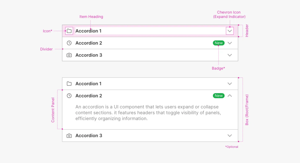
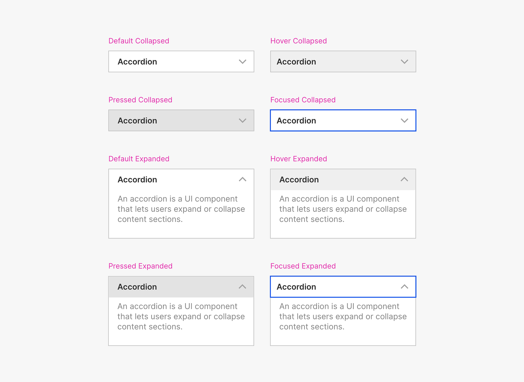
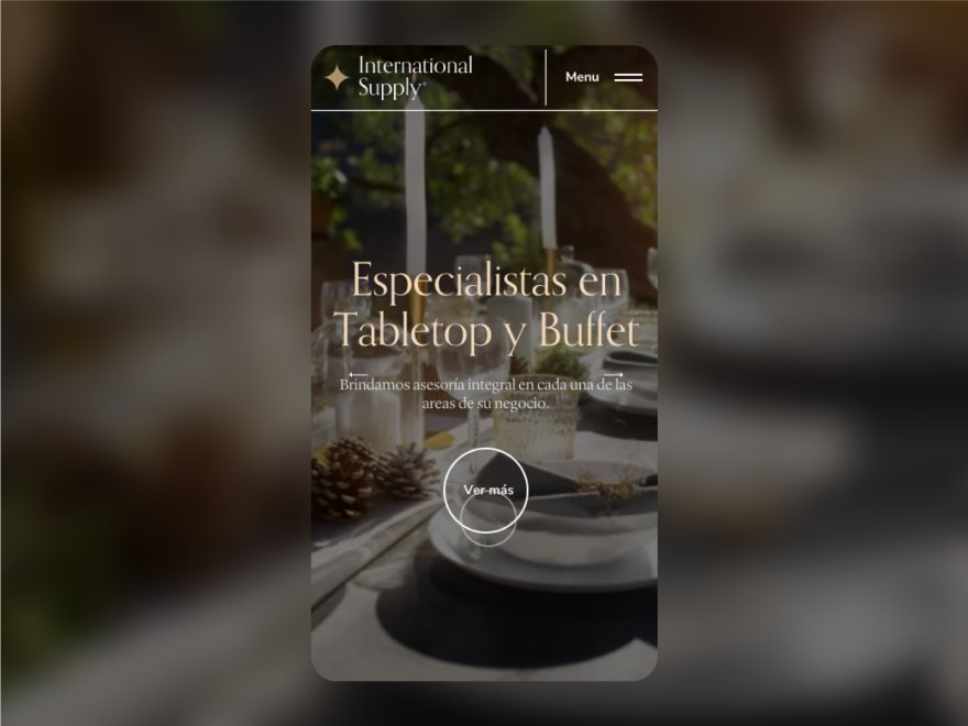
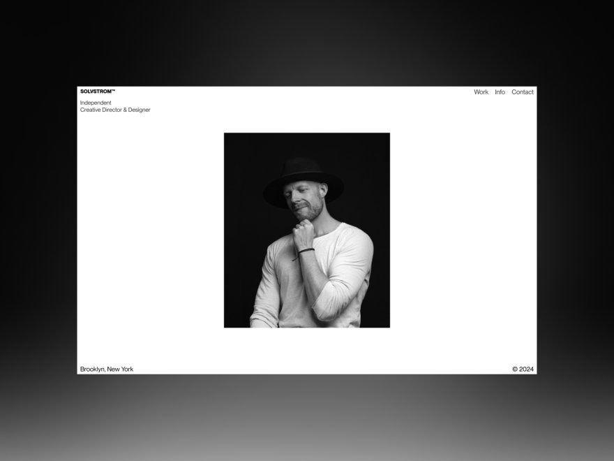
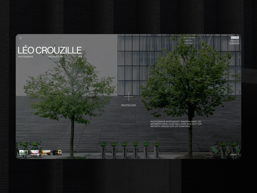
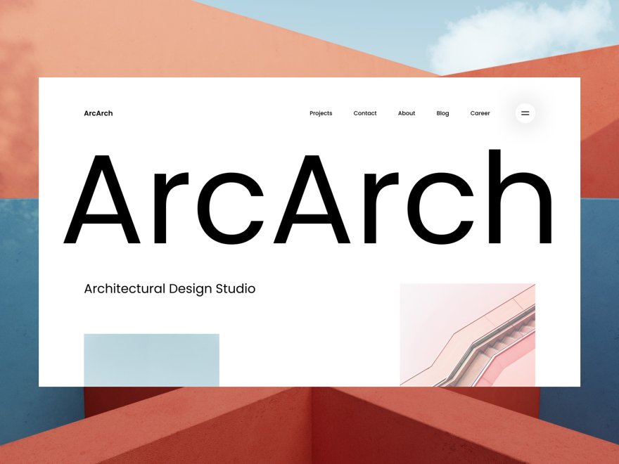
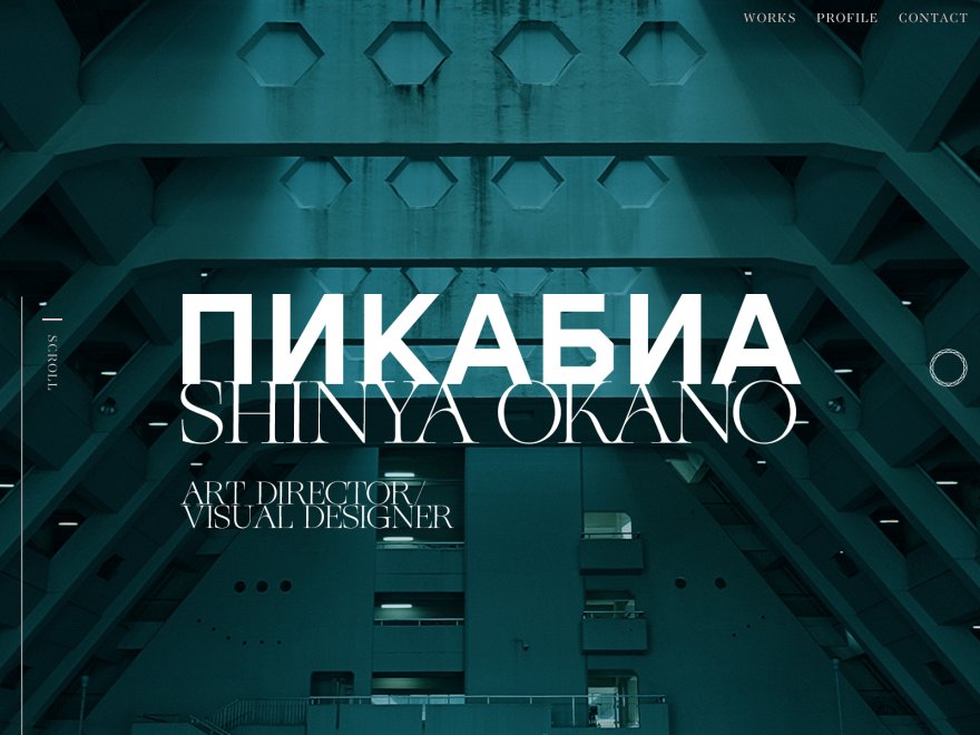
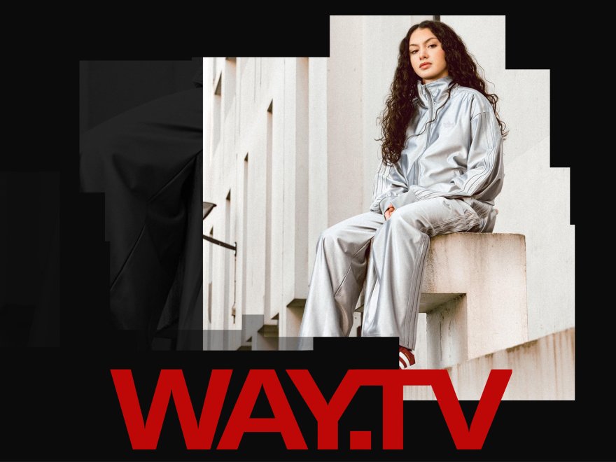
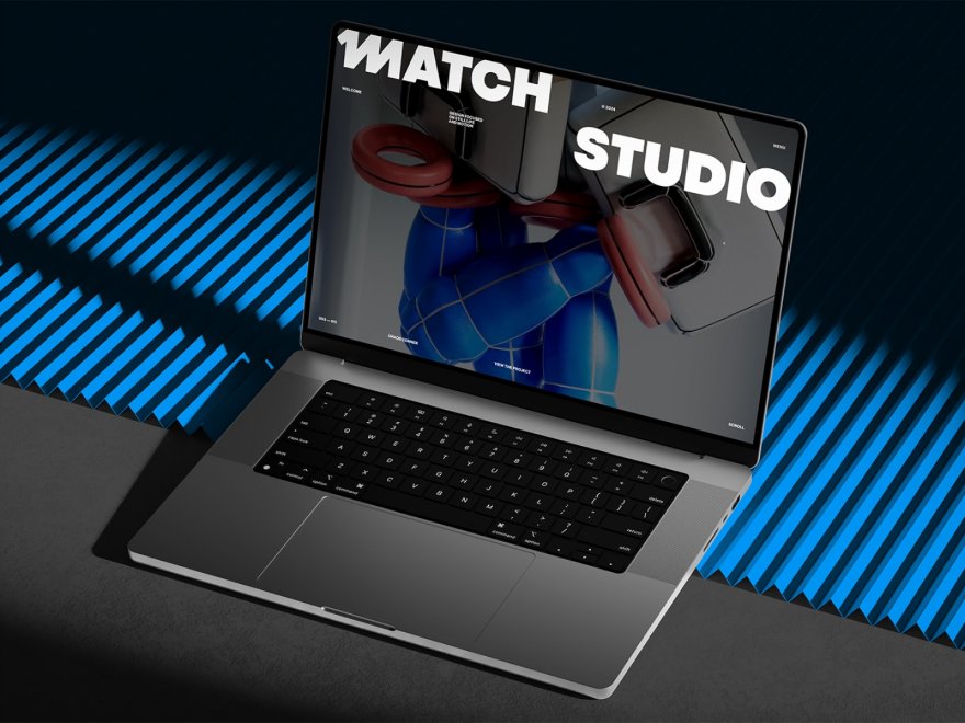
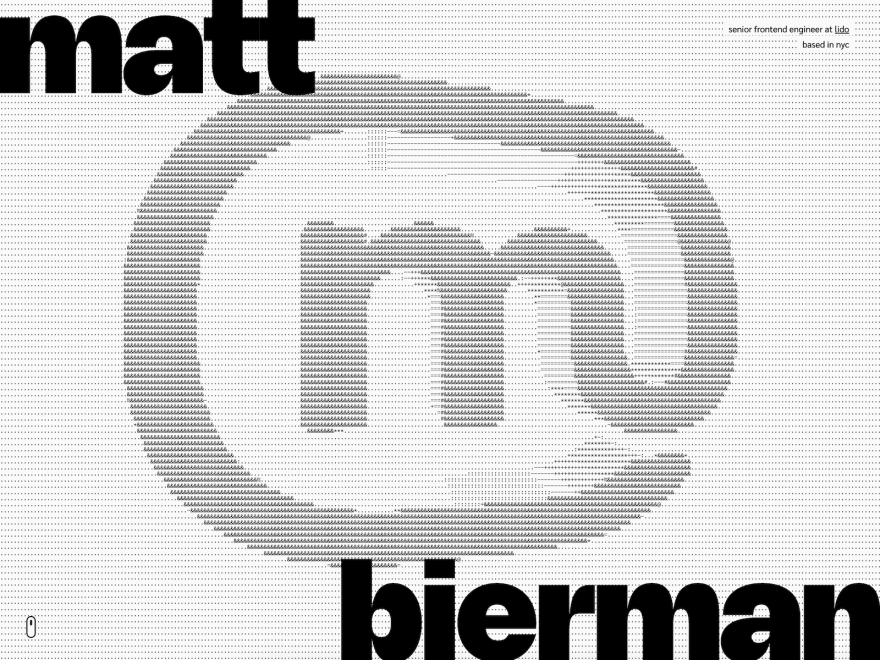
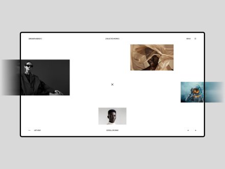
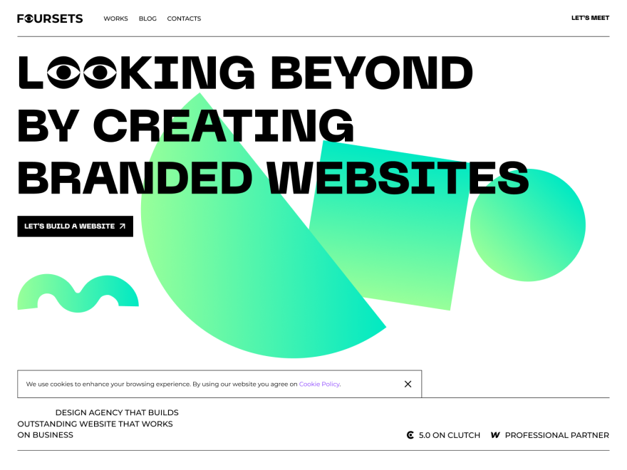
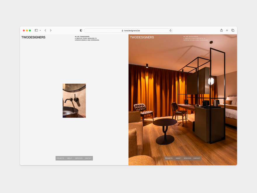
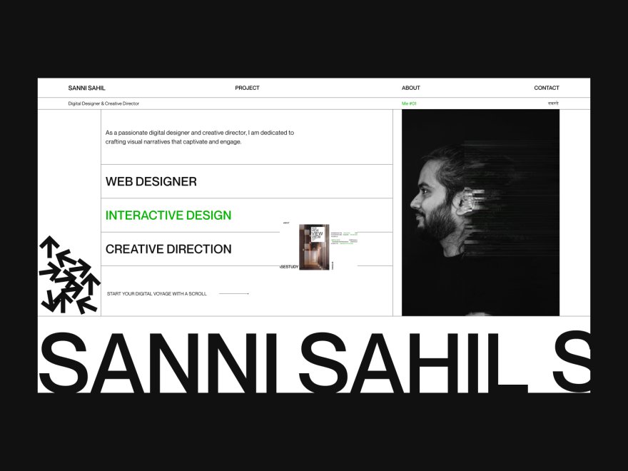
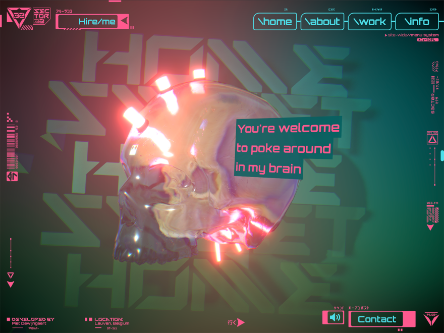
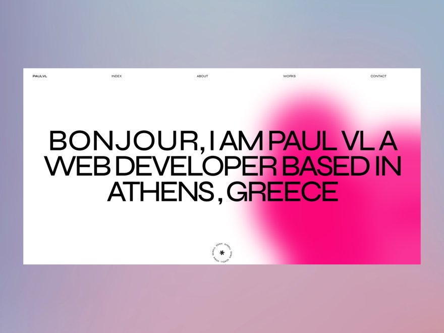
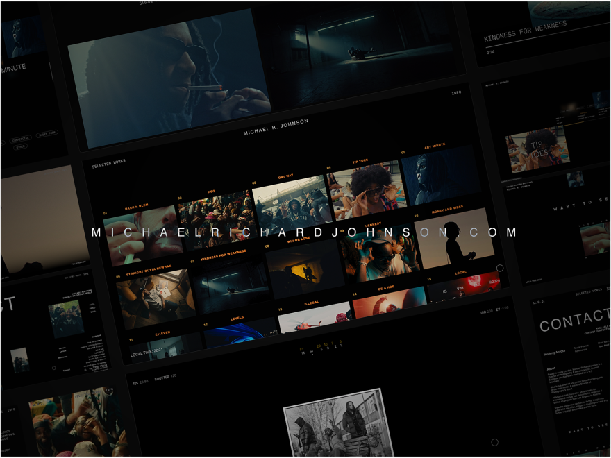
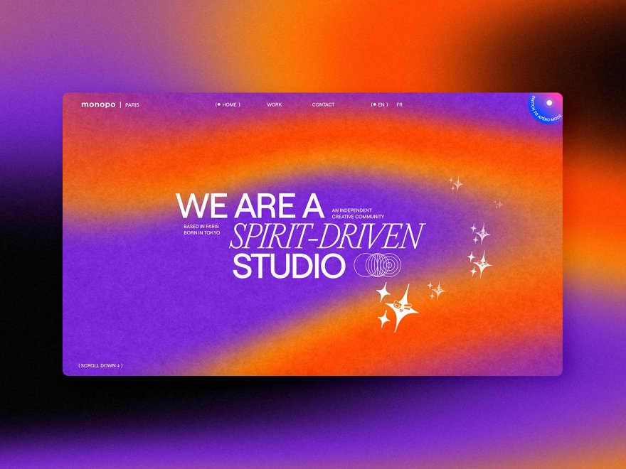
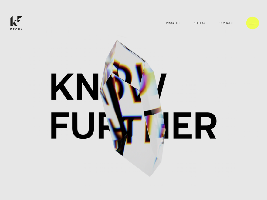
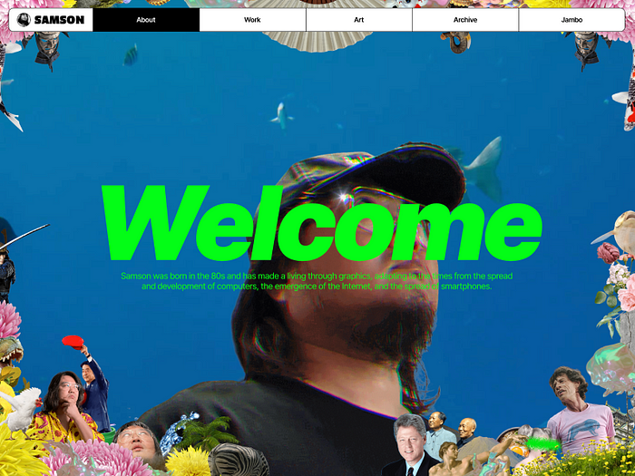
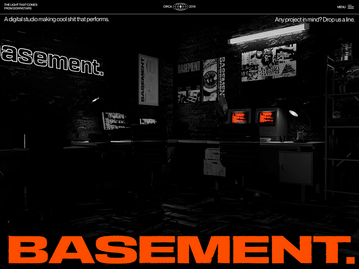
Brand storytelling websites.
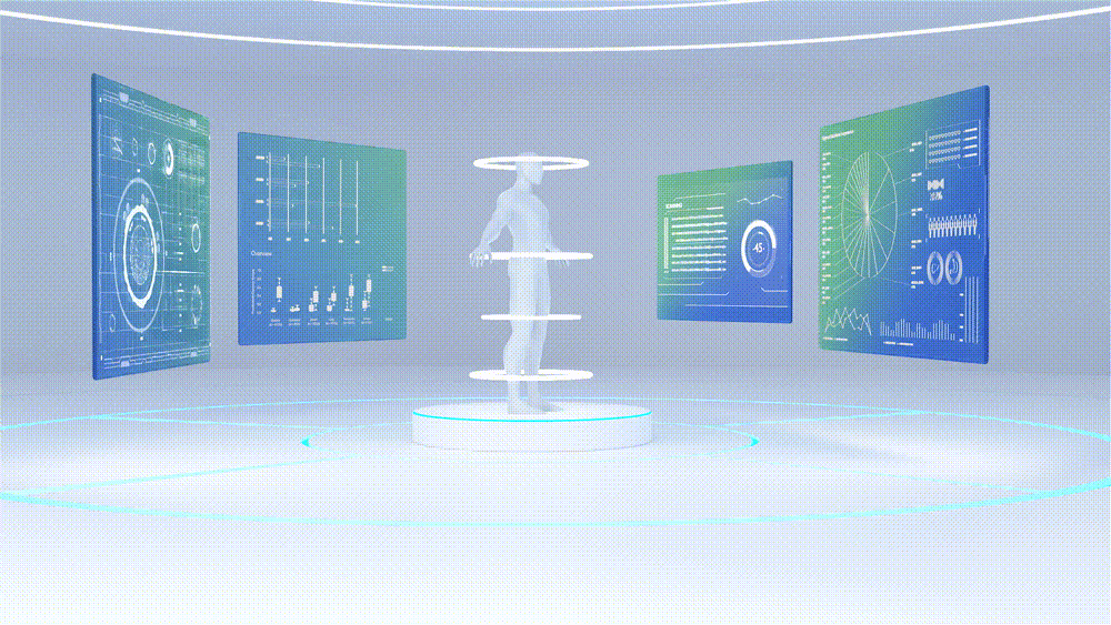
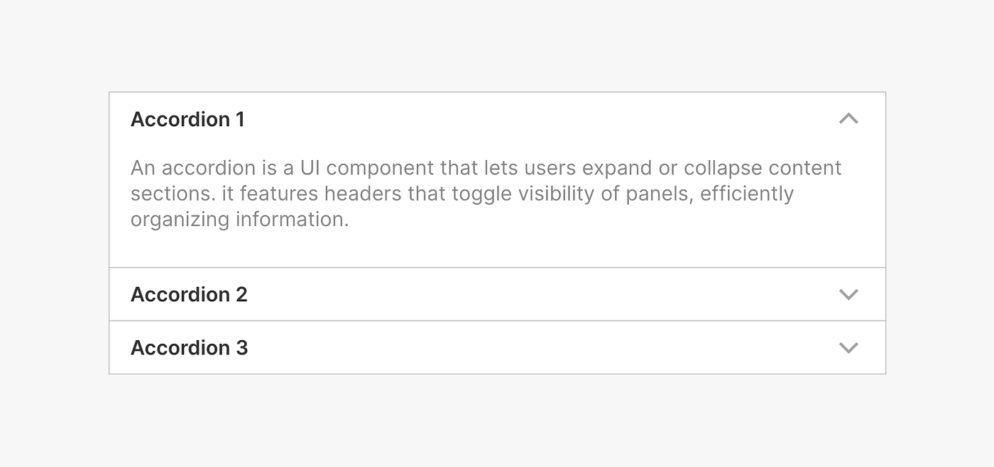
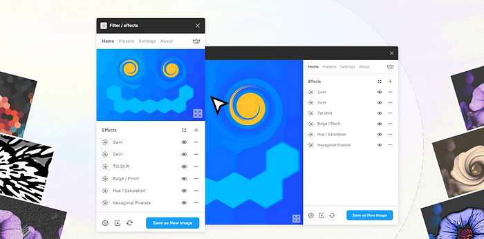
Immersive brand storytelling websites use rich media, like video, 3D animation, and AR, to tell compelling brand stories, significantly enhancing user engagement and emotional connection.
Immersive 3D web experiences significantly impact user engagement and conversion metrics across various platforms. Such experiences can effectively hold visitors’ attention, making content more memorable and engaging through storytelling, personalization, and interactive features.
- Increased User Engagement: Immersive 3D content on websites can increase user engagement time by up to 70%, keeping users on the site longer as they interact with the content.
- Higher Conversion Rates: 3D experiences have been shown to lead to higher conversion rates. For example, personalized 3D product builders can facilitate a more engaging shopping experience, directly influencing customers’ buying decisions. Websites incorporating 3D experiences have seen conversion rates improve by up to 40%. Read more How 3D configurators help brands increase engagement and improve user experience.
- Reduced Bounce Rates: Enhanced interactive and 3D content can reduce bounce rates by up to 20–30%. The engaging nature of 3D content makes users more likely to explore further rather than leaving after viewing just one page
- Enhanced User Satisfaction: The innovative use of 3D and interactive content meets users’ growing expectations for dynamic and responsive web experiences. This not only satisfies users but often exceeds their expectations, enhancing overall satisfaction and promoting positive user experiences.
- Repeat Visits: Implementing immersive 3D elements can increase repeat visits by 25%, as users return to re-engage with the dynamic content

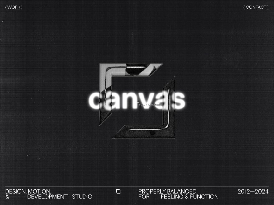
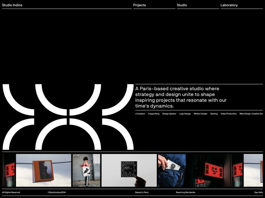
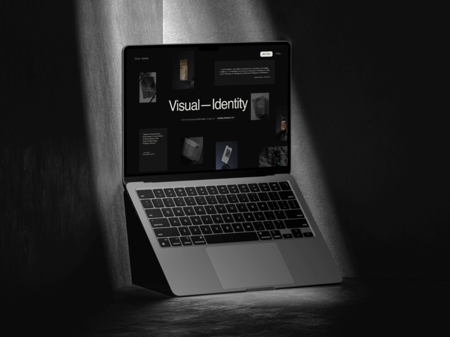
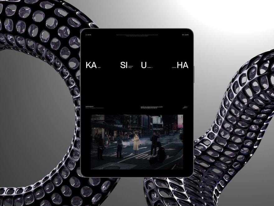
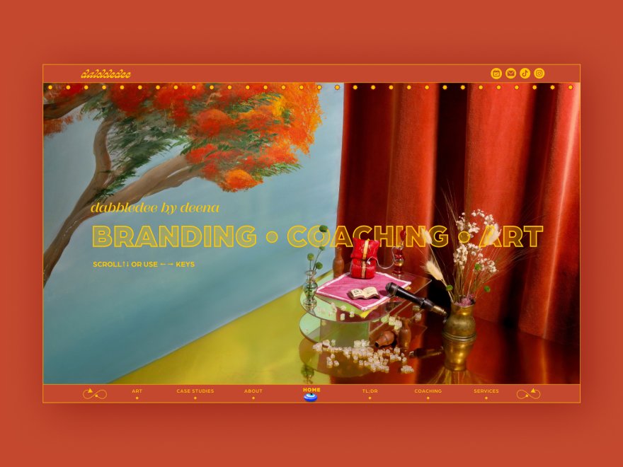
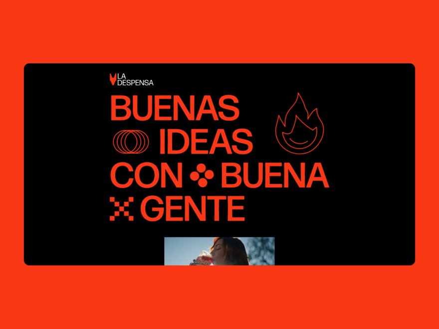
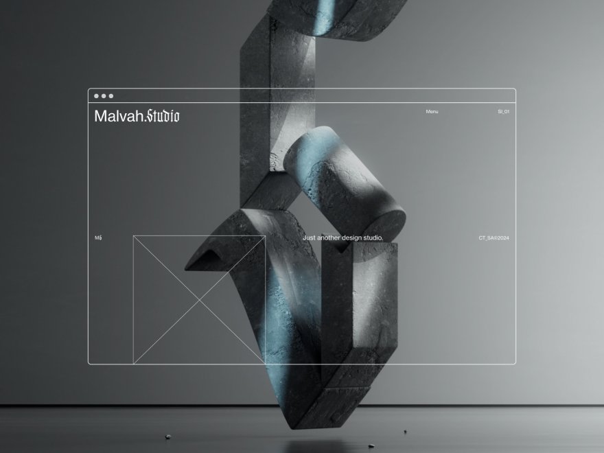
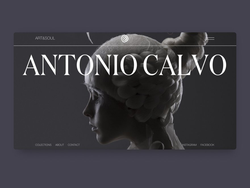
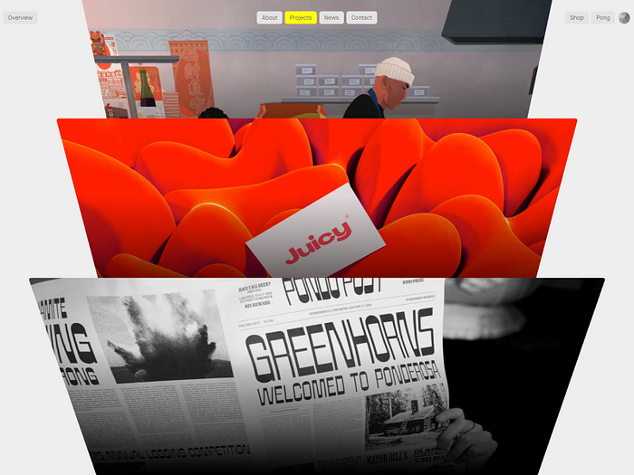
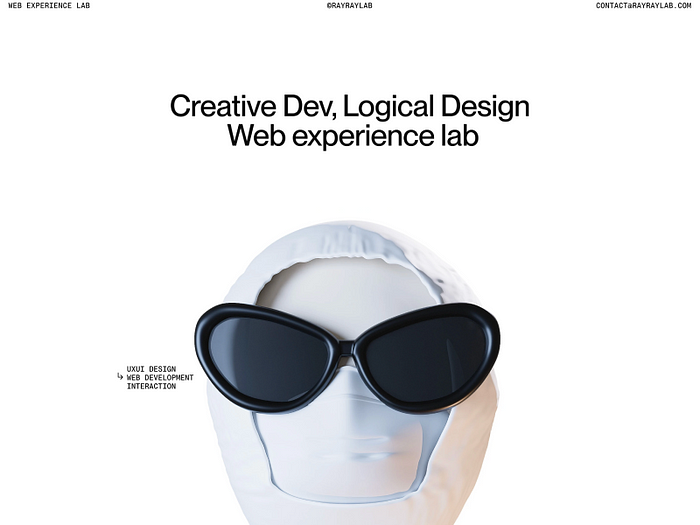
Microsites for a brand activation
Using microsites for a brand activation can significantly enhance user engagement and conversion metrics compared to more conventional marketing methods.
Check this immersive example.
Microsites create a focused and immersive environment tailored to specific campaigns or product launches, leading to various measurable benefits:
- Increased Engagement: Microsites typically achieve higher engagement rates, with users spending an average of 50% more time on microsites compared to traditional web pages. This is due to the focused and interactive content that keeps users engaged longer.
- Higher Conversion Rates: Due to their targeted nature, microsites often see higher conversion rates as they are optimized for specific actions, whether it’s signing up for an event, downloading a resource, or making a purchase. The streamlined user journey on microsites minimizes distractions, directing visitors toward conversion goals more efficiently. Campaign-focused microsites can see conversion improvements of up to 35–40% compared to standard pages.
- Improved Lead Generation: For microsites aimed at lead generation, conversion rates from visitor to lead can often double that of general websites. This is particularly true when microsites are used for specific events or product launches, where they can convert up to 20% of visitors into leads.
- Enhanced Brand Awareness and Reach: Microsites designed for brand campaigns can increase visitor numbers by up to 300% during the campaign period. This spike is often fueled by the novelty and uniqueness of the microsite experience, which encourages sharing across social platforms.
- Metrics Tracking and Optimization: Microsites allow for precise tracking of engagement metrics, from page views and session duration to user interactions and conversion rates. This data can be instrumental in optimizing marketing strategies and improving future campaigns based on real user feedback and behavior.

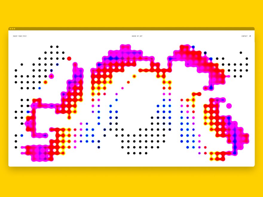
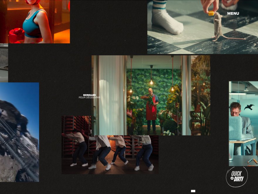
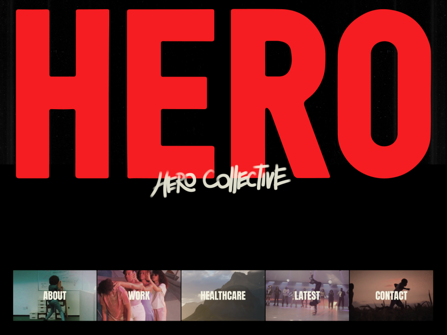
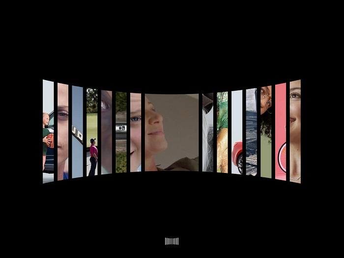
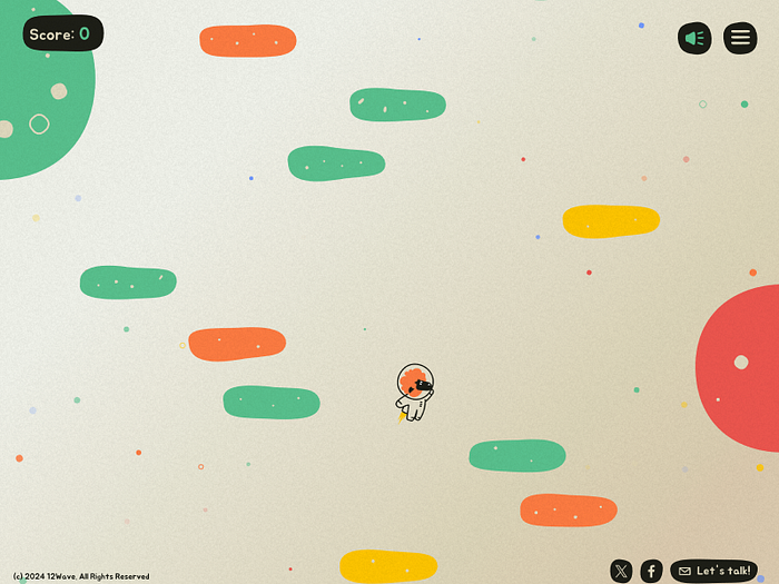
Interactive experiences for activation campaigns
Interactive experiences in activation campaigns, especially at events such as booths and exhibitions, significantly enhance engagement and improve campaign metrics. These activations are designed to not only attract attention but also deeply involve the audience, leading to:
Increased Booth Traffic: Interactive booths typically see higher foot traffic compared to standard booths. Studies have shown that booths with interactive elements can increase visitor numbers by 30–50%, as they offer a more engaging and dynamic experience.
- Enhanced Engagement: The interactivity of such booths significantly increases user engagement. Engagement metrics, such as time spent at the booth and interactions per visitor, often double when compared to less interactive setups.
- Higher Lead Generation: With increased engagement, the lead generation rates also see a substantial boost. Interactive booths can achieve a 40–60% increase in lead capture, as they often involve some form of data exchange as part of the interaction, such as scanning a QR code or entering details on a touchscreen.
- Improved Conversion Rates: The direct involvement and personalized experience provided by interactive experiences often lead to higher conversion rates post-event. Follow-up sales or inquiries can increase by up to 20–30% from leads generated at interactive booths.
- Greater Brand Recall and Loyalty: Interactive experiences are memorable and can significantly enhance brand recall. Participants are more likely to remember the brand and have a positive association, which can increase customer loyalty and advocacy.
- Valuable Feedback and Data Collection: Interactive experiences provide a unique opportunity to gather real-time feedback and data about customer preferences and behaviors. This data is invaluable for refining marketing strategies and tailoring future campaigns to better meet the needs of the target audience.

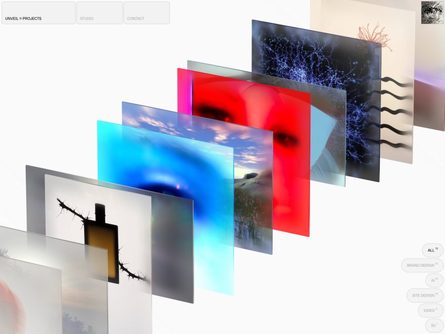
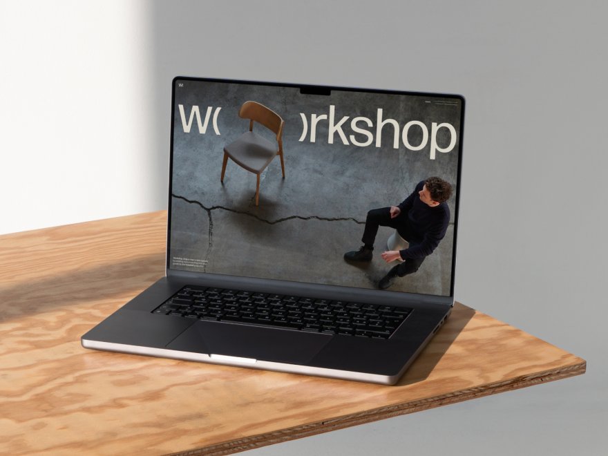
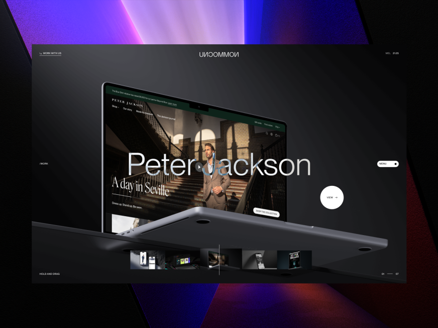
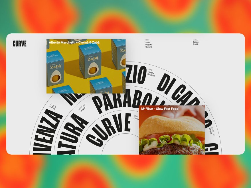
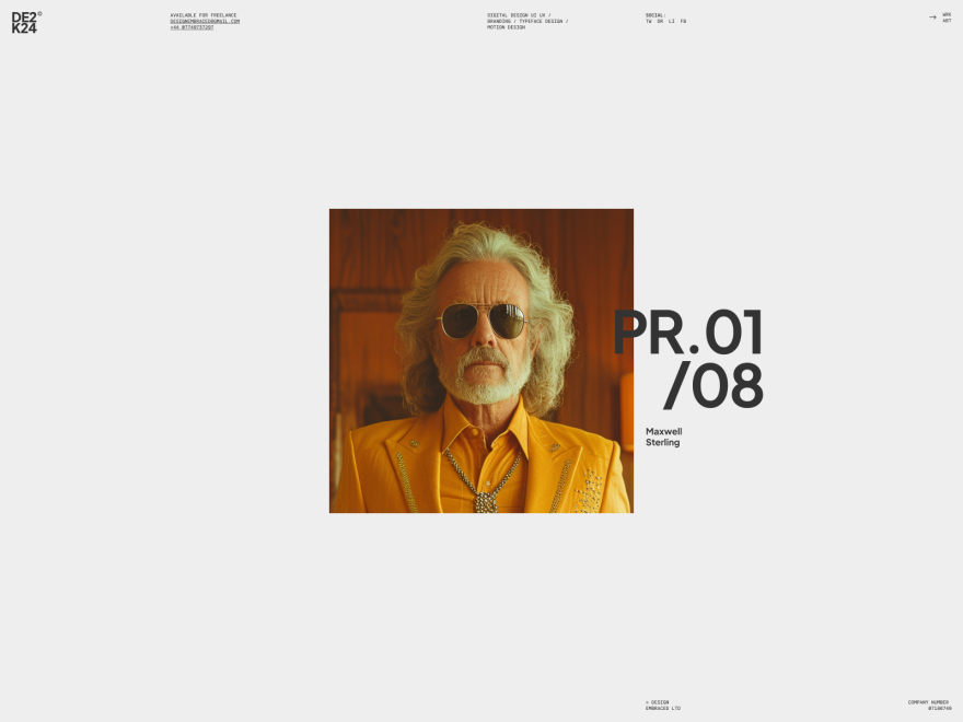
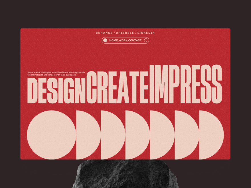
Using Interactive Websites for Product or Service Presentation
The way in which a product or service is presented has a direct influence on sales. Microsites that present the product are much more effective than videos or PowerPoint presentations for several reasons:
- Increased Engagement: Interactive presentations can lead to much higher engagement rates. By incorporating elements such as live polls, quizzes, and interactive diagrams, these presentations keep the audience actively participating rather than passively listening. Typically, interactive presentations see an engagement increase of 40–60%, as they require and encourage audience interaction throughout the session.
- Enhanced Retention: The interactive aspect of these presentations significantly improves information retention. Studies show that interactive learning environments can increase retention rates by up to 75%, compared to traditional presentation methods where retention rates hover around 20–30%. This is largely due to the “learning by doing” approach that interactive presentations offer.
- Reduced Drop-offs: In settings where presentations are critical to conversion, such as webinars or professional workshops, interactive elements can reduce attendee drop-offs by up to 35%. The interactive nature helps maintain interest and motivation throughout the session, keeping participants from leaving early.
- Improved Satisfaction: Satisfaction levels among participants are notably higher in interactive presentations. This is due to the personalized nature of the learning experience, where participants can influence the direction and focus of the presentation based on their responses and interests.
- Through hands-on product demos, customers gain a more profound understanding of products, enhancing their confidence in purchase decisions.

AR experiences for brand activation campaigns
AR experiences leverage immersive technology to enhance user engagement, increase conversions, and provide entertaining interactions, making them invaluable in digital marketing strategies. They create more interactive and memorable connections with customers, leading to increased brand loyalty and sales.
Enhanced Engagement: AR campaigns typically increase user engagement by as much as 70–80%. Users spend more time interacting with AR features due to the novelty and immersive nature of the technology.
- Improved Brand Recall: Studies have shown that AR experiences can boost brand recall by up to 70%. This is significantly higher compared to traditional digital advertisements or non-AR interactive experiences.
- Increased Conversion Rates: Brands utilizing AR for product demonstrations and interactions report increases in conversion rates ranging from 20–40%. The interactive, lifelike experience provided by AR helps reduce the uncertainty in online shopping environments.
- Viral Potential: AR activations have a high potential for viral sharing, with some campaigns seeing share rates increase by more than 50% when compared to non-AR content. The unique and engaging nature of AR content makes it more likely to be shared across social networks.
- Data Collection and Insights: Brands leveraging AR can achieve deeper insights into customer behavior, with metrics on user interactions improving the accuracy of customer engagement data by up to 30%. This helps in fine-tuning marketing strategies and improving future AR experiences.

These advantages make immersive 3D websites and interactive experiences superior choices for activation campaigns, product or service presentations, and marketing websites. They not only provide a richer user experience but also significantly enhance the understanding and appeal of the product, delivering significant improvements in engagement and conversion metrics.
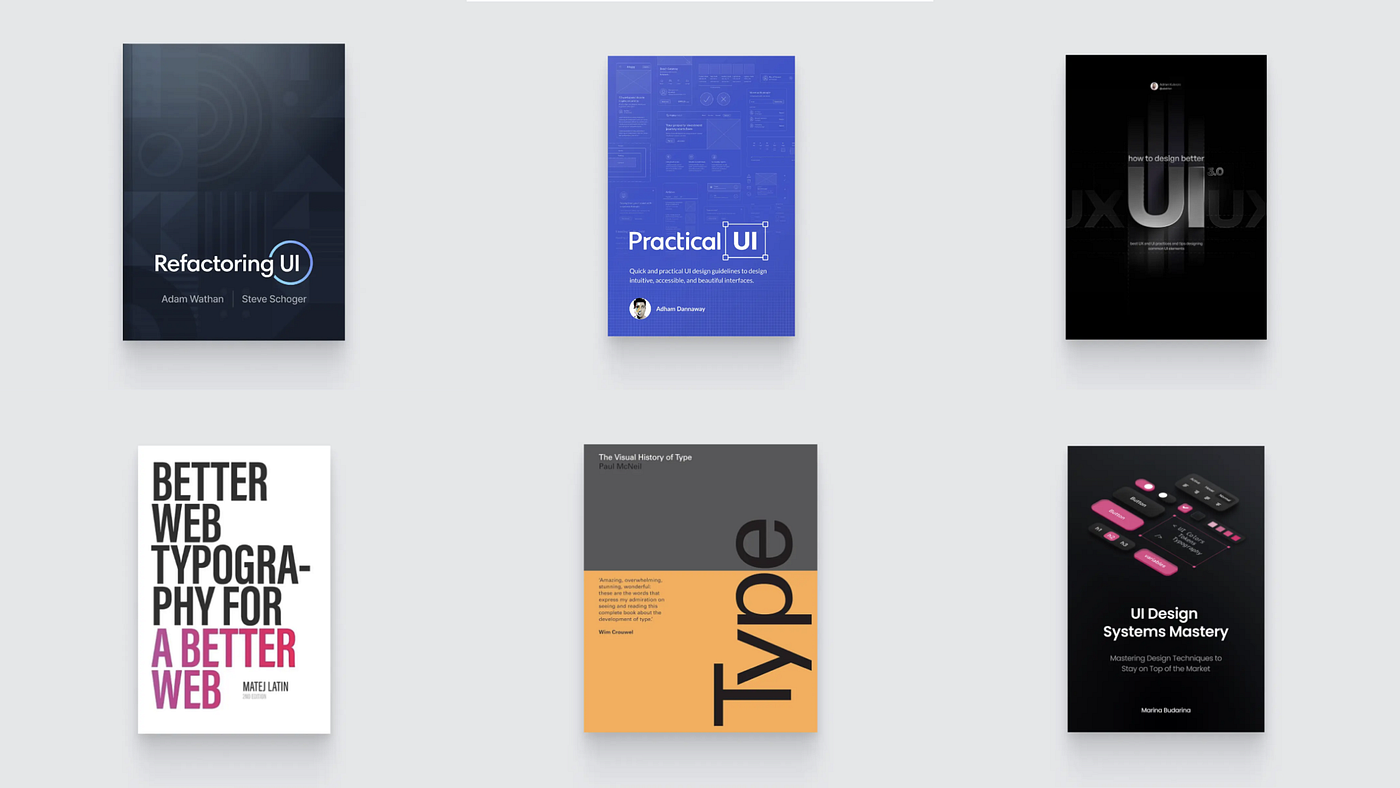
Want even more inspiration?
Follow Muzli on social media for your daily dose of design, innovation, and creativity right in your feed!
Linkedin | Instagram | Twitter


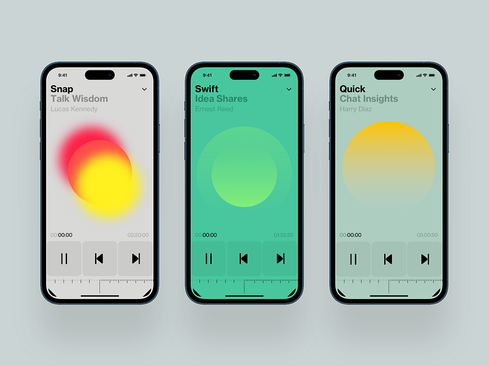 Podcast by
 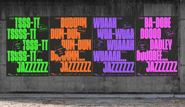 L’HORA DEL JAZZ by
 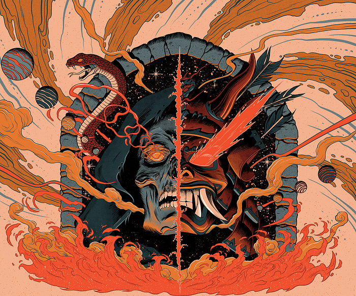 Gig Posters and Cover Albums by
  Indoor Sante by Benjamin Mira,
  Collage portrait by