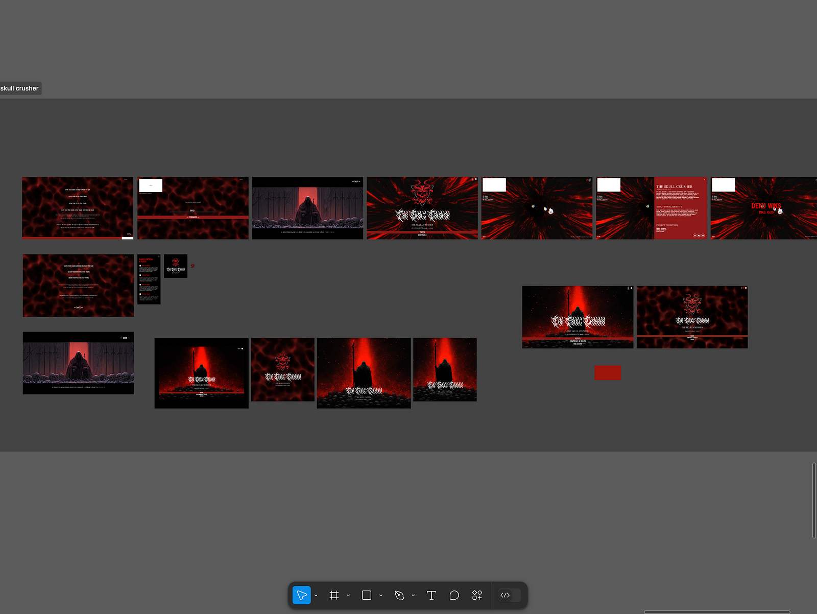
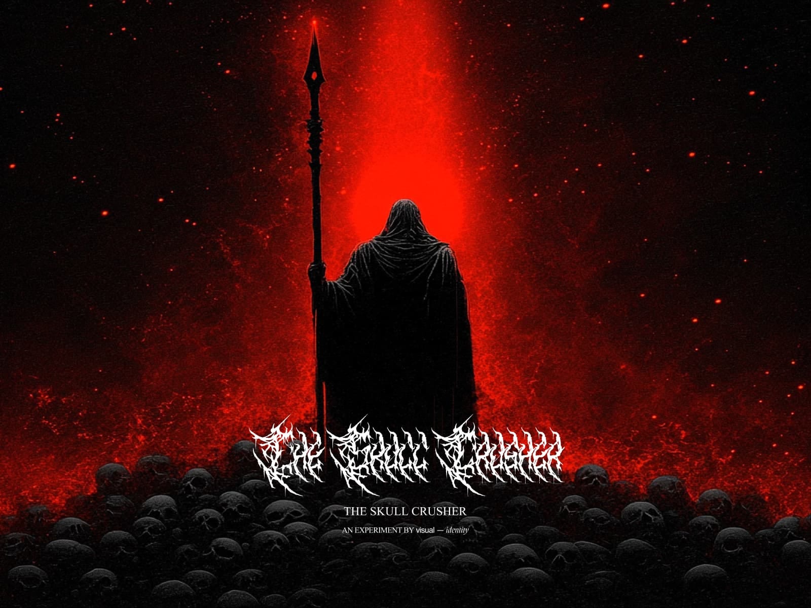
The boundaries between art, design, and technology are becoming increasingly blurred. This case study delves into the creation of The Skull Crusher website — an experimental extended reality (XR) project that uses hand-tracking technology to immerse users in a digital art experience. Through this, we’ll explore the process of merging creativity with technology and provide actionable insights for designers and developers in the art and design industry.
The Concept: Blurring Lines Between Art and Interaction
The Skull Crusher website wasn’t just a project — it was a vision to merge art with cutting-edge technology. By combining hand-tracking mechanics with a story-driven environment, the goal was to create an engaging and artistic digital product. The key takeaway? Digital products in the art and design industry must evoke an emotional connection while maintaining functionality.
Actionable Insight: Always start with a compelling narrative or artistic vision. This becomes the foundation for both the design and technical approach.
Challenges: Turning Vision Into Reality
Achieving Seamless Hand Tracking: Designing intuitive hand controls in a browser-based XR environment required technical precision.
Creating a Cohesive Experience: Integrating storytelling, sound, and interaction into a single, seamless experience demanded a holistic approach.
Actionable Insight: When tackling technical challenges, prioritize the user experience above all. Technology is a means to an end, not the end itself.
The Process: Designing for Immersion
Ideation and Storyboarding
The project started with brainstorming sessions to conceptualize the storyline and interactions. A simple narrative — a battle against a dark magician — formed the core.
2. Building With Three.js
The 3D environment was created using Three.js, allowing for realistic lighting and interactive objects.
Hand-tracking mechanics were developed using Google Mediapipe to recognize gestures like aiming, shooting, and stopping.
3. Iterative Testing
User feedback was crucial to refining the controls and ensuring they felt natural.
Multiple rounds of testing helped optimize performance without compromising visual quality.
Actionable Insight: Iteration is your best friend. Build, test, refine — and repeat until you strike the right balance.
Results: Impact Beyond the Screen
The Skull Crusher website demonstrated how art and technology could merge to deliver:
Emotional Engagement: Users felt a deep connection to the story and interactions.
Technical Innovation: A seamless hand-tracking interface showcased the potential of XR on the web.
Creative Inspiration: The project has inspired other designers and developers to explore similar intersections of art and technology.
Actionable Insight: Measure success not just by metrics but by the emotional and creative impact your product leaves on users.
Takeaways for Designers and Developers
Embrace Emerging Technologies: Stay curious and experiment with tools like hand tracking and XR to push boundaries.
Collaborate Across Disciplines: Work closely with storytellers, sound designers, and developers to create holistic experiences.
Focus on User-Centric Design: Always prioritize the end-user’s experience, ensuring technology serves a purpose.
Conclusion
Designing and building digital products in the art and design industry is about more than aesthetics — it’s about crafting experiences that resonate. The Skull Crusher project showcases how creativity and technology can converge to create something truly immersive. By focusing on storytelling, iterative design, and user-centric innovation, we can continue to push the boundaries of what digital products can achieve.
What’s Next? If you’re inspired by this case study, consider how you can integrate emerging technologies into your projects. Start with a bold idea and let creativity and technology guide you to something extraordinary.
……
Want even more inspiration? Follow us on social media for your daily dose of design, innovation, and creativity right in your feed! Linkedin | Instagram | Twitter
Ayush Soni / HEX Creative director and founder of a full-cycle brand and creative studio (hex.inc).
This really isn’t an end-to-end tutorial with organized instructions, but general brain dump of my general thought process when it comes to designing a “first shot” identity very quickly.
Over the years, this process has become more honed and I do feel there’s some value in this writing for those looking to test out an idea quickly. The first thing I’d start with is just summarizing what u want to do in 1–2 words. This is going to help you narrow down who you / your company are and what you want to explore visually.
I want to build a CPG brand while I do this tutorial. This one’s going to be for a water company called _thewatercompany. And the 1–2 word summary is going to be “Rimowa for Water”. Water packaging is something I’ve wanted to always explore, so here’s a cool idea that I don’t think has been done before. Correct me if I’m wrong though; I did no research.
That already gets us like 50% there. Not just visually but also strategically. The goal here is to get to a place where I can test this concept quickly, not to build a full-scale brand identity.
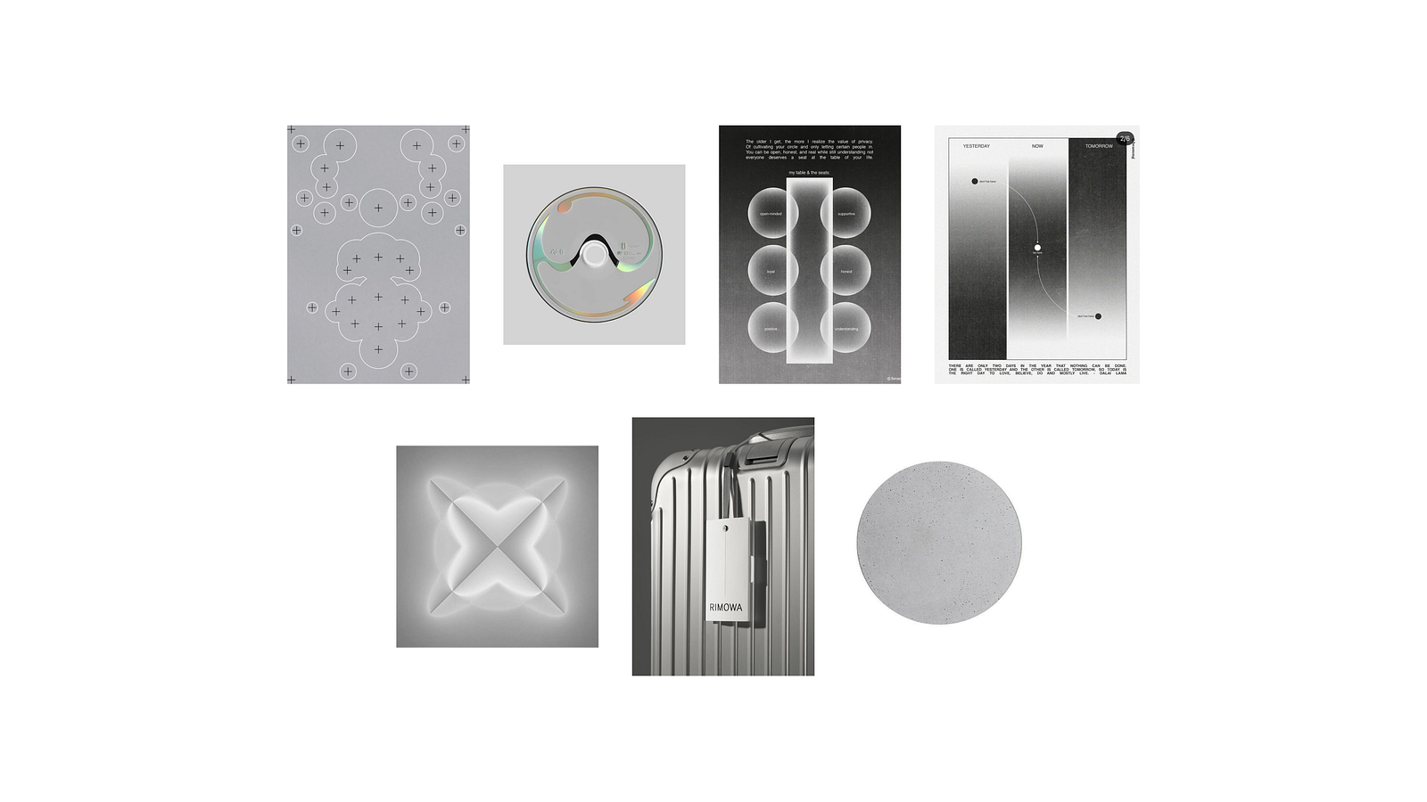
Now, the next step should be to build a quick mood-board so you can visualize the end product. This helps you even if you don’t know how to execute; a mood-board will help save time (money) + back and forth when working with a designer.
Cool so that above was my little 5 minute mood-board. Since I’m designing for myself there’s no reason to do too much at this stage. It gives me a very clear picture of what I want the brand to look and feel like. To get here, I just browsed through cosmos and pinterest for a little while and pulled together all images I liked on a figma file.
No need to waste time looking at thousands of designs, case studies, and ideas. There is an infinite supply of inspiration online and the best way to move forward is to narrow down, pick a few things you like, and get to work.
Now, time to dive in and start exploring things. Again, don’t take your ideas too seriously and just start jamming things together and see what sticks. I wouldn’t recommend this approach for a real client project where there are certain angles + demographics to watch out for, but this is a fun sprint.
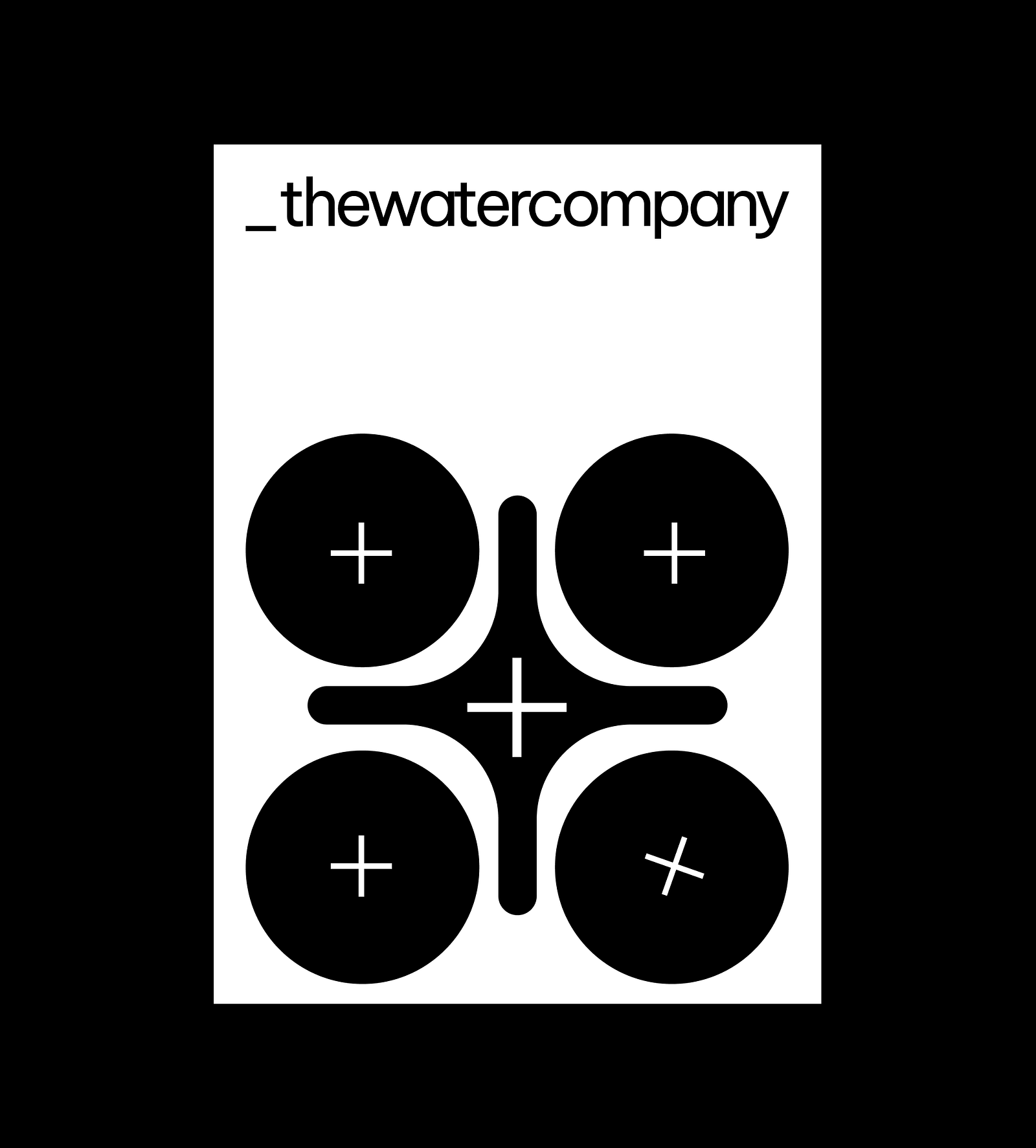
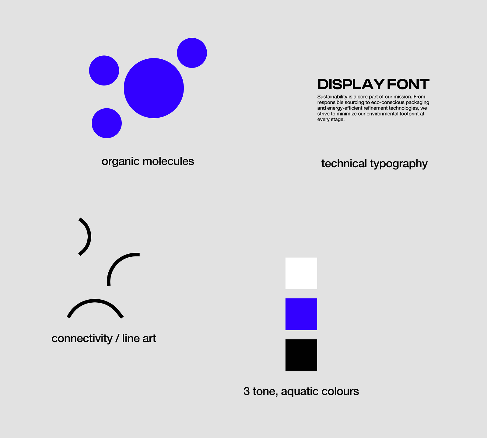
Below is the first thing I designed. Taking inspo from one of the screens above; the + style. Idk why but I love the idea of using the circles with plus signs in some capacitiy…remind me of particles and feels like something scientific which is what I want for this water company.
But the contrast is putting me off a bit, even though that’s kind of what I wanted looking at the inspo. A more brutalist exploration with the same idea:
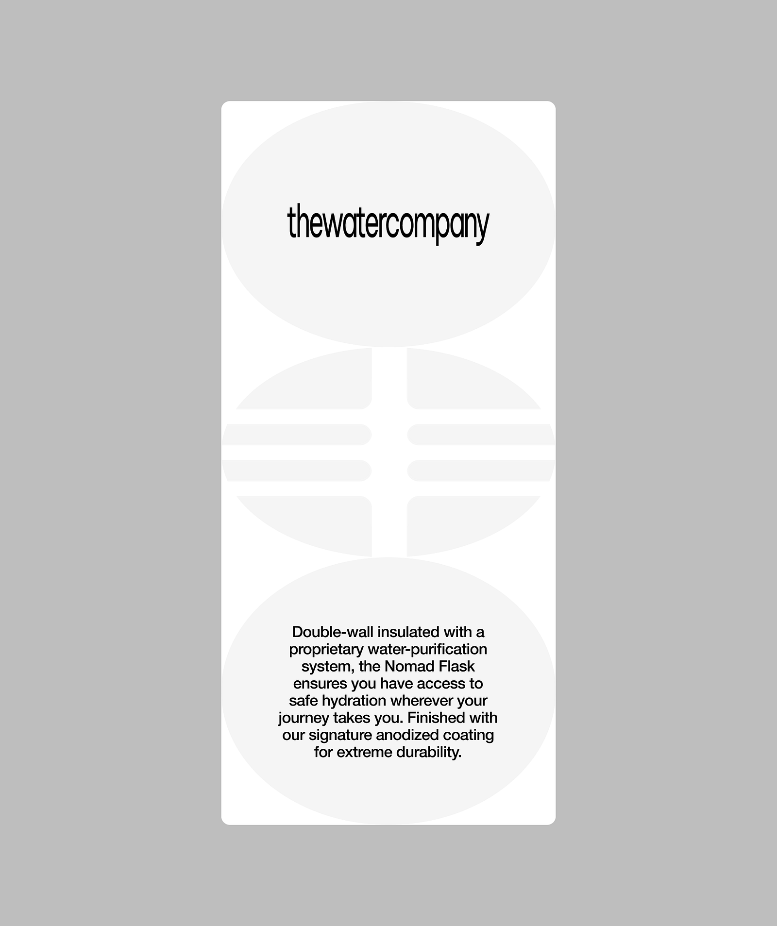
I do think this works a bit better, but it should feel like a blend of both worlds. Clear and brutalist, but also aquatic and glassy.
meh. At this point, I feel like this direction is inherently uninteresting to explore. Even though I think there’s a lot of cool things you can do with physical design when branding it like a Rimowa, the digital design potential is limited.
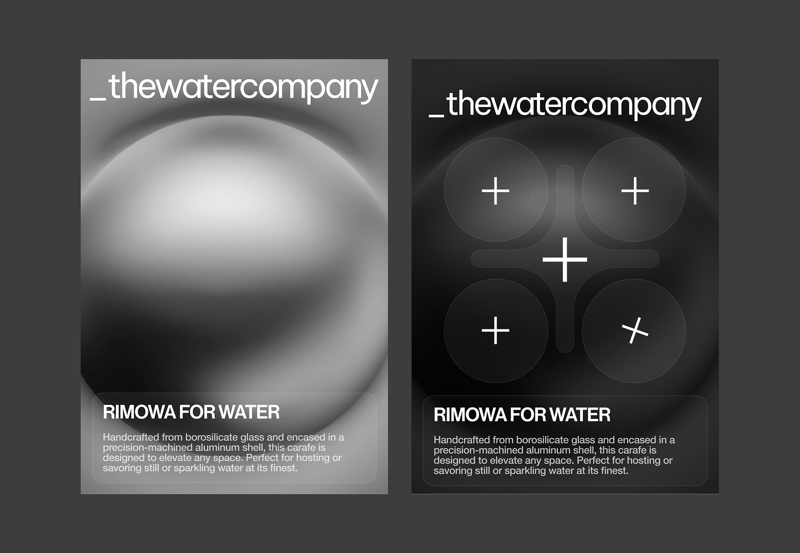
But, I’m still going to try a few more ideas to see if something sticks. I like this one exploration that interpolates gradients into the identity and adds a bit more depth to the design. I think pairing liquid circular gradients with the circular geometric symbols could be interesting.
It’s a bit harder for me to imagine a darker packaging for water, but anything goes at this stage. I want to explore something a little bit more “technical” for this brand since I want it to feel premium at first glance. This should feel like a product that has gone through multiple stages of iterations and sampling, passed multiple industry-standard testing, and put in the most rigorous research environments.
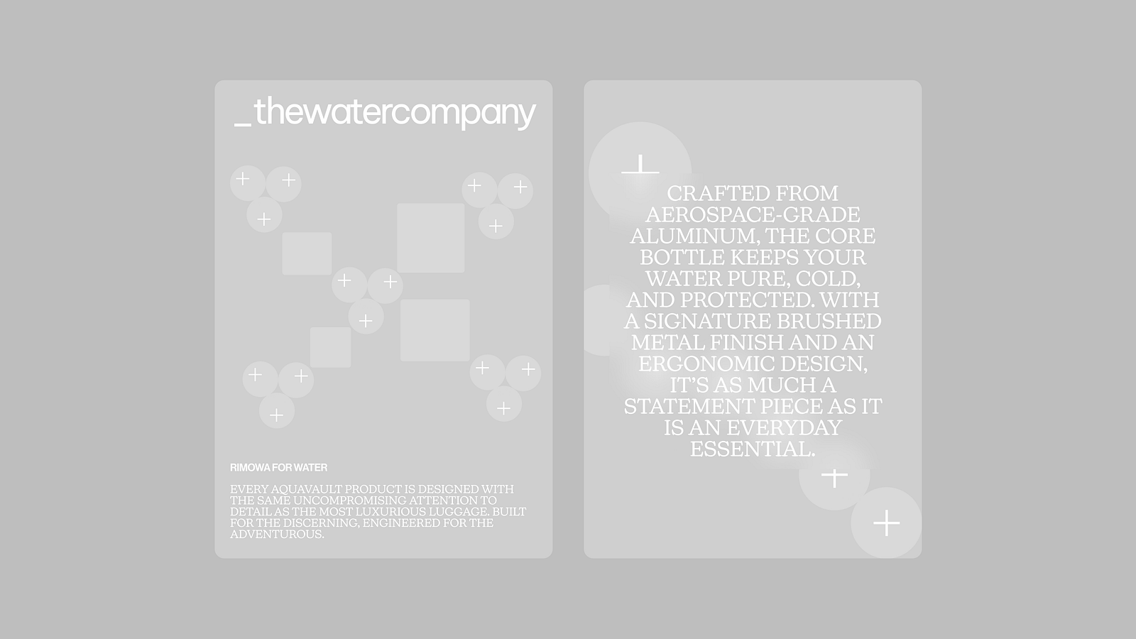
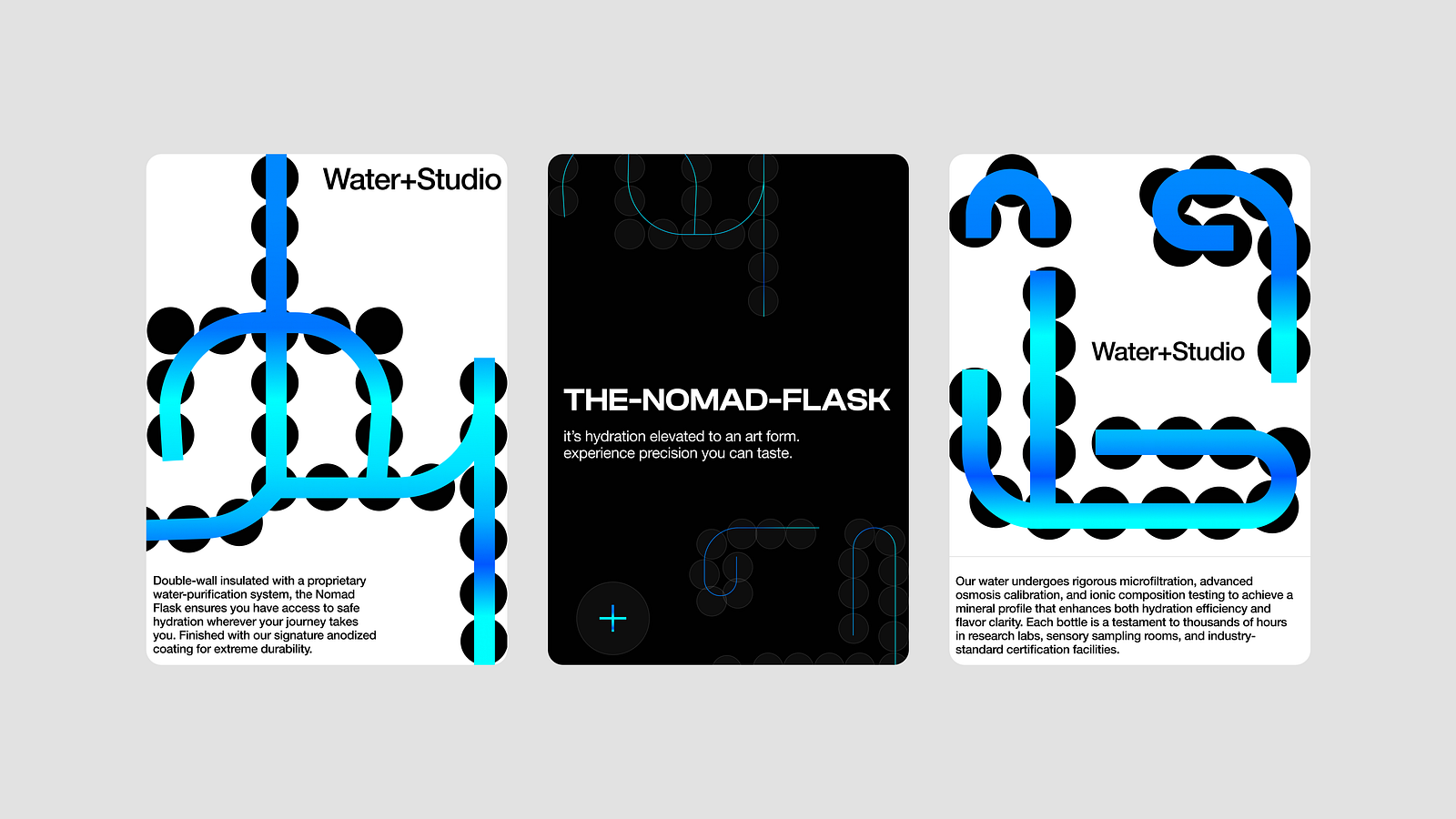
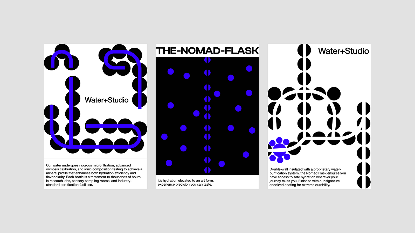
I think the exploration above feels closest to what I’m imagining. I like the use of using molecules to shape patterns and organic designs and having a distinct brand mark with the line art. I think those two elements can go really far to become defining motifs of the brand. Typography is relatively simple but I still wanted to experiment with a more technical display font for product naming.
I think I’m okay with sticking with this for now and building it further, just because I don’t want to spend TOO much time on this little sprint. From here, my goal will be to build core graphic elements and see how the brand reacts to web, social, and general print collateral.
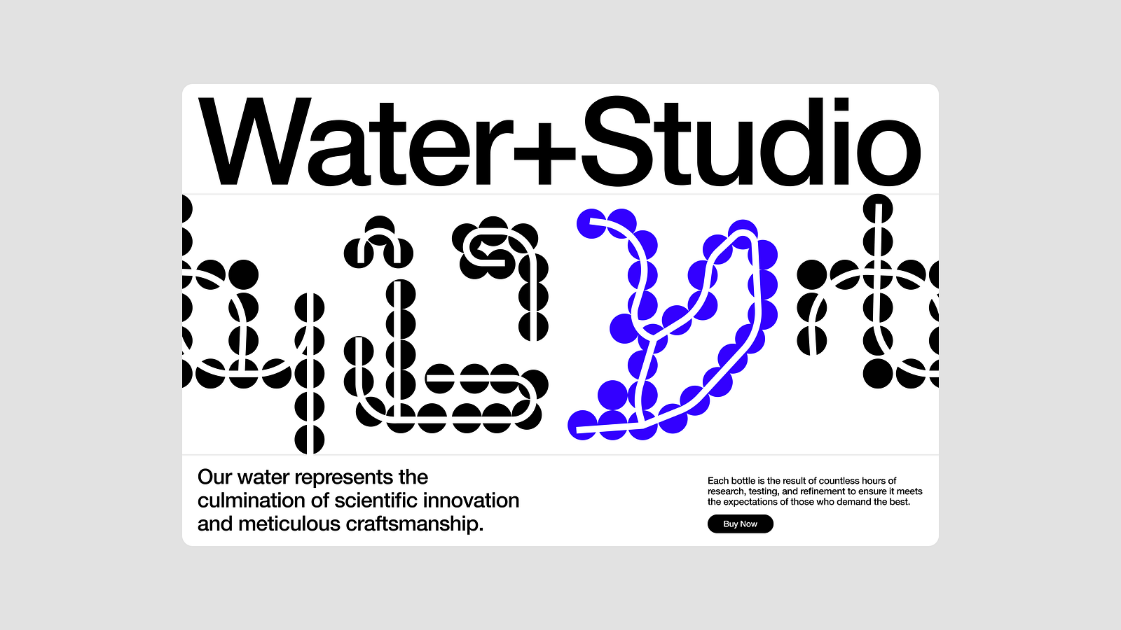
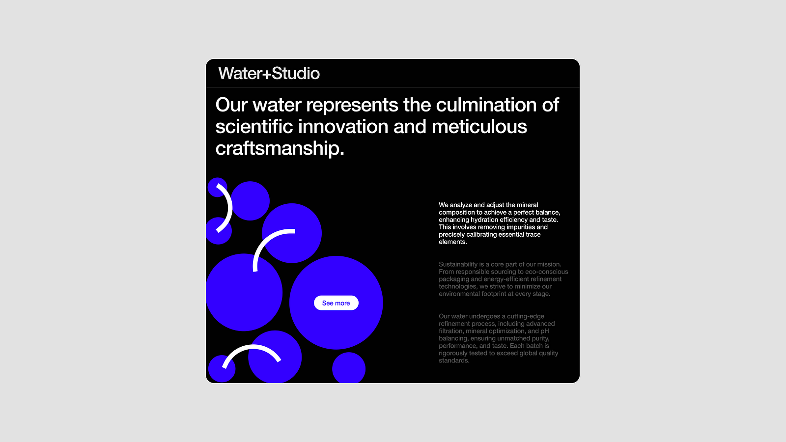
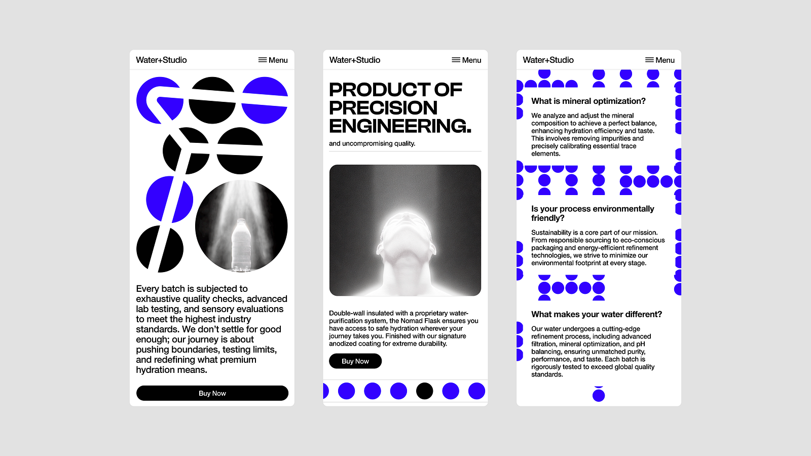
Of course, packaging + physical product design is missing here but the brand elements are defined, which was ultimately the goal of this sprint. I could potentially do a part 2 of this where I do packaging design for a sample product for this brand. I like the name Water+Studio as well.
Alirght, final product:
Below is a very quick summary of the identity. Everything I talked about and tried out is summed up below. From here, it’s easy to create new pieces of collateral like the website or packaging or social assets. Just need to think about each piece of collateral independently and find nods to this base identity system.
Alright that’s it. Let me know if you ever want me to do a v2 of this.
Effective ways to make your brand unique and stand out in the marketplace using iconic brand principles
Erik Messaki Co-founder and CEO at Outcrowd branding and web design agency
Naples helped me better understand global economy principles.
Roberto Saviano
This quote comes from a book by a writer who was assassinated by the mafia for revealing its secrets. I don’t intend to take such risks, so I’m going to share some legal ways of making a brand unique, effective, and unsinkable — like the mafia.:)
We know that a brand needs to be special to outperform the competition and stand out in the marketplace. In practice, it’s not always as fun as it sounds. A company comes up with a USP, builds great product features, and orders a special trending design. But as time goes by, the startup gets lost among its peers and stops growing, despite a promising strategy, regular updates, and active marketing efforts. What went wrong?
One of the reasons is misunderstanding of what exactly makes a brand unique, how it works, and how not to lose that uniqueness during the growth and scaling of a startup.
To understand it, we need to look at any iconic brand and see what makes it so. It will serve as an example. There’s a lot we can borrow from these guys and use in our own strategy.
Get ready, because what I’m going to say will shock you.
Uniqueness means being distinct. Creating an iconic brand is like starting a mafia or a cult, minus the criminal aspect.
This isn’t just a humorous simile. An iconic brand has all the characteristics of a mob octopus that holds the world in its tentacles. A strong brand is akin to a religion, a cult, an object of worship, with its own leaders, acolytes, and missionaries that spread ideas and products. The word “religion” means “a bond of faith.” Consumers are bound together by their belief in and loyalty to a brand. And just as every religion is unique and distinct, so is a strong brand unique and distinct from the sea of mediocrity. In any case, brand cultists believe their group to be apart from everyone else and are proud of it.
If you analyze how a cult is organized and what makes it effective and apply these principles to your brand, you will achieve incredible results, even if you have a small company, modest finances, and a non-unique initial product.
So, are you ready to become the godfather of the Brand Mafia? Then let’s go!
The Mafia/Cult Model
Most entrepreneurs usually rely on their current capabilities and never imagine their ideas and products taking over the world. But those who settle for less, get less. Strive to go beyond mundane reality and don’t limit your brand vision in the long run. One day, your brand may be the octopus that takes over the world. This vision must be built into the foundation. For this purpose, the internal ideology of the brand and all strategic steps and processes should be aimed at creating your brand mafia, growing it, and gradually introducing its tentacles into the market.
How does this approach differ from the standard growth and scaling strategy? Here’s how: you are consciously applying cult (or mafia, if you prefer) strategies, minus the illegal stuff. This approach can completely change the way you look at business. You might even reorganize the company, rewrite its development strategy, rethink brand development, positioning, and image.
This means a revolution and a hard reset of the system. But don’t make any steps in this direction without first learning how a mafia or cult works and how their models and principles are applied in marketing.
Few of us are ready to start a revolution — a restyling at most. Maybe a rebranding, if the brand has lost its luster and needs to be repositioned. But turning into a mafia? Thanks, guys, I’ll take a raincheck. We only sell soap, there’s no cult. (That laughter you hear is Procter & Gamble and Colgate-Palmolive.)
Still, you can already apply “cultish” principles as additional tools to develop and promote your brand. Once you see that they work, you’ll want to add more.
Uniqueness is about being chosen and distinguished. To become chosen, you need to be worthy. Not just create a worthy image, but live up to it.
To grow the right tree, you need to plant the right seed.
Branding doesn’t start with an identity. Branding starts with an idea, a purpose, a strategy, and an organization. It also starts with a team. If the brand is weak and not internally unique (if team members don’t feel like chosen and valued employees or lack motivation and vision for the brand), this will eventually manifest externally.
Branding starts from within.
The word “culture” comes from the word “cult.” If a company decides to postpone the development of its corporate culture until better times, it won’t become an iconic brand or even a good one.
Jesper Kunde’s brilliant book Corporate Religion reveals how an iconic brand is created. Kunde introduces the concept of “corporate religion” as a philosophy that unites a company and its employees around a common set of values, mission, and vision. Both consumers and the company itself become adherents of the “brand cult.”
Here are the salient points Kunde makes in Corporate Religion:
Successful brands evoke the same devotion and emotion in consumers as religion does in believers. Brands become part of people’s lives, inspiring trust and a sense of belonging.
To create a “corporate religion,” companies need to define their values and mission clearly. These elements must be sincere and integrated into every aspect of the business.
Company employees should become “adherents” of the corporate religion, sharing its values and goals. This promotes cohesion and performance.
Successful brands are consistent in their messaging and actions. Consistency in values and strategy helps create a strong, understandable brand that is appealing to consumers.
Consistency between external marketing communications and internal corporate communications is a must. This creates a unified brand perception both internally and externally.
To succeed, a company must strive for a culture of excellence that reflects a commitment to being the best at everything it does, from the product to customer service.
Fostering an internal culture builds and reinforces the core of the brand, making the brand stronger. But being strong isn’t quite enough to become iconic.
The brand needs to become special.
That’s where the “mafia/cult” marketing techniques come into play. These are tools of unification and separation. Strangely enough, some of them unite and divide at the same time.
La Cosa Nostra means “Our Cause.” (These guys have a great marketing department.)
1. Motivation
An iconic brand has a powerful motivating concept and communicates it to its followers on a constant basis. Universal and socially important values are involved in the brand concept. Philanthropy, solving social ills, saving nature, providing help and charity. Marketing actively (sometimes aggressively) spreads the brand idea.
2. Problem solving
The mafia takes care of its own, solving all their problems. (Sounds familiar!).
To the cult followers, sacred knowledge and a special path shall be revealed. It will take away their pain and solve all their problems.
A unique brand copies these valuable strategies.
3. Control and hierarchy
Every mob has its own charter and rules. The Sicilian Mafia has a pyramid management structure. The Camorra has a horizontal structure (clans are independent, prone to feuding and competition, but this makes it more stable). Any mafia group uses strict control, unquestioning obedience of the elders, discipline, rewards for the loyal, and punishments for the disloyal.
A strong brand also keeps all processes under strict control. It has a clear structure and hierarchy. It stimulates internal competition, playing on the desire of each team member to reach the next level and increase their standing. Loyalty is encouraged, while disloyalty can be punished (except there’s no bloodshed involved).
4. Initiation and involvement
In the mafia, newbies go through initiation rites and are taught the secrets of the craft. A strong brand actively works with newcomers (offering them attention, involvement, and immersion), instilling in them pride in the company and a sense of being chosen. The company holds regular workshops, meetings, training seminars, etc. A similar approach is used for the target audience.
5. Leader
An iconic brand has its own “preacher.” This is an authority, a charismatic leader who broadcasts the brand’s ideas constantly, like sermons. It’s an expert opinion with an emotional pitch that impassions adherents inside and outside the brand. The brand also employs regular celebrity endorsements.
6. Rituals and attributes
An iconic brand has more than just its own identity. It has its rituals. Its attributes. Its rules. Its prohibitions. Its incentives and rewards. It paradoxically unites and divides at the same time.
Cultists believe that their way is the best and they are the elite. So do brand cultists. Working for a corporation is extolled while consuming the brand’s products is proclaimed a privilege.
But being chosen is not just elitism. “The chosen one” works for a purpose, a specific mission. The chosen one is separated from the crowd and raised above it to do something important.
People aren’t inspired by a brand’s special features.
People are inspired by becoming special themselves or doing something unique through the brand.
An iconic brand allows customers to stand out, to achieve more than others, to be better than others. It gives people a desirable image of themselves. Such a brand becomes valuable and unique and stands out on its own.
By making people feel chosen, the brand becomes the people’s choice.
Even if you sell soap or nails, there’s no reason you can’t use an image of a smart homeowner or a successful nail wholesaler in your branding — the image of what your customers want to see themselves as.
2. Being chosen as personal and group identity
A unique brand treats every consumer like a special and important client. In doing so, it emphasizes that the customer is not alone. The brand groups people together and separates them from the rest. The group of adherents is proclaimed to be elite or to have advantages through exposure to the brand’s special products and ideas. Each member of the group believes in the power of these ideas (or the product being offered).
Uniqueness is born with an idea, brought to life through visual identity, and then broadcast to the world.
Identity is first and foremost a tool for brand recognition. It creates the face of your company. Design and marketing make this face recognizable, special, and loved.
This tool integrates and distinguishes at the same time. A unique identity is always cohesive and stylistically unified. It is the key to brand recognition and successful brand communications.
An iconic brand’s identity isn’t about shock and awe. It’s about good, professional design. You can commission one that’ll be just as good.
However, you need to realize that visual design is just the outer shell of the idea, which is the essence of the brand. A Christian is awed by the sight of the cross, even though there’s nothing outstanding about its design. The cross acts as a psychological and emotional trigger. Adherents of an iconic brand are awed by the familiar designer squiggle.
The foundation of a unique and recognizable brand is its essence, which marketers and designers make tangible and appealing, turning the brand into a visual magnet and a tool for communicating with users.
Iconic brands use emotions and stories to hook their customers, bring them together through common experiences, and encourage them to share their emotions and impressions.
“But we also do this!” I hear you saying. So where’s the result? The result depends on how well you know your users, and whether you were able to hook them emotionally and mentally so that they keep talking about you. Has your brand become a character in their dialogue and a protagonist in their stories — or is it just a passive observer? Iconic brands weren’t created overnight. They’ve been on the road to success for years, all the while studying and testing their audiences. They have penetrated widely and deeply into social networks and have reached the stage when they can mold public opinion and steer it in the right direction.
So you and I still have a long way to go, and we’ve got our work cut out for us. But the more aware your brand is of the world and the people in it, the more useful it strives to be, and the more aware will the people be of your brand. Real mobsters are masters of awareness! 🙂
Want even more inspiration? Follow Muzli on social media for your daily dose of design, innovation, and creativity right in your feed! Linkedin | Instagram | Twitter
My love for sneakers started at a young age. When I was still at school I had a side job at a basic footwear store. As a teenager I didn’t have the money to buy lots of sneakers, but my interest in the footwear culture was very high. Since that moment there always was one brand I admired the most; Nike.
My first pairs were white Nike AF 1’s in high and low. And there it started. For me it wasn’t only the look or fit, but also the brand itself. It felt like they did things differently. Their visual brand communication and campaigns were always next level and on point, I loved NikeID (now Nike by You), the SNKRS app, the interactive store windows and installations, their mind blowing collaborations and ofcourse one of the most beautiful logos ever created. For already 12 years I’m only wearing Nike. Mostly AM 1’s and AF 1’s, but lately also Jordan’s and Nike x Off White models.
When I was a kid I also was drawing sneakers all the time. The fact I could create my own sneaker the way I liked was fun to play with. Later I turned these drawings into Adobe Illustrator, which made it even more fun to work on.
Visualising imagination
Nowadays I’m working in the creative industry as a designer and art director. Visualising my imagination is my job so with all this background information you can imagine I got pretty excited when I heard about the benefits and possibilities of generative AI for the first time. (thanks Tim Dekens)
Images made with Midjourney
Back in 2022 the first tool I experimented with was MidJourney, one of the best platforms out there for image generation. Because Midjourney just started, it wasn’t that qualitative, comprehensive and refined as it is now. Creating a sneaker with a simple prompt was already a huge challenge in the beginning. And then we haven’t even talked about getting the Nike swoosh right.
Image made with Midjourney
In the early stages of Midjourney I was playing with lots of objects and subjects in my prompts but sneakers were my absolute favourite. I started posting them on my socials and because generative AI wasn’t that mainstream as it is now, my generations got a lot of attention. They even went a little viral on various social platforms and I got interviewed by a bunch of sneaker and AI blogs.
But not everyone was that positive. I got some critics here and there about the fact we shouldn’t underestimate the real crafted people out there, who are actually designing and creating sneakers for a living. And as a designer myself, I obviously couldn’t agree more to that.
“ShoeBakery actually makes these for real, give him his props.”
When the legendary footwear artist Daniel G. from Mache commented this below the Instagram post by Sneaker Freaker International about my first set of AI generated sneakers in the style of chocolate and icecream, I heard about the work of ShoeBakery for the first time. I felt a bit offended when I red this comment… Dan, ShoeBakery and probably others as well would maybe have thought I stole the idea from ShoeBakery. But I didn’t.
Instead of feeling sad I decided to contact Chris Campbell from ShoeBakery. Not only I liked his work a lot, he actually also did like my work. After a few conversations we agreed on starting a collaboration. We both were curious if we actually could create world’s first AI generated shoe for real.
Photo: ShoeBakery
Behind the scenes
“As an artist who hand designs shoes inspired by the delightful world of desserts, I constantly seek new ways to blend creativity with innovation” says Chris. “When I met Marten who is an AI artist, he created a set of AI-generated images, this sparked my curiosity and imagination, offering a fresh perspective on my artistic process.
“As an artist who hand designs shoes inspired by the delightful world of desserts, I constantly seek new ways to blend creativity with innovation.” – Chris Campbell
The intricate patterns and vibrant colours produced by AI presented an exciting challenge and opportunity to push the boundaries of my designs. This project allowed me to merge my passion for dessert-themed artistry with cutting-edge technology, creating a unique and captivating shoe that celebrates the fusion of tradition and modernity.”
Video: ShoeBakery
“The AI-generated image depicted a whimsical dessert-themed sneaker adorned with colourful sprinkles, wafer textures, and playful confectionery elements. This visual inspiration was the perfect catalyst for my creative process, allowing me to transform a digital concept into a tangible piece of wearable art.”
Photo: Harmen Nanninga
GOT ‘EM!
A few months back I finally had the pleasure to actually wear this piece of art myself; GOT ‘EM! It’s a child’s dream to wear a pair of sneakers I ‘created’. And yes, I’m aware it’s not really created by me but with AI, by Midjourney. But without my imagination and prompt, I never would have get this outcome. Let’s say that human imagination and creativity are still needed to create something unique and qualitative with generative AI.
Would I feel more proud if my drawings from my teenager years turned into real shoes? Yes, definitely. But let’s enjoy the little things and let’s look at it from another perspective. We created a shoe with AI. I say we, but ofcourse all the credits are going to the talented people from ShoeBakery. They did an absolutely amazing job and I really enjoyed the collaboration. We both did, so we’re also working on some high heels and AF 1’s for the future.
“AI won’t replace us, people who are using AI will.” – Marten Kuipers
In my opinion this process is the future of (generative) AI in a nutshell. We use human craft, creativity, experience, emotion, imagination and ideas as the foundation for our artificial output to reach the level of quality and personality we need. Our focus, work, role and jobs will change, our craft will stay. AI won’t replace us, people who are using AI will.
Want even more inspiration? Follow Muzli on social media for your daily dose of design, innovation, and creativity right in your feed! Linkedin | Instagram | Twitter
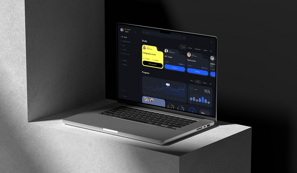
Today, we’re thrilled to share the story of our team at desh.team as we developed an online course platform for ClassPulse University. This innovative learning hub offers access to a diverse range of courses and materials designed for those eager to enhance their skills and take their careers to new heights.
Our project was brought to life by a global team of educators, tech innovators, and lifelong learners. Together, we share a deep-seated belief that continuous learning is the key to unlocking success and fostering career growth.
In today’s feature, we’ll spotlight our collaborative efforts in web design and graphic design.
Let’s dive in!
Web site
Ensuring your website reflects your essence in the best possible light is paramount. It’s about standing out amidst competition and offering your visitors an experience that’s both personal and distinctive.
By blending visually captivating design elements, intuitive navigation, and engaging content, we craft websites that immediately captivate visitors. It goes beyond mere aesthetics; it’s about delivering a tailored and unique encounter that resonates with your potential clientele.
Working closely with clients who possess a deep understanding of their audience and desires, we meticulously analyze the current user experience and competitors. Through collaborative efforts between our creative team and the clients, we develop a platform aligned with user goals and desires.
Our design philosophy was straightforward: simplicity and modernity. We focused on minimalist designs to highlight key information without overwhelming users.
Design system foundations
Establishing solid foundations is crucial for crafting simple and engaging end-to-end user experiences. This is achieved through maintaining consistency in text, spacing, color, and shape.
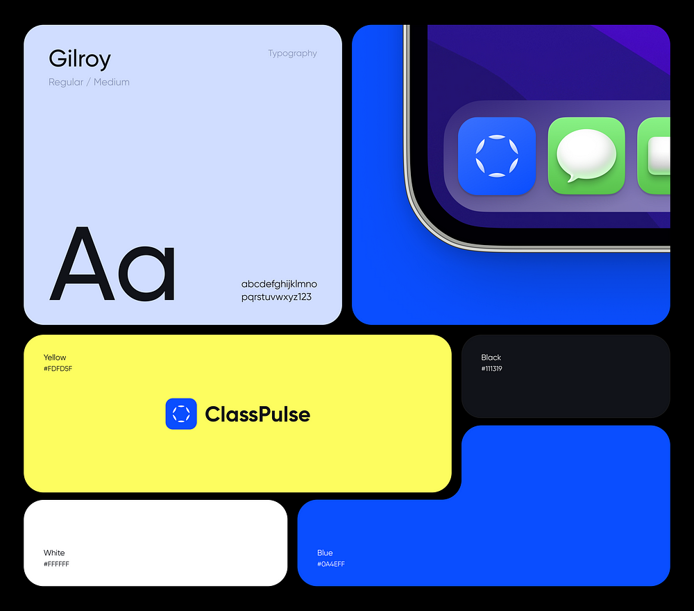
Our color scheme aims for strong contrast and modernity, blending dark tones with bright, cheerful accents of yellow and blue for an impactful visual impression. Colors serve as a conduit for consistent interactions with products and should be utilized to provide contextual cues, expressing hierarchy and status.
Typography plays a vital role, selected for its readability and friendly aesthetics, creating a modern and inviting space for students. The chosen font’s open shapes lend themselves well to both body text and headings, ensuring clarity across all content.
When it comes to form, elements with rounded corners exude a sense of sophistication compared to sharp, rectangular shapes, adding to the overall sleek design.
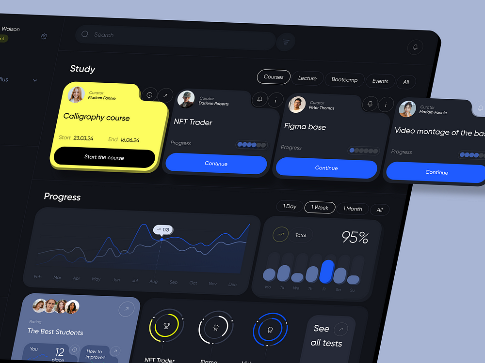
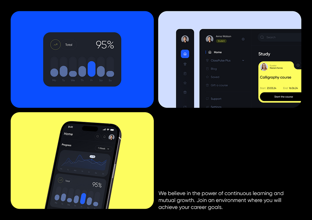
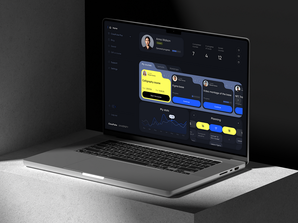
A bright and airy home page layout enables effective integration of various types of content. This includes a comprehensive list of all courses, strategically utilizing accent colors to highlight the most popular ones. Additionally, showcasing students’ progress in their studies serves to boost motivation.
We’ve gathered all essential student indicators and structured them into a clear and intuitive dashboard. This ensures that users can effortlessly process information without experiencing cognitive overload.
A robust visual hierarchy allows website visitors to quickly browse and scan pages, seamlessly moving from one section to another and immersing themselves in the service’s functionality and benefits for teachers and students.
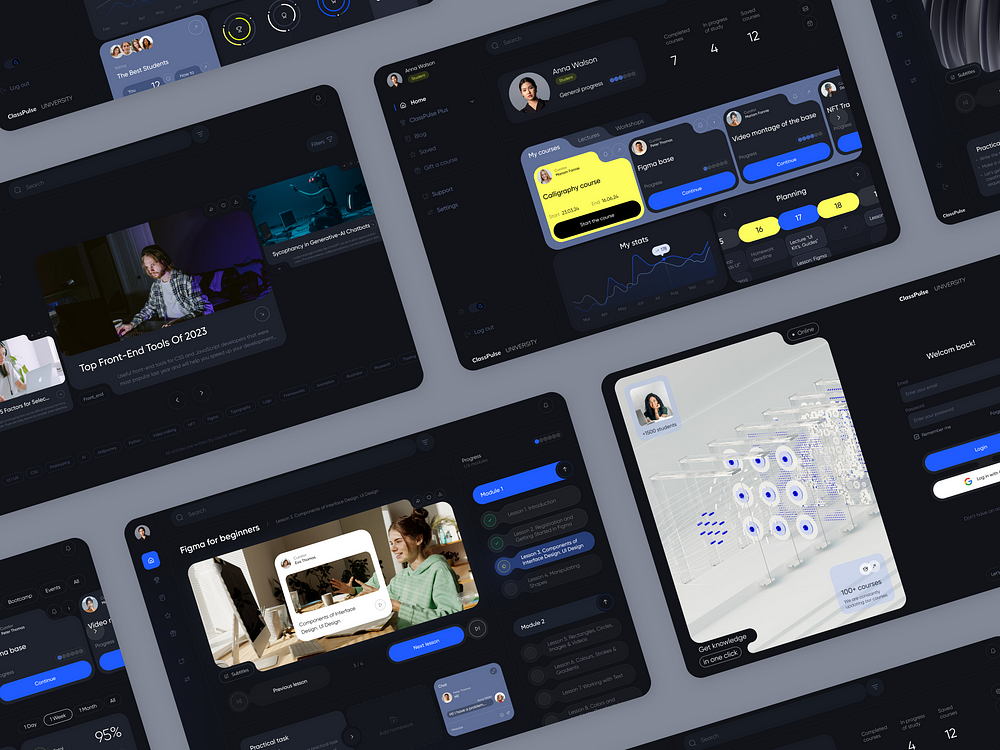
Thanks to our design system, which incorporates consistent card forms, rounded edges, and recurring patterns, we’ve not only achieved uniformity across all pages but also cultivated a distinctive appearance. This curled aesthetic is particularly significant for our target audience, enhancing brand uniqueness and recognition while showcasing the company’s technological prowess.
Let’s delve deeper into how the grid functions across various pages.
In a survey of 115 users regarding their preferred device mode, approximately one-third favored dark mode, another third opted for light mode, and the remaining third utilized a combination of both. Hence, we decided on a dark theme because it:
Alleviates eye strain
Conserves battery life
Offers aesthetic appeal
Enhances accessibility for individuals with visual impairments, such as cataracts
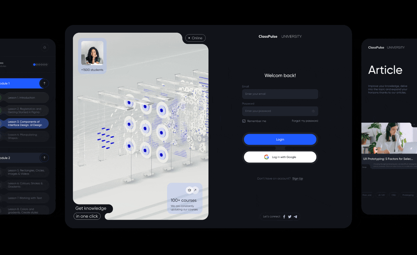
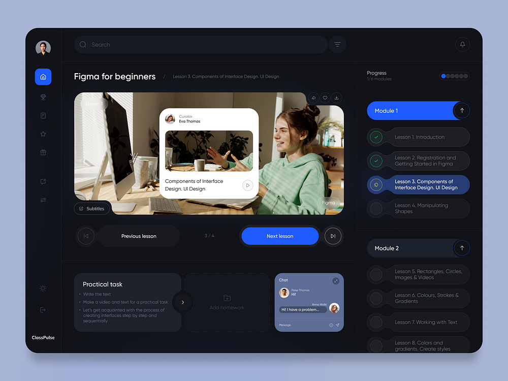
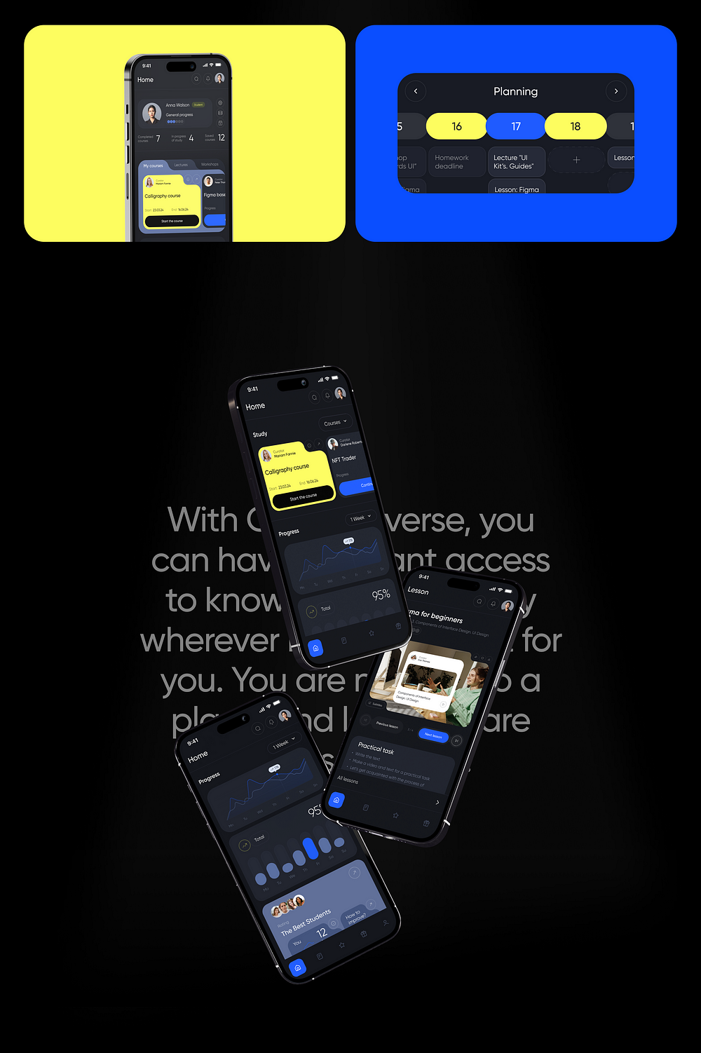
One of our most frequented pages is the lesson page, where we’ve revamped the structure to incorporate all essential features for the user’s convenience. This includes headers, breadcrumbs for seamless navigation, lesson-titled videos, and the ability to switch between lessons directly on the page. We’ve also implemented progress tracking across all lessons, ensuring users always know where they stand in their learning journey, supported by visual indicators.
As an additional feature, we’ve integrated a chat function with the teacher. This allows users to ask questions promptly as they arise, fostering a sense of engagement and involvement in the learning process.
The user’s profile is a comprehensive hub housing all pertinent information regarding study progress, statistics, and a calendar feature ensuring users stay on top of their study plan and never miss a class. Personalization is key, empowering users to tailor their schedules within the calendar if they’ve opted for flexible training options, as well as customize their profile settings.
Moreover, the left side menu offers swift access and seamless navigation across the platform, ensuring users can effortlessly explore and utilize its features.
Ensuring accessibility and ease of use for learners everywhere posed a significant challenge, leading us to develop a mobile version of the platform. Recognizing the prevalence of mobile usage among younger generations, offering a mobile application enhances the platform’s appeal and accessibility.
Furthermore, mobile versions are designed to adapt seamlessly to various screen sizes and device capabilities, ensuring a consistent user experience regardless of the device being used. This approach not only enhances accessibility but also ensures a smooth and engaging learning journey for all users.
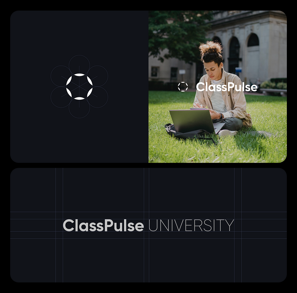
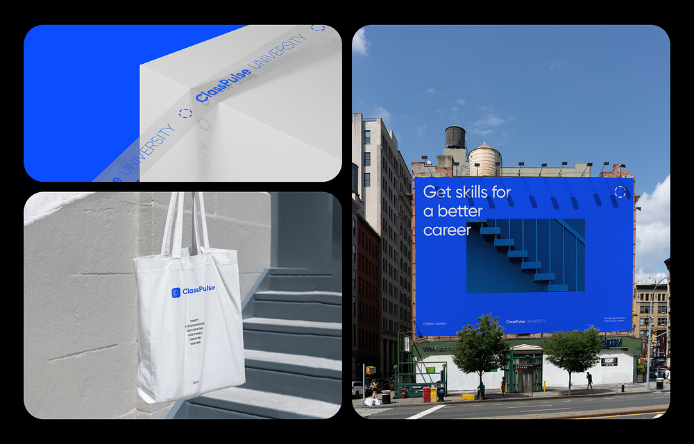
In our team, we believe in tackling each challenge comprehensively, fully immersing ourselves in the client’s objectives. In addition to the primary task of designing the platform, we took it a step further by creating a new logo and branding. This approach ensures that every aspect of the project aligns seamlessly, from visual aesthetics to brand identity, resulting in a cohesive and impactful solution for our clients.
Want even more inspiration? Follow Muzli on social media for your daily dose of design, innovation, and creativity right in your feed! Linkedin | Instagram | Twitter