
A dashboard UI is effective when it surfaces the right data at the right hierarchy with minimal visual noise. This is a curated collection of 50 cutting-edge dashboard design examples from 2026, organized by pattern type: analytics, SaaS operations, financial, and data-dense admin interfaces.
As 2026 approaches, dashboard design continues to balance functionality with creativity. The best examples today are not only clear and efficient but also visually engaging and full of character. To capture this diversity, we’ve gathered a mix of 50 dashboards ranging from practical, real-world SaaS designs to experimental and artistic concepts that stretch the imagination.
Take a moment to explore this massive collection, discover new ideas, and see how designers around the world are redefining what modern dashboards can look and feel like in 2026.
WanderWheels // Dashboard
by BL/S®
A visually striking booking dashboard that blends futuristic design with travel utility. The soft beige interface, bold orange highlights, and clean layout create a premium experience that feels both adventurous and refined.

.
Intelly — HealthCare App Dashboard
A playful and uplifting medical dashboard that blends functionality with cheerful design. The use of soft pastels, rounded shapes, and friendly contrasts makes healthcare data feel approachable and full of positive energy.

.
LifeStats — Health Dashboard
by Sunny Rathod
A calm and futuristic fitness dashboard with glassmorphism effects and soft lighting. The transparent layers, subtle gradients, and clean data visualization create a sense of focus and serenity while presenting health stats in a visually engaging way.

.
Teaching LMS — Classroom Management Dashboard
by Khoa (JAK)
A smart classroom dashboard that visualizes attendance and participation in real time. The clean layout, soft colors, and intuitive seating map make managing lessons effortless while keeping the interface friendly and human-centered.

.
iHealth — Healthcare Tracker App Design
A futuristic health monitoring dashboard with a clean white interface and soft blue gradients. The 3D body visualization and minimal layout create a calm, clinical atmosphere that feels both advanced and reassuring.
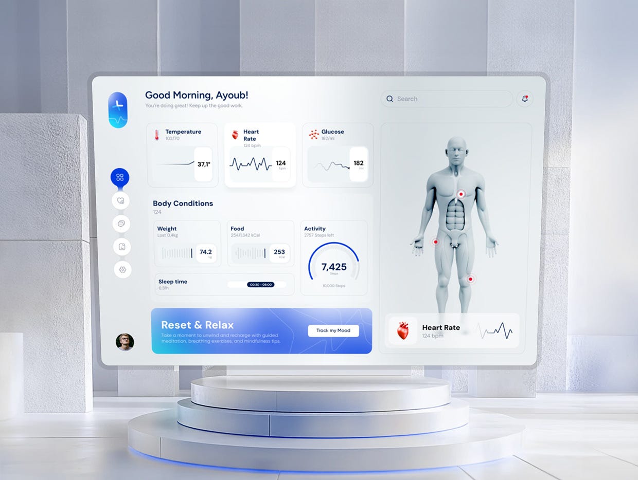
.
SaaS Dashboard Design
by Mirhayot
A dark, elegant telecom dashboard with soft lavender accents and smooth data visualization. The clear layout, refined color scheme, and subtle gradients create a polished interface that feels both modern and trustworthy.

.
Dashboard — Dark
by Felix
A clean and modern dark-mode dashboard that perfectly balances clarity and style. The soft gradients, bold typography, and clear visual hierarchy make data easy to digest while keeping the interface visually engaging and professional.

.
Hynex Healthcare Dashboard Design
by Orbix Studio
A sophisticated dark interface that blends fintech precision with futuristic healthcare design. The glowing accents, clean data cards, and balanced typography create a high-end look that feels intelligent, intuitive, and ready for AI-powered insights.

.
Dashboard — Modern Admin UI
by Felix
A bright and structured dashboard that balances clarity with energy. The soft color palette, clean spacing, and intuitive data visualization create a friendly yet professional interface that feels approachable and efficient.

.
Medical Admin Dashboard — ICarePro
by Riju Rajan
A clean and highly functional healthcare dashboard that prioritizes usability and clarity. The calm neutral tones, structured layout, and clear data visualization make complex medical information easy to navigate and understand.

.
ZenWallet — CryptoZen Dashboard Design Animation
A sleek and modern crypto dashboard that merges dark elegance with vibrant highlights. The contrast between neon accents and minimal typography creates a futuristic feel while keeping portfolio data and performance metrics easy to track at a glance.
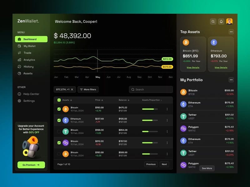
.
Warehouse Inventory Dashboard UI Design
A soft and elegant warehouse management dashboard that combines data visualization with smooth color coordination. The pastel tones, rounded shapes, and clear hierarchy create a calm, modern interface that feels both analytical and visually refreshing.

.
Fintech Wallet Dashboard UI Design
A bright and polished crypto dashboard with playful contrast and clean organization. The soft background paired with vivid highlights gives financial data a fresh, modern feel that makes complex information easy to follow.

.
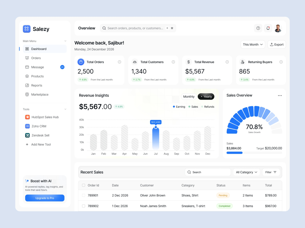
CRM SAAS Dashboard UI Design
by Sayeed Hasan
A well-structured business dashboard with a clean, professional layout. The balanced use of color and typography enhances readability, while the subtle charts and cards create a clear, data-driven overview without visual clutter.

.
Rabbet — Smart Real Estate Dashboard Design
by Dhruv
A refined financial dashboard with a cinematic dark aesthetic and neon highlights. The use of contrast, grid precision, and sharp data visualization creates a sophisticated look that conveys clarity and control over complex metrics.

.
Charts Mega UI Kit — Dashboard UI
by Vlad Tyzun
A bold and futuristic finance dashboard that pairs deep blacks with vivid purple accents. The smooth gradients, clean typography, and clear modular structure give it a high-end, modern edge perfect for digital-first analytics tools.

.
Fobework — E-learning Dashboard & Course Platform UI
by Orbix Studio
An elegant education dashboard that combines a dark, focused atmosphere with luminous accent colors. Its clear hierarchy and card-based layout make complex information easy to follow while maintaining a polished, contemporary look that keeps users engaged.

.
NobleFinance — Smart Finance Dashboard UI Design
by Orbix Studio
This finance dashboard stands out with its refined dark palette and energetic green highlights. The clean typography, well-structured cards, and balanced data visuals create a sophisticated interface that feels professional, dynamic, and easy to navigate.

.
Modern Finance Management Dashboard | Financia
by Orbix Studio
A bold financial dashboard that combines dark tones with vibrant gradients for a dynamic look. The clear typography and structured data layout make it easy to analyze spending, savings, and income at a glance while maintaining a modern, high-tech feel.

.
Lumos — Energy Management Dashboard
Stan D. for RonDesignLab
A bright and sophisticated solar management dashboard that merges data visualization with architectural 3D elements. The soft lighting, warm gradients, and precise layout convey a sense of sustainability, innovation, and modern home efficiency.
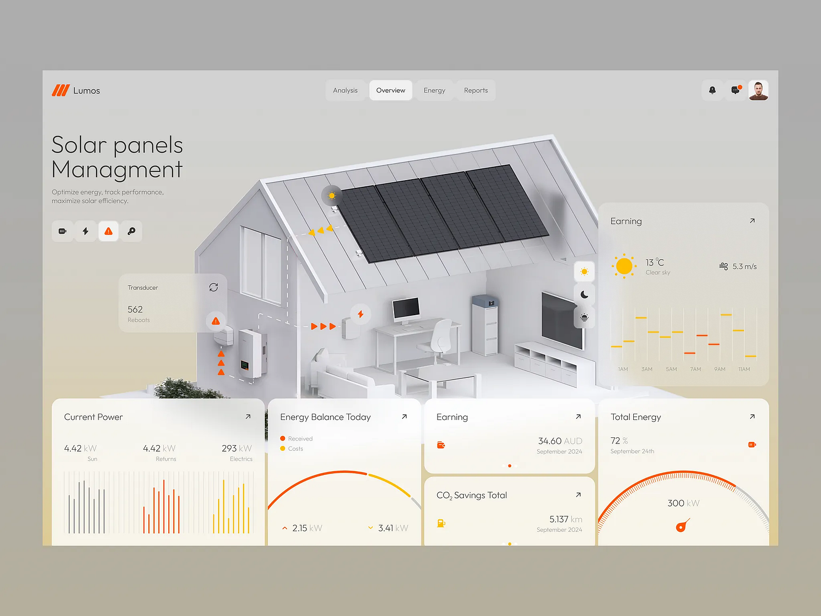
.
AI-powered Cybersecurity Dashboard
A powerful cybersecurity dashboard with a dark, data-driven aesthetic and precise green accents. The structured layout and real-time analytics deliver a sense of control and confidence, perfectly suited for monitoring complex system health and threat activity.

.
Rinesk — Call centre Dashboard Concept
by Anastasiia
A soft and elegant communication analytics dashboard with a pastel palette and smooth gradients. The minimalist charts and subtle highlights give it a calm, professional look that makes large amounts of data feel approachable and easy to interpret.

.
SaaS Analytics Dashboard — Data Overview & Management
A masterclass in information hierarchy. This [Dark/Light] themed dashboard uses a modular grid to balance complex data visualization with high-end aesthetics. The focus on [Metric Type] and clean typographic scale makes it a standout reference for professional enterprise tools.
.
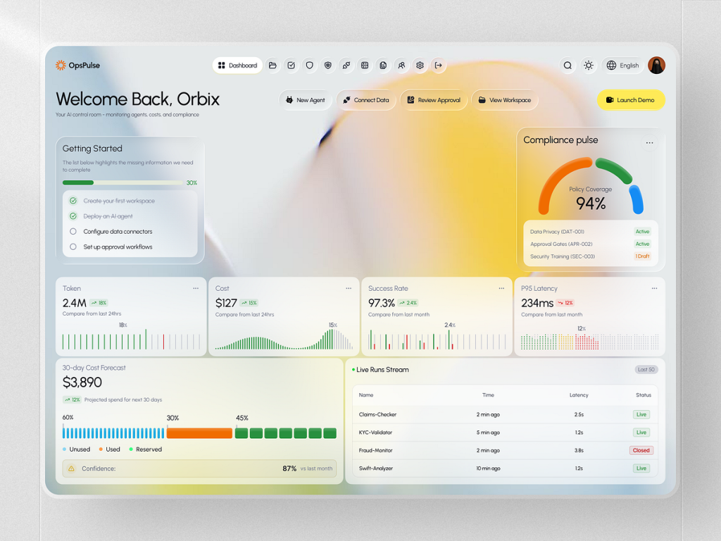
OpsPulse – AI Operations & Compliance SaaS Dashboard
by Orbix Studio
A boundary-pushing example of “Vibe Design” in the enterprise space. This dashboard utilizes a sophisticated frosted-glass aesthetic (Glassmorphism) to organize complex AI agent monitoring data. Key features include real-time compliance pulses, token usage tracking, and automated workflow status. The vibrant blurred background combined with high-contrast data cards proves that utility-heavy tools can, and should, look stunning in 2026.
.
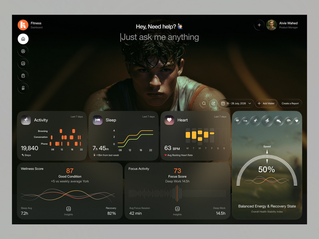
Fitness Tracking & Wellness Dashboard — Health Metrics Insight
by Juice Lab
A stunning example of an immersive, dark-mode health interface that prioritizes personalization. This dashboard uses a bold, cinematic background image combined with floating frosted-glass widgets to display biometric data like activity levels, sleep patterns, and heart rate. The layout masterfully balances “Focus Scores” and wellness recovery states, using smooth, organic wave charts to make complex health trends feel intuitive and motivational. It’s an essential reference for designers building high-end personal tracking or lifestyle apps.
.
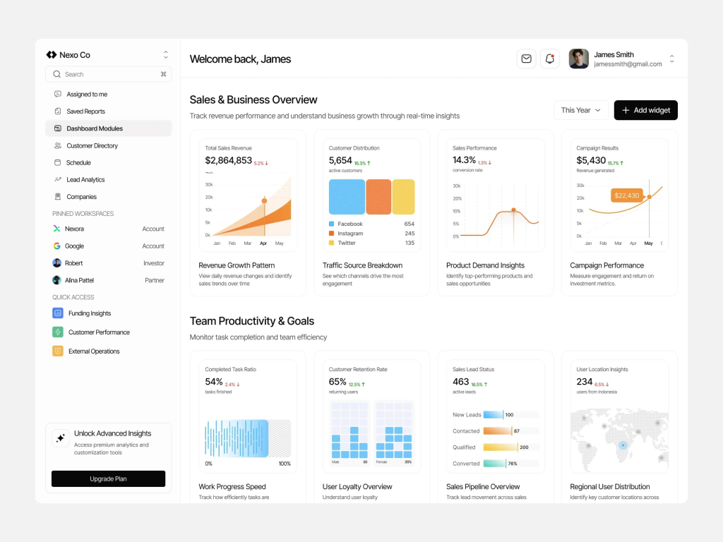
Sales & Business Overview Dashboard — High-Performance SaaS UI
by Oripio
A textbook execution of clean, scalable SaaS design. This sales management interface focuses on high-level business intelligence, featuring distinct modules for revenue growth patterns, traffic source breakdowns, and team productivity goals. The consistent use of soft-edged cards, a subtle pastel accent palette, and clear typography ensures that even with dozens of data points, the user never feels overwhelmed. It’s an ideal benchmark for designers building operational dashboards where speed of data interpretation is the top priority.
.
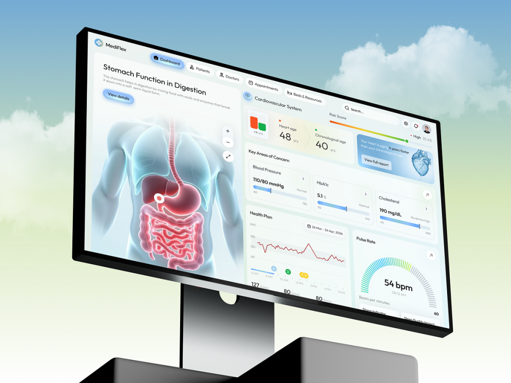
MediFlex – Medical & Health Analytics Dashboard
by Orbix Studio
A sophisticated medical interface that sets a new standard for clinical data visualization. This health dashboard combines high-fidelity anatomical 3D renderings with precise biometric data, such as cardiovascular monitoring and digestive health insights. The clean, accessible UI uses a soft palette and clear typography to manage complex patient information—including blood pressure trends, HbA1c levels, and pulse rates, making it an essential reference for designers working on advanced diagnostic or telehealth platforms.
.
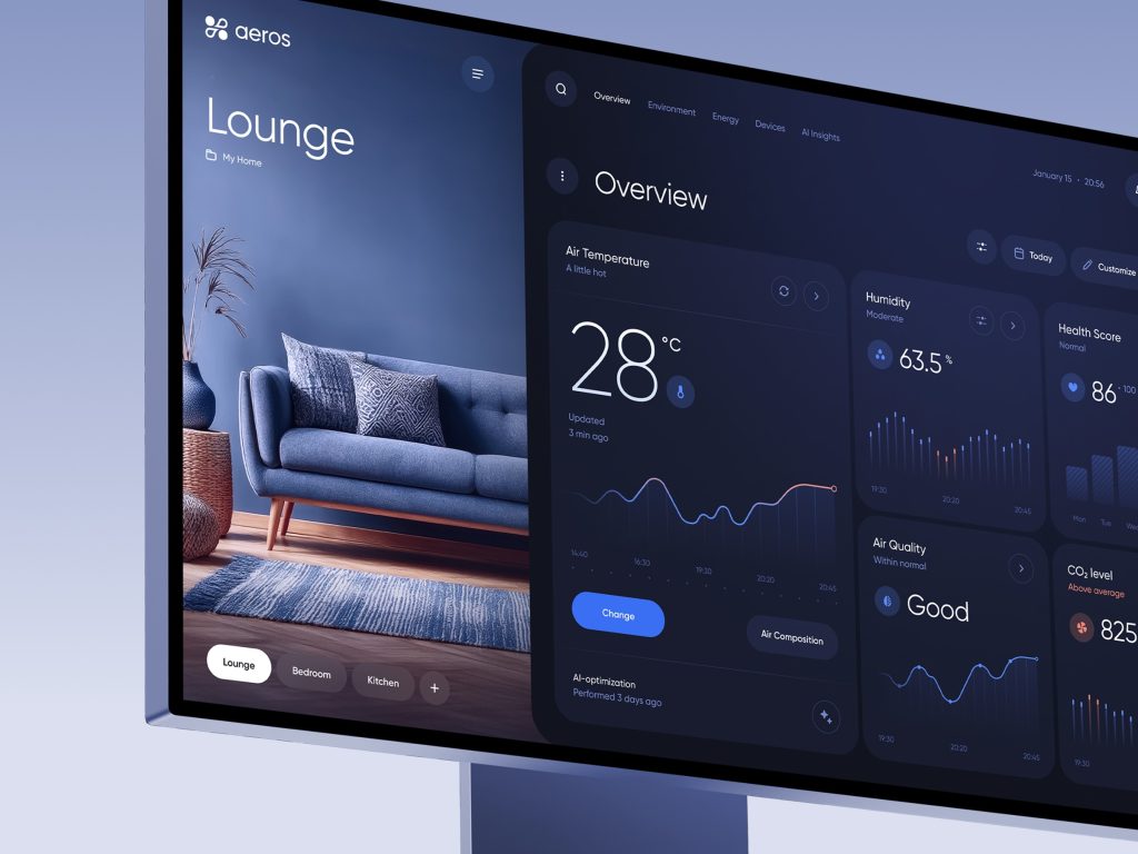
Aeros – Smart Home Climate Control Platform
beautiful integration of lifestyle photography and functional data visualization. This smart home dashboard manages indoor environments with a high-end, dark-themed UI. The layout prioritizes essential metrics like air temperature, humidity, and CO2 levels using elegant line graphs and minimalist status indicators. By blending real-world room previews with precise climate controls, Aeros demonstrates how IoT dashboards can feel like a natural extension of a modern living space rather than just a technical tool.
.
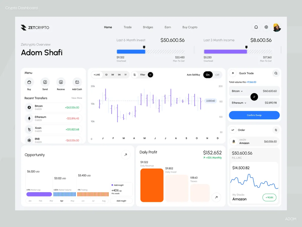
ZetCrypto – Professional Cryptocurrency Trading Dashboard
by Adom Shafi
A high-performance crypto-asset management interface designed for the modern trader. This tablet-optimized dashboard balances massive amounts of real-time data, including candlestick charts, daily profit yields, and multi-currency transfer histories, within a clean, spacious white-themed UI. The modular design allows users to monitor market opportunities and execute swaps instantly, proving that even data-dense financial tools can maintain a minimalist and approachable aesthetic in 2026.
.
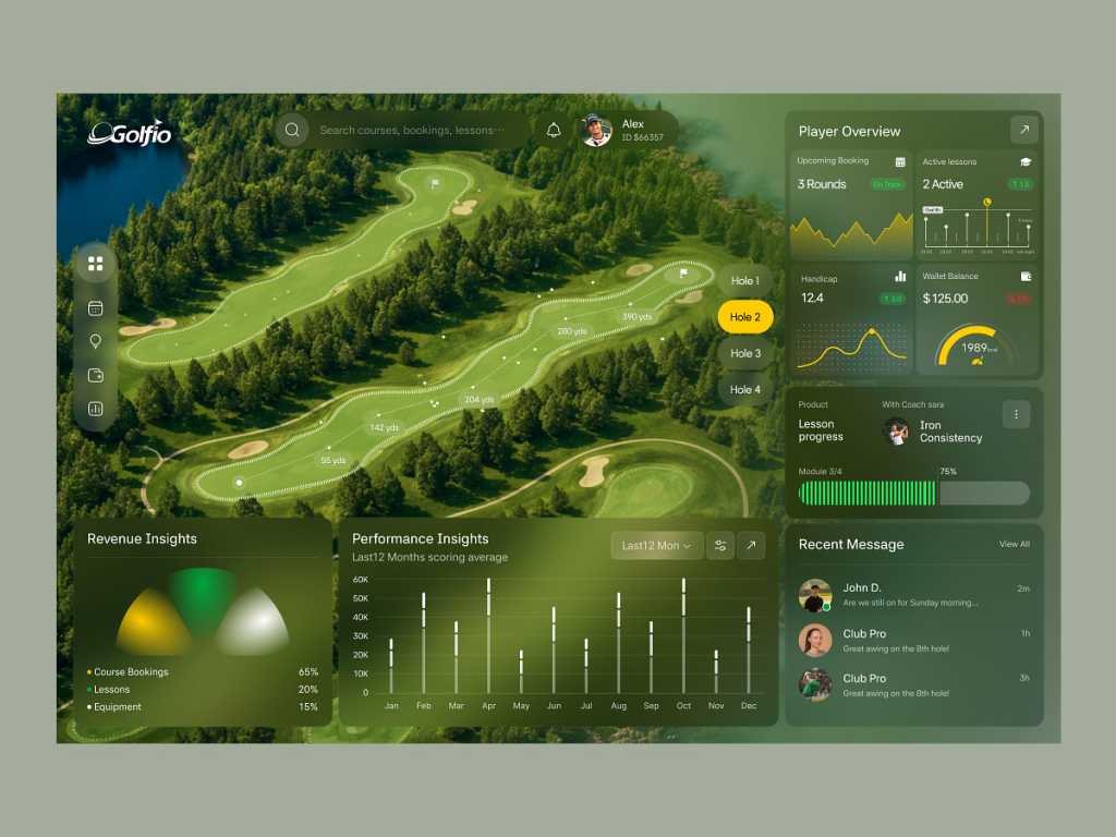
Golfio – Golf Analytics & Player Performance Dashboard
by Juice Lab
A masterclass in blending environmental data with personal performance metrics. This specialized dashboard uses an immersive aerial view of the golf course as its foundation, overlaying precise shot data and hole-by-hole analytics. The sidebar provides a clean summary of player stats—including handicap trends, lesson progress, and wallet balances—using a sophisticated dark-glass UI. It’s a perfect example of how niche dashboards can use spatial context to make complex sports data feel both professional and engaging for the end-user.
.
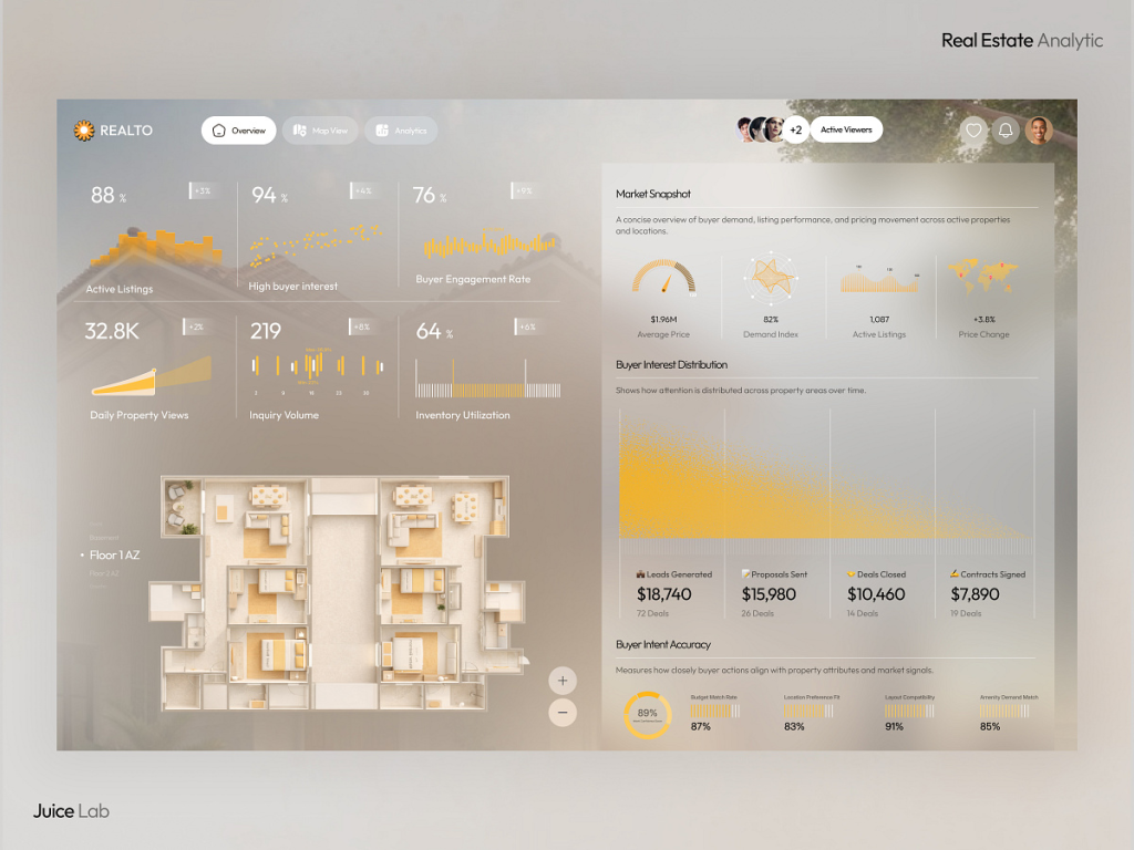
Realto – Real Estate Analytics & Market Intelligence Dashboard
by Juice Lab
A sophisticated example of how spatial data and market analytics can coexist in a single interface. This real estate dashboard, titled “Realto,” provides a comprehensive overview of buyer demand and property performance. It features a high-fidelity architectural floor plan alongside complex data visualizations like buyer interest distribution and intent accuracy scores. The use of a warm, neutral color palette combined with elegant “frosted glass” widgets makes high-level market intelligence feel accessible and professional, offering a perfect blueprint for modern property management and investment platforms.
.
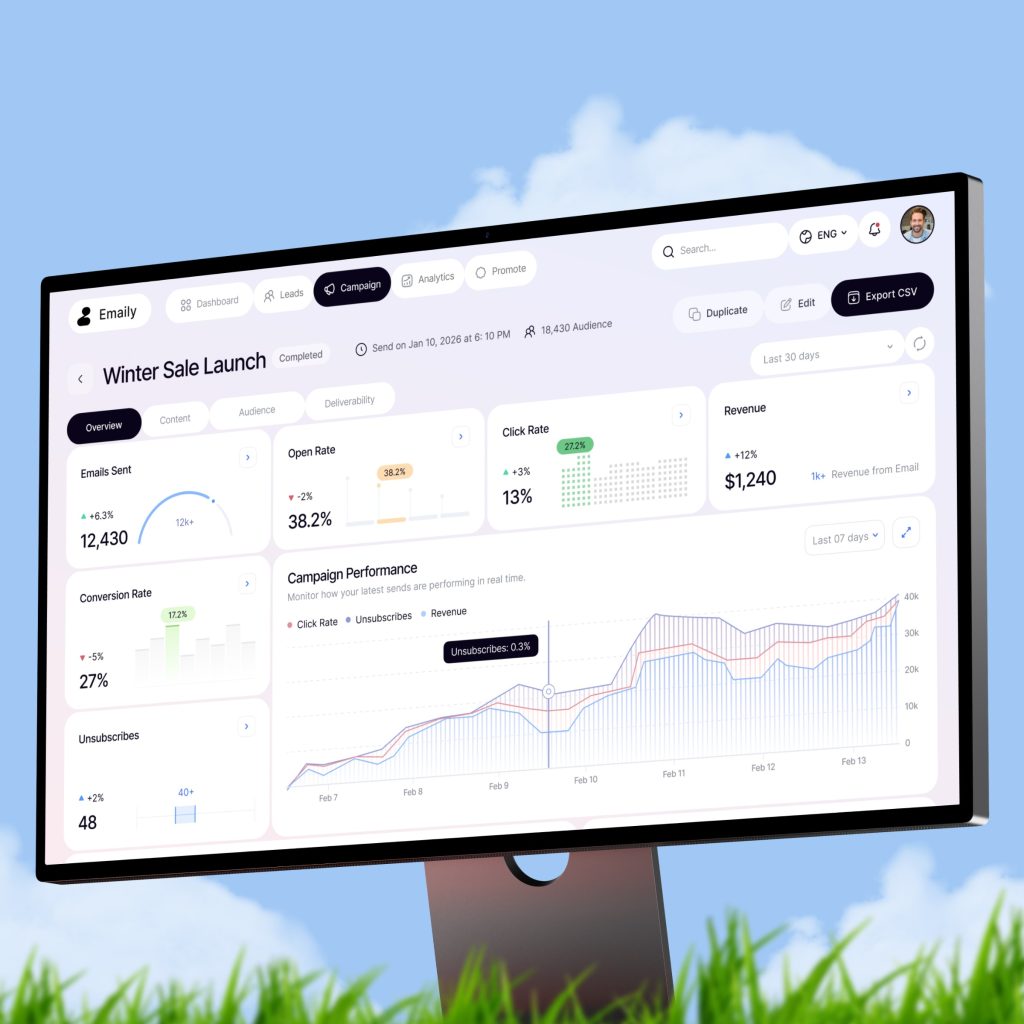
Email Marketing & Campaign Analytics Dashboard
A clean, results-oriented marketing dashboard that excels in visualizing campaign performance. This interface provides a clear bird’s-eye view of high-level metrics like open rates, click-through rates, and overall revenue generated from email sequences. The use of a bright, professional color palette and intuitive line charts for real-time campaign tracking makes it an ideal reference for SaaS platforms where data transparency and performance monitoring are key to user retention.
.
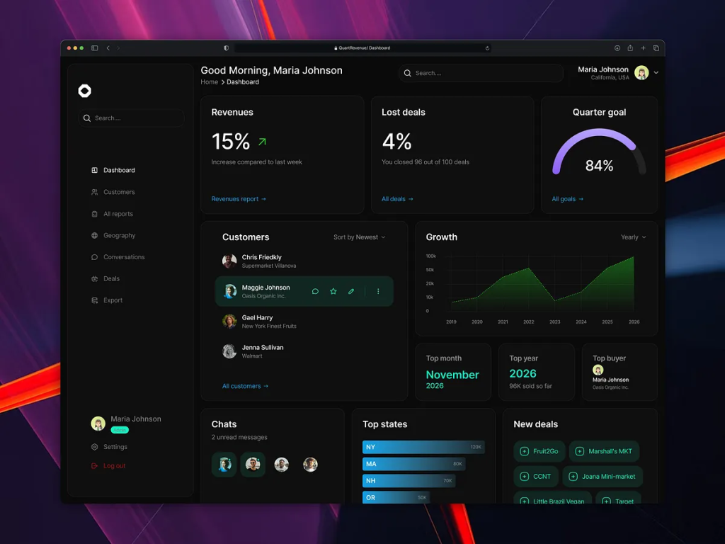
QuartRevenue – SaaS Finance & Revenue Operations Dashboard
A high-impact, dark-mode financial dashboard designed for executive-level oversight. This interface, titled “QuartRevenue,” excels at condensing quarterly growth metrics into a single, intuitive view. Featuring deep-green accents and neon highlights, it tracks critical KPIs such as revenue growth patterns, lost deal percentages, and progress toward quarterly goals. The clean sidebar and structured “Customer Growth” feed demonstrate how to manage complex financial CRM data while maintaining a focused, high-contrast aesthetic that feels both powerful and professional.
.
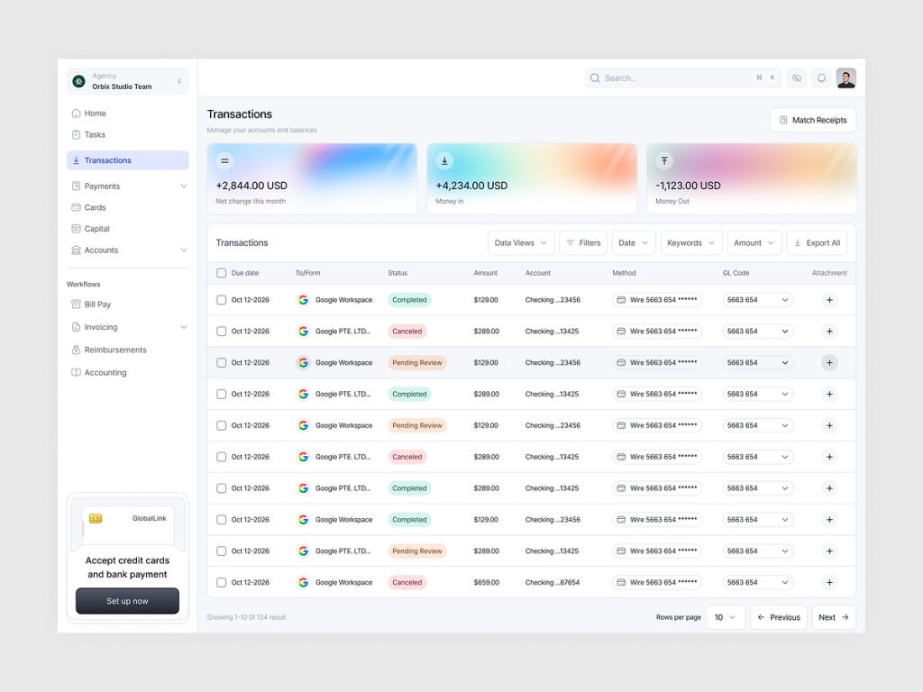
GlobalLink – Financial Transaction & Ledger Management
by Orbix Studio
A clean and highly functional fintech dashboard that masters the art of the data table. This interface simplifies complex financial logging by using a spacious white layout, subtle color-coded status tags (Completed, Canceled, Pending), and vibrant gradient header cards for quick balance snapshots. The intuitive filtering system and seamless integration of Google Workspace identifiers make it an excellent benchmark for B2B banking or internal accounting platforms where clarity and speed of verification are paramount.
.
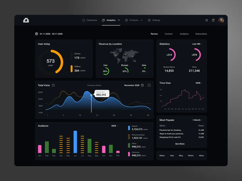
Analytics Dashboard – Dark Mode UI – SaaS
A premium dark-mode dashboard tailored for content platforms and digital publishers. This interface, titled “InsightStream,” masterfully visualizes complex audience growth and revenue data through a high-contrast, neon-on-dark aesthetic. Key features include a real-time “User Today” monitor, geographical revenue distribution, and detailed “Most Popular” content tracking. The use of vibrant pink and green accents against a deep charcoal background ensures that critical performance trends, like subscriber surges and traffic peaks, are instantly recognizable, making it a top-tier reference for modern data-driven storytelling tools.
.
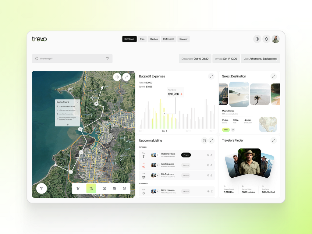
Travo – Immersive Travel Guide & Itinerary Planner
by Taqwah
A masterclass in spatial dashboard design that transforms trip planning into a visual journey. This travel companion interface, titled “Travo,” integrates high-resolution satellite mapping with real-time budget tracking and itinerary management. The layout allows users to visualize their route across coastal destinations while monitoring expenses and upcoming bookings through clean, minimalist data cards. The inclusion of a “Travelers Finder” social module and “Vibe” selectors (like Adventure/Backpacking) demonstrates how modern travel dashboards can offer a highly personalized, community-driven experience within a streamlined UI.
.
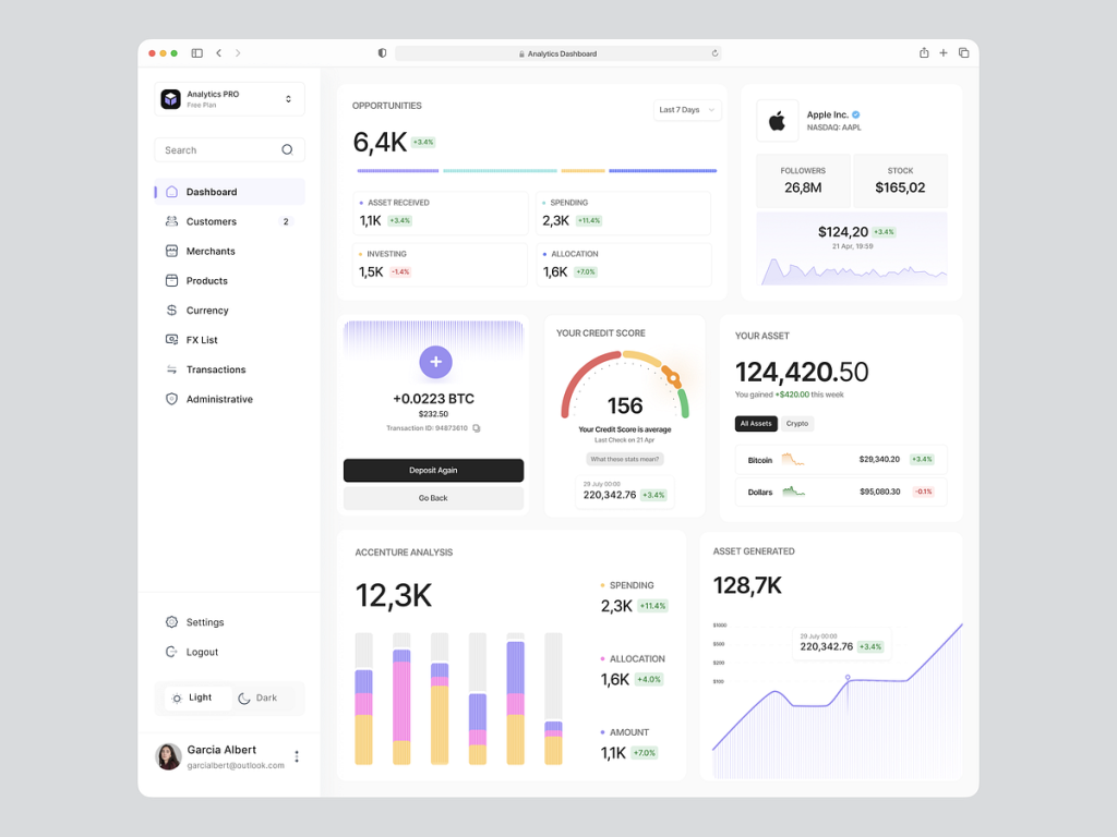
Analytics PRO – Multi-Asset & Credit Intelligence Dashboard
A comprehensive financial management interface that balances personal credit intelligence with asset performance tracking. This “Light Mode” dashboard provides a clear overview of diversified investments, including Bitcoin holdings, stock market followers, and overall asset generation, alongside a real-time credit score monitor. The use of a soft, airy layout with pastel-toned bar charts and subtle shadow play makes complex wealth management feel organized and stress-free. It is a perfect benchmark for designers looking to create “Human-Centric Fintech” tools where high-level data transparency meets a friendly, approachable aesthetic.
.
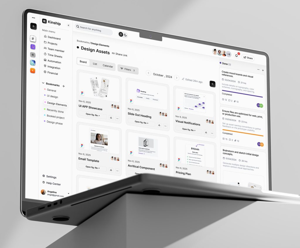
Kinship – Calm & Collaborative Project Management Dashboard
by Mohammad Ali
A masterclass in organized, low-friction project management for creative teams. This interface, titled “Kinship,” excels at bridging the gap between high-level task tracking and granular asset management. The clean, card-based “Design Assets” board allows teams to preview Figma files, UI components, and email templates directly within the workflow. By combining a soothing minimalist aesthetic with a structured kanban sidebar for “Done” tasks and upcoming milestones, Kinship demonstrates how enterprise tools can reduce cognitive load while maintaining a high density of functional information for fast-moving design sprints.
.
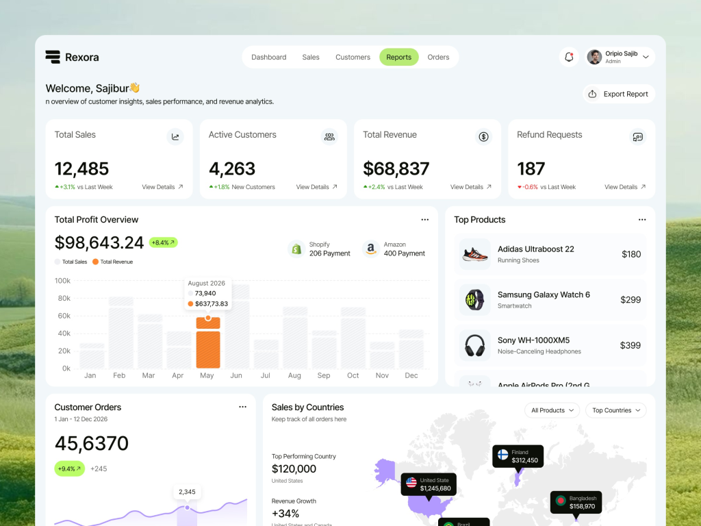
Rexora – Comprehensive Sales & Revenue Management Dashboard
A high-performance e-commerce dashboard designed for global retailers. This interface, titled “Rexora,” provides a unified view of multi-channel sales, integrating data from platforms like Shopify and Amazon. It excels at visualizing complex financial health through high-level KPIs like total profit overview, refund request tracking, and a detailed “Sales by Countries” heat map. The clean, spacious layout and intuitive “Top Products” list make it an essential reference for business owners who need to balance granular inventory performance with broad market growth trends in one cohesive view.
.
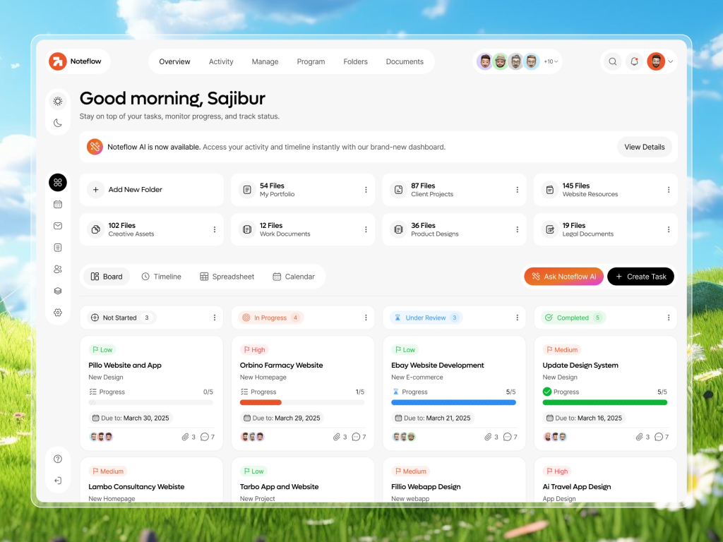
Noteflow – AI-Enhanced Project & Task Management Dashboard
A productivity-focused interface that streamlines complex workflows through intuitive organization and AI assistance. This dashboard, titled “Noteflow,” features a highly functional task board with clear status indicators (Not Started, In Progress, Under Review, Completed) and prioritized labels. The integration of “Noteflow AI” for instant activity and timeline access demonstrates how modern productivity tools use smart automation to help teams stay on top of deadlines. With its clean folder structure for creative assets and client projects, Noteflow is a benchmark for designers building scalable, collaborative platforms where efficiency and clear task hierarchy are the primary goals.
.
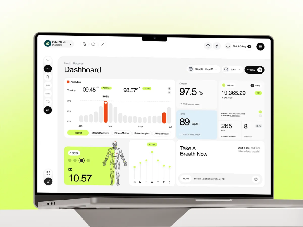
Health Records – Advanced Patient Monitoring & Bio-Metric Dashboard
by Orbix Studio
A sophisticated medical analytics interface that sets a new standard for patient-centric data visualization. This health dashboard manages complex biometric streams, including blood oxygen levels (SpO2), heart rate (BPM), and metabolic tracking, within a clean, airy “Light Mode” UI. The integration of 3D anatomical modeling for localized health insights, alongside automated reminders like “Take A Breath Now,” demonstrates how modern healthcare tools can blend diagnostic precision with proactive wellness coaching. Its modular grid and soft lime-green accents ensure that critical health metrics are both highly legible and visually reassuring for daily monitoring.
.
Vyniq – Smart Home Appliance & Maintenance Dashboard
A specialized IoT interface that brings high-level precision to home maintenance. This dashboard, titled “Vyniq,” manages a smart vacuum system through a detailed architectural 3D layout, allowing users to monitor cleaning progress across specific zones like the reading room or kitchen. The UI excels at visualizing hardware health, featuring dedicated modules for battery charging status, water tank levels, and filter life. By combining real-time spatial tracking with technical maintenance alerts, Vyniq demonstrates how appliance dashboards can transform a chore into a highly controlled, data-driven experience that ensures home efficiency at a glance.
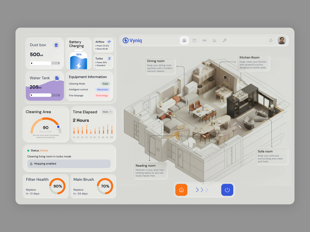
.
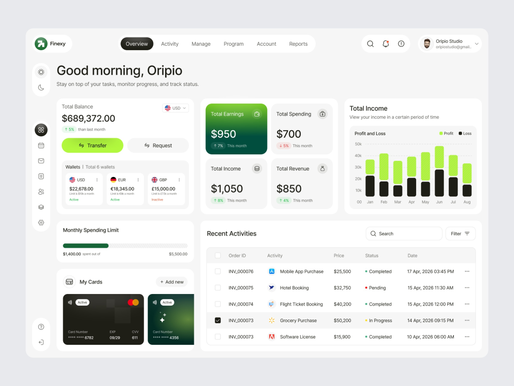
Finexy – Modern Finance & Digital Banking SaaS Dashboard
A sleek and highly functional financial dashboard designed for modern entrepreneurs and small business owners. This interface, titled “Finexy,” excels at consolidating complex banking data into a clear, actionable overview. It features distinct modules for real-time balance tracking across multiple currency wallets (USD, EUR, GBP), intuitive monthly spending limits, and a detailed recent activities ledger. The use of vibrant green accents against a crisp white layout, combined with high-contrast data cards for total earnings and revenue, makes managing day-to-day business capital feel streamlined and effortless.
.
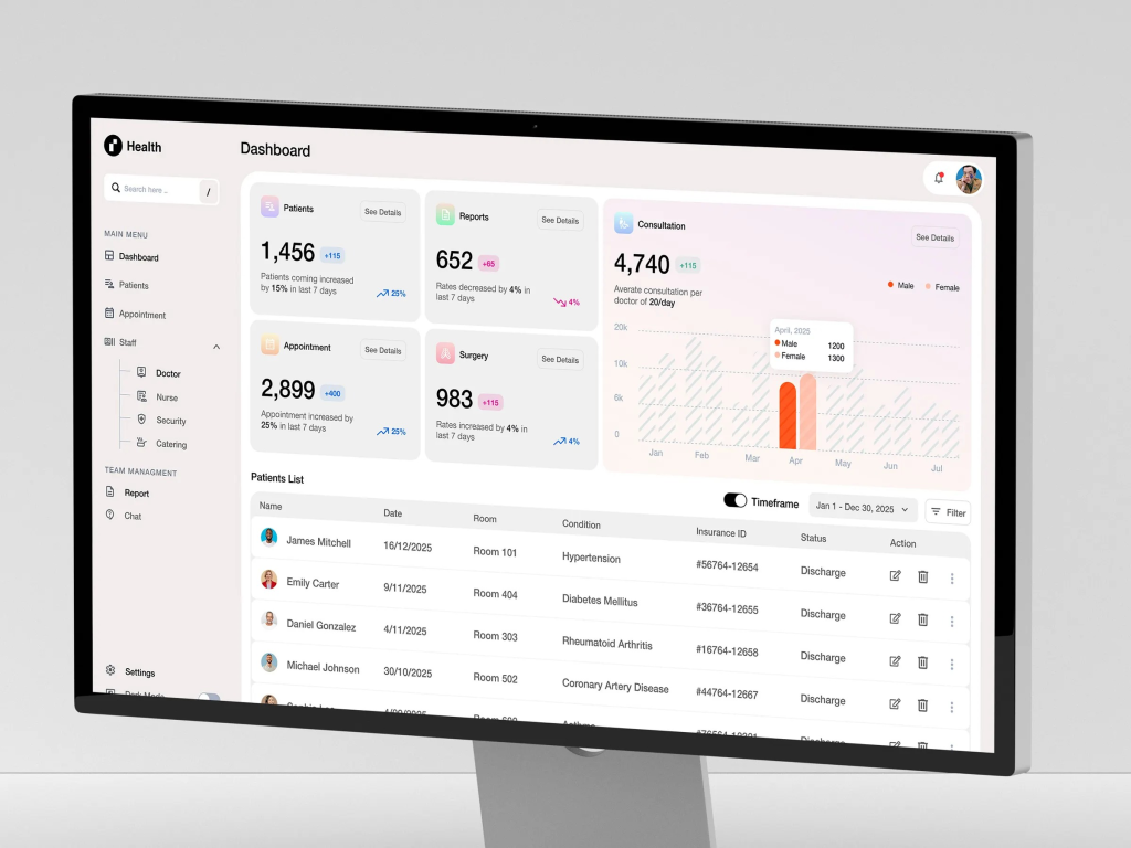
CarePulse – Integrated Medical CRM & Hospital Operations Dashboard
A robust administrative powerhouse designed for high-traffic healthcare facilities. This dashboard, titled “CarePulse,” focuses on the operational heartbeat of a hospital, tracking patient admissions, staff allocation, and consultation volumes in real-time. The interface excels at organizational clarity, featuring a detailed “Patients List” with status tracking (like Discharge or Appointment) and a hierarchical “Staff Management” sidebar. By visualizing complex trends like the 15% increase in patient inflow alongside gender-based consultation analytics, CarePulse provides hospital administrators with the bird’s-eye view needed to optimize resource allocation and improve patient care standards.
.
AI-Driven Fashion E-commerce & Catalog Dashboard
by Taqwah
A cutting-edge interface that redefines inventory management for the fashion industry. This dashboard, titled “VogueAI,” utilizes artificial intelligence to streamline the curation of seasonal collections and product photography. The UI features a high-end, minimalist aesthetic with a soft lavender palette, perfectly suited for luxury retail. Key functionalities include AI-powered trend forecasting, automated stock level alerts, and a seamless “Product Performance” tracker that visualizes sell-through rates across different styles. It serves as an excellent benchmark for designers building creative commerce tools where visual inspiration and data-driven logistics must coexist beautifully.
.
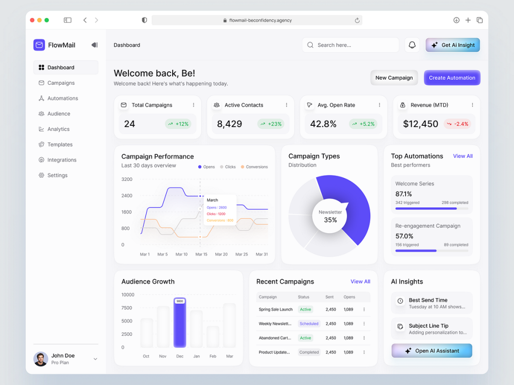
FlowMail – AI-Driven Email Marketing & Automation Dashboard
A high-performance command center for digital marketers that simplifies the complexities of multi-channel automation. This interface, titled “FlowMail,” excels at visualizing the entire campaign lifecycle—from audience growth patterns to granular automation performance. Key features include a real-time “Campaign Performance” monitor and a dedicated “AI Insights” module that provides actionable tips on optimal send times and subject line improvements. The clean, modern aesthetic with vibrant purple accents ensures that critical KPIs, such as average open rates and revenue (MTD), are always front and center, making it a premier reference for SaaS platforms focused on marketing efficiency.
.
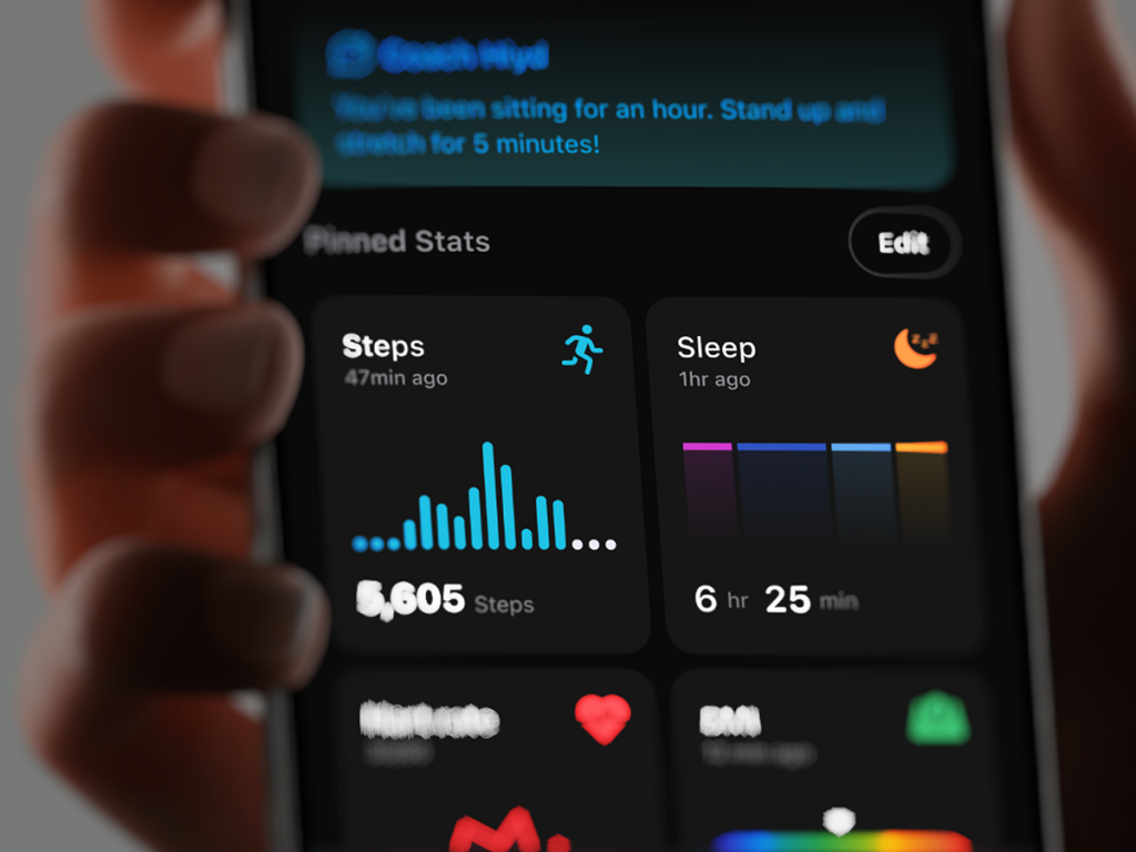
Hyid – Immersive Personal Fitness & Wellness Dashboard
A high-impact mobile interface that prioritizes real-time health feedback and behavioral coaching. This dashboard, titled “Hyid,” excels at visualizing daily activity through high-contrast biometric widgets, tracking everything from step counts and sleep duration to heart rate and BMI. The UI stands out with its dark, focused aesthetic and the integration of “Coach Hyid”, an automated wellness assistant that provides proactive reminders like “Stand up and stretch for 5 minutes!” By blending deep analytics with immediate lifestyle prompts, Hyid demonstrates how fitness dashboards can move beyond passive data storage to become active participants in a user’s health journey.
.
High-Velocity Project Management & Growth Dashboard
by Orbix Studio
A data-dense powerhouse designed for agencies and teams that need to balance project delivery with business growth. This dashboard, titled “Growth Stats,” bridges the gap between operational tasks and high-level productivity KPIs. The interface features a clean, professional grid that visualizes critical metrics like “Average Time Per Task” and “Total Completed Tasks,” alongside intuitive stacked bar charts for ongoing weekly workloads. The inclusion of a dedicated “Productivity KPIs” donut chart allows managers to quickly identify bottlenecks (like tasks marked “Stuck”) at a glance. It’s an essential reference for designers creating complex B2B tools where maintaining a high-level overview of team performance is just as important as individual task tracking.
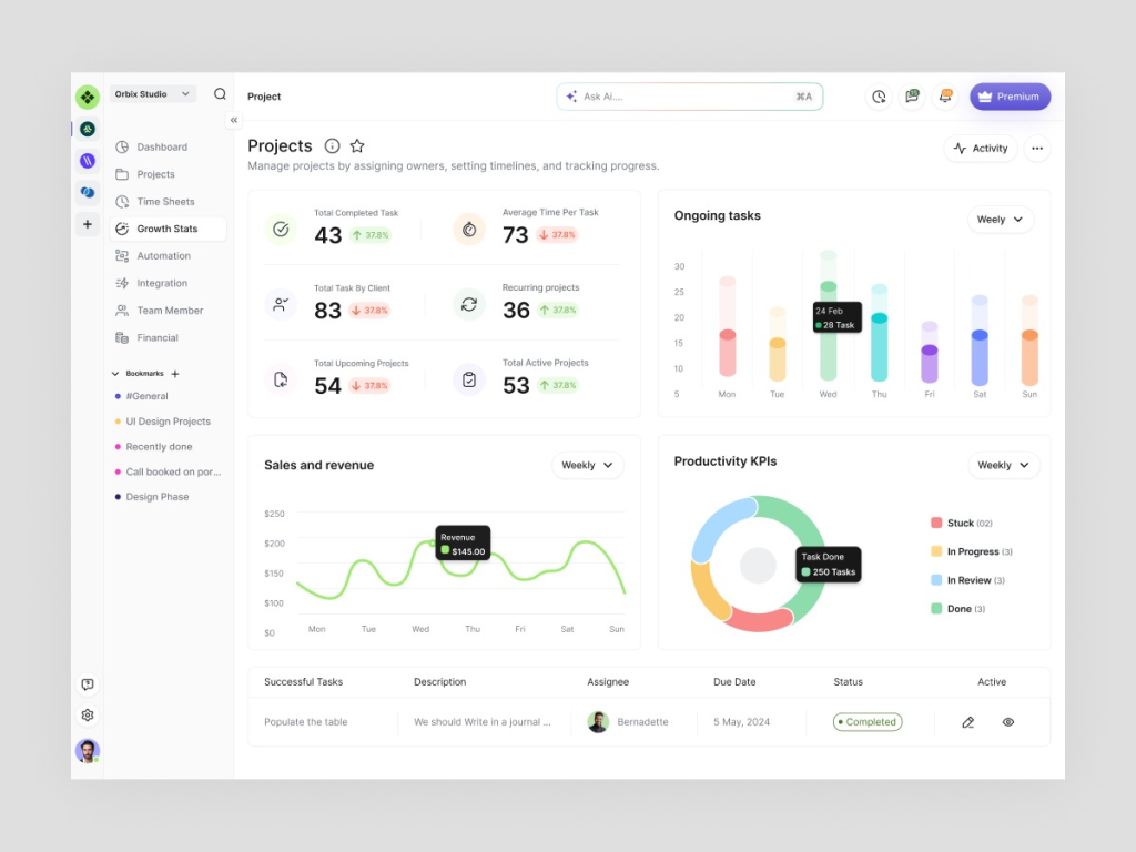
.
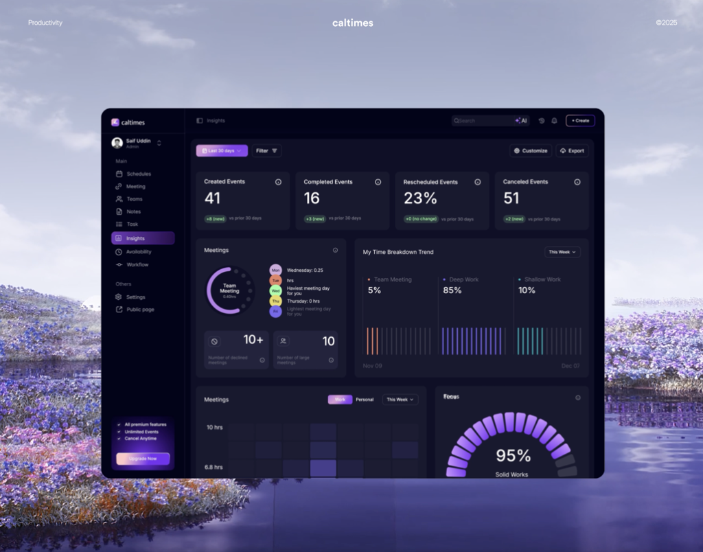
Caltimes – Intelligent Productivity & Time Management Dashboard
A futuristic workspace designed to optimize the most valuable resource: time. This dashboard, titled “Caltimes,” moves beyond basic scheduling by providing deep insights into a user’s workflow and meeting habits. The dark-themed interface features an advanced “Time Breakdown Trend” that categorizes activities into Deep Work, Shallow Work, and Team Meetings, helping users identify their peak focus periods. With integrated AI insights, it tracks event completion rates and cancellation trends, offering a 95% “Solid Works” focus score to gamify productivity. It’s an exemplary model for designers building next-generation scheduling tools where data-driven habits meet high-end, immersive UI design.
.
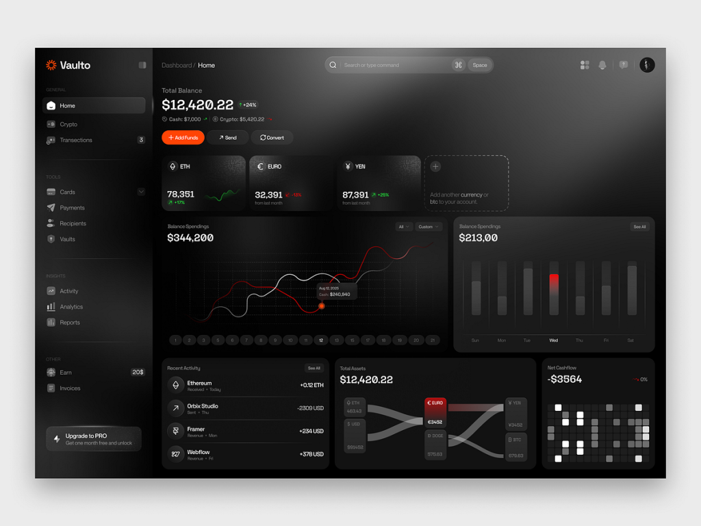
Vaulto – Cinematic Crypto & Asset Management Dashboard
by Orbix Studio
A high-performance financial interface that brings a dark, cinematic aesthetic to the world of asset management. This dashboard, titled “Vaulto,” excels at tracking diverse portfolios across traditional fiat (Euro, Yen) and digital currencies (Ethereum). The UI features sophisticated data visualizations, including a multi-layered line chart for balance spending and a unique Sankey diagram that illustrates the flow of total assets across different holdings. With its deep charcoal background, high-contrast typography, and intuitive “Net Cashflow” heatmap, Vaulto is a premier reference for designers building premium fintech platforms where complexity must be delivered with elegance and absolute clarity.
💡 Stay inspired every day with Muzli!
Follow us for a daily stream of design, creativity, and innovation.
Linkedin | Instagram | Twitter