
The best Figma UI kits and design systems for 2026. Tested for Variables, Auto Layout, proper variant structure, and real production use. Not just pretty previews.
There are hundreds of Figma UI kits available right now. Most of them look great in a preview and fall apart the moment you try to customize a button. They use fixed dimensions instead of Auto Layout. They hardcode colors instead of using Variables. Their variants are organized by someone who’s never built a real product.
We tested these kits against one standard: can a product designer open this file, customize the theme, and start building screens in under 30 minutes? If the answer required watching a tutorial, digging through unlabeled layers, or manually replacing 200 color values, it didn’t make the list.
The kits below are organized by use case. Every one uses modern Figma features (Variables, Auto Layout, component properties). Every one has been verified active in February 2026.
Want a daily boost of creative energy? Install the Muzli extension, your nonstop source for design inspiration, right in your browser!
Complete Design Systems
These are full systems, not starter kits. They include tokens, components, patterns, documentation, and a structure built for teams.
Untitled UI:
The industry reference for Figma design systems. 10,000+ components, 3,200+ variants, full token architecture. Best for SaaS products and web applications.
- Variables for colors, spacing, radii, and typography
- Auto Layout on every component
- Light and dark themes built into the variable system
- Responsive variants from mobile to desktop
- Pricing: Try our free version of Untitled UI, with basic styles and components.
- Why it works: this is what a professionally built design system looks like. The layer naming alone is worth studying. If you’re building a design system in Figma, Untitled UI is the benchmark.

.
shadcn/ui for Figma:
Figma components that match the wildly popular shadcn/ui code library. Best for React/Next.js teams that want their design file and codebase to speak the same language.
- Components map 1:1 to the shadcn/ui React components
- Tailwind CSS token values built into the Figma Variables
- Minimal, clean aesthetic that serves as a foundation, not a finished product
- Pricing: free (community maintained).
- Why it works: if your developers use shadcn/ui (and in 2026, many do), this eliminates the translation gap between design and code. What you name in Figma is what they import in their editor.

.
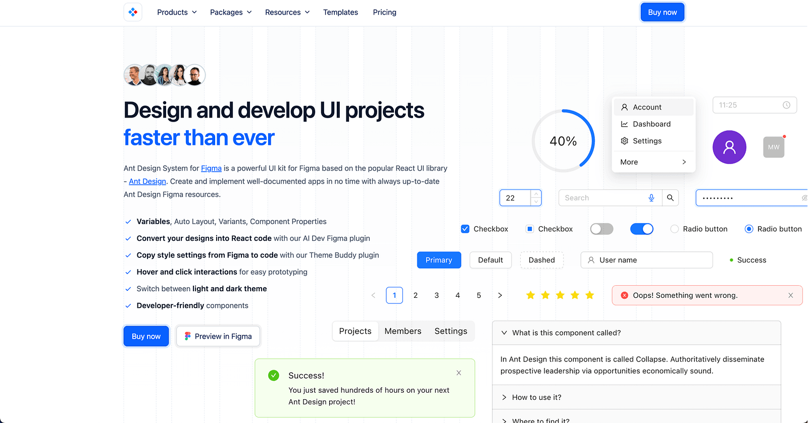
Ant Design for Figma:
Official Ant Design component library for Figma. Best for teams building with Ant Design in React.
- Comprehensive component coverage matching the Ant Design code library
- Variables and Auto Layout throughout
- Enterprise-friendly: data tables, complex forms, navigation patterns
- Pricing: free starter. Full kit premium.
- Why it works: Ant Design powers a significant chunk of enterprise products. Having the Figma library match the code library exactly saves hours of handoff confusion.
.
Glow Design System:
Modern design system with a focus on dark themes and contemporary aesthetics. Best for modern web applications and SaaS products with a premium feel.
- Dark and light themes with full variable support
- Clean, contemporary component style
- Dashboard and data visualization components included
- Pricing: premium.
- Why it works: most UI kits default to light themes and add dark mode as an afterthought. Glow is built dark-first, which makes its dark theme feel native rather than inverted.

Platform-Specific UI Kits
For native app design, you need components that match platform conventions exactly.
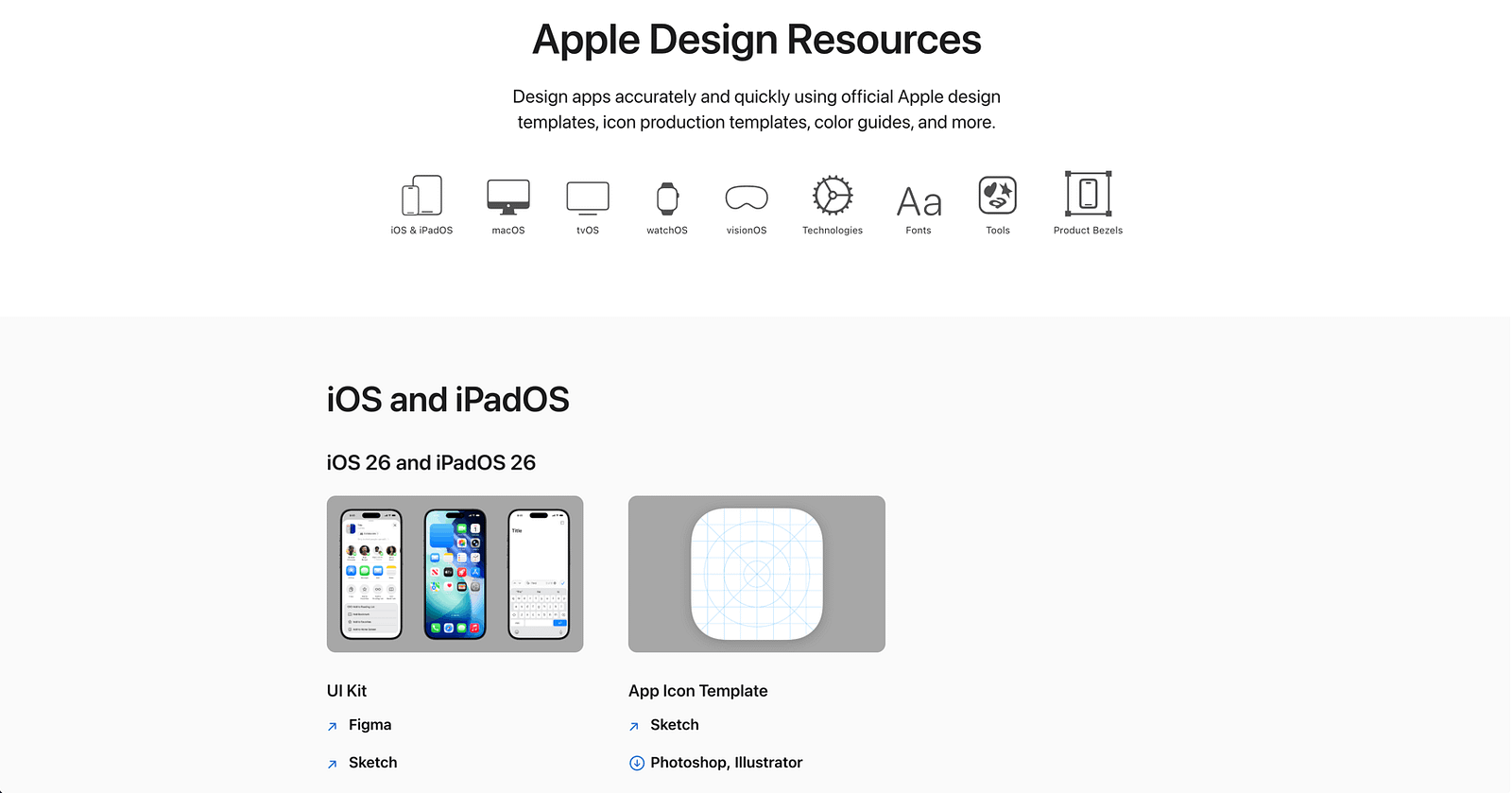
iOS 18 Design Kit (Apple):
Apple’s official Figma resource for iOS 18. Best for anyone designing native iOS apps.
- Every standard iOS component: navigation bars, tab bars, sheets, alerts, controls
- SF Symbols integration
- Updated for Dynamic Island and StandBy Mode
- Pricing: free.
- Why it works: it’s from Apple. The components match what ships in UIKit and SwiftUI. No guessing about spacing, sizing, or behavior.
.
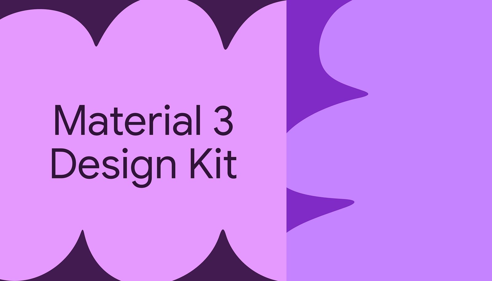
Material 3 Design Kit (Google):
Google’s official Material Design 3 Figma library. Best for Android app design and any product following Material conventions.
- Full M3 component set with token-based theming
- Dynamic Color support
- Variables for all design tokens
- Pricing: free.
- Why it works: Material 3’s token system is well-designed and the Figma implementation is maintained by Google’s design team. For Android projects, this is the starting point.
Dashboard and Admin UI Kits
Dashboards have specific component needs: data tables, charts, metrics cards, filter systems, and dense information layouts.
AlignUI:
Clean dashboard design system with comprehensive data visualization components. Best for analytics platforms, admin panels, and B2B SaaS dashboards.
- Chart components (bar, line, pie, area, treemap)
- Data table variants with sorting, filtering, and pagination
- Metric cards, KPI displays, and status indicators
- Dark and light themes
- Pricing: premium.
- Why it works: most general UI kits include a token data table. AlignUI includes the full spectrum of data visualization components that real dashboards need.
.
Horizon UI:
Dashboard-focused design system with modern aesthetics. Best for admin panels and SaaS products that need to look good while handling dense data.
- 300+ dashboard components
- Chart and data visualization library
- Multiple layout templates
- Pricing: free tier. Premium for full access.
- Why it works: the layout templates get you to a working dashboard design faster than building from components. If you have a demo to prepare by Friday, this helps.

SaaS and Web App Starter Kits
When you don’t need a full design system but need more than a blank canvas.
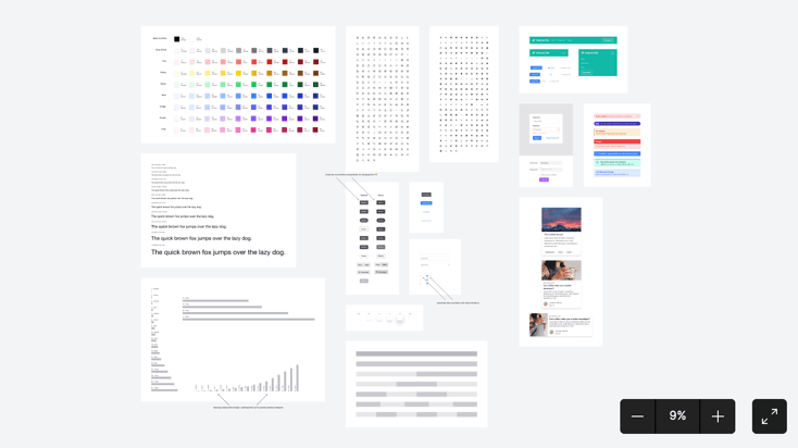
Flowbite Design System:
Tailwind CSS-based component library for Figma. Best for teams building with Tailwind who want design-code parity.
- 600+ components matching Tailwind’s utility classes
- E-commerce, marketing, and application components
- Auto Layout and Variables throughout
- Pricing: free tier. Premium for full library.
- Why it works: Tailwind is everywhere in 2026. Having a Figma library that uses the same token values and naming conventions as your Tailwind config file reduces design-to-dev friction significantly.
.
Chakra UI Kit:
Community-maintained Figma components matching Chakra UI v3. Best for React teams using Chakra UI.
- Components match Chakra’s code API closely
- Clean, accessible defaults
- Light and dark themes
- Pricing: free.
- Skip if: you’re not using Chakra UI in your codebase. The value is in the design-code match, not the components alone.

Free Community UI Kits
Surprisingly capable options for teams with no budget.
Figma UI Kit (Figma Official):
Figma’s own starter component library. Best for learning Figma’s component architecture and starting small projects.
- Basic but well-structured components
- Good example of proper Auto Layout and variant setup
- Free.
- Why it works: it’s the official baseline. Simple, clean, and correctly built. Good for understanding how components should be structured before scaling to a larger system.
How to Choose the Right UI Kit
Building a SaaS product? Start with Untitled UI (premium) or shadcn/ui (free). Both give you a solid foundation for web applications.
Building a native iOS app? Apple’s official kit. No exceptions. Third-party iOS kits almost always drift from Apple’s actual components.
Building for Android? Material 3. Same logic. Use the official source.
Building a dashboard? AlignUI or Horizon UI. General-purpose kits don’t have the data visualization components dashboards require.
Using Tailwind? Flowbite matches Tailwind’s token system. The design-code parity is the entire value.
Using a specific React framework (shadcn, Chakra, Mantine)? Use the matching Figma kit. Framework parity beats generic design quality.
Budget is zero? shadcn/ui, Material 3, Apple iOS kit, or the official Figma starter. All free. All properly built.
One principle: match your UI kit to your tech stack. A beautiful Figma kit that doesn’t match your code components creates translation work that erases whatever time the kit saved you.
Key Patterns
After testing dozens of UI kits, a few things are clear:
- Variables are now mandatory. Any UI kit that still uses static color styles instead of Figma Variables is already outdated. Theme switching, mode support, and token-based customization depend on Variables. If a kit doesn’t use them, it will cost you more time than it saves.
- Framework-specific kits are winning. The biggest shift in 2026 is UI kits designed to match specific code frameworks (shadcn, Tailwind, Chakra, Ant Design). Generic “pretty” kits lose to framework-matched kits because the design-code translation step disappears.
- Free kits got surprisingly good. shadcn/ui, Material 3, and Apple’s official kits are free and well-maintained. The gap between free and premium narrowed. Premium kits justify their cost through depth (more components, more variants, more patterns), not through basic quality.
- Dark mode is a system, not a theme. The best kits (Untitled UI, Glow, AlignUI) treat dark mode as a full variable mode with its own contrast ratios, elevation values, and color mappings. Kits that just invert colors produce bad dark modes.
- Documentation matters. A UI kit without documentation on how to customize tokens, swap themes, or extend components is a liability. The best kits include setup guides, naming conventions, and usage guidelines. If you have to reverse-engineer the structure, it’s not saving you time.
Discover more design systems, kits, and tools on Muzli. Curated daily for designers who build.
💡 Stay inspired every day with Muzli!
Follow us for a daily stream of design, creativity, and innovation.
Linkedin | Instagram | Twitter