10 graphic design trends 2025

2025 is here, bringing a new era of groundbreaking graphic design trends ready to shape the future and inspire your creativity. Let’s dive into the top transformative trends defining this year.

Trend one: AI-driven design

Artificial intelligence is transforming the way design and art are created, offering fresh approaches for stunning visuals. From generating highly realistic details to creating imaginative compositions, AI opens up endless creative paths.

In 2025, AI is more than a tool — it’s a creative partner. Designers use it to quickly explore ideas, refine visuals, and experiment with a range of styles. These advancements simplify workflows and allow designers to push boundaries, blending efficiency and creativity in ways we have never seen before.


⭕ 1. Example of AI-driven design

Animals as Humans by Ramon Castillo

Typo Girls
Ramon Castillo

APART-HOTEL WELL OPENING MAPPING

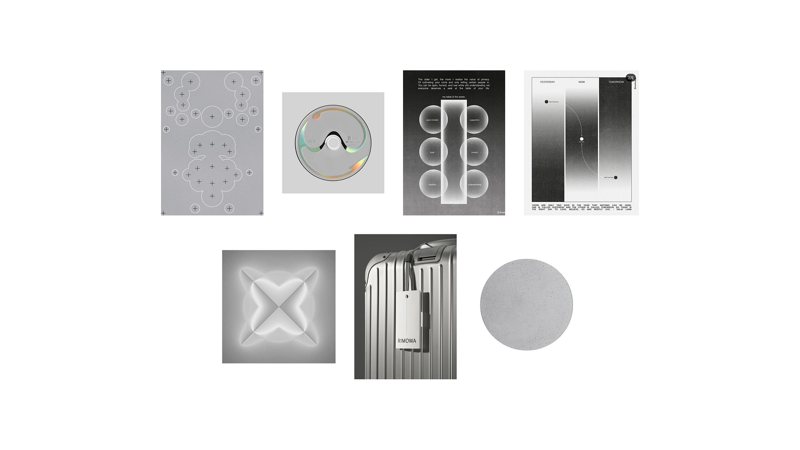
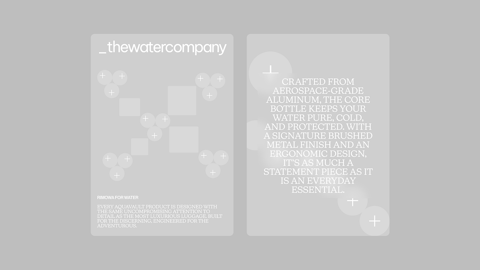
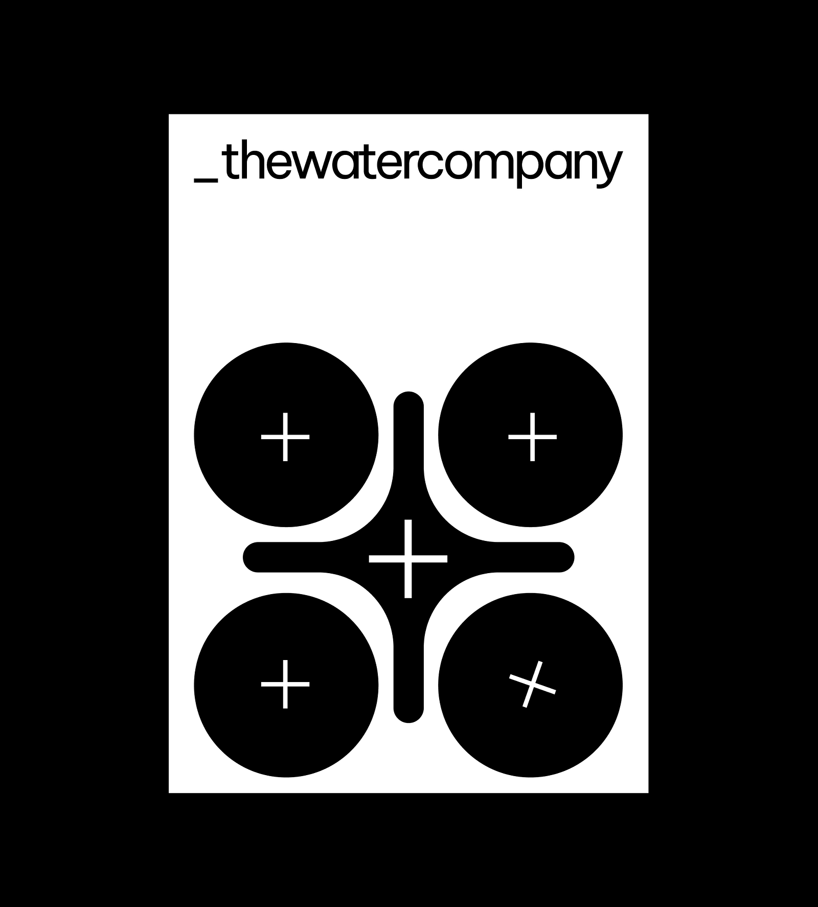
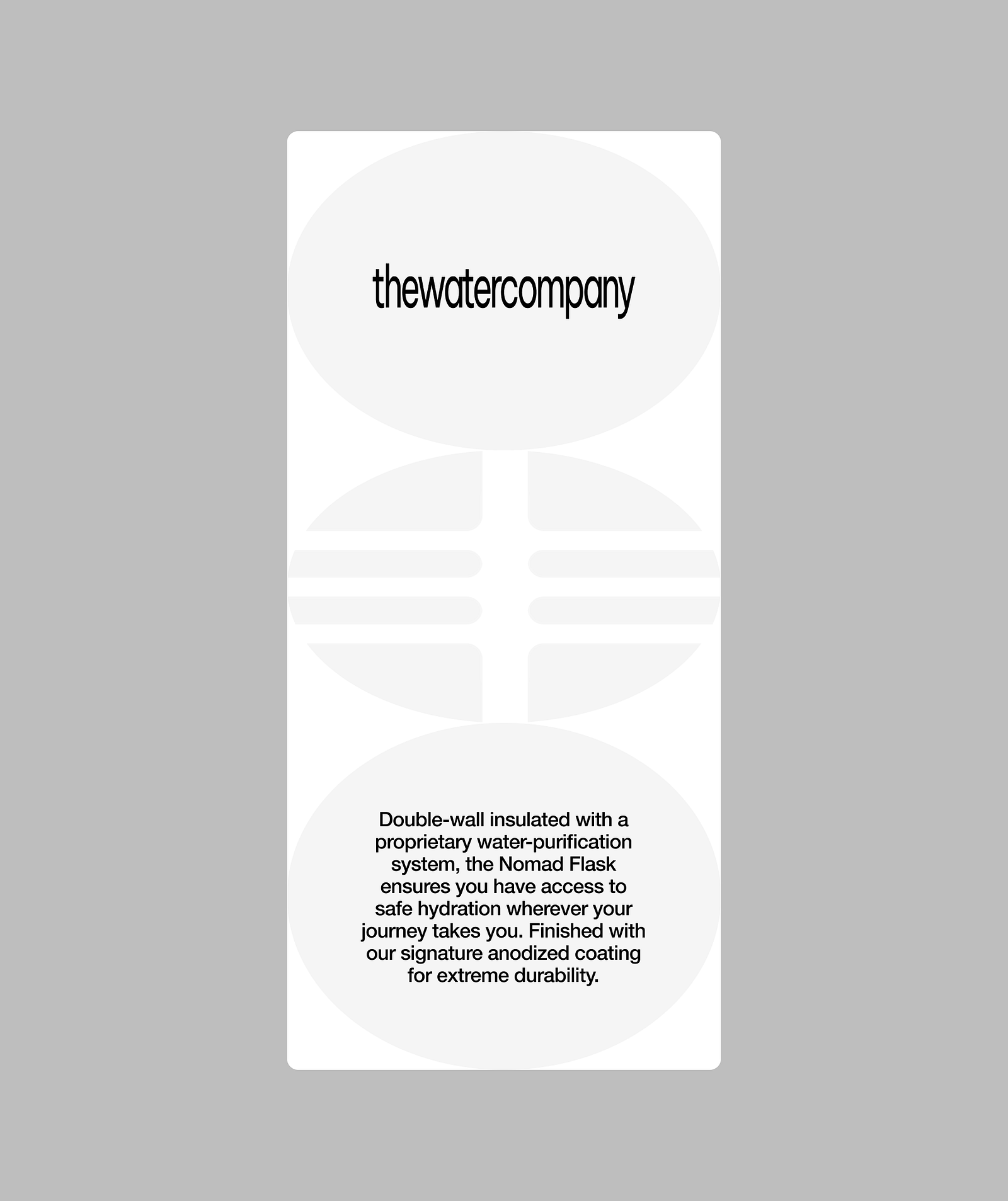
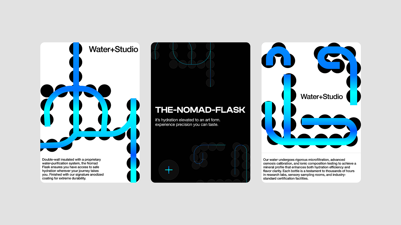
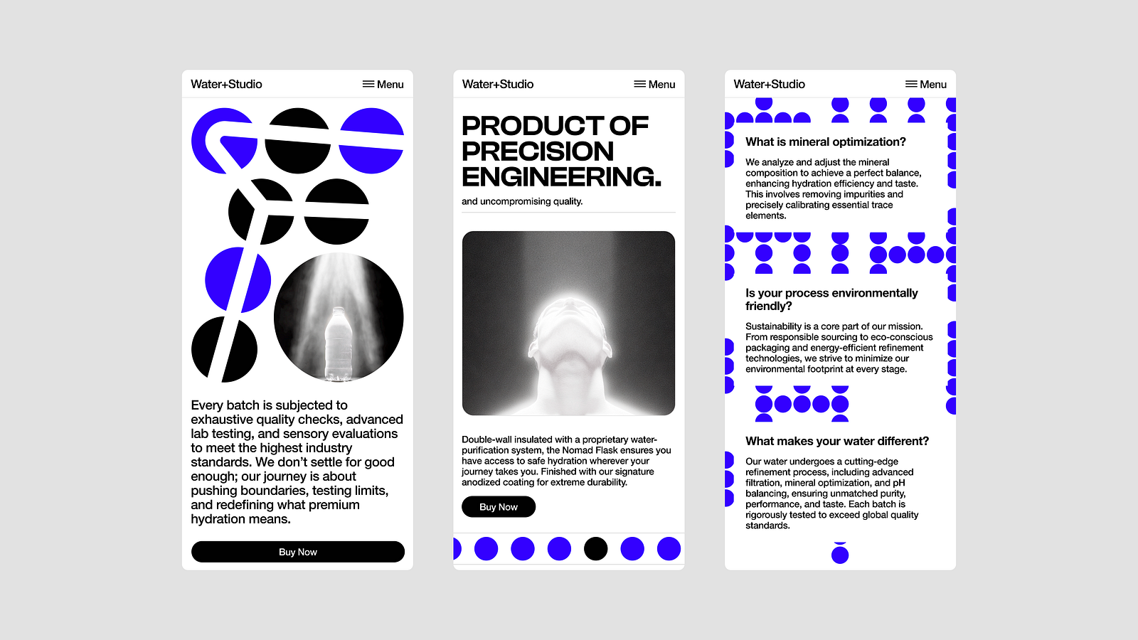
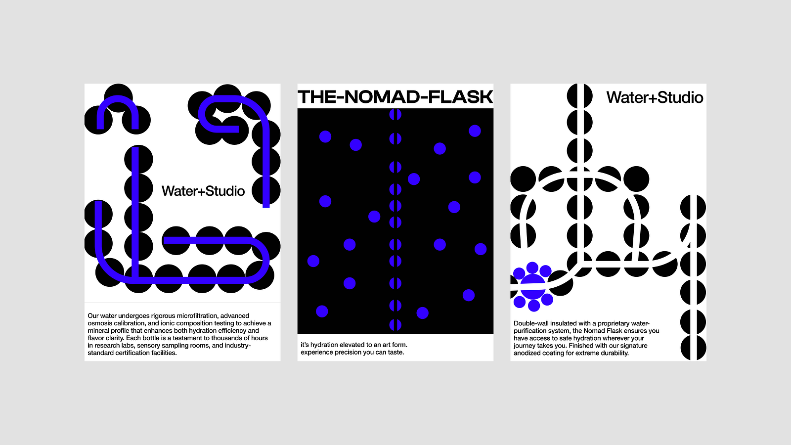
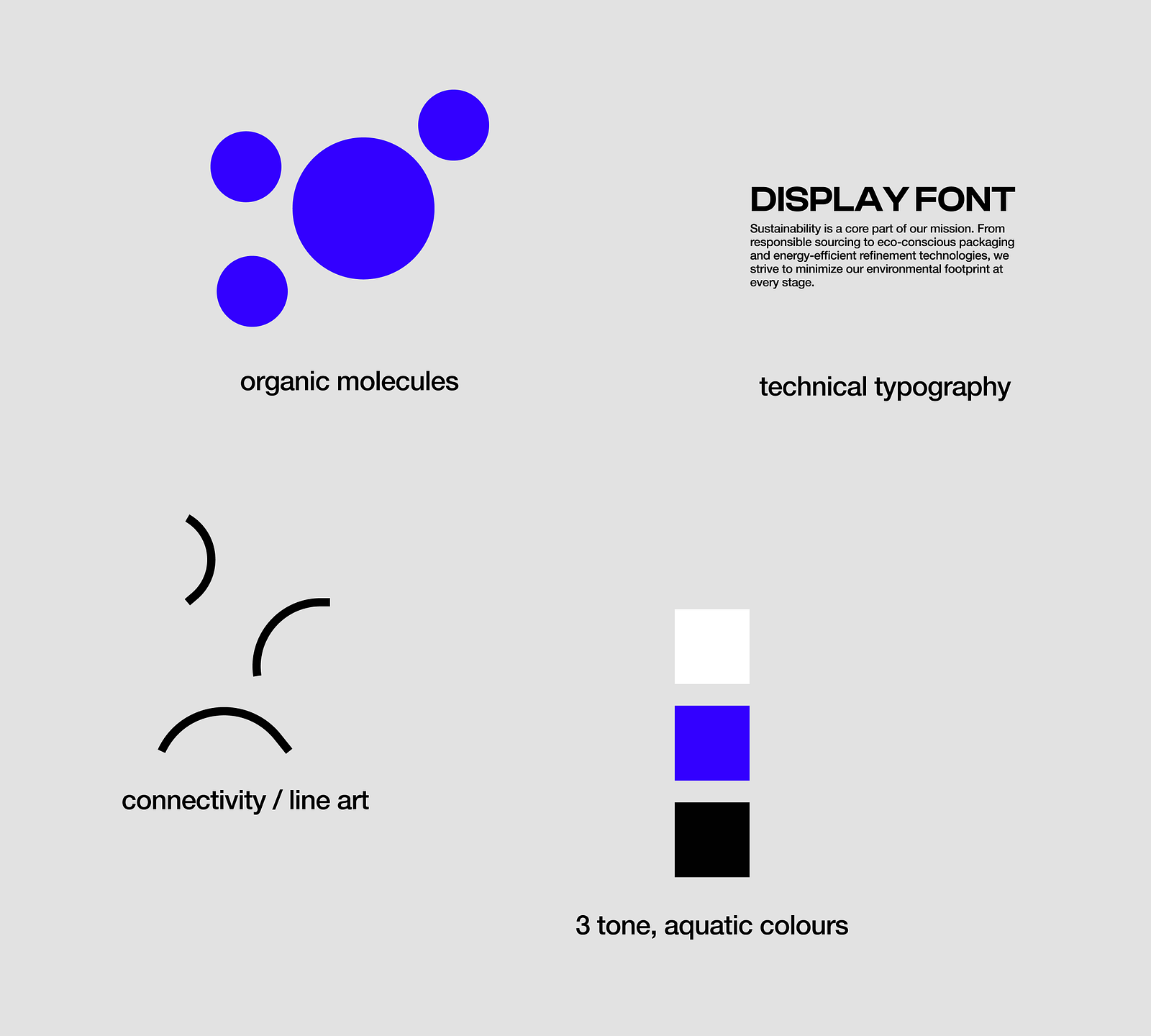
Trend two: Geometric abstract narratives

In 2025, shapes are more than just design elements — they tell stories. Bold lines, circles, and patterns come together to create visual narratives that are both meaningful and captivating.

These geometric designs strike a perfect balance between simplicity and complexity, giving projects a unique and modern look. It’s not just about aesthetics; it’s about making bold statements and letting the shapes speak for themselves.


⭕ 2. Example of blur and distortion

113 Dark Flower Backgrounds Bundle
Feelsoul Design

Motion Blur Style Photo Effect
Pixelbuddha Studio

Halto Major

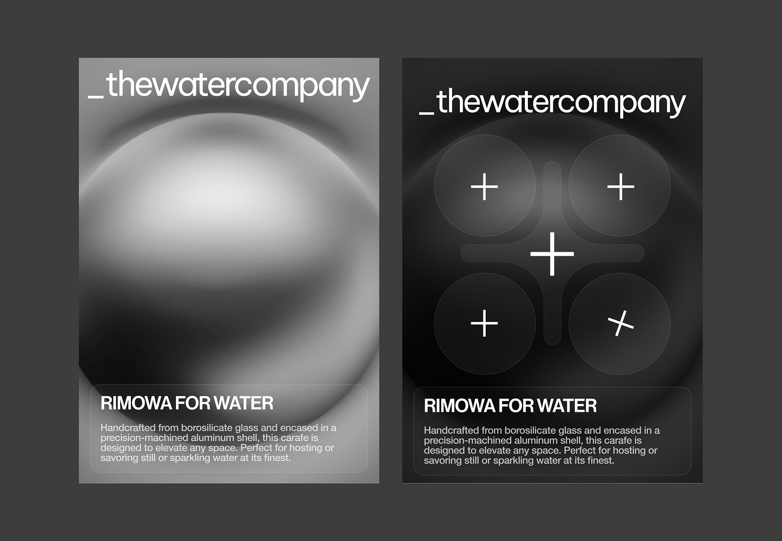
Trend three: Hyper-realistic 3D presentations

In 2025, 3D design reaches new levels of realism, with companies hiring expert 3D artists to create incredibly detailed product renders. These digital creations are so precise and lifelike that they seem to leap off the screen, giving audiences the feeling that they could touch them.

Skilled designers are pushing the boundaries of digital design by combining intricate textures and realistic lighting to bring products to life in ways never seen before. This trend is transforming product presentations, making them more immersive and captivating than ever.


⭕ 3. Example of hyperreal 3D product design

Cash App Evergreen Design System 2023 — 2024

Leica M9
Jeremy Shin


Nexx Helmets X.Lifetour
André Pires

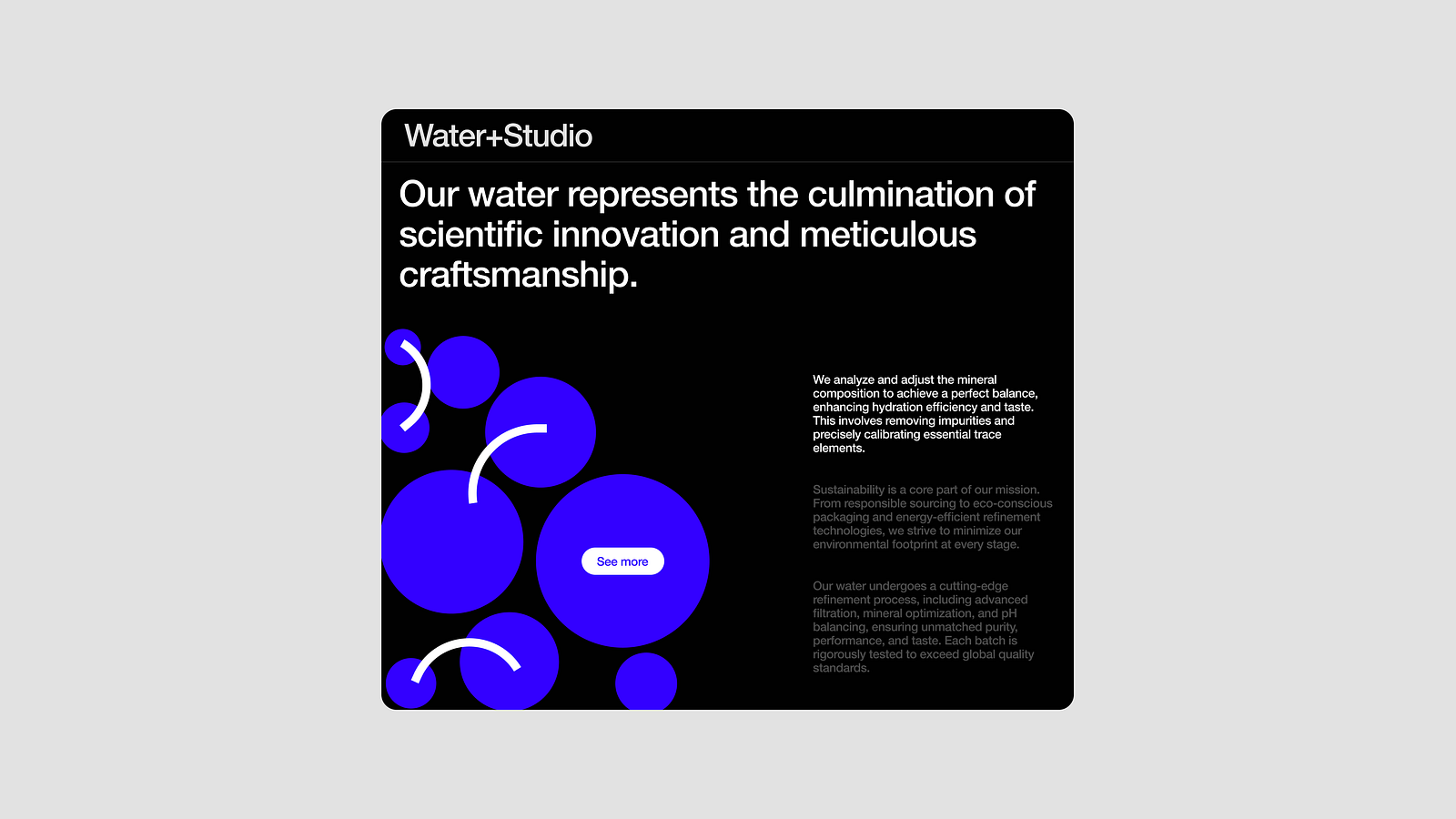
Trend four: Dynamic gradients

Dynamic gradients are a standout trend in 2025, transforming designs with bold, fluid energy. Designers are using gradients in motion, creating visuals that feel alive and engaging.

These moving gradients add excitement and draw the viewer’s attention, making them ideal for showcasing brands in a more captivating way. By blending smooth transitions and vibrant effects, this trend introduces a fresh and dynamic approach to modern design, ensuring a lasting impression.


⭕ 4. Example of dynamic gradient motion

UPWORK | GEN AI

Creative process | Motion design creative project

Trend five: Blur and distortion

The blur and distortion trends focus on blending colors and creating visuals that are not fully clear, making them look unique and interesting. This style reflects the complexities of life by mixing colors and softening clarity to create visuals that feel diverse, engaging, and emotionally expressive.

It brings depth and emotion by using soft edges and unclear forms, giving a dreamy and artistic feel. It’s a way for designers to embrace imperfection and create something eye-catching and different. Whether for branding, websites, or art, this trend adds a distinctive and captivating touch.


⭕ 5. Example of geometric abstract narratives

Compagnie de Provence
thomas lateur

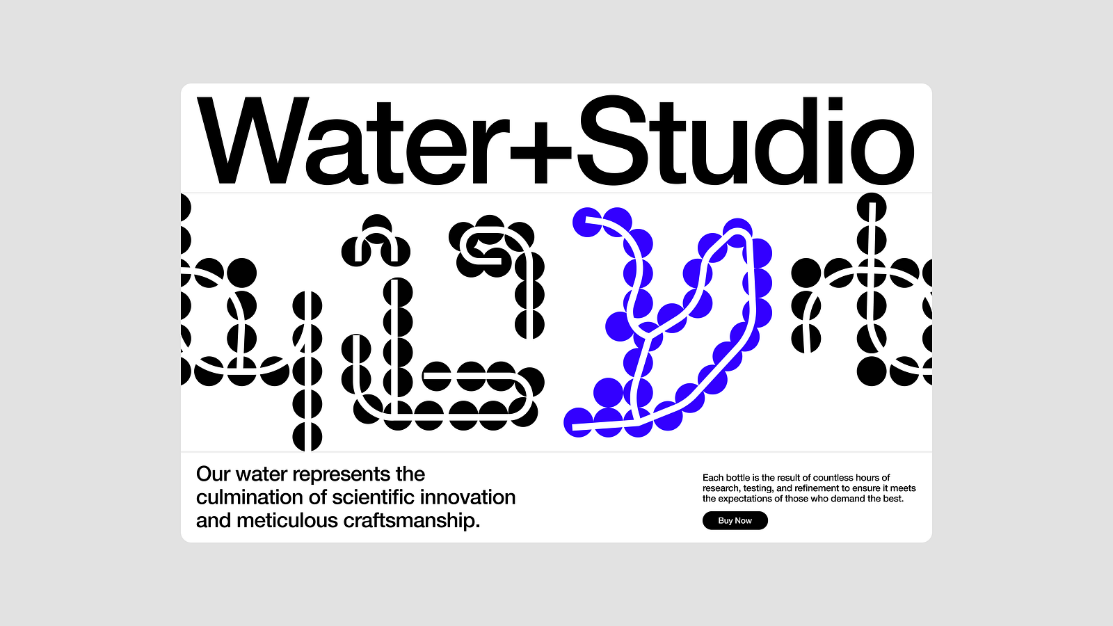
Trend six: Experimental typography

Experimental typography remains a key design trend in 2025, continuing its momentum from last year. Designers are taking bold steps to reimagine how letters can look and function. This isn’t just about fonts; it’s about turning typography into art with unique distortions, unexpected forms, and creative layouts.

While it’s not a new concept, this year’s designs take experimentation further, making typography more expressive and meaningful. It’s all about playing with type to create captivating, story-driven visuals that stand out.


⭕ 6. Example of experimental typography

Vitrium Opus - 3D Glass Typography Posters
Ion Lucin

NBA Experiments 8
Rhys Knight

Experimental Typography
Anastasiia Aliapkina

Trend seven: Mixed media and experimental collages

Mixed media and experimental collages are some of the most exciting — and, honestly, among my favorite — trends for 2025. Designers are blending different styles, including digital art, photography, hand-drawn elements, and textures, to create visually dynamic and unique pieces.

The mix of various mediums makes these designs stand out and feel fresh. Mixed media involves combining elements like photos, 3D art, and textures into polished and cohesive pieces. On the other hand, collages are more about cutting and arranging images, papers, and illustrations in an organic, often raw way.

When combined, they allow designers to explore both the digital and analog worlds, making designs bold and full of character.


⭕ 7. Example of mixed media and experimental collages

Mixed Media - CAREN GINSBERG
CAREN GINSBERG

Kacper H. Kiec
Kacper H. Kiec

MLK NOW: MIXED MEDIA ILLUSTRATIONS

Collage Art Series 03
Sinem Akdemir

AE Experiments : Video Collage 2

Trend eight: Mismatched and bright

Mismatched and bright is all about embracing vibrant, contrasting colors and playful mismatched fonts. These trends combine different font styles, sizes, and widths with unexpected color contrasts — think neon yellows paired with deep purples.

It’s a quirky aesthetic that’s perfect for standing out and catching attention. Designers play with asymmetry, irregular spacing, and bold typography to give designs a unique, fun vibe. It’s a playful approach that adds personality and charm to any brand.


⭕ 8. Example of mismatched and bright

What design style springs to mind for a “Natural” product?
by thelogolassie

.

Animation_ Générique de fin du film "Whip It"
Charlotte DIVO

Trend nine: Minimalist maximalism

Minimalist maximalism is all about finding a balance between simplicity and boldness. This trend pairs clean, minimal designs with vibrant maximalist elements like striking patterns and colors.

It’s about creating visual impact with carefully curated contrasts — bold typography, geometric shapes, and limited color palettes that avoid overwhelming the viewer. When done right, it combines boldness and restraint, offering both structure and energy for a fresh and dynamic look.


⭕ 9. Example of minimalist maximalism

Tomato Lover’s Impeccable Balance Between Minimalism And Maximalism
By Chloe Gordonhloe Gordon

Bamboo Balance

Btn Bold Sans Font
[S] Mockup

Burger Retro/Bold minimalism Branding
Rezaul | Logo Design & Brand Identity

Trend ten: Retro meets modern age

Retro meets modern age blends nostalgic vintage elements from the past with sleek, contemporary design. By combining retro typography, neon colors, and bold patterns with modern touches, these trends create a visually dynamic fusion.

It’s about bringing the old into the new, creating designs that feel both timeless and fresh.


⭕ 10. Example of retro meets modern age

Girasun

Travel Buddy | Branding
Ana Antonov

Maybelline New York Sky High Mascara Key Visual & Kit

MOLOTOV | BRANDING
Ana Antonov


That’s all for now!
I hope you enjoyed diving into these exciting design trends for 2025.

……

Want even more inspiration?
Follow us on social media for your daily dose of design, innovation, and creativity right in your feed!
Linkedin | Instagram | Twitter

How to design a MVP visual identity in an hour

Ayush Soni / HEX
Creative director and founder of a full-cycle brand and creative studio (hex.inc).


This really isn’t an end-to-end tutorial with organized instructions, but general brain dump of my general thought process when it comes to designing a “first shot” identity very quickly.

Over the years, this process has become more honed and I do feel there’s some value in this writing for those looking to test out an idea quickly. The first thing I’d start with is just summarizing what u want to do in 1–2 words. This is going to help you narrow down who you / your company are and what you want to explore visually.

I want to build a CPG brand while I do this tutorial. This one’s going to be for a water company called _thewatercompany. And the 1–2 word summary is going to be “Rimowa for Water”. Water packaging is something I’ve wanted to always explore, so here’s a cool idea that I don’t think has been done before. Correct me if I’m wrong though; I did no research.

That already gets us like 50% there. Not just visually but also strategically. The goal here is to get to a place where I can test this concept quickly, not to build a full-scale brand identity.

Now, the next step should be to build a quick mood-board so you can visualize the end product. This helps you even if you don’t know how to execute; a mood-board will help save time (money) + back and forth when working with a designer.

mood-board

Cool so that above was my little 5 minute mood-board. Since I’m designing for myself there’s no reason to do too much at this stage. It gives me a very clear picture of what I want the brand to look and feel like. To get here, I just browsed through cosmos and pinterest for a little while and pulled together all images I liked on a figma file.

No need to waste time looking at thousands of designs, case studies, and ideas. There is an infinite supply of inspiration online and the best way to move forward is to narrow down, pick a few things you like, and get to work.

Now, time to dive in and start exploring things. Again, don’t take your ideas too seriously and just start jamming things together and see what sticks. I wouldn’t recommend this approach for a real client project where there are certain angles + demographics to watch out for, but this is a fun sprint.

Below is the first thing I designed. Taking inspo from one of the screens above; the + style. Idk why but I love the idea of using the circles with plus signs in some capacitiy…remind me of particles and feels like something scientific which is what I want for this water company.

poster inspo

But the contrast is putting me off a bit, even though that’s kind of what I wanted looking at the inspo. A more brutalist exploration with the same idea:

poster inspo

I do think this works a bit better, but it should feel like a blend of both worlds. Clear and brutalist, but also aquatic and glassy.

poster inspo

meh. At this point, I feel like this direction is inherently uninteresting to explore. Even though I think there’s a lot of cool things you can do with physical design when branding it like a Rimowa, the digital design potential is limited.

But, I’m still going to try a few more ideas to see if something sticks. I like this one exploration that interpolates gradients into the identity and adds a bit more depth to the design. I think pairing liquid circular gradients with the circular geometric symbols could be interesting.

imagine a darker packaging for water

It’s a bit harder for me to imagine a darker packaging for water, but anything goes at this stage. I want to explore something a little bit more “technical” for this brand since I want it to feel premium at first glance. This should feel like a product that has gone through multiple stages of iterations and sampling, passed multiple industry-standard testing, and put in the most rigorous research environments.

shape patterns and organic designs

I think the exploration above feels closest to what I’m imagining. I like the use of using molecules to shape patterns and organic designs and having a distinct brand mark with the line art. I think those two elements can go really far to become defining motifs of the brand. Typography is relatively simple but I still wanted to experiment with a more technical display font for product naming.

I think I’m okay with sticking with this for now and building it further, just because I don’t want to spend TOO much time on this little sprint. From here, my goal will be to build core graphic elements and see how the brand reacts to web, social, and general print collateral.

Of course, packaging + physical product design is missing here but the brand elements are defined, which was ultimately the goal of this sprint. I could potentially do a part 2 of this where I do packaging design for a sample product for this brand. I like the name Water+Studio as well.


Alirght, final product:

packaging + physical product design

Below is a very quick summary of the identity. Everything I talked about and tried out is summed up below. From here, it’s easy to create new pieces of collateral like the website or packaging or social assets. Just need to think about each piece of collateral independently and find nods to this base identity system.

summary of the identity

Alright that’s it. Let me know if you ever want me to do a v2 of this.

hex.inc

Want even more inspiration?

Follow us on social media for your daily dose of design, innovation, and creativity right in your feed!
Linkedin | Instagram | Twitter