The best free icon libraries for UI design in 2026: tested across Figma, React, and production apps. Curated for consistency, not just quantity.
There are over 200 free icon libraries on the internet right now. Most of them have one thing in common: they look fine in a preview grid and fall apart at 16px in a real interface.
We tested these libraries against three criteria: visual consistency at small sizes, Figma and code integration, and license clarity. If an icon set looked great on its landing page but broke down in an actual sidebar navigation, it didn’t make the list.
Minimal Line Icons
Lucide:
The maintained fork of Feather Icons, now with 1,500+ icons. Best for clean, modern interfaces.
- Consistent 24px grid with 2px stroke
- First-class React, Vue, and Svelte packages
- Figma library maintained by the community
- License: ISC (permissive, commercial use OK)
- Why it works: picks up where Feather left off, with active maintenance and better coverage

Phosphor Icons:
9,000+ icons across 6 weights. Best for design systems that need flexibility.
- Available in Thin, Light, Regular, Bold, Fill, and Duotone
- Figma plugin with search and weight switching
- React, Vue, Flutter, and web component packages
- License: MIT
- Why it works: the weight system means one library covers everything from subtle UI to bold marketing
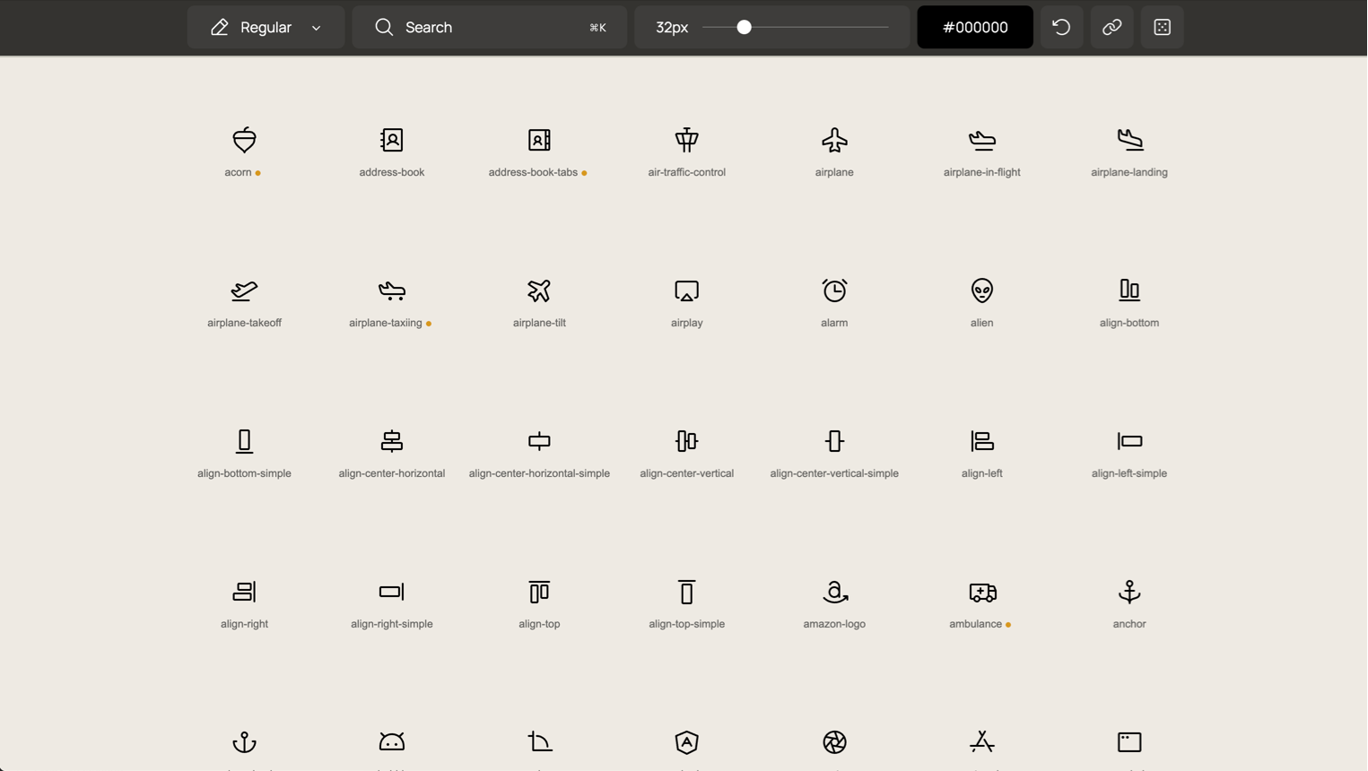
Feather Icons:
The original minimal icon set. 287 icons. Best for small projects that need a clean, tight set.
- Beautiful 24px grid, 2px stroke, round caps
- Still works perfectly for simple interfaces
- No longer actively maintained: use Lucide for new projects
- License: MIT
- Why it works: the original is still gorgeous. Just know it’s frozen.

Remix Icon:
2,800+ icons in line and fill styles. Best for apps that need both outline and solid variants.
- Neutral, clean aesthetic that doesn’t fight your brand
- SVG, web font, and Figma library
- License: Apache 2.0
- Why it works: the line/fill pairing is consistently well-executed
Solid and Filled Icons
Heroicons:
By the Tailwind CSS team. 300+ icons in outline, solid, and mini sizes. Best for Tailwind-based projects.
- Designed specifically for UI, not illustration
- 24px outline, 24px solid, 20px mini: three sizes for three contexts
- Copy-paste SVG, React, and Vue components
- License: MIT
- Why it works: if you’re in the Tailwind ecosystem, these feel native

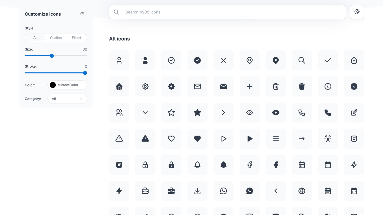
Hugeicons:
4,000+ icons with consistent stroke and fill variants. Best for large-scale product design.
- Massive library with good categorization
- Figma plugin with search
- Multiple styles: stroke, solid, duotone, bulk
- License: free tier with attribution, Pro for commercial without
- Why it works: when you need an icon for everything, including niche categories

Boxicons:
1,600+ icons in regular and solid styles. Best for general-purpose web and app design.
- Clean, geometric aesthetic
- Web font, SVG, and React library
- Logo icons included (brands, social media)
- License: MIT
- Why it works: solid all-rounder with good brand icon coverage

Figma-Native Libraries
Untitled UI Icons:
4,100+ icons built as a Figma component library. Best for designers who live in Figma.
- Every icon is a properly built Figma component with variants
- Line and solid styles with consistent 24px grid
- Part of the larger Untitled UI system
- License: free tier available
- Why it works: the Figma integration is first-class: swap icons with variant properties, not copy-paste

Iconoir:
1,500+ free icons with a Figma library, React, React Native, and Flutter packages. Best for cross-platform design teams.
- Consistent 1.5px stroke width across the entire set
- Dedicated Figma plugin with search
- Strong mobile and web coverage
- License: MIT
- Why it works: the cross-platform package coverage is unusually complete for a free library

Animated and Motion Icons
Lordicon:
2,000+ animated icons with configurable triggers and colors. Best for micro-interactions and onboarding flows.
- Lottie-based animations you can customize without After Effects
- Trigger options: hover, click, loop, morph
- Figma plugin for preview, plus web component and React packages
- License: free tier (100 icons), Pro for full access
- Why it works: adding motion to icons without opening After Effects is a real workflow win

Animated Icons:
Animated SVG icons with simple embed codes. Best for quick motion accents on landing pages.
- Small set but high-quality animations
- Simple embed: no build system needed
- License: free for personal, check commercial terms
- Why it works: when you need one animated icon, not an entire motion system

Specialty Sets
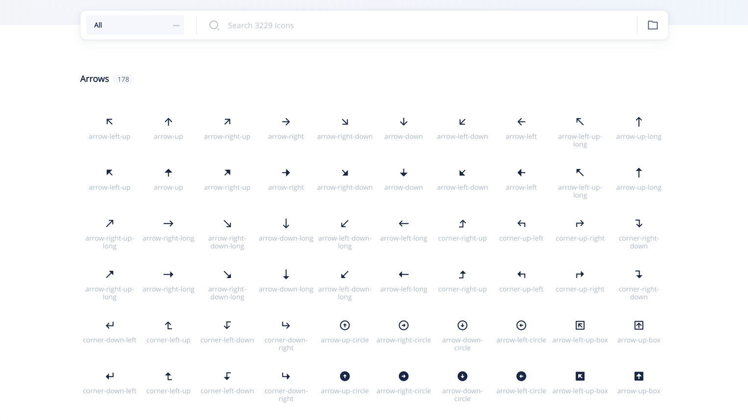
Tabler Icons:
5,300+ icons designed for web applications. Best for dashboards and admin interfaces.
- 24px grid, 2px stroke, consistent across the massive set
- Strong coverage of data, chart, and admin-specific icons
- React, Vue, Svelte, Preact packages
- License: MIT
- Why it works: the admin/dashboard category coverage is deeper than most general libraries
Radix Icons:
318 icons from the Radix UI team. Best for minimalist, system-level UI.
- Tiny, crisp 15px icons designed for dense interfaces
- Works perfectly alongside Radix primitives
- React component library
- License: MIT
- Why it works: when your UI is compact and every pixel matters

css.gg:
700+ pure CSS icons. Best for performance-obsessed projects with no SVG budget.
- Zero SVG, zero images: pure CSS shapes
- Tiny file size
- Skip if: you need complex icons. CSS geometry has limits.
- License: MIT
- Why it works: the “no asset files” approach is interesting for specific performance constraints

Iconmonstr:
4,500+ icons in a simple search-and-download interface. Best for quick grabs when you need one icon fast.
- No account needed, direct SVG/PNG download
- Clean, versatile aesthetic
- License: free for commercial use with no attribution
- Why it works: sometimes you just need one icon in 30 seconds

How to Choose the Right Icon Library
The decision isn’t about which library is “best.” It’s about which one fits your project:
Building a design system? Start with Phosphor or Lucide. You need weight variants and long-term maintenance.
Tailwind project? Heroicons. They were designed together.
Need everything? Tabler (5,300+) or Hugeicons (4,000+). Depth matters more than aesthetic perfection.
Figma-first workflow? Untitled UI Icons. The component structure is built for Figma, not ported to it.
Performance-critical? css.gg for the extreme case, Lucide for the practical one.
One principle applies to all: pick one library per project and stick with it. Mixing icon sets is the fastest way to make an interface look incoherent.
Key Patterns
After reviewing dozens of libraries, a few trends are clear:
- Figma-native is expected now. A Figma library isn’t a bonus: it’s a baseline requirement. Libraries without one are losing ground fast.
- Weight variants are the new standard. Single-weight icon sets feel limiting. Phosphor set the standard with 6 weights, and newer libraries are following.
- Animated icons are crossing from novelty to utility. Lordicon’s trigger-based approach shows that icon animation can be systematic, not decorative.
- Size is less important than consistency. A library of 300 perfectly consistent icons beats 5,000 icons with mixed visual language every time.
- MIT license is winning. Designers want clarity. MIT = use it, ship it, don’t worry about it.
Find more curated design resources on Muzli: icons, kits, and tools, all in one place.
……
💡 Stay inspired every day with Muzli!
Follow us for a daily stream of design, creativity, and innovation.
Linkedin | Instagram | Twitter